Twitter clients used to be a UI design playground. The growing popularity of Twitter, an open API, and the rapid takeoff of the App Store contributed to the creation of a defining genre of mobile software in 2009 and 2010: the Twitter client for iPhone. In the golden days of third-party Twitter apps, a good new client would come out at least every month, with several developers pitching their own ideas for what was meant to be a mobile-first communication network.
iPhone apps and the Twitter API were a perfect match five years ago. Twitter made sense as a social network in your pocket; Apple’s iPhone OS and newly launched App Store made that a reality. As a user, there was little friction in trying multiple Twitter clients: because Twitter data was always “in the cloud”, changing clients was like choosing a different outfit each day. The core Twitter experience would always be the same; the design and preferences around it would differ from client to client.
That was a time of astonishing innovation in mobile app design. Twitterrific, the first native Twitter client for iPhone, effectively invented key aspects of modern Twitter interaction and terminology; Tweetie, perhaps the most popular Twitter client of its time, pioneered touch interaction paradigms such as pull to refresh. And then there were Weet, Osfoora, Birdfeed, Twittelator, Echofon, Tweetings, TweetList, and dozens of other apps that helped refine and redefine the idea of what Twitter on an iPhone could be.
Good Twitter clients weren’t easy to create, but the challenge they packed was intriguing and flexible. As a Twitter developer, you needed to design an app that would primarily display textual information (this was before Twitter photos), handle hyperlinks, manage interactions between users, account for different network conditions, possibly integrate with third-party sharing services years before iOS 8, and, most of all, be fast, responsive, and easy to use. The constraints of Twitter clients in 2009/2010 freed many from the struggle of coming up with an original app idea.
If you’re using an iOS app[1] today, there’s a good chance some of its features or design ideas first appeared in a Twitter client five years ago.
We know how the story moved forward. In April 2010, Twitter realized that they needed an official iOS presence on the App Store, so they bought Loren Brichter’s Tweetie, relaunched it as Twitter for iPhone, and Brichter released the (unsurprisingly genius) Twitter for iPad.[2] For a while, it looked like Tweetie would live on, but then Twitter started adding questionable features to it, and it became clear that the third-party Twitter client would be persona non grata on the App Store.
Over the years, there have been countless examples of Twitter prioritizing their own app and a closed ecosystem approach over third-party developers and improvements to the API. From the infamous quadrant and token limits to the display guidelines and constant reticence about bringing new features to the API, Twitter has been nebulous in providing an official stance on third-party clients after the Tweetie acquisition, but the subtext of their announcements has always been fairly clear to everyone in the third-party scene. Twitter wanted people to use their official app, not a third-party client.
Before the Twitter acquisition in 2010, I was using a bunch of third-party clients but I had eventually elected Tweetie as my preferred one. After Brichter’s app turned into Twitter for iPhone, I stuck to it for a while, but then I was allured by Tapbots’ promise of a Twitter client for power users. As I wrote in my original review, Tweetbot had everything I was looking for, and that was before Tapbots would bring fantastic new features that made it even more versatile.
I loved Tweetbot in a way that I didn’t love any other app for iOS. I have extremely vivid and personal memories of getting the first beta builds of Tweetbot for iPhone and iPad, and, until Editorial came around, Tweetbot was the app I spent most of my days in. From 2011 until earlier this year, I used Tweetbot every working hour of every day. Tweetbot was Twitter for me.
That’s not to say that I stopped checking in on the state of other Twitter clients for iOS, but I certainly became less curious because I had found the one. I’ve primarily continued to keep an eye on Twitterrific, but I largely ignored the third-party space for two years. Last year, the launch of iOS 7 motivated me to look for new Twitter clients again and I stumbled across new versions of TweetLogix, Echofon, and Tweet7, but my affection for Tweetbot and the fact that the majority of my Internet friends were using Tapbots’ app convinced me that I didn’t have to look for anything else.
I like to think that I’m naturally curious, but, for my Twitter client of choice, I had become complacent and fixated on the belief that the official Twitter app could never offer anything valuable again. Earlier this year, an idea started poking me in the back of my mind: if the rest of the world is using the Twitter app for iOS, shouldn’t I give it another chance?
This realization came from a simple occasion: I was having dinner out with some friends, and I noticed that they were using the Twitter app for iPhone to read news and follow their favorite celebrities. Tweetbot was Twitter for me and I was certain that I could never switch to another app, but they seemed to be just fine with the official app and its lack of streaming, mute filters, quick actions, and all those other great details Tweetbot had. “They’re not power users”, I thought, and that settled it.
Still. For someone who likes to think he’s curious and writes about apps for a living, my unwillingness to at least try the app from the service I use every day was remarkable in its shortsightedness. Twitter had changed since 2011, and it wasn’t meant for power users. The rest of the world was using Twitter through the official apps and I thought that I knew better than anyone else. So, a fun experiment began:
I started using the official Twitter client as my main Twitter app on my iPhone and iPad.
For the past six months, I’ve been reevaluating my entire Twitter experience based on the apps I use to read tweets and interact with people. The idea made a lot more sense once I stepped out of my preconceptions: I wanted to understand what 2014 Twitter was like and if that meant sacrificing my nerd cred and use a Muggle’s Twitter app, so be it. But at the same time, I’ve gone back and forth between Twitter and third-party clients, primarily out of habit, but also because they still offer powerful features and design details that I appreciate.
I didn’t want to focus on the history of Twitter clients, my thoughts on Twitter’s policies, or every single Twitter app currently available for iOS 8. I also couldn’t compare every single feature or design decision for every possible scenario a Twitter client could be used in.
Instead, I attempted to address my curiosity from a utilitarian standpoint. Given the three most popular Twitter apps for iOS (Twitter, Tweetbot, and Twitterrific), I wanted to slowly evaluate their features for my use case. To do this, I assembled a list of features I need a Twitter client to be capable of handling and I started taking notes every time I switched between clients. I’ve been doing this since early June.
I’ve spent weeks comparing features and changing apps to understand the kind of experience they want to promote. But implementation details and design differences aside, I also kept wondering the same question: was the real Twitter different from the third-party clients I used for three years?
What’s 2014 Twitter like on iOS?
Table of Contents
- Loading Timeline Gaps & Tweet Marker Sync
- Web Views
- Cards and Previewing Tweets
- Extensions
- Gestures
- Profiles
- Lists
- Tweetstorms
- Direct Messages
- Uploading Photos
- Discover
- Muting
- Fave and RT Counts
- Search
- Timeline
- New Twitter
Notes
Update #1: Clarified that Tweetbot’s web view has a Readability mode and its double tap gesture on tab bar icons for timelines can scroll to the last read tweet if possible. Clarified that Twitterrific can load favorites and mentions on other people’s profiles too.
The apps tested for this article were the latest versions of Twitter, Twitterrific, and Tweetbot 3 for iPhone.
I only considered Tapbots’ iPhone app due to the lack of Tweetbot 3 for iPad. Both Twitter and Twitterrific (Universal apps) were tested in their iPhone and iPad versions, with design and feature differences noted when appropriate.
You can click (or tap) images to get a full-size version. You can link to any specific section using the Table of Contents above.
This is not a feature-by-feature comparison. If you can’t find a feature you care about in this article, it’s not because I don’t think it’s important. Rather, it means that I don’t rely on that feature and I’m not knowledegeable about it enough to cover it (this policy applies to all MacStories reviews).
Please also note that I approached this with the idea that Twitter is not evil because it’s trying to make money with ads. If you’re sure you won’t be able to use any Twitter client with ads in the timeline, this article won’t convince you of the contrary (nor does it want to). The Twitter app has ads.
And finally, I’d like to thank Silvia, Myke, Stephen, and Graham for their notes and feedback on the article. Their patience is always immensely appreciated.
That said, let’s dive in.
Loading Timeline Gaps & Tweet Marker Sync
I’m a Twitter completionist. Because I’ve always used the service to discover interesting new apps and links, I’ve developed a habit of trying not to miss a single tweet that is shared or retweeted in my timeline, with the only exception for the weekends.
Particularly after launching better linked posts on the site and starting our MacStories Weekly newsletter with a dedicated Links section, discovering stuff on the Internet has become essential to my livelihood, and Twitter is the best (and most diverse) service for this. I know that I haven’t missed cool apps, links, and news thanks to my dedication to reading my entire timeline every day, and for this reason, in spite of strong evidence suggesting that Twitter doesn’t intend timelines to be consumed this way, I won’t change how I read Twitter.
This behavior makes timeline gaps and timeline sync one of the most prominent aspects I have to consider in a Twitter client. I want to be able to wake up in the morning and start reading my timeline from where I left it the night before; and, I want to know that I can close Twitter for a couple of hours in the afternoon without losing my place in a stream of tweets. More importantly, whenever a timeline gap occurs[3] I need the ability to load tweets without making the timeline scroll and lose my position.
Unfortunately, the official Twitter app doesn’t support sync and leaves much to be desired for timeline gaps.
The app is capable of detecting timeline gaps[4], but it can keep your position (load tweets above or below) in the timeline only if you tap “Load more Tweets” when the gap is close to the top or bottom of the stream. It’s not clear that Twitter for iOS supports this (there’s no visual indication like in Tweetbot), and, sometimes, the app still scrolls the timeline upon loading tweets from a gap.
This means that you may end up scrolling back and forth in your timeline if you want to keep reading Twitter exactly where you left off, which can be a considerable waste of time when you’re a completionist and follow >1000 accounts. The lack of sync makes everything worse as timeline position isn’t shared across devices.
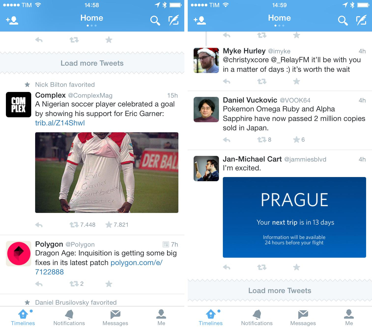
In practice, the Twitter app results in several minutes I spend scrolling and trying to find the last tweet I saw when I closed the app. Every morning and whenever I leave the app for a couple of hours, Twitter either completely reloads the timeline (pushing me to top to see the latest tweets) or inserts a timeline gap that occasionally fails to load new tweets above my position.
Combine this with the app’s tendency to not restore its state when it’s launched, and it’s easy to understand that Twitter doesn’t care about treating its timeline as a stream of tweets you want to read in its entirety from oldest to newest. In spite of timeline gaps, Twitter seems to be all about the latest tweets and providing you with fresh content, which can be tedious for a completionist – a problem that is common to modern social apps such as Facebook and Instagram as well.
Twitterrific fares better in this comparison, but I find the best implementation to be Tweetbot’s. Both apps support timeline gap detection and both allow you to sync your timeline position with iCloud and Tweet Marker, but Tweetbot has been faster and more reliable in my tests.
The concept of timeline sync between Twitter clients across multiple devices was popularized by Tweet Marker, a service launched by Manton Reece in 2011 (first teased as Tweetmarks) and that is embedded in dozens of clients for iOS and OS X. Tied to your Twitter account, Tweet Marker offers a mostly invisible, volatile bookmark that saves your position in the timeline every time you use an app that integrates with the service. This allows you to, say, stop reading tweets from 2 hours ago in Tweetbot on the iPhone and pick up in the same spot in Twitterrific for iPad without having to scroll to find the last tweet you saw. The implementation varies across apps and it’s dependent on how developers handle timeline gap detection and scrolling.
In Twitterrific, you can choose to show the visual Tweet Marker indicator and automatically scroll to it. When the same set of tweets is loaded across two different clients, Twitterrific is usually able to quickly take you to the last tweet you were at when you closed another Tweet Marker-enabled app. If you keep two apps open at the same time, Tweet Marker sync tends to be flawless in Twitterrific.
In my experience, Twitterrific loses position in the timeline when it has to deal with tweets that haven’t been loaded yet and that require loading a timeline gap. Twitterrific with Tweet Marker sync works well with recent tweets (e.g. You left home thirty minutes ago and want to keep reading tweets now that you’re at the grocery store), but it doesn’t work well when there are hours of tweets between the most recent tweet in your timeline and your last position hundreds of tweets ago.
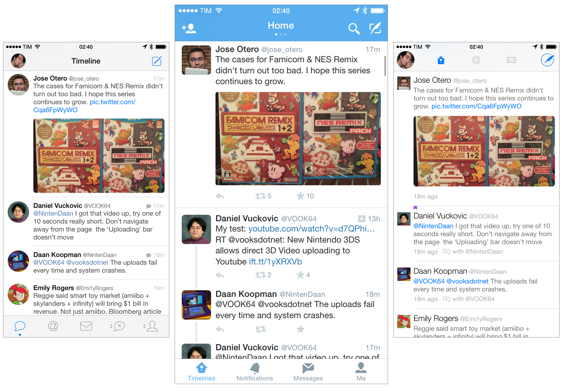
Tweetbot has the most solid implementation of timeline gap loading and Tweet Marker sync. Tapbots’ app rarely fails to load your last position when you launch it and it’ll always try to load as many tweets as possible (as allowed by the API) between your position and recent tweets above a timeline gap. Tweetbot shows a visual Tweet Marker indicator, always scrolls to the last tweet saved by Tweet Marker, and can keep position for the Mentions tab, too.
What’s great about Tweetbot is that beyond stable Tweet Marker sync and handling of timeline gaps, it also clearly indicates how to load more tweets above or below a gap in the timeline. When I wake up in the morning and I want to catch up on all the tweets I missed overnight, I can let the timeline gap turn into tweets above my current position so the full stream is loaded and I can keep reading without scrolling back to older tweets. Tweetbot appears to be designed with an eye for timeline completionists, and it has been this way since its early adoption of Tweet Marker.
Both Twitterrific and Tweetbot come with a second option for timeline sync – iCloud. I, however, have always preferred Tweet Marker for two reasons: I never had issues with Tweet Marker (unlike my iCloud account), and it works across multiple apps from different developers. So while iCloud adds the benefit of marking direct messages as read in Tweetbot, it doesn’t sync my position between Tweetbot and Twitterrific, which Tweet Marker handles elegantly.
Web Views
I spend a considerable amount of time discovering links on Twitter and opening webpages to see what they’re about. For this reason, being able to effortlessly switch between web views and the timeline as well as the ability to quickly share links to other apps are valuable aspects in my Twitter workflow.
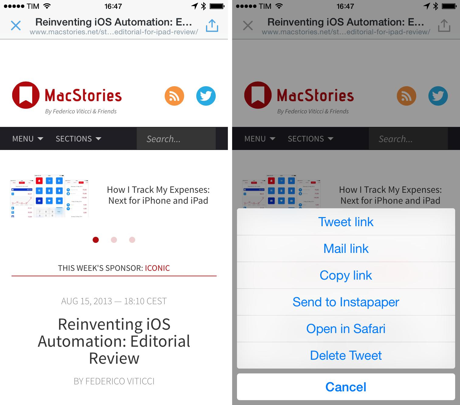
The Twitter app is, again, a disappointment from this standpoint. Links in Twitter open in a modal web view that takes over the entire app, with the title of the webpage displayed in the title bar. You can tweet a link (the only instance where the web view will be superseded by a UI element of the app), copy it, mail it, send it to a read later service, or open it in Safari; you can’t share it natively with extensions because, for reasons unknown, Twitter doesn’t support the native iOS 8 share sheet.
I cringe every time I have to open a web view in the Twitter app because it means that a webpage needs my full attention while it’s loading – I can’t switch to another part of my timeline, and I can’t dismiss the web view but keep it open in the background. The lack of share sheets only exacerbates my distaste for Twitter’s web view: I can’t easily save links to extensions when I’m using Twitter, which slows me down.

The only nice touch of Twitter’s web view is that it displays the full URL of a webpage in the title bar under the webpage’s title.[5] Twitter also displays a lock icon for HTTPS connections, which is a welcome plus.
Web views are much better in Twitterrific: they’re still modal, but Twitterrific supports a readability mode for webpages (either Instapaper or Readability) and lets you share URLs using the iOS 8 share sheet. Twitterrific doesn’t display webpage URLs and titles simultaneously (it only shows the URL while a webpage is loading) and it doesn’t come with any special icon for HTTPS, but it adds a dedicated 1Password shortcut to quickly fill logins with the 1Password extension (which I never used personally for links in tweets).

Support for share sheets in web views makes processing links great in Twitterrific for iPad: once you get used to the power and convenience of extensions, it’s hard to use the custom sharing menu of the Twitter app, unreasonably limited to options Twitter decided for its users and that don’t make Twitter a good iOS 8 citizen.
Unfortunately, Twitterrific suffers from the same issue of other apps that implement extensions: the system can be flaky. Twitterrific displays action extensions for webpages that are also supported by Safari, but only Safari returns the full DOM of a webpage, which makes extensions such as ImageDrain and Stacks useless in Twitterrific. This isn’t Twitterrific’s fault – just like I can’t blame the app for messing up the order of extensions if the share sheet is modified with drag & drop.
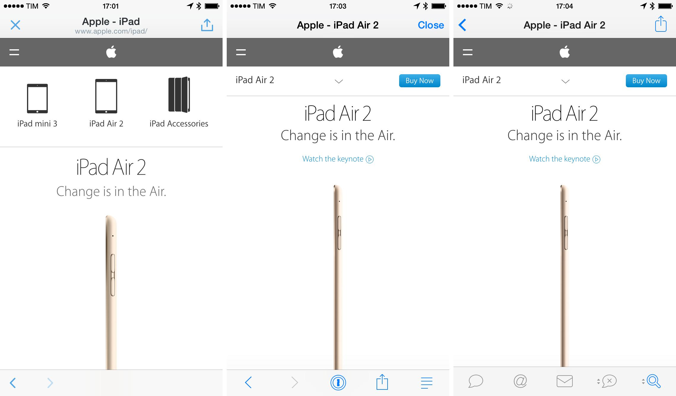
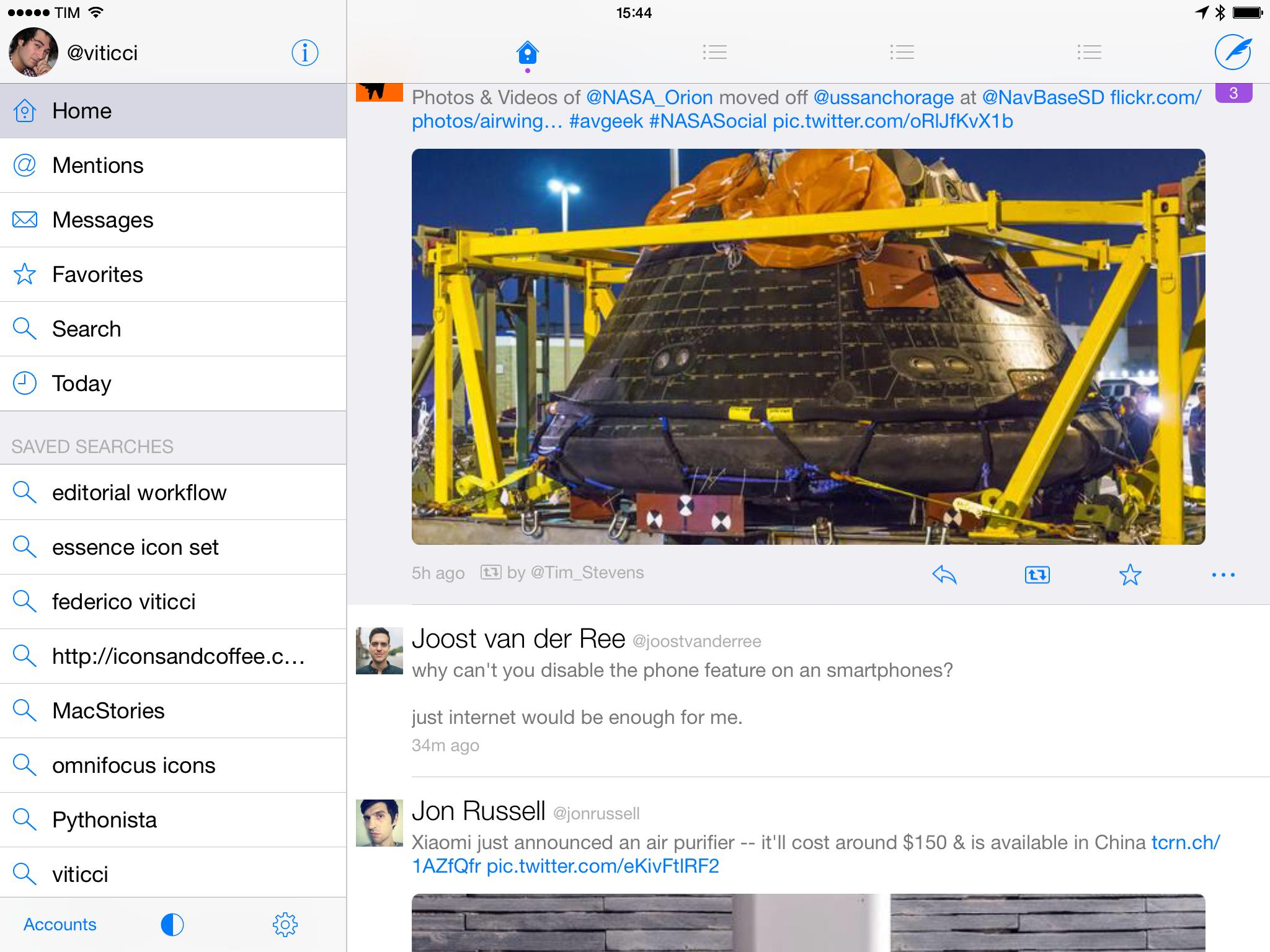
The way Tweetbot handles opening links from any view of the app is my favorite. As I mentioned in my original review of Tweetbot 3 last year, Tapbots built a web view system that lets you open a link without the in-app browser taking over the entire app. Each web view is modal to the view it was activated from: if you open a link from the timeline view, the timeline will turn into a web view, but you’ll still be able to switch to other sections such as Mentions or Favorites.

Tweetbot’s web view. Notice how the only active tab is the Profile one, where the web view was activated from.
This design choice frees you from the pressure of having to open a link knowing that you won’t be able to use the app in any other way while a webpage is shown, and it also lets you open multiple web views relative to their originating sections – you can open a link from the Timeline and another one separately in Search, for example. This is great if you want to multitask with web views in Tweetbot, and it makes me wish that more apps – not just Twitter clients – would be inspired by it.
Tweetbot also supports extensions with the same limitations of share sheets from Twitterrific. The system mostly works – I smile every time I can easily save a link to Todoist or a tweet to Notebox without leaving the app I’m using – but extensions can occasionally fail.
In switching between these three clients for the past months, I’ve noticed that I miss Tweetbot’s non-modal web views but I prefer the iPad to go through favorites I want to turn into todos or notes, and thus Twitterrific. The Twitter app has a lot to learn from The Iconfactory and Tapbots when it comes to web views, but it makes up for those deficiencies at the very starting point: previews for links.
Cards and Previewing Tweets
Twitter offers a feature called Twitter Cards that enable you, as a user, to preview content without leaving the Twitter timeline for a web view. There are different types of cards: from the popular Summary and Gallery to the more peculiar Lead Generation and Audio Player cards, the official Twitter apps support a wide range of interactive media previews that aren’t made available to third-party clients via API.
I suspect that most Twitterrific and Tweetbot users who never used the Twitter app for extended periods of time largely ignore the existence of Twitter Cards – I assume so because I did that. Since I started using Twitter on iOS, I became fascinated with the concept and realization of cards – so much that MacStories’ tweets support the Summary card and readers can sign up to our Weekly newsletter directly from Twitter.
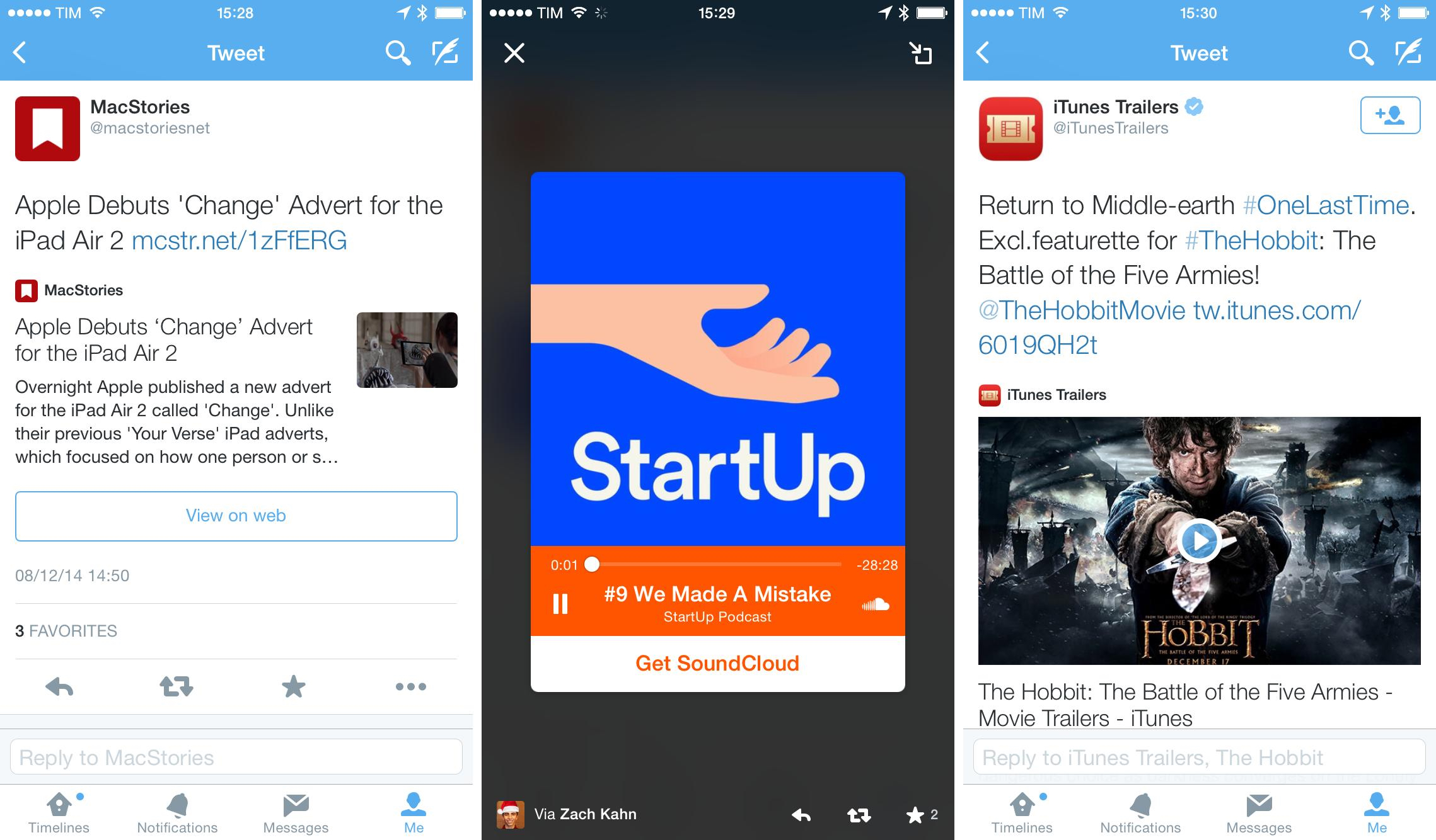
I first wrote about cards on MacStories when Twitter launched audio cards for SoundCloud and iTunes:
Besides the obvious photos, galleries, and aforementioned audio cards, there are several types of cards that get expanded or are interactive in the Twitter apps for iOS. In the months I’ve spent using Twitter for iPhone and iPad, I’ve come to expect articles to reveal Summary Cards (we support them with MacStories links) because they often tell me whether a link is worth opening or not just by looking at their preview. I find summary cards for web articles to offer more information and to be more respectful of my time (and cellular data).
In short, Twitter Cards turn tweets into rich previews that are easy to understand without visiting a webpage. Often, these previews embed relevant media directly in the timeline, so you can view images/press buttons without even opening a tweet’s detail view.
I’ve become a fan of Twitter Cards because they help me save time and find more cool links. Sometimes, the text that accompanies a link doesn’t really sell the article: by tapping the tweet, I can see if there’s a Summary card and take a look at the first image of an article, perhaps a brief description too, and decide whether the link may actually be worth opening or not. I was able to reevaluate dozens of links that I then used for MacStories or MacStories Weekly thanks to the Summary card. Same deal with YouTube videos: YouTube supports the Player card, which gives you a tappable video thumbnail and a description of the video in the tweet detail view.
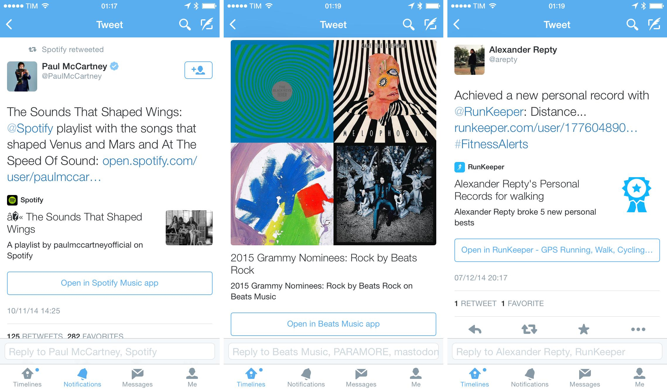
Most cards are deep-linked to their official apps, meaning that content can also be viewed directly in a native app if it’s installed on your device. YouTube videos can be played back in the YouTube app, Spotify links can be opened in Spotify, Kickstarter projects can be displayed in the official Kickstarter app, and so forth. This is optional – you have to tap a dedicated “app button” in the tweet detail view to beam content to its associated app, and it’s a great experience if you prefer native apps to web views. If you don’t have the app installed, Twitter will let you download it from the App Store using SKStoreProductViewController, which opens an App Store panel that doesn’t take you away from the app.[6]
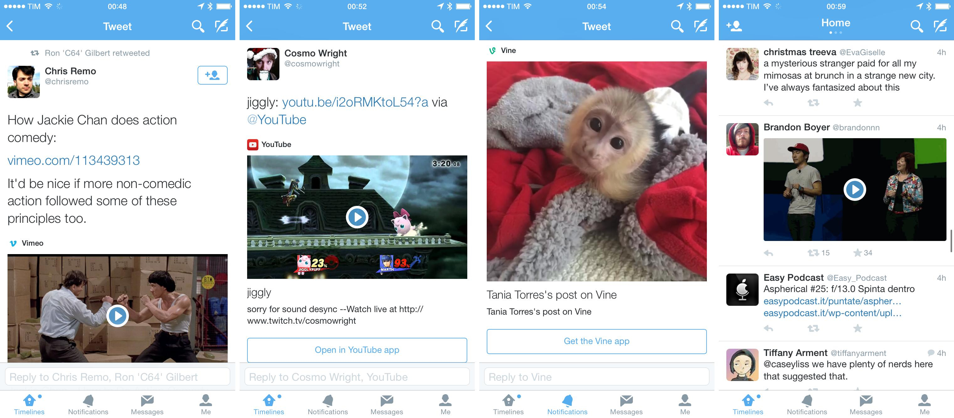
Even more impressive is when cards are more than thumbnail previews and bring interactive content to the Twitter timeline. Thumbnails for Kickstarter links can be tapped and a player for a project video will open immediately; iTunes Movie Trailers thumbnails also turn into a video player inside the Twitter app (Star Wars proof); SoundCloud links feature a special Audio Player card that turns into a persistent mini-player.
Cards are a smart move: they don’t compromise the 140-character nature of tweets, but instead they use web content to offer previews with deep ties to native apps that, in my opinion, make a lot of sense for an information network on a mobile device. I want to be able to open YouTube videos in the YouTube app and of course Kickstarter links should offer an option to easily switch to the Kickstarter app that already has all my credentials and preferences.
In daily usage, Summary Cards are the ones I see and use the most, and I’ve grown used to being able to preview articles before I tap them: it’s a great way to avoid clickbait and other sensationalistic garbage. Unlike other cards, web summaries aren’t embedded directly in the timeline – you’ll need to tap tweets to see them.
Cards work in the opposite direction of traditional clients: instead of forcing you to tap a link, they bring a native snippet of the web to you.
But there’s a problem: supporting Twitter Cards is entirely up to the publisher/content owner, and for this reason not every link automatically gets a rich visual preview on Twitter. While popular blogs and media services tend to support Twitter Cards nowadays, there’s still a vast sea of independent publishers who have no idea what the benefit of a card could be, or, really, what a Twitter Card is. When links aren’t supported by a card in the timeline, Twitter falls back to looking like Tweetie and any other client: a tweet, and a blue hyperlink.[7]
I also want to briefly mention the unusual and powerful Lead Generation Card that we’re using to handle signups to our MacStories Weekly newsletter through Twitter. Thanks to integration with MailKimp, Twitter lets you build cards for your newsletter that display a description and signup button alongside a tweet in the official Twitter app. To sign up, Twitter uses your configured email address: tap a button, and you’re signed up. No need to open a web view (although you can), no need to type your email address. This card type also extends to buy products from cards (which I haven’t tried) and other services that turn Twitter users into customers.
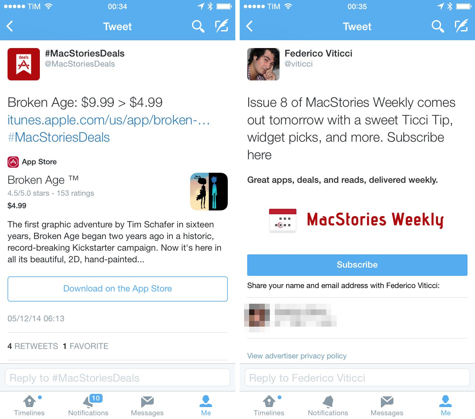
As a user, I’m a fan of the idea, although it still feels strange to be able to act on tweets and not just “consume” them. As a website owner, I can say that Twitter signups doubled our newsletter subscribers overnight since we tested them, which has been a positive experience.
Cards aside, Twitter has long supported timeline previews for photos, a feature that was expanded in the past year to include multiple photos and animated GIFs. I was initially put off by the former, but I’ve learned to appreciate the ability to include multiple attachments in uploads, and I’ve started to think of pictures as separate entities from the limited character space of tweets.
Native GIFs are welcome: GIFs I have in my iOS library can be uploaded through the Twitter app, but the service encodes them to video instead of preserving the original GIF format, which I’m not a fan of because I can’t redownload them. Still, they look like GIFs in the Twitter timeline, which should be okay for most people.
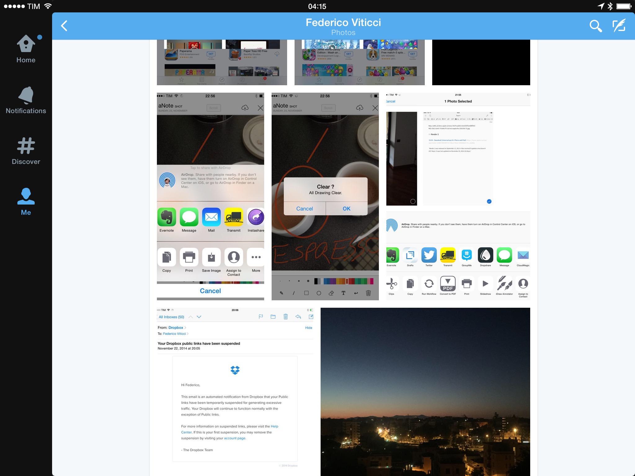
The Twitter app disappoints with direct URLs to images or videos stored elsewhere. For a long time, Tweetbot and Twitterrific have been able to turn image and video URLs into inline previews – a nice touch if you want to link to a GIF stored on your own server/S3 bucket or simply link to an image from someone else’s website. This is the epitome of a third-party client feature: it’s the right thing to do, but Twitter likely wants to encourage uploads to its own photo service, so they won’t support direct links to images or videos with native previews.
A great touch of the official Twitter app is that playing videos (whether they’re previews in the timeline or videos embedded in a web view) doesn’t pause audio playback that may be happening in another app. Instead, Twitter will simply lower the volume of existing audio playback in the background and play a video you’ve tapped alongside it.
I come across this difference on a daily basis: I always have music or podcasts playing on my iPad when I’m working, and I don’t want them to pause because I chose to view a Vine or YouTube video in Twitter. This will be strange the first time you’ll see it in action, but, at least for me, it absolutely started making sense after a couple of days and I now wish that iOS had an option to play multiple media items at the same time.
Twitter Cards aren’t available to third-party clients over the API, which has forced Tweetbot and Twitterrific to come up with their own custom integrations to display tweet previews for web content. The result is that the timeline shown in these two clients will look different and out of place after you get used to the richness of previews in the Twitter app.
For Tweetbot, Tapbots didn’t build any sort of visual preview for article links, which are shared and diplayed as regular hyperlinks in the app. Tweetbot has proper support for Twitter photos (both for tweets containing single and multiple photos) and it can load and show an inline preview for any URL that points directly to an image stored elsewhere. This is useful if you want to tweet GIFs using links fetched from services like Giphy – they will be visualized inline by Tweetbot, which comes in handy when you don’t want to share a native GIF through the official Twitter app (Tweetbot can’t upload GIFs to Twitter with the API).
Notwithstanding its API limitations, Tweetbot provides decent support for image and video previews. The app shows thumbnails for YouTube, Vine, and Instagram videos, which are differentiated from image thumbnails by a Play button; while YouTube thumbnails will take you to a YouTube web view, Vine and Instagram videos will play in a popup over the timeline. The same video player is also used for native Twitter GIFs, which are always transcoded to video by the service.
Tweetbot shows inline previews for Instagram[8], Droplr, CloudApp, Flickr, img.ly, Mobypicture, and yfrog images. Tweetbot can’t support previews for images shared in Direct Messages, and it can’t preview native Twitter videos (such as this one) either. The former is a particularly annoying limitation, as tapping an image URL shared in a DM will open a Twitter web view that will require authentication.
One of my favorite touches of Tweetbot is its ability to preview iTunes content inline, which I appreciate when it comes to iTunes links for apps.
Twitterrific, like Tweetbot, can’t support Twitter Cards and doesn’t have any inline previews for web links. Twitterrific shows previews for native Twitter photos, but only individual ones; Twitterrific, in fact, still hasn’t been updated to support multiple Twitter photos, so tweets containing more than one photo will only show the first one in Twitterrific. This is a major issue if you want to make sure you always see all photos attached to a tweet. Twitterrific can’t show native Twitter GIFs either.
Twitterrific displays inline previews for Droplr, CloudApp, Instagram, and Flickr links, but tapping their thumbnails (which can be set to small or large) will open a webpage to view the full image – it won’t load the image in a floating popup (as is the case with Twitter photos). Twitterrific can, however, load direct image URLs without opening a web view, which also shows a progress bar on top of the timeline.
Thanks to its integrated previews and iTunes support, I prefer Tweetbot to Twitterrific for previews of images and videos uploaded to third-party services.
The evolution of Twitter from quick status sharing service to an information network that spans text, links, and media has left third-party clients in the cold for Cards and the photo features the service has been rolling out in the past year. Tweetbot and Twitterrific – primarily due to API limitations but also because of their own implementations – largely treat Twitter timelines as streams of text with the occasional photo or GIF.
In the months I’ve spent using the Twitter app, I’ve come to expect my Twitter client to support multiple photos, native GIFs, summaries for web articles, and other static or interactive previews with Cards. I want to be able to listen to SoundCloud snippets in the timeline with a mini player, and I appreciate that Twitter gives me the tools to let people subscribe to my newsletter easily and securely.
Twitter is inconsistent in its implementation of Cards and previews across platforms. The iPhone app is the company’s most supported and frequently updated mobile client, always receiving the latest design updates and feature additions. On the iPad, only some card types are supported, while others are inexplicably broken.
In practical usage, I’m faster at discerning interesting links in the Twitter app because of its support for Summary Cards. The convenience of being able to see a quick preview of an article allows me to decide whether a link deserves my attention before tapping it. Selecting a tweet to see a summary is still faster than switching back and forth between the timeline and a web view. My main issue is that Twitter Cards aren’t supported by a few websites I read frequently; I wish more publishers added Cards integration to their content for Twitter users.
Extensions
Twitter doesn’t support native iOS 8 share sheets; Twitterrific and Tweetbot do. I don’t understand Twitter’s decision.
As I wrote last month:
I don’t understand why, two months after the release of iOS 8, the official Twitter app for iOS doesn’t implement the system share sheet for action and share extensions. There is no technical hurdle preventing Twitter from adding their own custom buttons to a share sheet or coming up with ways to show both custom and native share sheets. If the decision is political because Twitter doesn’t want to allow users to easily share Twitter content to external services, then it’s a stupid one, likely driven by an absurd idea that “user lock-in” is good for “engagement” and other buzzwords possibly made up by the same person in charge of the strategy statatement (but isn’t a share sheet all about connecting people to their world and other brands after all? Isn’t a share sheet “information sharing”? This is why I’m not a CFO, I guess). If a share sheet is considered dangerous by Twitter, then I guess that Twitter has bigger problems to worry about. Thankfully, third-party Twitter clients are still around to be good iOS citizens.
The way I see it, it makes no sense for Twitter to withhold support for the native iOS share sheet when they already have a few custom options that could be supplanted by better, official, and native extensions to let users share tweets and links to more services. If the decision is political, it’s a stupid one; if the reason is that this isn’t high on Twitter’s priority list, then their iOS team should know better.
Tweetbot and Twitterrific let you share tweets and links from the timeline and web views via extensions, which is useful. The entire extension framework in iOS 8 is still buggy and prone to presenting errors and it occasionally crashes, but there’s nothing Tapbots and The Iconfactory can do about it. Developers need better tools to debug extensions, filter them by type, and disable them when necessary, so hopefully Apple will keep improving the system over time.
Curiously enough, neither Twitterrific nor Tweetbot offer a share extension to send tweets using their app interfaces from anywhere on iOS. It’s a strange omission considering that both apps were quick to embrace share sheets for getting links out of their respective apps.
I’ve been using Twitterrific to save links through extensions because it’s available on the iPad and it lets me go through my Favorite tweets (I give a lot of faves every day) and send them to other apps easily. I loved the ability to merge links to multiple tweets with Notebox, and that wouldn’t have been possible without Twitterrific for iPad, updated for iOS 8. If you only care about Twitter clients on your iPhone, support for extensions in Tweetbot and Twitterrific is mostly the same – Twitterrific may get a slight edge over Tweetbot because it lets you save individual DMs through extensions.
Twitter should really add support for share sheets to its iOS app. The reliance on old and custom sharing options is inexcusable and it slows down the user experience.
Gestures
Note: The following section is technical and boring if you’re not into gestures. I decided to include it for the sake of research and to mention a few smaller implementation details. If you’re not interested, you can skip to the next section by clicking here.
Ever since I began using Tweetie in my iPhone in 2009, I’ve grown used to interacting with my timeline using gestures. Long presses, swipes, double taps, quick flicks – iOS has provided a great opportunity for developers to explore how multitouch can simplify the act of browsing your timeline and hide functionality until you need it.
In using Tweetbot, Twitterrific, and Twitter for iOS over the past months, I’ve collected how these three apps implement gestures differently and the trade-offs involved with enabling new iOS features and interaction patterns.
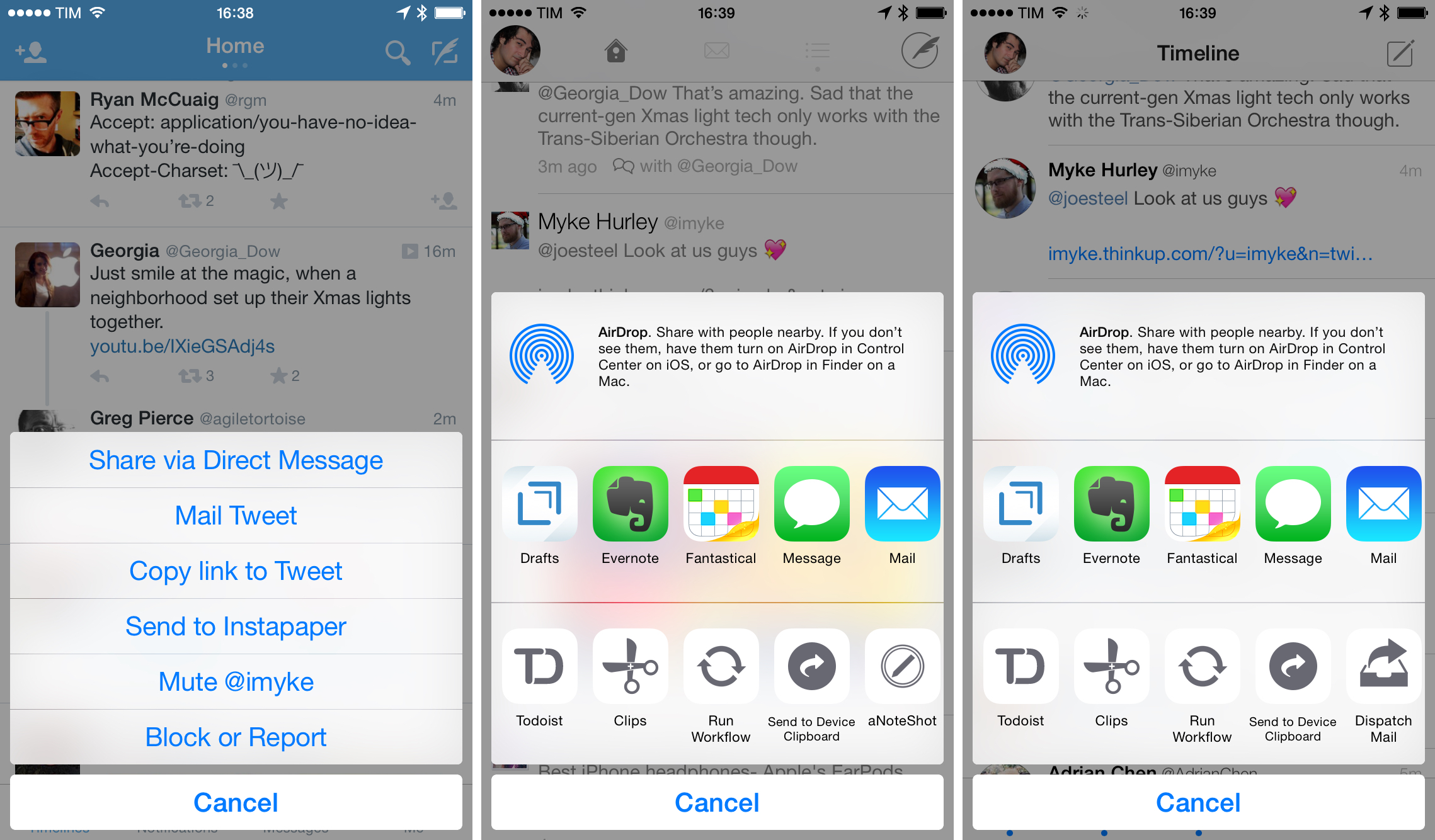
Tap & Hold
On the iPad, you can tap & hold on a tweet you sent to:
- Mail tweet
- Copy link to tweet
- Send to read later service (if contains link)
- Delete
The iPhone app has the same options, but it adds a shortcut to share a tweet via DM.
You can also tap & hold tweets sent by others on the iPad to:
- Mute
- Block or report
- Mail tweet
- Copy link to tweet
- Send to read later service (if contains link)
The iPhone adds, again, Share via Direct Message but presents the other options in a different order. It’s not clear why Twitter isn’t applying some consistency to this menu, as it makes things slower when switching across devices.
You can also tap & hold links directly in the timeline of Twitter for iOS, and, in this case, the options are the same between the iPhone and iPad app:
- Tweet (it’ll place the cursor before the link, adding a space between them)
- Copy
- Send to read later service
- Open in Safari
Tap & hold is supported for user avatars as well, showing integration with Apple’s Contacts app:
- Mute
- Block or Report
- Create new contact
- Add to contact
In the same vein, you can tap & hold usernames in tweets, but only from a tweet’s detail view because usernames aren’t directly tappable in timeline. When you do, you’ll get these options:
- Copy
- Create new contact
- Add to existing contact
And, of course, you can tap & hold photos to:
- Tweet photo
- Save photo
In addition to timeline tap & hold shortcuts, you can long-press the Me tab to show the account switcher, both on the iPhone and iPad.
The last tap & hold shortcut is one of my favorite ones: you can tap & hold the compose button (top right) to bring up a Drafts screen so you can modify a saved draft and send it as a tweet.
Twitterrific
Twitterrific and Tweetbot are more consistent with the rest of the system in that they have now replaced their former custom menus with share sheets for the most part.
In Twitterrific, long-tapping a tweet shows the share sheet with extensions, passing the Twitter URL of a tweet to it. The share sheet contains custom buttons to copy a link to the tweet, open it in Safari, tweet its link again, and translate it.
This idea of using the share sheet for every tap & hold gesture is carried out through the entire app with slightly different results:
- Usernames: the @username is passed to an extension; share sheet contains buttons to copy the profile’s URL and tweet the @username. Usernames are tappable in the timeline.
- Links: the URL is passed to the share sheet, which contains custom buttons to open it in Safari and tweet it.
- Hashtags: the share sheet receives the hashtag’s name and has buttons to copy a Twitter link for a hashtag’s search, view the search in Safari, and tweet the hashtag.
- Images from the timeline: the share sheet captures the Twitter photo’s URL.
- Images from the expanded view (tap image first): share sheet, but the image file is passed to extensions, so you’ll see a different set of them (such as Dropshare).
Furthermore, Twitterrific lets you tap & hold tabs to customize them, and you can also long-tap your profile picture in the top left to bring up the account switcher. In the timeline, you can tap & hold the retweet button (tap tweet first) to open the compose screen in old-style RT mode.
Tweetbot
Tapbots’ take on tap & hold gestures is similar to The Iconfactory’s, but Tweetbot still has a few custom panels that don’t use the iOS 8 share sheet.
The share sheet is used in the following places in the app:
- Tweets: the Twitter URL is passed to extensions; there are custom buttons to copy a link to the tweet, copy the tweet’s text, and open it in Safari.
- Links: the URL is passed to extensions; there are buttons to open the link in Safari, copy it, and tweet it. Like the Twitter app, tweeting a link this way places the cursor before the link in the compose field, adding a space.
- Images from timeline: the share sheet receives the Twitter photo URL; there are buttons to open in Safari, copy, and tweet a link.
On the other hand, Tweetbot’s tap & hold gestures use custom panels for:
- Usernames and avatars: the panel shows follow status and buttons to DM, manage in lists, mute, unfollow, and report for spam. Usernames in Tweetbot are clickable in the timeline.
- Images in expanded view: the menu has options to save or copy the image, plus view it on the web and tweet its link. There are no photo-oriented share and action extensions in Tweetbot.
- Hashtags: options to tweet the hashtag, copy it, and mute it.
In addition to share sheets and panels, you can tap & hold the gear icon in a tweet’s detail view to post a link to the tweet and long-tap your avatar or username to view your profile on Favstar. Tweetbot lets you tap & hold tabs to customize them and, like the Twitter app, long-pressing the compose button opens your existing drafts.
As I noted when version 3.5 was released, adopting the system share sheet forced Tapbots to drop the ability to view full URLs by holding them.
Double taps
Double taps don’t seem to be popular in Twitter clients. The only use I’ve found was in Tweetbot, which lets you double tap in four different places:
- DM tab bar icon: mark all messages as read;
- Tab bar, any timeline: scroll back to the top (Twitter uses a single tap for this; Twitterrific simply relies on tapping the status bar);
- Search tab bar icon: get into the search field and start typing;
- Profile tab bar icon: open your Favstar profile.
Swipes
Like double taps, swipe gestures aren’t used too much in the Twitter clients I tried. Tweetie was famous for its swipe gesture that revealed an action bar for a tweet, but that’s gone in Twitter for iPhone, which uses swipes to navigate across Timeline, Discover, and Activity.
In the Twitter app, you can swipe through photos in profile pages on the iPad and swipe through photos on tweets that contain multiple ones. You can also swipe from the edge of the screen to navigate (iPhone) and swipe to delete DMs.
In Twitterrific, you can swipe right on a tweet to reply, and swipe left to view the conversation; this also works in DMs.
Tweetbot has deeper support for swipe gestures:
- Swipe left on a tweet to open its detail view;
- Short swipe right on a tweet to fave it, long swipe to reply. The short swipe can be configured to be fave or RT;
- Swipe from the edge of the screen to navigate;
- Swipe to delete a DM;
- Swipe through multiple photos in a tweet;
- Swipe up/down with two fingers to change theme.
It’s hard to pick a favorite for gestures: there’s hundreds of details and variables to consider, and iOS 8 has brought consolidation in options shown via tap & hold. Twitterrific and Tweetbot have more convenient gestures than Twitter: Twitterrific is nice for quick replies; Tweetbot has a great flick gesture to dismiss images.
I compiled this list of gestures out of curiosity and to show the little design decisions that can go into what most people would deem trivial or obvious. My takeaway is that I deeply miss Tweetie 2’s original swipe gesture for actions.
Profiles
I look at user profiles on Twitter for various reasons. For my personal profile, I usually want to see who new followers are or I may need to find an old tweet or photo I sent. For other people’s profiles, I want to be able to look at their mentions, browse photos they’ve published, read their bio, and perhaps peek at their faves (it sounds creepy, but it’s a good way to discover interesting links – kind of like public bookmarks).
Twitter, Tweetbot, and Twitterrific have radically different designs for user profiles.
Tweetbot shows bios and other essential information (tweets, followers, following, listed) at the top of the profile, leaving room at the bottom for a Recent Photos grid that displays thumbnails for your latest 12–16 photos and videos[9]. You can tap a thumbnail to enlarge it and view the tweet it came with; tapping the tweet opens it in a detail view. Below the grid, Tweetbot shows when a user joined Twitter (useful to quickly spot spam accounts) and when the account’s last tweet was sent.
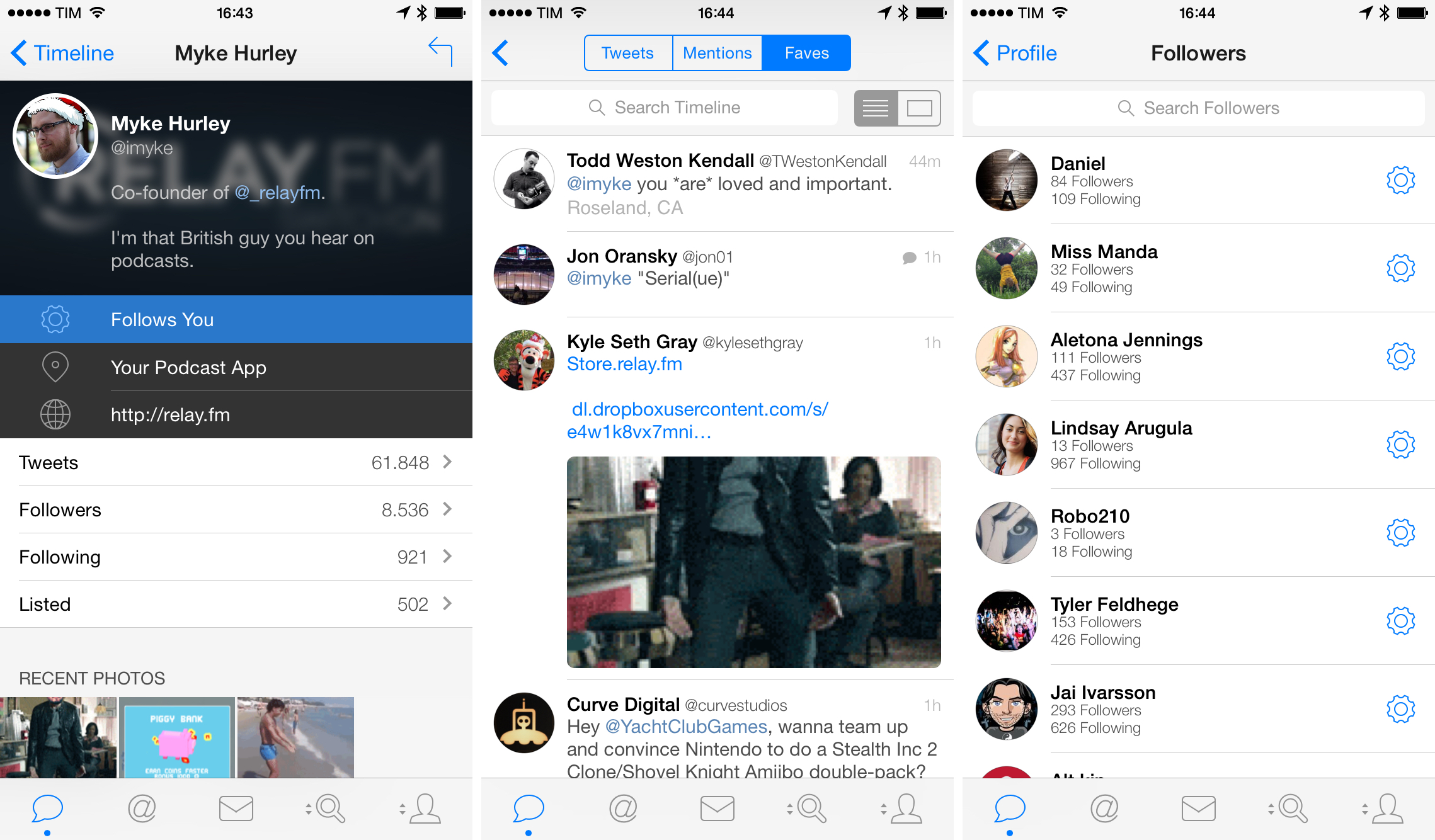
When you want to look at people who follow you, Tweetbot is the only client that displays follower/following counts in the Followers view. Again, this is a good way to quickly see if any weird spam account has started following you, blocking it preemptively; it’s also nice to be able to see when someone with a lot of followers has started following you (if you’re into that sort of thing) without having to open their profile page.
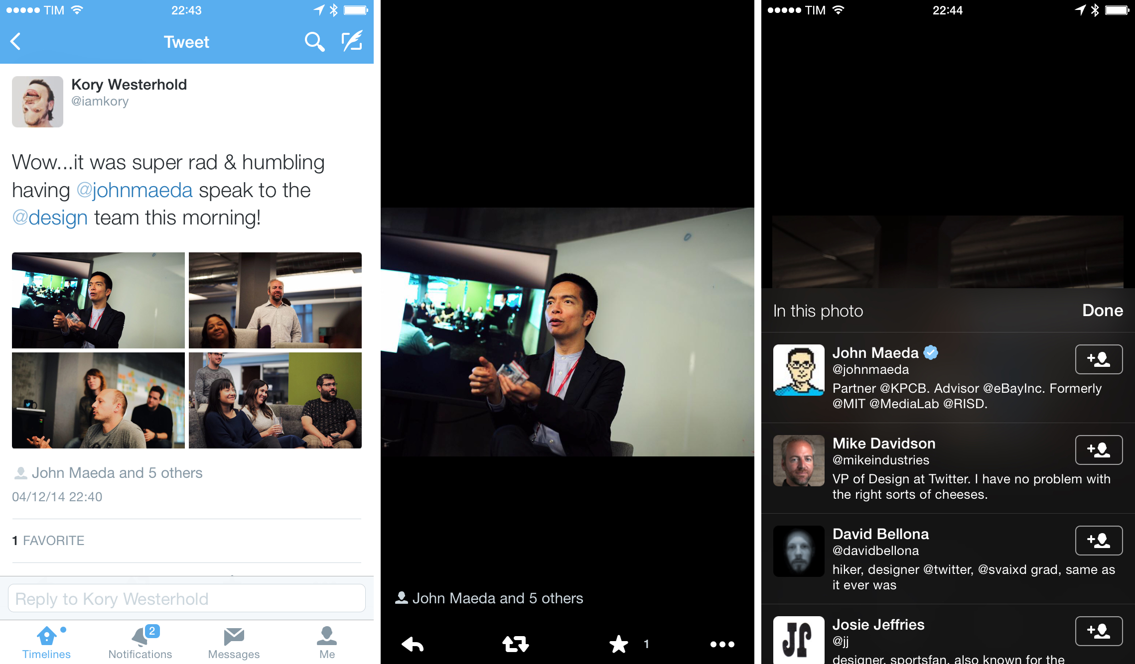
Something that is also unique to Tweetbot is its ability to load mentions and faves in other people’s profiles. As I mentioned above, I occasionally like to be able to see the tweets a person is receiving, and Tweetbot is the only client that makes it easy to see all mentions directed to a user. From a segmented control available at the top of a user’s Tweets page, you can load the user’s favorite tweets as well.
I also want to point out how Tweetbot offers two ways to look at a user’s recently shared photos. Besides the Recent Photos grid in the Profile page, Tweetbot features a control in the top right corner of the timeline to change between regular tweet layouts and media previews, which filters out tweets that contain media recognized by the app with inline previews. This special mode lets you browse all media items shared by a user on Twitter, but you’ll still have to scroll and wait for Tweetbot to fetch older tweets.
Of the three clients I tested for this article, Twitterrific comes with the most basic support for viewing user profiles and associated information. Accessing your profile in Twitterrific is done by tapping your avatar to reveal a sidebar and tapping a “i” button in the top toolbar or by simply tapping your avatar in a tweet.
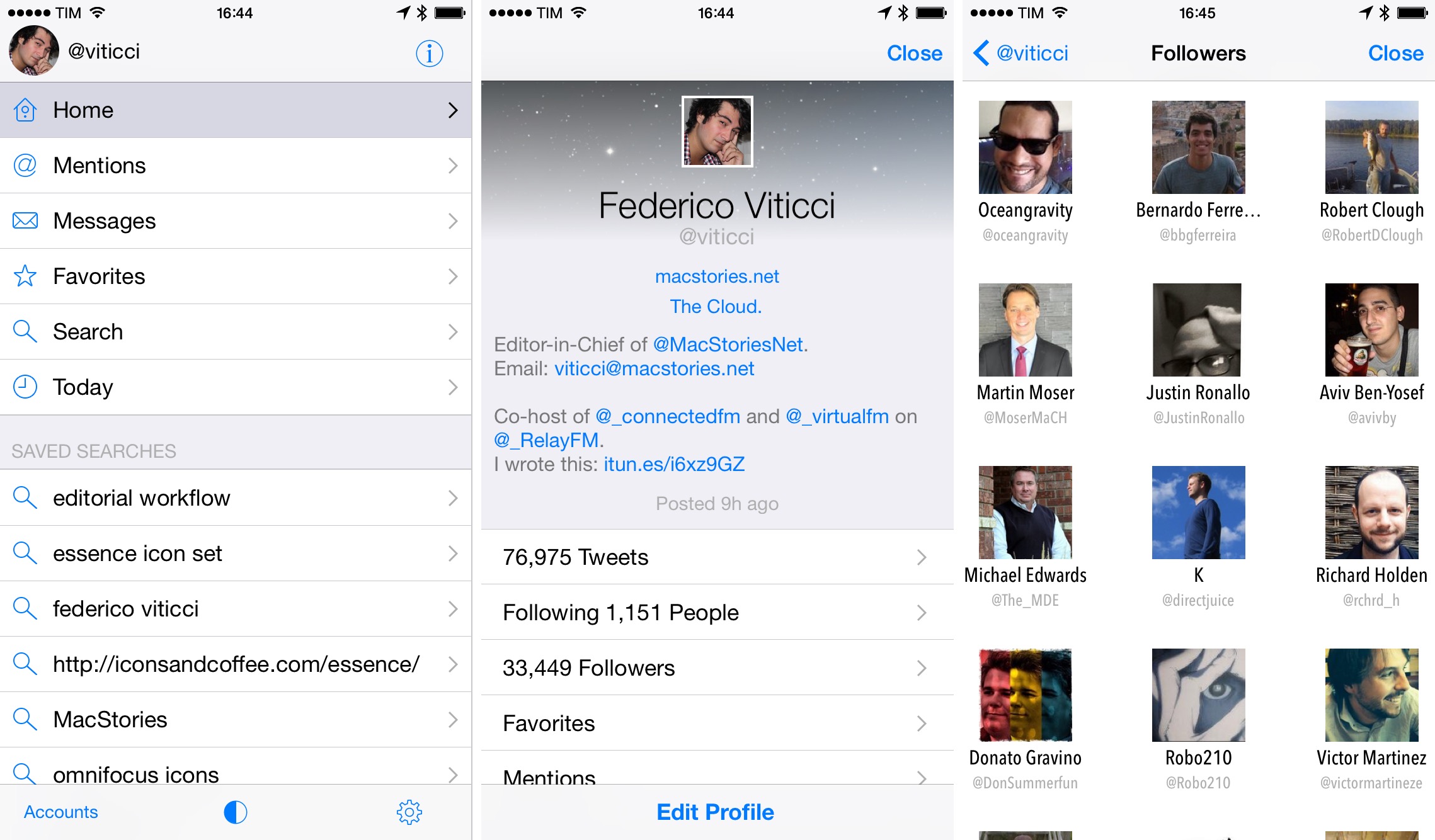
Once in your profile, Twitterrific shows bio and counts, lets you view your tweets, faves, and mentions in separate views, but has no support to view recently shared media. The Followers view is equally barebones, providing a grid of user avatars/names/usernames with no bios or counts to better understand who’s following you. If you care about re-viewing photos you’ve previously shared, Twitterrific can’t help you.
Viewing other people’s profiles in Twitterrific adds a series of shortcuts at the bottom to follow, DM, or @mention the user, as well as a button to muffle, add to lists, block, report, and open the profile page in a twitter.com web view. Considering the basic realization in terms of design and functionality, it appears that viewing complete user profiles isn’t a priority for The Iconfactory in Twitterrific.
The Twitter app is diametrically opposed to Tweetbot and Twitterrific for viewing profiles: it prioritizes media and “quick engagement” over easy access to tweets, but it’s got substantial differences between the iPhone and iPad versions. If you’re used to third-party clients and have been using them for years, this is where the discrepancies between clients and the official app are most striking.
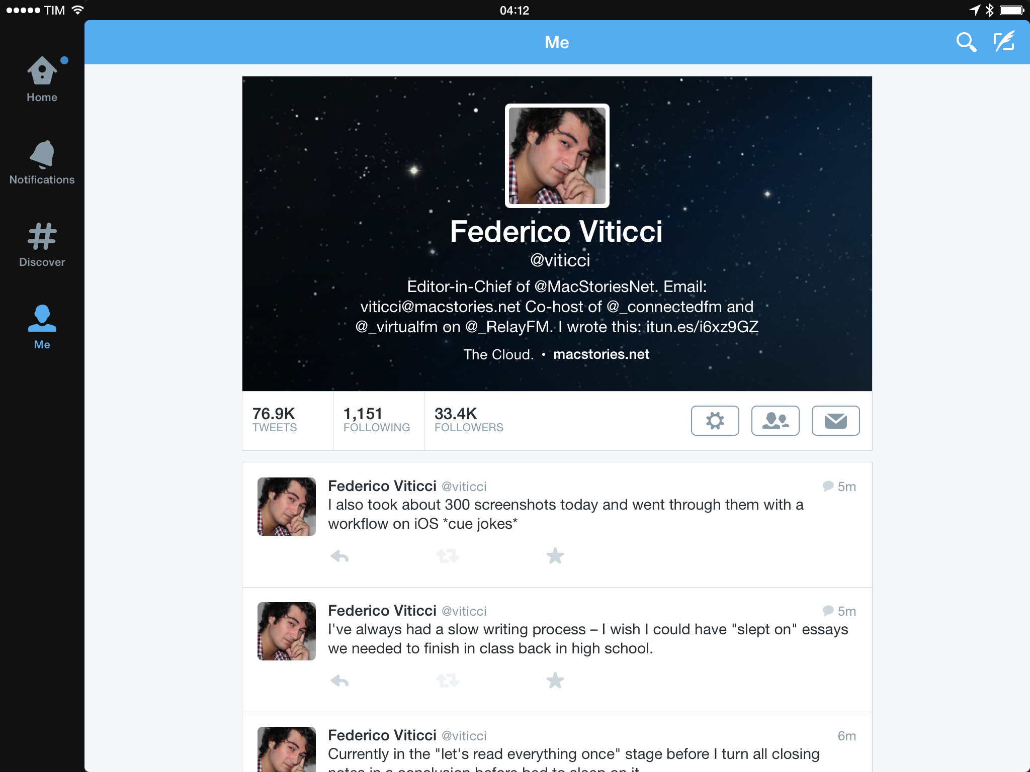
On the iPad, Twitter displays a large cover photo at the top as a background for a user’s profile picture, bio, and follow status (if it’s not your profile). Immediately below the top box, you’ll find tweets, followers, and following counts that are also buttons you can tap; next to them, there’s a big Folllow/Unfollow indicator/button and a gear icon that opens a popover with the following options:
- Mute
- Block or Report
- Turn on notifications
- Turn off retweets
- Create new contact
- Add to existing contact
- Follow/Unfollow
- Add/remove from lists
- Send direct message
This menu feels a little crowded, and I often struggle to remember which option is which because the entire list is made of blue buttons with no visual differentiators like icons or color labels.
When looking at followers, Twitter highlights the ability to easily follow back with one tap. In the Followers list on the iPad, the app displays a follower count in the title bar, the usual combination of avatar/name/username, and also bios. Unfortunately, the app doesn’t display how many followers a person has in this screen. Notably, each user has a one-tap Follow button, but unfollowing will require two taps as Twitter wants you to confirm your action.
The lower section of profiles on the iPad is more interesting. There’s a preview of a user’s most recent tweets (usually three of them) and you can tap a button to load all tweets in a separate view. Underneath tweets, there’s a scrollable gallery of recent photos (not GIFs or videos) that you can scroll and tap to enlarge items and view their associated tweet. I like this carousel because it gives me a quick way to view recent photos and I appreciate that tweets with multiple photos are supported as well.
But there’s more. You can tap a button to view more photos, and the app will open a grid view that contains every Twitter photo ever sent by a user.
The view is fast, easy to scan, and only the official Twitter app for iPad can provide this kind of visualization. It’s great that I can scroll quickly to two years ago and find photos I tweeted and get back to the original tweets. I use Twitter considerably more than Facebook for image sharing (whether they’re screenshots or photos), and I love that the app makes it simple to browse and scroll through old photos with no complications.
At the bottom of the profile view, Twitter for iPad adds different shortcuts depending on whether you’re looking at your own profile or someone else’s. In your profile, Twitter uses the end of the page to insert links to lists, favorites, drafts, and, again, people you’re following and people who follow you.
This is one of the worst parts of Twitter for iPad: not only does it make little sense to repeat the Followers and Following buttons – the sidebar on the left is left wholly unutilized when the Favorites, Lists, and Drafts buttons could have gone in there for easy access. Instead, if you want to read a list (as I do for my Apple News and Games lists), you have to open your profile, scroll, and find those unrecognizable buttons at the bottom.
When you’re looking at other people’s profiles on the iPad, a “Who to follow” section is added below the aforementioned list with account recommendations based on the currently open profile.
I have to say, for all the fun tech writers often make of Twitter recommendations, these are actually pretty solid and accurate. As with other screens, accounts are listed with bios and one-tap Follow buttons, and I have found quite a few new accounts of interesting people to follow through these screens – so I guess they do work as advertised.
What may be a problem for some people is that, among the “Who to follow” suggestions, there’s a chance you’ll see a promoted account. Again, there are ads in the Twitter app, and this is another area where ads can be injected. Personally, I don’t mind: years of reading on the web have taught me how to separate content from ads and, as the owner of an ad-supported website, I think it would be ironic to complain about the fact that the company that drives a good percentage of our traffic is relying on ads for revenue.
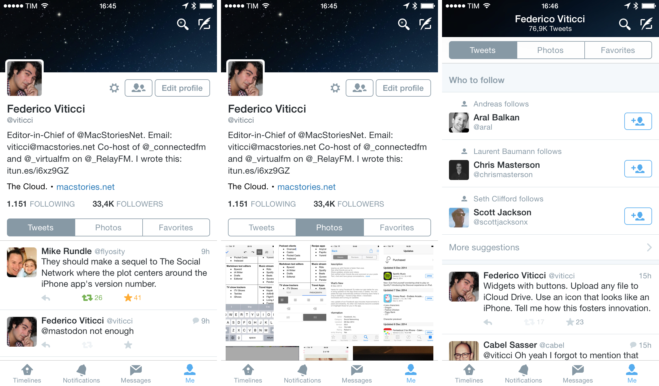
Profiles in the Twitter app for iPhone are great. Redesigned in September, profiles on the iPhone have the same options of the iPad app but they simplify access to essential (and most interesting) sections: Tweets, Photos, and Favorites.
These three sections are organized in tabs that snap at the top of the screen as you scroll, so you’ll always know the context of the tab you’re in. “Who to follow” recommendations are mixed in the middle of the Tweets list, while the Photos tab mirrors the grid design found on the iPad. After you follow an account, Twitter takes the opportunity to show more recommendations with an inline box, which surprised me.
Twitter has, effectively, created three timelines for the profile view on iPhone, which I think is a good idea as it simplifies access to them.
There are also many great design touches in this screen. As you scroll up, the cover photo becomes a title bar that contains the profile’s name and count for the selected tab below; this comes in handy, for instance, to know exactly how many photos you’ve shared on Twitter to date. In your profile, you can also keep pulling down the cover photo to activate the account switcher (which can be done by tapping & holding the Me tab, too).
What I found perplexing is, once again, Twitter’s decision to bury lists in a menu that I bet most people won’t even notice. To access lists and list management options in Twitter for iPhone, you need to tap the small Settings icon at the top of your profile, then choose Lists.
I struggled for days to understand where lists were in Twitter for iPhone – obviously, I was under the impression that the icon would let me open my account’s settings, which I didn’t need. I don’t know why Twitter doesn’t care about lists much, but their placement in the iPhone app makes it look like the company run out of space for a button.
Everybody has different needs and preferences when it comes to viewing Twitter profiles, and the three most popular clients differ vastly in this aspect. Twitterrific focuses on the basics; Tweetbot brings easy access to Mentions; Twitter features a lot of shortcuts with a special focus on photos and favorites.
For my use of Twitter, I prefer the official Twitter app for viewing profiles. In spite of its flaws on the iPad and iPhone, the fast access to all photos and favorites, solid recommendations, and revamped design on the iPhone make Twitter’s profiles work better for me.
Lists
I’ve always liked the idea of creating lists for people and websites I follow on Twitter. It’s too bad that Twitter has somewhat forgotten about lists and hasn’t shipped considerable updates to the product since its original launch.
I have two lists that I want to read every day: one is about videogames; the other focuses on Apple news. In lists, I keep websites and journalists that I don’t want to have in my main timeline – my use of lists is primarily news-oriented and I use them as a tool to group links about the same topic together. Think of it like RSS, but for Twitter, with no unread counts. I’ve always been intrigued by their premise, but most users don’t seem to care (and therefore Twitter doesn’t care). Fortunately, third-party clients do.
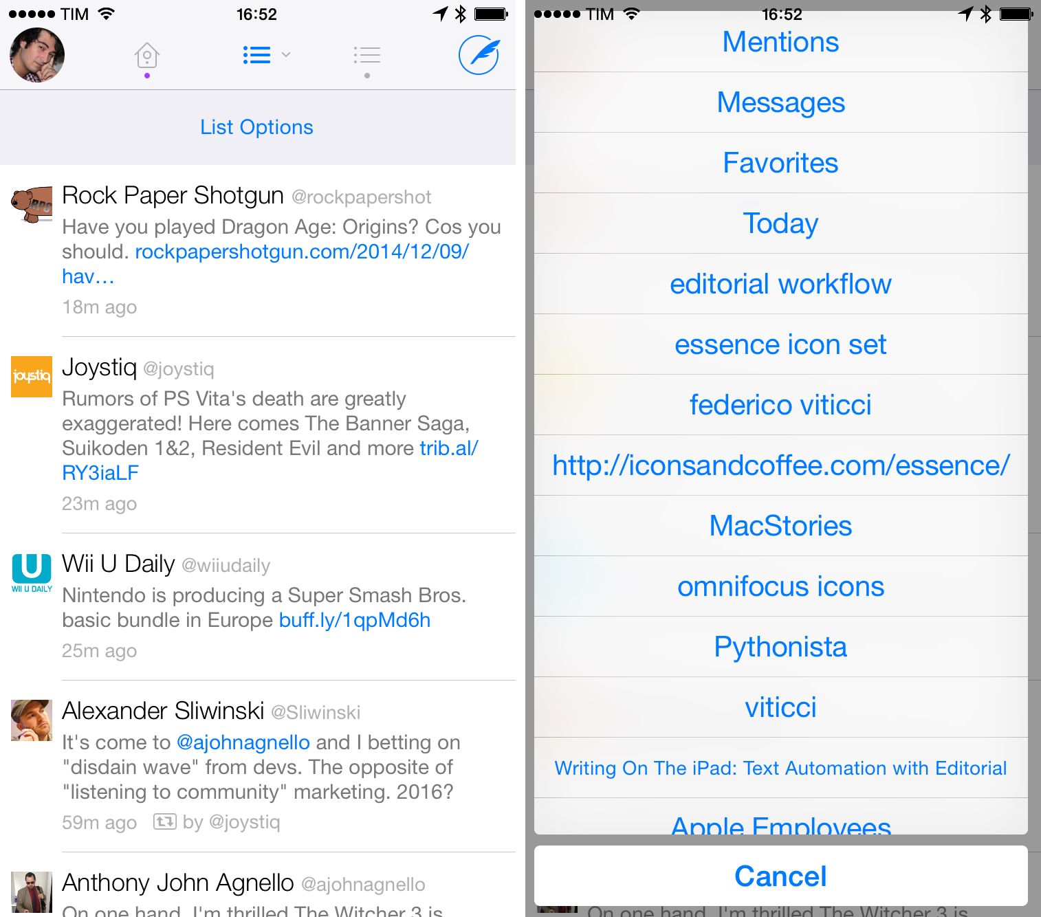
Tweetbot famously lets you switch your main timeline to a list of your choice: simply tap & hold on the title bar at the top, and Tweetbot will bring up a list switcher to turn any list (private or public) into your timeline so you won’t have to switch to a dedicated section to read a list. This is, by far, the most convenient way to switch to a list I’ve seen in any Twitter client for iOS – especially because different scroll positions are saved and restored every time you move between your timeline and a list.
Tweetbot matters for users who value Twitter lists because it makes them first-class citizens that are a core part of the app’s experience. Lists in Tweetbot aren’t tucked away in a settings menu or deep into three layers of navigation; if you want, you can even read two lists at the same time in Tweetbot thanks to its quick-switch timeline gesture.
Twitterrific has good support for lists, but it often sacrifices clarity for unified timeline consistency.
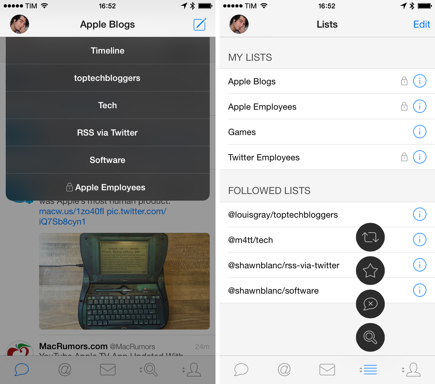
Twitterrific also treats lists well. Twitterrific can switch from the timeline (called “Home”) to a list through the sidebar on the left; tap your profile picture, scroll, and you’ll find your lists.
Allow me to nitpick: you can’t rearrange the position of lists in the sidebar, so you’ll always have to scroll to the bottom to find them (which can be problematic if you have many saved searches above them); and, there’s no visual differentiation between your lists and lists from others you’ve subscribed to.[10] Once you tap a list, the app switches quickly to its timeline, showing a different icon and the list’s name in the title bar. When viewing a list in Twitterrific for iPhone, the view is modal – shortcuts for mentions and messages at the top disappear completely. Like Tweetbot, scroll position in lists is saved and restored across app relaunches.
I prefer reading lists in Twitterrific for iPad, with a few reservations, again, about visual cues and usage of hollow UI areas. On the iPad, Twitterrific uses the same sidebar concept of the iPhone app, but it uses a split-screen layout with an option to keep the sidebar always visible in landscape mode. You can switch to lists from the sidebar, but, unfortunately, tabs disappear in the title bar on the iPad as well despite the higher amount of space available on screen. This is mitigated by the presence of sidebar shortcuts, but it’s something I noticed.
Twitterrific also lets you tap & hold tabs to customize them like Tweetbot can, with important differences in terms of interface design and amount of customization you can do. The good news: you can change three tabs out of four to display something else, including lists (on the iPad; it’s two out of three on the iPhone). The bad news: it’s not clear that you can do this because there’s no indicator (like the up/down arrows on tabs in Tweetbot); and, once you’ve switched to a list, you can’t tell from the tab alone which list it is, and there’s no title bar with displayed list name either.
Upon further inspection, it turns out that Twitterrific does tell you which list you’ve switched to via customizable tabs: you have to scroll the sidebar and see which list is selected. This can be considered a minor design issue, but it does matter if you’re a heavy list user and you’re constantly switching between lists.
Overall, I like reading lists in Twitterrific for iPad because I can temporarily switch mentions and favorites to lists, catch up on my news, and send links quickly to other apps with share sheets. Twitterrific may have some questionable UI choices here and there, but the functionality is great. On the iPhone, I prefer Tweetbot.
And then there’s the Twitter app, with its aforementioned hidden Lists buttons and no shortcuts to quickly open or switch to lists. It’s a shame that Twitter isn’t putting much thought into easier access to lists on mobile devices: with its new Cards and tweet recommendations, lists could easily become a powerful solution to read and find news through Twitter – something that the likes of Flipboard and Nuzzel have exploited to a good degree of success. Twitter’s only nice touch is that tabs allow you to move quickly between tweets, members, and subscribers in a list…which pales in comparison to what Twitterrific and Tweetbot are doing.
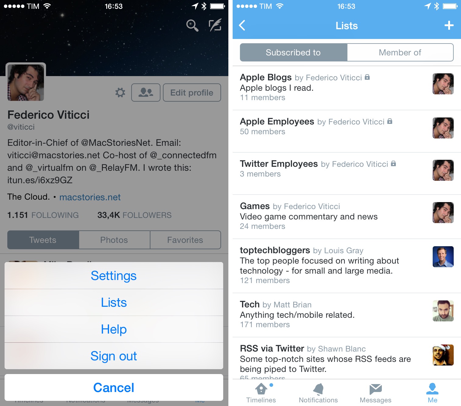
Twitter lists could be so much more. Off the top of my head: popular tweets and links in a list; a daily summary of news from a specific list; suggested users and websites; full Cards integration; search; list shortcuts in Twitter for iPad’s sidebar; traditional List and Snippet views based on Summary Cards; notifications for lists.
I use lists to find news through Twitter every day, and I know that other people use them in all sorts of different ways. Even just considering the news aspect, there are dozens of ideas that Twitter could explore, but they don’t seem to care, and this is reflected in their iOS app.
Tweetstorms
Over the past year, a peculiar way of composing multi-tweet messages has become commonplace in the tech Twitter niche: the tweetstorm.
I won’t get into the details of how this term came to be[11], but I find it to be a clever idea if you want to share a thought that doesn’t fit in 140 characters while still making sure multiple tweets can be held together in a thread. And the trick to do a tweetstorm is quite simple: send subsequent tweets in reply to youself.
I don’t know whether I should be proud or ashamed that I bought into tweetstorms, but I use them to share screenshots and quick thoughts when I don’t want to have a full blog post. Lately, I’ve been using tweetstorms (without the ordinal number before each tweet[12]) to share news before putting together a blog post (and I’ve also started returning to shortform blogging to make sure more thoughts remain on my own website). I’ve seen other users sharing thoughts via tweetstorms and, overall, they’re a fairly simple hack to post longer messages by splitting them up and connecting them back together.
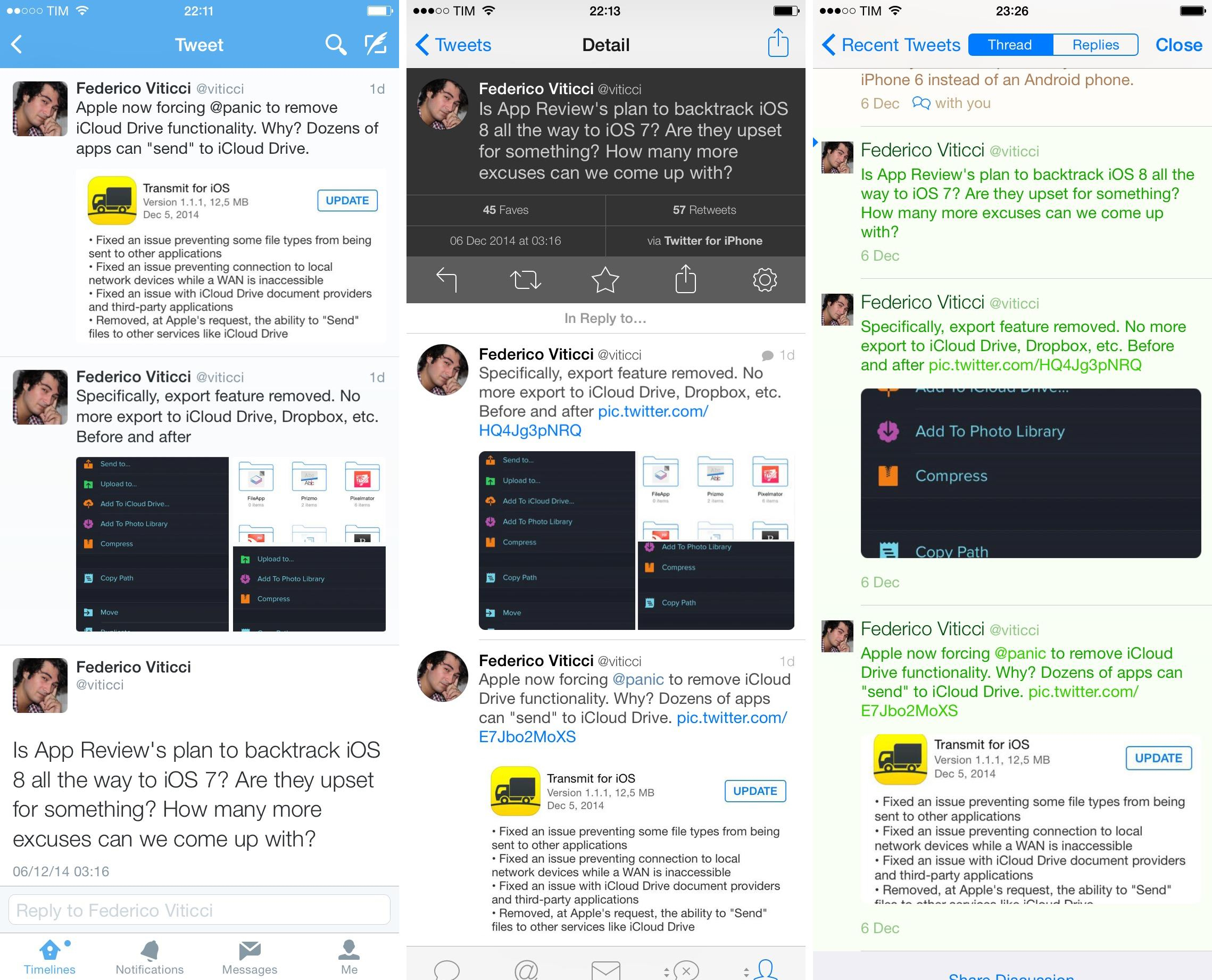
All three Twitter clients I tried support loading tweetstorms because they let you view threads anyway, but Twitter and Tweetbot are my preferred solutions as they put the last tweet in a tweetstorm directly below or above the previous ones sent by you, hiding replies by other users until you scroll. Twitter lets you swipe up from the last tweet in a tweetstorm to see the tweets you’ve replied to, while Tweetbot shows original tweets directly below the last one, with no replies.
The difference is minor, but Twitterrific starts scrolling at the top where replies by other users are shown, which is slightly less optimal if you’re a tweetstorm power user. Which, I realize, doesn’t sound as good as I thought it would.[13]
Direct Messages
If I had to pick the communication service that I’ve used most frequently, consistently, and joyfully over the past five years, it would be Twitter DMs. But I’m sad, because Twitter never fully understood the potential that lies in the simplicity of DMs.
Direct messages on Twitter are based on a great concept: they’re limited to 140 characters and they don’t require you to learn and manage separate email addresses. The ability to message people is always there – but only people you follow can message you back. These three simple limitations remove the majority of cruft and complications that make email frustrating and hard to manage. Direct messages are fast, short, and reciprocal.
You could say that Twitter never grasped the great messaging system they had invented or that they didn’t want to alter its simplicity. I find it difficult to believe that Twitter applied willful restraint to DM development considering the sad state in which they left the feature for a year, but I digress.
Since 2009, I’ve been using DMs to communicate with all sorts of people. Friends, developers, other writers, readers – DMs have allowed me to skip email and be able to send short and direct texts without the layer of email, iMessage, phone numbers, or other messaging protocols. I remember when developers tried to make dedicated DM clients into sustainable apps[14], and to say that I’ve had hundreds of valuable conversations via DM would be an understatement. Twitter is my Facebook and DMs are an essential part of it.
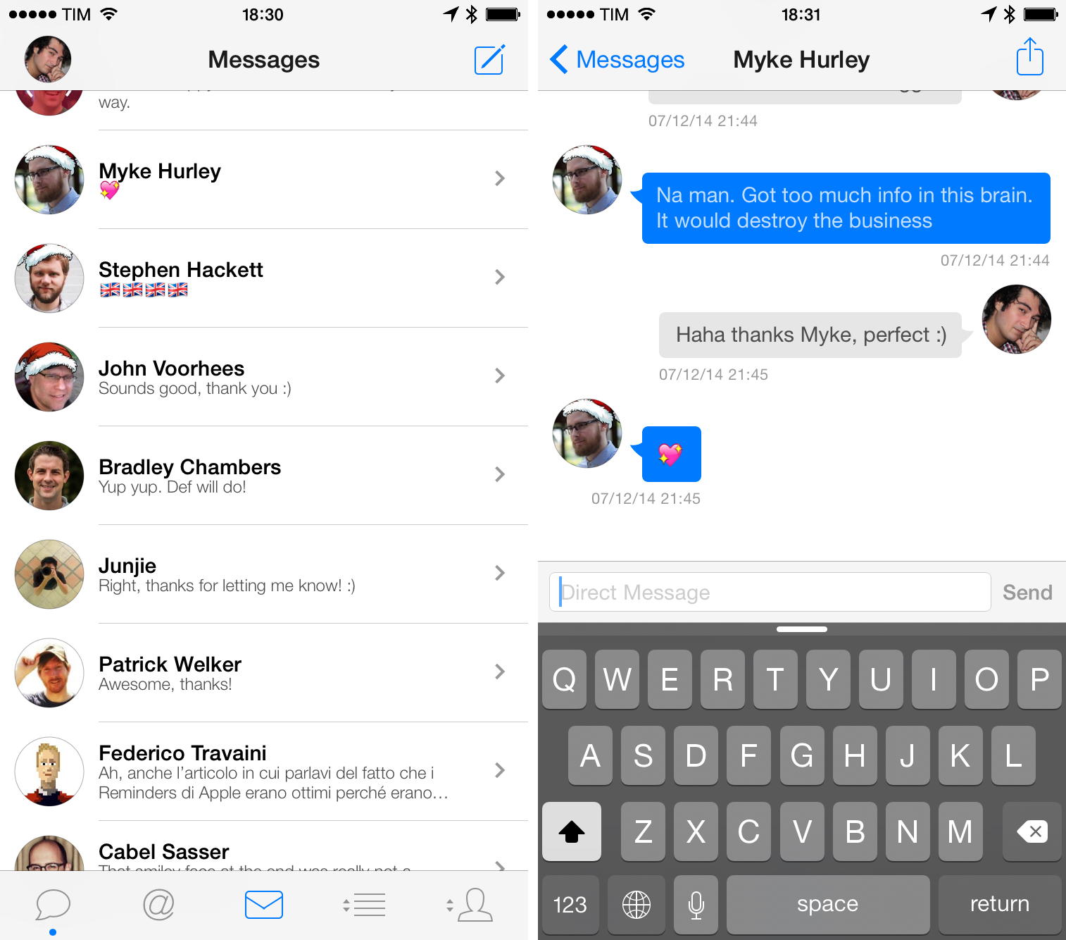
Which brings me to Twitter clients and how they handle DMs, threaded conversations, and the ability to share links and media with other users privately. I’ll start from my (obvious) favorite in this case: the Twitter app.
Twitter has long ignored DMs, but they recently reinstated the ability to share links and promised to bring various enhancements to the product in the future. Over the past year, the company rolled out the ability to share photos via DM and added a button to quickly send a tweet to someone else via DM in Twitter for iPhone. Twitter has an API advantage over third-party clients: the reason I prefer Twitter for DMs are features that third-party apps can’t implement – especially the ability to share a photo via DM.
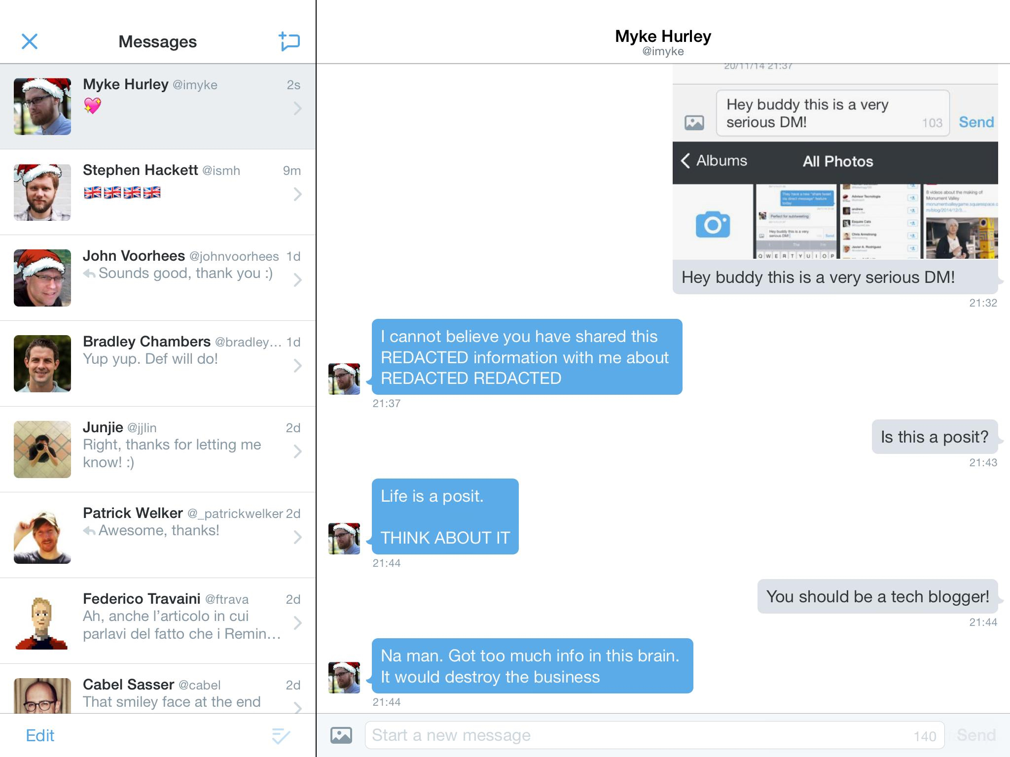
Direct messages have a standalone tab in Twitter for iPhone. Conversations are sorted from newest to oldest, and threads are displayed in chronological order; this Messages-like display has become the de facto standard for hundreds of other messaging apps, and it’s the one that I like.
In the conversation view, timestamps are shown by default and the recipient’s avatar is tappable so you can open their profile. You can also tap & hold a message to bring up options to copy, delete, or flag it; when typing a message, a character counter is displayed in the right corner of the compose field.
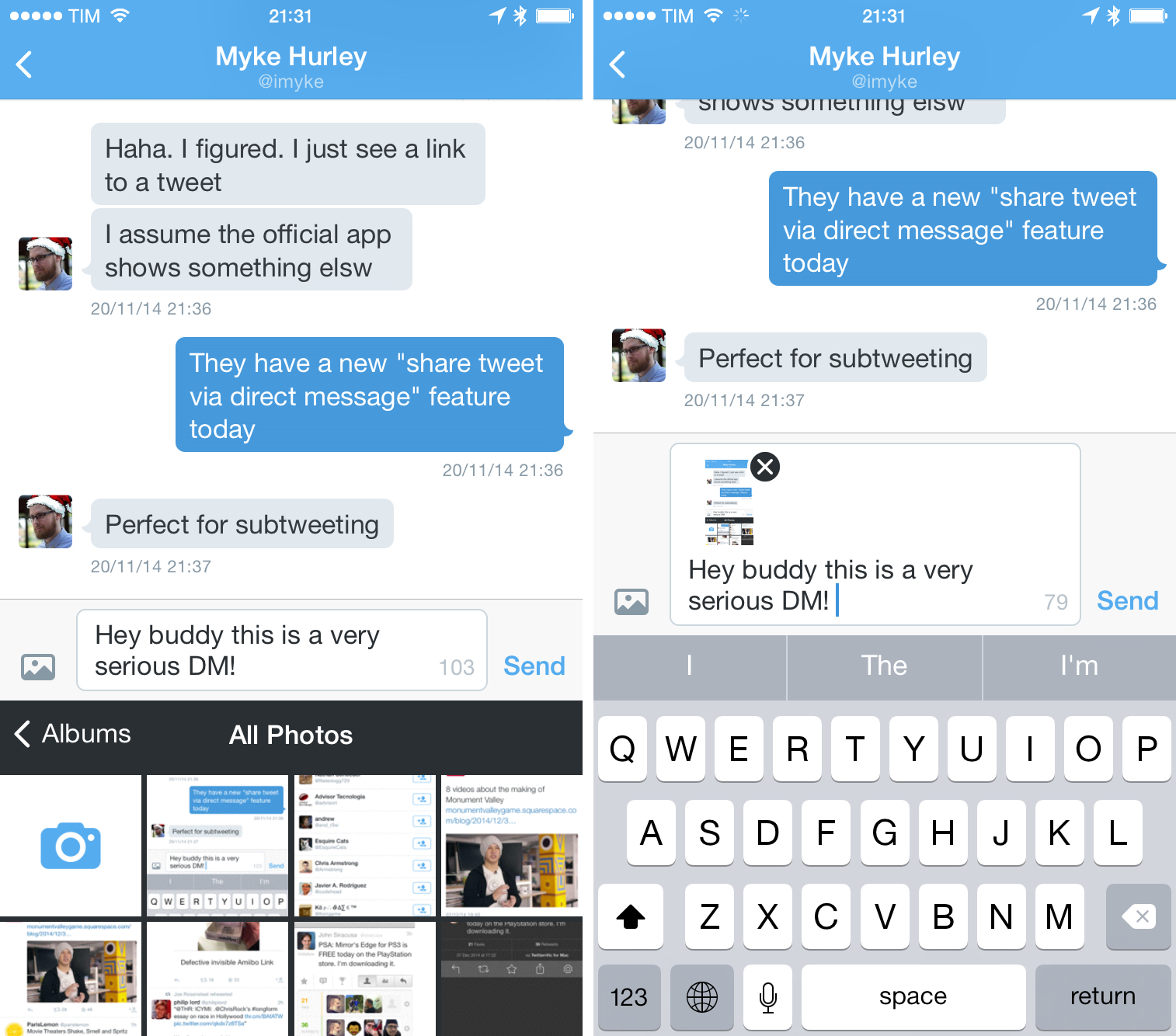
Over the past couple of months, the ability to share photos via DM has become essential to how I communicate with people on Twitter. Perhaps I just want to point out a typo or website issue to a friend, or maybe I need to quickly send a bug report with a screenshot to a developer – photos in DMs allow me to ping people without the annoyance of email or the burden of downtimes and read receipts on iMessage. I use photos in DMs extensively, although I wish I could send multiple photos privately instead of just one at a time.
What really is impressive about DMs in the official Twitter app, though, is the history of private conversations it lets you browse. In third-party clients, DM history is always cut off at some point both for conversations and messages inside a thread – I would guess it’s another API limitation for the number of historical data that is returned to clients.
In the Twitter app, you can view your entire history of direct messages: I was able to scroll back to old messages in conversations and I went all the way back to mid–2009 to read DMs from when I had just started writing for MacStories. I wasn’t aware of the fact that DM history could be accessed in the Twitter app – like search, it looks like a massive technical undertaking and I’m impressed by how fast everything loads even when viewing messages from six years ago.
There’s a certain irony to the fact that the only private messages I can retrieve from 2009 are Twitter DMs and IMAP email.
If you’ve been reading MacStories and listening to Connected, you know how much I care about data and software preservation for posterity, which is why I was excited to find out about DM archives in Twitter. This amount of data, however, begs for better tools to filter messages and search inside conversations, which are absent from the current version of the Twitter app. While Twitter is fast at loading conversations, it is tedious to scroll all the way back to 2012 to load messages from a couple of years ago, and, if Twitter really cares about improvements to DMs, I hope search and filters will be on their list.[15]
There’s a “but” in Twitter’s full DM history: it’s only available on the iPhone, as the iPad app is limited to roughly the same set of DMs I get in third-party clients. The iPad app comes with the same features found on the iPhone (including photos), but, for me, it only shows direct messages from the past few months. It could be that Twitter is rolling out the ability to view more DMs gradually, but I wouldn’t be surprised to know this is one of the features that got left behind in the company’s prioritization of the iPhone app over the iPad version.
An example of a feature that’s only been launched on Twitter for iPhone is a shortcut to quickly share a tweet via DM. This isn’t a big deal: you can tap & hold on a tweet and share it via DM, which, in practice, will send a message with the URL of a tweet attached.
What is interesting about this is that a) it’s limited to the iPhone, more proof that Twitter for iPad isn’t where Twitter’s iOS team likes to experiment; and b) tweet URLs get a special treatment in DMs. Tweets shared via direct message get a nicely formatted snippet view in conversations, showing a preview of the tweet inline without having to tap it. This is a reiteration of the idea of bringing content to the user in the Twitter apps, and, while far from indicative of Cards coming to DMs, the feature does suggest that different media/preview types could be potentially supported in private conversations.
As you would guess at this point, Twitter for iPad seldom takes advantage of its own sidebar, and there’s no DM shortcut in there, leaving a single button in the profile page the only way to open the Messages screen. At least Twitter put in some work for this view, which takes advantage of the iPad to display messages in a sidebar on the left.
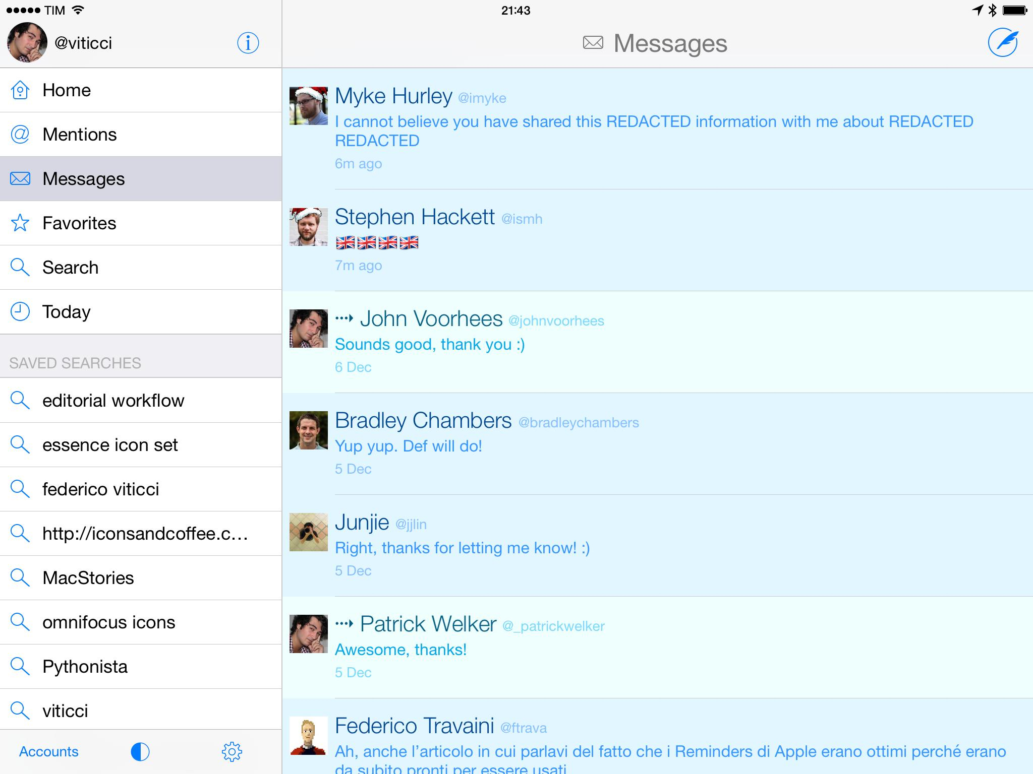
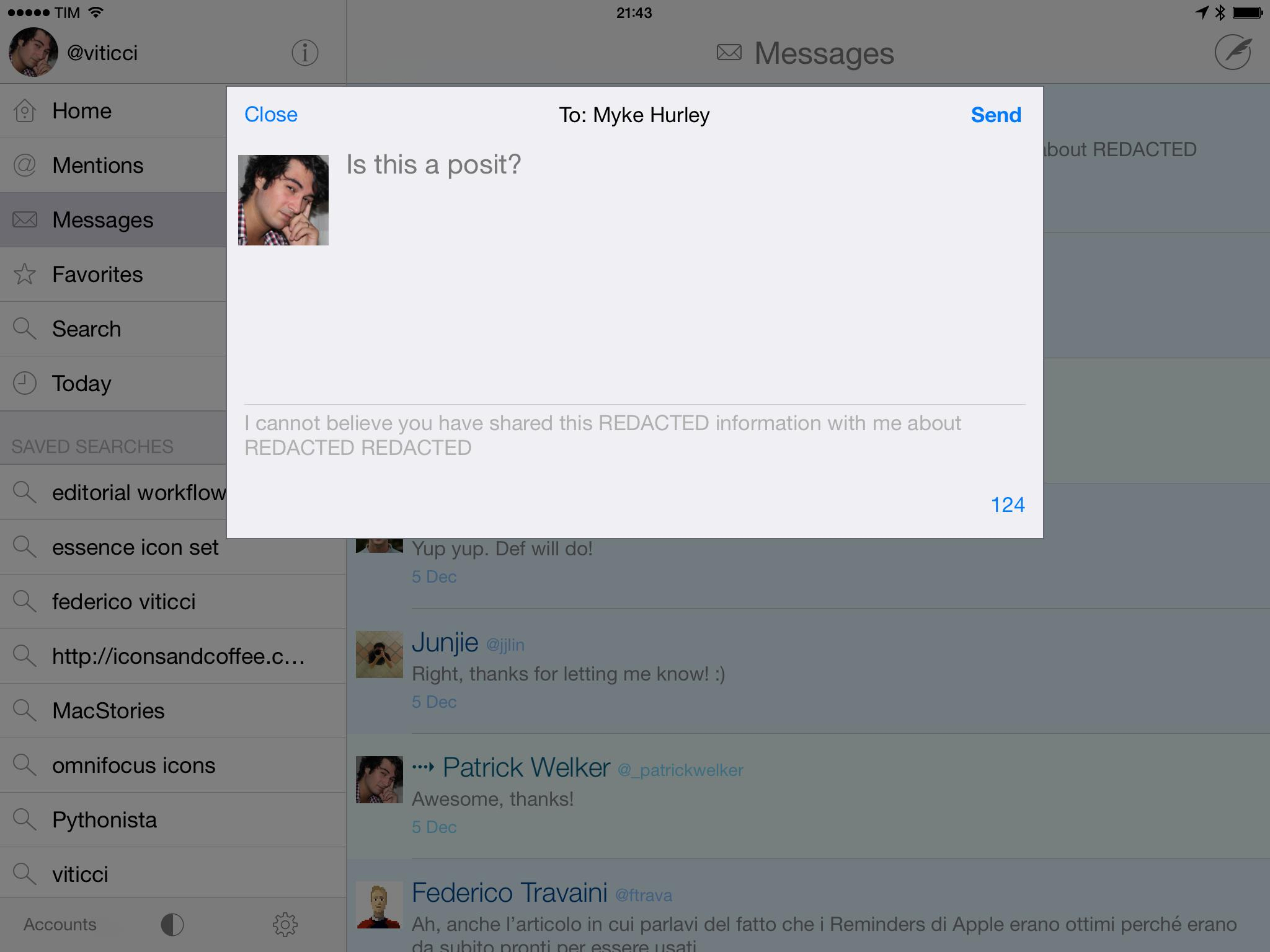
In Tweetbot, DMs are available from a button in the middle of the tab bar and, due to the Twitter API, they’re limited to recent messages – I can’t go back and view my entire history of direct messaging in Tweetbot.
There are some shortcuts and design choices that I like about DMs in Tapbots’ app. I’m a big fan of the double-tap gesture to mark messages as read. In conversations, Tweetbot lets you tap individual messages to bring up a custom menu to delete, copy, email, and translate, but you can also tap & hold links shared via DM to use the system share sheet. Unlike the Twitter app, DM conversations can be shared over email, but you can’t share photos privately.
Another substantial difference between Twitter and Tweetbot is how they implement the DM compose experience when you’re starting a new message from scratch without using shortcuts from tweets or profile pages.
When you tap the compose button in the top right corner of Tweetbot’s Messages screen, the app asks if you want to create a new tweet or a direct message – the button is the same throughout the app, so Tapbots decided to keep it consistent in DMs and ask the user for input upon tapping it. Choosing the DM option reveals a screen that lets you pick a recipient, although it’s not clear how, exactly, Tweetbot picks users to display in this screen; in my experience, some of the suggested recipients are people I follow, but others are not.
You can filter this list with a search bar at the top, or you can scroll to the bottom for a Find User option that contains another search bar for global username search as well as shortcuts to pick recipients from your followers or people you follow. Tweetbot offers plenty of options to compose new DMs, but sometimes they’re confusing or redundant.
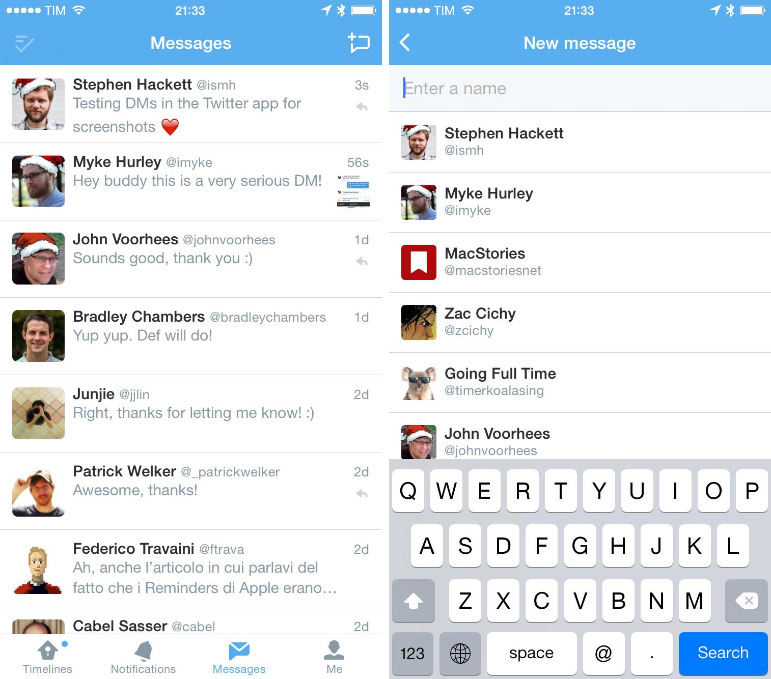
Twitter is less versatile, but obvious. The compose button is replaced by a message button in the DM screen, which defaults to creating a new DM. Tapping it brings up a list of your recent DM contacts, which is handy, with the keyboard focused in a search field. You can start typing to filter people you follow in real-time, or you can manually type a username and tap it to start a new conversation.
Tweetbot may offer more shortcuts to compose new DMs, but Twitter’s simplicity feels more consistent and it makes sense. And besides features, a small design detail represents my affinity for Twitter’s DM experience: messages you’ve replied to have a reply icon on the right, while others don’t.
This brings me to Twitterrific, whose DM view is one of my least favorite aspects of the app. Of the three Twitter clients, Twitterrific is the only one to adopt a non-traditional display of DMs: they’re not threaded by conversation, but they’re displayed as individual replies from newest to oldest, and they’re all colored in blue and light blue depending on status and selection.
My problem is that I’m used to interacting with DMs as conversations modelled after Apple’s Messages app, whereas Twitterrific treats direct messages as special tweets, displayed in their own timeline. The interactions with DMs in Twitterrific are completely different than Twitter and Tweetbot, which can be a plus if you want to have a unique visualization of private messaging. It just doesn’t work for me.
You can swipe on a message to reply to it or show the thread in reverse chronological order; these two modes can also be activated by tapping buttons that appear when you select a message (the same interaction you have with regular tweets in the normal timeline). When in reply mode, the recipient’s name is shown in the title bar, the message you’re replying to is quoted at the bottom, and character count is placed in the bottom right.
This design means that Twitterrific can’t show you a full conversation when you’re typing a message.
Like Twitter, Twitterrific shows an indicator for messages you’ve replied to, but because the view is made of single messages with no threads and everything is either blue or light blue, the reply indicator loses most of its meaning.
I get what The Iconfactory is going after with their DM experience – they want to replicate the timeline for consistency. However, there’s something inherently dangerous about private conversations, and Twitterrific’s DM view always makes me feel nervous or confused. I’m not always 100% sure I’m sending a DM or looking at an ongoing conversation, and I believe that the ungrouping of direct messages for a timeline-like experience is more beneficial to the developers’ sense of order than a practical use case.
The Thread view of DMs is another example. Twitterrific can show you a thread of direct messages, but they’re treated like tweets instead of traditional message threads. You can share a discussion via email, copy it as plain text, and you can even tap & hold messages to bring up the system share sheet, but there’s nothing – besides color – that Twitterrific uses to meaningfully differentiate tweets from private messages here. To understand the downside of this approach, try this: open a DM thread, swipe left on a message to view its thread, keep swiping on messages this way, and you’ll stack private DM threads on top of each other endlessly.
I use DMs a lot, and I think that Apple’s thread view first implemented in the Messages app is a superior interface for displaying conversations with people. Nowadays, every major messaging app or platform uses the threaded conversation view to handle display of texts exchanged between people, and, by this factor alone, The Iconfactory’s decision to not adopt this standard is confusing and, for me, not useful.
Therefore, in choosing betwen Tweetbot and Twitter for DMs, I prefer the official Twitter app on the iPhone because of its ability to display old messages, shortcuts to share tweets, and, most importantly, new photo sharing options. Tweetbot has more shortcuts, but, unfortunately, it is limited to what it can implement in direct messages, and I’ve come to enjoy and depend on the possibility to share photos in DMs.
Uploading Photos
My biggest frustration with the Twitter app for iOS is that, at its “High” option in the Settings, it can’t upload full-res versions of my photos. Tweetbot, Twitterrific, and even Apple’s share sheet using the native Twitter photo service can upload (slightly) higher quality versions of my files, and I don’t know why this is the case. I understand that Twitter may not want the entire world to share full-res pictures, but their High setting isn’t high enough and their compression is generally too aggressive.
The benefit of using the Twitter app for photos is the ability to share multiple photos, GIFs, and tag users in photos (which I’ve never needed). While I enjoy the fact that Twitter for iOS always gets all the latest photo features (like better editing tools and effects built-in), I’m sad every time a good picture turns into a compressed mess.
A nice detail of the Twitter app is that it displays a progress bar underneath the title bar when you’re posting a tweet that contains images – it’s subtle, and a welcome addition to the posting experience.
Third-party clients, on the other hand, offer support for third-party services that either have less terrible image compression or don’t compress images at all. Twitterrific has img.ly, Mobypicture, and Droplr uploads; Tweetbot comes with CloudApp, Droplr, img.ly, Mobypicture, yfrog, and custom endpoints if you want to use your own server.
Droplr seems to be the most popular alternative image sharing service for Tweetbot and Twitterrific users. Droplr is a great sharing service in general, and images uploaded to it always load at full-resolution in third-party clients, often without having to open a web view.
As much as I like full-size screenshots and photos in my tweets, I’ve tried a number of third-party image sharing services over the years, and inevitably they all disappear, are acquired and start asking for money, or the short URLs used for images break and can’t be viewed anymore. My Twitter archive is full of images uploaded to a third-party service that, yes, may have offered full-res uploads and other cool integrations – but now those links are broken and I can’t view those images anymore. They’re gone, forever, and I don’t know when and how I lost them, exactly.
Partially, it’s my fault because I forgot to renew domains for short URLs or simply jumped from service to service without caring enough. But still, for my next five years of Twitter I’d like to keep all my shared photos retrievable and preservable, which is why I’m sticking to native Twitter photos in spite of their poor quality.
A compressed image is still better than no image five years from now. That doesn’t mean that Twitter won’t ever do something crazy with my photos, but, by always using native Twitter photos, I can remove possible points of failure and I can enjoy a nice integration with the Twitter website and apps for all my images.
Discover
I’ve always had a theory: if an article is good enough, it’ll come to me through RSS and Twitter. That’s been generally true over the years, but it discards the fact that I follow hundreds of websites and over a thousand users on Twitter. Which is why, I believe, companies like Twitter and Facebook want better discovery tools for the majority of their users.
By “discovery”, I mean technologies and design choices aimed at facilitating the process of finding interesting stuff without much work. Users shouldn’t have to follow 1000 accounts to never miss a good article; the network should be able to figure out what users want and give it to them. All the talk about curation, discovery, and serendipity ultimately comes down to the fact that Twitter and Facebook want people to be happy with their service because it lets them find stuff relevant to their interests, which keeps them hooked. That’s not necessarily evil – my job is essentially based on discovering links, and any improvement to that process is welcome.
Twitter has various discovery-related features built into the app, and all of this is completely unavailable to third-party developers. Both Twitterrific and Tweetbot focus solely on displaying tweets from lists or timelines they can load because they can’t access the algorithm that provides suggestions for users and tweets.
The Twitter app has an entire section dedicated to this, aptly called Discover. It can be accessed by swiping left on the main timeline in the iPhone app and through a sidebar shortcut on the iPad. The swipe gesture, which has historically been dedicated to interacting with tweets in third-party clients, is the only way to open the Discover section on the iPhone.
Recommendations in Discover have, for me, been organic and accurate: I usually find suggested users, tweets about topics I care about, old retweets I may have missed, tweets faved by people I follow, and other users followed by people I follow. It’s a very variegated section, always providing tweets that tend to match my interests or at least be relevant from a newsworthy perspective. Suggestions are tailored for me because they’re based on my timeline and following list – very rarely I find a tweet in there that I absolutely have zero interest in.
The Discover section also displays trending topics and ads. Ads can be promoted trends, tweets, or users, and I’m not particularly disturbed by them. On one occasion, I received a promoted trend about the PlayStation 20th anniversary, which I tapped and found rather interesting as it was about genuine tweets from people remembering the console in Italy (it had been promoted by @PlayStation). I should say that I’ve never been into the idea of trending topics and barely participated in a few ones over the years.
After I started using Twitter for iOS full-time, I was surprised by the fact that you can always reload the Discover section to get a fresh set of suggestions. That didn’t make sense to me because I was used to the idea of reaching the top of a timeline and stopping when there was nothing new to see anymore, but now I get it. There is no “top” in the Discover section, as it’s been built to constantly refresh and give you tweets or users you may be interested in.
I don’t open the Discover section every day. When I do, I’m surprised by the quality of its recommendations and I’ve discovered interesting articles and users thanks to it, but I don’t feel like I need to open it on a daily basis. Like lists, Twitter could do more to give users better tools to discover interesting tweets: there is no topic organization for the Discover section, no daily or weekly recaps, no connections between related users and topics.
The Activity tab, which sits next to Discover on the iPhone and is a subsection of it on the iPad, offers a much simpler message: it shows you tweets and users people you follow have favorited or followed. That’s it. I always find cool stuff in the Activity tab, and Twitter should take a cue from its simplicity to bring some clarity to the Discover section, which is nice, but somewhat confusionary.
Apps like Nuzzel and Digg are showing how links and topics can be collected from a user’s Twitter timeline, remixed, and displayed in different ways. I personally depend on Nuzzel and it seems absurd to me that Twitter hasn’t acquired the company or built a similar tool for its own apps yet – it’s such an obvious idea, perfectly designed for Twitter.
The Discover section may seem like a useless thing to those who are used to Tweetbot and Twitterrific, but I actually find it pretty cool and useful and it gives me solid recommendations every time I open it. I just wish that Twitter did more of it.
Muting
Being able to mute specific users is an important feature for many as it grants the benefit of not seeing certain tweets without unfollowing. In other cases, muting hashtags and keywords puts up a filter that prevents tweets matching those criteria from being displayed altogether, saving up valuable space in the timeline.
Twitter recently added the ability to mute users so you won’t see their tweets in your timeline but you’ll still be able to receive notifications from them. In the iOS app, you can mute by tapping & holding a user’s profile picture or tweet in the timeline and pressing the Mute button; otherwise, you can go to their profile page and mute them from the menu next to the Follow button. Muted users won’t know they’ve been muted, and they will get a red mute indicator on their profile that you can tap to unmute them at any time.
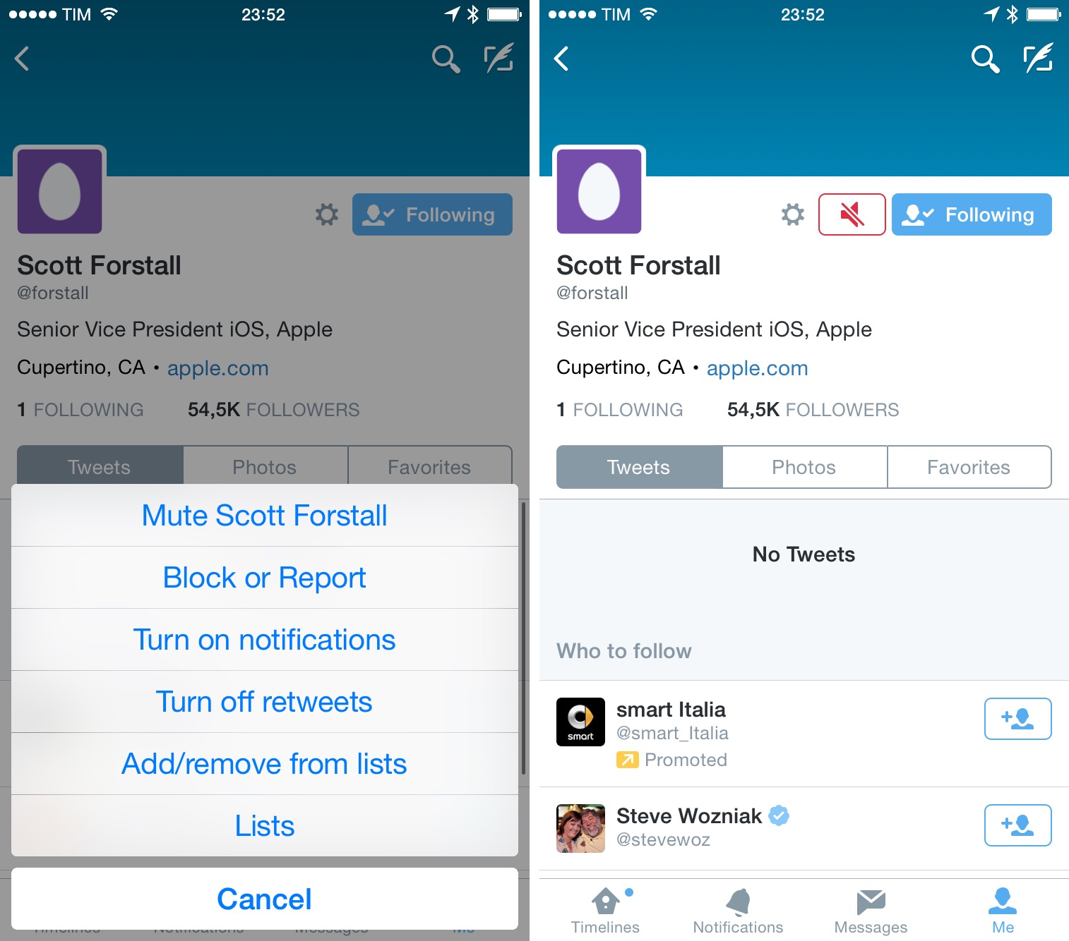
Twitter’s mute feature is the simplest possible implementation: there’s no way to see all muted users in a list and you can’t mute hashtags or keywords of your choice. Power users will think mute is an afterthought for Twitter, but I’m glad it’s there.
Twitterrific has what it’s called “muffling” users – a custom implementation of muting that works in the same way of the Twitter app, but it’s proprietary to Twitterrific. You can muffle users, domains, and hashtags, and you can do so from profile pages (for users) or by tapping on the “More” button (three dots) on a tweet. I struggled to find the option to muffle hashtags and domains in tweets because of this hidden menu, but the ability to block specific websites without writing a regular expression is a great addition to the app.
The profile page of a muffled user doesn’t show this status, but you can tap the icon again to find “Cancel Muffle” as an option.
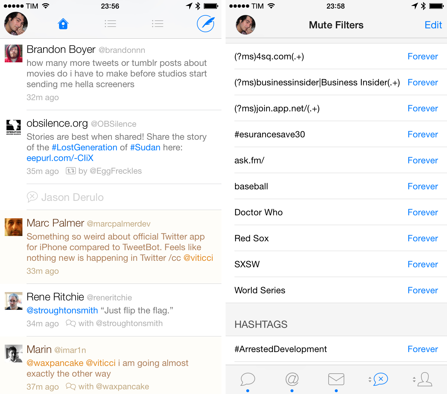
Contrary to Twitter, Twitterrific shows muffled tweets in the timeline as minimized tweets with username and muffle icon but no text. This is an interesting idea: Twitterrific is showing you the result of your muffling with the option of expanding a tweet if you still want to see what a muffled tweet contains. Twitterrific doesn’t put any special indicator on a muffled tweet you’ve expanded, but that’s a minor problem. The app’s implementation of muting is handy and unique.
Tweetbot destroys the competition when it comes to advanced mute options. Taptbots’ client offers a wide selection of mute filters that span users, hashtags, clients, keywords, and even regular expressions if you want to make sure you never see a specific string of text in your timeline. Tweetbot’s mute filters are even shareable if you want to allow other people to install them easily in their Tweetbot; like Twitterrific, this is a custom implementation that doesn’t apply to mute settings in your Twitter account.
In Tweetbot, you can mute users by tapping & holding their profile pictures in the timeline (this also works for hashtags) or a gear icon on their profile page. Tweetbot is the only client to provide a second layer of muting with time-based filters: you can mute for 1 day, 1 week, 1 month, or forever – and these apply to all types of mute filters, but you can’t specify a custom time period.
You can also view a dedicated Mute Filters section by accessing it from the app’s tab bar; in this screen, you’ll be able to delete filters, edit them, and share them (tap & hold one). Additionally, you can tap Edit and then “+” in the top left to bring up a menu to mute a client or a keyword. The latter lets you enter type a keyword you want to mute, shows you matching tweets in the timeline that’s currently loaded in the app, and optionally lets you mute mentions too.
For advanced users, Tweetbot offers further control and customization by supporting regular expressions for keyword filters (I had a few for topics and websites I never wanted to see).
The ability to mute clients is interesting: of the three apps, Tweetbot is the only one left that can display what client each tweet was sent from, and you can tap & hold the client’s name to mute it (also doable from the aforementioned Mute Filters screen). This can be useful if you want to mute specific clients that websites and other organizations may use to send tweets you don’t want to see.
Until last year, I thought that muting was absolutely necessary to me because I wanted to avoid the awkward situation of unfollowing someone and then being asked why I did so. For years, I muted users I didn’t want to unfollow just because I felt bad. But over the past 12 months, I’ve realized that, of all the things one could feel bad for in this world, unfollowing someone on Twitter shouldn’t be one of them. I don’t want to overthink about the fact that I can’t unfollow users because of uncomfortable follow-ups via email. Twitter has an Unfollow button, and I started using it more when I know I don’t want to see someone’s tweets in my timeline anymore –just like I know others are doing with me or MacStories. And that’s okay.
But, I also understand that other people want to avoid the possible awkwardness of unfollowing someone. And I know that, unlike me, there are people who can’t stand seeing tweets about sports or TV shows or other topics in their timelines. I used to be one of them. It could be that I’ve become more patient, or maybe I don’t have the energy to keep up with my mute filters anymore – I just scroll past tweets that don’t interest me and go on with my day.
I’m fine with the Twitter app and its basic mute feature (I only use it for a few accounts that people keep retweeting), but I recommend Tweetbot to everyone else who needs powerful filters and more advanced options. Tweetbot’s offerings are impressive in this regard, and more developers should take a look at what Tapbots built to ensure users can be in control of the content that appears in their timelines.
Fave and RT Counts
I like to know when tweets are popular by looking at their fave and RT counts. I appreciate the ego boost that results from seeing many faves for a joke I just tweeted and I want to know when other people’s tweets are popular so I know I’m not missing something important and/or funny. The Twitter app is the best client at displaying counts because of API limitations on third-parties and their own design decisions.
Let’s start with Twitterrific, which doesn’t display any count for retweets or favorites. The app has no detail view for individual tweets, and there isn’t any section to view how many times any given tweet has been retweeted or faved by other users. Twitterrific simply isn’t an option if you want to see these counts.
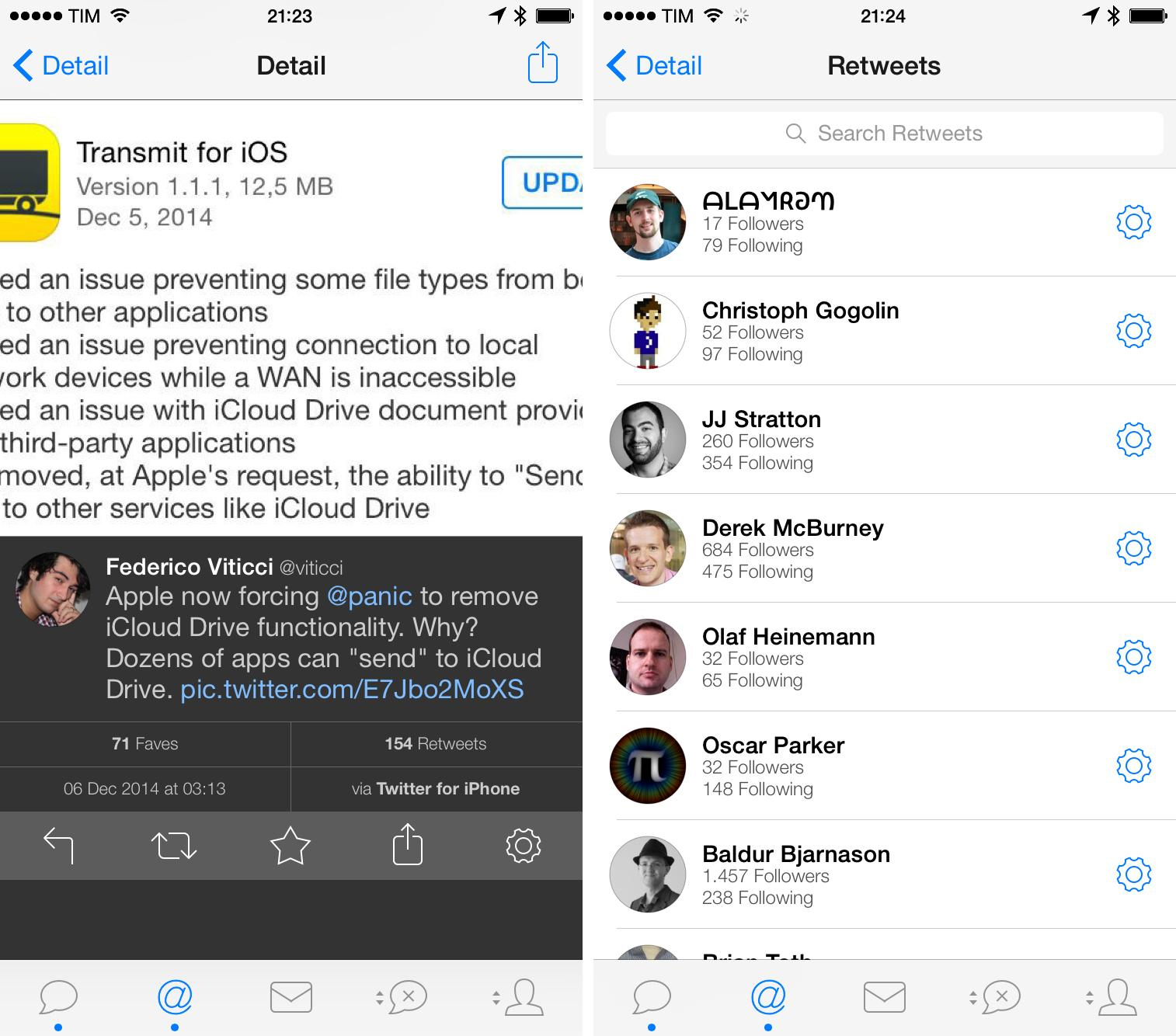
In Tweetbot, you need to swipe left on a tweet in the timeline to view fave and retweet counts below its text. For your own tweets, Tweetbot can show you people who retweeted or faved a tweet upon tapping one of the numbers; in this list, each user is displayed with their followers and following counts, so you can quickly know if someone popular retweeted you if you’re receiving an influx of RTs.
However, Tweetbot has a major limitation for counts on other users’ tweets: it can’t display the list of people who favorited a tweet on tweets posted by other users. Instead, tapping the fave counter on tweets not sent by you will open an inline Favstar page, which is often not as accurate as the native data returned by Twitter. I believe this is another limitation of the Twitter API; so, while the implementation isn’t great and you’ll still need to open a tweet to view counts, at least Tapbots is doing the best they can with Tweetbot.
When I was first started using Twitter for iPhone, I thought the idea of displaying retweet and fave counts for each tweet was crazy. After years of Tweetie and Tweetbot, I was used to a perfectly clean timeline with tweets displayed as textual updates, perhaps inline previews for images, but no extraneous interface elements visible without tapping or swiping on a tweet first. The fact that Twitter wanted to inject counts in each tweet for “engagement” purposes was sacrilege at best.
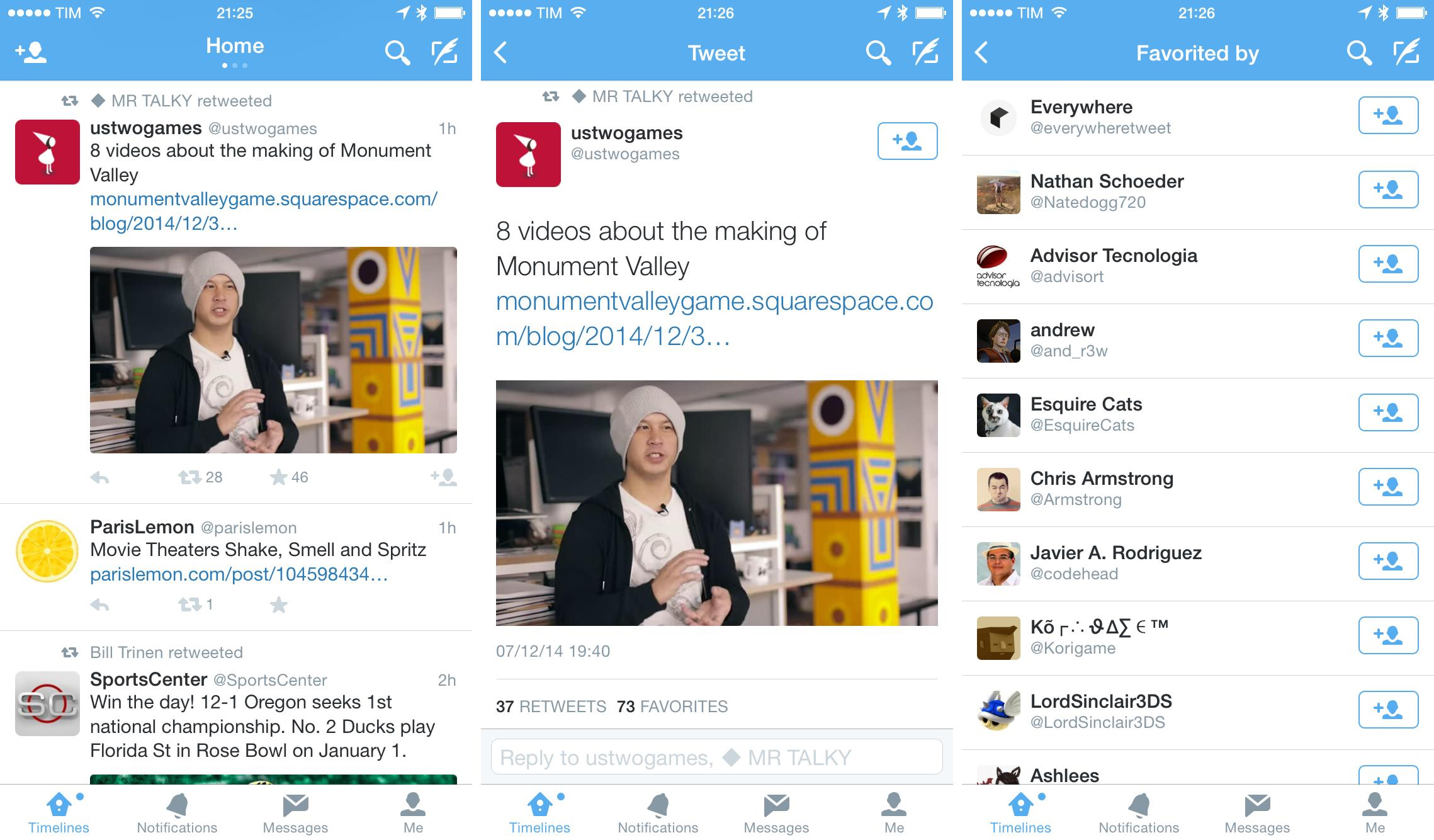
To my surprise, though, I soon started enjoying the ability to discern a tweet’s popularity without tapping on it first and being taken into a separate view. And now that I’ve been using the official app for a few months, it’s hard to go back to clients that don’t instantly show me counts for faves and retweets – it’s similar to the absence of cards in third-party apps, but amplified by the fact that I’m a sucker for faves.
It’s interesting how a simple interface change has altered my interactions on a network I’ve been using for years. Thanks to more easily available counts, I am discovering more interesting links because I’m missing fewer of them – I scroll my timeline with more attention and I skim less. Retweet and fave counts are direct indicators of popularity and interest that don’t require to be guessed – they’re always there, and while they don’t magically “fix” discovery of cool tweets, they help in ensuring you don’t easily miss stuff.
They’re a good example of how practical design trumps idealistic interfaces: in theory, a cleaner timeline is better, but, in practice, I’ve discovered that always-visible counts make me faster (less tapping around) and more attentive.
Twitter’s RT and fave counts, however, aren’t just static indicators – they’re buttons. I can fave any tweet with one tap just by pressing the star icon, and I can retweet with two taps (there’s a confirmation step in between).
My understanding is that Twitter’s main intention was to let you easily engage with tweets through retweets and faves, but the buttons also made for nice indicators besides the interactive part. When you tap those buttons in the Twitter timeline, you aren’t taken to a list of people who retweeted or faved a tweet. To see the list of users, you have to tap a tweet (not swipe on it) so you’ll be taken to a detail view with larger previews, more buttons, replies, and full RT/fave counts.
Tap the counts, and you’ll see all users who have interacted with a tweet. Both on the iPad and iPhone, these lists show users with no bios or follower counts (unlike Tweetbot); as you would expect, there are buttons to quickly follow users with one tap.
I was fiercely opposed to the idea of having buttons and counts cluttering up my Twitter timeline. With time, not only have Twitter’s buttons grown on me because I like seeing RTs and faves at any time – I am slower and less efficient in Twitter clients that don’t put RT and fave indicators/shortcuts a quick tap away. Twitter’s timeline may not be minimal or true to to Tweetie’s roots, but it works better because it puts the focus on interaction without complications.
Search
I rely on Twitter search to monitor tweets about MacStories, articles I publish, and other keywords related to the websites I run. More importantly, I believe in the value of older tweets as reference material for editorials and news, which is why I need to check Twitter search for tweets that go back in time.
Until recently, I would have recommended Tweetbot for the best implementation of Twitter search and Tweet Library to browse the Twitter archive, but an update that Twitter recently rolled out has completely changed the scenario.
The Twitter Search API is part of Twitter’s v1.1 REST API. It allows queries against the indices of recent or popular Tweets and behaves similarily to, but not exactly like the Search feature available in Twitter mobile or web clients, such as Twitter.com search.
Third-party Twitter clients have a finite number of search results returned by the Twitter search API. This means that Twitterrific and Tweetbot cannot look for every tweet ever sent – they’re limited to the past few weeks (at best). This has always been the case with the Twitter API, and it’s not under the developers’ control.
With this in mind, both apps have done a good job at offering handy search features for tweets, trends, and users. In Tweetbot, you can access saved searches, view nearby tweets, view trends worldwide and regionally, and browse suggested users by category.
I love two aspects of Tweetbot’s search: results are color-coded and you can restrict search results to tweets or users containing a specific string of text. The first one is useful for me so I can find tweets that mention my name without being a reply: tweets that contain “viticci”, aren’t blue, and aren’t sent by me including my last name without my @username. This is usually someone who deeply disagrees with me. The Twitter app doesn’t make it easy to parse tweets through color because it has no tweet highlighting.
When you hit the search bar in Tweetbot and start typing, the app will offer to look for users that contain that text in their name, tweets where that text appears, or it can let you go directly to a valid username you typed. The first shortcut is fantastic if you want to see a group of usernames that share a similar name or if you only partially remember a username.[16]
Twitterrific puts shortcuts to saved searches in the sidebar and its search screen lets you find people, trends, and tweets. Twitterrific has fewer options than Tweetbot as it goes for a friendlier, more visual approach – users, for instance, are shown as a grid of large profile pictures with no counts or other information before tapping them.
Search in the Twitter app is on another level because Twitter has enhanced it and locked it down with no API access. The first big difference, though, isn’t technical – it’s in the design of the feature. Search is always accessible in the title bar of the Twitter app (except in the DM screen) with an icon next to the compose button. The placement of this icon immediately suggests that search is important to the company – or at least they want it to be.
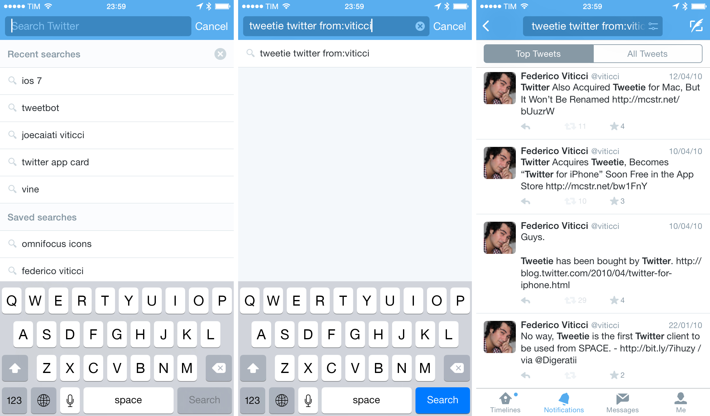
When you tap the search icon, the app shows a list of recent and saved searches; on the iPad, this happens in a popover. As you start typing, the app shows suggestions for older searches you performed, users, and popular searches. You can tap one of these results and be taken to the relevant user or search results page.
Search results are split in Top Tweets and All Tweets. The former shows a mix of best results, suggested users, and photos shared alongside tweets relevant to that search; the other tab shows all tweets in reverse chronological order. I’m usually able to find a tweet I remember through the Top results, which tend to be accurate and are handy shortcuts.
Filters is where it gets more interesting. The Twitter app lets you refine results by hitting the filter icon in the search bar at the top, and you can use the following criteria to narrow results to specific tweets:
- Photos
- Videos
- News
- People
- Collections (also searches Lists)
- All People/People you follow
- Everywhere/near you
These are powerful filters, and available right on the iPhone and iPad. I use them often to refine results to links and combine them with a search query to, say, find a specific article a person I follow tweeted.
This all comes together with the fact that Twitter recently launched a fully searchable archive of every tweet ever sent, available exclusively in the native Twitter apps. You can now look for every tweet ever posted to Twitter directly from the iOS app and find results from years ago in seconds. This is an amazing capability and impressive technical achievement – especially considering how well it works.
As I wrote when Twitter rolled out the new search:
For me, there’s tremendous value in being able to easily retrieve old tweets: I’ve written about the Twitter archive before, but today’s rollout brings retrieval of indexed tweets to the search section of the Twitter app – no need to download an archive. Twitter search used to be limited to tweets from the past couple of weeks; now, you can look for every public tweet sent since 2006.
In my first tests using Twitter for iPhone, I was able to find the first tweet I ever sent through search in a couple of seconds by simply typing words contained in its text. I then looked for other old tweets I remembered from 2009 and 2010, and the app brought them up instantly. Retweet and fave counts were correct, but I couldn’t load replies to those old tweets in the Twitter app.
You can combine full search with advanced search operators to refine results from the entire Twitter history so you can, for instance, find a tweet sent by a user on a specific day. I don’t know what Twitter plans to do with search – it’s hard to imagine how casual users would want this kind of advanced functionality – but, for me, the additions have been beneficial to what I need to do with Twitter search.[17]
Ultimately, this is why I prefer search in the official Twitter app: it lets me find any tweet I want on my iPhone and iPad, it’s fast, and it can auto-complete search queries for me. Search in Twitterrific and Tweetbot has some nice touches and hidden details, but what Twitter is offering in their app is too essential for my workflow.
Timeline
Twitterrific and Tweetbot, either because of limitations or design decisions, have a traditional display of the Twitter timeline. Tweets from people you follow and retweets are shown in the timeline, with no external contaminations from ads[18] or tweets that don’t respect the classic reverse chronological order.
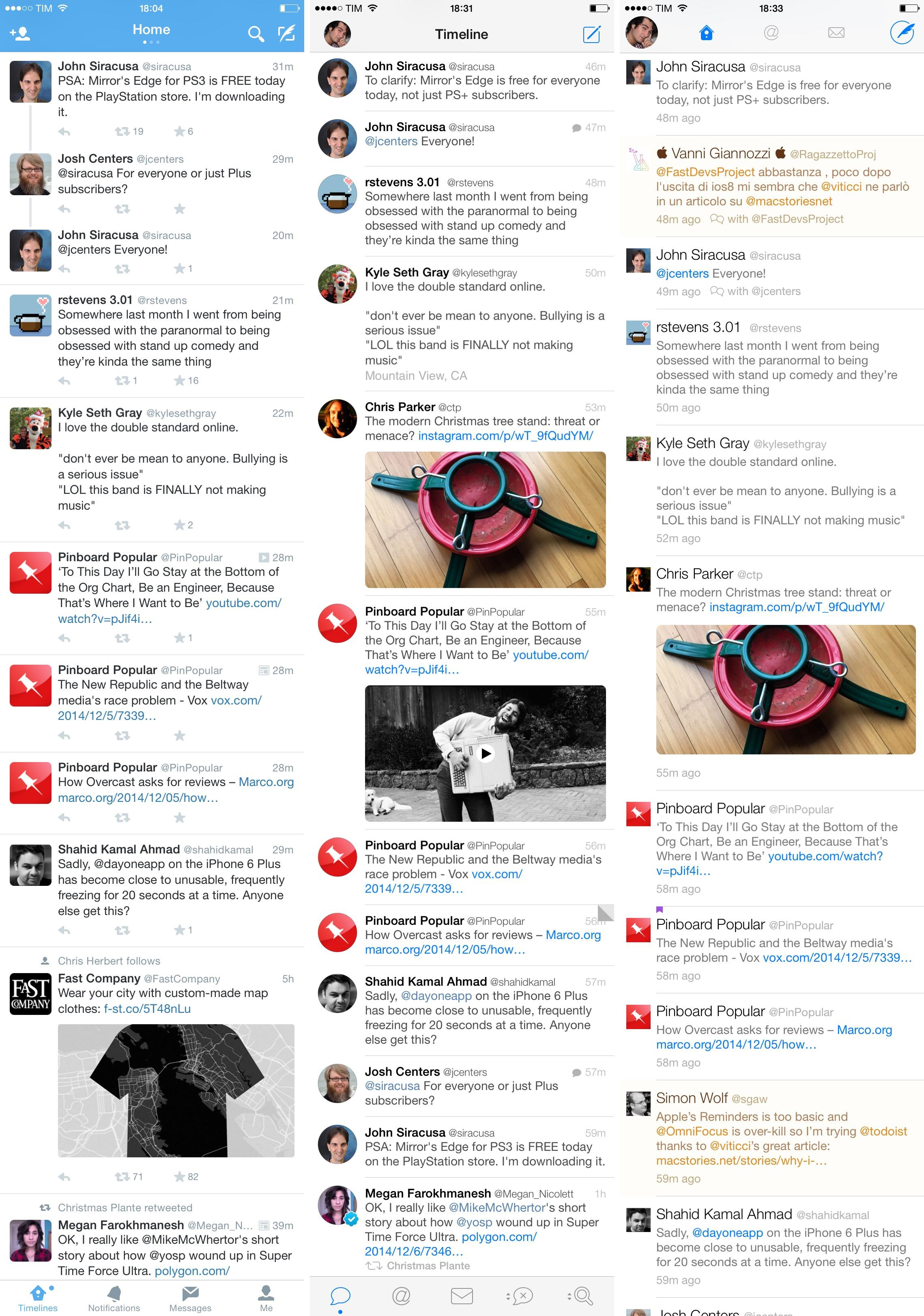
Twitterrific deserves a special mention because it supports theme customization and a unified timeline. The latter is one of the app’s unique features, as it lets you include mentions and direct messages in the Home timeline. I was never able to use the unified timeline on a daily basis because of the amount of mentions and messages that would make it impossible for me to quickly read tweets from people I follow. The ability to switch to a dark mode and customize fonts is also very nice, and a must-have if you can’t use apps with white interfaces and small fonts.
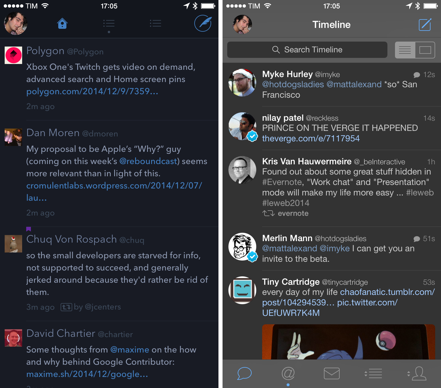
Tweetbot also supports switching to a dark theme, but it doesn’t offer the same amount of options found in Twitterrific.
Twitter, on other hand, is changing the timeline entirely to show you tweets that go beyond the people you follow.
And I actually like it.
Coming from five years of traditional timeline, seeing it change from the order I was used to was a shock. Tweets have to be shown from oldest to newest and nothing can change that rule – I think pretty much every Tweetbot and Twitterrific user can agree on this. The great thing about Twitter is its simplicity: you can see events unfold in real time because of the nature of the timeline and, unlike Facebook’s News Feed, you have a sense of place in a timeline that lacks any sort of modification.
Twitter has started changing the timeline with the infamous blue line – a way to put conversations back at the top by connecting a reply to its original tweet with a vertical line. But because both the first tweet and reply are shown in the timeline, this means that the Twitter app can show you tweets from 1 minute ago, then one from 19 minutes ago, then back to recent tweets from a minute ago. This happens when a recent reply is sent to an older tweet, which is pushed back to the top of the timeline alongside its reply, all held together by a line. When Twitter rolled out this feature, I hated it.
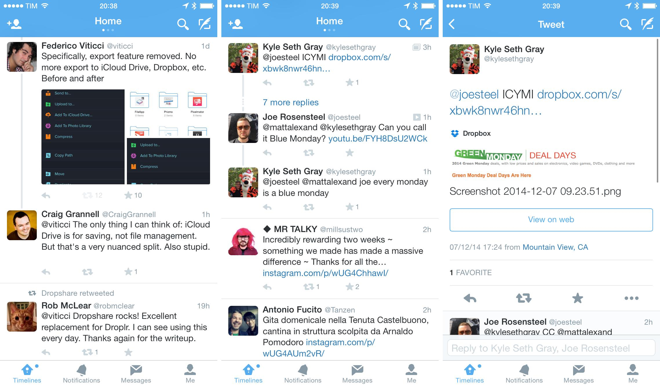
How can you not hate the blue line if you’re used to the traditional timeline? Tweets are never older tweets – they’re new ones. Historically, Twitter clients have always allowed you to swipe or tap to load a tweet’s detail view and associated thread in case of conversations; Tweetie did this, and both Twitterrific and Tweetbot follow this rule.
The blue line disrupts the traditional concept of the timeline: it sacrifices the intrinsic simplicity of the Twitter stream for the ability to catch up on past conversations and retain context, but this has the nasty consequence of showing the original tweets multiple times in different places if people you follow keep replying to them.
Here’s the thing, though: I have discovered tweets I had missed thanks to the blue line. Whether for tweets I didn’t see because it was the weekend or updates that I just skimmed and ignored, Twitter’s insistence on pushing tweets to the top through the blue line allowed me to discover valuable conversations because of replies that I would have ignored otherwise. I know that this is an unpopular opinion, and it takes a lot of time to get used to it, but the blue line does make sense once you learn to accept it.
This isn’t to say that it’s perfect. Twitter could (and should) find ways to make original tweets less obtrusive and repeat them less, or perhaps devise ways to minimize them over time so you don’t see the same tweet five times over two minutes. Because the Twitter app lacks timeline streaming (Twitterrific and Tweetbot have it), it’s also confusing that, upon refreshing, you see tweets moving from their original place to the top because they’re being yanked by the blue line.
And yet, in spite of its design and implementation problems[19], I like the blue line. It does clutter my timeline, but it has allowed me to find good tweets I missed, and it wouldn’t be fair to say that it’s “wrong” or “useless” on principle.
But the blue line isn’t the only tool that Twitter is leveraging to make timelines break out of their reverse chronological mold. As the company recently announced, they are experimenting with different ways to include relevant tweets based on activity from accounts that you already follow – in other words, putting tweets from accounts you don’t follow based on interactions from the ones you do follow. The primary motivation is, according to Twitter, related to the fact that people don’t want to cautiously cultivate their own timeline over the years. It’s easy to imagine why the casual Twitter user who reads Twitter.com while being logged out would ever want to manually follow hundreds of people.
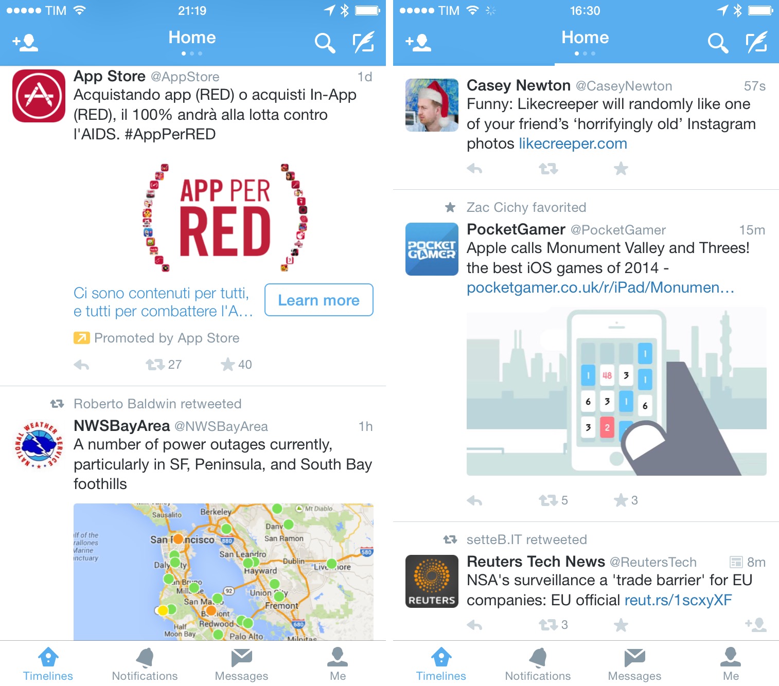
Twitter is working on an instant personalized timeline[20] that you don’t need to set up, but their willingness to bring discovery of tweets and users to the timeline is trickling down to existing users who have an account and already follow people. Like many others, I’ve started seeing tweets from accounts I don’t follow pop into my timeline based on what another person saves or follows. External tweets (as I call them) I’ve seen always came with a reason attached – “Joe favorited” and “Kyle follows” indicate why a tweet is being included in the timeline.
In my experience, these relevant tweets have been mostly good – I’d say 70% of the time I either laughed at a funny favorite I was being shown or got interested in opening the profile page of a user I didn’t know. The other 30% of external tweets were either American sports or duplicate tweets that I had already seen but that a person marked as favorite.
Twitter knows a lot about me. It is the web service I’ve used the most since 2009 and I would guess that they have a fairly accurate snapshot of my location, interests, sense of humor, political orientation, taste in foods, and spending habits. Just by scanning my tweets sent between 2009 and 2014, Twitter could understand which electronic devices I bought and which models, or when I tend to buy videogames during the year and on which platforms. They have a treasure trove of data about me, which is fed every day with more engagement and interactions. They can use it.
I don’t mind the external tweet injections in my timeline. Like the blue line, I’ve grown to like them because they let me discover tweets that tend to be relevant to my interests or at least somewhat compatible with my tastes. Their algorithms are admittedly pretty good, and I’ve started following new people since Twitter began showing me different tweets in my timeline. Recommendations aren’t perfect: at this point, Twitter should know that I have no interest in the NFL or American politics, but tweets about them keep occasionally appearing.
From a technical standpoint, I noticed that Twitter injects external tweets more during slow timeline moments than, say, in a typical Wednesday afternoon full of updates from people I follow. Tweets that have been favorited by others (by far, the external tweets I see the most) are more present at night, when my timeline is slower and more sparse. I think that’s a good idea to have “something for everyone at any time on Twitter”, as the company says.
I’m also in the strange position of an Italian who doesn’t follow Italian websites and behaves like an American because of his job and Internet friends. This, I believe, is what influences the amount of promoted tweets (ads) that I see in the Twitter app on a daily basis.
This is an important aspect for many users of third-party clients, which don’t show ads in the timeline. In my tests over the past months, I’ve seen an average of 5–10 ads in my timeline each day, but every time I talk about this on Twitter or Connected readers and listeners tell me that they see many, many more, to the point where the app is unusable because of ads. I don’t know why I’m seeing fewer ads, but my impression is that my Twitter account must be confusing to advertisers. As I said above, I’ve grown used to naturally skimming ads on the web through the years, and doing the same in Twitter isn’t much different than most blogs I read.
The Twitter timeline was built to be a reflection of a Following list people could build meticulously over time. But as it approches its ninth anniversary, Twitter has realized that curating a list of accounts isn’t most people’s forte, and they want to make sure that the timeline stays interesting even without investing time into finding accounts to follow. And that meant breaking the original concept of the timeline to include content and account suggestions. It meant to make the Twitter timeline a little more like Facebook.
This sounds like blasphemy to longtime Twitter users. And I completely understand: the idea of the timeline was a sacred one, especially for people who have invested hours over the years in following other people and trimming the uninteresting branches of their following lists.
But, after trying Twitter’s timeline for the past six months, I have to say that it’s not as bad as some people wanted me to believe. It’s different, it breaks the chronological order of tweets, and, yes, maybe it’s been inspired by Facebook, but it feels more lively than the classic timeline of a third-party client. The “clutter” that many dismiss as automatically wrong has actually been full of interesting faves and user accounts that I wouldn’t have discovered hadn’t Twitter decided to show them to me. Twitter’s algorithms are good, and we should be excited about the prospect of a service being able to cater to our interests with timely and accurate recommendations – not cynical by default.
Once you accept the idea that Twitter timelines may expand beyond your following list and tweets’ timestamps, it’s easy to imagine how they could be remixed to offer more topic suggestions, summaries, or recommendations. But Twitter needs to go easy with that. The idea of a timeline still is a powerful one: Twitter wants to show you what’s happening, and events – no matter the algorithm you use – always happen in succession. Being able to stop and watch events as they unfold is what makes Twitter great and essential and unique – whether it’s #Ferguson, the elections, an Apple keynote, or just a regular news day.
Twitter’s biggest challenge with the timeline isn’t appeasing power users – it’s balancing its desire for user attention with the very nature of the service. Twitter doesn’t want to become like Facebook because it would lose the unique advantage that puts them against a confusing and clunky News Feed; but at the same time, a static timeline that doesn’t help people get more out of Twitter isn’t interesting, pushing people to leave Twitter out of boredom.
It turns out, Twitter struggles with a common dilemma: how to deal with time.
New Twitter
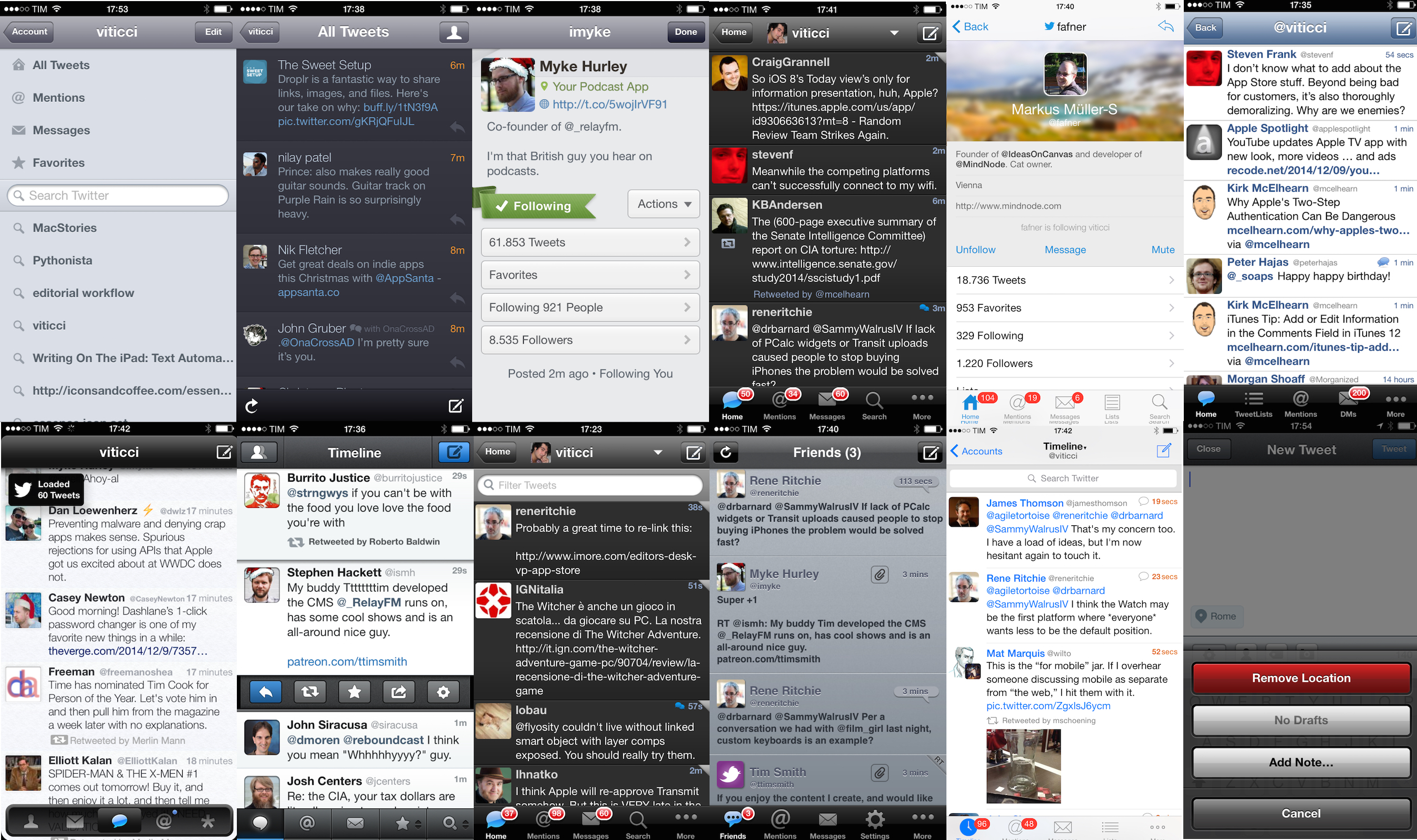
Twitter and the third-party iOS development community owe a lot to third-party Twitter clients. The modern Twitter mobile experience wouldn’t have been possible without the early efforts of The Iconfactory and Loren Brichter; with Tweetbot, Tapbots has built a Twitter client for power users that can’t be found anywhere else.
But 2014 Twitter is bigger than Twitterrific and Tweetbot. Today’s Twitter goes beyond text and a traditional display of the timeline – it encompasses native photos (and soon videos), interactive previews, advanced recommendation algorithms, photo tagging features, and a fully indexed search. I didn’t know how much I would come to rely on Twitter’s new features until I started using the official app and now, in spite of design details and advanced functionalities that I still prefer in third-party clients, I don’t feel like I want to switch back.
And that’s because the basic Twitter experience in 2014 is different. Twitter is split in Legacy Twitter and Modern Twitter, and it increasingly seems like users and developers of classic clients will have to stay in the past of the service. Perfectly functional (for now), beautiful in their delightful touches, but ultimately limited.
Choosing a Twitter client is incredibly personal. This experiment reinforced my belief that most of my criticism for Tweetbot and Twitterrific stems from API limitations that Twitter won’t fix for third-party developers. For this reason, it would be wrong to judge third-party clients solely based on features they can’t implement. Instead, my exploration allowed me to take a fresh look at the design choices in Twitterrific (generally thoughtful, but sometimes confusing and too skewed towards the idea of a unified timeline) and the functionality of Tweetbot (still great, but sorely missed on the iPad). Twitterrific and Tweetbot aren’t without problems, but they are fantastic apps for what they can do.
Reevaluating Twitter clients with no preconceptions made me realize that the official Twitter app is the best choice for me.
To me, third-party Twitter clients now feel like apps from a different era. Dozens of features that have become part of my daily Twitter experience aren’t supported by Twitterrific and Tweetbot, and there’s nothing they can do about them. At this point, I don’t know what’s right or wrong, and I don’t know if Twitter is making a smart or shortsighted move in not bringing new features to the API. In an ideal world, every developer would always be able to write a client for a web service, but the world is less than ideal, and, unfortunately, sometimes big software companies choose a closed ecosystem.
I started this experiment in June for two reasons: I wanted to assess the state of Twitter clients and I was curious to see if the official Twitter app was as bad as many were saying. In the end, I realized that, as a power user, not only have I been fine with the Twitter app – I miss the new Twitter features when I don’t have them.
I see what Twitter has become, and I like it. The Twitter experience I have in third-party clients isn’t the full Twitter anymore. As much as I wanted to deny it, I needed to face the facts and accept that the rest of the world sees Twitter through a different lens than our iOS community. Twitterrific and Tweetbot still offer plenty of features that I love such as timeline sync, better support for external image URLs, and share sheets, but, when compared to the new Twitter that I can have in the official app, the trade-off isn’t worth it anymore for me.
One day, third-party Twitter clients will likely stop working, and I hope that day will be as far in the future as possible. Twitter was built on third-party apps, and, even if it seems improbable, I’m still hoping that Twitter will find ways to modernize its API because a diversity of clients can only benefit iOS users.
Today, the real Twitter is what you get in their iOS app. And it’s not so bad after all.
Guys. Tweetie has been bought by Twitter. http://blog.twitter.com/2010/04/twitter-for-iphone.html
— Federico Viticci (@viticci) April 10, 2010
-
Including Apple’s. ↩︎
-
I still consider Loren’s original Twitter for iPad to be one of the highest points ever touched by iPad software. ↩︎
-
When the timeline is broken in two and you need to load tweets in the middle. Every Twitter app supports timeline gap detection now. ↩︎
-
As far as I recall, timeline gaps in Twitter for iOS still have the same design of Tweetie’s ones – a tear in the timeline. ↩︎
-
Good jokes can be hidden in permalinks. ↩︎
-
And when an app downloaded this way has been installed, Twitter will show you an in-app notification. ↩︎
-
Tweets that have a Summary card show a special icon in the timeline to suggest that you can view a snippet in their detail view. ↩︎
-
Notably, Instagram previews aren’t supported in the official Twitter app (they show up as simple URLs), but Flickr’s are. ↩︎
-
Why not rename the section to Recent Media then? ↩︎
-
My interpretation is that your lists are displayed at the top, but there is no visual hint or separation between the two distinct sets. ↩︎
-
I’m not fancy enough for that yet. ↩︎
-
Anyone else feel like Tweetstorm Power Users would make for a great podcast? ↩︎
-
At what point should Twitter consider making a standalone DM app with real messaging features and tie-ins with the main Twitter product for private sharing? Does the company care about that experience? Could it be monetized? Should it exist? ↩︎
-
The list of usernames that comes up shows followers and following counts, which is useful to quickly find popular accounts. ↩︎
-
To find my old tweets, I used to rely on Google search using a “site:twitter.com/viticci” filter. Not ideal, but it worked most of the time. ↩︎
-
Unless you use Twitterrific’s free version, which is ad-supported. ↩︎
-
Not to mention that sometimes the blue line is applied, other times it isn’t. Twitter should use the blue line more consistently. ↩︎
-
Twitter also natively supports Collections, a TweetDeck feature that lets you create custom timelines from selected tweets. I used this feature on a couple of occasions to create and share lists of tweets, and I like that I can natively view them on iOS. This, though, is not related to the personalized timelines that Twitter is working on. ↩︎