The iPad is still waiting for its Tweetie: a Twitter client which will set new standards and raise the bar so high it’ll be difficult for developers to catch up. Twitterrific hasn’t raised the bar: it brought a blow of fresh air in a market that, since Twitter’s acquisition of Loren’s app, is struggling to find its new Messiah. For as much as I love Twitterrific 3.0 (it’s my default client on the iPhone) I can’t say The Iconfactory has reinvented the wheel. The first Tweetie for iPhone did.
Maybe the wheel doesn’t need to be reinvented. Maybe we’ve already explored all the possible ways to lay out a Twitter application and now we’re just waiting for the one developer who implements them best. It’s a subtle difference.
If we take this approach, Osfoora for iPhone and iPad might be the best example to take a look at. It started as a quite blatant Tweetie ripoff, but it slowly evolved overtime in a wisely developed alternative to much more celebrated clients such as the aforementioned Tweetie, Twitterrific but also Echofon, Twitbird and Twittelator. It’s really changed a lot since the last time Cody reviewed the iPhone version here on MacStories.
Even though its terrific evolution, this time I won’t be talking about Osfoora for iPhone. The iPad version, released last month, was updated yesterday with a lot of new features and now it’s seriously claiming the throne of the best Twitter client for iPad. App Store users seem to be on Said Marouf’s side.
Here’s why I agree with them.
Osfoora for iPad (bear with me if I don’t call it “HD” - I heard the app is set to change name soon) comes with a couple of original and interesting ideas, combines them with tons of features geared towards the average Twitter power user and offers a good-looking, polished package which gets a very few things wrong, but surely deservers your attention. As you may have read on Twitter, I switched over to Osfoora from Twitterrific for the second time when 1.1 was approved yesterday. Also, unlike many other apps for the iPad, Osfoora provides two radically different experiences whether you’re holding the device in landscape or portrait mode. A very few apps do that, Reeder being one of them.
When you launch the app for the first time you’re presented this beautiful login page which also allows you to go create an account if you don’t have one. Why would one download a Twitter client if he doesn’t even have a Twitter account is beyond me. The app support multi-accounts: available through an icon in the upper-left corner, you can switch between them with a single tap.
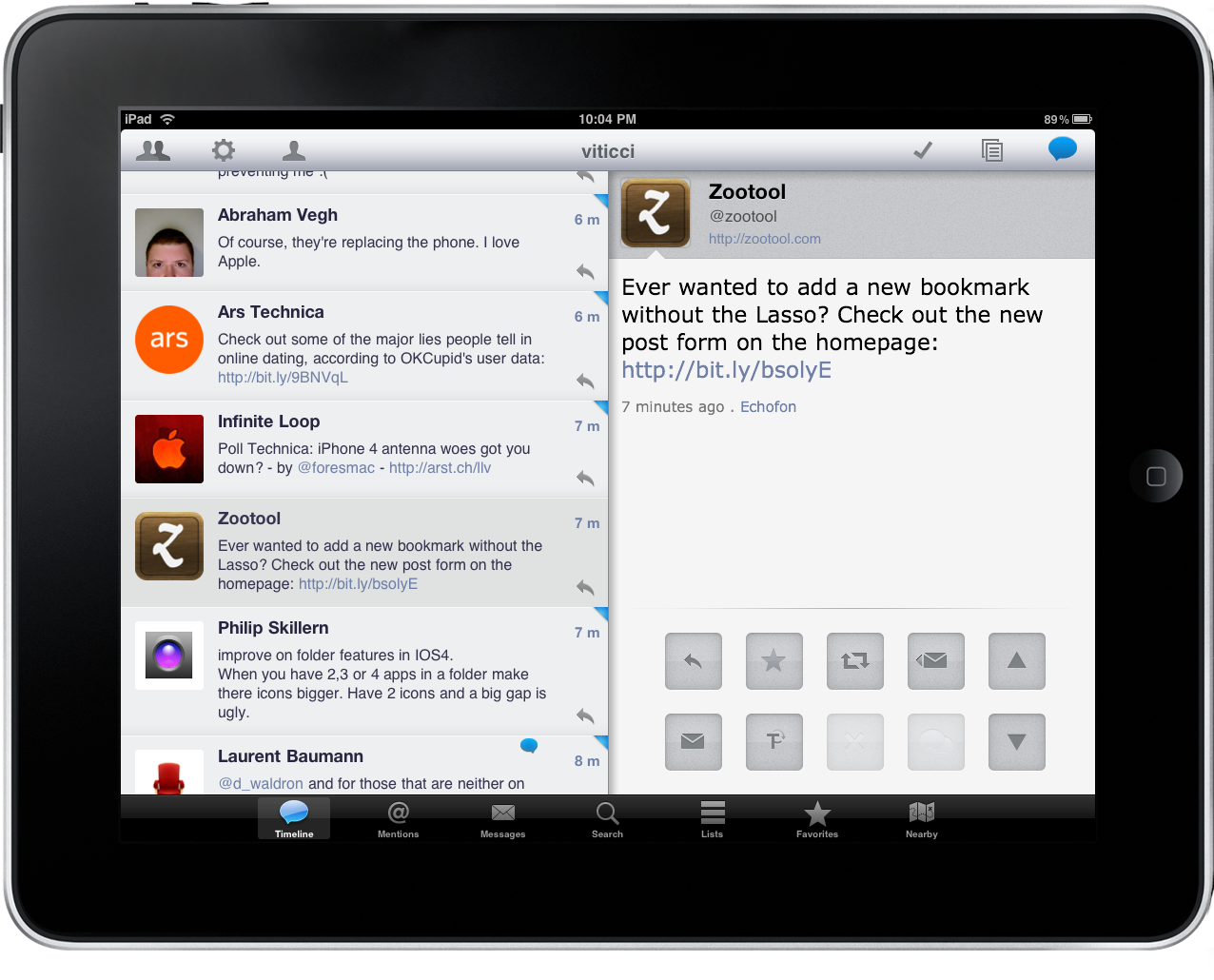
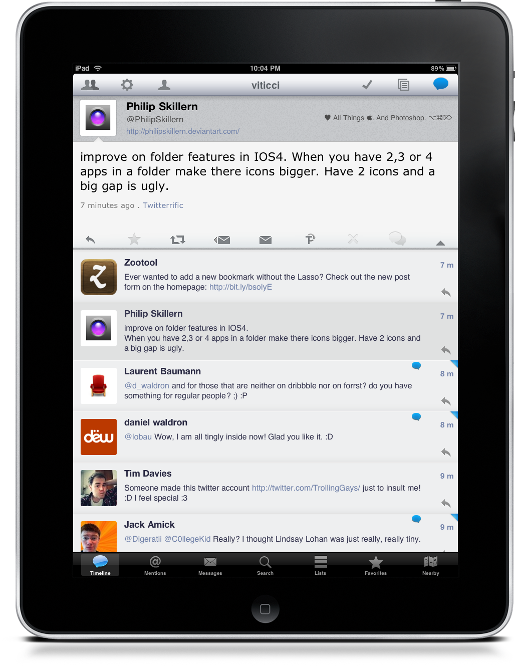
When in portrait mode, the app might look a little bit underwhelming. You have tweets, seven tabs at the bottom: it looks just like a bigger iPhone app. Luckily for us, it ain’t so. Stay with me.
When you scroll the timeline, you can’t apparently do nothing with the tweets displayed in front of you. Pay attention: first, there’s a tiny arrow in the bottom-right corner of each tweet “bubble”, which allows you to reply, DM, retweet and email that tweet. Useful, but it’s not the best part. If you tap on a tweet, a panel containing that single tweet slides down from the top allowing you to perform many other actions. You can fave a tweet from there, as well as translate it, email it, DM or show conversation. Conversations are located inside a popover, both in landscape and portrait mode. The app is quite fast at fetching them, as fast as Twitterrific, I guess.
So, the panel. While Osfoora shows 9 tweets in portrait mode (on average) when the panel isn’t shown, the number decreases to 6-7 when you tap on a tweet. It was even bigger on previous versions. I like it, anyway - actually I find myself scrolling the timeline with the panel always on-screen, as it allows me to do a bunch of other things like jump to users’ profiles (very useful in case of retweets) or read profile bios. Oh, of course the timeline is refreshable via pull-to-refresh. Yeah, the Tweetie one. The implementation is perfect. You can also filter tweets, but I’ve never done that. I don’t understand what’s the purpose of “marking tweets as read”, too. Twitter’s not a RSS reader.
Like I said, there are tabs on bottom. Mentions, Favorites and Lists work just like you expect - they’re simple timelines. Nearby pulls a Google Map and displays tweets near you - at least it should. It’s not working for me - maybe because there are not so many Osfoora users in Viterbo.
Search is interesting. When you tap on the search icon in the toolbar, the application opens a new window with a Recent Searches popover enabled by default. It’s pretty useful. If you just want to search, move your finger to the search bar and enter your search terms. There are some additional tricks you might want to know about though: you can enter a search term and then hit the user icon to jump to a specific profile. Neat. You can also access your saved searches or add the current one to the list. Last, Trends: they’re there in the top bar, but we all know Twitter’s Trends are crap.
Before I delve deeper into the Settings and some other gripes I have about the app, let me mention the all-new landscape mode, introduced in the latest update. It’s a quite original implementation, even though it needs some practice getting used to. When in landscape, you see the timeline on the left and a single tweet on the right. There are some buttons below the tweet, and I particularly appreciate the navigation ones which let you scroll the timeline with your thumb resting on the iPad’s right side. The only thing I don’t like about this orientation is that the app doesn’t display enough tweets in the left column - 5-6 on average. Changing the font size in the Settings doesn’t help, either. Given this new landscape interaction methods, I would have liked to see the developer building a swipe-to-reveal gesture for tweets / web view (again, like Reeder). Maybe in a future update.
The Settings is the place you have to visit to fine-tune your Osfoora experience. And I said “you have to” - quite different from Twitterrific’s philosophy. You can set the auto-refresh interval, hide or show unread badges (seriously?), enable sounds, change from dark to light theme (awesome), choose image and URL services, enables the Read Later menu (both Instapaper and Read It Later are supported), fill your Wacchen credentials and install the Safari bookmarklet. There are dozens of Settings to play with. Is it a good thing? For me, yes: while I appreciate Twitterrific’s simplicity on the iPhone, I felt the need of something that would allow me to enjoy a full-featured Twitter experience on the iPad.
It’s about what you want from Twitter: do you need these features? Then Osfoora is for you. Oh, by the way: TextExpander and Drafts are supported, too.
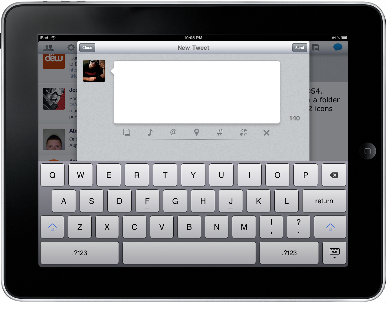
But how do you actually tweet? The compose button triggers a modal window when in landscape, it goes fullscreen in portrait mode. You can upload pictures, tweet the song you’re listening to, pick up a user from your contacts, locate your position and shorten URLs. If you close the compose window before sending a tweet, you’re asked if you want to save it as a draft.
If Osfoora perfect? No. For instance, it takes too many taps to fave a tweet. And I do fave a lot of tweets every day, damn you @Digeratii. Also, I think user’s popovers (for profiles) could use some refinements - especially the buttons - and same for the way the app displays images from Twitpic, Img.ly, etc. Twitterrific’s animated popovers are more elegant.
As it stands now, though, Osfoora HD is what I want from Twitter on the iPad. Clean and good-looking UI, lots of features, fast, perfect state-saving (doesn’t happen with Twitterrific for iPad) and great integration with online services.
Osfoora HD is the Twitter client to beat on the iPad.
Available at $3.99 in the App Store.