Valentine’s Day deals are rolling in! Here are today’s @MacStoriesDeals on iOS, Mac, and Mac App Store apps that are on sale for a limited time, so get them before they end!
Posts tagged with "iOS"
#MacStoriesDeals - Tuesday
#MacStoriesDeals - Monday
Valentine’s Day deals are rolling in! Here are today’s @MacStoriesDeals on iOS, Mac, and Mac App Store apps that are on sale for a limited time, so get them before they end!
#MacStoriesDeals - Friday
Valentine’s Day deals are rolling in! Here are today’s @MacStoriesDeals on iOS, Mac, and Mac App Store apps that are on sale for a limited time, so get them before they end!
#MacStoriesDeals - Thursday
Here are today’s @MacStoriesDeals on iOS, Mac, and Mac App Store apps that are on sale for a limited time, so get them before they end!
#MacStoriesDeals - Tuesday
Here are today’s @MacStoriesDeals on iOS, Mac, and Mac App Store apps that are on sale for a limited time, so get them before they end!
iOS Monitors (And Cursors)
Gabe Weatherhead has an interesting take on my iOS-ification of Apple’s Ecosystem piece:
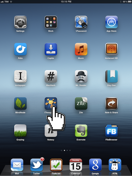
But there is one feature missing from iOS that will prevent it from ever being effective with an external display: a cursor. I know this seems blasphemous but if you have ever tried to us an iPad with mirroring, you know that you must still look at the iPad to get anything done.
To use the iPad as a desktop replacement, mirroring is not enough. I need a cursor displayed where my finger touches the iPad (or iPhone) so that I have context on the external display. Every time I see iOS app demo videos they are accompanied by cursor representations for the touch interactions, and I think “that would be a great feature on the AppleTV.
I have used AirPlay Mirroring with my iPad 2, and I agree that it’s weird to be forced to look down at your iPad’s display if you want to get anything done that’s not sliding presentations and photos. Even games, in spite of their less complex on-screen controls and interfaces than, say, an app like OmniFocus, can be hard to be played without looking down sometimes.
What I’d like to see – and something that likely won’t happen anytime soon – is a series of “desktop accessories” to better take advantage of the iPad when mirrored or connected to an external display. For instance, imagine some sort of Magic Trackpad for iOS that would allow you to retain gestures and multitouch, but have a cursor when the iPad is mirrored to an Apple TV. Something I often hear (and find myself into as well) is that some apps are just better with a cursor in the current state of software offerings – for example, image editing and highlighting text. Imagine if Apple built an official accessory that, through APIs (much like iCade does), allowed developers to enhance their apps with direct support for “cursor mode” when the iPad’s screen is mirrored or even when the device is held by a stand (magnetic latches could inform the system of the current orientation of the device). If I had to put my two cents in it, I’d say this could be a way to market the iPad as a device capable of switching to a more precision control-oriented environment if needed. Video professionals woud sure welcome such a move.
I’m not saying Apple should produce a convertible tablet that switches between iOS and OS X (albeit Apple’s direction seems to be making switching between the two a seamless experience) – I’m arguing that some specific software and functions are better with a cursor in the current state of things. So unless we’ll see revolutionary new touch controls that will obviate the need for such idea, I think cursor controls on an app-by-app basis is something worth considering for the future of iOS’ mirroring and external display connections.
Perhaps Apple is fully committed to multi-touch and we’ll never see new cursor-based interfaces/hardware coming out of Cupertino again. But I think cursor-based controls are still superior for some kind of apps, especially for professional software such as video and image editing.
The Case for an iOS Aperture
I’m not usually one for making baseless predictions about what Apple’s going to do next. There are plenty of people who already do that, and I’m generally more interested in their current affairs than in unconfirmed rumors. But there are exceptions to every “usually”, and today I want to try my hand at speculating.
Though we tend to forget about them after the fact, iPads have always debuted with iPad versions of some of Apple’s biggest apps. The original was released alongside iWork, to show that the iPad could do real work from day one (never mind how many people derided it as a consumption device for months). The iPad 2 brought an iPad-optimized version of iMovie and GarageBand, which expanded the boundaries of what everyone thought could be created with a touch screen.
Now Apple is on a photography kick in a big way. Not only have they been relentlessly improving the iPhone’s camera since the 3GS, they have also added important and useful features in iOS 5 in the form of basic photo edits, built-in HDR and composition grids, the ability to organize albums, and Photo Stream, which near everyone agrees is their favorite feature of iCloud.
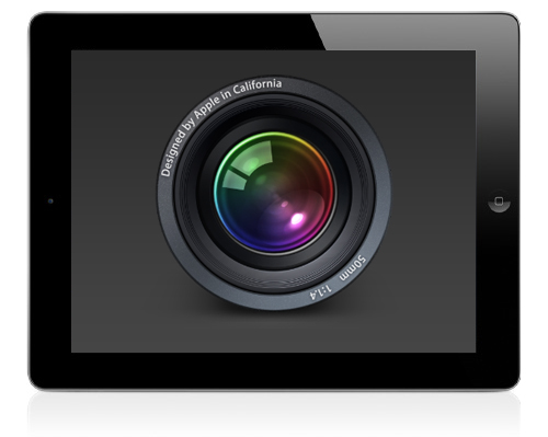
Given all that, I think that the next big Apple app to make its iOS debut will be Aperture, alongside the iPad 3’s inevitable announcement. Our own Cody Fink has written about the possibility of Aperture for iOS before, but there are a number of reasons why the timing for it makes sense now.
Retina Display
The one thing everyone expects about the iPad 3 is that it will finally get its long-awaited Retina display. It’s also the feature that everyone is most looking forward to (and for good reason, seeing what a huge difference it made when we first saw it on the iPhone 4). Of course this display will be great for reading and writing text, but what better way to really show it off than with photography, where the crispness and clarity of the display will be readily apparent?
A6
Another all-but-certain feature everyone agrees the iPad 3 will have is a quad-core A6, the next evolution of Apple’s A-series mobile processors. Like the A5, this chip will surely include vastly improved CPU and graphics performance over its predecessor, and in addition to games a great way to demonstrate it would be an iOS version of Aperture that shows how fast and fluidly the iPad 3 can manage tons of photos and perform complex image edits.
Photo Stream
Given Apple’s current photography kick the iPad 3 is likely to have better cameras than the iPad 2, but even if they’re not as good as the ones on the 4S —which, given how poor the ones on the 2 are compared to even the iPhone 4, seems likely— the brilliant thing with Photo Stream is that they don’t have to be. With Photo Stream, every photo you take on your 4S, your iPad 3, or even on a DSLR (once it’s been imported into iPhoto or OS X Aperture) would be available on your iOS Aperture library without you having to lift a finger.
iCloud Metadata Sync
We know iCloud is a big part of Apple’s strategy, and is only going to get bigger as time goes on. I can see iCloud playing a big part in Aperture on both iOS and the Mac. Any photo tagged, edited, or organized in one version of Aperture could be automatically mirrored with those same changes on another. Naturally this won’t make sense for current large Aperture libraries, but perhaps there will be a special iCloud section on the Mac version (like how there’s already a section for Photo Stream) specifically for photos that have been edited in this way.
Another Desktop Need Eliminated
iOS 5 may have given us “true” post-PC devices that could finally be used independently of our old-fashioned mice and window-based systems, but many people still need traditional PCs to store and manage digital photo collections. Aperture for iOS (along with iCloud and higher-capacity iPads) could be the next natural step in the iPad’s evolution towards being the only computer that 90% of people need.
Like I said, I don’t usually care to make baseless predictions, and everything here is certainly that. I have no idea if Apple will do any of this or not; for all we know they could be readying iOS versions of Logic and Final Cut Pro instead. But when you consider what the combination of Aperture for iOS with a retina-enabled iPad 3 could do, I think we may very well be seeing this alongside its announcement.
One More Thing: Open photos in any iOS image editor
This is more of a wish than a guess, but just like Aperture on the Mac I would love to see Aperture on iOS have the ability to open any image in any of the great image editing apps that already exist for iOS (with the ability to roundtrip them back into Aperture, of course). I have even less of an idea as to whether Apple will do this than I do my above speculations. Perhaps we will have to wait for a future version of iOS that better lets us share data between apps. But when and whether it happens or not, I think it would be a great way to let Aperture for iOS coexist happily among the many photo apps that iOS users already know and enjoy.
#MacStoriesDeals - Monday
Here are today’s @MacStoriesDeals on iOS, Mac, and Mac App Store apps that are on sale for a limited time, so get them before they end!
#MacStoriesDeals - Friday
Here are today’s @MacStoriesDeals on iOS, Mac, and Mac App Store apps that are on sale for a limited time, so get them before they end!


