
Coming into this Lion review, I think the first thing you’d expect me to say is that Lion is a transitionary version of OS X that begins the process of converging with iOS. At a first scratch on the cat post, this is the conclusion that we may immediately jump to as we glance across the changes made. We focus too much on the Launchpad, complaining about what seems to be obvious handholding without looking deeper into the underlying enhancements Apple has made for everyone across the board. OS X Lion may be influenced by a lot of smart interactions discovered in iOS, but it doesn’t feel nearly as limited as initially perceived. It is one of Apple’s goals to provide consistency across all of their platforms, but OS X is still of its own design.
Lion is exceptionally well done. Consistency, the user experience, and improvements to the user interface aren’t a nod towards iOS, but rather a nod towards Apple’s future. Much attention was paid to making the Finder easier to navigate, the interface more fluid, and the desktop more accessible than ever before. Lion fixes and improves upon the previous version of OS X just like every other version did. The fundamentals never change. Instead, concepts are expanded upon and built out in new, delightful ways. With Apple’s recent innovations and discoveries being made on iOS, it only makes sense that they’d implement much of what they’ve learned into their desktop OS.
The UI
As you open apps for the first time in Lion, you’ll notice everything has an airy quality to it that gives Lion a pleasant floating feeling. The traffic lights are noticeably more pale in color, and what’s left of application frames have been speckled with a bit of noise that replaces the cold Aqua gradients of Leopard with a friendly pastel-like texture. Scrollbars are now hidden in favor of mimicking iOS’ indicator, only revealing a simple opaque scrubber as you scroll naturally through minimal, near chrome-less interfaces. Rounded corners feel more pronounced, yet retain a softness that’s just perfect.
Finer details carefully reveal themselves as you explore the OS for the first time. Application badges no longer scream a distracting red, blending into Lion with a lighter shade that also mimics the iOS style. The Finder places emphasis on documents as monochrome icons line the sidebar. Rounded buttons have been replaced with rectangular buttons that no longer feel antiquated. The Launchpad blankets the desktop with frosted glass that purposely highlights your installed applications with tremendous detail. From the login screen to Mission Control, linen patterns line Lion as windows fade in and out of view.
Lion is gratuitously decorated with comfortable pillows on top of beautiful linen covers.


As an operating system, Lion feels decidedly refreshing to look at as sharp contrasts are established between frameless windows and the desktop background. It’s as if QuickTime X’s movie player in Snow Leopard sparked the trend of minimalism. Of course a few hipsters, notably iCal and Address Book, would buck idealism for realism via the influence of the iPad. The promise of congruency and of maintaining a familiar HIG is supplanted by the promise of familiarity between iOS and OS X. In both fashions, Lion’s applications are devoid of any harsh lines or edges.
There’s an interesting coalesce between hard and soft edges in Lion, which I find is the main discriminator between applications and desktop boundaries. Swipes between desktops and Mission Control dictate a clear partition between spaces and full-screen applications, providing visual distinctness when moving between the various areas of the system. Razor-thin edges surrounded by a tight shadow against the dark linen background in Mission Control frames the desktop as lofty applications float overhead. Through your use of Lion, you should notice a consistency in these kinds of details. Popovers for example share a familiar, flat opaque ivory gloss that signifies their ephemeralness.
Bright colors are bounded and active as translucent whites determine dismissiveness.
The Finder

The Finder sees some considerate refinement in Lion, the evolution of which nearly isn’t as iOS influenced as we’re led to believe. Instead, behaviors for moving and grouping files have been improved to a great extent, and the addition of search tokens rubs against the grain of iOS’ icon-based navigation. The toolbar has been upgraded with a new view button that gives users the ability to sort their files by date or type. Instead of perceived limitations, Apple has added improvements all around to solve niggling issues with file management.
Noticeably Apple has changed the appearance of the Finder window to accommodate gestures in Lion, and to de-emphasize the importance of the sidebar over that window’s contained files. Apple has always looked for ways to emphasize the ‘beauty’ of file navigation between Cover Flow, the icon slider (which can be revealed in the Finder by showing the status bar), and continues to pursue easy drag-and-drop motions with files and folders. Lion makes this blatantly evident via the new All My Files that’s not too dissimilar from Libraries on Windows 7.
All My Files can be thought of as a big Smart Folder that groups together all of your images and documents in one place, categorizing files through a new ‘by Kind’ view that separates file types into their own subsections of the Finder window. Each subsection, or group, has a new scrollable icon view that presents files in a mini carousel not dissimilar from Cover Flow, which can be expanded into a traditional icon view by clicking the Show All indicator to the far right of the group title. All My Files is both an introduction to new Finder concepts, and a central hub for everything you’ll dump onto your system through your user account. Recent images can simply be plucked from All My Files instead of having to navigate through the Downloads or Pictures folders, for example.

On the topic of the new view constraints, I’m conflicted with whether I like this approach to file navigation — I wouldn’t take issue if I could set views to show all of their contents by default, but Lion is determined to align files under an appropriate subheading if a specific view is chosen. Horizontal scrolling is okay with two dozen files, but any more and you’ll need to make a click to scroll through your folder contents. Lion does, however, add a new ‘Clean Up By’ operation via a right-click on the Finder window, which you can use to quickly sort files without applying a view.
Dragging and dropping files in Lion is made just a little bit easier thanks to improved merging and duplicate handling. Two folders with the same file name can be combined into a single folder containing the merged content. If duplicates are created in the process (or at any other time), Lion gives you the chance to keep the duplicate by appending the word ‘copy’ to the end of the file name. Interestingly, if you copy a file and paste it in the same folder, Lion doesn’t ask and simply appends a version number such as ‘2’ or ‘3’ at the end. The same thing happens when multiple copies are created, leaving the possibility that you’ll end up with ‘copy 2’ if you end up with lots of duplicate copies. Lion is smart in that it can predict when you intend to make a copy, and asks if you’re dragging blindly into a folder to protect you from overwriting important files.
I’d like point out that dragging files does work across Mission Control, which is substantial since you can move a file from a Finder window in your current desktop to a different Finder window in an adjacent desktop. Once you start dragging a file, you can use a three finger swipe to move between desktops and Mission Control (my thumb holds down the trackpad). Mission Control is unique since just like with files and folders, you can hover a file over a desktop space or app window in the Exposé view to navigate. Spaces or application windows will blink before zooming open as you continue to browse through your file system.

With the improvement in moving files around, there are two other upgrades that are meaningful to me since I occasionally work with batches of images. Often I’d drag and drop a group of images into a new folder, but now I can simply right click and create a new folder containing the contents, reducing a two step process to just one. When dragging a selection of files, Lion will include a small iOS badge indicating how many files were selected for the move. The latter is particularly useful in reminding me if I’ve accidentally forgotten a file in a move.
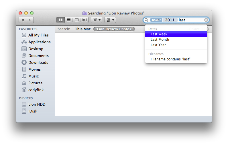
The new geeky features of Finder pertain to search — tokens in Lion allow you to build text-based keywords specific to names, file types, and dates in order to better locate files. I’ve never been a big user of specific search functions like this in OS X in the past since Smart Folders and Spotlight took care of everything, but the swiftness of tokens has opened up some new use cases for me. Tokens aren’t a terribly new concept, instead presenting a quicker way to build rules with simple text. Too, tokens can be quickly dismissed without need for building a Smart Folder or rule sets.

Tokens are predictive in that as you type something, Lion will make a good guess as to whether you’re looking for part of a file name, date, or downloaded file by association with its domain name. If I start to type “ap” for example, Lion assumes that I’m looking for a file with those characters in the file name, Applications, or an Apple icon image. Under the token headings, I can either click or use the down arrow and press return to make a selection. I can then continue typing to add another token. Date tokens in particular are extremely helpful. If you type ‘Thursday’, Lion asks if you’d like to only look for files you worked with last Thursday.
I only have one complaint with Tokens, and it has to do with developing certain expectations. If you type “last”, you’ll have the option to build a search query for the last week, month, and year. But where’s the ‘last day’? You can enter keywords like ‘today’ or ‘yesterday’ to find recent files, but should Apple build in some redundancy if users aren’t familiar with other search terms? When in doubt, try asking Lion what you want in plain English instead of expecting to use certain search phrases.
Certainly, I should address that the Library has been hidden in the user’s home directory since it’s been used as an argument for the ‘OS X to iOS’ convergence theory. Alone, hiding the Library from users isn’t any indication that Apple wants to remove the filesystem, and I’d say it’s a non-issue. The Library is a confusing mess of folders, preferences, and logs that don’t need to be seen by inexperienced Mac owners — it’s initially scary to look at, and I don’t doubt a lot of people ask, “Why is this thing here and what do I do with it”? For the most part, you never have to touch the Library. The only sort of outcry is coming from geeks who downloaded the betas early and whined about what I believe to be an improvement to the user experience. Personally, I wish the Library wasn’t where I shove my fistfuls of disorganized documents. If you’re smart enough to work with the contents in the Library, then you’re smart enough to either unhide the folder or access it from the command line. But even geeks like getting to things easily, so Apple has done something very nice in the Finder’s menubar.

The only reason you likely ever visit the Finder’s menubar is to connect to a server (I use it to connect to the computers at my college campus). Now, Apple’s given you a second reason to revisit this menu. If you want easy to access to the Library, click your desktop, select Go in the menubar, then hold down the option key. Like Magic, an icon for the Library appears for easy access. There you go kids: the Library is all yours.
A new sidebar item, available when your Mac can share files, makes its appearance as AirDrop. AirDrop is Apple’s peer-to-peer replacement for the USB key, and it’s a pretty brilliant one. Instead of sharing documents via your Shared folder on the local network, you can simply send a file to a friend who only has to accept the transmission. AirDrop doesn’t require a Wi-Fi network, working directly between Macs to transfer files. Files are transferred securely, and AirDrop is only activated when it’s selected in the Finder. The solution is better than File Sharing or ad-hoc sharing on Windows, being faster to initiate and dismiss without the heft of setup. With a single co-worker or friend, AirDrop is simple to use, but won’t replace all of your sharing needs for large groups (in which case a local server or something like Dropbox is more useful).
Quick Look
One of my favorite new improvements in Lion revolves around Quick Look, which comes painted in a new white lacquer compared to the smokey previews in Leopard and Snow Leopard. I often used Quick Look to preview photographs in Snow Leopard, but the problem was that it wasn’t very good at being resolution independent as you moved between images. In Lion, Quick Look resolves this issue by conforming to various image sizes, giving me a clear look without having to open Preview. You can also take Quick Look full-screen in working with large documents and images.

Quick Look’s changes aren’t just aesthetic — WebKit is a prominent feature under a new hood that allows users to preview websites from the Finder or a Spotlight popover. You can interact with Quick Look’s web view to click on links and scroll a webpage, with any interaction leading to a new Safari window or tab. With the mention of Spotlight integration, quickly tapping the left arrow on a highlighted item will present a popover that displays the discovered content. As there are no icon previews in Spotlight, being able to peek into a file before committing to the result will lead to less guessing and more ‘knowing’. Disclosure triangles in Mail and iChat will also allow you to peek at content.
Desktop, Menubar, and Application Windows

The object dock has remained the same since its glossy debut in Leopard, sporting the same pedestrian crossing while being initially populated with only a few new apps such as Launchpad, Mission Control, and the Mac App Store. While I don’t understand why fresh installations of Lion (and even installations at Apple stores) default the dock to such a large size, right clicking the pedestrian crossing and selecting Dock Preferences will give you the option to adjust sliders such as the icon size and their magnification for when you drag your mouse over the dock. One new checkbox you might not be aware of is the ‘show indicator lights’ setting. Indicator lights are used to tell you which applications are launched and running, but disabling them leaves a spotless dock. I prefer to have the lights on (I work in multiple spaces), but to each his own.

Lion’s menubar offers some quick access to important controls and utilities, Bluetooth being one of them. I have to complain since it’s one of the first things I noticed when setting up my Magic Trackpad: the option to turn off discoverability for Bluetooth is grayed out. In Snow Leopard you could click this option in the menubar to quickly enable and disable whether your machine is discoverable to other Bluetooth devices, but now changing that setting requires users to visit the Bluetooth preferences. I prefer that my MacBook isn’t discoverable unless I’m setting up a new device.


A second reason to visit the menubar would be to access the Apple menu for ‘About This Mac’. About This Mac looks the same on the outside, but has been given some new guts if you click the More Info button. You may expect the System Profiler to come into view, but instead we’re given a new pane that resembles how iOS device information is displayed in iTunes. A picture of your Mac sits next to generic information pertaining to processing speed and RAM, but the real fun is with Storage and Memory. Storage not only breaks down how much space on your hard drive has been consumed, but breaks down what kinds of files are populating your machine. Memory is neat since it gives you a visual on how much RAM you have installed, and can even indicate whether a slot is empty. Support and service shortcuts are also built in which redirect you to various pages on Apple’s website.

Returning to the desktop, we should take time to appreciate what I think is the strongest lineup of desktop wallpapers yet for OS X. Simply right click on the desktop, and select Change Desktop Background to pick from nineteen new backgrounds for Lion. There was always a wallpaper or two in previous versions of OS X that I didn’t care for, but every wallpaper provided in Lion is gorgeous. From the default Andromeda Galaxy to Eagle & Waterfall, I’m blown away by just how good and fitting these wallpapers are. Desktop wallpapers are a very personal things — I’m sure these won’t appeal to everybody. Frankly, I’m impressed with what Apple’s chosen.

Also impressive are two new screen saver options. While the defaults are still relatively crappy, the iTunes Artwork and iPhoto screen savers are well worth checking out. The iTunes one in particular is very cool, allowing you to browse through your library of music and play an album in a sea of artwork. The iPhoto screen saver is similar, displaying your pictures a la a slideshow.
Lastly, we should talk about what floats above your desktop: the application windows themselves. Remember the hassle of resizing your windows? Windows in Lion no longer have to be dragged from the bottom right corner — any edge or corner on an active window can be pushed and pulled to resize your windows to your heart’s content. That’s a very welcome change as I no longer have to rely on a third-party app to provide a hack for that functionality.
Resume

When you shut down Lion, you’ll be prompted as usual on whether you really want to wish the big cat good night. In addition to the shut down and cancel buttons, there’s now a little checkbox that asks you if you’d like to resume applications when logging back in. This is just a piece of Resume in action. Resume allows you to pick up where you left off in two instances, the first being when you reboot your Mac. Working in conjunction with your Login Items, Resume attempts to open your apps exactly as you left them. It should work perfectly, but currently it’s a ‘good enough’ implementation that has a few edge cases. The most disappointing issue is that your place on a web page is lost since Safari refreshes the page quickly after startup. If you have multiple windows from the same app open across multiple desktop spaces, I found that sometimes they ended up being grouped in the space you were loaded into (Resume does remember what desktop you were working in), and if an app has a welcome panel, that will be displayed on top of your open windows instead of being automatically dismissed. Resume isn’t quite there yet when you return to your Mac, but it’s close.
A habit I’ve picked up while using the Mac is an automatic command-Q reflex that quits an app in progress. It can be of issue with a web browser like Safari, where you could lose all of your open tabs. Resume ensures that this is no longer an issue. With Safari, your open tabs are saved so you continue browsing the web — it’s unnecessary to open tabs from history in the menubar. As an additional example, let’s say you opened a bunch of TextEdit windows that were kept unsaved. You’d assume that by quitting you’d lose all of your work (or at least be asked to save your work first), but Resume allows an app to reload the untitled documents as you left them. It’s a neat little trick, and should even protect from a power outage if the lights go out.
The reverse is true in how annoying this can be. A heavy Safari session, multiple open Previews, and scratch documents might want to simply be dismissed when you’re finished working with those applications. Where command+Q would start you off fresh when you reopened an app in Snow Leopard, Lion picks up where you left off without asking if you’d like to continue. Lion is aggressive in making sure you don’t lose your work, assuming that you intentionally opened files and have created documents with the sole purpose of keeping them. How do we keep Resume from saving the app’s state? Easy: we just toss in the option key. Holding down the option key when you quit an app ‘quits and discards windows’. It’s a hidden feature, but one that’s bound to prevent many stressful headaches when you just want to start over.

A good Lion can be tamed, however, if you’d rather that Resume wouldn’t take precedence. A quick trip to the General pane of the System Preferences will allow you to make a more permanent change. At the bottom of the pane, you’ll see an option for ‘restore windows when quitting and re-opening apps’. If you uncheck the ‘restore windows’ checkbox, it reverses the functionality of Resume described above (including for the option key to quit and keep windows). Resume is a major feature of Lion, but this is one preference that may be too much of a jump for some.
In writing this Lion review, I often spent late nights reading and writing until I couldn’t stay awake anymore. Resume played a big part in this review — I could lazily shut down my MacBook without saving any work, and return the next morning knowing everything would be as I left it.
Auto Save and Versions
In describing the functions of Resume, it’s hard not to get confused on whether its functions are provided by or overlap with Auto Save. I like to think of Resume as the function of Lion that remembers the ‘state’ of the application as it quits, and Auto Save as function that keeps track of the actual progress of your document or file. The combination allows us to continue editing a document where we left off when we re-open apps, restart our Mac, or boot back into our desktops for the morning. Auto Save is the automatic save key that’s flexible, built into the titlebar, and designed to prevent loss of information.

As you make changes to a document, the titlebar will reflect that the document is edited by appending an ‘Edited’ note to the title. What’s odd to me is that in this edited state, you can’t click on your document name in the titlebar to reveal Auto Save’s functions — you must instead click on the ‘Edited’ suffix. I have to ask why Apple didn’t just make the whole title clickable as this isn’t entirely obvious. There’s a difference as to where you’ll click the menu depending on the document’s saved or edited state, but at least it only takes one click.
Saving the document manually effectively locks your current session in place. If you’re particularly carefree, you can edit a document between sessions (between opening and closing your editor), and only ever see an option to ‘Revert to Last Opened Version’. Any edits you make can be discarded for what was presented when you initially opened your document. If you manually save in the meantime, this option will change to ‘Revert to Last Saved Version’. Changes made from thereon can be discarded, and you’ll return to the point where you last saved your document.
Auto Save can lock down your changes, or duplicate the document so you can work on a copy of a file instead of the original. If you don’t manually lock a file, Lion will eventually lock it for you after it goes untouched for two weeks. Once a file is locked, you’ll be prompted on whether you really want to make a change if you begin editing the document. Unlocked files remain unlocked until the two week time limit is up, or until you manually lock the file again. As for duplicates, well, that’s pretty self explanatory.

Versions, also working in conjunction with Auto Save to remember all of your iterations of a file, is essentially a contained time machine for the current working file. You’d think the future had arrived with one of Version’s most handy features: you can copy and paste content between previous or newer versions with the current working document — that’s impressive. Versions does crank up the fan a bit, and my aging MacBook struggled to respond to scrolling or interaction with the file previews. Oddly, the background animation remained fluid. This leads me to believe that Lion tries to load all of your previous versions at once, which eats up processing power as its creates each preview. Then again, I’m only working in text documents most of the time (they shouldn’t be too hard to generate). In any case, Versions are available and generated quite often — every time you save, quit, or open a document, a new version is created. While my Mac struggled to use the feature, it is comforting to know that with some patience, I can undo a batch of unwanted changes, or recover a piece of the document that I ended up wanting in the final version.
Safari and Mail Overview

Safari 5.1 on Lion has received an iOS overhaul, bringing a lot of useful touch interactions right into the browsing interface. The Multi-Touch trackpad can take advantage of pinch-to-zoom, double tap, and swiping gestures to blow up text and navigate forwards and backwards. The double tapping gesture in particular is useful for MacBooks with smaller displays. Beyond multi-touch, there are other behaviors that have been changed for the better. Opening a link in a new tab will open it after the current tab instead of just stacking it at the far right. Downloads are built into the browser on Lion, presenting a Downloads list that can be accessed to the right of the search bar. You can drag a file from the Downloads list onto your desktop (moving the file from the Downloads folder in the process), but you can’t drag a file into an open Finder window (I find this limitation intriguing). For the most part, these are all welcome usability enhancements that make Safari more enjoyable to use.

In talking about the new version of Safari, it’s impossible to avoid mentioning the Reading List. You’re already familiar with my take on how the Reading List affects the ‘read later’ industry, and my view hasn’t changed much. Reading List is great for saving up articles I want to read before leaving the office, but it doesn’t replace an app like Instapaper for when I crash on my couch in the evening. Shift-clicking a link can quickly add an article to the Reading List, as will clicking the add-button next to the favicon in the address bar. Until iOS 5 launches this fall, the full utility of the Reading List can’t be realized.
There are lots of changes to Safari under the hood, which improve stability and quickness. A new process architecture will prevent a misbehaving webpage from crashing the whole browser (we’ve all been there), and Safari 5.1 will sandbox websites and applications so that malicious code never reaches your Mac. Ironically, Safari will still open “safe” files automatically after downloading them (I recommend disabling this in Safari’s preferences). Some additional benefits Safari brings is its ability to tie into your hardware on the Mac for graphics in games and better performing web applications.

Mail in particular has undergone the most extreme changes, bringing it closer to its iOS siblings while gaining additional search functionality with tokens and Safari integration. The visual changes alone are enough to excite most people (the round buttons in the previous version of Mail were horrible); vertical previews are so much better than the previous horizontal message previews.
When you log into your Gmail or Yahoo account in Safari, you’ll be prompted on whether you’d like to save that login information for use with Mail. If you say yes — setup is virtually painless. Mail will automatically configure everything so you can begin to use email on your desktop. Labels still translate to folders in Gmail, and currently the Archive button creates a new Archive label rather than working in tandem with All Mail. Gmail integration issues aside, you have a new choice on how you can add Mail accounts (for Exchange or another email service). Instead of using the traditional account setup wizard in Mail, you can have a more familiar iOS-like setup if you set up your accounts through System Preferences in the ‘Mail, Contacts, & Calendars’ pane.
There’s a lot to fiddle with in Mail, including the toolbar which can be customized with a wide variety of options. Apple has included just about everything you’d ever want when it comes to buttons, including an interesting ‘Move Folder’ option that’s not added by default, but provides a quick way to drill down into your mailbox’s folder hierarchy (similar to moving messages on iOS).
Search tokens in Mail work just like they do in the Finder: type something, hit the down arrow to select one of the assumed contexts, hit the return key, and keep adding search terms if you wish. I found it useful for finding old receipts and licenses that I hadn’t properly archived — Mail is both snappy and smart in presenting the results you’ve queried.
Of all the updated apps in Lion, Mail has received the most substantial and welcome improvements. Everything in Mail is very well done asides from the preferences which remain largely unchanged — it’s still a confusing mess of options that need to be streamlined.
iCal, Address Book, iChat, and Front Row Brief
iCal and Address Book are special since they deviate from the expected pastel gray frames of Aqua. Freshly coated with realistic textures that represent physical objects we might find on our work desks, I believe the intention here was to simply establish similarities with their iOS counterparts. Similarly, iCal on the iPad sports a lighter, but applicable leather texture with pages that represent a day planner more-so than a calendar in some places. The Address Book on the other hand appears to be ripped straight out of Contacts on the iPad, mimicking the hardback pocketbook and presentation style with minor UI differences to accommodate for a pointer. A lot of us find it strange that Apple would do this with iCal and Address Book, but I’d reason those changes are much more apparent than the similarities Mail draws between its iOS compliment (where it’s also gray).
Chances are, iCal will be turning a lot of people off for its visual alterations alone. You can get away with the changes in Mail since it looks like your typical OS X application, but iCal is very loud in its appearance. Torn bits of paper line the top of the calendar (it never feels like I have a fresh start), although the stitched pattern between the toolbar and the calendar views is admittedly nicely done. I’m still not sure if I’m comfortable with a real-world interface being so prominent on my desktop, and I also fear that developers will abuse their application designs as Apple establishes this idea of realism. There is a place in making things look good, but my question is whether the GUI should be consistent beyond the buttons and traffic lights.
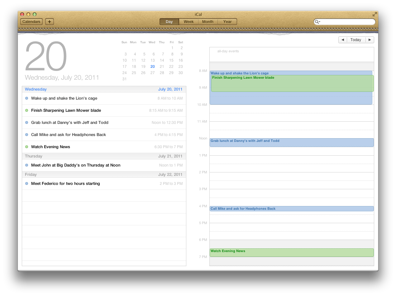
Onto the features, iCal has a couple new additions that I think are quite killer. The combination of the day view and mini calendar is nice on the desktop as I can see everything that’s happening today and quickly in relation to other days. Beyond the day view, the year view allows you to jump quickly throughout the twelve-months to quickly edit dentist or doctors appointments, see if a weekend is empty so you can schedule a vacation, and presents a heat map so you know which months are going to be the busiest throughout out the year. The heat map may be cool, but it’s iCal’s quick entry that could win over some fans. Many apps (such as Fantastical) have been hitting the Mac App Store with the ability to enter sentences like, “Meet John at Big Daddy’s on Thursday at Noon”. Regular phrases work okay; iCal is able to pick up the date and start time, but has trouble determining how many hours or the location I’m supposed to meet at. If I say, “Meet Federico downtown at The Pelican for two hours starting at Noon on Friday”, iCal will schedule the appointment for Friday at Noon, but only set it for one hour. The entire phrase is used as the event title, which will be shortened once the event is committed. Since this is done, I’m surprised the entire search query wasn’t added as a note so I could better reference the query to make final adjustments.

The Address Book can be thought of primarily as a social update. The biggest changes aren’t limited to starting FaceTime or iChat conversations as there’s also a new Twitter field that can be added to the Address Book (simply look in the Card menu and select Add Field). That’s important since Twitter integration will be happening soon in iOS 5, but the implementation is odd since users are more likely to find Facebook and AIM options for the user name field, being led to believe Twitter is absent. Adding fields to the Address Book in general feels rather hidden, although these abilities could sooner or later be found through the help menu. Contact photos can be pulled in from iPhoto if desired, and there’s a single pane view for individual contacts that can be scrolled through using the forward and back buttons that’s not bad. I’m really not a fan of Address Book’s particular style, but there is one very cool animation. If you click the red bookmark, the page will flip revealing contact groups — I find the page flip amusing to watch.
Present in the Lion, iChat has a unified buddy list that combines all of your contacts in the sidebar. Even more seamlessly, contacts that exist across multiple services will only show up once to avoid duplication. Your status is also unified across all of the services, bringing together one interface that branches out to all of your messaging networks. Perhaps the bigger change is that iChat will support service plug-ins, allowing users to add new instant messaging services.
Front Row is no more as of Lion. Apple has axed the feature completely, but has left the DVD Player so you can still pop in those old MTV Unplugged concerts. I imagine this decision was reached for a couple of reasons. One is that Apple believes their future is with the cloud, and removing Front Row is the first step towards distancing themselves from optical media. Another has to do with the Apple TV. Apple may call it a hobby, but the Apple TV is essentially ‘Front Row in a box’, giving you the television experience you want for $99 without having to connect your Mac to a television. The combination of the latter has led to Front Row’s demise, but fortunately there are plenty of third party alternatives to fill this gap if an interface like this is desired.
Full-screen
Lion goes beyond (randomly) maximizing apps with the green zoom button by introducing a true full-screen mode for applications. Not every app will take of advantage of it (e.g. Twitter for Mac), but applications like Safari, Mail, iCal, and iPhoto can fill the screen with all of their beautiful pixels to provide a richer and more fulfilling experience. Full-screen applications exist outside of your desktop (I think of them as existing entirely in their own desktop space), and can be swiped onto or off the screen with a simple three finger flick.
What’s the appeal you might ask? It depends on what you’re trying to achieve. A full-screen Safari browser won’t make sense on a 27” iMac, but a full-screen app like OmniPlan 2.0 or Mail will provide ample room to tackle a project without feeling cramped. Apps like iPhoto turn your monitor into a digital picture frame (and alternatively a beautiful canvas for editing). The possibilities aren’t fully realized yet, but I find full-screen apps useful for those brief moments of focus when I want to be presented with all the details with little distraction — Mail in particular is something I’ll keep full-screen as I process my inbox. Full-screen apps will be more appealing on smaller displays, but even the largest monitors will find uses with professional or industry leading software.
Multi-paw
When Steve Jobs described the virtuous circle between the Mac, iPhone, and iPad during 2010’s ‘Back to the Mac’ event, Apple made it clear that the innovations in touch being delivered in iOS would be implemented in the new version of OS X. This was made even more obvious with the commencement of the iOS 5 developer beta in June; the concepts of pushing content and using gestures to interact with multiple applications would find plenty of new uses with Lion and the Multi-Touch trackpad. In combination with Mission Control, Spaces, and the Launchpad, gestures in Lion transform a traditional operating system into something that truly feels alive underneath your fingertips. Overall, the implementation of gestures in Lion is its most important feature that defines the end user experience.
That concept of pushing content — of using your fingers to directly interact with the virtual material presented on your display — is boldly evident with the inclusion of natural scrolling (what we’ve come to know as reverse scrolling). Years of habit, muscle memory, and visible scrollbars have taught us that in order to scroll the page up, we’ve had to swipe down and vice-versa. For years, the association of manipulating web pages and documents has been that scrolling matches the direction of the scroll bar. Yet, intuitively our habits change when we physically interact with content on our iPads and iPhones. Instead of scrolling content we push content across the displays without a second thought. Only when we return to our desktops do our fingers move in the opposite direction. I blame the scrollbar.

By removing the omnipresent scrollbar in Lion, Apple is able to implement natural scrolling by default. There is a mental switch that has to take place, and an adjustment period if you decide to leave natural scrolling enabled in the System Preferences. After all, we’re accustomed to following that scrollbar up and down the page as we navigate our favorite websites. But with the scrollbar gone, there’s nothing but you and the content. When you decide that pushing up really means up, and pushing down really means moving the page down. Maybe the developers who brought this feature into Lion had a bright idea. Has what we think of being normal actually been reversed all along? It makes sense that MacStories would be pushed up the screen as I drag two fingers up on my Magic Trackpad. Natural scrolling also takes precedence with left and right movements: left actually means pushing content left. The differentiation is you’re manipulating content, and not the view.
Natural scrolling in Lion is as natural as scrolling in iOS. While you’re not forced to live with Apple’s default, it’s the most interesting glimpse into how the brains behind Lion think about interacting with their display. I have no intent to defend this logic or label it as ‘better’, and nor do I believe Apple is forcing you to adjust to this way of thinking. (No scrolling is required to disable this default). It’s clearly a very careful implementation designed to make the behaviors between OS X and iOS congruent. The idea of reverse scrolling is a major shift in thinking: you’re manipulating the article and not the frame it’s presented in. Maybe Apple had other motives, but I’d like to think my explanation at least partly describes the why in this decision.

Beyond scrolling, all of the gestures we are familiar with on the iPhone and iPad have been translated to Lion. Web pages with small text can be pinched to enlarge or shrink paragraphs. Pictures come alive as two fingers rotate photographs from landscape to portrait orientations. Even the perfect double-tap gesture is implemented in Safari, bringing articles into view. The gestures you expect to work on iOS translate effortlessly to Lion.
While iOS 5 won’t arrive until this Fall, Lion is already mirroring many of the gestures that will be available to the iPad. New four finger gestures in iOS 5 replace interaction with the home button and introduce a new concept for multitasking (this is all on Apple’s website by the way). As apps are only presented in full-screen on iOS devices, switching between them involves either opening the app from your Home screen, or resuming the app in the multitasking bar. A four finger swipe left or right will allow you to page through open apps on the iPad, effectively removing the need to visit the multitasking bar if you want to quickly switch to an adjacent app. A four finger gesture up will reveal the multitasking tray, and a four finger pinch will close the app to the desktop. If you haven’t already guessed, these gestures directly correlate with switching between desktop spaces and full-screen apps on Lion, activating Mission Control, and launching applications via Launchpad; the ‘baby’ features in iOS 5 are paired with their grown up counterparts in Lion.
You already know that full-screen apps in Lion are removed from the current desktop as they inhabit their own space, but you’re not stuck in that full-screen mode, nor do you have to visit the menubar to minimize the app. My workflow often consists of having Mail full-screen while I bounce between a text editor and web browser, thus I simply flick between my email and desktop with a simple three finger gesture left or right. The feeling of moving between desktops and full-screen apps is fluid and natural, with the momentum of the switch only dictated by how fast you brush your fingers across the Multi-Touch trackpad.
A three finger gesture up on the trackpad brings all of your open windows and desktops into view with Mission Control, Lion’s version of iOS’ multitasking bar. Again, I can’t emphasize how smoothly the animations are executed in coordination with your fingers. A simple three finger stroke down on the trackpad dismisses Mission Control, and your current desktop and windows are returned to their original positions. While it’s not enabled by default, a three finger gesture down from the desktop can also activate App Exposé, which enables you to quickly group and preview all of the windows for the application you’re working in. It can be useful for finding a lost Pages document or Safari window when things start to get messy.
Admittedly, there is at least one animation I don’t particularly care for. I don’t like how folders and files on your desktop fade into view as you scrub between desktops. There is no fade out animation as you leave the current desktop, and it simply feels like an unnecessary animation. If you have a desktop cluttered with temporary files, this could potentially drive you crazy.
While Launchpad resides in your dock next to the Finder for easy one-click access to all of your apps, a four finger pinch out simulates returning to your Home screen on iOS. Launchpad flies into view as the desktop fades out, and you can dismiss Launchpad with a four finger pinch in the opposite direction. The consistency between iOS 5 and Lion is stunning. This gesture does have one additional trick up its sleeve on Lion: a four finger pinch out from the desktop scatters your windows to the edges of your display, revealing your desktop and hiding your open documents from nosey coworkers.
To appreciate the elegance of how gestures are implemented in Lion, you only have to look as far as iOS to see how the two tango. Lion’s newest and most important features are connected by your hardware — by the trackpad underneath your fingers to make the experience unlike any previous OS X release. Gestures are the defining feature of Lion, and are of great importance in shaping the future of OS X. Newcomers can learn the gestures in a matter of minutes, and those already familiar with iOS will feel the connections immediately. The best part about gestures in Lion is that they aren’t just easy to use, but they’re cheerfully addictive.
Launchpad

As the most fascinating addition to OS X, Launchpad has been a main topic of discussion when the tech community talks about how OS X and iOS are eventually going to converge. Launchpad is iOS’ Home screen brought to the Mac, and when it was first previewed it appeared as if the bolt-on would only appeal to consumers who are unfamiliar with the filesystem. I don’t think of Launchpad as a dumbing down, but rather as an improvement to a system that was previously broken. I think I’ve opened enough Disk Images to comfortably say the previous process of installing and finding apps is unnecessarily arduous. So much that I came to love productivity tools like Quicksilver as it was introduced to me in the April 2009 issue of Mac|Life magazine.
Launchpad is going to be a very personal feature in Lion — as personal as your dock. It’s something that users are going to immediately reject, or try and realize that it’s actually pretty great. While I’ve kept an Applications folder as a list in my dock, I generally prefer to use an application launcher such as Quicksilver (and more recently LaunchBar) in my workflow to supplant the Finder where possible. I’m not exactly the candidate spokesperson to talk to if you’re interested in clicking on icons.

I expected to be disappointed by the Launchpad, but I’ve come to really enjoy it. It’s the simple things really — I don’t have to hunt for apps, and the Utilities folder was put right in front of my face with a four-finger pinch. That’s a pretty big deal since I don’t like to keep lots of items in my dock, and navigating folders is finicky with launchers. The Launchpad is pleasant to use, and it provides an instant overview of applications without having to scroll through the Finder or my dock list.
The Launchpad has excellent intentions in combination with the Mac App Store. Mac users don’t have to click through a laborious installation process, nor are they left deciding which Application folder apps should be dragged into. The Launchpad takes care of this by mediating the installation and placement of your apps for you, and it presents a friendly interface that anybody can grasp. I don’t know of too many people who don’t like organizing their apps and customizing their iOS Home screens — the Launchpad presents a way of accessing your programs that’s just as painless and fun on the Mac.
That’s not to say Launchpad doesn’t have problems. Functionally, Launchpad works and acts as it should as a launcher, but aesthetically it can be silly on bigger displays. The Launchpad works really well on my 13” MacBook where screen estate is limited (and the icons remain small on a 1280 x 800 resolution display), but it’s annoying to look at on my 1920 x 1080 external monitor. The icons are much too big to be pleasing to the eye, and I do think Apple tries too hard to fill up the display. It’s certainly a magnificent display of OS X’s ability to scale images, but I resize my dock and Finder icons for a reason. The turnoff of Launchpad isn’t what it does, but how it looks.
On Macs with larger displays, I think Apple could keep the icons at a reasonable size; centering the Launchpad’s Home screens would be much less intrusive even with more whitespace.
Mirroring iOS, Launchpad also allows you to rearrange applications and delete them by tapping (or clicking) and holding down on an icon. While you don’t have to wait for the wiggle to move an app to a new location, you will have to wait for it to delete an app. That is unless you press the option key, which instantly activates the app-dance. You’re able to delete apps added to Lion from the Mac App Store in Launchpad, but apps installed from external sources will remain locked. This doesn’t make sense to me though, especially since end users will either be confused that they can’t delete an app, or they’ll go in the Finder and drag the app icon into the trash anyway. I understand the purpose of disallowing this: it’s a catch-all since products like Microsoft Office and Adobe’s Creative Suite will have their own uninstaller and shouldn’t be moved to the trash. It’s too soon, but Apple will eventually set a precedent that says apps on Lion can only come through the Mac App Store. Launchpad is just part of the first steps toward that goal.
Mission Control
Mission Control is a fundamental rethinking of Exposé and Spaces, which were introduced in earlier versions of OS X. Exposé is turning eleven this year, having made its first appearance in OS X Panther (10.3) which debuted in October of 2003. The window manager was so important to OS X that it eventually adopted its own dedicated key; Apple dropped the Apple logo from the Command key and tied the function keys to various controls for OS X . While Exposé could be initiated with the F9, F10, or F11 keys, Exposé found its place with the familiar icon on the F3 key we have today. The hardware changes coincided with the launch of Leopard in October of 2007, where ‘Exposé & Spaces’ decidedly replaced ‘Exposé & Dashboard’ in the System Preferences. Since OS X Leopard (10.5), Spaces and Exposé have worked in tandem to create stunning opportunities for unique workflows based on a user’s desired needs. With the introduction of Mission Control in Lion, Exposé’s functionality is virtually unchanged — the keyboard shortcuts (with the control key) you’re familiar with for exposing all windows, application windows, and the desktop remain.
It’s Spaces, however, that has been superseded by Mission Control in Lion. While Spaces was a key component of OS X Leopard, Spaces was disabled by default; it’s possible that customers never explored this additional feature to its fullest extent. Spaces in Leopard and Snow Leopard enabled end users to create a grid of virtual desktops that you could move between; incredible workflows could be accomplished thanks to the amount of control and interactivity that was given. Spaces could be interacted with in a number of ways, and was flexible in that end users could adopt spaces through hot corners, by dragging application windows to the edge of the desktop to move it to the adjacent space, or by activating Spaces and dragging the application window into one of sixteen possible desktops (the amount configurable in the System Preferences). Spaces themselves could be rearranged, and Exposé could be activated in the Spaces overview, providing the ability to preview all open application windows in each Space, and rearrange them at will.
While Spaces was generally simple to use in practice, it was considerably complex as a whole thanks in part to the numerous ways you could interact with all of your virtual desktops. Spaces was a healthy piece of meat in OS X Leopard and Snow Leopard, but left a lot of fat that has been substantially trimmed down in OS X Lion.
Mission Control removes much of the advanced functionality associated with Spaces, while retaining core concepts such as having multiple virtual desktops and organizing your apps by dragging application windows between the desktop spaces. To the dismay of some, the similarities end there.
")
Purposing Mission Control as ‘Spaces for everybody’, Mission Control does away with the nuances of Spaces in order to develop similarities with iOS 5 while attempting to unify it with Exposé and full-screen apps through one fluid gesture. A simple swipe zooms out your current Desktop into a thumbnail view of the dashboard and open desktop spaces as an Exposé view of your open applications flies open underneath. Here, you can manipulate your OS X environment to your heart’s content as you interact with open applications; drag apps into desktop spaces by dragging windows to your desired location; create new desktop spaces for apps by revealing the (+) tab in the upper right corner; and jump to your desired workspace with a simple click. With full-screen apps being displayed inline with desktop spaces as they were created, Apple has effectively streamlined the gridlock of Spaces into a flowing stream of apps that’s strictly managed by the operating system.
Conceptually, Mission Control is a novel idea that can solve a lot of the excess associated with the original implementation of Spaces. With Spaces, you had to configure the number of desktop spaces you wanted, how they were oriented vertically and horizontally, what hot corner (if any) Spaces was assigned to, and then you were left tweaking your implementation as you discovered the mess of spaces you’ve created was too much or too little. While Spaces appealed to my inner OCD child, its implementation in Leopard felt oddly foreign and tacked on. I’ll hedge my bets that the dizzying array of options likely only appeals to power-users who want granular control over their workspace. Mission Control is seemingly the exact opposite of Spaces, being an active feature that attempts to remove any barriers of entry. There is no setup as desktop spaces are created only as you need them. The only main interaction relevant to casual use would be dragging windows to a new space from the Exposé view. While Mission Control has its fair share of odd modifiers that aren’t entirely intuitive, Mission Control is easier to approach and feels connected to Lion unlike Spaces in Leopard. Instead of just being an overlay that throws everything at you, the approach of Mission Control gives it the opportunity to introduce the end user in working with multiple desktops at their own pace.
Structured to provide casual users confidence when lost in a sea of open windows, Mission Control will feel a bit stiff and immovable for previous Spaces users. Interactions that were commonplace — that would feel intuitive and natural — either aren’t allowed or are hidden via a modifier key. Users new to Mission Control won’t notice omissions that are obvious to me, and Apple’s decision to restrain interactions between desktop spaces provides clear direction on how this principle of multitasking works.

Touted as a command center for your Mac, the promised “bird’s-eye” view realistically only gives you detailed information on the current desktop space you want to manage, and not everything on the system. Exposé doesn’t extend to desktop thumbnails, which means you’ll have to swipe to that Space in Mission Control or option-click to magnify its contained applications. Exposé will allow you to peek at your application groups with a two finger gesture up, allowing you to magnify a group of windows so you can select which one you’d like to choose. Unfortunately, peeking doesn’t bring any specific app windows in a group forward for a better preview. Spaces savants will want to pull and push apps between desktops in the thumbnail view, but alas this isn’t possible. You may only interact with Exposé, and push windows to other desktops as you see fit. The thumbnails are entirely static, so much so that you can’t rearrange desktop spaces. Lion keeps your ‘true home’ desktop to the far left, keeping previous or oft-used apps and spaces to the right.
This ‘true home’ is important for a couple of reasons, and ties together the full-screen applications launched and additional desktop spaces spawned by the user. Firstly, your home space determines the default background for other Spaces on the system. Changing the desktop picture in additional spaces only affects that space, allowing you to differentiate or customize your desktop spaces as needed. Secondly, the home space becomes the eventual container for all apps running on the system. If you have multiple apps open in other spaces, and you decide to close them all, Lion won’t lose (or quit) the apps in that space. Instead, apps are moved back home. Home is the space you’ll likely start from as you log on to your Mac, and additional workflows will build on top of this.

While Mission Control is rigid, you can make some minor adjustments by visiting Mission Control in the System Preferences. (Holding down the option key while pressing F3 or F4 provides a quick shortcut for opening Mission Control’s preferences). Essentially reduced to three basic options, Lion offers some granular controls strictly revolving around the new Spaces implementation. Removing the Dashboard as a Space means pressing the Dashboard key will reveal its widgets on top of the current space you’re working with, just as in Leopard and Snow Leopard. Disabling the option to automatically arrange spaces based on most recent use essentially forces full-screen apps to the far right, even as you add new desktop spaces. Lion won’t try to guess what Spaces you use the most, which I prefer. The switching option will affect command-tab users: if you attempt to switch to an app that’s residing on a different desktop, Lion won’t switch to that space. Only the menubar will change indicating that you’ve switched to the app within your current desktop. Adjusting keyboard shortcuts in this pane is self explanatory, but Apple has surprisingly kept Hot Corners around for this release. I use Hot Corners constantly in Snow Leopard to activate Spaces and Exposé, and while I won’t need to use them when I have my Magic Trackpad since gestures are so integrated, they’ll be useful when I’m on the road since my 2008 MacBook’s trackpad isn’t multi-touch enabled.
Mission Control is effective in that you can push apps out of your way — clutter is removed when present, and open applications aren’t meant to be truly managed in a way that made Spaces sometimes feel distant from OS X. Instead of being an organizer, Mission Control simply extends your desk space when you run out of room. It’s a simpler implementation, but one that’s ultimately better suited for the environment OS X dictates as a big brother to iOS.
Via the Magic Mouse and Multi-touchless Macs
Lion is very much built for Multi-Touch trackpads, and I stated on Twitter that a Magic Trackpad would be required to get the most out of Lion. That’s a fairly subjective statement — obviously there will be many people who prefer the Magic Mouse to the Magic Trackpad. I’ll have to eat crow here, as using the Magic Mouse is very acceptable in Lion. Apple has done a good job of translating the most important gestures to a limiting surface.
The Magic Mouse is initially pretty similar to the Multi-Touch trackpad, sans pinch-to-zoom. Scrolling is natural, you can double tap on text to zoom in in Safari, and you can right-click on the right corner of the mouse. It’s the least you’d expect the Magic Mouse to do.

Gestures are put into practice very nicely. Activating Mission Control requires a two finger double-tap, which goes against the norm but feels practical on a mouse. A two-finger swipe (instead of three) will fling you between your various desktop spaces. As you can’t have a two finger swipe for both Safari and Mission Control, the next step down is a single swipe for navigating between pages in Safari. A one finger swipe is used to navigate the Launchpad as well, for which there is no activating gesture. The Magic Mouse also doesn’t have a gesture to reveal the desktop, but this is where Hot Corners can come in handy. I’ve dedicated that action to the top-right corner (out of sheer habit). The Magic Mouse is a-okay for Lion.
It’s possible that you have a MacBook that doesn’t have a Multi-Touch trackpad, in which-case you can’t take advantage of a majority of the gestures available in Lion. The saving grace is that the F3 key is your ticket to backwards compatibility as Expose and Spaces are “combined” in Mission Control. You’ll be dependent on Hot Corners, as not even a two-finger swipe will take you between desktop spaces. With limited functionality in mind, I find it bizarre that a two-finger swipe can navigate pages in Launchpad, but won’t navigate pages in Safari. But it’s the same gesture! That would be my only complaint, which I feel is reasonable since a two-finger swipe is certainly possible (currently a two-finger swipe scrolls the page horizontally).
Dual Monitor Workflow
Does Lion play nice between your MacBook and Cinema Display? Reasonably yes, but the implementation of Mission Control doesn’t feel as nice across multiple monitors. Let’s examine what Apple has changed.
When you connected your display in the past, you’d plug in your external monitor to your (variant of) DVI or DisplayPort, make a few adjustments such as dragging the menubar to the big display in your System Preferences, and call it day. With the MacBook lid open, I could keep it disconnected from AC power so I could cycle the battery as needed.
To enter closed display (closed clamshell) mode, you’d be forced to connect to AC power, and shut the lid of the MacBook. What would essentially happen is that you put the MacBook to sleep, and you’d have to press a button on your bluetooth keyboard or click the mouse to wake the MacBook back up onto the secondary display. You’d hear the optical bay rev, the white light would fade, and Leopard appear after the second or two of waiting.
In Lion, closing the lid won’t put your MacBook to sleep. Instead, there will be a moment where the secondary display will go blank, and Lion will automatically take care of the transition for you. A second or two after you close the MacBook, Lion appears without the noise or wait of the optical bay.
Back in Leopard, you could then open the lid to the MacBook without transitioning out of closed display mode. The benefit was a neat trick: you could unplug AC power from your MacBook and it wouldn’t go to sleep. This would be a good time to interject a reminder that my MacBook is an Early 2008 model — I’m not sure if you could pull that off with a newer model, but I assume you could. Apple claimed that the MacBook’s display would remain inactive until you disconnected the display cable from the MacBook, which was true.
This has changed in Lion. Opening the MacBook’s lid will reactivate its display, and Lion will automatically initiate that transition for you. Thus, Apple has also countered (perhaps fixed is the right word) my ability to run the MacBook in closed lid mode off of battery power. It’s nothing to complain about as Lion takes care of what used to be annoying or tedious workarounds. Apple has only automated how Lion connects to a second display with this release.
On the software front, everything is mostly the same between Snow Leopard and Lion. Hot Corners are spread between the farthest corners of either display, and moving between “spaces” still isn’t terribly friendly. I never felt that Apple got Spaces right with multiple displays, and I feel the same way about Mission Control. What Lion does is it runs its own instance of Mission Control on each monitor — you don’t have a combined view that I’d like to see on the main display (which in my case was assigned to the external monitor). You’re also limited in that you can’t push an app from the Exposé view on your MacBook to a desktop space on your external monitor (or vice versa); you utlimately are forced to take an extra step to move applications between monitors before or after pushing the app to its new desktop Space in Exposé if you want to move apps between displays. The tradeoff is that while Mission Control isn’t as visually clunky, the interactions you could make with Spaces are no longer present.
Lion: iOS Inspiration with Continuing Desktop Ambition
When I look at search tokens and Quick Look in Spotlight, these things don’t ring ‘iOS’ to me. It’s not that it’s the complete opposite of iOS, but clearly there’s a divide between a mobile and desktop operating system, and what you can do with those platforms and devices. Lion was clearly built for both a keyboard and trackpad, and utilizes these tools wherever possible. Just like previous versions of OS X, you’re not limited in personalizing your experience. When I look at Mission Control and App Exposé, I wonder if we’ll ever see something that’s as involved on iOS.
There is lots of familiarity between OS X and iOS, but that doesn’t mean these things are on collision course. Instead, the improvements to the user experience can simply be attributed to this: the ability to transition between the iPad and the Mac without thinking about how you interact with these devices is key. There’s a convergence in behaviors, but not with what OS X can do. Lion is much stronger than previous iterations of OS X and finally ties all of the ideas Apple has had about desktop interfaces into once nice package.
Everything Lion does gives us some clues about how Apple thinks about the future. That OS X is a separate thing that’s really powerful, and that there’s room to fix broken procedures for casual and power users alike. Choice isn’t eliminated — workflows can still be customized to a great extent — but Apple seeks to define certainty. The future of information is on the Internet as is evident by the release of Lion on the Mac App Store. The process of installing apps is broken, of which the Launchpad is Apple’s first serious attempt to fix this. On the surface Lion should be intuitive and friendly to touch, which is why Apple implemented gestures and streamlined actions to be taken with file conflicts when we drag and drop. Yet for those who need more, we can still access the Library, tweak preference files, move our docks, and perform speedy searches in the Finder and Mail. Lion is very clever about mediating the needs of everyone with the needs of the few.
Lion is an evolution of OS X that’s instantly familiar to anyone coming from a previous version. It’s also well designed to be easy to learn for someone who’s never picked up a Mac before. Some would argue you’d have to change everything and rewrite the books to be innovative, which is where I disagree. There’s real innovation happening under the hood of Lion. When things I took for granted are improved upon and made even easier, that’s when you know something is innovative.
Lion isn’t a glamorous iOS. It’s not any less capable than its predecessors, nor is it relying on user familiarity with the iPad and iPhone as a crutch for smooth operation. Innovation comes full circle. Apple weaved our working knowledge of gestures and interfaces into the Mac to capitalize on our intuition. For everyone, Lion is a better OS X.