Posts tagged with "iOS"

Dropbox Releases Completely Redesigned iOS App

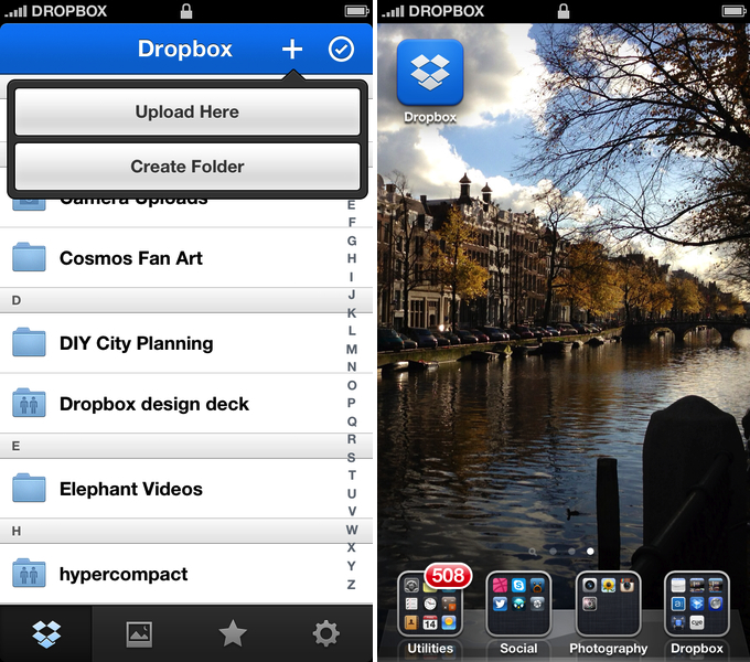
Dropbox has today launched a major new version of its iOS app, featuring a new UI design, new upload features, and an updated photo experience.

As detailed in a blog post by the company, the new Dropbox aims at simplifying the user interface with “flattened out” colors, simpler lines, and less visual complexity. For instance, the new tab bar of the app doesn’t come with text labels, using only icons to indicate folders, Photos, Favorites, and Settings. In a way, the Dropbox redesign is somewhat reminiscent of the latest Rdio update for iOS, also focused on flat colors and an overall simplification of graphical elements.

The new Dropbox changes the upload system as well. In the previous version, there was an Uploads section to upload items from the iOS Camera Roll to a specific folder; users needed to specify the folder before starting the upload process. In Dropbox 2.0, every folder – including the main Dropbox one – has got a “+” button in the upper toolbar with two options: “Upload Here” and “Create New Folder”. I look forward to trying this feature in particular as I use the Dropbox app to upload photos on a daily basis to different folders; I don’t know whether an upload button dependent on the folder you’re currently viewing will eventually make me save taps, or require more navigation around folders.

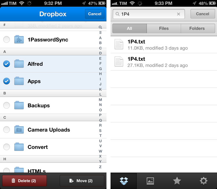
Photos are also part of my Dropbox workflow, and the new app introduces a new browsing experience for them. According to Dropbox “all of your photos” including those you have “uploaded from other devices” will be available in the new Photos tab. This view comes with a grid interface to browse photos from newest to oldest. Interestingly, sharing options for photos now include separate entries for “Post on Facebook” and “Facebook Message”. The Photos view retains the Camera Uploads functionality of the previous version (though personally I use CameraSync for this, a third-party app that offers more settings for Dropbox photo uploads).

The new Dropbox app is available on the App Store.

Update: Based on my first tests, it appears only photos uploaded with the app’s Camera Uploads feature are recognized in the Photos tab; it doesn’t seem like the app is recognizing photos I uploaded with third-party apps like CameraSync. Too, like in the previous version of the app, you can’t star folders.

More screenshots below.


“This Won’t Happen On iOS”

“This Won’t Happen On iOS”

I found myself nodding in agreement with Jason Snell’s latest piece for Macworld:

That’s why I’m optimistic that the dismissal of Forstall to tend his garden might be just the shake-up that iOS needs. In the operating system’s nearly six years of existence, Apple hasn’t really rethought any of iOS’s major features. We’ve seen the continual addition of new features, but very little has disappeared to be replaced by something utterly new. iOS is pretty good, but that stasis is odd, and perhaps even a little self-delusional on Apple’s part: Nothing is inviolably perfect, especially on the first try.

For me, there are two sides to this argument. I have been advocating iOS, and especially the iPad, as a platform capable of doing tasks previously exclusive to “real computers”. At the same time, I’ve also been trying to focus on how “regular people” could benefit from using apps that we thought were only “for geeks”. Maybe not Pythonista or another scripting app, but definitely – just to name two examples – apps like 1Password or Launch Center Pro.

And yet, the single reply I get the most every day is that “this won’t happen on iOS”. Some people seem to think that just because Apple was successful in reinventing the mobile OS five years ago, then they’ll have to stick to that model forever. That they’ll have to keep the Mail app as it is, that they’ll avoid considering more “power user features”, and that trying to make technology work for everyone – from grandparents to nerds – is wrong.

I disagree with the notion that the philosophy of iOS is set in stone. If there’s anything great about software, is that it can be changed. Sometimes it’s a huge undertaking, but it can happen.

I’m not saying change is always good – because I don’t know. But like Jason says, being static and complacent isn’t good either: the market is changing, people change their habits and needs. Eventually, change is not only good, but necessary.

And if Apple didn’t believe this too, we’d all be using a stylus today.

Permalink


Audiobus Inter-App Communication On iOS

Audiobus Inter-App Communication On iOS


I’ve been on a personal “quest” to find examples of iOS inter-app communication. I’ve set up workflows with Pythonista and the apps I use, and I’ve searched for apps that have implemented x-callback-url in meaningful ways. I believe Apple will eventually have to address the need of letting iOS apps better communicate with each other with something more powerful than an Open In... menu.

Today I was sent a link to Audiobus. The developers call it an “inter-app audio routing system” – a way to bring music apps together to avoid sending files back and forth between different apps. It is, essentially, a way to record on an iPhone an iPad using the capabilities of multiple apps at once: with a system based on inputs, outputs, and effects, Audiobus routes audio through specific apps and keeps playing audio from different apps in the background. The videos are really the best way to understand the whole concept behind this solution, as it doesn’t look like anything that has been done on iOS before.

I would love to know the technical details behind this. From what I can gather, Audiobus provides an SDK that developers can use to register their apps as input and output sources, or effects. Once registered, Audiobus creates a “workflow” for these apps and displays a “panel” at the side of an iPhone or iPad, showing the apps that are playing in a single session. I don’t think there’s a time limit on background audio, and it appears the side-panel is also capable of stopping audio from specific apps and switching back to them.

I am intrigued by the possibilities offered by a third-party SDK for better iOS inter-app communication: right now, Audiobus already works with apps like Rebirth for iPad, Loopy HD, SoundPrism Pro, and MultiTrack DAW, and more developers will join the program soon. I’m not sure how the panel concept would translate to tasks that don’t involve audio; however, imagine, say, being able to copy a URL from your browser into your text editor without switching back and forth between them. Or getting a file from the Dropbox app embedded into a Pages document without a tedious variety of multitasking gestures and Copy & Paste menus.

Check out Audiobus here.

Permalink

iPhone Settings Mind Map

iPhone Settings Mind Map

Timotheus Wischniowski went through the effort of putting together a mind map of iPhone 5 settings on iOS 6.0.1. Using OmniOutliner and MindNode Pro, he collected every single menu of the iOS Settings app, with sub-menus, options, and switches.

I made an outline which contains all iPhone 5 iOS 6.0.1 settings from the iPhone itself and from the preinstalled apps. I did this with the iPhone setup with English as the OS language and German for time formats and so on. I tried to write everything down, but I couldn’t write down some things, like Japanese characters and such. So the mind-map competition should be about 98 % or more.

As I scrolled Timotheus’ image, I remembered this post by David Lanham from 2010 on redesigning Twitterrific, including its Settings:

The previous design ended up being overwhelming for normal users (and even some experienced ones) and became very confusing for people with multiple accounts since it was unclear which account was performing a search or looking at trending topics. There were also three different areas to set preferences and many of the options in the preferences were unnecessary and confusing to most users so they were avoided or left to defaults anyhow. So we took a leap and removed the preferences completely, only adding them back in when we found something that absolutely needed it.

I do have to admit sometimes I “get lost” in the iOS Settings app. I’m not sure there’s a need for a complete redesign – after all, there are options users have to set on an operating system – but I wonder if Apple could make browsing Settings easier, more “compact”, with less choices in the future.

Permalink

Pages For iOS and Change Tracking

Pages For iOS and Change Tracking

Yesterday, Apple released an update for iWork on iOS that added, among changes to Numbers and Keynote, support for change tracking in Pages. I’m not a frequent user of this particular feature, but it could have come in handy when we edited my Mountain Lion review earlier this year. However, last night I noted how the way Apple implemented Change Tracking on iOS felt outdated and convoluted.

Jeff Richardson does use Pages on a regular basis and posted his thoughts on the new version (via David Sparks):

Track changes support has long been the Holy Grail for many litigators using an iPad or iPhone. For the most part, I really like the way that Apple implemented this feature in the latest version of Pages. I wish that the update included a better way to review each edit, but for the most part I suspect that I’ll just scroll through a document and look at the redline edits in the context of the document as a whole so this omission is not critical for me. The lack of support for Comments will sometimes be a problem (depending upon how often you work with people who use that feature), but as long as you know about it and have an app like Documents to Go, Office2 or Quickoffice Pro, you can work around the Comments omission when it becomes an issue.

I can see how lack of Comments and Review mode can be an issue for some users. Mostly though, I believe that the interaction of Change Tracking needs to be redesigned entirely. On Pages for Mac, you can simply click on a change to review it and accept it from a sidebar on the left; in fact, if you click on the blue boxes in the sidebar you can see the blue line connecting the change to the actual text being highlighted in real time. It’s a subtle visual hint, but it’s there.

I’m not sure why Apple decided to go with this simpler interface rather than cooking up a completely new one, but I have a couple of theories. My first thought is that text rendering and manipulation on iOS still doesn’t allow for fairly complex on-screen drawings such as the aforementioned blue lines; a second reason may be scrolling performances, especially on older devices (Pages still supports the iPhone 3GS). But I think that, overall, Apple decided to use this approach because is consistent with the current iOS text selection and because a major new version of iWork for iOS (possibly requiring iOS 6 or later, not iOS 5.1) could be on track for next year.

Apple has long touted iOS devices as heralds of the post-PC era, but iWork has been far behind its desktop counterpart (originally launched in 2009) for months. I expect iWork 2.0 for iOS to level the field in every area.

Permalink

Improving The iOS Keyboard

Improving The iOS Keyboard

Chris Bowler, writing about possible improvements for the iOS keyboard:

The negative with writing on the iPad is typing. It’s a bit of a mixed bag experience — the iOS autocorrection is (at times) brilliant and I can fly along with confidence, knowing the OS is going to correct my typos. But when mistakes are made and are either not autocorrected, or autocorrected incorrectly, then the iPad becomes a less comfortable environment.

Remember when, ahead of the original iPad’s announcement in January 2010, rumors tended to focus on what the “tablet keyboard” would be like? Here are a few examples. In spite of the iPhone having shown that Apple simply wanted a regular keyboard’s appearance translated to multitouch, several people wondered whether Apple should do something different for the bigger screen. The answer was that they simply designed a “full-screen” keyboard.

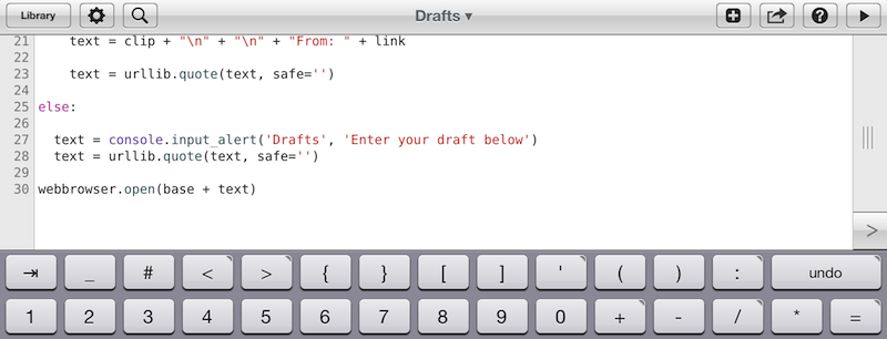
As Chris notes, over the years third-party developers have extended the iOS keyboard with additional bars. Look at Writing Kit, Pythonista, Textastic, and iA Writer for examples of these modifications.

I think the discussion on the iOS keyboard often mixes writing with editing. Personally, I believe the iOS keyboard is great for writing, because it’s just a normal keyboard, but iOS text selection is in serious need of an update, because it feels outdated. I’m not sure the average user cares about better text selection, but for the sake of the argument, I will say that a better solution should be explored.

If you read those old pre-2010 posts on the “iSlate keyboard”, you’ll notice a common thread: that Apple must build something revolutionary for text entry. I recall some people guessed a split keyboard could be a possible implementation, and, in fact, that one came true in 2011. But what about text selection? I don’t think keeping on adding bars above the keyboard is feasible. Especially on the landscape iPad, a single bar alone sensibly diminishes the space available for writing – space being one of the most commonly cited advantages of the iPad against 16:9 and 16:10 tablets. On the iPhone 5, it’s an acceptable solution thanks to the taller screen, but, then again, the bar is too narrow to be a meaningful improvement.

Rather, I would say entirely new ideas for text selection and manipulation are the future. It’s the reason everyone got excited for the Hooper Selection: once you saw it, it just made perfect sense. Too, I wouldn’t completely forget about features that Apple put on the shelf, as they tend to come back.

So here’s my hope for the future of iOS for writing: the same keyboard, but also new, fresh ideas for text selection and editing.

Permalink