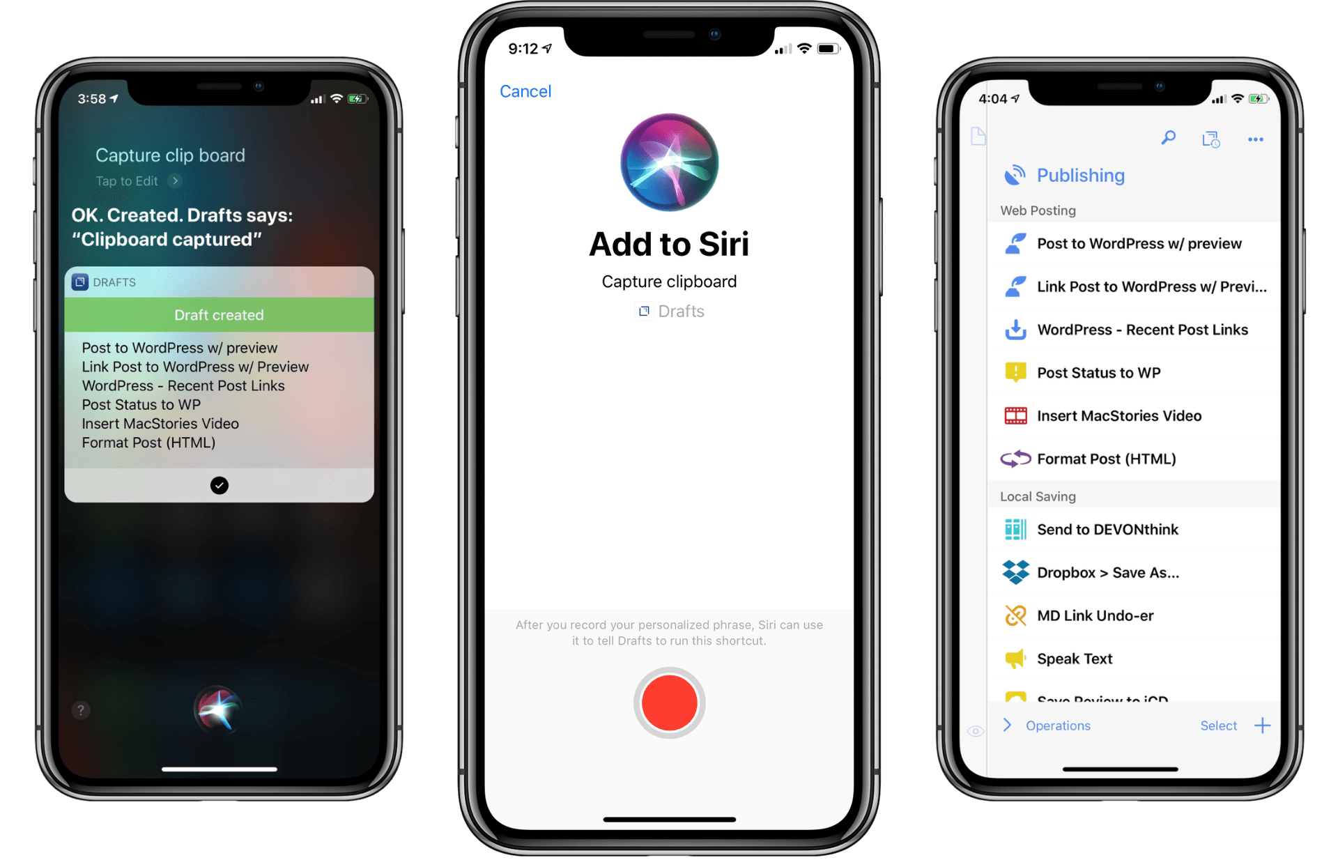
Drafts 5 was recently updated to version 5.4, which brings a host of new features. While there is support for iOS 12’s Siri shortcuts and all that they have to offer, there are also other important features that have improved the app’s capabilities significantly.
Posts tagged with "iOS"
Drafts 5.4: Siri Shortcuts, WordPress, and More
How to Trigger IFTTT Applets with iOS 12’s New Shortcuts App and Siri
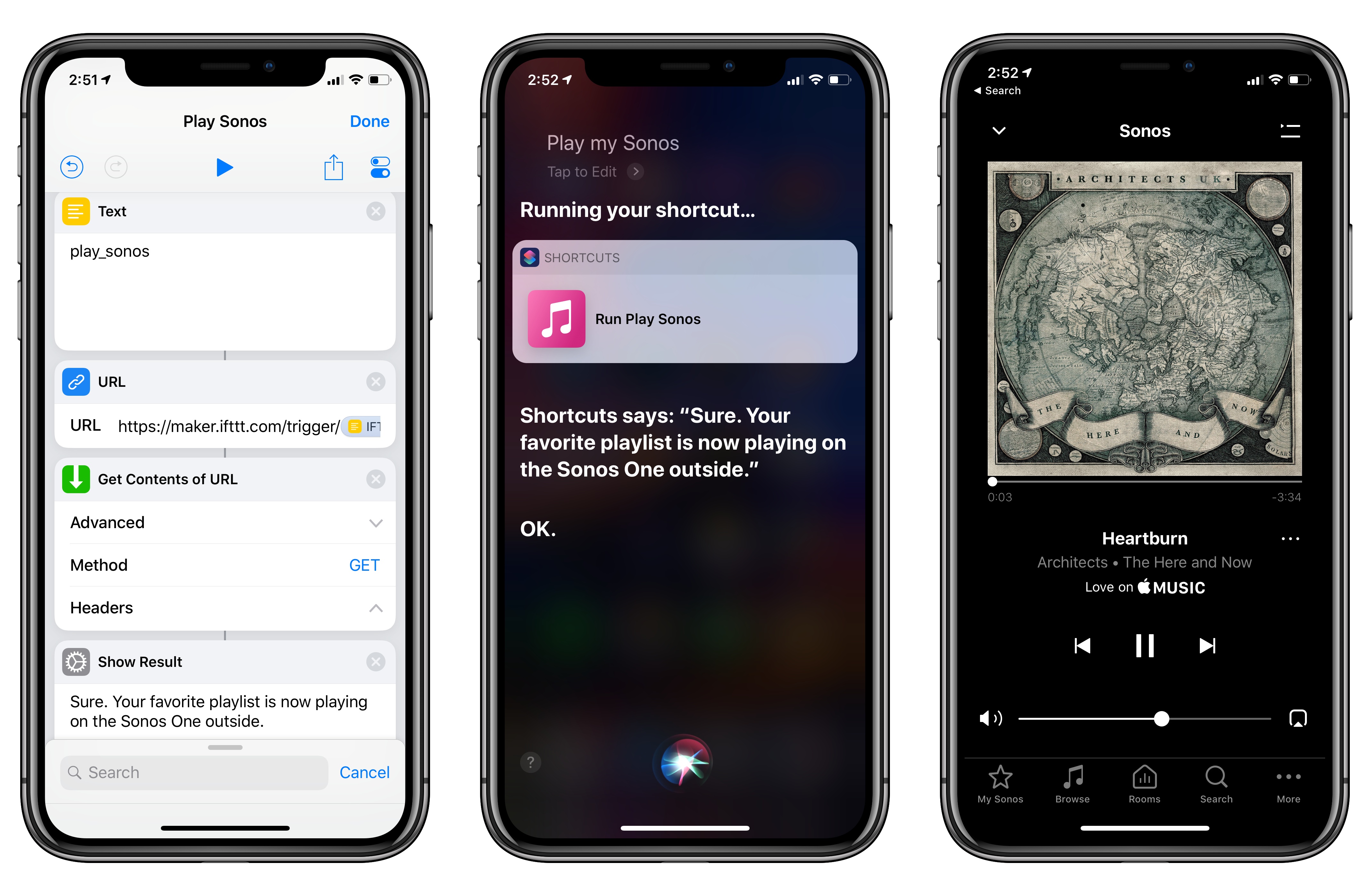
Among the actions that didn’t make the transition from Workflow to the new Shortcuts app for iOS 12, built-in support for triggering IFTTT applets (formerly known as “recipes”) is perhaps the most annoying one. With just a few taps, Workflow’s old ‘Trigger IFTTT Applet’ action allowed you to assemble workflows that combined the power of iOS integrations with IFTTT’s hundreds of supported services. The IFTTT action acted as a bridge between Workflow and services that didn’t offer native support for the app, such as Google Sheets, Spotify, and several smart home devices.
Fortunately, there’s still a way to integrate the just-released Shortcuts app with IFTTT. The method I’m going to describe below involves a bit more manual setup because it’s not as nicely integrated with Shortcuts as the old action might have been. In return however, you’ll unlock the ability to enable IFTTT triggers using Siri on your iOS devices, Apple Watch, and HomePod – something that was never possible with Workflow’s original IFTTT support. Let’s take a look.
Overcast 5: Redesigned Now Playing Screen, Search, Siri Media Shortcuts, and More
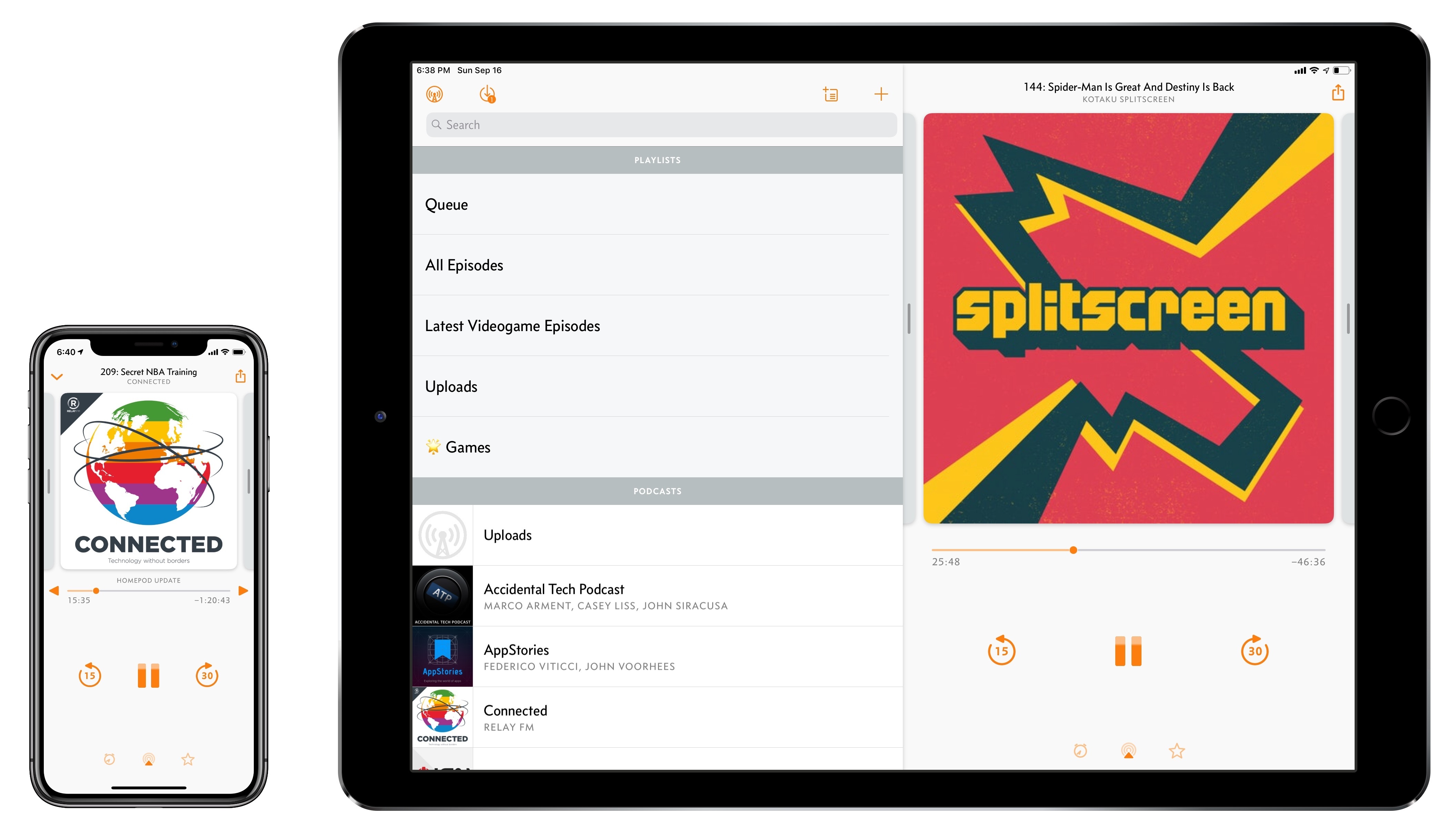
Overcast, Marco Arment’s popular podcast client for iPhone and iPad, received a major update today to version 5. While I’ve long praised Apple’s work on their built-in Podcasts app for iOS – particularly since getting three HomePods and leveraging Podcasts’ support for AirPlay 2 – I also recognize the appeal of Overcast’s advanced features and powerful audio effects. Sprinkled throughout Overcast’s release history are design details and enhancements big and small that make it a sophisticated, versatile client for podcast aficionados who don’t want to settle for a stock app. From this standpoint, despite welcome improvements to Podcasts in iOS 12, changes in Overcast 5 make it an even more attractive option that has caused me second-guess my decision to embrace Apple’s native app.
iOS 12: The MacStories Review
After years of unabated visual and functional changes, iOS 12 is Apple’s opportunity to regroup and reassess the foundation before the next big step – with one notable exception.
We left last year’s iOS 11 update with a palpable tension between two platforms.
On one hand, following a year of minor changes to the iPad and a hardware refresh that came in later than some expected, Apple once again devoted plenty of attention to reimagining the tablet’s role in the world of modern computing. iPad updates in iOS 11, despite having their fair share of critics, largely did not disappoint. On the other hand, the iPhone – by and large still Apple’s crown jewel – had to play second fiddle to a platform that was more in need of a strong, coherent message. And so despite blessing the iPhone with the same features of its larger multitouch cousin (at least most of them), Apple seemed content ceding the smartphone’s spotlight to the iPad. There was a healthy array of new functionalities for both, but iOS 11’s “Monumental leap for iPad” tagline pretty much told the whole story.
iOS 12, available today for the same range of devices that supported iOS 11, feels like a reaction to changes that have occurred around Apple and consumer technology over the past year.
While iOS 11 may go down in Apple software history as the touchstone of the iPad’s maturity, it will also be remembered as one of the company’s most taxing releases for its users. You don’t have to look far into the iOS 11 cycle for headlines lamenting its poor stability on older hardware, plethora of design inconsistencies (which were noted time and time again), and general sense of sluggishness – issues that may have contributed to a slower adoption rate than 2016’s iOS 10.
There were debacles in Apple’s PR and marketing approach as well: performance problems with battery and power management were handled poorly during a key time of the year, culminating with a year-long discounted battery replacement program and a somewhat rushed battery-related addition to iOS’ Settings. Then, of course, there was the much derided iPhone X ad clearly showing one of the many reported iOS bugs on TV, which had to be fixed with an updated commercial before the actual software was fixed. No matter how you slice it, it’s been a rough few months for Apple in the realm of public perception of its software.
At the same time, toward the beginning of 2018, technology observers witnessed the rise of Time Well Spent – an organization and, perhaps more broadly, a public movement demanding that tech companies prioritize enabling healthier relationships with mobile devices. The principles underlying Time Well Spent, from battling smartphone addiction and notification overload to including superior parental controls in mobile OSes, may have originated as a natural consequence of breakneck technological progress; as some argue, they may also be a byproduct of global socioeconomic and political events. Time Well Spent’s ideas found fertile soil in Silicon Valley: earlier this year, Facebook made key changes to its news feed to improve how users spend time on the social network; Apple made a rare commitment to better parental features in a future version of iOS; Google went all out and turned digital well-being into a suite of system features for Android.
It’s important to understand the context in which iOS 12 is launching today, for events of the past year may have directly shaped Apple’s vision for this update.
With iOS 12, Apple wants to rectify iOS’ performance woes, proving to their customers that iOS updates should never induce digital regret. Perhaps more notably though, iOS 12 doesn’t have a single consumer feature that encapsulates this release – like Messages might have been for iOS 10 or the iPad for iOS 11. Instead, iOS 12 is a constellation of enhancements revolving around the overarching theme of time. Apple in 2018 needs more time for whatever the next big step of iOS may be; they want iOS users to understand how much time they’re spending on their devices; and they want to help users spend less time managing certain system features. Also, funnily enough, saving time is at the core (and in the very name) of iOS 12’s most exciting new feature: Shortcuts.
iOS 12 isn’t Apple’s Snow Leopard release: its system changes and updated apps wouldn’t justify a “No New Features” slide. However, for the first time in years, it feels as if the company is happy to let its foot off the gas a little and listen to users more.
Will the plan work?
PCalc 3.8 Adds Support for iOS 12’s Siri Shortcuts, Including Powerful Clipboard Commands
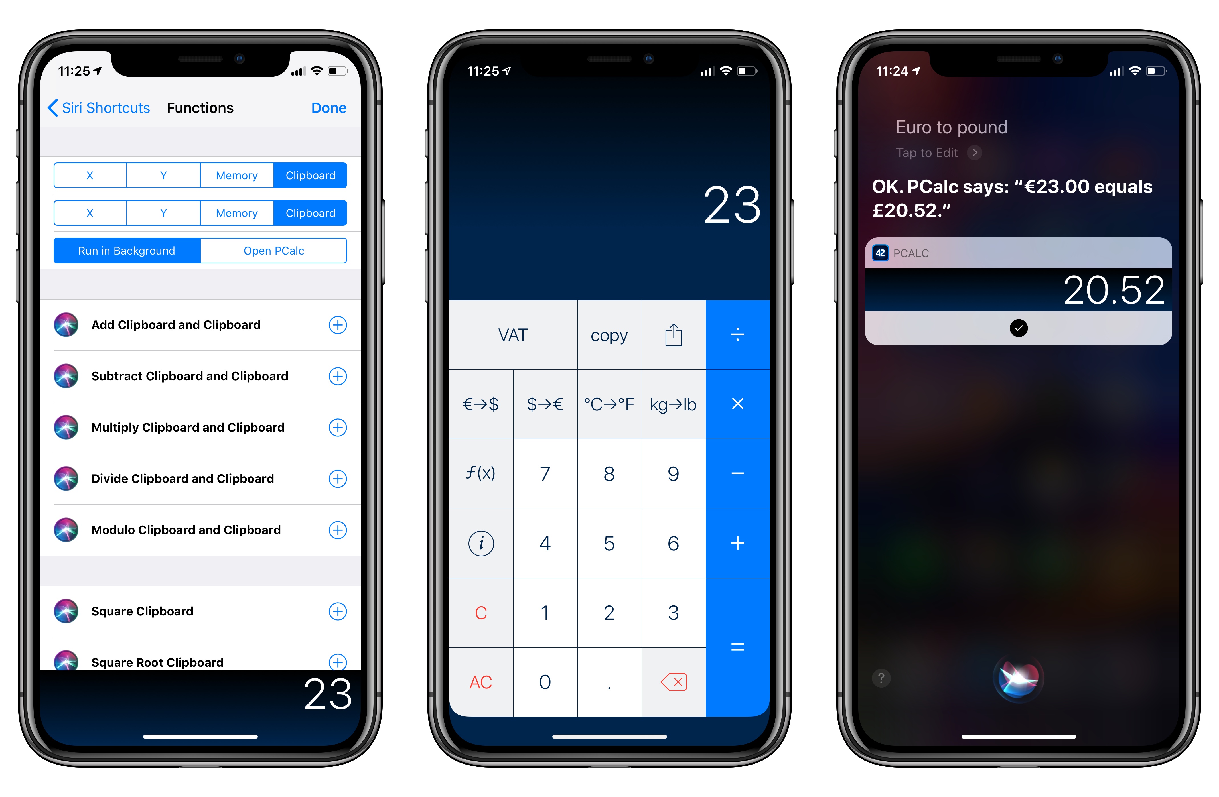
PCalc, James Thomson’s advanced calculator for iPhone and iPad, has been updated this week to version 3.8. I’ve been testing PCalc 3.8 for the past couple of months on my devices running iOS 12, and it features one of the best implementations of Siri shortcuts I’ve seen from a third-party developer yet. Even more than the app’s excellent widget, shortcuts have enabled me to integrate PCalc features into different aspects of my daily workflow, including conversations with Siri via my HomePods.
Compiling and Exporting Chapters for My iOS 12 Review with Drafts 5
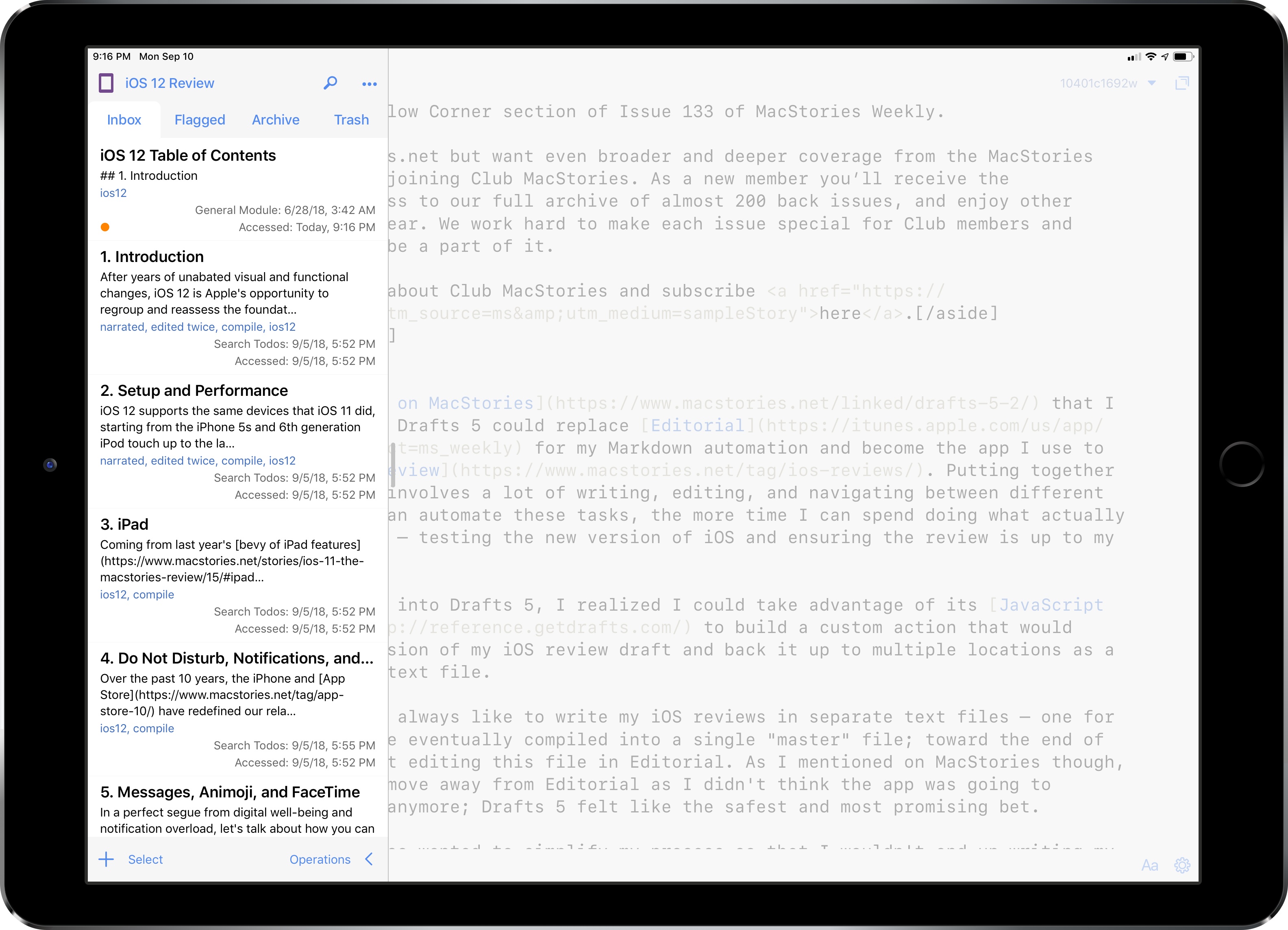
Back in June, I wrote on MacStories that I was evaluating whether Drafts 5 could replace Editorial for my Markdown automation and become the app I use to write my annual iOS review. Putting together these longform pieces involves a lot of writing, editing, and navigating between different sections; the more I can automate these tasks, the more time I can spend doing what actually matters for the review – testing the new version of iOS and ensuring the review is up to my standards.
Once I started looking into Drafts 5, I realized I could take advantage of its JavaScript automation engine to build a custom action that would compile the latest version of my iOS review draft and back it up to multiple locations as a single Markdown (.md) text file.
Text Case for iOS Adds Title Case Text Transformations Based on Popular Style Guides
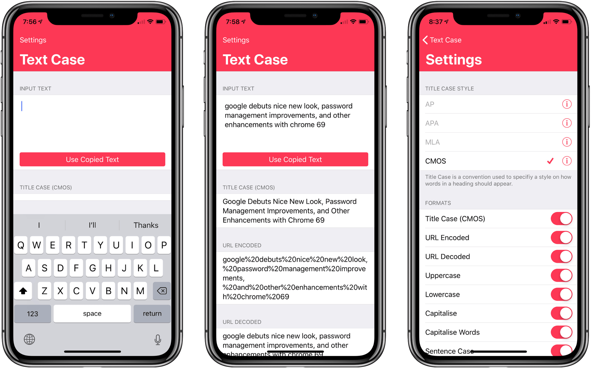
Several weeks ago I mentioned Chris Hannah’s recently-released iOS text transformation utility Text Case in the Club MacStories weekly newsletter. The app has a simple, utilitarian design that uses the big, bold header text popularized by Apple apps like News and Music. Version 1.0 included a long list of built-in text transformations. Some, like URL encoding and decoding, are useful, and others, like ‘Mocking SpongeBob,’ are just for fun. By and large though, the transformations in version 1.0 were geared more towards developers than writers. That’s changed with version 1.2 of the app, which should make it appeal to a wider audience.
The latest update adds Title Case, which can transform headlines according to the style guides for the Associated Press, American Psychology Association, Modern Language Association, or Chicago Manual of Style. The update also adds sentence case and Pascal case.
Due 3.0 Adds Pure Black Theme, Custom Snooze Times, and Haptic Feedback
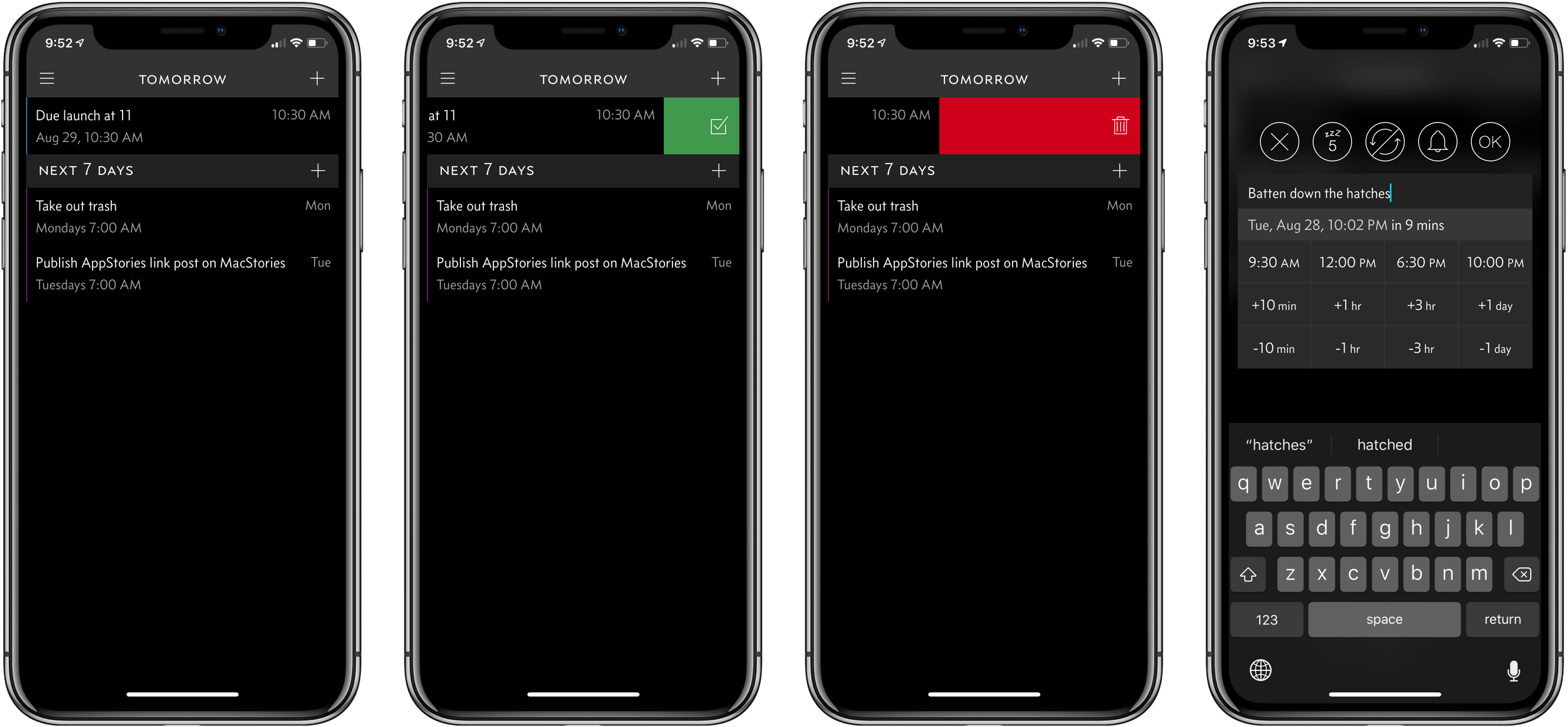
My task manager is packed with personal and work tasks. I rely on it to keep me on track day-to-day and week-to-week. The reason my task system works though is that it doesn’t include absolutely everything. If I started adding the minute-to-minute minutiae of life, I’d get bogged down in the volume of tasks each day.
For a while now, I’ve been using Apple’s Reminders app to keep track of one-off tasks, little things I might forget to do, errands, and tasks with deadlines. I’ve found that it’s a great way to stay on top of items that don’t have a home in a formal project. For the past couple of weeks though, I’ve largely replaced Reminders with Due, which was updated to version 3.0 today.
Game Day: Donut County

Tomorrow, Donut County by developer Ben Esposito will be published by Annapurna Interactive, which also backed the critically-acclaimed Florence. The game, which was announced in 2014, but has been in development since 2012, tells the story of a raccoon named BK, his friend Mira and an assortment of other characters from Donut County who are trapped 999 feet beneath the surface of the Earth. You play by manipulating a hole that grows as you move it across the landscape swallowing objects. If the premise sounds strange, that’s because it is, but it also works through a combination of a clever game mechanic, funny writing, and engaging sound design and artwork.