I don’t need my Mac as much as I used to.
When I started MacStories in April 2009, I had a late–2008 MacBook Pro and an original iPhone I had bought from the United States and unlocked to make it work in Italy. From 2008 and until the better part of 2012, my MacBook Pro (and then the Air) was my primary computer: it was the device I used to write, browse the web for research and leisure, respond to emails, and do all the other tasks to get work done on a daily basis. Because my Mac was also the only device that could allow me to manage MacStories, I had to bring it with me on trips or longer vacations.
I’ve always been the kind of Mac user who likes to enhance his OS X experience with little scripts, shortcuts, and automation tools to save a few minutes every day and speed up tedious work tasks. I have Keyboard Maestro macros to automatically resize and generate screenshots for my reviews; I have assigned hotkeys to actions that I run frequently; if necessary, I can trigger a Python script or AppleScript-based workflow and have OS X take care of a complex task for me. I fall into the category of OS X power users and I’m fond of the apps and utilities I rely upon. But, in the past year, I’ve found myself using them less and less because I enjoy working from iOS more.
Most of my work activities are related to writing: whether it’s an article, a quick research note, an email, or chatting with my co-workers, I spend a lot of time typing and assembling words in a way that (I hope) makes sense to my readers and colleagues. In the past year – as people who have been following this site know – I have realized that I can be as efficient on my iPhone and iPad as I am on my Mac. I was initially forced into my new iPad-first workflow by frequent hospitalizations and a general inability to use my MacBook Air for long writing sessions; after the initial “What do I do now” moment and annoyances, I’ve come to like iOS – and the iPad – more and more.
I haven’t listened to people who told me I couldn’t work from my iPad.
With Pythonista, I have replicated several of my image automation macros and created scripts that communicate directly with our CDN; I can create workflows with URL schemes; with Editorial, I have found a Markdown text editor that provides the perfect blend of workflows and scripts that has completely changed the way I write for MacStories from my iPad. As I concluded in my review of Editorial, I enjoy writing from my iPad more than my Mac.
I don’t need my Mac for the majority of my work tasks, but I still use my MacBook Air. The larger screen lets me to keep multiple windows visible at the same time (particularly handy during Apple keynotes so I can watch a livestream and write simultaneously) and there are some apps, like Hazel and Cyberduck, there are still nowhere to be seen on iOS. I use my Mac to print receipts as PDFs and save them to Evernote or to record screencasts of iOS apps using Reflector, editing them with ScreenFlow and uploading them with Safari to YouTube.
I don’t need to take my Mac with me on trips anymore, but I still have to use it for things that I can’t do on iOS.
Mavericks, the latest version of OS X that was released yesterday on the Mac App Store, comes at an interesting time: last month, Apple released iOS 7, a complete overhaul of iOS that dramatically reimagines core apps and features with new principles of color, clarity, content, and context. iOS 7 is providing a unique opportunity to third-party developers who can now get rid of years of interface cruft to ship modern iOS apps that feel new and are more powerful; for Apple, iOS 7 is a new foundation that, in spite of numerous imperfections and technical issues (that are quickly being fixed), is a solid start for the future.
After a year of daily iPad usage, the first thought I had after I installed OS X Mavericks was that it looked and felt…stale. There are some new features, apps, and subtle design changes, but, unlike Lion and Mountain Lion, Mavericks doesn’t considerably alter key parts of my daily OS X experience in a way that brings me to look at the OS as something that is indisputably and evidently new or dramatically better than my iPad mini with iOS 7.
Apple has made the most important changes with power user additions and under the hood of Mavericks, and I believe that those are most obvious on recent MacBooks that take advantage of the latest advancements in CPU and graphic processing power. But for a user like me – someone who doesn’t understand the beautiful intricacies of power management and API changes as John Siracusa does – Mavericks seems like a timid step into the future.
Or could it be that I’ve been spoiled by the iPad and iOS?
Perhaps Apple didn’t have much time and resources to allocate to a profound reimagination of OS X this year. Here’s what I wrote in 2012 for Mountain Lion:
Apple is now the kind of company that can support the evolution of two operating systems simultaneously, and it shows with Mountain Lion. Some new features of the OS — such as Notes and iCloud Tabs — will only reveal their full potential with iOS 6, which is coming in a few months. But Mountain Lion also brings a better OS X to customers who own an iPhone and iPad today. With this upgrade, they will find a more integrated and cohesive experience that starts with the initial setup process and goes on to touch almost every area of the OS. In a way, iCloud is becoming the operating system — from the user’s perspective, if not from a technical standpoint.
The fact that Apple is aiming for iOS and OS X to be equally consistent and familiar shouldn’t trick us into thinking the Mac is becoming an iOS device with a keyboard. Features that originally appeared on iOS (Power Nap, AirPlay, Dictation, and Notification Center, just to name a few) have been ported to OS X with the unique nature of the Mac in mind. Whereas most companies would think that more marks on a checklist is all they need to make better products, Mountain Lion demonstrates that Apple knows it’s the interplay of hardware and software that yields more intuitive, tasteful, and ultimately, better experiences.
In hindsight, I was partially wrong about Apple being able to support the simultaneous evolution of two operating systems, and right about the importance the company still gives to the unique nature of the Mac.
Mavericks doesn’t bring a new design language to OS X, nor does it meaningfully change the experience of built-in apps like iOS 7 did. While 2012 Apple could, as we saw with iOS 6 and Mountain Lion, ship two operating systems that were at least close to each other in terms of visual apperance and feature parity of some built-in apps, Mavericks and iOS 7 couldn’t be more different.
Essentially, Mavericks is, visually speaking, a tweaked Mountain Lion that gets rid of skeuomorphism where Apple had time to do so. The old leather and paper textures are gone from the Notes app, which now has a white sidebar and a new, lighter yellow paper texture somewhat reminiscent of iOS 7’s Notes app. The new Calendar eschews stitched leather in favor of a return to a sober toolbar accompanied by a new cleaner look for the calendar view itself. Linen is gone from places such as the iCloud Document Library, Notification Center, and the login screen. The Contacts app is no longer a physical representation of an address book and it is usable for the first time in years. For some reason, Reminders and Game Center are completely unchanged from last year. Everything else looks mostly the same as Mountain Lion, and I don’t think that the untrained eye of the average user will notice the extremely subtle tweaks that Apple brought to same areas of the OS. The first time I installed Mavericks and logged into my account, I thought that it looked like Mountain Lion with some new icons in the dock. I uphold my first impression.
Writing about the iPhone 5c, John Gruber said that, in marketing, what looks new is new. Aside from the removal of skeuomorphic elements from some system applications and views, I can’t deny the fact that Mavericks looks like a tweaked Mountain Lion. We could argue about the need to change the fundamentals of the OS X design after a decade, and we could hypothesize that an iOS 7-style redesign would open up a fantastic opportunity for third-party OS X developers, but, in general and from a mere visual perspective, Mavericks doesn’t make an impact. It doesn’t look new, and, therefore, it leaves much of its appeal to the features that have been added to the system.
Features
To further put my daily OS X experience in perspective, here’s a list of the apps I have in my dock:
And my menubar apps:
I don’t use multiple displays; I use Gmail and Apple’s Mail app; I rely heavily on Keyboard Maestro for scripts and task automation; I don’t use Spotlight; and, I have Alfred installed. When I need to use my Mac, I spend most of my time browsing, reading tweets in Tweetbot, writing in Byword, and chatting with my coworkers on Google Hangouts (which we all despise, but it has the best notification settings we’ve found).
In the past few months, I’ve also gone back to using more Apple apps than third-party ones: my todos are organized in Reminders instead of OmniFocus, and I use Safari instead of Chrome. However, I’m still using Google Maps because of its superior directions and accuracy for my area, and I don’t love the OS X Mail app because the effort required to fall in love with it would be wasted considering that Mailbox is on the Home screen of my devices.
With Mavericks’ nature in mind and well aware of what I’m capable of doing on an iPad, I approached OS X 10.9 with two simple questions: is it better than Mountain Lion for my Mac workflow? Will it make me want to use my iPad less?
I have mixed feelings.
Safari
I recently switched from Google Chrome to Safari as my main browser on all my devices. I wanted to try the improvements that Apple touted with iOS 7 and OS X 10.9 firsthand, and I needed to understand why so many of my readers and followers kept recommending Safari over Chrome.
Admittedly, Safari is pretty and snappy. On Mavericks, Apple improved the browser’s JavaScript engine and re-engineered the app’s tab system to use App Nap, a new energy-saving technology that slows down apps you’re not using (or that aren’t visible) to save CPU and hence battery power. In practice, this means that Safari is faster at rendering webpages and, more importantly, it triggers my MacBook’s fans less than Mountain Lion’s Safari 6.0 and considerably less than Google Chrome on Mavericks. I don’t know if Google will soon update Chrome to use the 10.9 APIs for App Nap, but what I know is that with 6–7 Safari tabs and other apps like Tweetbot, Mail, Evernote, Messages, and Byword open in the background I don’t hear my Mac’s fans anymore. Just because of the quieter work environment, I wouldn’t be afraid to call the faster, smoother Safari my favorite Mavericks feature.
To my surprise, I have found other aspects of Safari that I like better than Chrome. For instance, I forgot how good it is to be able to double-tap with two fingers to zoom into a specific area of a webpage, or how nice the three-finger tap to define gesture is (it never worked reliably in Chrome for me). Safari has always been more Mac-like than Chrome, but proper support for multitouch gestures and smart zoom really gives it away – plus, I like the consistency that I have across iOS 7 and Mavericks with Safari now.
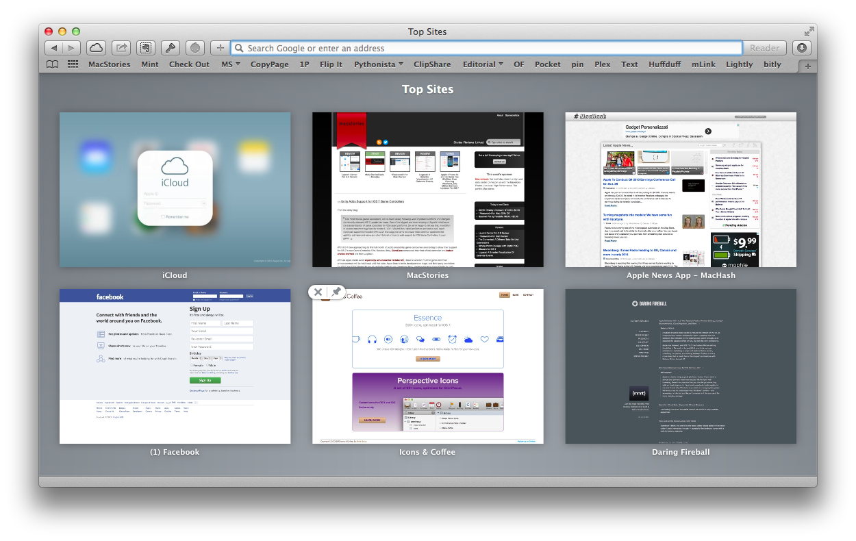
I have tried to use and like Safari’s new Top Sites and Sidebar, but they’re not for me. The Top Sites have been redesigned with a simpler layout that leaves the old app’s 3D-esque effect behind, and they feature improved drag & drop interactions for re-arranging sites and pinning them. Top Sites look nice, but I don’t find them useful as I keep three tabs open all the time (Mint, Feedly, and Google Hangouts), launch Google searches with Alfred, and type an address’ first letters and then hit Enter to quickly go to a new website. For me, opening Top Sites and reaching out to the thumbnail is slower than using the keyboard.
This is also why I feel the lack of Chrome-like pinned tabs and favicons in Safari: Chrome has a clear distinction between sites thanks to the colors of favicons and pinned tabs allow me to save space in the browser’s toolbar. In Safari, every tab looks similar to each other and I don’t see the tab’s name as enough of a visual differentiator.
The Sidebar, accessible with ⇧⌘L (or View > Show Sidebar), collects Bookmarks, Reading List, and Shared Links in a single vertical space. Adopted from iOS 7, Shared Links let you see links that people you follow on Twitter or LinkedIn are sharing, but I have no use for them as I rarely close Tweetbot and I still have no idea whether LinkedIn is a social network or a legalized email spamming service.[1]
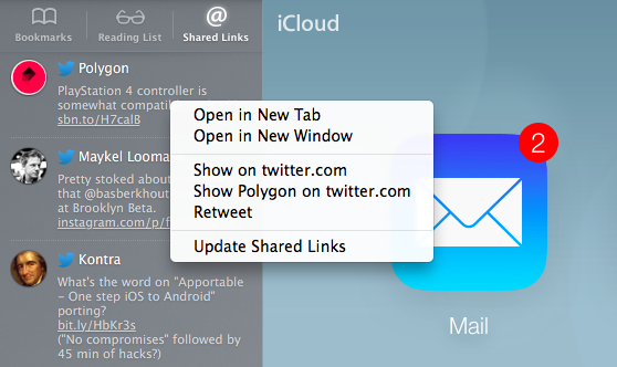
Shared Links have some interesting details, though. For one, clicking a status update that contains a link opens that link and, for Twitter, also adds a bar at the top of the screen that shows the original tweet (for context) and that lets you retweet with one click. It’s very low friction and it looks nice – I wonder how putting this in the hands of millions of OS X users will affect Twitter’s link consumption and sharing statistics.
You can also right-click on a tweet in Shared Links to access a contextual menu that contains options to reload shared links (they don’t update in real time), open a link in a new tab/window, retweet, and show the user or tweet on Twitter.com. When you open a link in a new tab you don’t get the Twitter bar at the top, which makes me think Apple envisioned this feature as a way to open a tab then quickly click on tweets one after the other, retweeting the ones you like.[2] I don’t use Shared Links regularly, but I think they’re well done as they are a nice filter for those times when I want to keep Tweetbot closed.
While I suppose that some people will like to keep the Sidebar always shown when browsing Safari, I’m a traditionalist. I don’t use Reading List (I prefer Pocket) and I like my bookmarks (and bookmarklets) in the Favorites Bar. It’s nice to be able to click to open and close folders with a cool animation, but the horizontal visualization of bookmarks is now too ingrained in my muscle memory to switch back to a sidebar. Plus, I like to see a webpage in its full width, and my MacBook Air’s screen isn’t big enough to accommodate a sidebar and full webpage without compromising on the size of both.
A minor and very welcome addition that was prioritized over more “serious” missing features is the new popover to edit a bookmark’s address inline. Taking cues from Chrome, you can right-click a bookmark in the Favorites bar and edit its address in a small popover that doesn’t force you to leave the webpage you’re viewing. This is a much better implementation than the old way (you were taken to the Bookmark Manager page) and it follows Mountain Lion’s inline editing for bookmark names.
I haven’t been able to properly test other features that Apple has added to Safari with Mavericks. With iCloud Keychain, the company is now embedding a password generator, encryption tool, form filling tool, and sync solution inside Safari, and while that’s a good thing because it allows every user to generate stronger passwords that are securely stored on Apple’s servers, iCloud Keychain was only added to iOS 7 yesterday. Furthermore, I prefer 1Password, which is a password manager that works anywhere on my system (not just in Safari) and that syncs across iOS and OS X with dedicated apps.
On top of energy-saving features, Apple has also built a plugin-blocking tool into Safari. Similar to the old ClickToFlash extension, the new Safari Power Saver automatically pauses plugins recognized in webpages and displays a static preview that is not power-hungry and that you can click to activate. I haven’t tested this because, with my fresh install of Mavericks, I promised myself I wouldn’t install Flash, choosing to keep Chrome as my go-to browser for Adobe Bad Times (e.g. the occasional YouTube video). As with iCloud Keychain, I think that this is a smart and useful addition for average users who think they “need Flash” but who also don’t like it when their Mac gets warm and noisy (yes, friends, it’s Flash doing that).
I am impressed by Safari’s speed, performance enhancements, and quietness in Mavericks. I think that App Nap does an admirable job on my 2011 MacBook Air, and I haven’t experienced issues or bugs with reloading tabs or background audio/video playback on my machine with the Mavericks GM seed. I believe that bookmark and tab sync with iCloud has improved since last year, and I appreciate the minor changes to keyboard shortcuts (for sidebar), Shared Links, and bookmark editing.
I think that it’s strange that Apple still hasn’t addressed longstanding annoyances of Safari. The browser still can’t pin tabs, and it’s hard to differentiate between open tabs when they’re all gray boxes with black text (Apple could learn a thing or two from Chrome and Internet Explorer). Coming from iOS 7, I was expecting an increased usage of apple-touch-icons and colors in the tab bar and Favorites bar, but instead all that Safari got from a tab/bookmark standpoint was the sidebar, which is nice, but not a solution. Safari keeps the old amount of UI chrome, focus on text labels instead of favicons/icons, and set of minor problems that include the behavior of the status bar, which, unlike Chrome, still can’t display a URL only when hovering over a link (it has to always be shown).
I like Safari and I deeply appreciate the fact that it doesn’t start my Mac’s fans anymore. It needs design changes and new features; for now, I’m glad to have my gestures back.
Energy Saving
Apple has done a lot of work under the hood to improve Mavericks’ performance while still using less CPU and offering longer battery life. All these technological advancements are explained by Apple in a dedicated webpage as well as a PDF document; they include features like Timer Coalescing (ahem), Compressed Memory, App Nap, and Safari Power Saver. A lot of the terminology and ideas behind them are over my head, so I’ll leave a well-deserved technical explanation to other people who are more knowledgeable than me. I want to share some thoughts as a user, though.
As I also wrote about Safari, I have noticed that my MacBook’s fans start spinning a lot less than what they used to on Mountain Lion with the same amount of apps open and running in the background. They still occasionally kick in when playing an HTML5 YouTube video in HD, when I have dozens of Safari tabs, or when I’m exporting video, but, in general, my Mac is quieter, colder, and, overall, snappier.
I believe that most of the improvements that I’m mentioning are related to App Nap, which pauses apps that aren’t visible or executing background tasks (such as audio playback) to consume less CPU and therefore less power. Because of App Nap, however, I have noticed that apps like FaceTime, which launch with an iSight camera view, take a while to “refresh” the camera when un-minimized from the dock. On my MacBook Air, whenever I open FaceTime, minimize it, then bring it up again, I have to see a frozen snapshot of my face for less than two seconds.
In spite of all this, I haven’t seen a dramatic improvement of my battery life. When on battery power, I still get around three hours out of a normal work session, which is comparable to Mountain Lion. While in Mountain Lion I’d get two and a half hours with some fan noise, now I get almost three plus silence. It’s a good deal, but I wouldn’t call it revolutionary in my case. I think that, on recent Macs, the combination of Mavericks and new SSDs with improved battery technologies will make for a pretty fantastic battery life – which is laudable. Three hours is no iPad – and my Mac still gets warmer than the mini – but I’ll take the extra minutes.
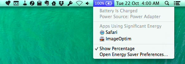
I like that Mavericks can show apps that are using significant energy in the menubar just by clicking the battery icon. This addition helps understanding while it’s time to slim down those Safari tabs or when it’s time to quit an app that went wild and started eating CPU resources. I also like that you can Option-click the battery icon to see battery conditions, which are “Normal” for my MacBook Air.
I’m curious to see if and how fast developers will add support for App Nap in their apps. It’s my understanding that developers have access to various APIs to enable or disable App Nap, and I hope that, as more third-party apps implement the technology, my MacBook’s performance will increase even further. If you use primarily Apple apps on your Mac, they should all be fully Mavericks-ready.
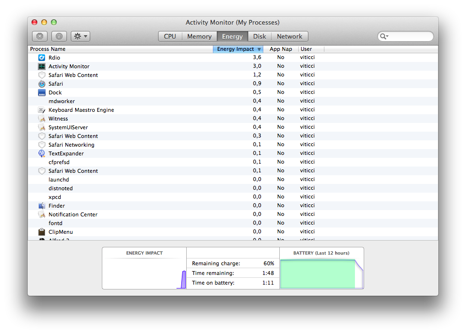
Energy information is also available in the revamped Activity Monitor, which is organized in five tabs among which there is an Energy one that shows the “energy impact” of each process and its support for App Nap.
Based on my non-technical examination of Apple’s energy-saving technologies, I’d conclude saying that, in normal every day usage, I’m happy about the fact that my Mac is less excited about rotating its fans and getting all hot and bothered. Apps seem more responsive but I’ve seen some strangeness with App Nap and Mail; battery doesn’t last much longer on my Air.
Calendar
I was excited to try the changes in Calendar after Apple previewed Mavericks at WWDC 2013: anything that makes calendar clients less dumb is welcome in my workflow, and the addition of smart travel times with embedded map view and weather forecast sounded intriguing.
Unfortunately, I’m completely disappointed by Apple’s implementation.
The Calendar app sports a new cleaner look that gets rid of textures and uses a white background that makes the events’ colored blocks come forward. This is a good change to make browsing events clearer as there is no more leather or bits of torn paper distracting the user at the top of the window. What I don’t like is that, because of the more subdued UI, I struggle to find the current day in the Month view. Maybe I’m getting old, but this is what I mean:
Alas, the design change doesn’t go in tandem with more audacious calendar views: Apple’s Calendar app is still largely based on a digital representation of physical calendars and agendas, with the usual day/week/month/year views and their existing limitations (for instance, you don’t have something new like Logacal or filters for individual views in Apple’s Calendar app).
Apple is making some changes to move away from the feature skeuomorphism of the old app, but they feel half-baked. Calendar has continuous scrolling now, allowing you to scroll naturally from month to month without clicking arrows, hence achieving views like the second half of October and the first half of Novemember; however, these views can’t be saved as “presets”, meaning that the app can scroll continuously, but it defaults to the primitive 30-day view for the Month tab. The new event compose field continues to support basic natural language processing, but it isn’t nearly as advanced as the one seen in Fantastical. For people who deal with multiple timezones, the top right corner of the app comes with a new timezone switcher to visualize events in different timezones, and I think that’s a good addition.
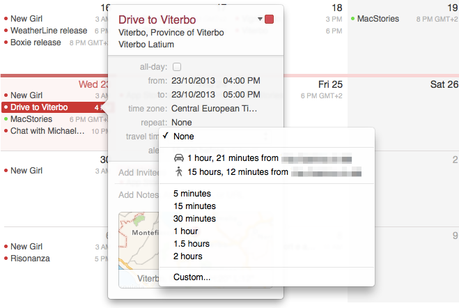
My main gripe with the new Calendar is the new event inspector with support for travel times. The new feature takes advantage of Apple’s database to find a location you have added to an event, calculate travel times for walking or driving directions, and add the travel time as a separate alert on top of the default alert you may add to an event. If, for example, you create an event that has an alert 15 minutes before the event but you need 40 minutes to reach that location, Calendar will combine those pieces of data and alert you 55 minutes before the event. In theory, that’s handy and smart. In practice, it doesn’t work for me because of Apple’s obtuse design choices and poor location database.
To understand how Apple designed this feature, let me quote their Mavericks webpage:
A new event inspector makes it simpler to create and edit events by suggesting addresses and points of interest when you start typing in the location field. It shows your event’s location on a map so you can get directions with a click. It also displays a weather forecast and can even calculate travel time, so you know how long it will take to get there. And you can send yourself a notification so you know exactly when to leave.
And the Calendar Help document for starting locations:
To set your starting location, Calendar first looks for your location in any events that are up to three hours before this event. If Calendar doesn’t find a location, it uses your work address during work hours and your home address during other hours. (Your work hours are set in Calendar preferences using the “Day starts at” and “Day ends at” menus.) If your card in Contacts doesn’t have your addresses, Calendar uses your computer’s current location.
Apple is making several assumptions with travel times, and I believe that most of them are wrong.
First, you can’t enter any address and expect Calendar to pick it up and calculate travel times for it. As Apple explains, you need to choose a suggestion or point of interest from the dropdown menu, which will show a loading spinner when trying to find a location and then a list of suggested locations/POIs that you have to choose from if you want Calendar to calculate a travel time. You can type an address manually, but, unless it’s a suggestion by Apple, Calendar won’t be able to assign it an automatic (and supposedly “smart”) travel time.
Limiting travel times to suggested locations meant that, for me, Calendar was never able to find an address and calculate its travel time. I’m glad that the feature works reliably for Craig Federighi and his friends; it’s unusable for me.
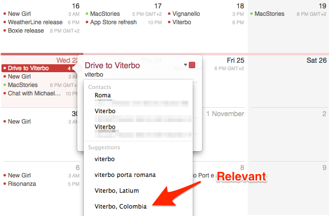
I wanted to calculate travel time for a specific address in Viterbo. Calendar often just offered “Viterbo” and one POI – “Viterbo Porta Romana”. Oftentimes, the app would just downright refuse to find town and city names, showing a loading spinner that loaded…nothing. To me, this makes absolutely no sense as Calendar is made by the same company that ships Maps, a mapping app that is able to give you estimates and directions for specific addresses. Calendar, however, insists on “suggestions”, which I don’t want, don’t trust, and don’t like.
Because Calendar can’t pick up any address that sees in an event, it means that creating events from apps like Fantastical won’t tell iCloud “Look, here’s an event, it’s got an address, figure out the travel time”. If you add an event with a location from another app, the address will show up without automatic travel time detection. You can still add a travel time manually, but that defeats the purpose of having a system that has a mapping backend that can calculate travel times for you because you’re not a computer.
But let’s say that you managed to receive a good suggestion in the event inspector and that you can now instruct Calendar to add an automatic travel time. At this point, you can click the alert section of the event inspector, click travel time, and choose from Apple’s second set of suggestions for driving and walking travel times based on your starting location. You may be wondering if Apple was smart enough to give you control over the starting location instead of making it “just work” by using their own assumptions. Again, prepare to be disappointed.
Let’s repeat the Help document’s text, this time with emphasis:
To set your starting location, Calendar first looks for your location in any events that are up to three hours before this event. If Calendar doesn’t find a location, it uses your work address during work hours and your home address during other hours. (Your work hours are set in Calendar preferences using the “Day starts at” and “Day ends at” menus.) If your card in Contacts doesn’t have your addresses, Calendar uses your computer’s current location.
So you have three options:
- A starting location is determined based on events that are up to three hours before a new event, and which contain locations;
- A starting location is determined based on work hours that you configured in Calendar’s Preferences;
- A starting location is determined, if all else fails, based on the computer’s current location.
As you can see, the obvious absent: you can’t type a starting location manually. I see several wrong assumptions in Apple’s reasoning for this feature, and it baffles me that the company behind Maps and Siri could be this shortsighted when it comes to daily events, personal schedules, and locations.
In the first option, Calendar assumes that you add every event that contains a location to your calendar, and not just some of them. Here’s an example: every Friday, I drive from Rome to Vignanello (a small comune near Viterbo) at 1:30 PM. It usually takes me 60–70 minutes to get to Vignanello (so I arrive between 2:30 and 2:40 PM) and after that, I stay until 4:30 PM then continue to Viterbo. In my Calendar, I create an event for “Drive To Vignanello”, but I don’t create one that says “Drive To Viterbo From Vignanello”, because both towns are close to each other and driving to Viterbo may happen after 4:30 PM (I just need to get to Vignanello in time, leaving time can change). Because of Apple’s decision of looking at events up to three hours before another event, if I chose to create a second event for “Drive back to Rome from Viterbo”, the starting location would be Vignanello, and not Viterbo, because I didn’t create an event for Viterbo in the first place, and Calendar didn’t know where to look.
I’m not describing a possible scenario: I did drive from Rome to Vignanello, from Vignanello to Viterbo, and from Viterbo back to Rome again in the same afternoon on many occasions. I thought that, maybe, even if I hadn’t added events for each driving session, iCloud would understand I wasn’t in Vignanello when I needed to drive back to Rome – I was in Viterbo, and therefore it would update the travel time automatically in the background. I ended up getting a notification on my iPhone 78 minutes before the “Drive Back To Rome” event, which was the travel time for Vignanello as a starting location.
For the second starting location option – work hours – Apple assumes that everyone has a 9 to 5 job with fixed work hours. Here’s a reality check: they don’t. People work from home, people have shifts, people have part-time jobs and they change their schedule often. Maybe at Infinite Loop in Cupertino they are lucky enough to get the same work hours every day of the week for every month of the year, but the rest of the world is more flexible, especially in the era of remote working where the lines between work and free time have blurred.
The third option, current location, is grotesquely amusing. The OS X Calendar app can use your Mac’s current location as a starting location for travel times, which means that, if you want to use this feature for a location you’re currently not at, you have to drive there, get your Mac out of your giant pocket, find the current location, and, sure enough, now you have a starting location for your current location on Earth. That’s not cumbersome at all.
One more thing: travel times sync back to iOS as regular alerts that don’t have any location data attached. In a parallel universe, Apple did ship a travel times feature that fired off a notification on your iPhone, specified that it was related to a travel time, and that opened the Maps app to give you directions to drive to an event’s location. In our sad and unfair universe, there is no distinction between a travel time alert and a regular alert on iOS, and everything just shows up as a unified “alert” in Apple’s Calendar app. Third-party iOS developers don’t seem to have access to travel times created on Mavericks either.
If you happen to get, thanks to some fortunate coincidence, Apple’s travel times to work for you and you’ll find other hidden settings that contradict what I wrote above, please get in touch and let me know.
For everybody else, travel times sound cool, but, seriously, come on. Who thought that restricing automatic travel times to “suggestions” would be a good idea? Who thought that assuming all events containing locations that are added three hours before an event would be a good way of filtering events? Why does Apple assume that people rely on work hours and work addresses for starting locations? And, for heaven’s sake, why can’t you type an address manually and make iCloud figure out travel times on its own?
In its current version, travel times are another black box that prove how Apple insists on the “It Just Works” model when, really, it doesn’t. It’s frustrating to know that Apple has a mapping backend that is only mildly integrated with Calendar’s travel times when, using the dedicated Maps app of the same company, you can get travel times for specific addresses entered manually that (at least for some people) are somewhat accurate. If Apple understood how modern web services needed to work, they’d make travel time calculation an iCloud feature that happened on a server and synced to all devices, not a functionality of the OS X Calendar app that is limited to suggestions.
But what’s really sad is that I want to love travel times because it’s an incredibly smart feature on paper, and I keep being jilted by Apple’s poor thinking. When it does work, you get a nice embedded map view with a weather forecast and you can click it to open the desktop Maps app with directions. Most of the time it doesn’t work though, and I’m frustrated because I know that Apple could be better than a company who wants to throw ads at my face (and then make my face the ad) if only they tried harder and were more flexible. If Apple adds anything to OS X 10.9.1 and iOS 7.1, I hope that’ll be more versatility and sync for travel times.
Maps
We’ll have a separate article on Maps for Mavericks, but I wanted to quickly touch upon the topic after mentioning locations in Calendar.
My opinion is unchanged from last year. Maps is a beautiful app with bad data for my area. The selection of points of interest is poor when compared to Google Maps, the voice navigation is inferior (both for commands and timeliness when driving), and it just refuses to find addresses that Google Maps can find with no issues. I got lost twice thanks to Maps, and I do check on the app’s improvements every once in a while, but I don’t trust it.
The desktop app is nice and overdue. It doesn’t do anything that’s terribly innovative – it really is Maps for iOS brought to OS X – but at least it’s got keyboard shortcuts and it can send directions over the air using iCloud to an iOS device.
Everything Else
As usual with Apple’s major OS releases, there are several minor details and tips and tricks that we’ve collected in a separate article on MacStories. We’ll have have in-depth looks at Maps, iBooks, and changes in AppleScript throughout the week as well. In this last section, I want to highlight three other changes that I like. Other stuff like improved support for multiple displays and offline dictation is also cool, but, as I said above, I don’t use those features.
Finder tabs and tags. I don’t spend my time managing files in the Finder: in a typical work day, I may drop screenshots into Evernote, save invoices from Mail to Dropbox, and maybe extract the occasional .zip download and trash it. Dropbox is my filesystem (as I have written before), and I don’t like the idea of tags as a sole organizational system for my documents. I do like the fact that tags can work as quick filters for articles I’m working on, and I’m a fan of the way they show up in the Finder’s sidebar and in every Save or Open dialog. I just think that, for me, tags are no substitutes of folders, especially because they don’t sync back to iOS (yet?) and I rely on Dropbox and Evernote.
Tabs are another interesting addition to the Finder, and I’m certain that Finder power users will like them, but I don’t use them often for the same reasons above. You can open tabs and cycle through tabs with keyboard shortcuts, you can drag & drop files between them, and each tab can have its own view. For the use that I make of the Finder, tabs haven’t been a huge productivity boost. I’m curious to see how they will be received by proponents of the old spatial Finder, and what will happen to Finder extensions like TotalFinder and Path Finder, both of which implemented tabs before Apple.
Notifications. In Mavericks, notifications are actionable: if you receive a new message, you can rest the mouse over the banner and reply inline without opening the full Messages app. Based on the same idea, you can accept FaceTime calls, delete, and reply to mails directly from the notification banner. This is a good change and I can’t wait to see third-party apps adding support for it. Mavericks has also new settings to schedule Do Not Disturb and show notifications on the Lock screen like iOS, which are handy.
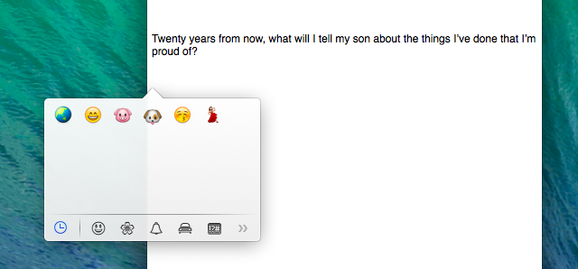
Emoji popover. One of my favorite changes in Mavericks is the popover to add emoji characters to any text field without opening a separate window. Accessible by hitting ⌃⌘Space, the popover shows up under the cursor and it lets you see browse emoji by category, search for them by name, and even view recently used ones. It is a system-wide feature, so emoji used in Tweetbot will appear as recent ones in Messages, and so forth. Accessing pile of poo has never been easier.
X
The more I think about Mavericks, the more I see it as Apple’s Janus. One one hand, it comes with forward-looking technologies like Timer Coalescing, App Nap and Compressed Memory as well as new desktop apps like Maps and iBooks; on the other, it retains an old design language, old user experience paradigms, and straight-up old apps from Mountain Lion. It wants to appeal to all users with power saving features, iCloud Keychain, and the possibility to view maps and read books on the desktop, but it also winks at the power user with Finder tabs and tags, proper support for multiple displays, and several minor details and tweaks. And just a year after Apple achieved some sort of visual parity between iOS 6 and Mountain Lion apps, Mavericks takes some cues from iOS 7 but also keeps a foot in the past.
This article’s opening sentence wasn’t there just because it looks good[3]. I felt it was necessary to contextualize how I use my Mac, why I need it less than three years ago, and why, as someone who relies on his iOS 7 devices for work, Mavericks is, like Janus, the emblem of beginnings and transitions – both new and old, promising in its under-the-hood changes and awkward in its reliance on old apps, visual styles, and functionality issues.
I’m lukewarm on many of the additions to Mavericks like Finder tabs, tags, and multiple displays as they don’t considerably augment my daily experience; I’m genuinely impressed by Safari and new energy-saving features; I’m disappointed by features that I was looking forward to, such as the new Calendar with travel times, Maps, or changes to Messages.
I recommend upgrading to Mavericks: Apple has gone to great lengths in recent years to ensure easy OS X upgrades with the Mac App Store and iCloud, and, assuming you have a modern Mac, the entire process should take just a little over 30 minutes. Plus, Mavericks is free. Can you go wrong with free?
The technological advancements in Mavericks are important for the future of the OS X platform. With iPads getting over 10 hours of battery life with Retina displays, anything that can contribute to making Macs last longer is welcome.
From an interface and feature standpoint, Mavericks seems a little confused. It’s got new consumer apps like Maps and iBooks, and it wants to get rid of skeuomorphism, but it also keeps members of the old guard like Reminders and Game Center around, unchanged. Apple’s apps are increasingly based on an iCloud backend, but the company is still showing clear deficiencies when it comes to making the cloud more than a black box where decisions are invisibly made. Honestly, I believe that the best additions to Mavericks are Safari, the energy-saving APIs, and new power user features that prove Apple is still heavily invested in making the Mac great for what it is: a productivity machine.
Coming from iOS 7, I feel a disconnect between my iPad and my MacBook that was less evident with Mountain Lion. Perhaps Apple just needs more time to get to a new kind of design and feature parity. Perhaps they have changed their mind about this (I don’t think so). I like some of the new things in Mavericks, and I profoundly dislike others. I look at my iPad with iOS 7, and I see a new OS with background downloads for all apps, 10 hours of battery life, and a cold aluminum back; my MacBook Air is better because of Mavericks, but it doesn’t make an impact on me. Like I said, I’m conflicted.
Ultimately, this is not a big deal for me. To answer my questions: Mavericks is overall better than Mountain Lion, but it doesn’t make me want to use my iPad less.