Design
UI design on watchOS has largely remained the same in recent years. Even when we receive a notable change like what we saw in watchOS 10, it’s been more evolution than revolution, and the look and feel have always felt familiar. This year was a massive one for design on iOS, iPadOS, and macOS, and the question was whether we would see any significant alterations to Apple’s smallest OS. For the most part, the answer is no, but not without a few twists in that tale.
Liquid Glass
On iOS, I fall into the camp of those who like the physicality of Liquid Glass but really dislike the legibility compromises. I find the pared-back UI attractive and occasionally functional; still, I struggle to support a design system that makes text and icons significantly less readable and, on occasion, illegible.
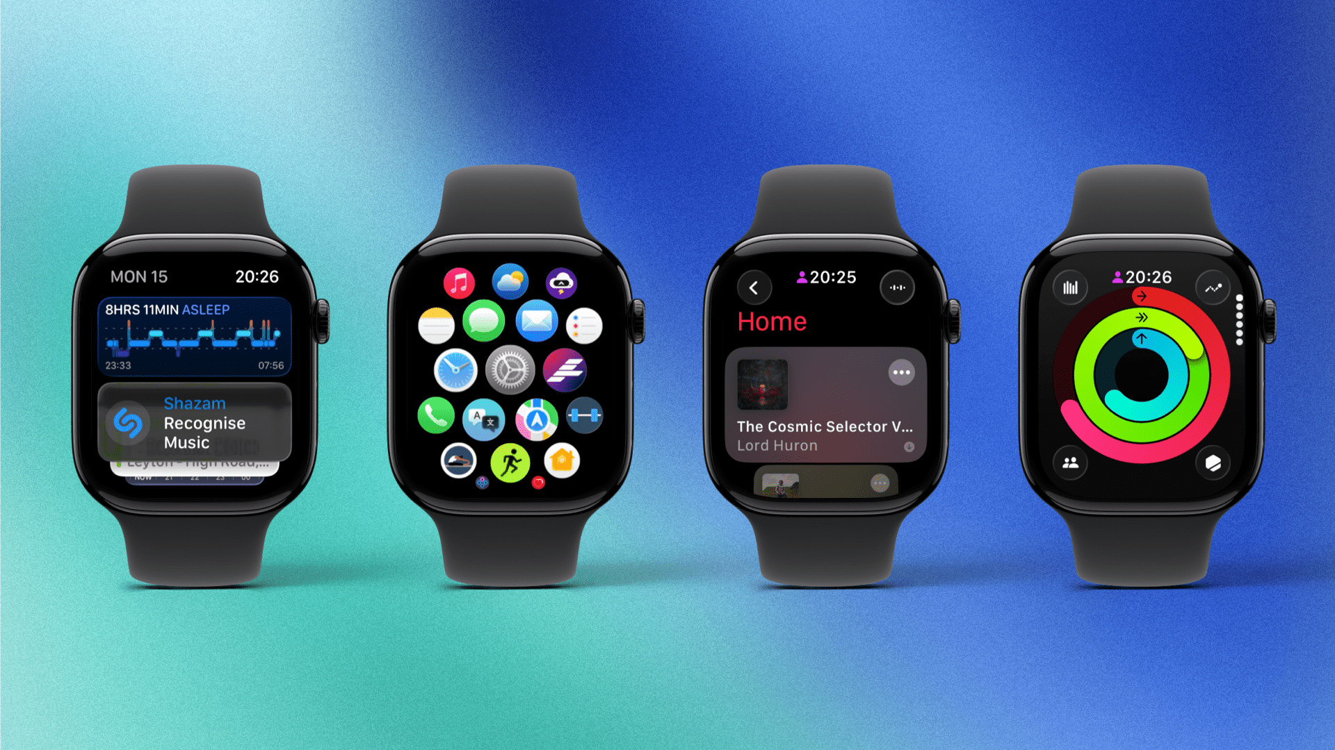
In watchOS 26, Liquid Glass amounts to not much more than a re-skinning of the system, with buttons, widgets, and the like taking on shiny, reflective edges. There are none of the animations present on the other platforms, and the position of buttons, checkboxes, and other elements remains the same as on watchOS 11.
This seems like a wise decision. It was only two years ago, with watchOS 10, that Apple introduced a significant new design system for the Apple Watch. Going through another big revision this year would have been jarring, to say the least.
It also strikes me that one of the key pitches of Liquid Glass – the idea that the UI vanishes into the background so you can focus on your content – is the exact antithesis of what the watchOS UI needs to be. The size of the Apple Watch necessitates a UI that is both clear and intuitive, with considerable areas of interactivity.
For the most part, Liquid Glass on the Apple Watch is fine. It’s not adding anything useful, nor is it taking anything away, and there are few transparency issues since the watchOS UI rarely sits on top of any content. It’s a visual change all the way down.
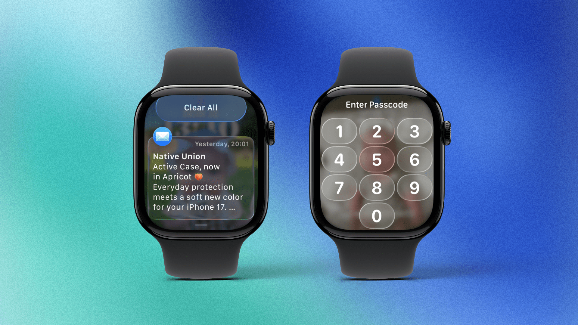
One of the few exceptions is the passcode screen, and the result is, unfortunately, emblematic of the flaws with the whole Liquid Glass concept. The numbered buttons appear in all their translucent, Liquid Glass glory, and the numbers are white, which means that if you have a dark watch face, you should have no problem at all. The issue arises when you have a very light and detailed watch face, such as a bright image on the Photos watch face. In this situation, the numbers start to disappear into the background.
The same can be said for notifications. Again, if you have a dark watch face or if you’re using a dark app when you invoke Notification Center, you should be fine. However, if you’re using a bright watch face or app, then you run into a bit of trouble.
Is this a massive issue in the grand scheme of things? No, not really. If you type your passcode daily, you likely have so much muscle memory for this action that you no longer need the numbers. Notifications are still readable; it’s just not that pleasant to do so. In the end, it’s a failure in UI design and accessibility, but it occurs in so few places that it doesn’t affect regular usage all that much.
Watch Faces
Despite still refusing to give us what we want – nay, deserve – in the form of third-party watch faces, Apple continues its yearly tradition of introducing new designs to accompany the latest Apple Watch releases. This year, there are two new faces called Exactograph and Flow.
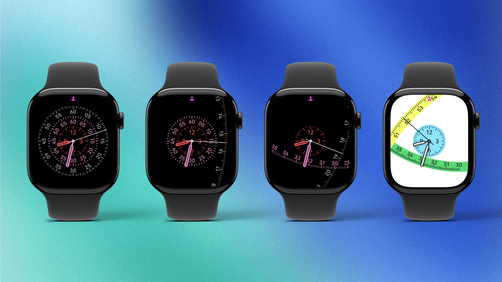
Exactograph is made up of concentric circles, each displaying either the hours, minutes, or seconds. In this regular form, the design looks quite similar to the Solar Dial, Lunar, and Chronograph Pro watch faces, and I’m sure many people will enjoy it.
However, if you change the face’s style setting, you can make the two outermost dials (the ones for seconds and minutes) zoom outwards so that they are many times larger than the watch face itself. As the seconds and minutes pass, these dials rotate around the center axis of the watch face. That is honestly the best way I can describe it, and it still doesn’t give the proper impression. You can have a look at the example images above, but to truly appreciate this design, you will have to try it for yourself. And of course, you can customize it to your heart’s content with different colors.
I’m not sure that a lot of people will keep this face in its expanded form, but I suspect many will enjoy the collapsed version. Either way, it’s a pretty funky bit of design, and I was slightly hypnotized the first time I tried it.
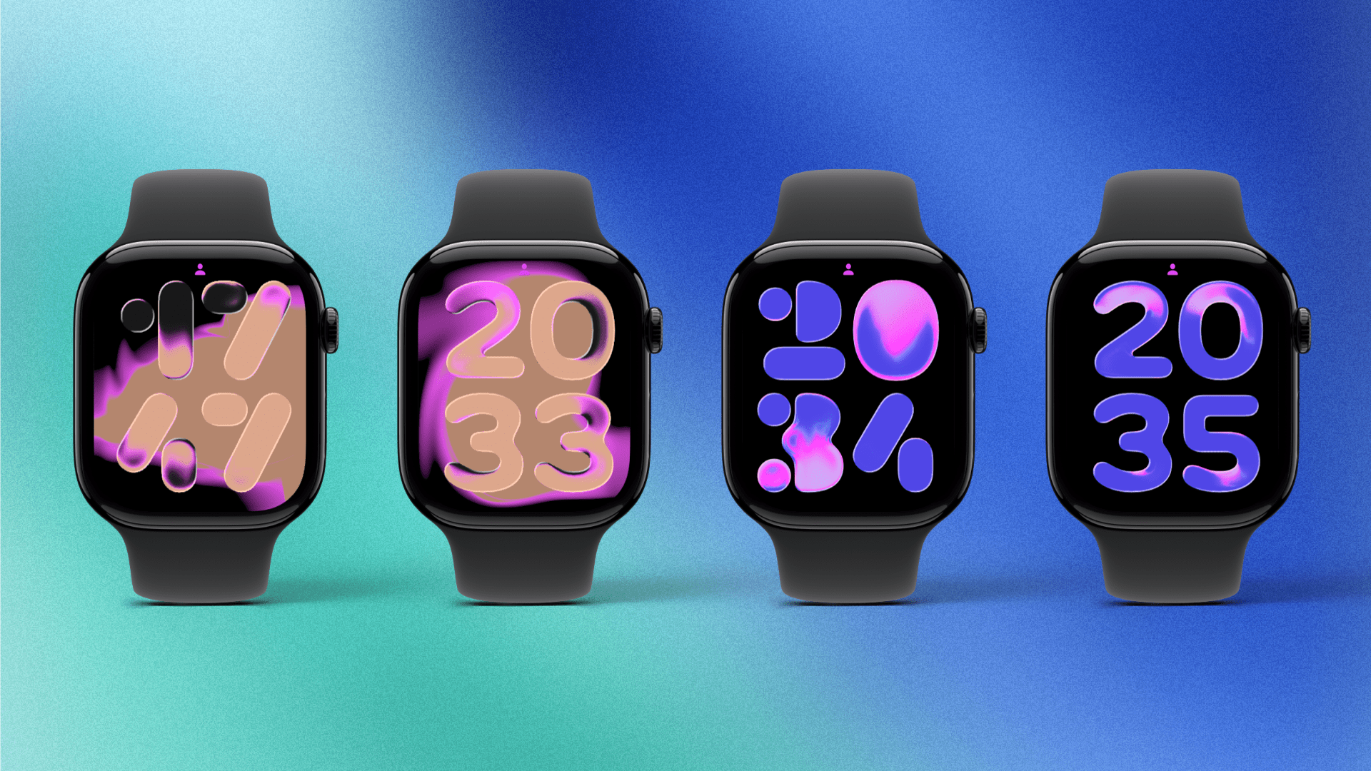
Somewhat predictably, there is also a Liquid Glass watch face, though for some reason, Apple has decided to christen it Flow. The background features a glowing heat map-style shape with the time displayed in big, bold numbers in front of it. These numbers refract the light, just like Liquid Glass does, which, regrettably, renders them slightly harder to read.
You can use the simple SF Rounded font for the numbers, but there is an alternative font that’s honestly quite bad. If you look at the image above, you will see a selection of screenshots I took at various times of the day. Can you work out what time it is on the far left example in under a few seconds? If you can, you have better vision than I do. Despite the option of having a black background and solid numbers, the Flow watch face is, unfortunately, a hard fail.
Liquid Glass is also prominent in the updated Photos watch face. This face works almost exactly as it did in watchOS 11: you specify the different categories (people, pets, nature, and cities) you want to see photos of, and the numerical time will poke out from behind various key elements of each picture.
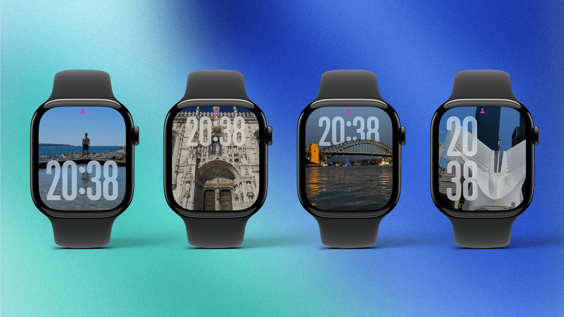
The twist in watchOS 26 is that the time will take on the translucent Liquid Glass effect. This works with varying degrees of success. If your background is an image of a mountain with a clear blue sky, the Liquid Glass effect works well. If you have a complex photo with an overly detailed background, the numerals become harder to read.
Is it illegible? No. But the whole idea of the time on a watch face is that it should be easily glanceable. If you have to spend a few extra seconds adjusting your eyes to read the time, it reduces the face’s utility. The good news is that you can turn off the Liquid Glass effect on the Photos watch face, returning it to watchOS 11 levels of legibility.
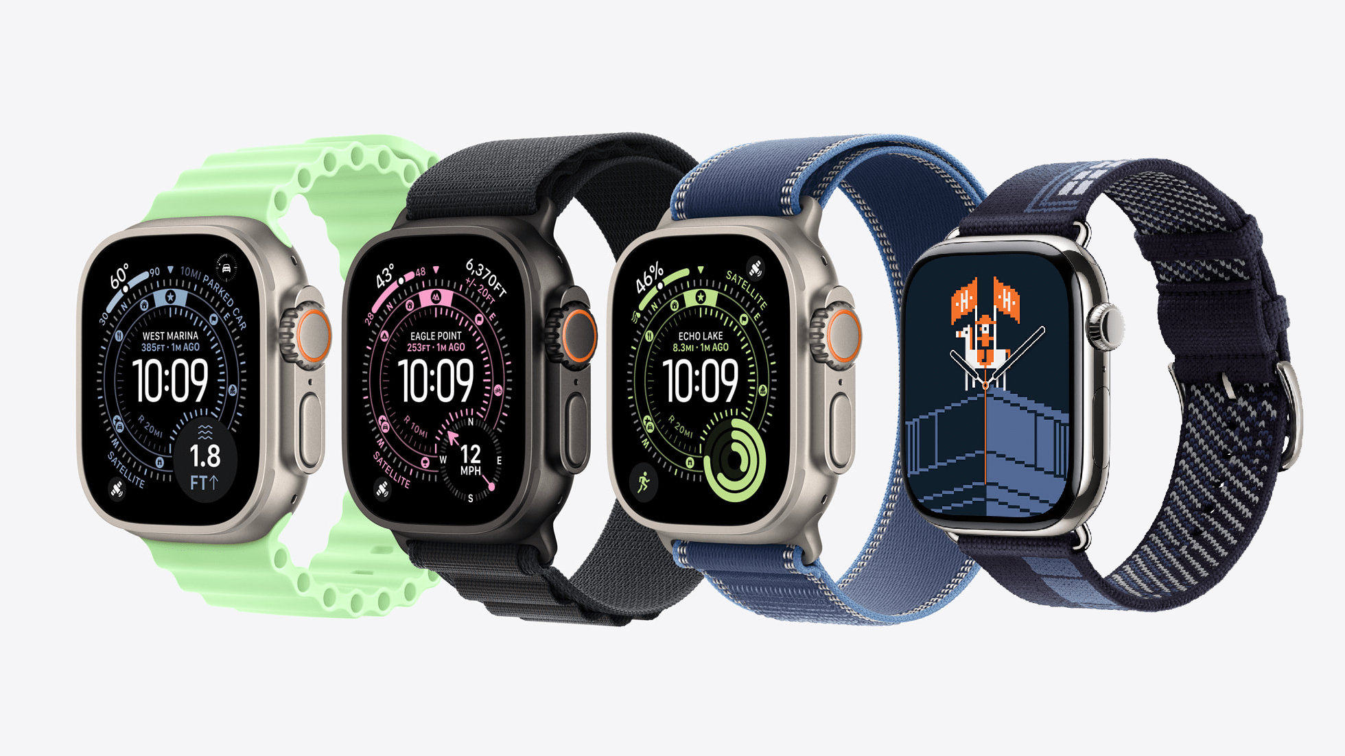
If you’re an Apple Watch Ultra user, you now have access to a brand new watch face called Waypoint, and it’s a doozy. At first glance, it seems like another chronograph-style face, but there are two big features that scream “outdoors”. The first is a circular dial just inside the compass that runs around the outside.
This dial features points of interest that change position based on the direction you are facing. They include the following items, which you can filter:
- Waypoints
- Map pins
- Map places
- Map routes
- Map guides
- Trailheads
- Beaches
- Parked cars
You can further refine what is displayed on the dial by limiting the radial distance of objects that will be included. For example, if you want to know the way back to your waypoint but not to your car, which you parked further away at the camp, you could adjust this setting to not show the vehicle.
The second prominent feature of the Waypoint face is an extra-large custom complication that can be located in the bottom-right or bottom-left corner. This can show any app complication as well as one of five specialized data points:
- Compass
- Elevation
- Level
- Last Viewed Waypoint
- Parked Car Waypoint
I don’t have an Apple Watch Ultra to try this out on, but this seems like it would be a very popular watch face for those who go on long, complex hikes or follow intricate trails. It looks very cool to say the least.
Finally, for those of us with a bit of extra cash to spend on a Hermès watch band, you can enjoy the exclusive Hermès Faubourg Party watch face. The design features some animated pixel art reminiscent of early Apple Macintosh days, even including an old “paint can” fill icon. There’s a flying horse, a weird, rapidly growing vine, and more. Honestly, it looks nuts and makes me, for a fraction of a fraction of a second, want to get an Hermès watch to have this.
As Meatloaf almost sang: three out of five great new watch faces ain’t bad.