Smart Stack
My disappointment with the Side button change aside, I actually really like what Apple has done with watchOS 10 overall. In particular, the all-new “Smart Stack” interface is a wonderful addition.
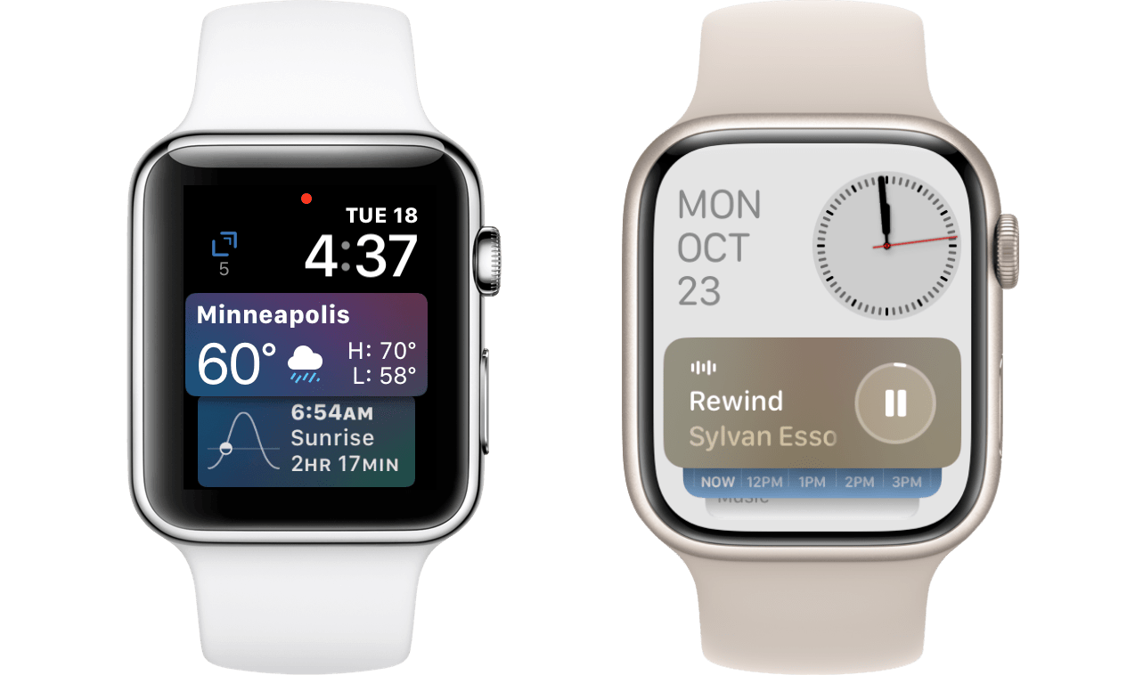
The Smart Stack is clearly a descendant of the old Siri watch face, which was a marquee feature in watchOS 4. Both interfaces are made up of the date and time hovering above a vertically-scrolling list of cards, with each card showing information from some app on your Apple Watch. The list is generated automatically, and tries to sort by the most relevant items at any given time.
The Siri watch face was a great idea, but I always believed it suffered from being a watch face as opposed to a more general-purpose feature for intelligently surfacing data on the Apple Watch. As I stated in my watchOS 6 review:
I’ve never really felt like the Siri watch face was solving the problem in the right way. If it truly lived up to its expectations then the Siri face would sanitize the Apple Watch experience. Everyone would have to use it or else sacrifice major functionality.
Exactly. The wide variety of watch faces are one of the main factors in making the Apple Watch a truly personal device. Locking everyone into the same Siri watch face in order to access the intelligent cards interface was antithetical to the Apple Watch experience. Apple seems to have come to the same conclusion, because the last time the Siri face received any notable attention was in watchOS 5.
I’m not sure why it took Apple five years to reimagine the Siri watch face in an improved form, but they’ve done it now, and their new solution solves nearly all of the problems I had with the original version. The Smart Stack has taken over Control Center’s old spot directly beneath the watch face. Swiping up on the watch face or turning the Digital Crown upward will slide in the new view. This works on any watch face1, so you’re no longer forced to choose between advanced functionality and personalization.
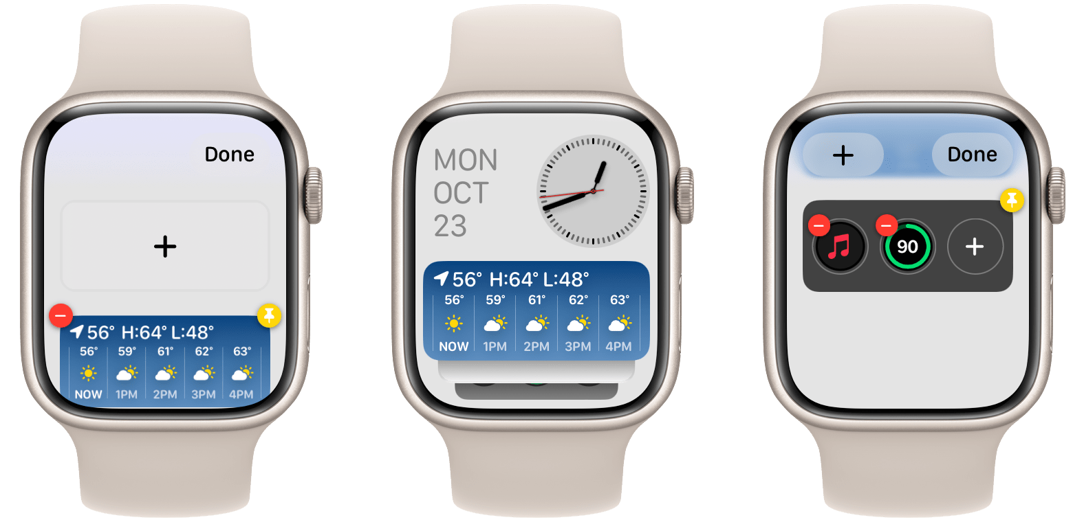
The Smart Stack interface is very reminiscent of the Siri watch face, but with some notable improvements. First and foremost, you can now tap-and-hold on any card in the stack to access a new editing interface. This includes buttons in the corners to delete the card, or to manually pin it to the top of the list. There is also a large ‘+’ button at the top which you can use to manually add more cards to your stack.
If you don’t add anything manually, most cards will still appear programmatically when your Apple Watch thinks they’re relevant. But, the ability to add exactly what you like — particularly combined with pinning whatever is most important to you to the top — transforms this interface’s functionality from hit-or-miss to beautifully consistent. By default the Smart Stack will use machine learning to attempt to intelligently display what you want before you tell it, just like the Siri watch face did. But for those of us who are willing to put a bit more work into taking control of things, we are empowered to tell the interface what we want (or what we don’t want) when it inevitably gets something wrong.
This is exactly what I always asked for from the Siri face. Machine learning is great, but it’s impossible for it to guess what we want with 100% accuracy. Every time an “intelligent” interface fails to show us something we expect from it, it degrades trust and makes us less likely to think about consulting that interface next time (see: Siri).
Starting with machine learning is a great idea, because it allows new users to get some functionality out of the interface without having to put in any work up front. But as users adjust to it, successes become less special and failures become more jarring. Allowing us to build from the initial machine learning foundation with easy-to-use controls creates a perfect learning curve to help users build a system that works for them personally. This is exactly what the Smart Stack provides, and I love it.
As for the cards themselves, which have now officially received the title of “widgets”, they are made up of small composable data-only interfaces. For now, developers cannot make watchOS widgets interactive, although Apple’s own Now Playing widget does include a functional play/pause button, so hopefully a future update will enable widget interactivity for all watchOS apps.
In the meantime, watchOS widgets are like a far more evolved version of watchOS 1’s Glances. Rather than giant, full-screen views that were inefficient to navigate between, the Smart Stack’s widgets take up a little over one third of the screen. This allows you to fully see two widgets at a time, plus get a glimpse at those remaining in the stack below. Scrolling this interface with the Digital Crown is pleasant and efficient — it’s a great way to quickly move through data from a variety of different apps.
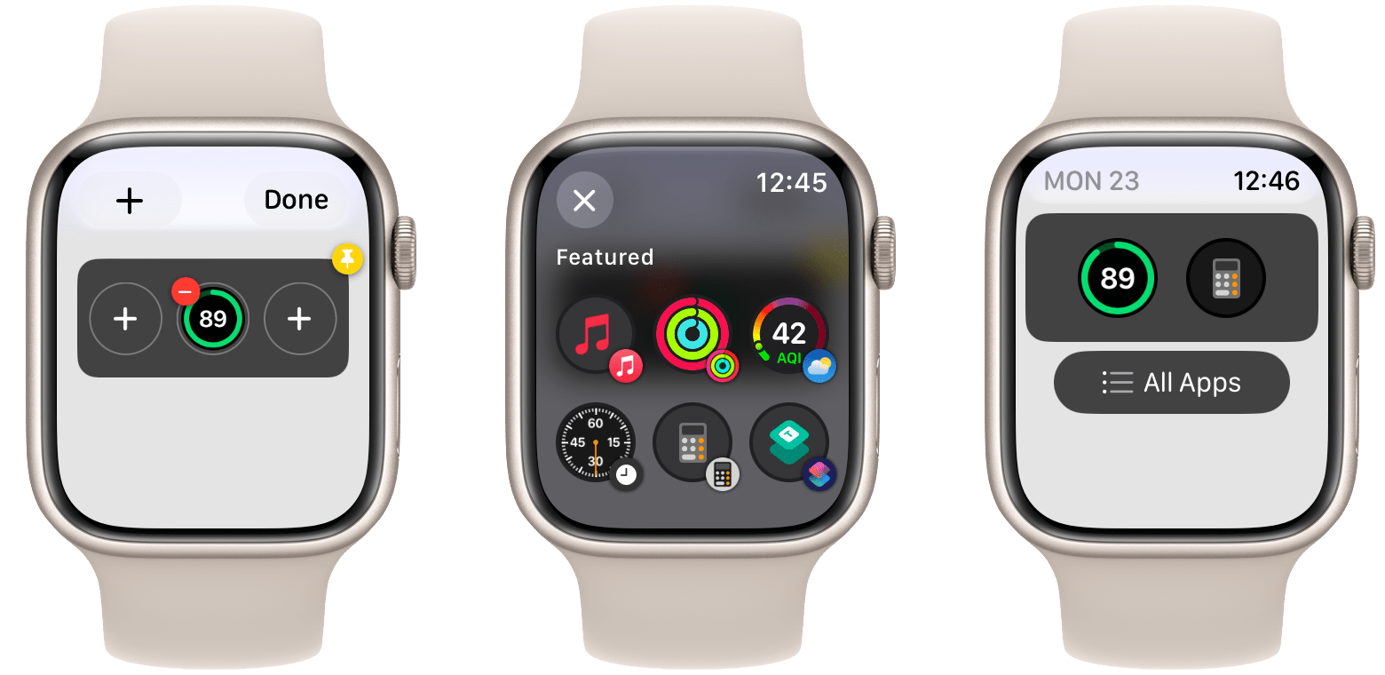
Apple also includes a single special widget that is made up of three circular watchOS complications. You can customize these by tapping and holding on the widget to bring up the Smart Stack’s editing interface. Use the small ‘x’ button to remove an existing complication, which then reveals a larger ‘+’ button to add a new one in its place. If you’d like to only keep one or two of the slots filled, just don’t replace a removed complication and the interface will adjust those remaining to be centered. watchOS apps need to have their complications updated to work with these new versions, so not all circular complications from older apps will be available.
The complications widget is a great addition to the Smart Stack. By default, it sits at the very bottom of the interface at all times. If you’d like quicker access to your three chosen apps though, you can pin it to keep it at (or closer to, depending on your pinning order) the top of the stack.
My one gripe with the Smart Stack is the top of the interface. When you first open it, you’re greeted with a static clock and date which take up fully half of the screen. Seeing as how you just came here from a watch face, re-showing the time is an enormous waste of screen real estate. The date is a bit more forgivable since not all watch faces show it, but I still don’t understand why Apple didn’t just put some customizable complications up here so that we could use this space however we want. Alternatively, they could place a button to open Control Center in this space, thus keeping it fairly easy to access while also freeing up the Side button to become an Action button.
Other than the date and time, I’m loving the Smart Stack. It’s a combination of so many old watchOS ideas which were not bad, but simply executed poorly. Now, finally, Apple has figured out an effective interface for showing quick bits of glanceable information from apps throughout the system, choosing and sorting those bits algorithmically, and still enabling their most invested users to make customizations. More of this everywhere, please.
New Systemwide Design Language
watchOS 10 includes a refreshed design language throughout the system. App interfaces have been expanded all the way to the screen edges, and most buttons have transitioned to circular icons which float above the interface layer. All of Apple’s first party apps have been upgraded to this new design.
I find the new design language to be an improvement across the board. The expanded interfaces and floating buttons create a very pleasant effect. The new buttons appear similar to circular complications from the watch face, making them feel instantly familiar and natural to use. It’s not all form over function either; the changes in many apps have resulted in more data being fit into the same screen real estate, or enabled better navigation or access to controls in more intuitive ways.
While we don’t need to go into all of them, we’ll take a quick look at the changes in a few different apps which are representative of the new design.
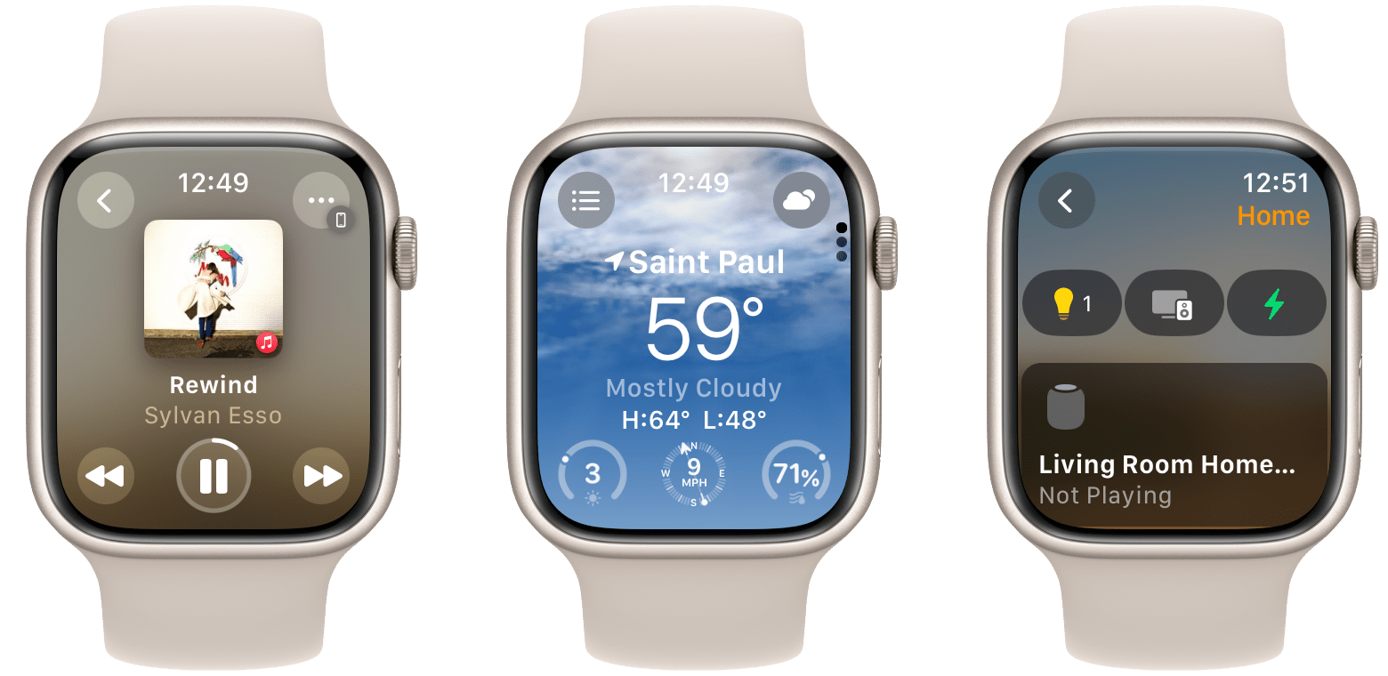
Now Playing
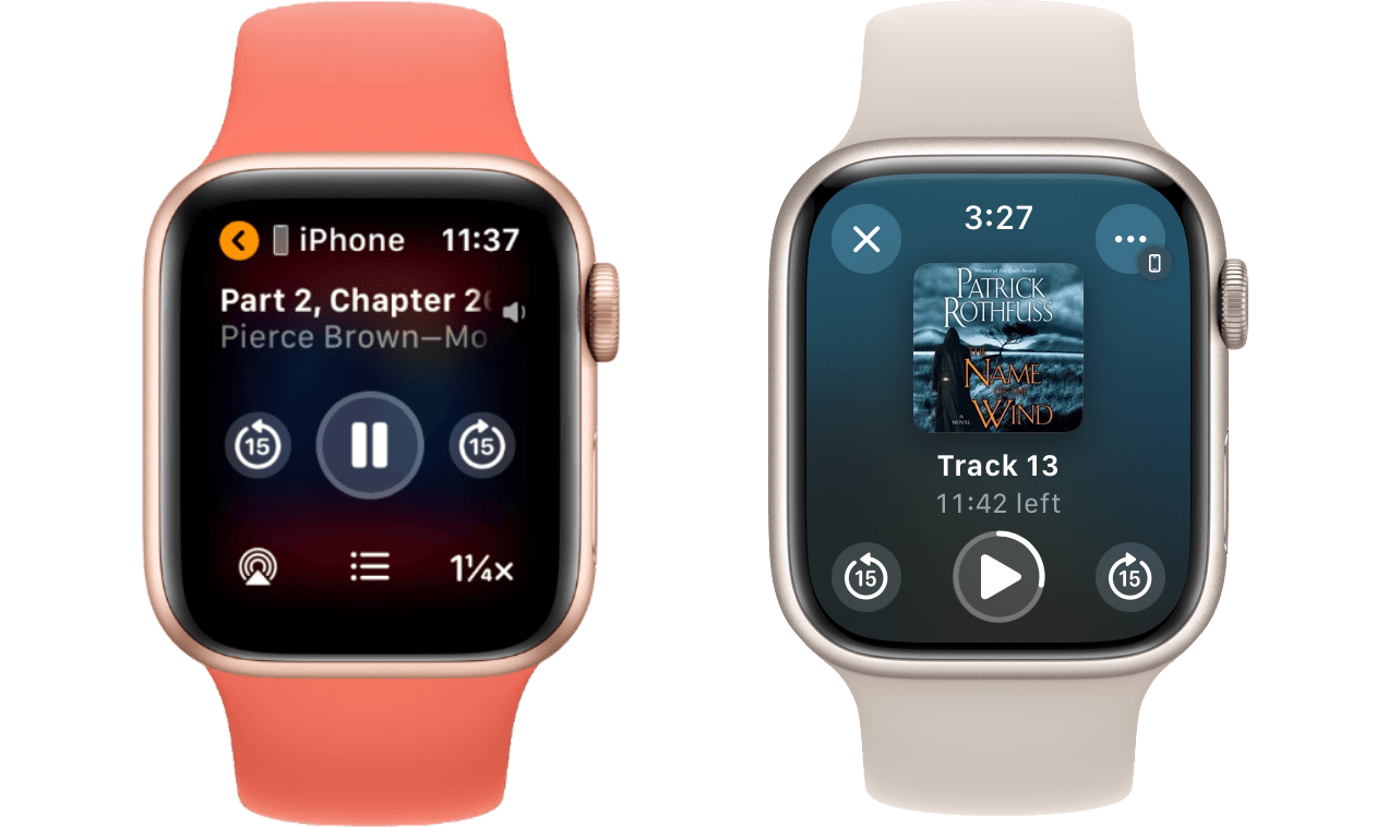
The Now Playing screen has been updated significantly, as have its embedded versions in the Audiobooks, Podcasts, and Music apps. Pictured above is the Audiobooks version, although they all look essentially the same. While the information density of this interface isn’t particularly improved, it certainly looks a lot nicer.
The AirPlay and playback speed controls have been moved to a menu behind the button in the top-right corner. While this technically removes some single-tap functionality, in practice I don’t think most users need either of these controls often enough for that to be a huge deal. Playback speed in particular made for easy accidental taps in the old design, which was quite annoying since you had to continue tapping until you cycled all the way back around to the speed that you wanted. The new control behind the menu includes ‘+’ and ‘-’ buttons so that you can easily adjust speed back and forth.
Contacts
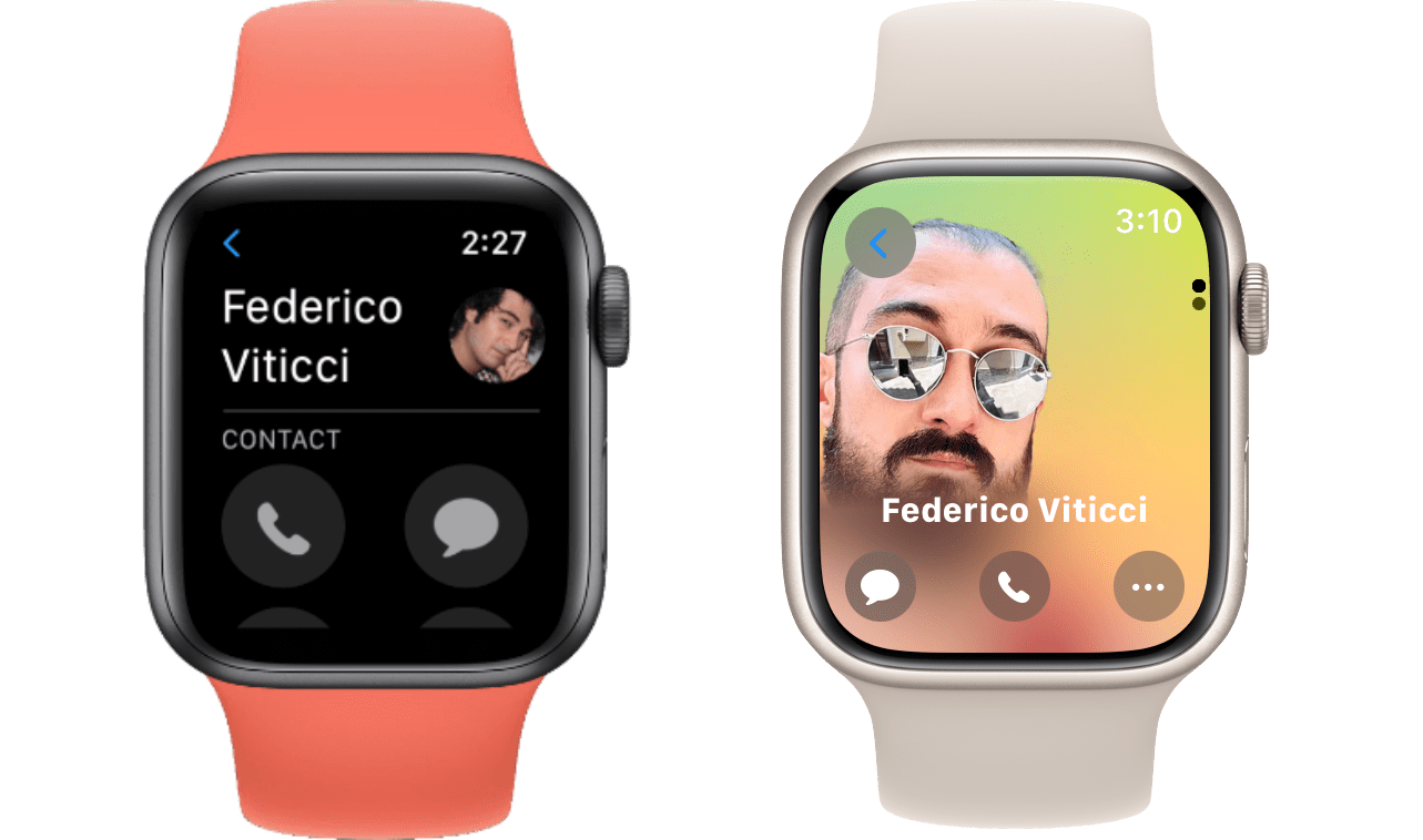
The Contacts app has embraced Apple’s new Contact Posters feature, making for a far more dramatic interface than the older version. Despite the new full-bleed layout, Apple still managed to fit another button on the first page of the interface.
The incoming call screen in watchOS 10 sports a very similar interface, Contact Poster and all. These new interfaces make their year-ago versions look instantly outdated, and I am very much a fan of the changes.
Home
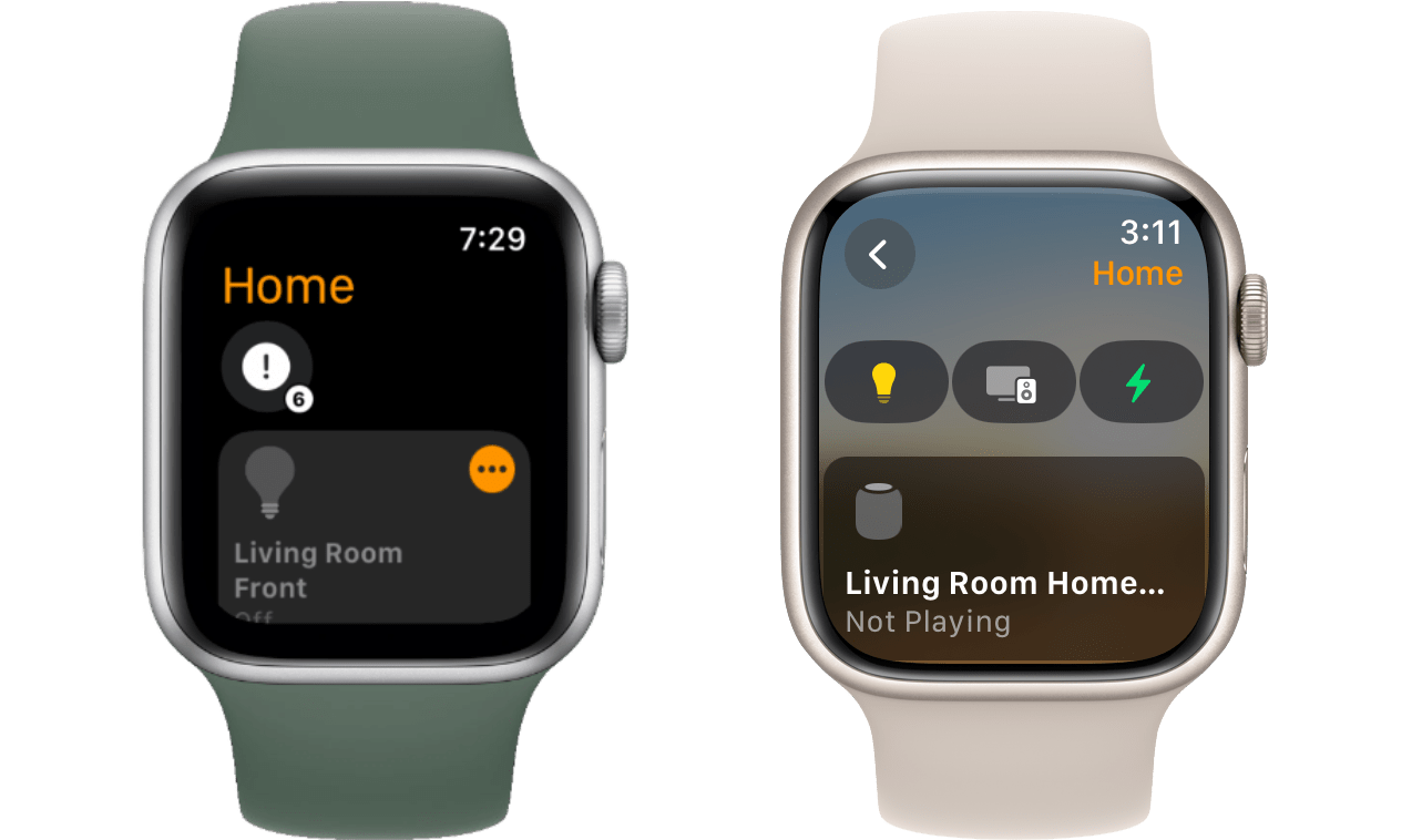
The design changes to the Home app look initially quite subtle, but they represent something that Apple is doing across many apps on the system. By moving the page title from a huge word on the top left to a much smaller caption on the right, they’ve cleared up space to add nice navigation buttons in more areas of the interface.
For Home, Apple used this change to shake up the app’s hierarchy. Now rather than having to scroll all the way down your list of devices to get to other rooms, you instead just hit the back button to access a new screen with options to open a certain room or a list of scenes. Especially if you have more than 5 or so devices, this is a definite improvement over the previous setup.
- Except for, amusingly, the Siri watch face itself, which maintains its own outdated cards interface. watchOS 10 takes the Siri face from arguably the most functional watch face to objectively the least functional. I imagine this watch face only still exists to avoid breaking compatibility with any holdouts out there who are still using it. If that's you, well, props for hanging in there through five years of essentially no updates, but the time has come to make the switch. ↩