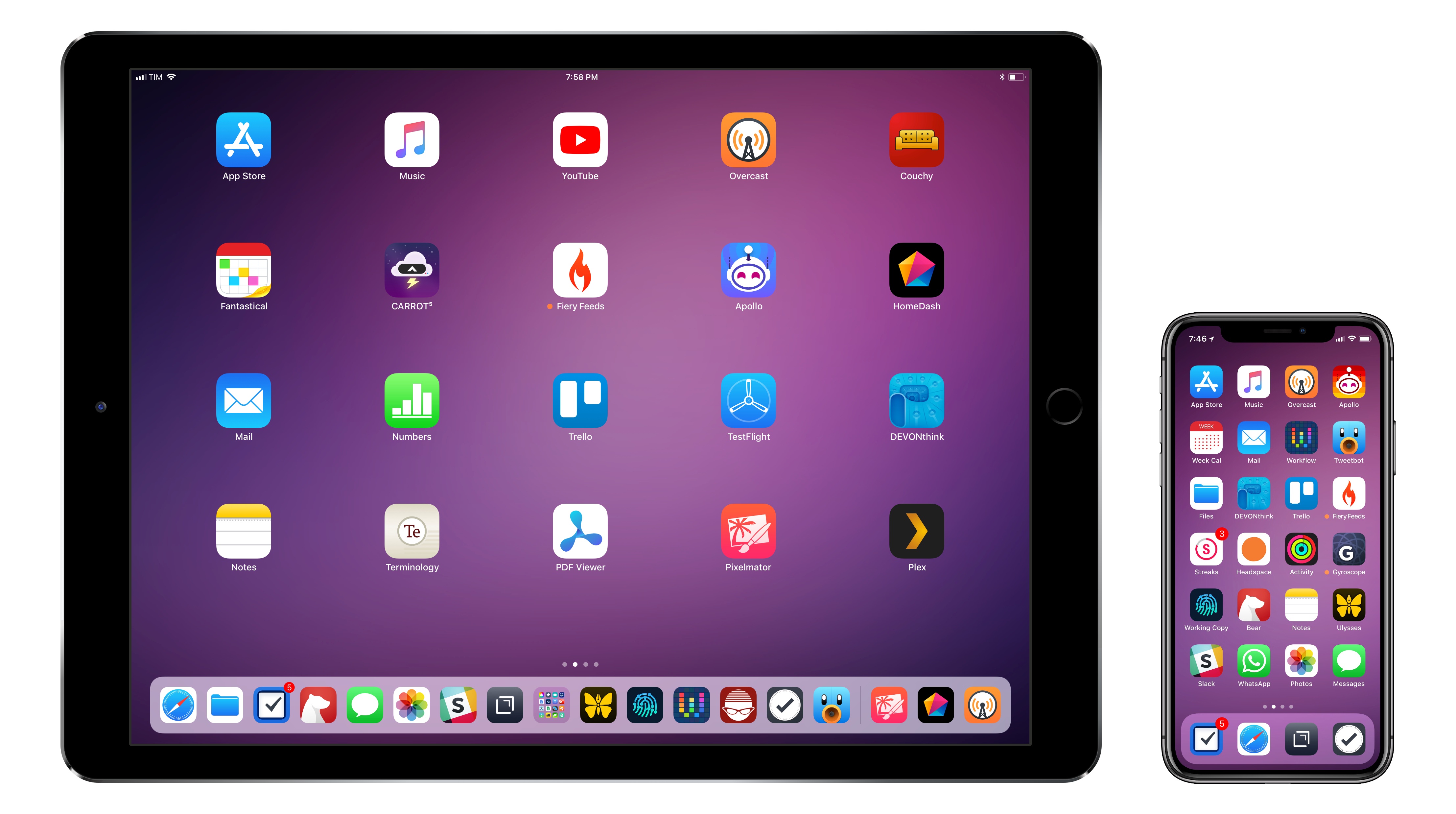
You can download my wallpaper here.
The new year is always an opportunity for me to take some time off work and better understand how I use technology and, more importantly, what I want from the devices I write about. Historically, that meant I would take a short break over the holidays and come back to MacStories with a handful of recommendations for new apps I wanted to test throughout the year, from text editors to finance management utilities and health apps.
This time, the break lasted a little longer. Last year was a particularly stressful one for me, and I felt that I needed to take at least a couple of weeks off all my work projects to clear my mind and make a plan for the year ahead. That turned out to be a fantastic idea: not only was I able to finally relax (to the point where I was craving the website and feeling the urge to write again) – the extended break also allowed me to identify areas of my life that I wanted to act upon immediately and improve in 2018.
This is why, when Myke Hurley asked me on Analog(ue) which big project I was working on for the new year, my first answer was “myself”. My plan for 2018 is to take better care of myself – from multiple perspectives – so I can avoid the stress of 2017, feel more inspired, write more, and, ultimately, be happier. I don’t have a single big “work project” for 2018; my goal is to improve every aspect of my daily routine, in big and small ways, so everything I do can subsequently grow as well. Essentially, I need to fix the foundation before I can build on top of it again.
In addition to new habits (which I detailed in last month’s issue of the MacStories Monthly Log for Club members; you should subscribe if you haven’t yet), this effort involves new apps I’m using to help me along the way. I decided to wait a full month after I came back to work because I wanted to see which ones would actually stick around; what you’ll find below is a collection of apps I’m now using on my iPhone and iPad on a daily basis.
While this type of story isn’t new to longtime MacStories readers, I feel like the 2018 version is more personal and pragmatic. These aren’t advanced automation apps or utilities I’m just experimenting with for the mere sake of geekery; from mental health to time tracking, each of these apps is having a tangible, positive impact on my life that I’d like to highlight.
Headspace
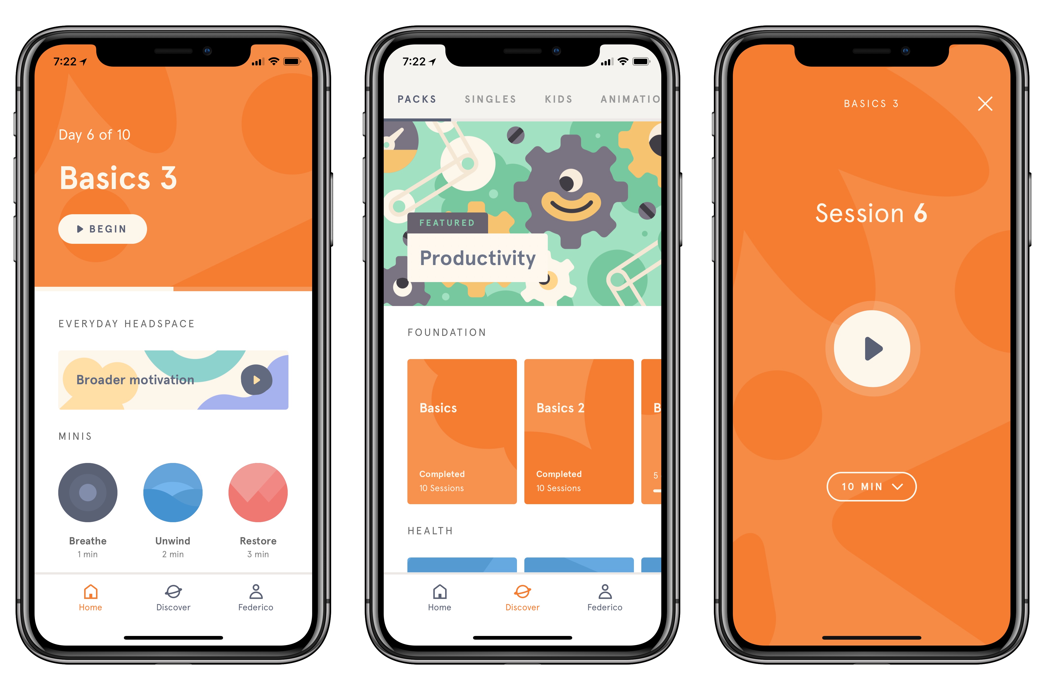
As I wrote in last month’s Club MacStories Monthly Log, I didn’t believe in guided meditation until I completed the free trial of Headspace. After 10 free sessions, I signed up for an annual subscription at the beginning of January, and I’m now trying to meditate every day, aiming for at least 5 completed sessions every week.
It’s tricky to broadly recommend meditation as a lifestyle technique: maybe it works well for you; maybe you feel like it adds nothing of value to your life. Personally, I’m finding the time I set aside for myself extremely useful and precious. After completing a Headspace session, I’m more relaxed and, thanks to the breathing exercises, in a better position to “scan” and feel my body – something that I always wanted to understand but consistently failed at. Headspace puts me in a good mood and it’s become something I miss when I don’t do it.
The Headspace app itself is colorful and neatly organized in sections that contain thematic packs and collections aimed at helping you in different aspects of your life. Headspace can even write its Mindful Minutes data to HealthKit, which is a nice plus.
I’m still a Headspace novice, but I’m already seeing the benefits of unwinding for a few minutes every day to approach the problems of everyday life with a calmer, more optimistic viewpoint. Even though I sometimes skip a day because life gets in the way, I’m committed to Headspace for the year.
Workouts++
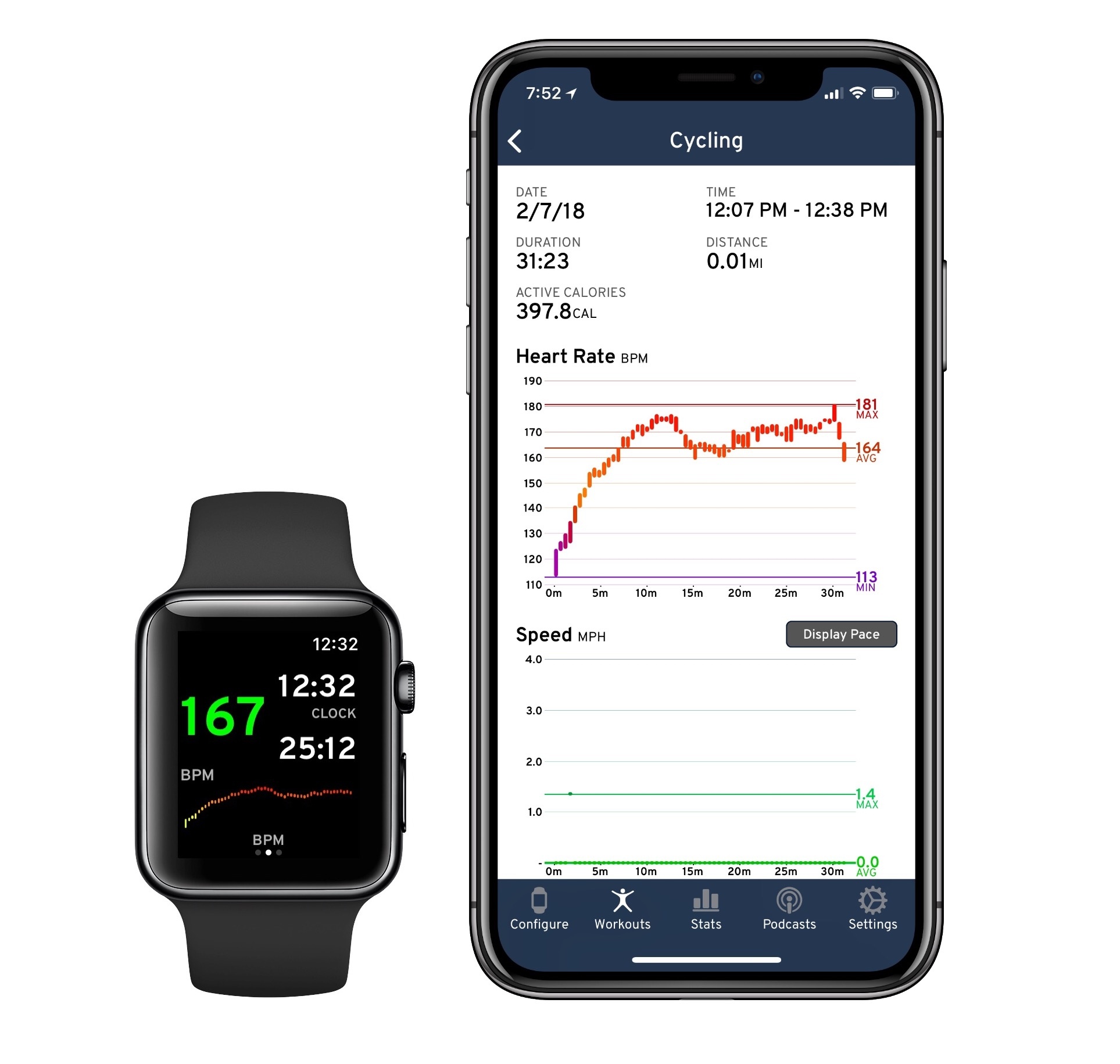
John reviewed David Smith’s alternative workout app for iPhone and Apple Watch in late 2016. I recently started using Workouts++ in lieu of Apple’s default Workout app as part of a new daily exercise regime I began last month. Mens sana in corpore sano, as the Romans used to say; in addition to a calm and healthy mind, I need to get in better shape.
Right now, I’m doing a 30-minute indoor cycling workout and 150 sit-ups every day. My goal is to increase these numbers to 45 minutes and 300 sit-ups by the end of April; long-term, I want to build muscle, add new workout types, and lose 22 pounds by the end of 2018.
The Apple Watch is playing an essential role in this with the help of Workouts++, Overcast, and a Polar H10 external heart rate sensor that directly integrates with the Watch. Thanks to Overcast, I can listen to my favorite podcasts over my AirPods as I’m working out and a) save time with Smart Speed and b) control my queue with the Overcast Watch app.1 When I’m on the bike, I dip in and out of Overcast (mostly for skip controls) and always go back to Workouts++, which reports time elapsed and real-time heart rate data (polled nearly every second) thanks to the Polar H10 chest strap.
What I love about Smith’s app is the bold design (which works well at a glance) and its deep personalization options. I’ve created a Workouts++ view on the Watch that shows me exactly what I need, so I can keep an eye on the workout’s duration and precise heart rate measurements to stay in the fat-burning zone and slow down when I’m pushing too hard. I was familiar with Workouts++ before, but it’s only now that I’m taking regular exercise seriously that I can fully appreciate Smith’s vision for a free, highly customizable alternative to Apple’s Workout app.
I also want to call out one of my favorite details of the app: to quickly end a workout, you can rotate the Digital Crown and spin it for a few seconds. I find this to be a faster and more intuitive method than swipes and taps on the screen.
Streaks
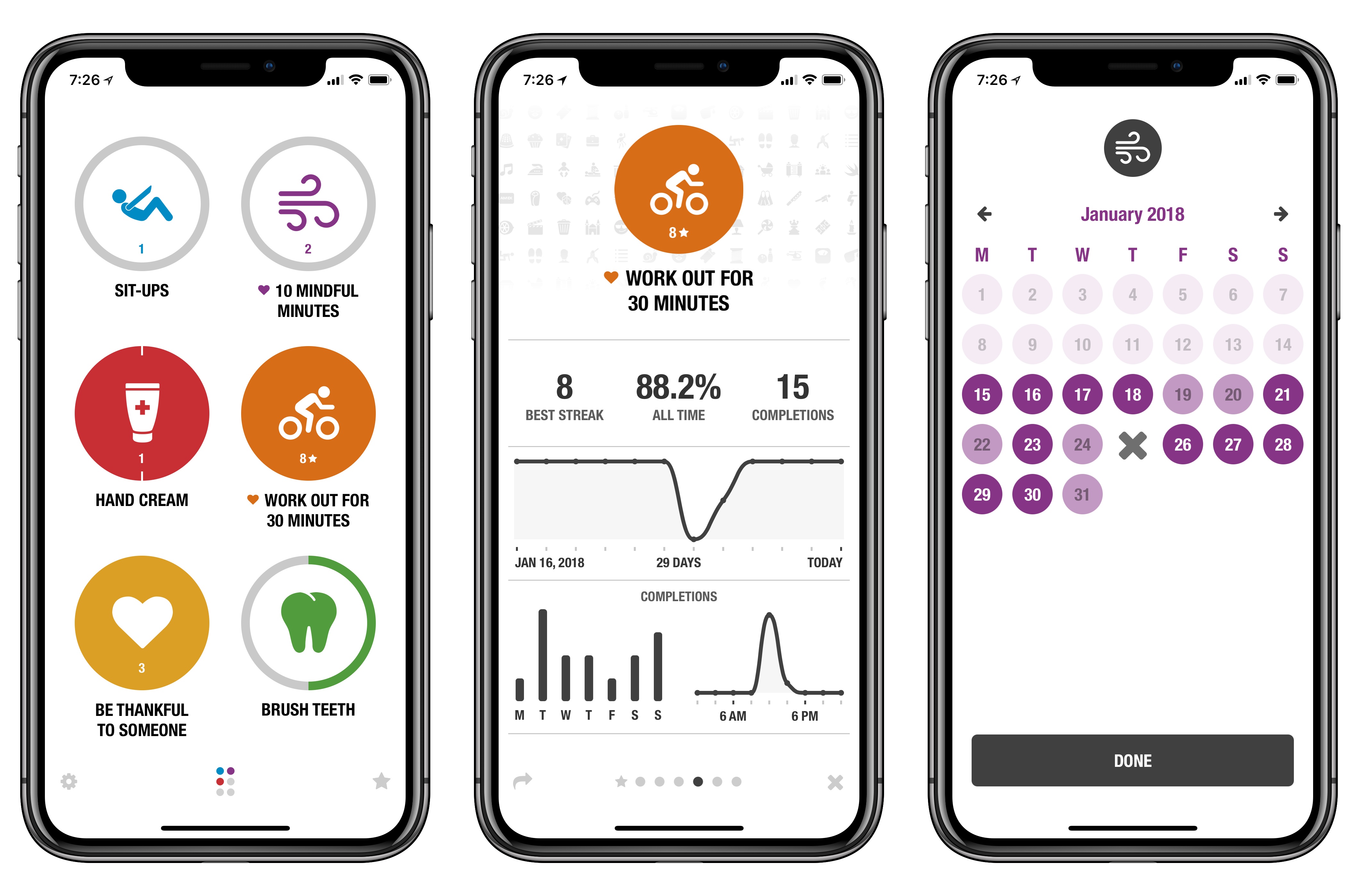
This is where all my new habits come together in one unified dashboard. Like Workouts++, I’ve known about Streaks for a long time, but never fully committed to it for keeping myself accountable. After sketching out a “personal improvement plan” over the holidays, I created a handful of realistic daily goals intermixed with other habits I want to develop every day, and added them all as tasks in Streaks. Now, Streaks is on my Home screen and it’s one of the four apps that still have badges enabled (the other three are Messages, WhatsApp, and Things).
I prefer Streaks over other habit trackers for a few reasons. First and foremost, the app integrates natively with HealthKit so it can see whether I’ve actually worked out or meditated during the day. It’s almost as if I can’t lie about it: as soon as a workout is logged in HealthKit, Streaks automatically marks the habit as complete; if it’s still grayed out, it means I need to do better.
In addition, Streaks lets me set up habits that need to be “filled up” during the week without being daily, such as meditating five times a week. There’s a great selection of custom colors and icons to better visualize different goals, and you can even complete tasks from the Apple Watch or via Siri. Lastly, there’s a general overview page that displays your overall progress since you started using Streaks, which is an equally amazing and terrifying way to understand whether you’re following through on your plans or not. So far, I’m doing pretty good.
Streaks motivates me to do better every day, but it also keeps me honest without being annoying. A traditional task manager would turn overdue tasks red and make me feel bad about those unchecked items sitting in my inbox; Streaks puts an “x” on the calendar for days when a habit was not completed, but otherwise it simply moves on and encourages you to try again tomorrow. There’s a warm sense of satisfaction at the end of the day when all the circles in Streaks have been filled, and I’m happy I started using this app to keep track of my journey towards a healthier, more positive lifestyle.
1 Second Everyday
I’ve always been intrigued by those timelapse-like videos that, through small snippets of footage recorded every day, show you what the past year has been like. I wanted to do something similar for 2018. While my initial idea was to share a photo every day (something that my friend Stephen has done multiple times), I realized that it was going to be too much work, so I settled on something more low-friction and private with 1 Second Everyday.
As the name suggests, this app makes it easy to record a one-second snippet of video every day. At the end of the year, multiple snippets are stitched together in a single video that you can save or share with other people. If one second is too limiting, you can increase the duration to 1.5 seconds. You can also use videos contained in Live Photos for the selected day if you forget to record a video, or import a video from the library and cut it to only include a small clip in 1SE.
There are two things I like about this app. First, it nudges me to record a video every day with a gentle reminder; 1SE is one of the few apps on my iPhone that still has banner notifications enabled. Furthermore, the app uses a grid view that acts as a glanceable dashboard of video previews but also as a calendar that lets me tap on a specific day to add a video to it. I sometimes struggle to record a video every day (which is why I’m thankful for the Live Photos integration), but I’m getting more disciplined at using this app, and I’m excited to see the final product in 10 months.
Homecam
I’m in the process of adding more (cheap) HomeKit cameras in our apartment thanks to Homebridge running on a Raspberry Pi, and this app does something extremely simple, yet essential for this kind of setup.
Homecam displays a live grid of all the HomeKit-enabled cameras in your house. That’s it. Instead of having to look for cameras in specific rooms or at the bottom of the main accessories list in Apple’s Home app, you can launch HomeCam and see them all at once. Then, you can tap on a camera to watch live footage in full-screen, and optionally add a camera to the Today widget as well. Soon, you’ll also be able to control accessories in the room where the camera is located.
Homecam’s widget is particularly impressive as it can also display live footage from each camera without having to load the main app – and it works both over WiFi and with remote access on cellular connections. I can’t recommend Homecam enough if you own multiple HomeKit cameras and have been looking for a quick way to switch between them.
Airtable
This app isn’t new to MacStories: I covered Airtable in a similar roundup at the beginning of 2016. I ultimately didn’t stick to Airtable because I didn’t have a strong incentive to track items in it; this time, I have a few important reasons to keep using Airtable throughout the year.
Airtable is a mix of a spreadsheet and relational database that combines the benefits of organizing records in rows and columns with the flexibility of a database that contains rich fields for each record. It’s difficult to explain Airtable: it’s one of those unique products that eludes traditional categorization but that makes perfect sense once you use it for a few minutes. On the surface, Airtable looks like a spreadsheet; as you tap on an item, you realize that you can add metadata, links to other records on other tables, formulas, and much more.
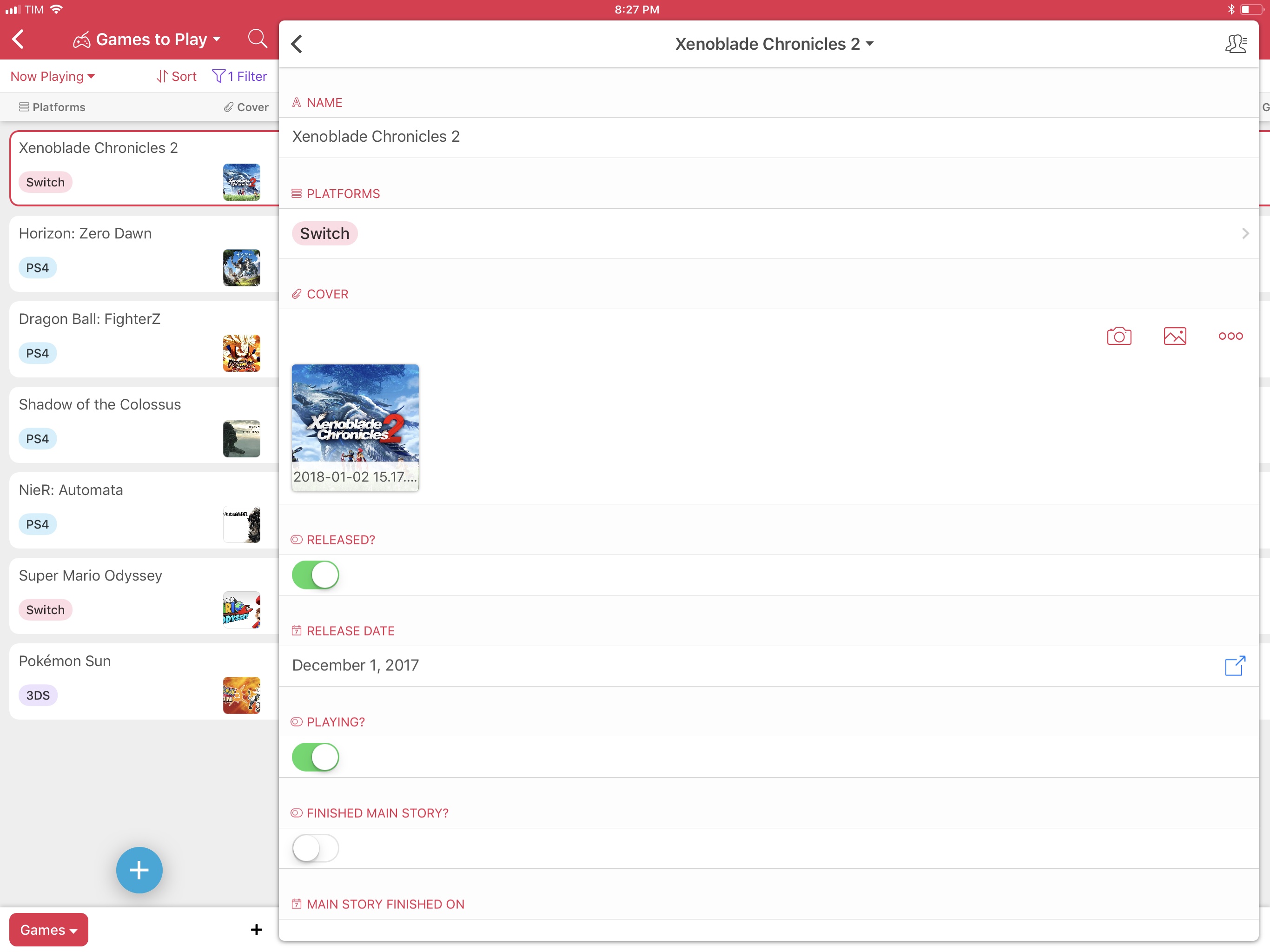
I’ve decided to use Airtable again to keep track of movies I want to watch and videogames I’ve played or plan on playing. Ryan and I are also sharing an Airtable “base” to track the workflows I create for Club MacStories, which I then extract via Workflow (through the Airtable API) to create an index for Club members (look for news on this front very soon).
One of my favorite aspects of Airtable is the ability to save custom views based on filters: in my Games base, for instance, I have separate views for Now Playing and Upcoming games that are managed by filters that look for special toggles in each record.
I wish the Airtable iOS apps were as powerful as the desktop web app, but I can live with them as long as Workflow allows me to automate other features with an API.
iCab
Speaking of desktop web apps: I rediscovered the power of iCab at the beginning of the year when I realized that Safari couldn’t reliably open the Airtable website in desktop mode. iCab isn’t new to MacStories either – I covered the app numerous times in the past. It’s only now, however, that I find myself regularly opening iCab instead of waiting until I’m at my MacBook to work with a website that doesn’t play well with Safari on iOS.
iCab is an app with a lot of preferences, which, unfortunately, are confusingly organized in multiple sub-sections and nested screens. The app can be daunting to configure and too deep to customize for most people. It pays off if you put in the time to learn its labyrinth of settings though. One of the advanced options that I’m using all the time now is the ability to set custom user agents on a per-domain basis, with support for wildcards in the URL.
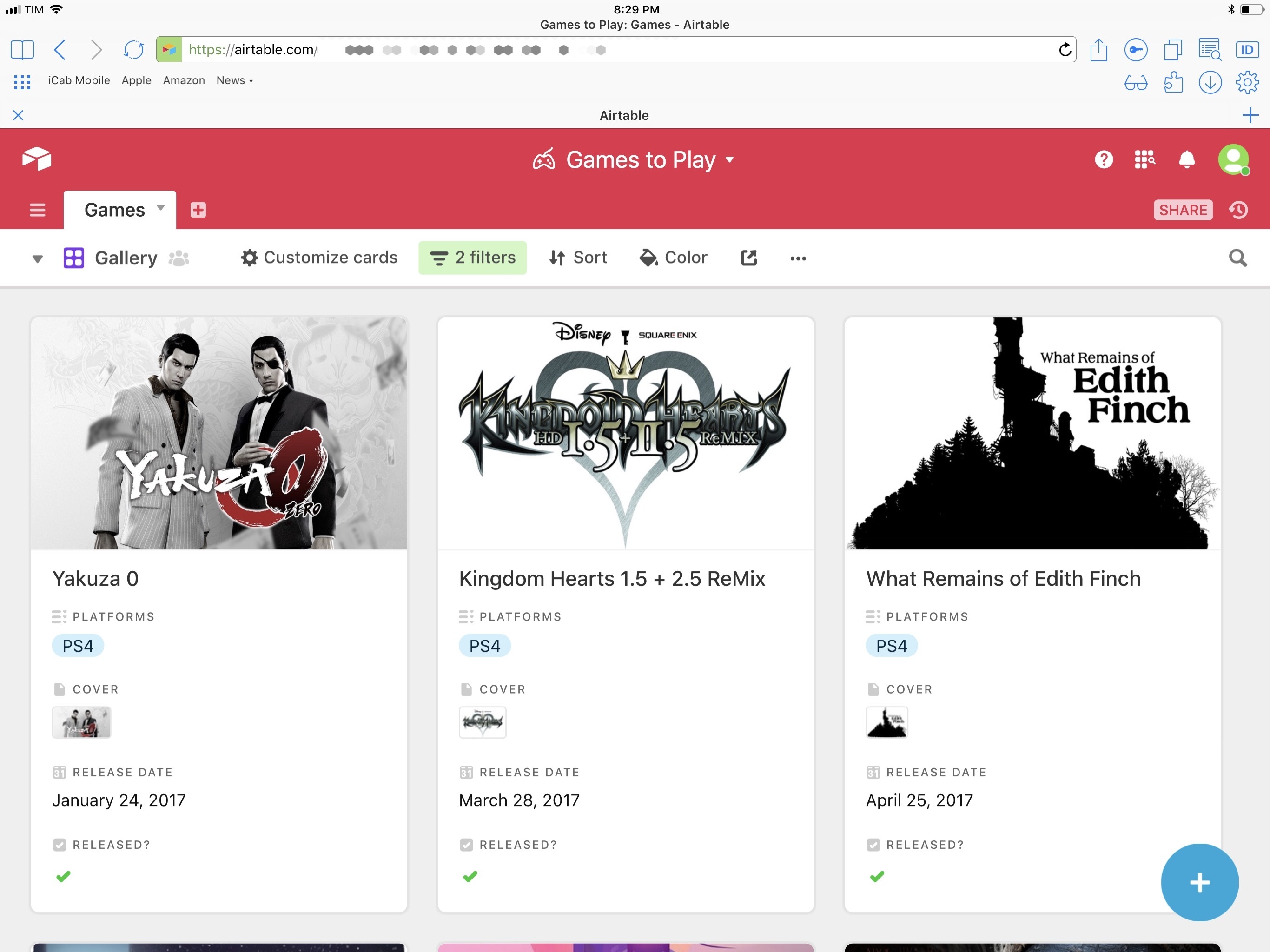
To overcome the Airtable issues mentioned above, I created a rule that exposes Safari for Mac as the browser’s user agent, which lets iCab trick the Airtable website into thinking I’m browsing from a Mac. This way, I can access advanced functionalities of my bases that aren’t available in the iOS app, such as the Gallery and Kanban views.
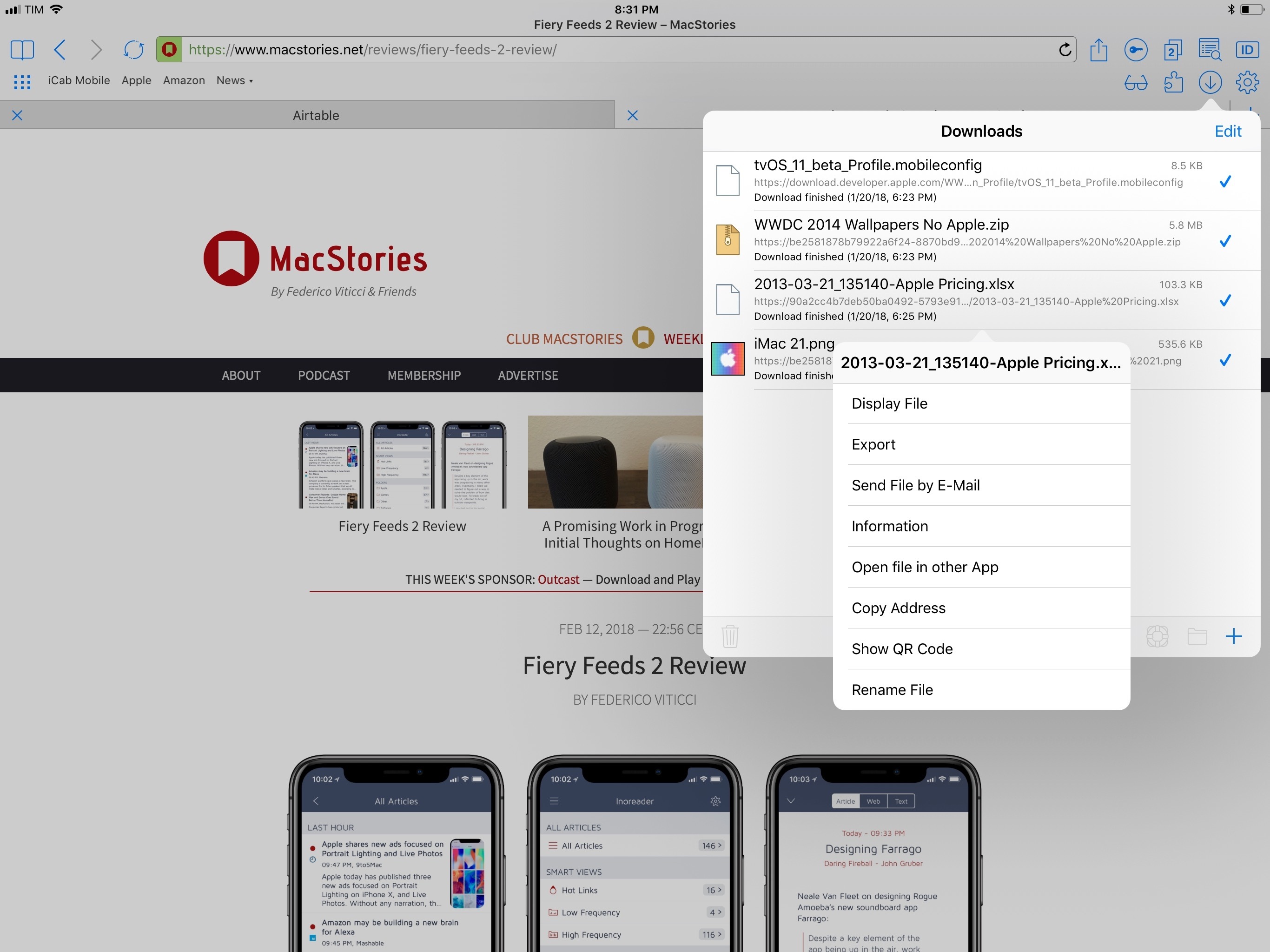
There’s a lot to love in iCab – if you know where to find it. Unlike Safari, the app offers a proper file downloader that does everything I’d like Apple to do: you can queue multiple downloads, preview them when they’re done, send them to other apps, and even browse them in iCab’s Files extension.
The app’s toolbar is entirely customizable and, again unlike Safari, the iPhone version shows you tabs below the address bar instead of forcing you to open a separate carousel view to see your currently open tabs. I would like to see developer Alexander Clauss make iCab more approachable by reorganizing its settings and getting rid of some legacy features, but I also know that part of iCab’s appeal is that it offers a little bit of everything for everyone. I’m not sure how much that can be simplified without compromising the app’s value.
Timelogger
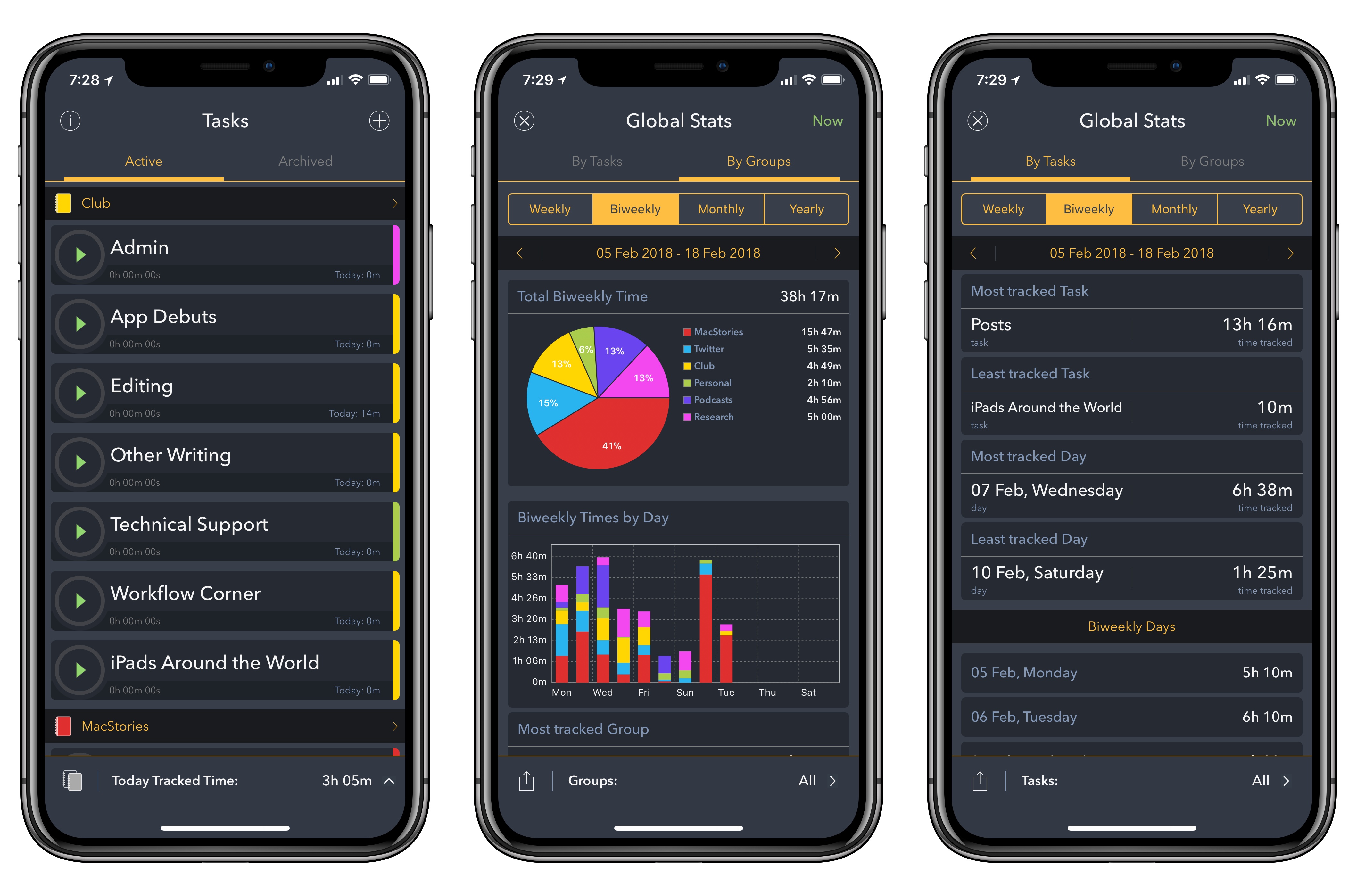
Annoyed by the lack of a solid Toggl client for the iPhone and iPad, earlier this year I decided to take a handful of time tracking apps for a spin and see if the App Store suggested anything better that also matched my requirements. My ideal time tracker has to offer iPhone, iPad, and Apple Watch apps, an interactive widget, cloud sync, the ability to organize timers in tasks and groups with different colors, and in-depth reports generated natively on iOS. After a few days of unsuccessful tests that almost convinced me I would always have to use a web app and my API workflows, I stumbled upon Timelogger. After a couple of weeks of tracking, I realized the app was working so well for me, Timelogger replaced Tweetbot in my iPhone’s dock.
Developed by Filipe Martins, Timelogger is, effectively, what I would create if I had the ability to build my own time tracking app for iOS. The main view is a list of timers, each with its own Play button to pause it or resume it. Timers can be assigned to groups, which are color-coded, but each timer can also have its own unique color. Underneath each timer, you can see for how long it’s been running in the current session, as well as the total amount of time you’ve logged in it for the day. This structure is exceptional because it helps me visually group timers together by color, as well as immediately see whether I’ve spent too much time on Twitter. At the bottom of the screen, there’s a bar that gives you a total of the time you’ve tracked today.
Then there’s the Global Stats page, which is where Timelogger beats anything else I’ve tried on iOS. Here, you can view a pie chart that visualizes how you allocated your time for the selected time period and a vertical bar chart for the current week. If you, like me, have a lot of timers, it’s best if you view stats by group to make the charts more readable and useful. Scroll underneath the charts, and you’ll find more handy statistics for the most and least tracked groups and days. If you need to export your stats and share them with someone else, you can hit the Share icon in the bottom left corner to generate a PDF report.
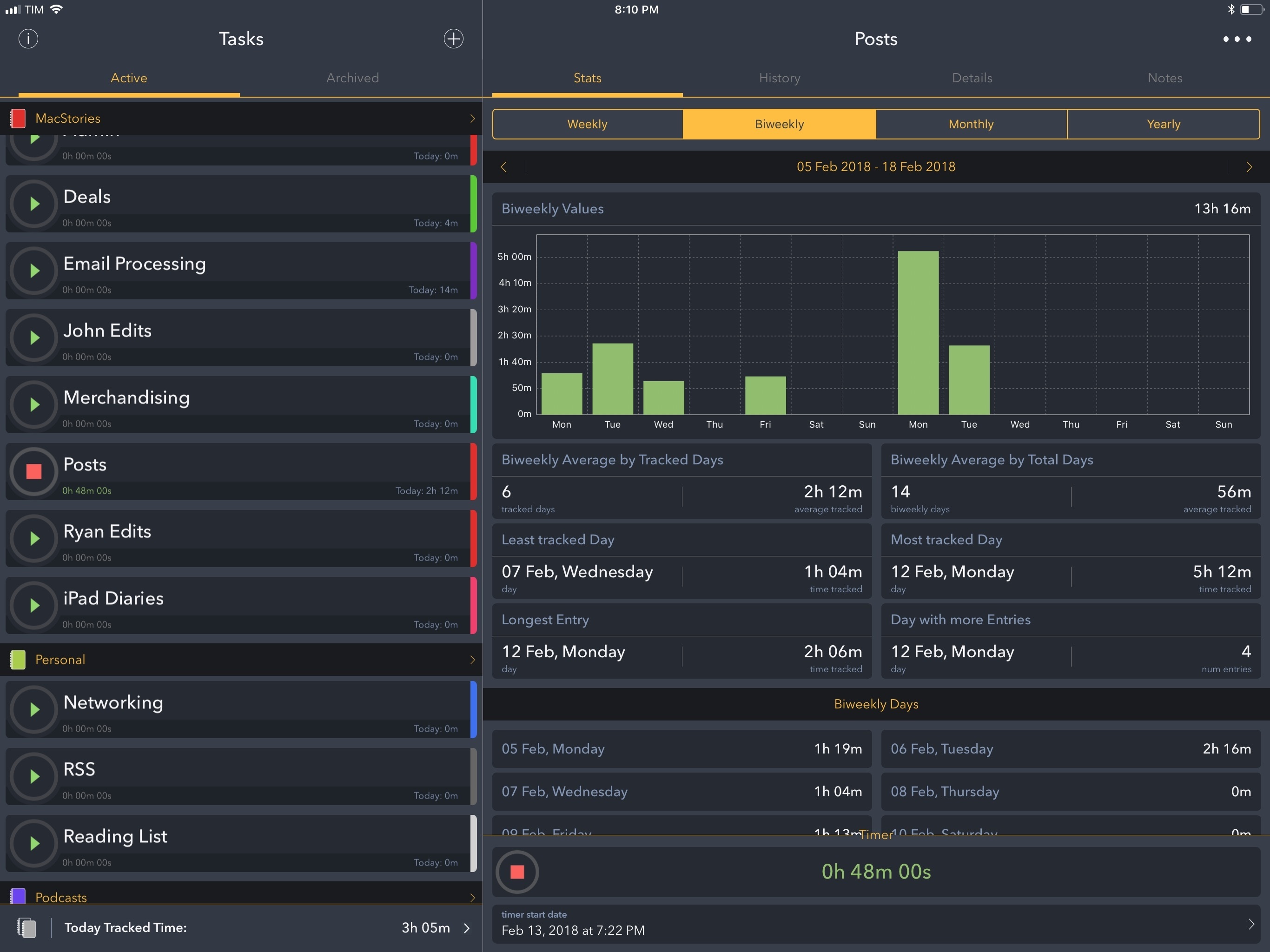
Timelogger works better than Toggl for me because it’s a native app that lets me easily keep track of my time and check in on total tracked time without having to build a custom workflow. The app also comes with a widget to start timers and pause active ones, plus an Apple Watch app to quickly start timers from your wrist.
There are aspects of Timelogger that I’d like to see improved: the app syncs your data with iCloud, but only once a timer is complete, so you can’t start a timer on the iPhone and later pause it on the iPad. Furthermore, there’s no Mac app (which could be a problem for some) and you can’t set custom date ranges in the Global Stats page.
Thanks to Timelogger, I’m tracking my time more consistently and I’m able to effect changes on my habits as hard stats about my time are always at my disposal. I used and loved Toggl for a year, but Timelogger is a better iOS experience, which is what I need at this point in my life.
HomeDash
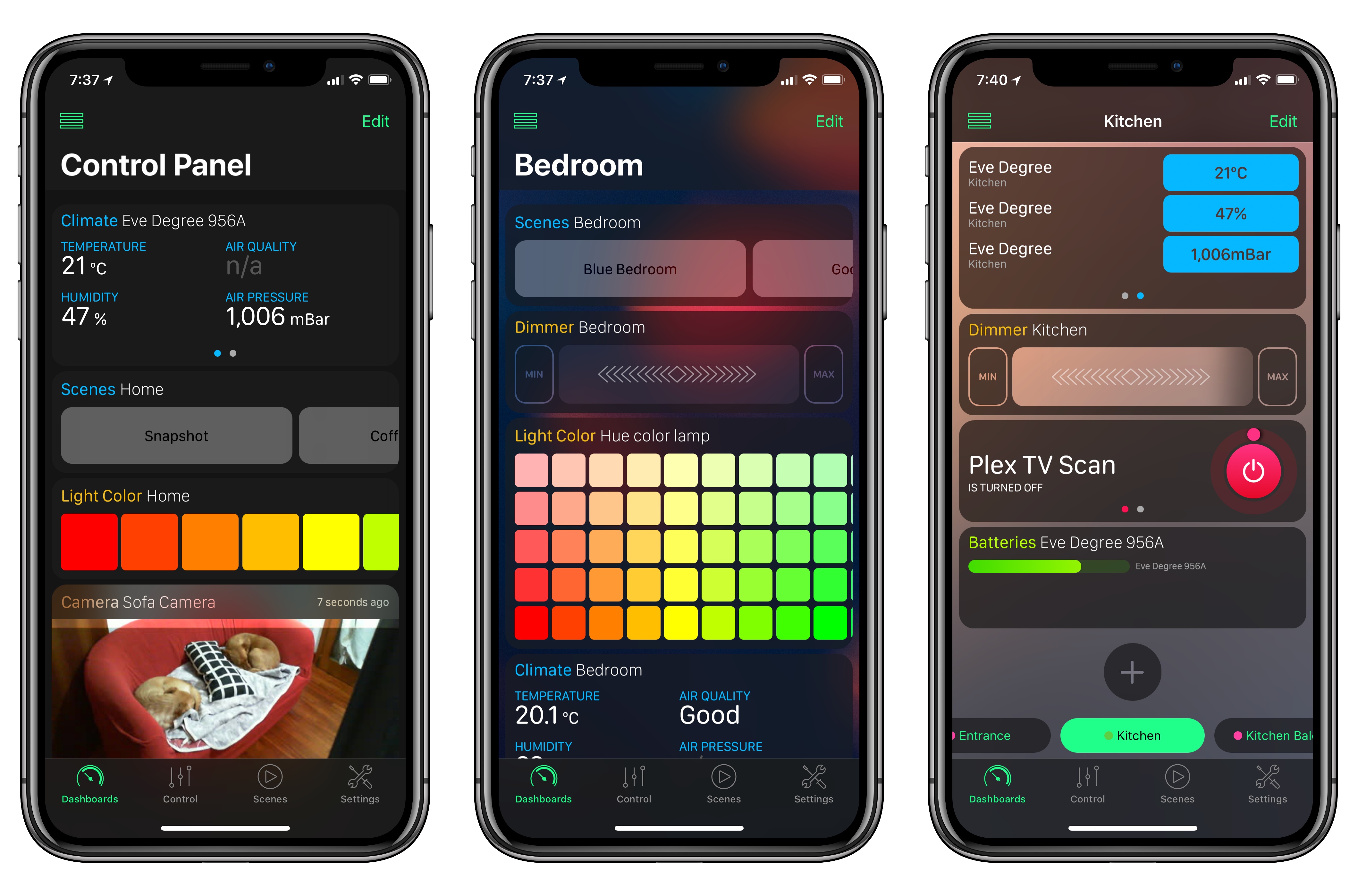
As those who follow me on Twitter have probably noticed, I’ve been on a HomeKit binge lately, adding new devices and automations to our house with a mix of official HomeKit hardware and custom accessories hooked up to Homebridge.2 I wanted to do this in preparation for the HomePod, which we’re going to use as a complete replacement for the Echo and Alexa, but also because my increased usage of Siri (both on the Watch and iPad) lends itself well to HomeKit commands.
Besides scarce international availability of compelling products (the HomeKit situation in Italy is quite sad, which is also why I’m making my own HomeKit accessories with Homebridge), I would argue that HomeKit is plagued by the confusing design of the Home app on iOS. I like the idea of the Home app as a centralized place for all kinds of accessories and scenes; however, its lack of personalization and bland design make it hard to understand the differences between accessories, conditions, and scenes. Specific settings or device characteristics require too many taps to be viewed as they are buried beneath 3D Touch or long presses; bafflingly, some HomeKit features are exposed in the API available to third-party apps, but can’t be used in Apple’s Home app itself.
I discovered HomeDash when I shared its time-limited sale on @MacStoriesDeals a couple of weeks ago. HomeDash isn’t perfect, but it’s very close to my vision of what Apple’s next Home app should be.
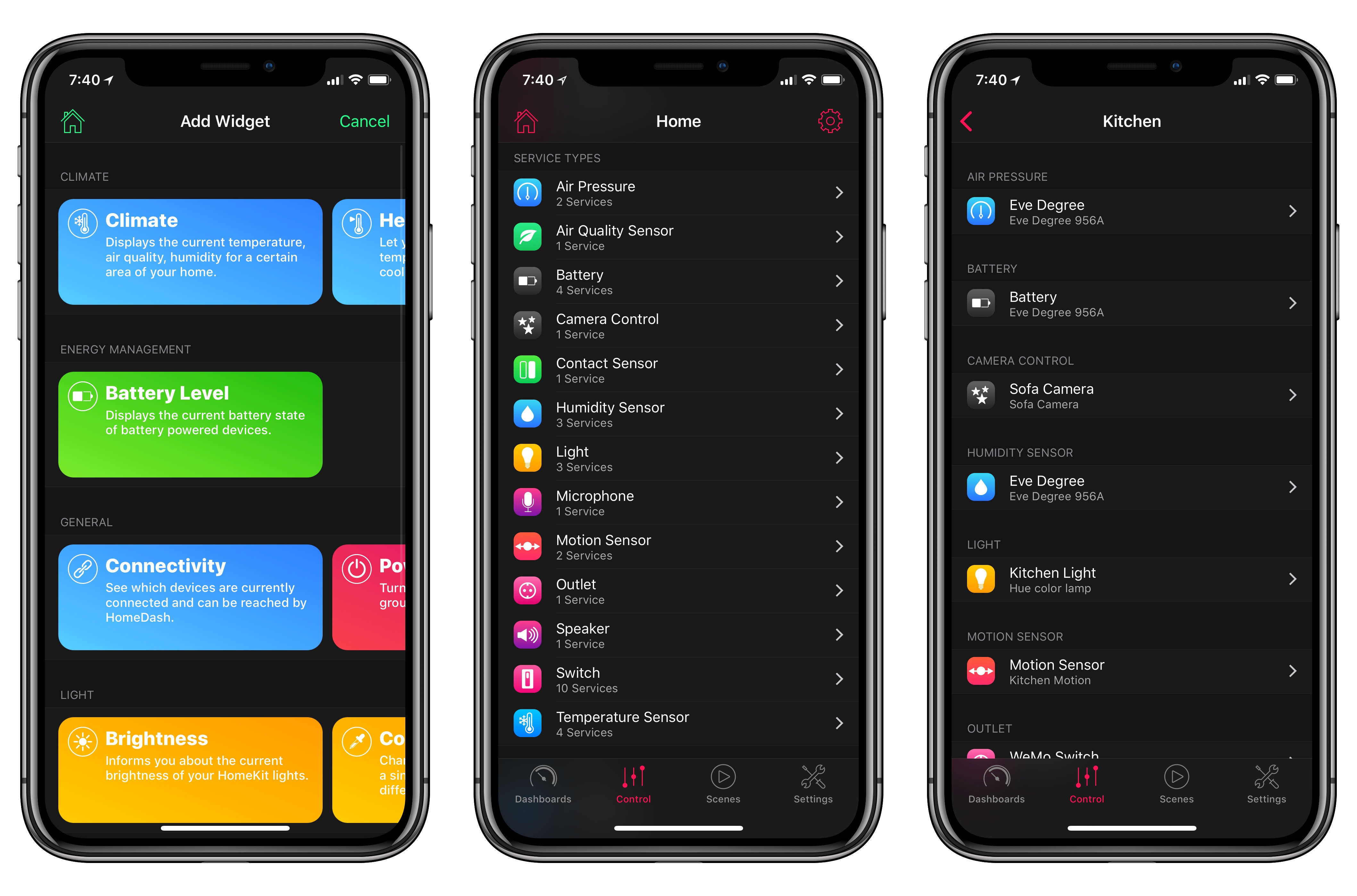
In HomeDash, you set up multiple dashboards, each containing a grid of controls. By default, there’s a dashboard for each room of the house, but you can create new ones from scratch too. You can navigate dashboards by swiping on a bar at the bottom of the screen. Each dashboard can include controls for accessories from any room of the house, which makes it possible to create “master control” dashboards for every accessory or scene as well. This alone is, in my opinion, a superior logical organization to Apple’s Home app: by default, everything is divided into rooms; if you want to, you make your own dashboard (or even several) and you’re not limited to a single Favorites screen.
It gets better though. Controls in HomeDash are represented as large, colorful, interactive widgets that use colors, buttons, and sliders contextually for different types of accessories. Unlike Home, which represents everything as a square button that requires a long press for additional controls, HomeDash features power buttons to trigger on/off states, light dimmers that are actual sliders, multi-size grids for color pickers, and swipeable lists of information for sensors or scenes.
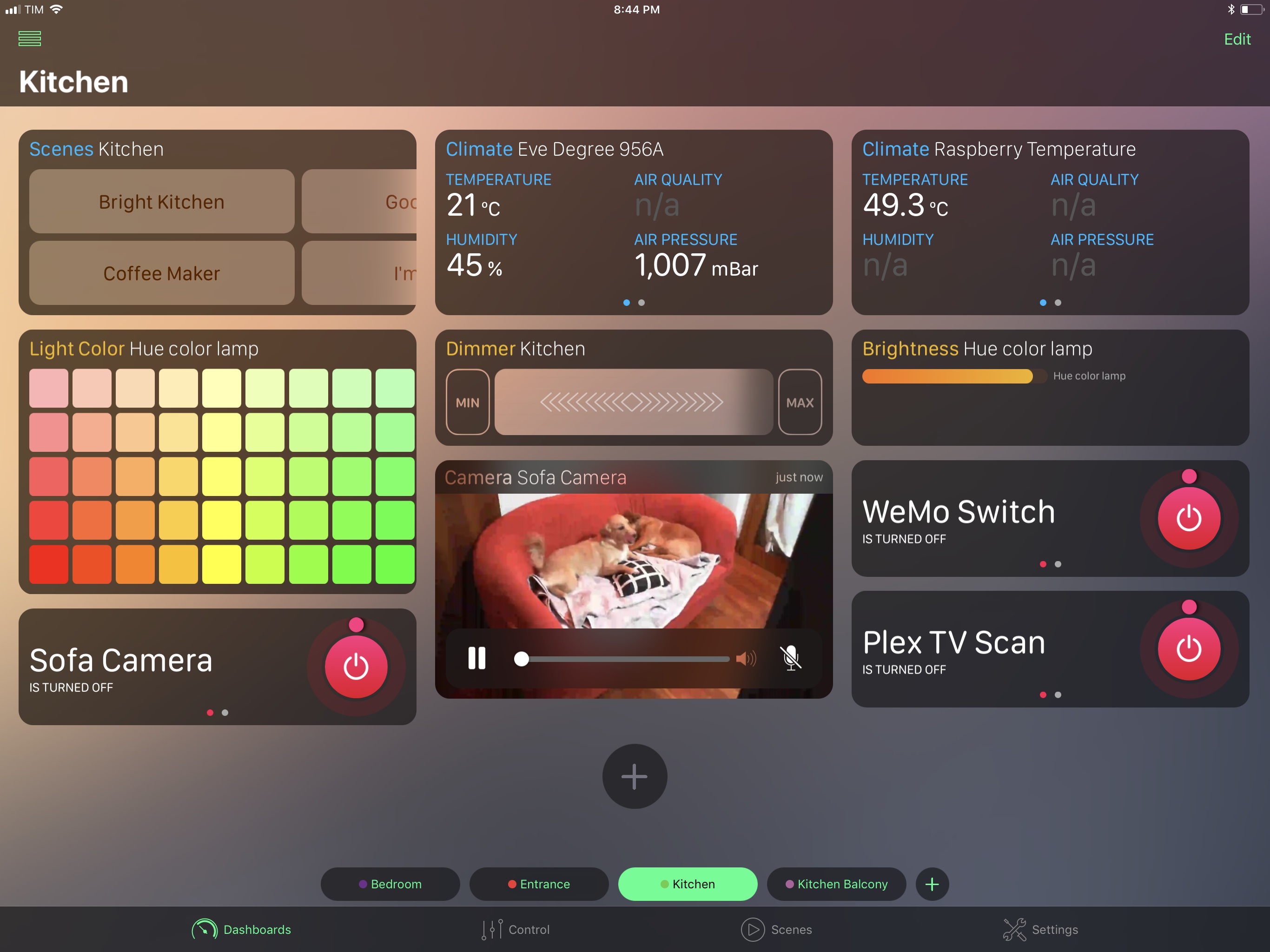
You have complete freedom over the arrangement of widgets in a dashboard: when in Edit mode, you can pick one up with drag and drop and move it elsewhere – you’ll even feel a subtle haptic tap when crossing over another widget. Some widgets have multiple size options available that display varying amounts of information. Like Apple’s Home app, you can choose from a selection of default background photos for each dashboard, or add your own.
HomeDash is more intuitive than Apple’s Home when creating new widgets, too. The Add Widget screen has colorful buttons for different categories and actions, which makes it easy to find what you’re looking for and understand what it does. Similarly, when editing an existing widget, there’s a screen that lets you modify the control so it affects the entire home, zones, rooms, groups, accessories, or individual services – a cascading structure that makes sense at a glance.
There’s a lot more that HomeDash can do, even though I’ve been primarily using it for quick access to specific actions and accessories via multiple dashboards. In the Control tab, you can browse rooms and view all active service types in your home. Every section or device has a unique icon; HomeDash sports fantastic attention to these details, which, in practice, help visual parsing and are just pretty to look at. You can also view and manage HomeKit scenes in a dedicated tab, selecting different sets of favorite scenes for the app’s widget or Apple Watch version.
My only criticism of HomeDash is that it doesn’t offer a sync option between the iPhone and iPad, forcing you to recreate all widgets from scratch and rearrange them manually on multiple devices. However, even with this limitation, HomeDash remains my favorite recent App Store discovery.
HomeDash makes Apple’s Home app look clunky, boring, and uninspired. I hope Apple takes a look at HomeDash to see what a powerful, user-friendly HomeKit management app is like.
2018
When I published collections of apps similar to this one in the past, I had the tendency of including apps that I had been playing with over the holidays, and which seemed interesting for a short period of time. I feel different about my picks this time. They’re deliberate. Besides the fact that it’s taken me longer to evaluate and test them, I’m highly motivated to make 2018 all about improving my lifestyle, happiness, and quality of my work. I’m more confident in the apps I mentioned in this story because many of them are helping me make important changes to my life on a daily basis.
Time and software updates will be the ultimate tests for any longterm app pick. It’ll also be interesting to see what impact iOS 12 and new iOS devices will have on my app preferences and usage. As always, we’ll know which apps stick around and which ones will be left behind in 10 months.