Sidebars, Corner Radii, and Drop Shadows
macOS Tahoe turned sidebars into glass-like slabs that sat on top of a window. I liked the layered look, but many others didn’t. Plus, when one window was obscured by others, it was too hard to tell if what you saw poking out was two windows sitting on top of each other and slightly offset or a sidebar.
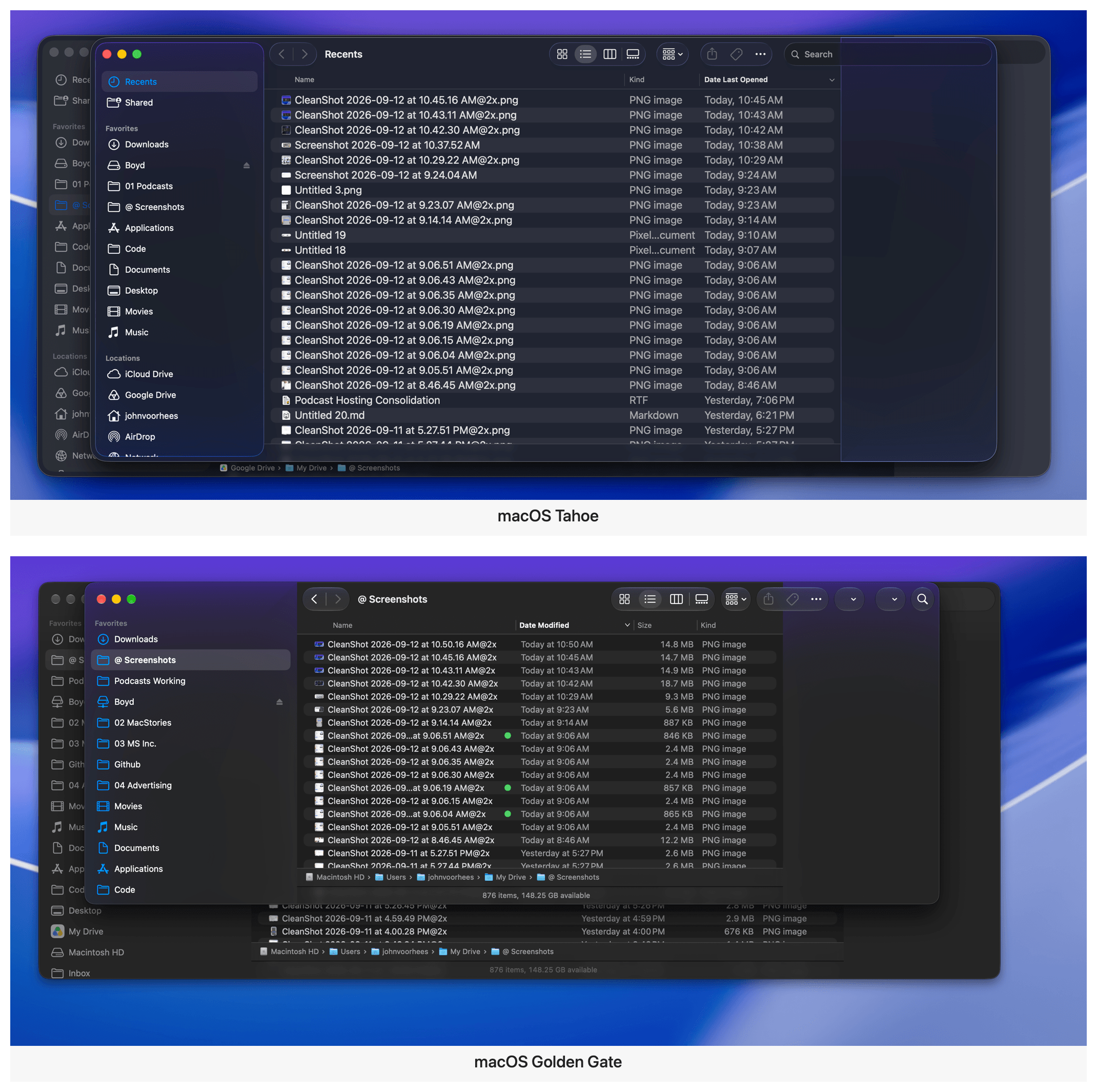
Sidebars extend to the edges of windows, and deeper shadows make overlapping windows easier to pick out.
The fix is to extend sidebars to the top, bottom, and side to which they’re anchored. The sidebars retain their glassy look and icons have regained their color, but the layering effect is gone. I can’t help but feel like something was lost in the update, but from a practical standpoint, it’s a usability win.
Golden Gate also brings more consistent corner radii to system windows. I honestly never noticed the difference between window corners, but it bothered some users who will no longer be bothered, which is a plus.
Finally, there was something about Liquid Glass that could make it hard to distinguish one window from another. I experienced this with Tahoe myself, especially in Dark Mode. macOS Golden Gate has more pronounced drop shadows, which become the new normal very quickly, but do a better job of defining the separation between windows.
Wallpapers
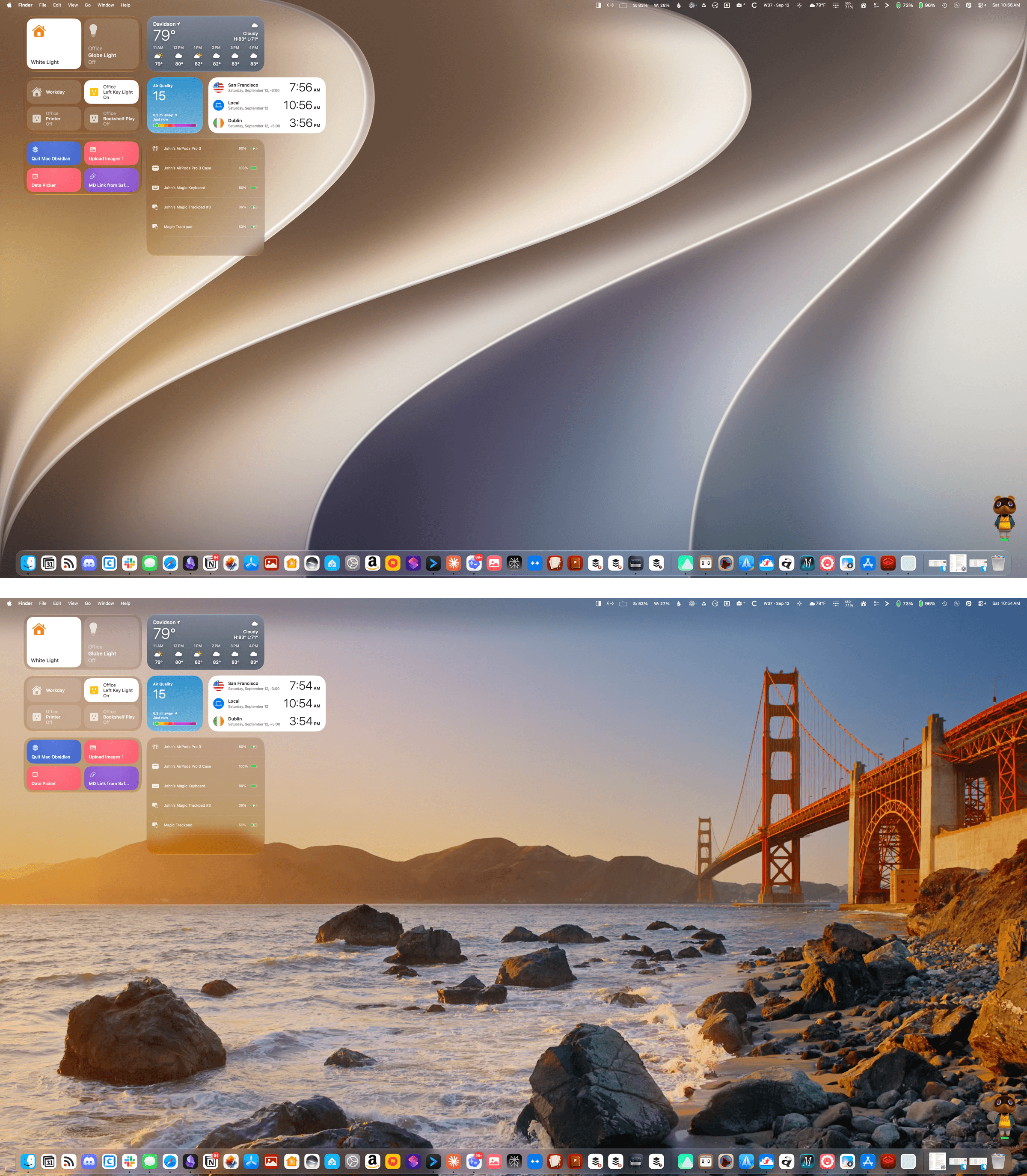
As always, this year’s macOS update comes with a beautiful set of wallpapers including Golden Gate, a dynamic golden wallpaper with sweeping curves that vaguely resemble the number “27,” and Golden Gate Sunset, a shot of the Golden Gate Bridge with an animated screen saver that’s mesmerizing to watch.
This year, the Mac’s stylized wallpaper also appears on other Apple devices, bringing a shared look across platforms.
Other Tidbits
We’re living through a menu bar app explosion thanks to AI coding agents, making it harder than ever to manage your menu bar. That’s especially true on Mac laptops with a notch. It really doesn’t take much to fill up the available space and end up with icons hidden by the notch or the tail end of an app’s menus.
There are third-party apps like Ice that will manage your menu bar for you, but new macOS releases can break them. That’s why on my MacBook Pro, I’ve historically aggressively managed my menu bar instead. But even then, it can be hard to avoid hitting the notch.
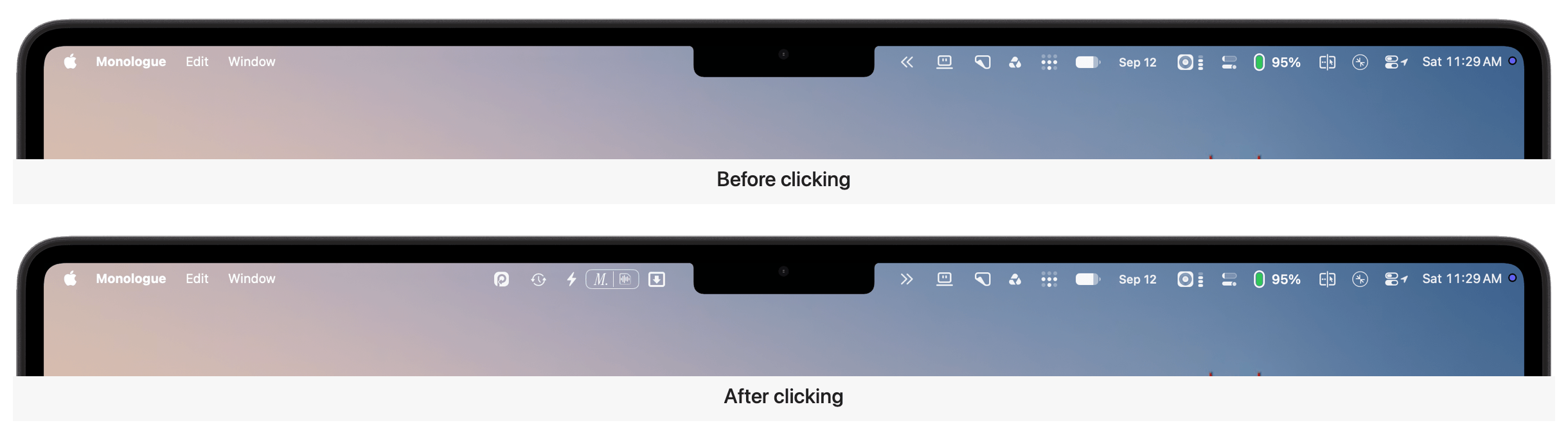
With macOS Golden Gate, Apple has added an overflow control in the form of a double arrow that appears when the notch or menu system is covering menu bar items. Click it and the hidden menu bar items appear to the left of the notch temporarily, so you can interact with them. This is especially helpful if you use all of the available space up to the notch and a new app installs a menu bar item that you want to move where you can see it, but it’s been hidden.
I like what Apple has done with Liquid Glass in Golden Gate a lot. My main reservations last year were the inconsistent implementation and poor legibility in apps like Photos and Music. The result is more coherent and usable, though whether the update is enough to satisfy Liquid Glass’ harshest critics remains to be seen.
The shape of icons matters, but it isn’t the design change that affects my use of the Mac the most. Clearer toolbars, windows that are easier to distinguish, and consistent controls have had a much more substantial impact.
More importantly, though, I appreciate seeing macOS’ design evolve alongside its hardware and the new tasks they’re called on to do. The Mac isn’t a static hardware platform, and its OS shouldn’t be either. I’ll miss the flourish of icons that escape their bounds, but if it makes it easier for more people to move from the iPhone, which is a far larger platform, to the Mac, that’s great. Software is never finished. macOS Tahoe’s design pointed the Mac in the right direction, but was a big enough departure from the past that it had some rough edges. Golden Gate addresses my biggest complaints with Tahoe and has been a pleasure to use all summer.