This Week's Sponsor:

HomeSnap

A Private, Read-Only Window Into Your HomeKit Home


Posts tagged with "macOS 27"

macOS 27 Golden Gate: The MacStories Public Beta Preview

The public beta of macOS 27 Golden Gate is out today, and I’m sure many of you are wondering whether to take the plunge and give it a try in advance of its official fall release. That’s the question this preview is here to help answer. It’s not my final take on Golden Gate by any means; after all, I’ve only been using it for about a month, and there will be several more turns in the beta cycle between now and the public release. However, I’ve used Golden Gate long enough to help you make an informed decision about whether or not to install the public beta now.

Of course, it’s impossible for me to account for everyone’s unique Mac setups when considering Golden Gate’s stability, but it’s worth reiterating what I’ve said in past previews: modern Apple betas have been consistently stable. That’s to say, the risks of using the public beta are modest. It’s been years since I’ve had a critical app fail or lost data. I never go into beta season without a backup plan, though. If something goes terribly wrong, I have backups, backups of those backups, and alternate Macs I can switch to in the event of a disaster. I don’t expect to have to go to Plan B, but if you’re going to jump on the Beta Bus, you should have a Plan B, too.

Okay, you’ve been warned. Let’s get to the fun part.

Read more


WWDC 2026: macOS 27 Icon Refinements

During this year’s WWDC keynote, Apple announced improvements to icons for all of its first-party apps. The company says that by “integrating additional layers of Liquid Glass directly into the icon artwork itself,” icons now “appear sharper and more defined.”

It’s certainly a noticeable improvement, and unsurprisingly, Basic Apple Guy is all over the changes with an excellent side-by-side comparison of all the icon changes in macOS Golden Gate. (Many of these icons carry over to other platforms, of course.)

The clarity and legibility of almost all the icons have improved significantly, with icons like Photos packing a real visual punch. Additionally, viewing the icons at this size, you can see the nice refraction effects of the glass-like elements.

Image: Basic Apple Guy.

Image: Basic Apple Guy.

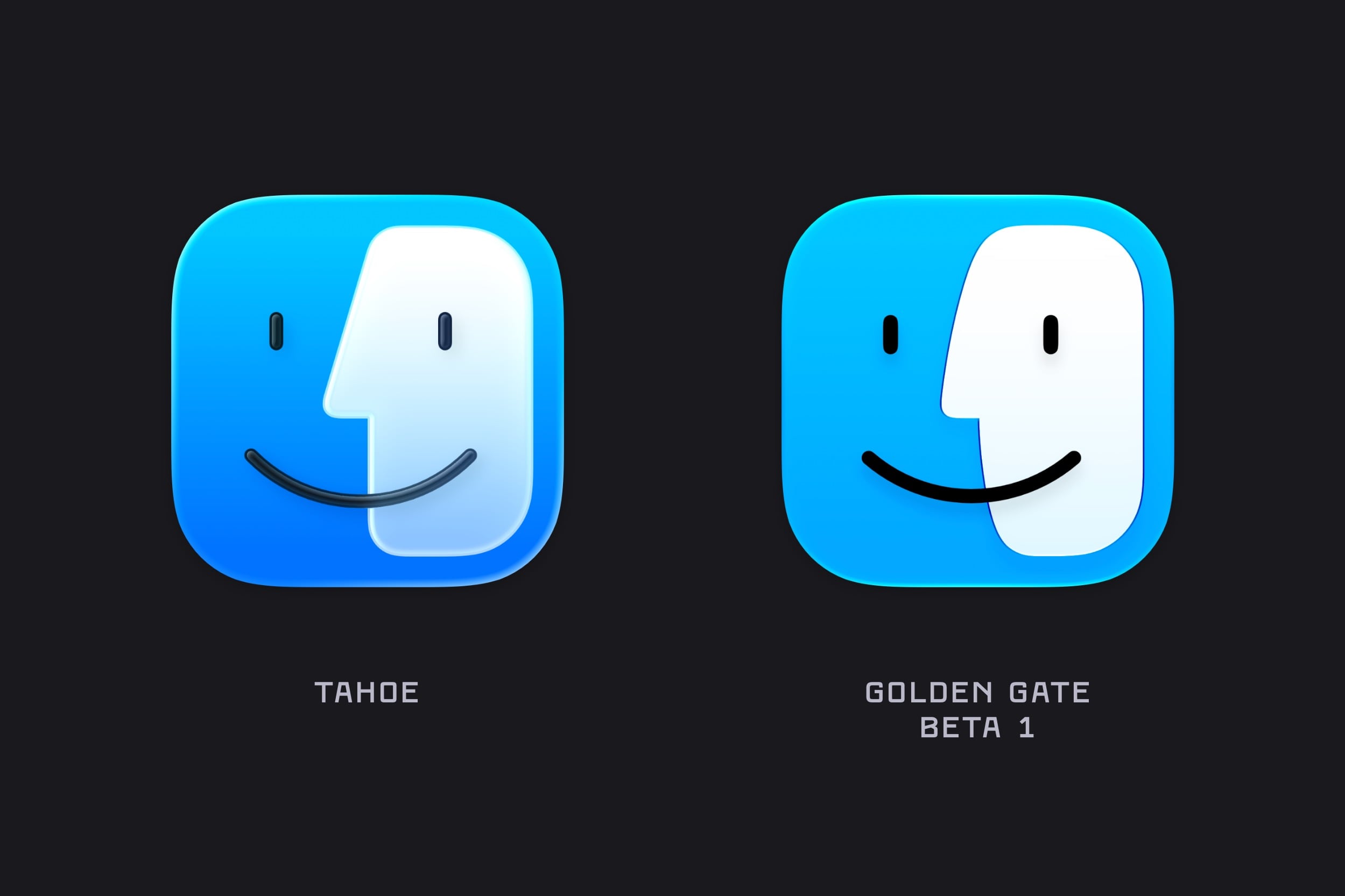
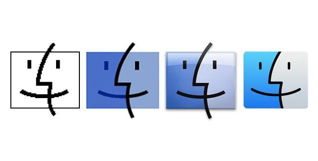
The one that really stood out for me, though, was the new Finder icon, which not only looks cleaner but also has a subtle change to the nose and the curve of the divide, bringing it much closer to the classic Finder icon from the pre-Liquid Glass days.

The Finder icon evolution, pre-macOS 26.

The Finder icon evolution, pre-macOS 26.

What can I say? I’m a stickler for classic design.


You can follow all of our WWDC coverage through our WWDC 2026 hub or subscribe to the dedicated WWDC 2026 RSS feed.
Permalink