Design
Of the three transitions that shape macOS 27, the Liquid Glass design language is the most recent. Announced at WWDC in 2025, the change drew strong reactions from early users and beta testers. Despite continued criticism in some quarters and vows not to upgrade until Tahoe’s design was “fixed,” I like Liquid Glass, as do most people I’ve talked to about it in my day-to-day life.
However, liking Liquid Glass is not the same as feeling that Apple nailed it with Tahoe. It didn’t. Tahoe’s design felt incomplete. It was as though there had been an all-hands meeting of Apple’s software designers who were given a detailed briefing on how to implement Liquid Glass but then they never talked again. Some apps took an aggressive Liquid Glass approach similar to iOS 26, while other apps felt like they’d barely been touched. In fact, there were even inconsistencies between how Liquid Glass was applied to different view modes in Finder.
Golden Gate addresses those issues with a more cohesive, readable experience. It also gives users control over transparency, addressing one of the core criticisms of Liquid Glass.
Icons
One of the most subtle changes to Liquid Glass is the way it diffuses light. The best place to inspect the difference is by looking at the icons side by side. The edges are darker, and the highlights are brighter, adding a greater sense of depth, while avoiding the softness and blurriness of Tahoe icons. The result is that UI elements are sharper and more readable, which is an accessibility and usability win.
Liquid Glass’ light diffusion update isn’t limited to icons, but because it’s one of the best ways to visualize the change, I’ve collected a few examples that show the change off especially well.
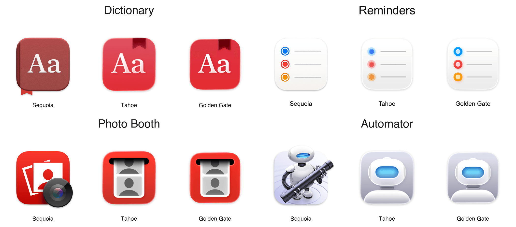
I like the refinement to Apple’s system app icons. What once made my screen look unnaturally soft and mushy is now crisp.
Alongside these changes, many icons have received small tweaks, such as Finder’s rounder nose. There’s also one wholly new icon and several material redesigns.
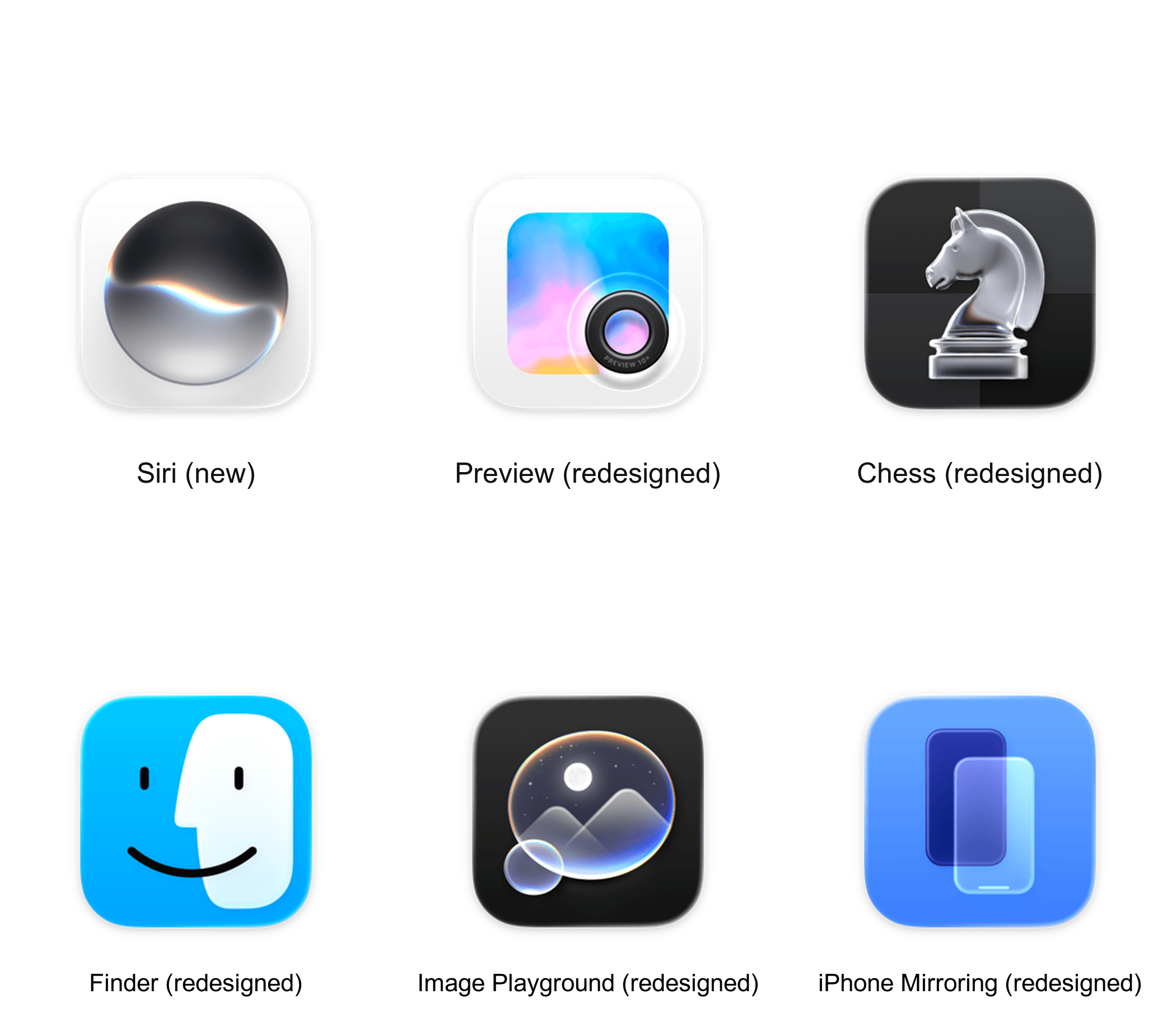
The new Siri icon alongside redesigned icons for Preview, Chess, Finder, Image Playground, and iPhone Mirroring.
What Golden Gate does not resolve is the so-called “Squircle Jail” controversy introduced by macOS 26. Starting with Tahoe, Apple mandated that all icon glyphs appear within the bounds of their background tile. Icons that violate the new restriction usually end up shrunken inside a generic “squircle jail” tile, which doesn’t look good.
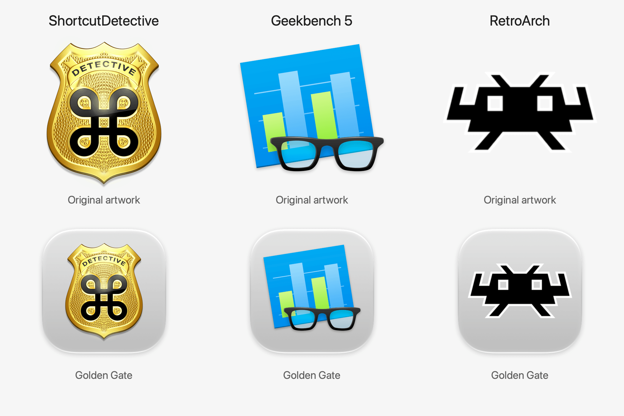
During the macOS 27 beta period, Paul Kafasis and John Gruber called for Apple to eliminate its icon rule, while Tyler Hall demonstrated a workaround. Nevertheless, “squircle jail” endures.
I can see both sides of this debate. On the one hand, as Kafasis argues, the uniform shapes Apple has imposed make it harder for people with color vision deficiencies to distinguish one icon from another. Former Apple designer Roger Wong takes a different tack, arguing, based on older Mac icons, that gaps in irregularly shaped icons can cause users to miss their click targets. Both arguments go to icon functionality and both have their merits.
On balance, I’m fine with the direction Apple has taken its icons. They mirror the design of icons on the iPhone and iPad, and there’s value in consistency for users who don’t think as deeply about icons as some Apple nerds. We’ve been trained through habit to expect that a squircle is an app. I also think Wong’s argument takes on even greater significance if the rumors that Apple is working on a touchscreen Mac are true.
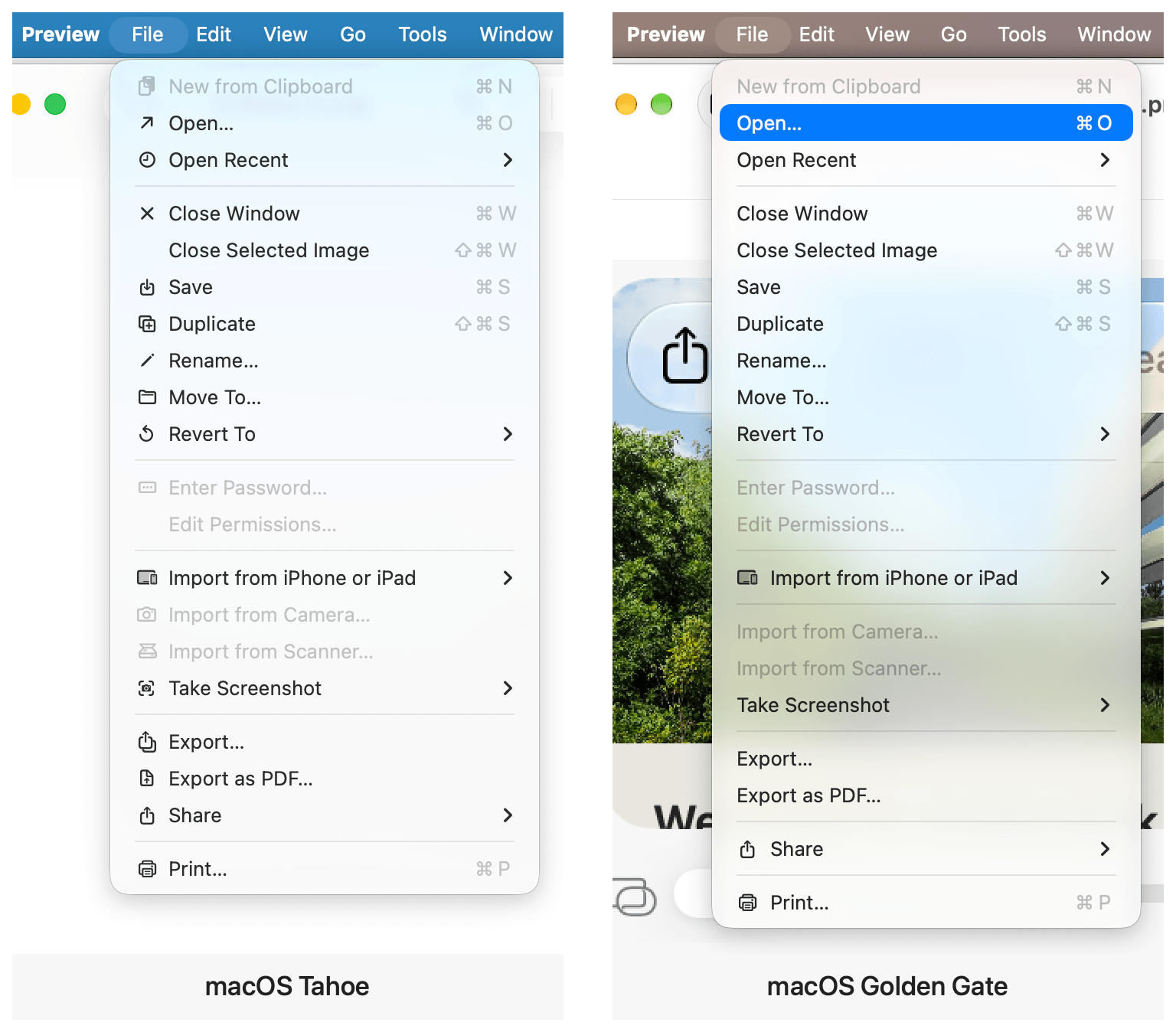
Finally, the proliferation of SF Symbols in app menus has been reversed, too. You’ll see fewer in system apps, and Apple’s Human Interface Guidelines have been revised to advise third-party developers to use the icons “sparingly and with purpose.” Also appearing in the menu bar is a new Ethernet icon that replaces the Wi-Fi icon when your Mac is wired to a network.
Transparency and Toolbars
Alright, enough about icons. It’s time to think about transparency. Apple’s designers have significantly improved the readability of Liquid Glass elements throughout the system and given users a tool to tweak transparency to suit their own tastes.
I don’t envy Apple’s designers who have to design a UI that works with any app whether it exists today or someday in the future. The first iteration of Liquid Glass worked well with some apps, but fell down in spots, such as when the background of an app was busy and unpredictable. Music with its colorful album art and Photos with its views of photos of literally anything someone might take a picture of are both great examples. As you scrolled through music or photos, both apps’ toolbars often seemed to disappear or become unreadable as colors passed beneath the toolbars. Text-heavy apps like Finder presented a similar problem, sometimes causing the text of scrolling lists of files and icons to compete with the toolbar’s content.
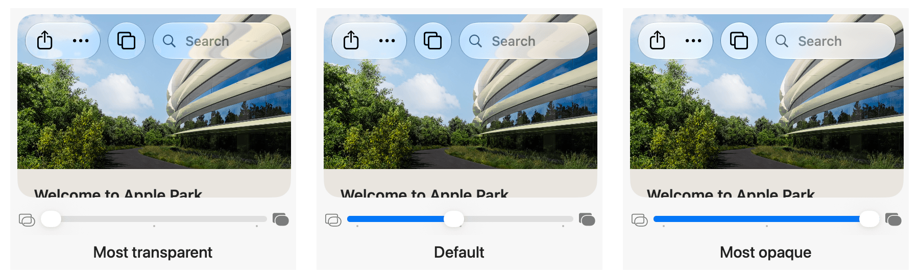
macOS Golden Gate solves this with toolbars that diffuse the content beneath them better at the OS’s default setting. That default is squarely at the midpoint of a slider found near the top of the Appearance section of System Settings. Move the slider’s indicator to the left and more of the background will bleed through toolbars, and move it to the right and the background frosts over to a nearly solid color. The setting is accompanied by a handy preview that shows the effect that each point along the spectrum has.
A great example of the change is Photos, which has regained a toolbar structure that separates buttons from the content scrolling behind them. It’s a welcome change to an app that struggled with a more transparent Liquid Glass approach.
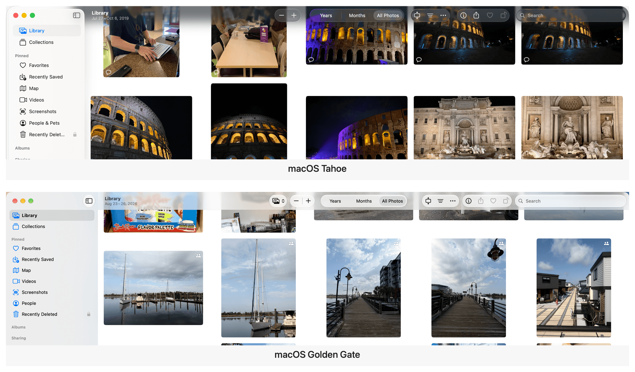
Photos’ updated toolbar gives its controls a clearer separation from the images that scroll underneath it.
Apple’s solution is a good one. It would have been simple enough to give users a slider and be done with the transparency controversy, but instead its designers took the time to improve the default, too. The new default strikes a good balance between transparency and opacity that I expect most users will never feel the need to change. In contrast, I’ve always liked Liquid Glass’ transparency, so I set it all the way to the left where things are most transparent and never looked back.
Interestingly, I did the same thing on the iPhone and eventually dialed the Liquid Glass back a little. It may be the smaller screen or the fact that I use my iPhone in the bright North Carolina sun so often, but on the Mac, full transparency looks less extreme to me.
Toolbars also benefit from a more unified treatment. With Golden Gate, a continuous bar appears beneath controls automatically when content scrolls under them.