This Week's Sponsor:

Copilot Money

The Apple Editor’s Choice Award App for Tracking Your Money. Start Your Free Trial Today


Search results for "music player"

Longplay 2.0: An Album-Oriented Apple Music Player with Loads of New Features

Longplay 2.0 by Adrian Schoenig is out, and it’s a massive update of the iOS and iPadOS album-oriented music app.

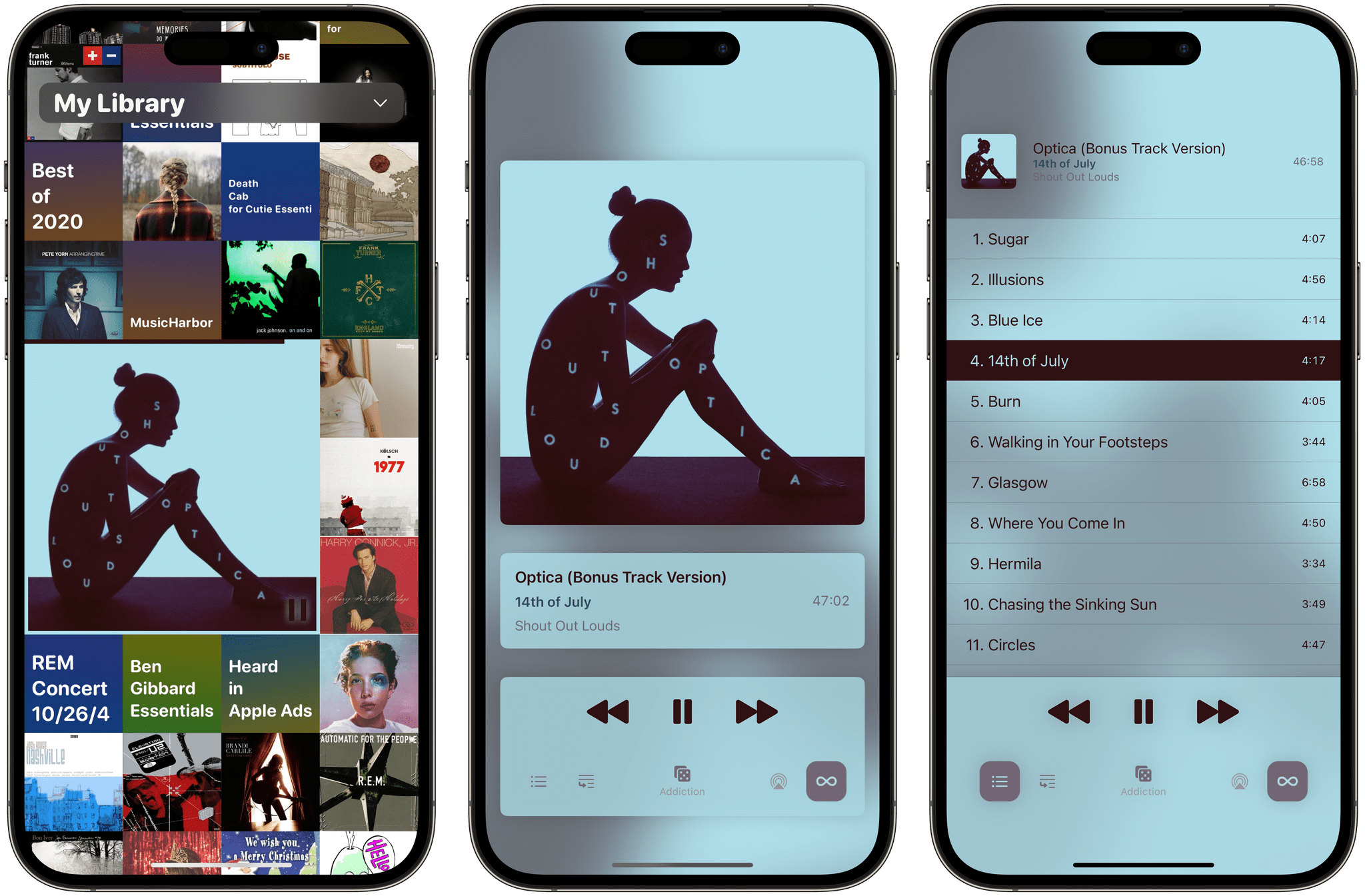
If you’ve tried Longplay before, the update will be familiar. The first time it launches, it quickly checks your Apple Music library (about six seconds for over 1200 albums in my case), finds all the nearly complete and complete albums, and displays them in a grid of album art. I’ve always loved this interface because it does such a great job of emphasizing album art. However, what’s different is a long list of new features, but since we’ve only covered the app for Club MacStories members and AppStories listeners, I’m going to cover everything and call out the updated features as I go.

Read more


Musens: The Beautiful Music Player [Sponsor]

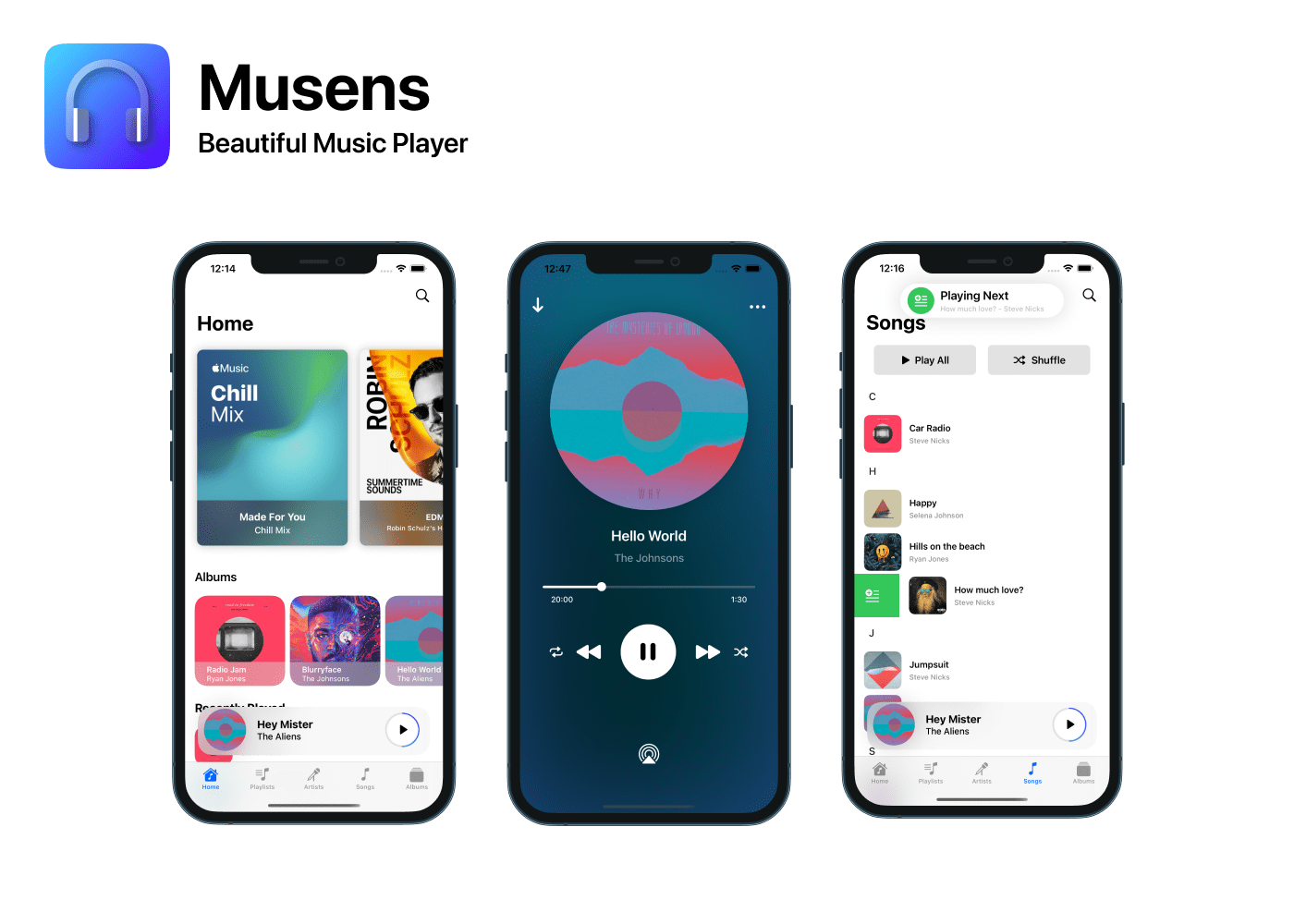
Musens is a beautiful, customizable music player for the iPhone that brings your music collection and Apple Music’s entire catalog to life with stunning animated artwork. The app has been built from the ground up to take advantage of Apple’s latest Swift UI frameworks and modern features. Whether you’re playing your favorite albums from your own library or trying something new on Apple Music, Musens lets you do so in a simple, elegant way.

Musen’s Home tab is the perfect place to start listening with its thoughtfully organized sections that feature playlists, albums, recently played material, top charts, recommendations, and more. It’s a deep well of music tuned to your tastes that makes picking something fast and simple because all of Apple Music’s extensive selection of music is available to browse and add to your own library.

Outstanding design is what sets Musens apart. Tap an album, and it opens with a delightful animation that reveals a vinyl record emerging from the artwork. Start playback, and the album art on the now playing screen rotates, providing a fun, dynamic turntable-like experience. The playback view is completely customizable, allowing you to enjoy static square art and three different background options too.

Musens also makes great use of intuitive gestures, making it effortless to build your playback queue. Of course, the app has dedicated tabs for easy access to your and Apple Music’s playlists, artists, songs, and albums as well as support for dark mode. Together, the attractive design and deep feature set make Musens an outstanding way to enjoy your favorite music.

Musens is the creation of Alec Attie, an iOS developer and the founder of Cybertiks, who won a WWDC scholarship in 2018 and currently works as a backend developer making apps for big companies like Miniso and the SEP, which is a governmental branch in Mexico.

Download Musens today, and start enjoying your music collection and the millions of songs available on Apple Music for just $3.99.

Our thanks to Musens for sponsoring MacStories this week.


Soundflake Review: A Music Player for SoundCloud

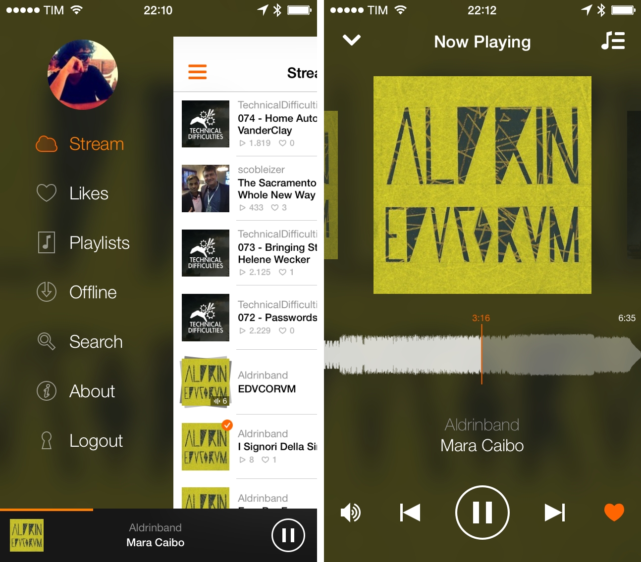
While my daily music listening needs are mostly fulfilled by Spotify1 and my personal library in iTunes Match2, I do follow a couple of artists on SoundCloud and I enjoy using the service to play a variety of mashups and records from independent creators that I can’t find anywhere else. I’m not a huge SoundCloud user, but I’ve always had an affinity for the website’s interface and the company’s focus.

Created by Stefan Kofler and Patrick Schneider, Soundflake is a new SoundCloud client for iPhone that wants to provide a better experience than the official app through a modern design, advanced features, and gesture controls that make managing playback and sharing a faster and more intuitive affair. After trying Soundflake for about a month, I don’t see why – as an occasional SoundCloud music listener – I would go back to using SoundCloud’s app for iPhone.

Read more


Tuner for iPhone Turns YouTube Into A Music Player

Tuner

Tuner

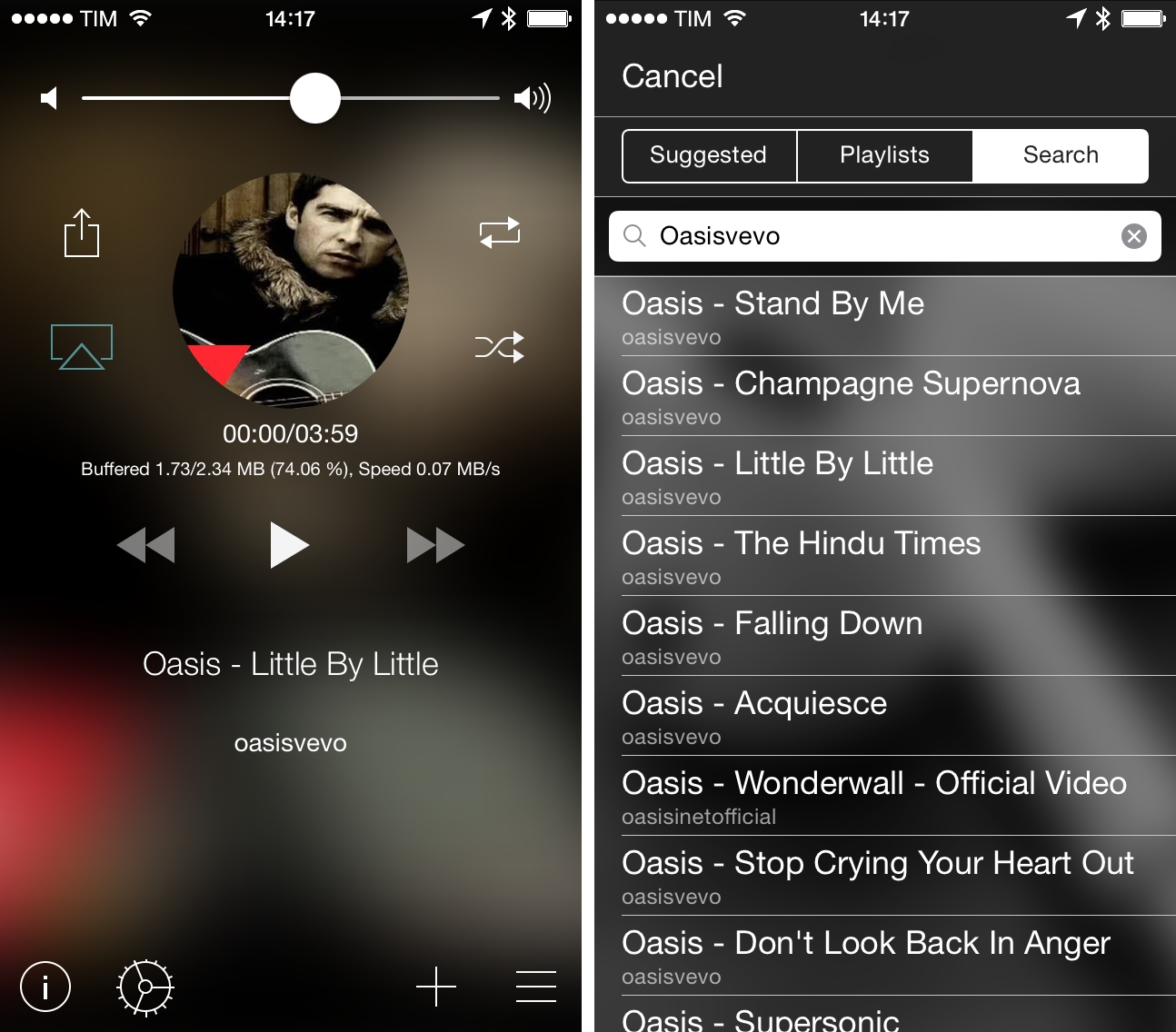
Every time I go out with friends and we start talking about music, there’s always that one guy who wants to play a song and he does so…using YouTube. In spite of the relatively low barrier to entry for services like Spotify and Rdio (both available in Italy with free plans), the convenience of using YouTube as an audio source is indisputable (on top of that, add the fact that most people have a high tolerance for YouTube ads – or ads in general). Personally, I prefer a dedicated music streaming service or my iTunes Match library, but I do rely on YouTube for the occasional live performance or unreleased demo tape that I can’t obtain legally anywhere else.

Tuner is a music player for YouTube videos: with a simple search feature, it uses YouTube as an audio source, turning videos into songs you can listen to on your iPhone.

Read more


Listen: A Gesture Driven Music Player

It’s not for me but I think the app looks good and the animations are gorgeous. Listen lacks traditional playback controls or buttons, relying on gestures, swipes, and taps to play, pause, and skip music. The idea is that you can drag the album artwork around to trigger various actions, but it works well for some things and not so much for others. I think developers have to keep in mind that removing buttons adds a lot of complexity — in this case something simple like playing a song over AirPlay requires a very specific drag gesture. Listen’s great for shuffle play, but not so much for rummaging through your music collection. Also, what’s up with circular artwork lately?

Check it out on the App Store — it’s free to download.

Permalink

Gain Magical Control Over Your Music Player With Flutter

It’s a bit like Minority report. Just raise your hand and your computer responds with an action. Motion-based controls with your hands, now more common with modern gaming consoles (PlayStation Move and XBOX Kinect), still feels a bit futuristic.

On personal computers and modern tablets, peripheral input and touch-based gestures won the race against camera-based gesture recognition. Still, some developers are in love with the idea of controlling devices without any actual hands-on. In small doses, this can be fun and useful. This is the case with Flutter, developed by a large team of developers at BotSquare.

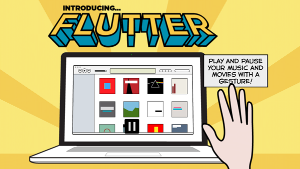
Flutter is a small tool for recognizing motion gestures on OS X, which recognizes you via a webcam (iSight or external) to control your favorite music player. After downloading it, you have work through a tutorial to get to become familiar with the hand gestures. Flutter then sits in the background, with your Mac’s iSight camera on (obviously required for running Flutter) and awaits your actions.

The current version of Flutter (0.1.237 — don’t be afraid, it’s not a beta version, the developers just want to add more features before calling the app 1.0) supports three gestures: a flat open hand, and a fist with your thumb either pointing to the right or the left. Do those gestures in front of your webcam, and Flutter will recognize them and do the action associated with them. To make sure the app recognizes your hand’s action, you have to keep it one to four feet away from the camera.

With the open hand gesture, you can play and pause your music. Using the thumb either pointing to the right or left you go to the next or previous track. The Flutter team is working hard to implement more gestures such as volume control (I suggest a single index finger pointing upwards or downwards respectively for this one).

All three gestures work well in the current version — you just have to get used to the fact that you often need to move your hand a bit to make the camera notice it. Knowing where to position yourself at first so that your hand is inside the viewing area of your camera can be tricky at first. But after a while you also get used to it; when Flutter recognizes you it’s easy to use, looks like magic, and can be a very intuitive way of controlling your music player (the app currently supports iTunes, Spotify, VLC, and QuickTime; no Rdio support unfortunately).

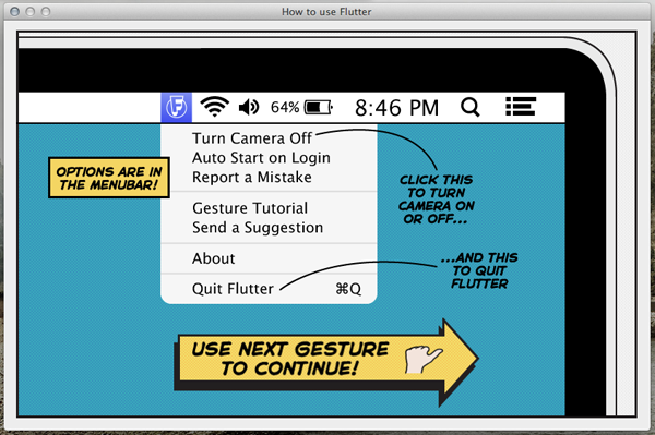
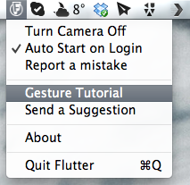
Through the app’s drop-down menu, you can turn the camera on and off (for privacy and energy saving reasons), set Flutter to automatically launch at login, as well as report bugs and re-watch the aforementioned (very interactive and easy to understand) tutorial. The app also sends notifications to the Notification Center when you change apps to let you know that you’re still able to control the newly activated player with Flutter.

Flutter is a small app, although it’s not something I would recommend because not everybody needs it. However, I can imagine that lots of people would want to try it for the novelty of it. It’s a magic little piece of software that can be fun to use.

Flutter is available for free on the Mac App Store.


Ecoute Is The Best Music Player For iOS. Period.

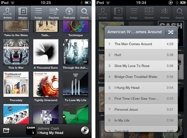
Since I started to write about UI design and iOS apps again 5 months ago, I became more and more disappointed with the native music player on my iPod touch. During my research, I found many innovative modifications of the iOS table view, and I often wished that Apple will integrate some of them into their system apps, especially their music player. But since Apple is a company that believes in radical minimalism and coherence throughout its ecosystem, this never happened and also won’t likely happen in the future. I tried out many alternatives like GoodMusic, but no app was able to satisfy both my design and usability needs on my iPod touch. Until yesterday. Yesterday, Pixiapps released Ecoute for iOS.

Ecoute for Mac has been the app Pixiapps focused on during the last years. It is a minimalist, easy to use iTunes replacement with iconic UI and many cool hotkey and playback features. I’m still an iTunes guy, because I need a reliable solution for managing my over-1100-record digital music collection. But Ecoute for Mac was the first app which really made me think about switching my desktop music player. And now, Ecoute debuts on the iPhone. Although the app is promoted as “Ecoute for iOS”, there is no iPad version available yet. For me this is not really a problem — I like the semi-skeuomorphic design of the iPad music player very much and was never seriously thinking about replacing it. But when I opened up Ecoute on my iPod for the first time, I immediately knew that this was exactly what I’ve been searching for. I basically want three things in a mobile music player: easy navigation, intelligent gesture integration for flawless in-app movement, and a focus on album artwork. Except for some flaws in terms of navigation, Ecoute measures up to all these requirements. Read more


Track 8 Brings The Metro Experience To An iPad Music Player

At what point do we cross the line that separates insipid clones from genuine inspiration, uncomfortable hybrids from interesting experiments? Track 8, a $1.99 music player by Ender Labs, tries to imagine what listening to music on the iPad would be like using Microsoft’s Metro UI experience.

Following the basic principles of Swiss graphic design, the Metro design language is focused on getting rid of “superfluous” design elements such as buttons and toolbars to turn the content – words, pictures, videos – into the user interface to manipulate on screen. Originally conceived on Windows Phone 7 and being updated as the foundation of the future Windows 8 OS, Metro has struck a chord with the design community thanks to its elegant approach to modern typography, dynamic layouts, and intrinsic originality compared to other mobile platforms. But does Metro make sense as an app running on iOS, the polar opposite of Microsoft’s studies in terms of UI design and experience?

Ender Labs isn’t afraid to say that they wanted to see how Metro would work on the iPad, without excuses. So while I’ll leave the task of determining whether this is right to someone else – I sure hope Microsoft doesn’t come knocking at Ender Labs’ door for any reason – I want to to focus on Track 8 the app for iPad you’d probably interested in checking out.

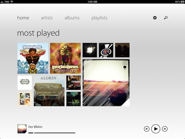
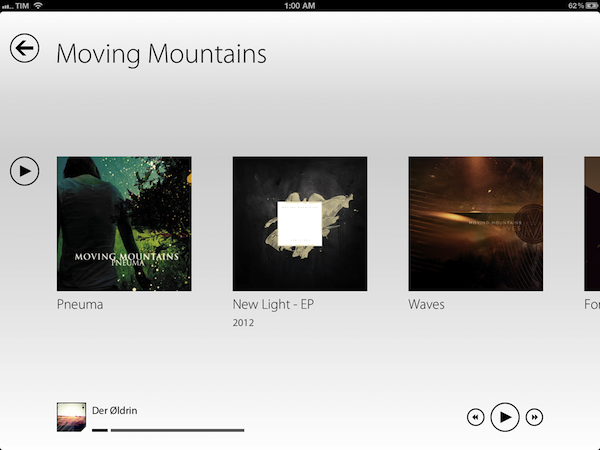
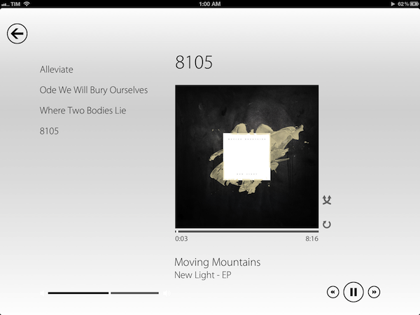
Fetching music directly from the native iOS music app, Track 8 displays four tabs (home, artists, albums, playlists) on a clean canvas that emphasizes typography, solid colors, and album artworks instead of icons, buttons, and scrollbars. In pure Metro fashion, the content becomes the interface you are manipulating: tapping on an album will advance a level “into” the content of that album, and tapping again on a song will bring up the now playing view with a larger cover art, and only some basic buttons to play, pause, shuffle, and repeat. Everything is kept as minimal as possible: the volume and progress controls are two simple flat, solid bars you can slide; to go back to a previous view, you tap on a large back button in the upper left corner that “snaps back” with a nice fading animation. To move horizontally between content, you swipe.

Track 8 comes with some appearance settings to customize the look of the Metro experience on iOS. The background color can be set to light or dark, and 10 additional options are provided to set the “accent color” for selected content and UI items. The app has some wallpapers (including linen), and you can also opt to display artist backgrounds, which are pulled from Last.fm and saved in the app’s local cache for when you won’t have an Internet connection. To keep the app in line with Metro’s elegant and uncluttered paradigm, I turned artist backgrounds off and chose a simple light wallpaper.

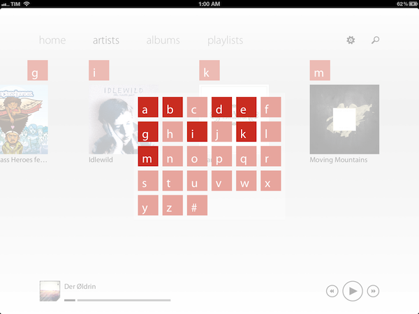
Track 8 works and it looks gorgeous, but it is undeniable that is an app that’s not meant to be on this platform. Not just for mere aesthetics – as an iPad app, Track 8 contradicts the very underlying principles of iOS interaction and navigation. The fact that tapping on sections at the top, for instance, gets you into a single level of interface is the antithesis of the iOS tab bar, which always allows you to switch with one tap between multiple, even nested sections. Or again, alphabetical lists: on iOS, letters are placed on the right side of a scrollable view, allowing you to quickly jump to a specific letter. With Track 8, artists and albums are grouped alphabetically, sorted horizontally in a grid, and tapping on a specific letter will display a popup grid to quickly jump to any other letter.

Track 8 doesn’t want to be an iOS app by design, and whilst this can be an advantage as long as loyalty to the Metro design language goes, it is also the app’s biggest shortcoming when it comes to expecting certain elements and patterns that are standards on iOS.

Track 8 won’t win an Apple Design Award. It won’t revolutionize the market of third-party music players for iPad, and it sure is an experiment that doesn’t aim at pushing the limits of iOS forward. But that’s not to say Track 8 doesn’t look great and work well on the iPad: if you’re a fan of Metro and would like to see that kind of experience in app that also happens to have a real functionality, Track 8 is your best option. You can get it at $1.99 on the App Store.


Stage: Social Sharing and Music Player App. Review and Giveaway!

Yesterday I reviewed PodTweet, a cool and nice application by Cardboard Software which lets you tweet the song you’re listening to on your iPod Touch or iPhone. It has one and only feature, but it surely gets the job done. Could this process of sharing music on Twitter be better developed? It surely can.

Meet Stage, a recently released iPhone app which combines this social networking music thing with a stunning and delicious user interface.

Read more