This Week's Sponsor:

Textastic

The Powerful Code Editor for iPad and iPhone — Now Free to Try


Gmail for iOS URL Scheme

Gmail for iOS URL Scheme

Tom Scogland figured out the complete URL scheme for Gmail 2.0, Google’s official Gmail app for the iPhone and iPad. As documented on his blog, the Gmail app allows you to compose an entire message using the following template:

googlegmail:///co?subject=<subject text>&body=<body text>

As I’ve also found out, you can add a to= parameter to pass a URL-encoded email address to which an email will be sent to. Unfortunately, my tests also confirmed that a similar from= parameter isn’t supported, and that this undocumented URL scheme doesn’t support x-callback-url, unlike Chrome. So, it’s not possible to return to a “calling” app after an email has been sent or the compose screen dismissed. I’ve also noticed how this URL scheme isn’t particularly reliable at bringing up the compose screen if the app wasn’t paused in the background (such as in a cold start); this is probably the reason Google isn’t publicizing this URL scheme – it’s not ready yet.

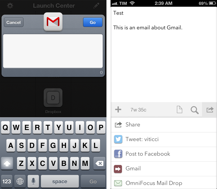
I’ve still made some stuff for it, though. Here’s a JavaScript bookmarklet that will open Gmail using a webpage’s title as Subject and URL as body:

javascript:window.location='googlegmail:///co?subject='+encodeURIComponent(document.title)+'&body='+encodeURIComponent(location.href);

Here’s an action for Launch Center Pro:

googlegmail:///co?subject=[prompt]&body=[prompt]

And an action for Drafts:

googlegmail:///co?subject=[[title]]&body=[[body]]

Keep in mind that the URL scheme may fail if Gmail wasn’t paused in the background (it’ll show a splash screen when loading again). I’m looking forward to improvements to the URL scheme, as Google has been doing a great job with these lately.

Permalink

Convertible for iPhone

Convertible for iPhone

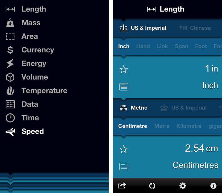
Convertible is one of the most peculiar and fun iPhone apps I’ve downloaded recently. On the surface, it’s a unit converter that uses “nested levels” to show conversions: levels start from the top with type (Length, Time, Currency, etc), then move to category (Metric, US & Imperial, Atomic, etc), and end with the actual unit you want to convert (Celsius, meters, Dollars, etc). The interaction is interesting: you can tap a level to bring up a list (therefore “expanding” the entire level), but you can also scroll horizontally to avoid taps. The animations are smooth and responsive. There are color schemes to choose from in the Settings, as well as an option to show or hide the iOS status bar.

The process of entering numbers for conversion is done by tapping on the larger level showing the unit you chose below a numeric value. The same level also comes with a “star” button to add a unit to your Favorites and a “note” you can expand to know more about a unit. The numeric pad to enter values is custom and in line with the aesthetic of the app. I like how showing the numeric pad “zooms” into the unit levels and how you can hit a button in the bottom toolbar to quickly swap the units you’ve chosen.

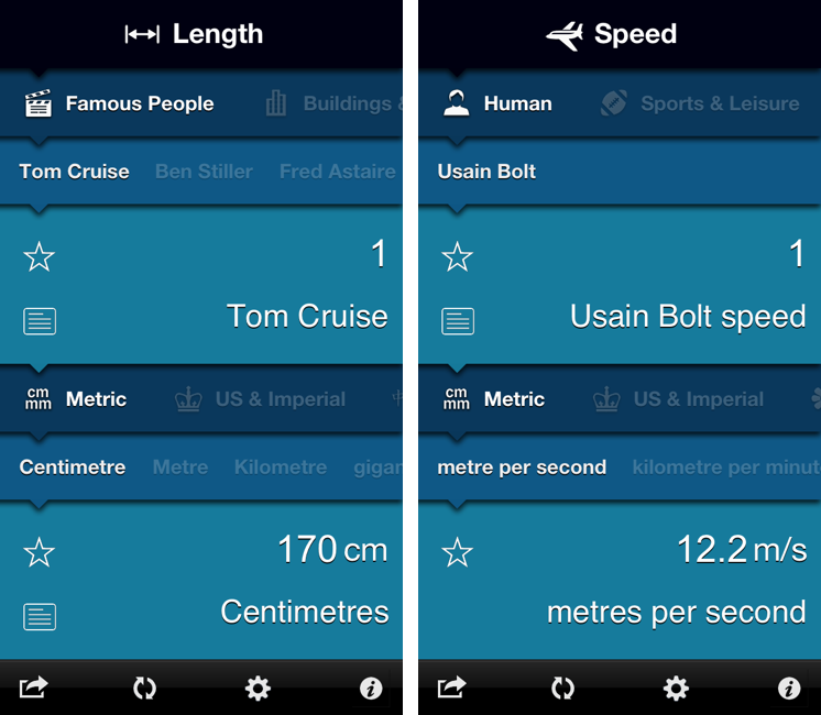
My favorite feature of Convertible is the addition of custom categories besides the standard Metric and Imperial ones. For each type, you’ll find things like Human, Everyday Objects, Natural World, or Food & Drink; the selection of “units” is variegate enough and not necessarily skewed towards the US. For instance, I can compare 1 Tom Cruise to the length of an iPhone 4S and find out that he equals 14 devices; or, I can choose 1 Usain Bolt and see how he’s capable of running 12.2 meters per second (my personal average is 10.2).

I had a lot of fun exploring Convertible’s interface and its custom categories. The app is available at $1.99 on the App Store.

Permalink


The Larger iPhone

The Larger iPhone

Marco Arment has posted some mockups of what a larger, 4.94-inch iPhone may look like:

The theory is easy to understand: perform John Gruber’s Mini-predicting math backwards. The iPad Mini uses iPhone 3GS-density screens at iPad resolution. What if an iPhone Plus used Retina iPad screens with iPhone 5 resolution, keeping the rest of the design sized like an iPhone 5?

Later in the post:

An iPhone Plus almost as big as a Galaxy Note isn’t ideal for many people, but it doesn’t need to be quite that large to accommodate a 4.94” screen. It’s clear that other manufacturers have found designs and techniques to make larger-screened phones require smaller bezels. Apple could achieve similar results and shrink the “forehead” and “chin” even further, limited primarily by the size of the Home button and the desire to keep the forehead and chin equal height.

Max Rudberg proposed the same concept in early January:

This way, Apple would enter the “phablet” market2. There is obviously such a market, likely people who figure they can get something in between a phone and a tablet instead of having two separate devices. If they can enter a new market segment this easily, why shouldn’t they?

MacStories readers know that one-handed operation of an iPhone is a big deal for me. I don’t think I would be able to use a larger-than-iPhone-5 device comfortably with one hand; judging from my past (and brief) experiences with the Samsung Galaxy Note and S III, I would say an iPhone such as the one Photoshopped by Marco is not for me.

However, the point I’ve made in the past on Twitter still holds true: there’s a market of consumers who like smartphones with bigger screens. Now, Apple and Samsung are two profoundly different companies also in the way they spend advertising dollars. From what I see here in Italy, I can say Samsung’s marketing push for the Galaxy line-up has been huge, and it’s clear how the company’s handset business is growing. These days, when I’m not seeing an iPhone, I’m seeing a Galaxy device.

The question is whether those Samsung devices could have been iPhones sold by Apple. Is Samsung selling Galaxies because the carriers have an interest in pushing those more to consumers? Are people buying Galaxies because they “hate” Apple? Is Samsung doing well thanks to advertising? Or could it be that some people actually like the idea of a bigger smartphone that’s not a tablet or a computer?

I don’t know the answer, but I’m fairly certain these are questions folks at Apple are asking themselves too. So I’m going to relay the same example again: several friends of mine told me how they ended up choosing a Galaxy Note (which to me looks ridiculously huge) because it allowed them to comfortably “watch movies” and “read” in a screen bigger than an iPhone, bought on contract and therefore “virtually” cheaper than a MacBook. The reason they were not using a computer to do those tasks? They just didn’t want to anymore.

Like I said, I don’t know if the rumors are true, I don’t know if there’s an Apple market for iPhones in between an iPhone 5 and iPad mini, and I don’t think I’d buy one. But if I were to buy that theory, I’d say Marco’s ideas make sense.

Permalink

Twelve South Releases SurfacePad for iPhone, with Smart Cover-like Protection

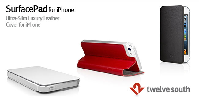
Twelve South, makers of excellent Mac and iOS device accessories, have announced today the latest product in their family of accessories for the iPhone: the SurfacePad. Made of Napa leather and weighing less than an ounce, the SurfacePad is a modern, minimal design that beautifully complements the stylish design of iPhone.

What makes SurfacePad special is what it’s not: a military-style rubber grenade for your iPhone. SurfacePad is an ultra-thin, luxury leather cover that shields iPhone 5 or 4/4S from the more typical hazards of life, like the change in your pocket, jump drive in your backpack or the nail file in your purse. It allows you to set your iPhone down on rough spots like a concrete bench or stone tabletop without worrying about scratching the sleek surface of your iPhone.

Check out more photos of the SurfacePad here, and a video below. Read more


Evernote Relaunches Penultimate: Free, Evernote Sync, Search

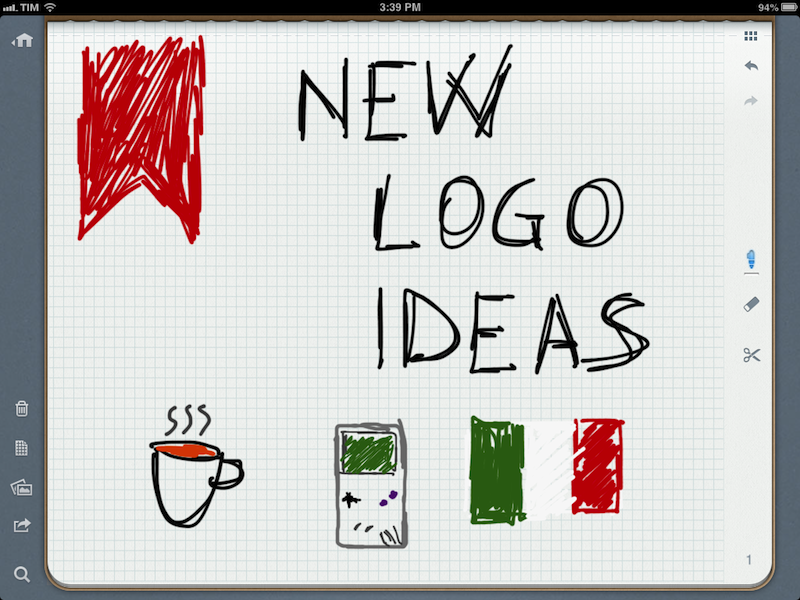
In May 2012, Evernote acquired Penultimate, one of the most popular handwriting apps for the iPad. Today, Evernote is relaunching Penultimate as a free app with built-in Evernote sync and search for handwritten notes.

I have been beta testing the new Penultimate, and, overall, I like the update. I have to admit that my usage of the application is limited to importing images into the app’s notebooks and drawing a few callouts and simple illustrations on them. I usually prefer Evernote’s other app, Skitch, for quick image annotations, but I don’t mind using Penultimate every once in a while when I need something more complex than a straight line or callout. Still, keep in mind that I don’t store hundreds of notes in Penultimate. Read more


iPad and “Content Creation”

iPad and “Content Creation”

In doing research this week, I came across an article by Richard Gaywood that I found to be one of the most balanced takes on the three year-old iPad is for consumption/creation subject.

No device is one-size-fits-all, including the iPad. It’s fine to acknowledge the shortcomings of an iPad for content creation, whilst keeping in mind that these are only shortcomings – not hard limits. What’s important is understanding your needs and the ways different devices can fulfil or frustrate them. What’s important is the nuance; the shades of grey between the “the iPad is a toy” and “the iPad is the future of computing” extremes.

Whenever I “criticize” a shortcoming of iOS or the iPad, I’m accused of being a “bored geek” who doesn’t consider “real life scenarios”. In this regard, I particularly appreciate Richard’s real-life practical examples:

Other tasks are complicated by the way you can only see one app at once and because switching back and forth is relatively slow and relatively laborious (which is why many bloggers have asked for cmd-tab support on iOS.) Try making a calendar entry from details sent in an email, for example – if the automatic tap-to-make-entry fails you, lots of tedious back-and-forthing between two apps becomes necessary. Try collating data from a dozen disconnected cells in a spreadsheet into a wordprocessor document. Try cross-checking two spreadsheets against each other. Try following a tutorial in a web page about how to carry out a task in your presentation software. Try plagiarising a Wikipedia page by subtly rewording it into a high school paper. And so on, and so forth.

Saying that the iPad can be used for “content creation” isn’t a crusade against people who don’t like Apple, iOS, or the iPad. Similarly, blindly insisting that the iPad is for “consumption only” is just silly and shortsighted. More importantly, the term content is awful. So, for the sake of this linked post, I’m going to refer to the issue as: doing real work and/or tasks that you’d normally do on a computer.

Once iOS reached a certain degree of “basic functionality”, I’ve always thought this discussion sounded like arguing about your favorite color. Being “objective” in regards to the iPad’s capabilities is, ultimately, subjective: I can say that the Nebulous Notes macros are objectively fast and they make writing in Markdown easier for me; my girlfriend can objectively state that graphic design work is severely limited on the iPad. So who’s right? Well, nobody is. But nobody is “wrong”, either.

Like Richard says, the truth is more nuanced. And I will add: it really depends on the kind of software you’re looking for. Out of the box, the iPad can’t do much for a writer, but there are hundreds of good/great apps for text editing on the App Store. On the opposite side of the spectrum, even a jet fighter pilot managed to make an iPad work for him thanks to third-party apps and accessories. Now consider all those shades in the middle: teachers, students, corporate employees, sale reps, doctors. Condemning and glorifying the iPad on principle as a “work” machine won’t let us get to the core of the subject – because the actual core are those millions of people using the iPad every day for thousands of different tasks. And in that case, a single blogger can’t expect to cover all the possible combinations. Keep in mind that many of those “iPad is consumption” complaints come from journalists who often deal with complex web-based CMSes, multi-author editing workflows, and lots of email attachments. Admittedly, the iPad isn’t as efficient as the Mac at completing those tasks.

Which, again, is why I like Richard’s article. Judging a device with a black/white meter isn’t the way to go. But: there are pragmatic examples worth mentioning as areas of improvements. He touched upon many of the topics I’ve covered as well: opening documents in various apps; text selection; switching from a browser to something else. I believe we can safely agree that those areas could use some attention by Apple now.

The thing is, I’m not writing headlines about the iPad being “the best device for creation” or “consumption only”. I am sharing what works for me and I’m just happy to show other people that the App Store comes with great apps that we can leverage when it comes to writing, reading, doing research, and other tasks that I care about.

Permalink

View Mac App Store Links On iOS

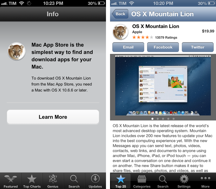
I don’t like how iOS devices can’t preview the contents of an iTunes link for a Mac App Store app (shown in the screenshot above on the left). While I (partially) understand the limitation from an infrastructure standpoint, I still think “incompatible” App Store pages should at least display text, screenshots, and a link back to the developer’s website without a Buy button.

There are solutions to preview a Mac App Store link on iOS. As far as browsers go, you can “Request Desktop Site” in Chrome for iOS and choose a different user agent in iCab Mobile (my two favorite third-party browsers). Chrome is my go-to browser these days, and I like how the feature is limited to single tabs, rather than the entire app.

Thanks to @AppleSpotlight, I’ve also found a non-browser app to achieve the same functionality and also a bit more. Desktop Apps lets you browse the Mac App Store from an iPhone or iPad (the app is Universal and free with ads). You can view the Top Free/Paid/Grossing apps, categories, and you can search for a specific app. You can open an app’s page, view screenshots, share a link via Email, Twitter, or Facebook (with native iOS integration), and even select text displayed as a description. Unfortunately, the app doesn’t fetch additional information like Developer Website, ratings and reviews, and there’s no URL scheme to easily turn itunes.apple.com links into URLs for the app (like Documents does for Safari).

Desktop Apps’ graphics aren’t entirely Retina-ready: the app is optimized for the iPhone 5, and two out of five tab bar icons are Retina-ready, but three of them aren’t – just like the icons of the Mac App Store apps. It’s a strange mix of fuzzy and crisp graphics. Desktop Apps has a $0.99 in-app purchase to remove ads; if you’re really into the idea of browsing the Mac App Store from iOS, go ahead and unlock it. Otherwise, I think you’ll be fine using the free version alongside Google Chrome.

Permalink