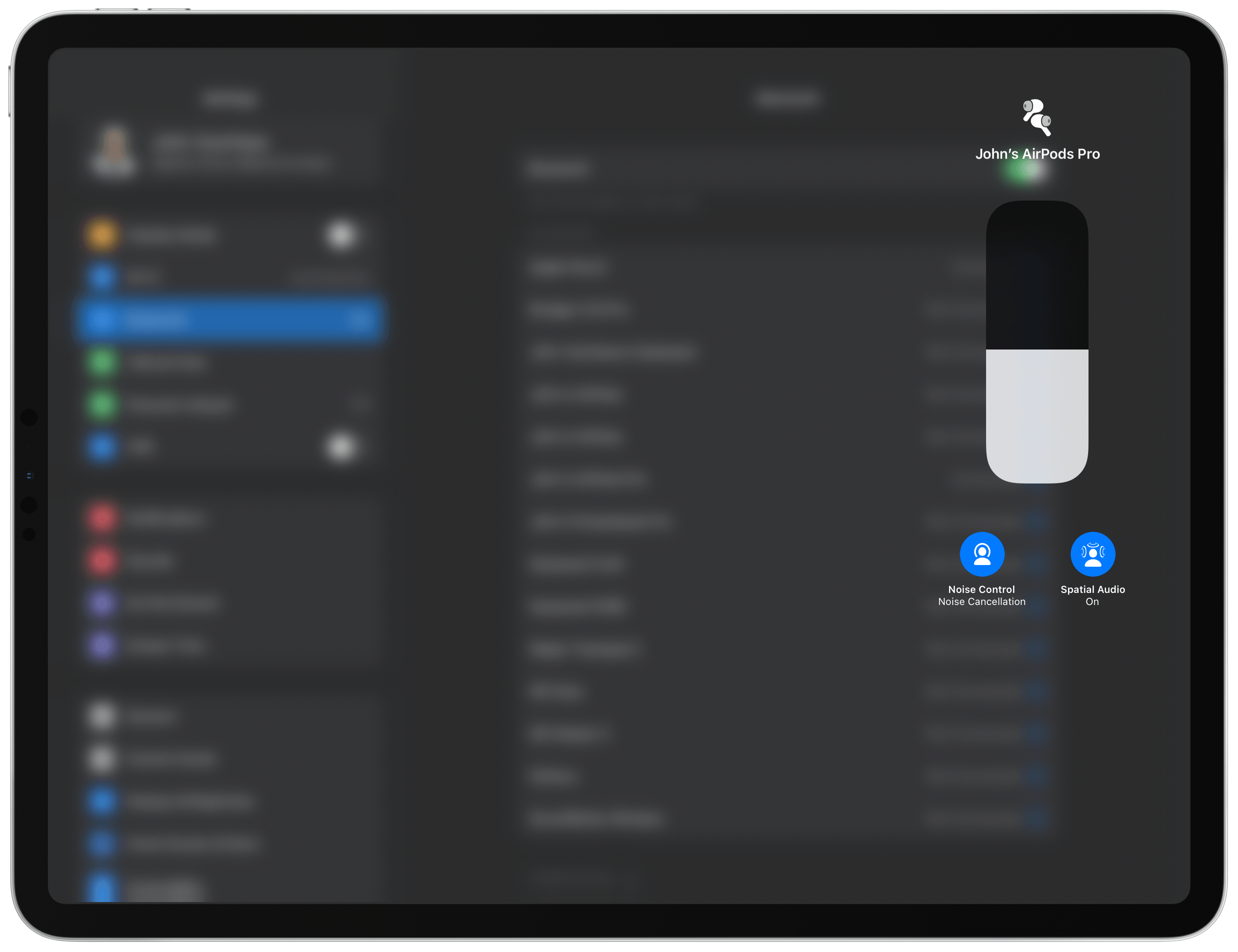
OffScreen: Leave Your Phone, and Focus on Real Life [Sponsor]

It’s far too easy to get sidetracked and waste time on your iPhone. With Offscreen, you’ll understand exactly how you are spending time, regain control of it, and learn how to focus on what’s most important to you.

OffScreen is a beautifully-designed app for the iPhone and iPad that humanizes the way it reports statistics of your device usage. Not only does the app track screen time, but you can set goals, track your progress, and gain insights into your use patterns with built-in, understandable details like Pickups, Checking Every, Walking Life, Stationary Life, Last Pickup, First Pickup, Best Break and Sleep Time. It’s a holistic overview of your time that gives you the tools you need to form better habits.

OffScreen also helps you focus on your work. The app supports Pomodoro timers, countdowns, and cumulative time counters. Once you start a timer and put your phone down, OffScreen will remind you to get back to work with a notification, if you pick it up. Of course, if there are apps you need for your work, you can whitelist just those apps. OffScreen has terrific white noise options to help you concentrate on your tasks too.

To keep you on track and assist you with spotting long-term trends, OffScreen provides reports too. You’ll find detailed historical information beautifully displayed using charts generated for certain days, weeks, months, or years. You can also navigate your data from a calendar view to quickly jump to a particular day, and statistics are sharable.

Download OffScreen today on the App Store to take control of your iPhone use and focus on real life.

Our thanks to OffScreen for sponsoring MacStories this week.


MacStories Unwind: The ADAs, New Apple Watch Details, and Big Sur’s Redesign

AppStories+ Deeper into the world of apps
0:00
35:58

AppStories+ Deeper into the world of apps


Sponsored by Streaks Workout: Work out in your home with no equipment.

This week on MacStories Unwind:

MacStories

Club MacStories

  • MacStories Weekly
    • John shares a collection of small but interesting changes coming in macOS Big Sur
    • Federico shares an OmniFocus shortcut for iOS and iPadOS 14
    • Ryan considers Apple’s plans for gaming
    • We’ve got a reader straw poll about WWDC 2020
  • Monthly Log
    • John on the Big Sur redesign and whether it’s a sign of an imminent touchscreen Mac, part of a longer-term experiment, or something else
    • Stephen considers the design changes coming to the Mac with Big Sur
    • Ryan shares some of the apps he’s switching to while testing iOS and iPadOS 14

AppStories

Unwind Picks


Josh Ginter’s First Impressions Review of HEY

Despite all the drama surrounding the App Store launch of HEY, the new email service from Basecamp, I never got around to actually trying out the service for myself. As a result, I was excited to see today that Josh Ginter at The Sweet Setup had published an in-depth first impressions review following a couple weeks of use. In short, he loves it:

To say this is a glowing first impressions review would be an understatement — in just two short weeks, HEY has shown itself to be the most revolutionary app or service I’ve ever tried.

While I may not be alone, I also know many folks who feel otherwise.

Which makes a lot of sense, I think. Email is one of the oldest digital technologies and it’s worked a specific way for a very, very long time. There will be some deeply engrained email habits out there, and old habits die very, very hard.

I also recognize that HEY likely works for a specific type of emailer. HEY appears to thrive with a multitude of daily email and may feel out of place for someone who has either worked out their email workflow, someone who incessantly unsubscribes from anything unworthy, or someone who relies on other forms of communication to get their stuff done each day.

I found Ginter’s review an excellent primer on HEY’s unique approach to email. If you love in-depth app reviews – and I hope you do – and have been wondering why some people are calling HEY the next Gmail, I highly recommend Ginter’s piece.

Permalink

Apple Debuts Web Portal for Apple Card Management

Apple Card users can now view their entire transaction history, make payments, and more from card.apple.com.

Launched today, the new web portal for Apple Card users addresses a concern prospective users voiced when Apple Card first launched: how do I manage my credit card if I lose my iPhone (and/or iPad)? That should no longer be an issue, since Apple’s website now enables users to:

  • Check their Apple Card balance
  • Make payments, including setting up scheduled payments
  • Download PDF statements of monthly activity
  • View information about their Apple Card Monthly Installments
  • Set up and remove bank accounts
The new card.apple.com landing page.

The new card.apple.com landing page.

The timing of this new web portal coincides nicely with a special promotion Apple just started, which offers new Apple Card users a $50 credit to use toward Apple services. Just a couple weeks ago, Apple Card also gained special 0% financing options for a host of Apple products, including Macs, iPads, AirPods, and more.

I’ve been an Apple Card user since the beginning and love it. While I don’t expect to use the web interface on a regular basis, it’s a great option for people who need it, and I’m happy to see Apple continue to make the product more appealing.


Connected Trio Host Interview with Members of Apple’s iPad Team

Federico, Stephen, and Myke had a special surprise on this week’s episode of Connected, their podcast about Apple, technology, and general shenanigans. Episode 301, titled We Should Be Developers, features an interview with Apple’s Jenny Chen, who works on the Apple Pencil team, and Stephen Tonna, who works in iPad product marketing.

The interview covers the new Scribble feature in iPadOS 14 and other Apple Pencil enhancements, the philosophy behind iPad app design, including the new sidebars and dropdown menus of iPadOS 14, and also how the iPad’s versatility of input methods needs to be kept in mind by app developers.

There are a ton of great insights into how Apple’s team thinks about the iPad and approaches its evolution. If you’re an iPad user, you won’t want to miss it.

Permalink

Michael Flarup on Big Sur’s New Design

In the years since iOS 7 ushered in flat, minimalistic design, Michael Flarup has consistently pushed back, insisting that the trend had gone too far and there was still room for fun and expression in design. With the redesign of macOS 11 Big Sur, Apple surprised the design world by introducing a design that harmonizes macOS with the company’s other OSes, while providing room for expressiveness.

As Flarup explains:

Materials and dimensionality has made its way back into the interface —and every single app icon for every application and utility that Apple ships with macOS has been redesigned with depth, textures and lighting. This is a big deal. Probably bigger than what most people realise.

The post is a fantastic overview of where design stands on Apple’s platforms today and the influence that the company’s choices have on the design community. Whether intended or not, the unexpected design shift on macOS is one that Flarup expects to see radiate out to affect the design of iOS and iPadOS too:

With this approach Apple is legalising a visual design expressiveness that we haven’t seen from them in almost a decade. It’s like a ban has been lifted on fun. This will severely loosen the grip of minimalistic visual design and raise the bar for pixel pushers everywhere. Your glyph on a colored background is about to get some serious visual competition.

It’s interesting to consider where this new direction will lead. Big Sur’s iconography is part of a broad redesign on macOS that runs far deeper than the design changes made to iOS or iPadOS this year. Whether those platforms will follow the Mac’s lead in the future or take their own paths is something I expect to see debated a lot in the months to come. However it plays out, though, I’m glad to see the Mac retain character in its design as it heads into what promises to be a new era for the Mac.

Permalink