Today, Apple updated its budget-model iPhone SE with a new A15 Bionic chip, 5G connectivity, better battery life, and other modern iPhone features.
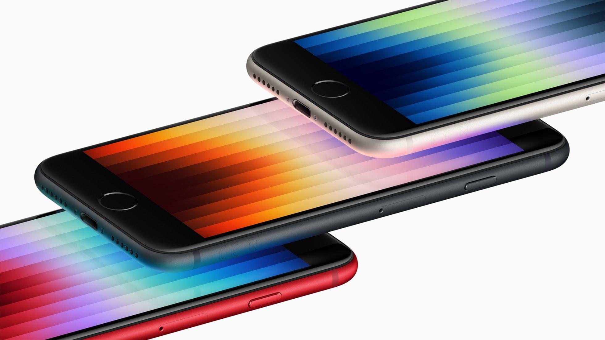
As with the previous model, the new SE comes in three colors: Midnight, Starlight, and (Product)RED. With the new A15 Bionic chip, Apple says the new SE’s graphics are 1.2x faster than the 2nd generation model it replaces. The addition of the A15 Bionic means iPhone SE users can enjoy advanced features like Live Text too.
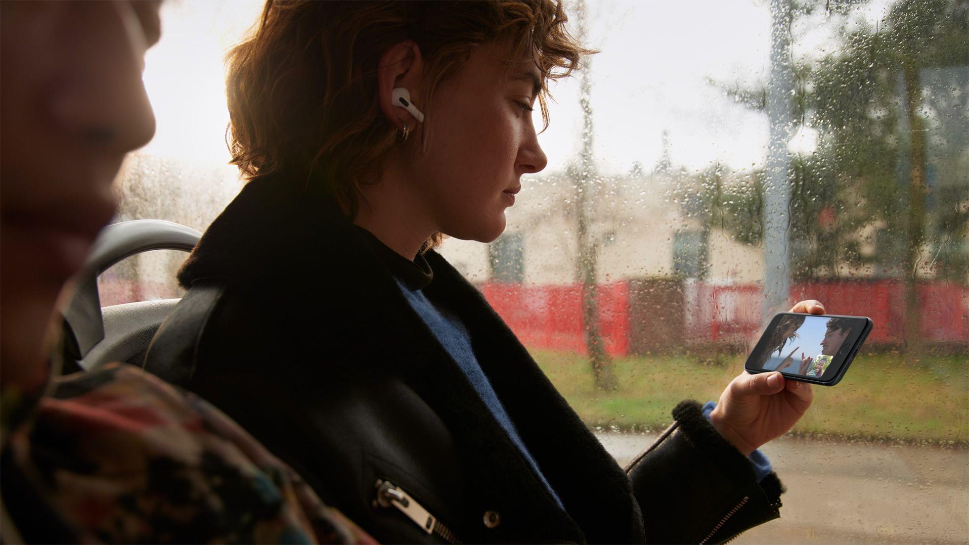
A combination of the new chip, different battery chemistry, and changes to the design also allows the SE to run for up to 2 hours longer on its battery in video playback tests. With a 20W charger, the SE can fast charge from 0-50% in 30 minutes too.
The iPhone SE has a 12MP camera with a sensor that is capable of Apple’s Deep Fusion technology. The update also supports Smart HDR 4 and photographic styles, which first appeared on the iPhone 13. Although the camera’s sensor and the hardware that drives it makes this a new camera system, the lens hardware itself appears to be unchanged.
The iPhone SE’s glass has received an upgrade too. It uses the same shatter-resistant type of glass as the iPhone 13 and 13 Pro lines.
Finally, the iPhone SE carries a $429 starting price tag. That’s $30 more than the prior generation.
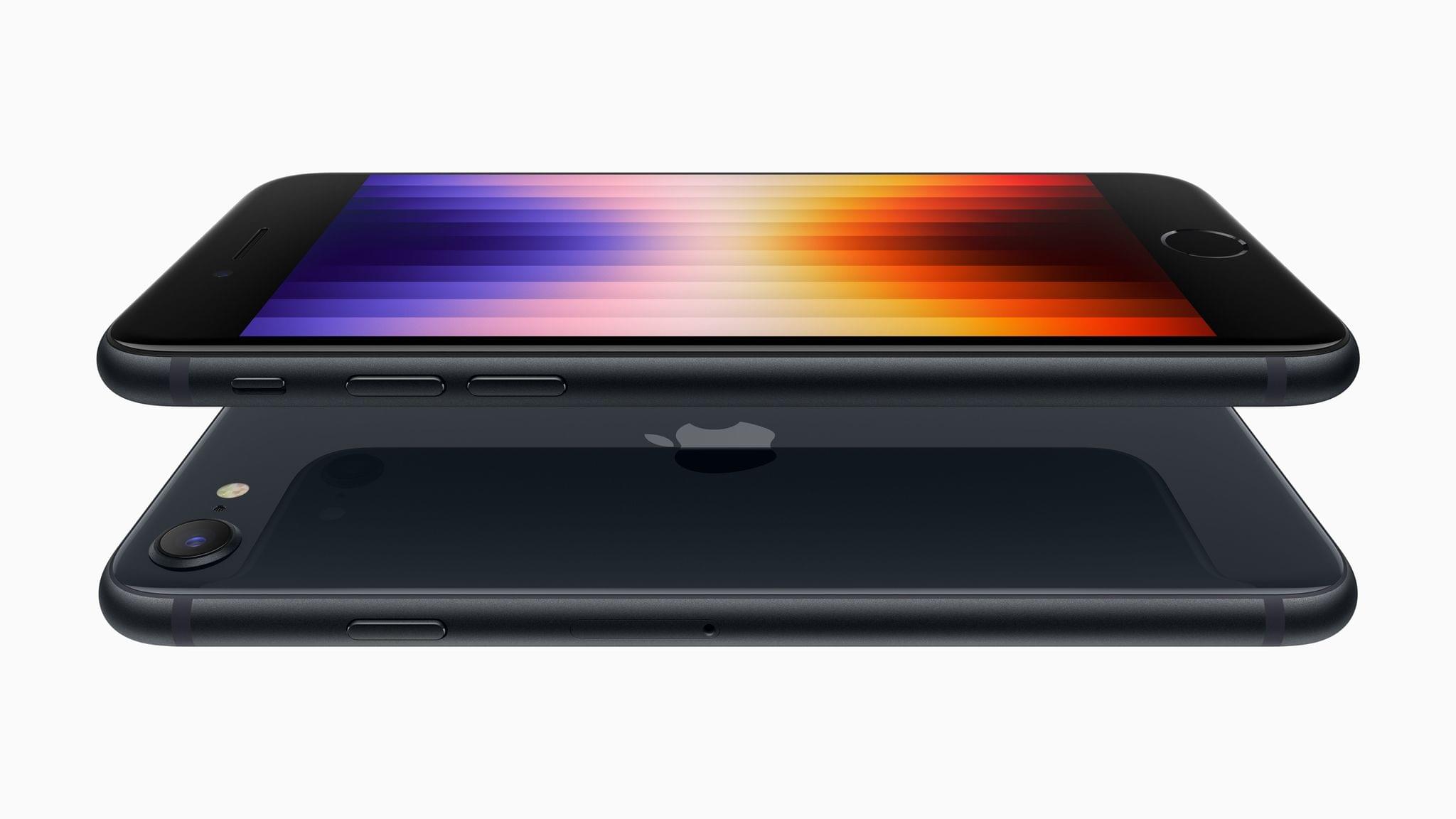
Other features of the iPhone SE remain the same. The model uses Touch ID embedded in its Home button and has the same 4.7” display as the model it replaces. Like the previous model, the new SE is also IP67 rated for water resistance. The new SE offers 64, 128, and 256GB storage capacities too.
With an A15 Bionic chip, which powered the previous-generation iPad Air, the new iPhone SE is an excellent choice for anyone who wants a smaller iPhone. It would have been nice to see it adopt Touch ID in the power button, as the iPad Air did, but regardless, today’s announcement is a nice refresh of Apple’s most affordable iPhone.
You can follow all of our ‘Peek Performance’ Apple event coverage through our event hub, or subscribe to the dedicated RSS feed.p


](https://cdn.macstories.net/banneras-1629219199428.png)