Watch Faces
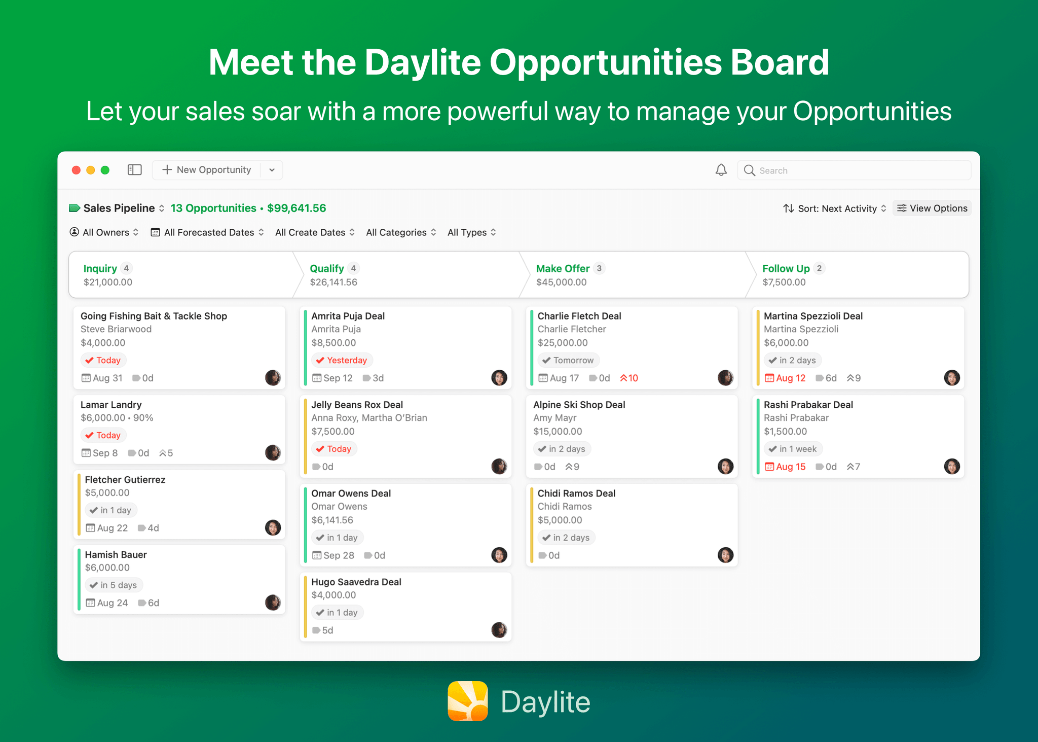
From left: the new Metropolitan, Playtime, Lunar, and Astronomy watch faces in watchOS 9. Source: Apple.
As always, Apple has some new watch faces for us. Also as always, most of them are extremely niche or novelty faces. There is one new option this year which may be a legitimate contender for your watch face, though.
Metropolitan
The Metropolitan face may be my favorite new face of the last few years. It features four complications — one on each corner — and a very clean central dial. When you spin the Digital Crown, the numerals either stretch or squish in a fun effect to fidget with. Four is a decent number of complications, and the face has some very nice customization options for the dial and background colors, allowing you to design some very interesting faces via color combinations.
Metropolitan still isn’t going to pull me off of my long-running favorite Infograph watch face, as I don’t want to miss out on the nice central complications. For users who care less about complications than I do though, this is a really nice watch face option that is well worth your consideration.
Playtime
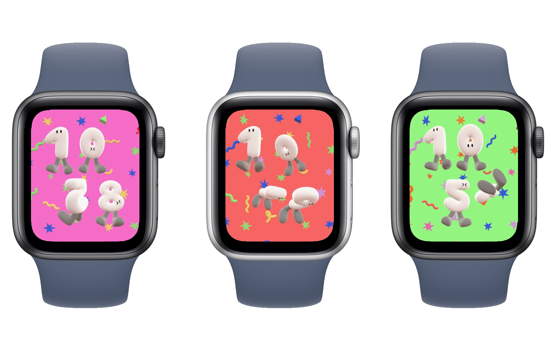
Playtime is another of Apple’s strange novelty faces. It shows the time as four ballon-like characters with eyes and feet. In the background is some confetti. You can spin the Digital Crown to twirl the confetti, and you can tap the screen to “bump” the balloons. They will be playfully nudged around for a bit before coming back to their main positions. If you tap fast enough for a long time, generally using two fingers, you can get the balloons agitated enough that they will occasionally do a full backflip or spin all the way around.
This watch face looks like it was a very fun exercise for Chicago-based designer Joi Fulton. As an official watch face on the Apple Watch though, I have no idea why it exists. At first glance it looks like it would be entertaining to kids at least, but the interactivity is honestly underwhelming to degree that I think even kids would get bored quickly. It takes far too much tapping to make the balloons do anything particularly interesting, and even then all you get is a slow flip before they return to position. Maybe if furious tapping caused the balloons to go absolutely crazy, or if spinning the Digital Crown did something better than mildly rotating the background noise, then this face could at least be fun.
Lunar
The Lunar watch face is pretty straightforward. It celebrates the Lunar calendar by placing it on your watch face, and it includes support for the Chinese, Hebrew, and Islamic calendars. You can spin the Digital Crown to rotate through the lunar dates.
This watch face does have four corner complications, but overall it’s extremely busy. If you need to check in on the Lunar calendar frequently then I suppose this is the face you’ve been waiting for. Otherwise, it’s just another novelty face.
Astronomy
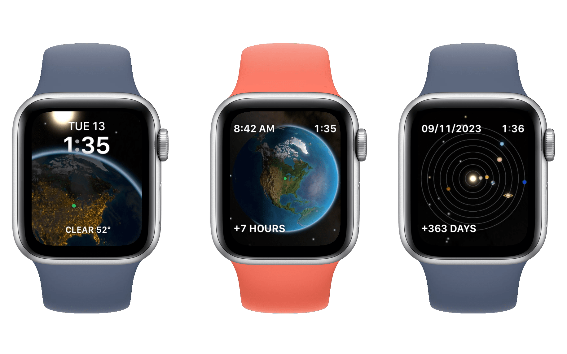
The best I can say about the Astronomy watch face is that it sent me down a mildly entertaining research rabbit hole trying to find out how many years I’d need to go backwards or forwards in time to see all eight of the little planet icons line up perfectly with each other. (Sadly, this apparently never happens.)
This watch face has three different views: Earth, Moon, and Solar System. Each view shows an up-close depiction of its subject layered behind the digital time, and includes a complication at the top and another at the bottom. If you spin the Digital Crown, you’ll see each view zoom out so that you can see the entire subject. Continuing to spin the Crown will take you backwards or forwards by hours or days at a time. The Earth view will show the sunlight rotating around the planet throughout each day, the Moon view will show the phase of the moon, and the Solar System view will show the rotation of the planets around the Sun.
My teasing aside, this face does look really nice. If you’re really into astronomy then it’s probably exactly the kind of watch face that you’ll love. Outside of that niche though, I doubt it has much staying power.
First-Party Apps
While the only brand-new first-party app this year is Medications, Apple also has some updates to existing apps ready for watchOS 9.
Calendar
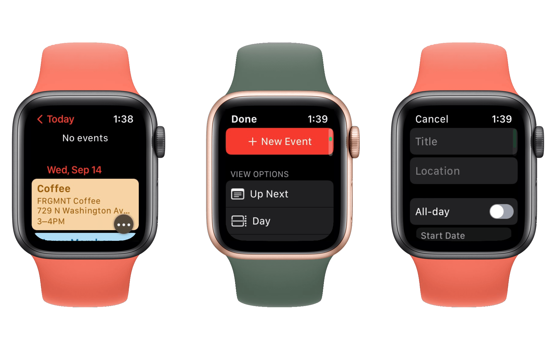
The watchOS Calendar app can now be zoomed out to week or month views, rather than only displaying single day views. Just spin the Digital Crown to swipe to scroll up and down between weeks or months. Tap to drill down to the day view, which has been updated with a new hovering ‘…’ button. You can tap the button to access a menu of options, with a ‘New Event’ button at the top and a list of view options beneath it.
The view options aren’t new, but they were previously only accessible from the Calendar panel in the watchOS settings app. Bringing those to the app itself should make them a lot more accessible, which is good since I think the ‘List’ view (which now appears to the be default) is a lot better than the previous default ‘Up Next’ view. In the List view, only events show up, so you no longer have to swipe through empty days just to get to the next day with an event.
The ability to create events within the Calendar app is new this year, and it’s great to see Apple build out this core app with such a necessary feature. You can configure new events with titles, locations, start and end date and times, repeats, and more. Essentially every feature of Calendar events from iOS can now be configured in watchOS.
When configuring an event’s location, you have options to use the locations you’re currently at, or to type in a search term. The search option will display a list of results from Maps, so you can search for and add locations by name, which is a nice option.
If you tap into an event with a location, you can tap on the location to open it in the Maps app for Apple Watch, and then activate navigation directions to the location from there.
The updates to Calendar are excellent, especially in the age of the full-size keyboard for Series 7 Apple Watches and later. With text input becoming more accessible, as well as with modern Apple Watches being less connected to iPhones, it’s vital for Apple to start empowering the operating system to do more.
The one miss here is that, while you can add new calendar events, you can’t edit them once they exist. This feels like an oversight, since the entire interface to edit them is already there. I hope Apple adds this feature in a dot update.
Reminders
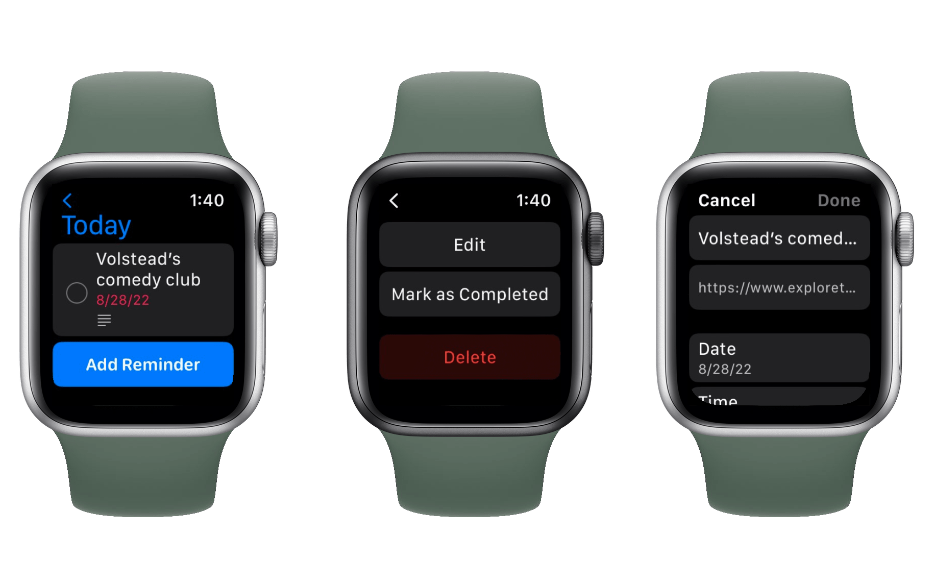
Reminders has also been updated with the ability to edit existing reminders. Just tap on a reminder to open a menu with an option to edit it. Tapping the ‘Edit’ button will bring you to a new interface in the app, from which you can change the reminder’s title, notes, due date/time, and more.
Oddly enough, the interface for adding a reminder, which was already present and allowed adding them with only a name, has not changed. So you can only create reminders with a name, but then you can find the created reminder and edit it to have all of the details that you’d like.
This whole thing is very strange, as Calendar allows creating with full details but no editing, while Reminders allows editing with full details but only extremely basic creation. These two apps combined would have all the features that we want from them.
Regardless of the oversimple creation flow, it’s great that we finally have some avenue to set up more complicated reminders from the wrist. Siri still works too, but the new editing interface makes even more features available.
Podcasts
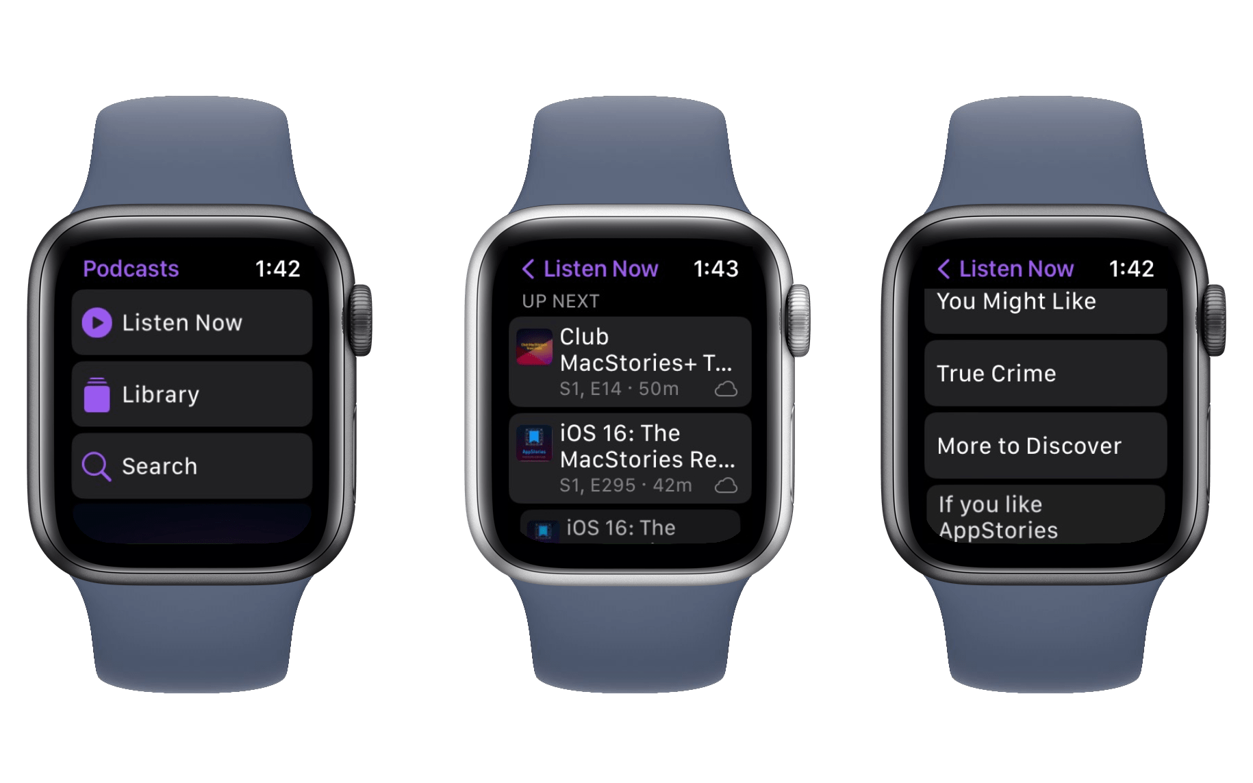
Finally, the Podcasts app has been updated to go fully independent from the iPhone in watchOS 9. The new version allows you to search for, follow, and unfollow new shows directly from your Apple Watch. Selecting particular episodes to download is also supported, and the new Listen Now section will make suggestions for new shows you might like to listen to.
With Apple pushing harder on its Family Setup feature this year, these improvements to Podcasts make a lot of sense. Family Setup allows kids to be given Apple Watches without requiring a paired iPhone, and now they’ll have access to their favorite shows from the first-party Podcasts app for the first time.
Banner Notifications
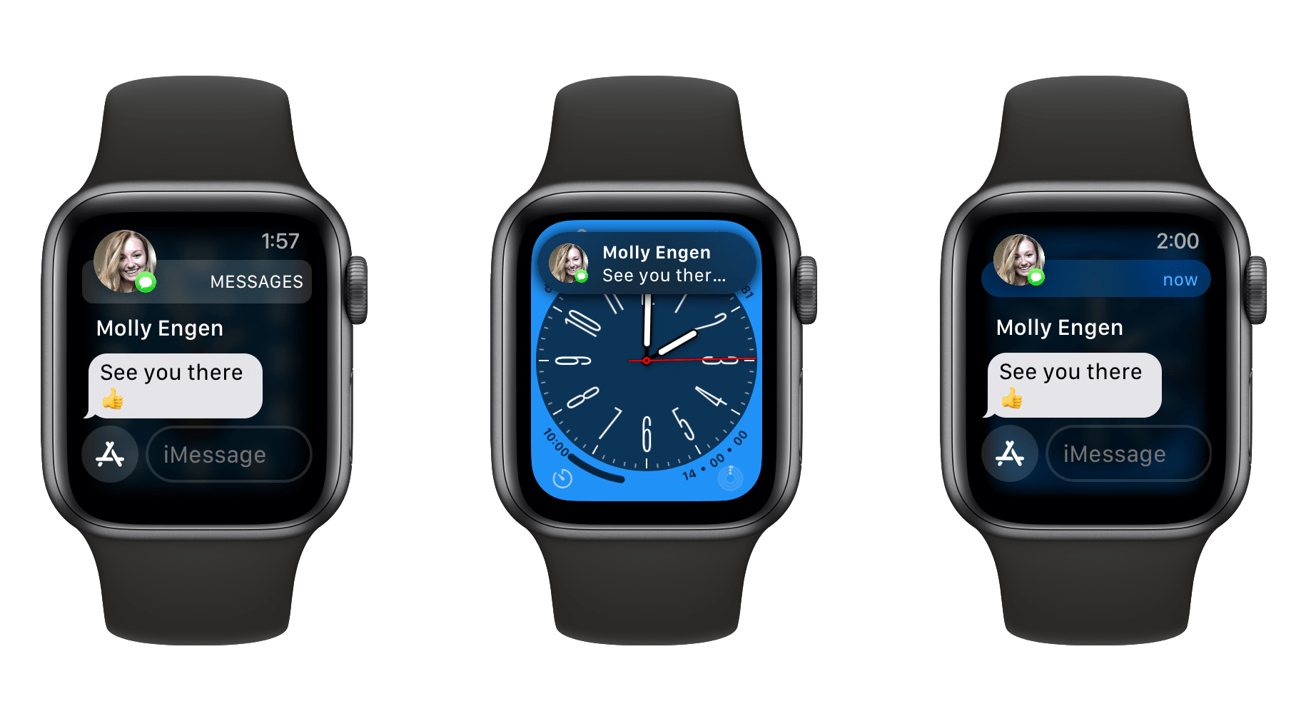
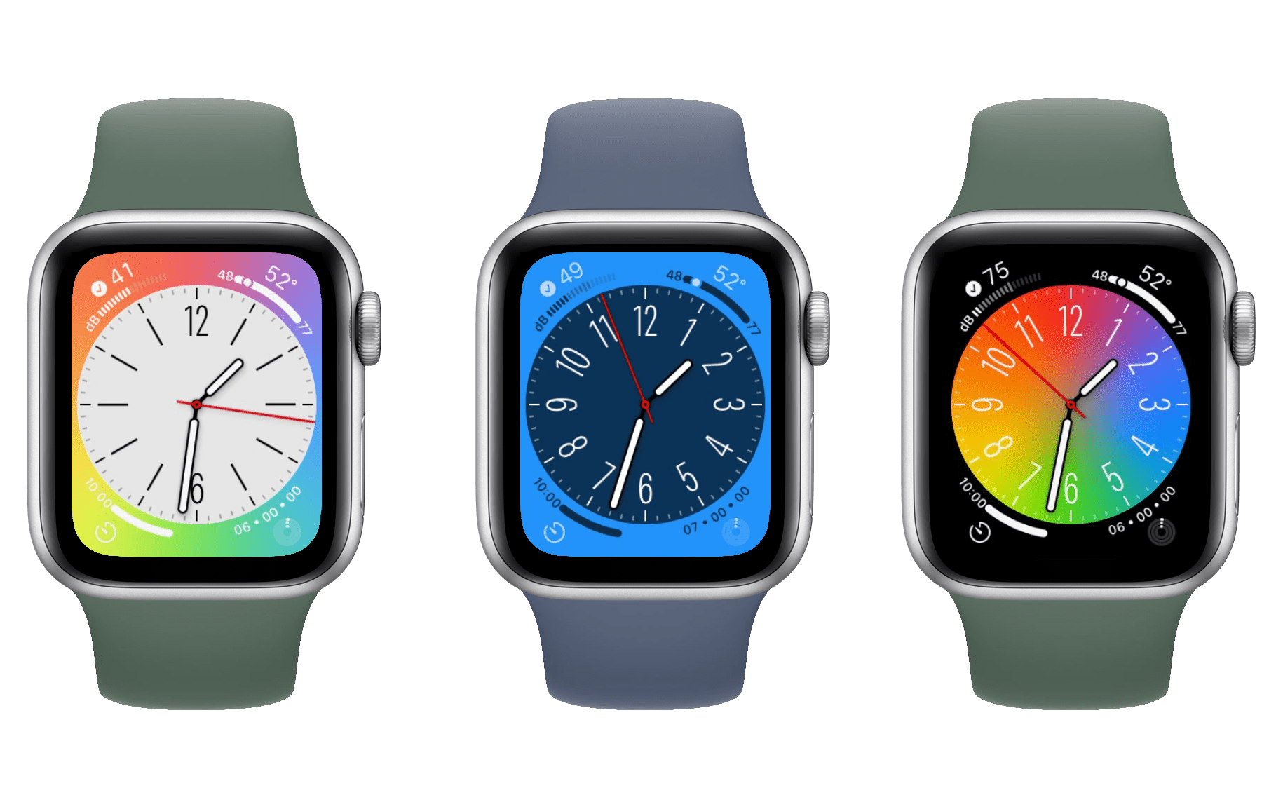
Left: watchOS 8 pop-up notification. Center: watchOS 9 banner notification. Right: expanded banner notification.
This year’s new system feature is the debut of drop-down banner notifications. When you’re actively using your Apple Watch in watchOS 9 and a notification comes in, it will slide down as a small banner from the top of the screen, rather than taking over as a full-screen notification.
This is a huge improvement over the old setup, and it has actively made the experience of using my Apple Watch more convenient and comfortable. Full-screen notifications popping up while you’re trying to do something else makes the whole device feel more like a notification machine than an actual computer on your wrist. With banner notifications, Apple is giving control back to the user to determine whether or not the incoming notification is more important than their current task.
The implementation of this feature is perfect. While you have your wrist raised, notifications come in as banners. You can easily swipe up on them to dismiss the banner if you don’t want to deal with it, or tap it to expand to the usual full-screen view. However, when your wrist is not raised and a notification comes in, it will show up in its normal full-screen form immediately when you raise your wrist. In practice, this has been exactly the behavior that I want every single time.
Miscellany
- Low Power Mode is now available on watchOS, and can be activated by opening Control Center and tapping the battery percentage icon. The new mode will preserve battery life by disabling certain features such as the always-on display — a far nicer alternative to Power Reserve mode.
- The Compass app has been updated in watchOS 9 to support waypoints and a new Backtrack feature. While available on the Apple Watch Series 4 and later, most of the new Compass features require an Apple Watch Series 6, so I wasn’t able to test them out. MacRumors has more details.
- The Portrait watch face now supports photos of dogs and cats.
- The special Nike watch faces which used to only be available if you purchased a Nike-branded Apple Watch are now available to all Apple Watch users.
- Apple Watches configured as independent devices by Family Setup can now be given access to HomeKit-enabled devices, allowing these users to control lights, lock and unlock doors, and more right from their wrist.
- The Siri UI in watchOS 9 now overlays the small Siri bubble on top of other watchOS content, rather than immediately initiating a full-screen UI change.
- The full-size keyboard on the Apple Watch Series 7 now supports more languages.
- The wobble interface for adding or removing items in watchOS Control Center now shows text labels, making for a convenient way to remember what all of the icons actually do.
Conclusion
Recently, I’ve found my excitement for the future of watchOS rekindling. The Apple Watch hardware is far stronger than it was in the early days, from larger screens to far more powerful processors. Will improved text input via the full-size keyboard pave the way for a new evolution of the Friends interface, or some other unique modicum of communication2? Will Glances return and gain interactivity now that the Apple Watch could actually handle third-party apps operating from the watch face3?
Obviously we can’t answer those questions yet, but in the last couple years we’ve seen Apple bring back colorful iMacs, ports (ports!) on the MacBook Pro, Clarus the Dogcow, and more. In many ways it has felt like a loosening up of the strict professionalism that we saw from Apple throughout the 2010s. Perhaps they’ll point some of that new energy at watchOS in the coming years as well. I want Apple to make watchOS weird again.
Maybe I’m reading too much into a sample size of one, but I think watchOS 9 may already show signs of new life in this area. Banner notifications make watchOS feel like a software platform again rather than a high-end Fitbit. The ability to create and edit calendar events and reminders, and to discover and follow new podcasts, aid in this vibe shift as well. I hope we continue to see more features like these in the coming years.
While OS-level advancements are always going to be my personal favorites, there’s no argument that the health and fitness features of Apple Watch will always be of more importance. In these areas, Apple is saving and improving lives by bringing more and more advancements to personal healthcare and healthy living. In watchOS 9, Apple hit it out of the park here.
The improvements to the Workout app are excellent, and arrived with a surprising level of sophistication for brand-new watchOS features. The same can be said of the Medications feature, which I think will be enormously popular (although they really need to make those notifications sticky). I’m pleased to see sleep tracking growing more in-depth too, especially since the new data points don’t require new hardware.
On the watch face front, Apple continues to drain what is clearly a significant amount of effort into new watch faces every year, but they just keep creating weird novelty faces, or faces for extremely niche groups. If this is what Apple wants to do, I just don’t understand why they remain stoically unwilling to open up the device to third-party watch faces. Allow developers to fill in the gaps of actually good general-purpose watch faces, and I will immediately stop minding that Apple invests its limited focus into accurately depicting planetary rotations or collaborating with designers.
Watch faces are almost always bad though, so I can barely even bring myself to ding watchOS 9 on them at this point. Overall, I think I’m ready to call this one of the best Apple Watch updates in years. We saw great new features across the board, filled in some longstanding gaps in functionality, and finally dropped support for the Apple Watch Series 3. The last may seem like a minor footnote, but it actually should free up watchOS developers to make even better apps going forward now that they don’t need to support that very flawed, outdated hardware.
watchOS 9 was released this week, and is available for free to all users with Apple Watches Series 4 and above.
- Remember Walkie-Talkie? While only useful in niche situations, that was a legitimately cool new feature which felt perfect for the Apple Watch. I want to see Apple try out more weird ideas like that. ↩
- Apple removed Glances from watchOS while the Apple Watch Series 3 was still a top-of-the-line device, rather than a relic whose end of life was recently celebrated by developers. The idea of having customizable third-party mini-interfaces available via swipes directly on the watch face was always a great one, but the hardware back then just couldn't handle it. ↩