Pixelmator Pro 3.2 adds a new dimension to the Pixelmator team’s flagship app: video. I have yet to spend much time with the app’s new video features yet, but anyone familiar with Pixelmator Pro should feel right at home because working with video works a lot like editing still images.
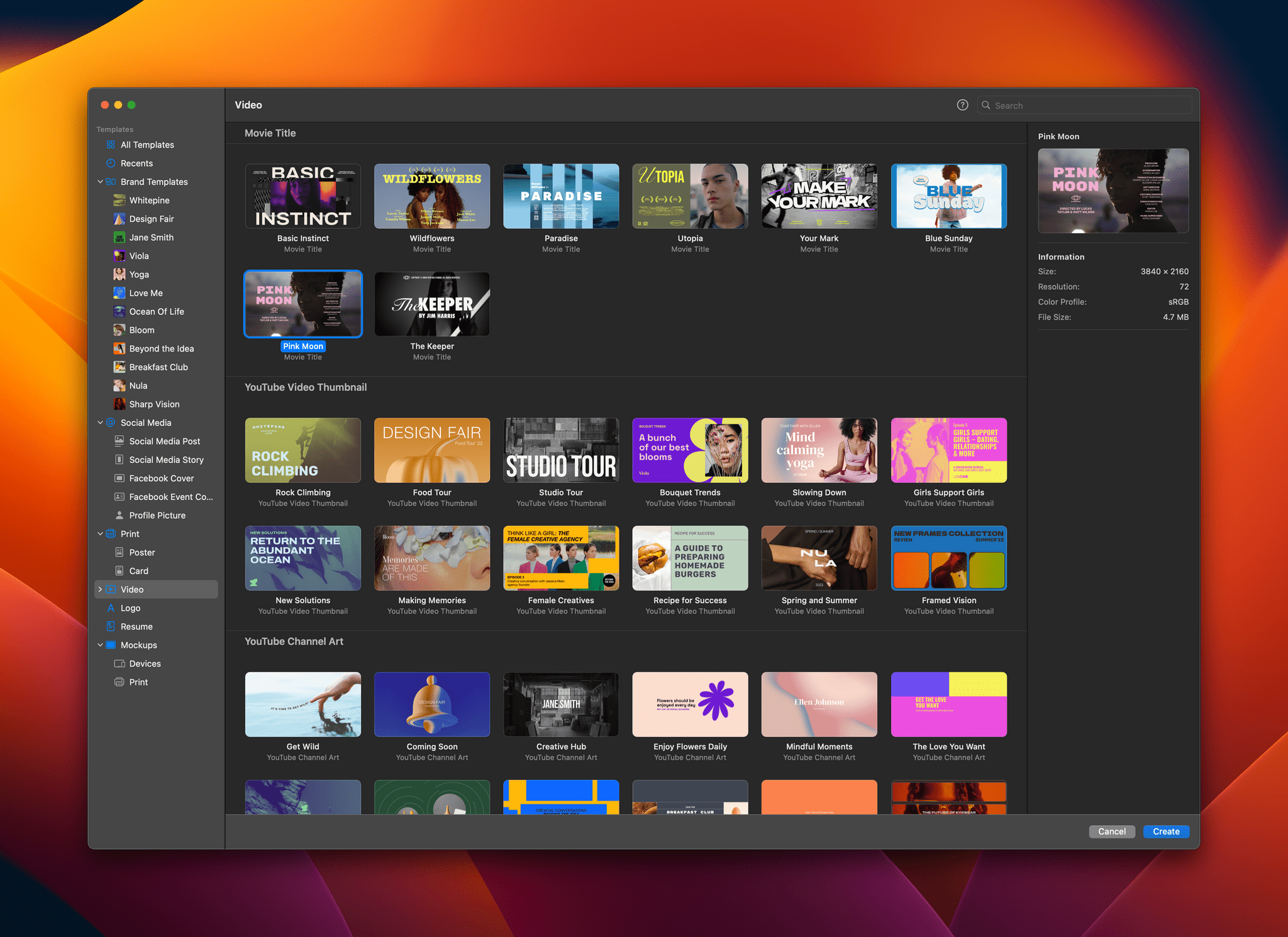
To get you started, Pixelmator Pro includes templates, a feature that was added in version 3.0. There are templates for a movie title clip, a YouTube thumbnail, YouTube channel art, and story-style vertical video. Only some templates incorporate placeholder video clips, but those that do are a great way to get a better feel of the video features added to the app.
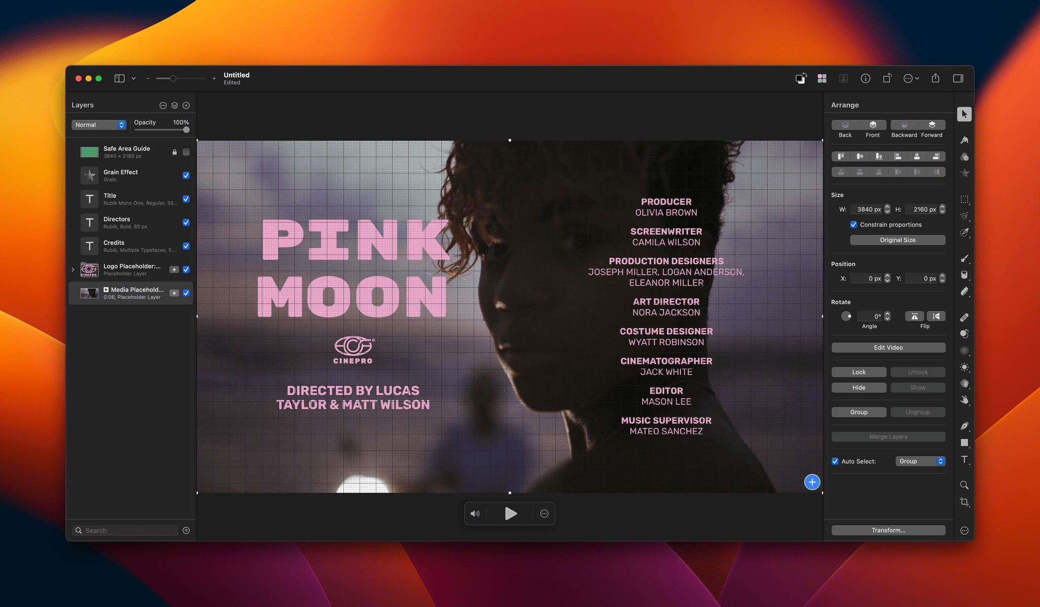
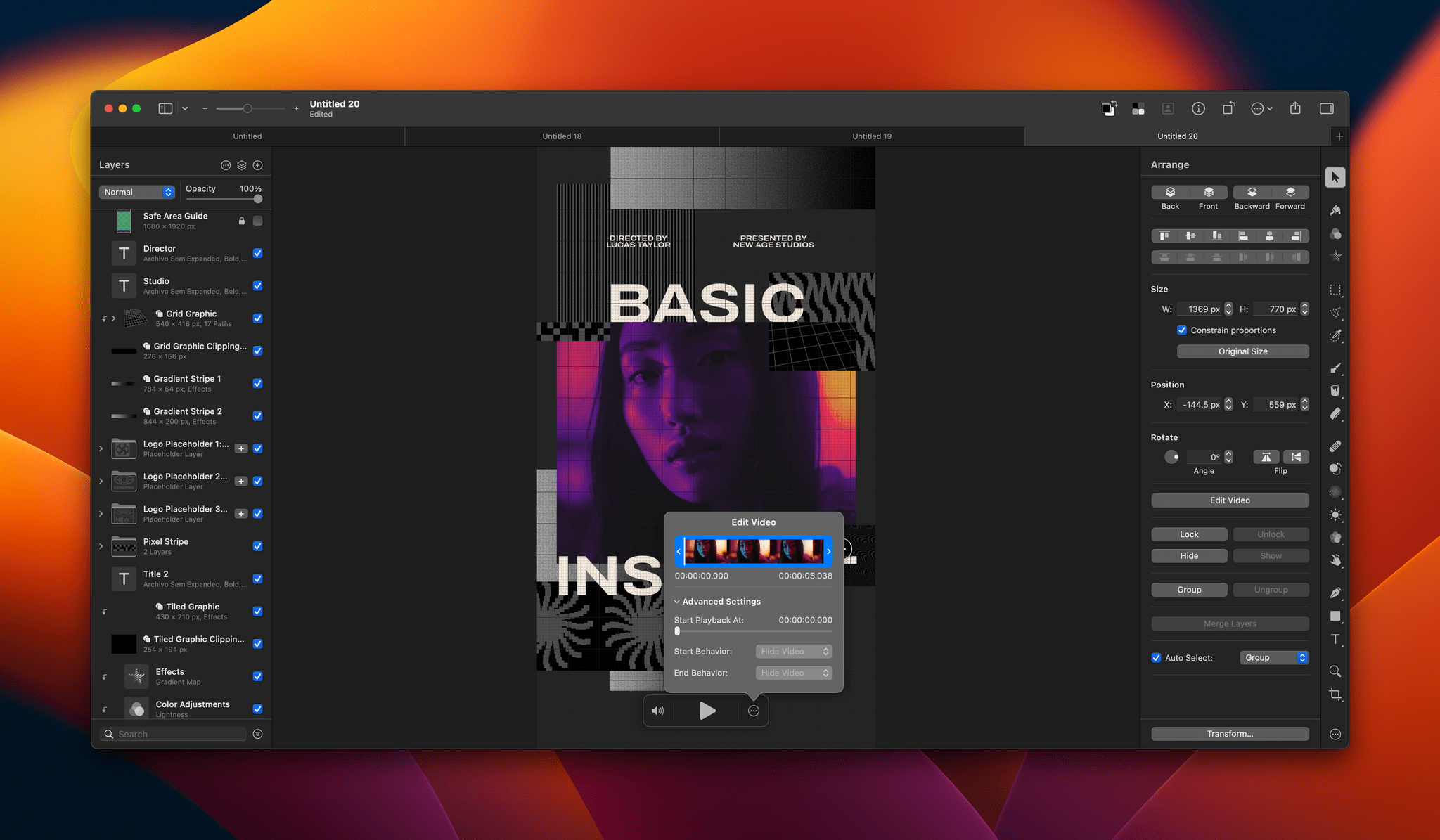
Editing a video isn’t much different from working with still images, except you’ll notice playback controls at the bottom of the clip you’re editing for controlling sound and playing back the clip. Also, a three-dot ‘more’ button reveals a scrubber with clip trimming controls and other advanced options when clicked. Other than that, video layers work just like other layers. You can adjust brightness, exposure, colors, and other aspects of a clip, apply filters, crop your video, overlay text, and more.
Video can be exported as MP4 files, QuickTime movies, animated GIFs, or PNGs. The Pixelmator team also says it has improved support for Motion projects.
Pixelmator Pro isn’t a replacement for a timeline-based video editor that lets you build a video from multiple clips. However, for clips like title segments and short-form social media posts, Pixelmator Pro strikes me as a far simpler solution than a more complex video editor like Final Cut Pro.
Pixelmator Pro 3.2 is available on the Mac App Store and is a free update to existing users. New users can purchase currently purchase Pixelmator Pro for $19.99, a 50% discount of its usual price.


](https://cdn.macstories.net/banneras-1629219199428.png)