I’ve been playing around a lot with OpenAI’s Whisper speech-to-text engine this year. Whisper isn’t perfect, but it does a remarkably good job, substantially lowering the effort and cost of generating transcripts.
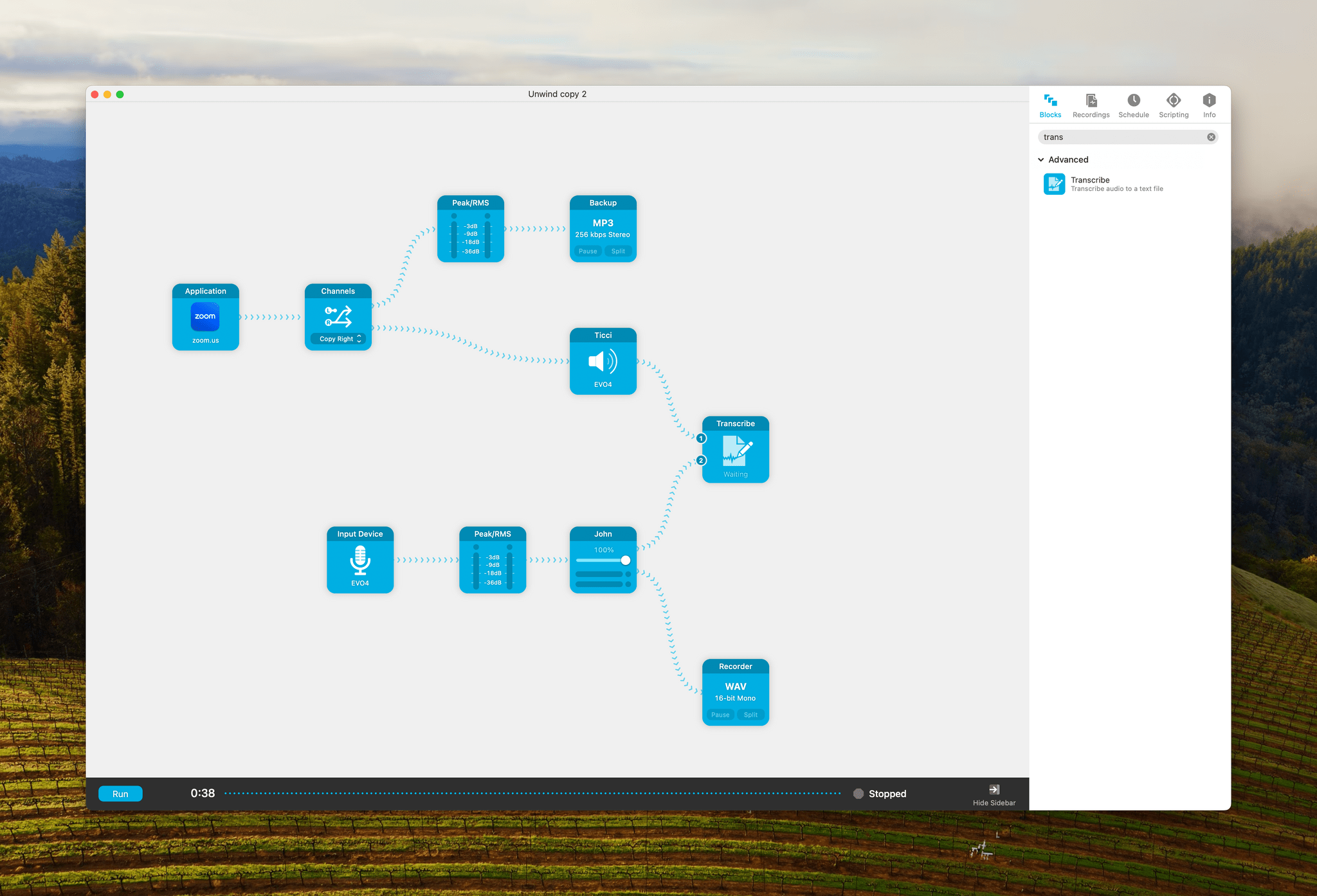
There are dedicated apps to transcribe using Whisper like MacWhisper by Jordi Brun and Transcriptionist from the makers of Ferrite, both of which I’ve tried. However, the most promising option so far is a new Transcribe block released today as part of Audio Hijack by Rogue Amoeba.
The new block is a beta feature that Rogue Amoeba’s Paul Kafasis says the company will continue to refine. It’s using the same underlying Whisper technology as other apps, but by reducing transcription to part of your existing recording flow, it’s possible to transcribe on the fly as you record and identify speakers whose audio is coming from separate channels.
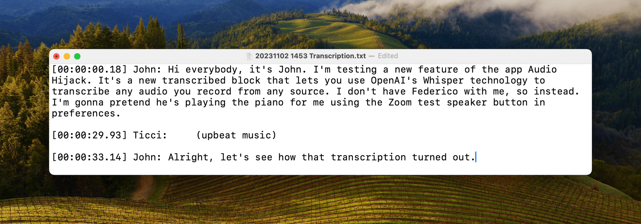
We weren’t recording any shows today, so to test the new feature, I copied our MacStories Unwind recording session and used the Zoom audio settings as a stand-in for Federico. I spoke into my microphone, which was one source, and used the piano music from Zoom’s settings as the other source. Audio Hijack recorded both and started transcribing the audio as I was still recording. Here are the results:
This was a very limited test. It remains to be seen how the app does with a longer recording session, but the ease with which I set this up has me excited. By renaming the sources fed into the Transcribe block, I was able to create a real-time transcript complete with timestamps and our names.
Still, as impressive as the results are, I don’t publish what I record in Audio Hijack. It still needs to be edited, at which point the transcript created with this session would diverge from the released audio. Nonetheless, for a newly released beta feature, I’m impressed and looking forward to seeing where Rogue Amoeba takes this.


](https://cdn.macstories.net/banneras-1629219199428.png)