
Here are today’s @MacStoriesDeals on hardware, iOS, and Mac apps that are on sale for a limited time, so get them before they end!
Read more
#MacStoriesDeals - Friday
The Magazine 1.1→
The Magazine 1.1
Marco Arment shipped today version 1.1 of The Magazine, which I reviewed when it first came out in October:
Marco Arment’s The Magazine falls exactly under this aspect of writing. It’s about people who love technology, delivered as a curated collection of articles from great writers. In a way, it’s the opposite of Instapaper: while Marco’s more popular app is what you make of it, The Magazine is Marco’s own vision. So, yes – you’ll have to trust him on this one.
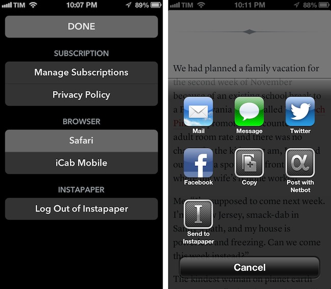
The Magazine has been growing in terms of quality of content and as an app. Version 1.1 adds new sharing options and a settings window to choose the default browser to open links with – a design decision that Marco has extensively discussed on his podcast Build and Analyze with Dan Benjamin. Fortunately, the added screen doesn’t make the app more complex: The Magazine 1.1 scans for installed third-party browsers and offers a popover (on the iPad) or a new view (on the iPhone) to set the default browser. Safari, Chrome, Opera Mini, iCab Mobile, Grazing, Mercury, Dolphin, and Terra are supported. In the same screen, Marco added buttons to manage subscriptions and read the privacy policy, as well as log out of Instapaper if you’ve enabled the service.
There are more improvements I like in The Magazine 1.1. The hyperlink popovers now have an icon to share and send an article to Instapaper, but you can also share selected text through the same method. It is a small addition, but I particularly appreciate support for posting to App.net using Netbot and its custom callback protocol: if you send a post to Netbot and hit Cancel in Netbot, you will automatically go back to The Magazine. This system is based on Tapbots’ custom protocol for URL callbacks, but it works similarly to x-callback-url, which I’m a big proponent of.
The Magazine 1.1 is now available on the App Store.
Nintendo Launches First Paid iOS App with In-App Purchases→
Nintendo Launches First Paid iOS App with In-App Purchases

As reported by Serebii (via Eurogamer), Nintendo has today launched its first paid iOS app: a universal version of its existing Pokédex app for the Nintendo 3DS.
Once downloaded you’ll find a version of the Pokémon encyclopaedia which covers all of the latest generation of critters (from DS games Pokémon Black and White). This costs 170 yen (about £1.30). Four extra packs with monsters from previous generations are then available to download for 500 yen (£3.90) each - meaning users will pay around £17 for the whole thing.
This is not the first iOS app for Nintendo (Pokémon Say Tap was available for a limited time last year), but it is the first time the Japanese videogame company is trying its hand at paid App Store downloads. The app is developed by creators of the main Pokémon series Creatures Inc., a studio owned by Nintendo.
Nintendo aficionados have long wished for the company to start bringing its most popular franchises such as Mario and Zelda to the iPhone and iPad. Historically devoted to creating games only for its own hardware (home consoles and portable), Nintendo has, in recent years, started allowing other platforms and devices to use its brands and characters. Aside from this new Pokémon app, it’s worth noting how the new edition of Tekken for the Wii U console features exclusive Nintendo-themed costumes and gadgets. It’s also worth noting how Japan alone represented 7% of Apple’s revenue in Q4 2012.
It’ll be interesting to see if Pokémon will remain an isolated experiment, or if Nintendo will consider more paid iOS apps in the future.
Day One 1.9 with Tags, Search, MultiMarkdown Footnotes→
Day One 1.9 with Tags, Search, MultiMarkdown Footnotes
Day One is one of my favorite apps of this year. I wrote extensively on the importance of software like Day One in my review of the app a few months ago:
At this point, it’s clear to me that Day One wants to be more than a journal. I see Day One as a variegate, yet elegant mix of thoughts, photos, and data that, in the end, define what we do, what think, and what we remember. It still isn’t perfect: I’d like to see support for videos (though that might be tricky for uploads), and integration with services we’re already using to share moments of our lives. The obvious one is Facebook – but wouldn’t it be great to have our Instagrams pulled into Day One, too? I think there’s plenty of room for growth in this regard: Day One could easily become a destination for many of the status updates and photos we’re already sharing elsewhere.
I often say that Day One is not an app, it’s an experience. I see going back through my log entries as a trip down a memory lane of facts, places, and faces that become blurry with time. But Day One can’t escape from its app nature, and that’s why when I compared the app’s Markdown support to other apps I made a note:
As an extra, I also previewed my text in Day One, as I think it’s got one of the nicest MMD previews on iOS. It’s based on Sundown, and it shares the design aesthetic that made Day One so popular. Unfortunately, in its current implementation, Day One doesn’t render footnotes and header levels correctly. More importantly, it doesn’t have a “Copy HTML” option. It looks very nice, though, and I believe the developers should consider adding better support for MMD previews.
Day One 1.9, released today, brings support for MultiMarkdown footnotes, different styles for Markdown headers (such as H2 and H3, which I use), auto-hyphenation improvements, and a built-in web browser to open links directly in the app without Safari. I use Brett Terpstra’s excellent Slogger to save web content as Markdown entries in Day One, so I welcome the new features and I look forward to having more footnotes in my daily notes.
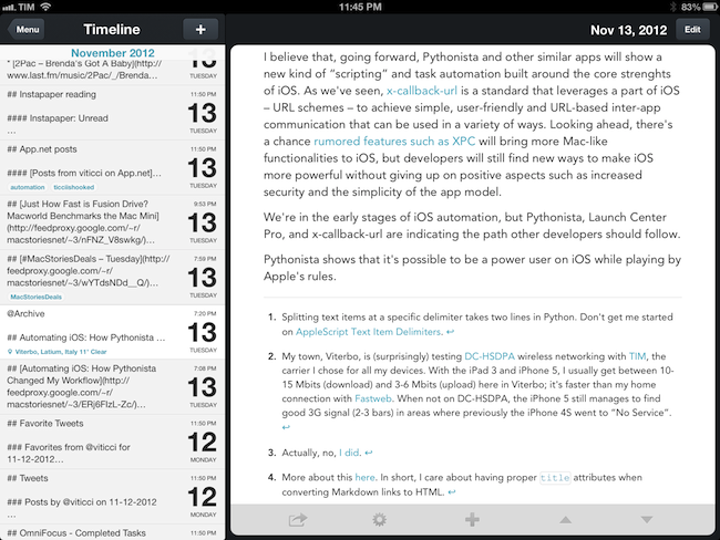
There’s more to Day One 1.9 than just Markdown improvements, though. The app now has a Search functionality, which makes sense considering users like me have been writing in Day One for over a year now. Search is located above the main timeline entries, and it allows you to quickly look for specific text, names, or anything you remember about an entry. It’s a terrific improvement, and it even supports advanced operators (documentation is available in the Search Tips).
The other big feature of Day One 1.9 is support for Tags. Long-awaited as a way to better organize entries by topic (rather than day or location), tags have been cleverly implemented: people who, like me, have been using hashtags in entries can now run a built-in converter to turn them into tags, which can be browsed in a dedicated menu with sorting options for name and usage. You can choose to automatically turn #hashtags into tags, or simply select the tags field when editing to enter some manually. I like how the Day One team thought of existing “unofficial” solutions for tags and is now offering support for making them work properly within the app.
I’m constantly impressed by the amount of polish and usefulness that Day One adds on each release. It is, by far, one of my favorite iOS apps – and, above all, a piece of software with far-reaching consenquences that go beyond simple note-taking. Day One 1.9 is available on the App Store.
Facebook iOS App Updated with Share, Improved Tagging, News Feed Sorting

Revealed yesterday, the Facebook app for iOS has now been updated to version 5.2, which includes the long-awaited Share option. Notoriously missing from its mobile app, users have long been able to re-post interesting posts on their News Feeds using desktop browsers; with the latest Facebook for iOS update, they’ll now be able to share a post natively, using a dedicated menu that keeps the original link/status but allows for an additional comment.

Another notable missing feature of mobile Facebook has also been fixed in this version: you can now tag your friends in any post, comment, or photo by using a simple “@name” syntax for including friends’ names in messages. Like the desktop websites, tags included in a post will be highlighted in blue (but they’ll still remain regular text you can copy and select).

Last, emoji and sorting. Facebook says you can now include “smileys, hearts, and other emoji” in messages, and I indeed managed to send a message to a friend including standard iOS emoji, which showed up on her end (she’s still running the 5.1 version of Facebook for iOS though). Sorting is, perhaps, more interesting, as it “finally” lets you decide how to sort your news feed: by tapping on a gear icon next to News Feed in the left panel, you can “Show Top Stories” and “Show More Recent”. For me, this is a welcome option as I never want to show top stories but I like to check out plain, old-style posts in reverse chronological order.
Facebook 5.2 is available on the App Store.
CloudMagic→
CloudMagic
I, like others, am a fairly passionate proponent of preserving digital memories and information for the future. I believe the amount of information we have today – tweets, blog posts, emails, or notes – needs a unified standard to ensure it won’t get lost – forever – decades from now.
From my review of Day One:
Where the human mind can’t get, I think software can help. In the connected and post-PC era we’re living in, I believe the devices and apps we use play an important role in enabling us to create memories. But just as relevant as “content creation” has become to this discussion, we have to ensure the memories we create today will be preserved digitally for the future.
That’s why we, today, need to invest on open standards for data conservation, hardware interoperability, and cross-platform cloud storage. In my recent article for Read & Trust, I explained how, going forward, technology makers and trend-setters will have to figure out ways to preserve and standardize how information is archived online. On the same level, we need to make sure we are creating our memories on devices, apps, and services we know we’ll be able to operate a decade from now. I don’t want to end up with another dead Nokia phone in my drawer.
This is a long-term project, but we need to invest in tools to preserve our digital lives now. I think it starts with search: there should be a platform to automatically index and archive the data from services and apps we use every day. Earlier this year I started using Cue (née Greplin) and CloudMagic, two web services that try to do exactly this – indexing and searching your “digital life” for any sort of information.
Today’s CloudMagic update for iOS made me realize I never properly mentioned the app on MacStories. CloudMagic is a free service that can index (using OAuth) a variety of other services including Twitter, Gmail, Dropbox, and Evernote. They have a human privacy policy, a clean interface, and, fundamental for my workflow, a universal iOS app. They don’t have a premium product yet, which is too bad because I would pay even a monthly fee just to guarantee the long-term viability of their product.
CloudMagic is fast: it can search across thousands of indexed items in seconds, with results updating in real time. It is astonishingly accurate, even when it has to match a couple of words with, say, hundreds of tweets from last year or an Evernote PDF inside a nested notebook. I use CloudMagic on a daily basis to retrieve old tweets (as reference material), email messages, or notes; in fact, I would say the app has better search than Evernote’s iOS app. Which, by the way, is supported with an URL scheme – so you’ll be able to search notes and open them directly in the Evernote app.
The CloudMagic app isn’t perfect – for instance, it could use an URL scheme itself and I’d love to be able to save recurring searches or, generally, have faster access to Twitter and Email filters (there are, however, advanced search operators).
CloudMagic for iOS is free on the App Store.
Update: I’m told that CloudMagic does actually have a URL scheme to start new searches: cloudmagic://search?query=foo. Useful.
ProductiveMacs Bundle: 9 Great Mac Apps for $29.99

There are some nice software bundles available for the Mac right now, and this one is no exception. Apparent Software has a great ProductiveMacs bundle that contains some excellent utilities that will help you get work done. Some of the highlights of the bundle are TextExpander (one of our favorites), TaskPaper, Trickster (brand new, read our review), and Path Finder. If you had to purchase all nine of these productive goodies separately they would cost $239 but this new bundle is priced at the super-low total of $29.99.
Flipboard Adds iBookstore Section
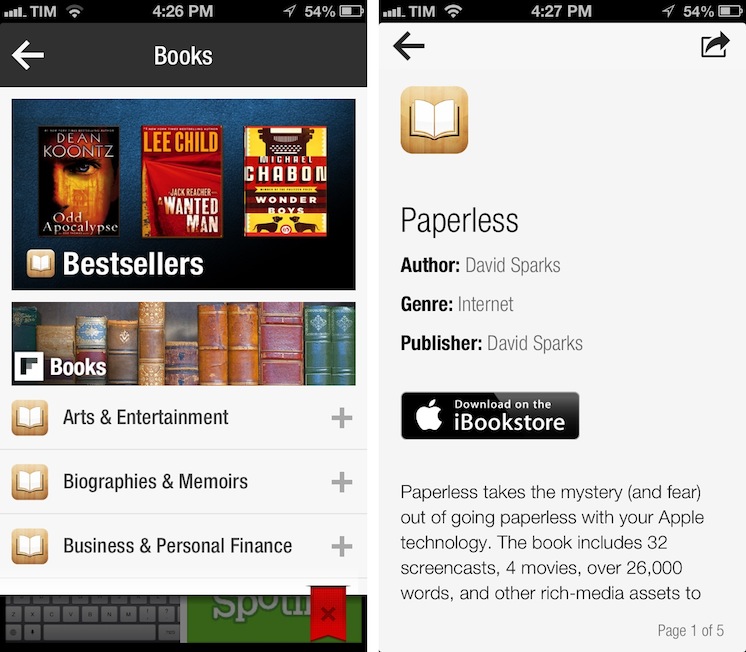
Mike Walsh reports at MediaPost (via The Next Web) about Flipboard’s latest section: Apple’s iBookstore. In an update to the in-app catalog released today, Flipboard is now featuring a “Books” category that embeds previews of books from Apple’s store, available for purchase upon clicking a “Buy” button in Flipboard.
The new section – spanning 25 categories including literature, travel guides, biographies and cookbooks – lets users flip through catalog-like pages of books, with brief descriptions and cover art images. Each title has a link to the book’s page on the iBookstore to streamline purchases from the Flipboard app on the iPhone, iPad, iPad mini and iPod touch. The new books section is available in 10 countries at launch: The U.S., Canada, the U.K., Australia, Brazil, France, Germany, The Netherlands, Italy, and Spain.
There are some points to be made about this interesting Flipboard initiative. Firstly, as we seen earlier this year with the Levis partnership, Flipboard has turned into a magazine of all-things Internet-related, rather than a prettier interface for blog posts and status updates. Flipboard supports articles, videos, audio podcasts, photography, social networks, and, now, Books. On the other hand, the launch of the Books section is reminiscent of an old rumor which claimed Flipboard was thinking about TV shows and movies; perhaps Flipboard was indeed considering that kind of media from iTunes, but went with Books first.
Books categories and descriptions have been redesigned for Flipboard: iTunes pages are stripped out of unnecessary clutter and they’re presented as elegant previews in Flipboard. The interesting detail is how Flipboard is requiring users to buy books: rather than using the new SKStoreProductViewController class of the StoreKit API in iOS 6, upon tapping the “Download on the iBookstore” button Flipboard will open a web view and ask the user to launch iTunes. It works, but it isn’t exactly the best purchasing experience when apps like Mail have showed it is possible to show a modal iTunes window to buy media without leaving the app, yanking out the user into iTunes.
Why doesn’t Flipboard follow Mail’s example and use an in-app iTunes window to let users buy books without leaving the app? I believe the reason lies in affiliate links: apparently, SKStoreProductViewController doesn’t work with affiliate links for now, and Flipboard is, according to The Next Web and MediaPost, using these links to generate a 5% commission off every sale made from Flipboard links. It is, essentially, a way to monetize the new section without asking the user for anything in return (we use affiliate links here at MacStories as well).
In trying the new section, I’m impressed by how iTunes content has been reformatted to fit Flipboard’s style; I’d only suggest to remove links to books made with iBooks Author from the iPhone version, as iTunes will report an error when trying to open them from an iPhone.
The new Books section doesn’t require an app update and is available on Flipboard now.
Quickly Email A Picture On iOS Using Pythonista→
Quickly Email A Picture On iOS Using Pythonista
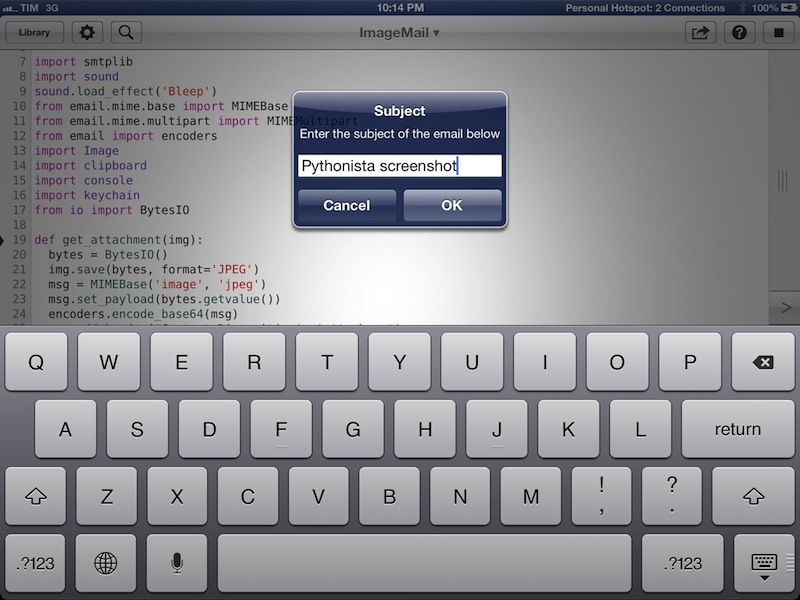
In my review of Pythonista yesterday, I didn’t include any scripts to send email messages. Email is, however, a huge part of my iOS workflow, as I often send screenshots back and forth with my teammates about upcoming site features or new apps I’m testing. Fortunately, Pythonista developer Ole Zorn shared today a script that uses smtplib to quickly send an image via email. His script is available on GitHub Gists here.
I have modified it slightly to import my login data using keychain and send an image that’s been previously copied to the clipboard. In this way, I can take a screenshot/photo, open the Photos app, copy it, and send it via email in seconds, at full-size. You can save the script as shortcut on your Home screen and have one-tap access to it, or, even better, you can copy images from Safari without saving them first to the Camera Roll (though, in my tests, this hasn’t always worked reliably). My modification also uses console.input_alert to let you enter a different email address and Subject every time, and it plays a sound effect when an email is sent. Right now, the ImageMail script works with Gmail, but it could be easily modified to work for other email services.
In a future version of Pythonista, I think it’d be neat to have a dedicated Address Book module to return contact fields such as email addresses or Twitter usernames; Ole suggests Reminders and Calendar integration might be handy as well. I think Pythonista has a very bright future, so we’ll see. In the meantime, you can download my modified version of the ImageMail script here.
Pythonista is available at $4.99 on the App Store.