Patrick Welker goes all meta with a macro to save Keyboard Maestro macros as screenshots – a new feature of version 6.0.
Save Keyboard Maestro Macro Screenshots with Keyboard Maestro→
Auto Tag Songs in the Background with Shazam for the iPad
Shazam is one of those things that has always felt entirely magical. With a tap of a button, usually any song playing from a static filled speaker is correctly tagged, and sorted into a tab where you can revisit it on your accord at a later time. It’ll pluck songs out of the air in a noisy bar, identify what’s playing on TV, and even tell you whether MSTRKRFT’s remix of Monster Hospital is playing before the keynote starts. And Shazam is always in my pocket, ready to settle disputes on what band is actually playing and what the name of the song actually is.
There’s a social element to Shazam which I personally don’t find appealing. I don’t want to see what people are tagging locally, nor do I care about Facebook integration or top tracks. They’re discovery tools, but I don’t care about what you’re tagging from your radio station. Rdio’s Heavy Rotation provides the most intimate kind of feedback between friends as does Spotify with their social features. Shazam wants me to share, to gather demographic data and to get people really using their sharing tools, but what I’m hearing right now is really the only thing that’s relevant.
So the exploration features, the maps and the social sharing, I’m entirely disinterested in. I mean, locally, we’re all listening to the same radio stations or watching the same television shows in company anyway. I use Shazam as my own personal list of things I’ve heard and want to know more about. What I do care about is tagging — the blue spinning circle and thumping waveform, as well as the immediacy of the feedback it provides. Auto tagging is entirely about this.
Auto tagging is a core component of the new iPad app, reminiscent of something like Yahoo’s IntoNow. The iPad, with its big battery, can sit on your coffee table or beside your media center, sipping battery while listening to songs playing in the background from your favorite television shows. I’ve had Radium running in the background this morning, and Shazam quietly but quickly identified the music that was playing from a local radio station. It automates what previously required a button press, even if does raise an eyebrow concerning privacy at home. As you launch the app and turn on the feature, Shazam pops up an alert that says (and definitely not verbatim), “We aren’t listening to what you say! Just identifying the music :-D.” Yeah, but… And until you close the app, Shazam will continue listening in the background even when the iPad’s display is off.
Possibly trading personal privacy for this kind of convenience obviously depends on your own comfort level. The same people who find Chrome’s “Ok, Google” or the Xbox One’s voice features will probably find this feature unsettling. Keep in mind that Shazam does listen every few seconds in the background even when auto tagging is off to help it more quickly identify music that’s playing, and I imagine the company feels that the only time you’d turn on Shazam is when you’re actively wanting to figure out what’s playing. I’m personally ok with it — I can’t wait to try it during a YouTube concert live stream to see how it fares there. I’ll probably just end up using it when watching press events and keynotes.
Shazam is free to use, the company making money from advertisements and purchases made from tagged music. You can, however, pay a $6.99 IAP (or purchase a “pre-paid” version) to remove advertisements.
Download Shazam for the iPad here.
Evernote Launches Reminders

In the years I’ve spent using and recommending Evernote, I’ve always noticed a chasm between people who rely on the service to store reference material and notes, and those who want to also use Evernote as a “getting things done” system to keep track of their todos. The topic has been widely discussed on the Internet, with smart folks such as Sven Fechner and Fraser Speirs delving deeper into the subject of Evernote as a GTD system. Tutorials and eBooks have been published with tips on how to use tags and saved searches to turn Evernote into an app capable of equally handling documents, notes, and todos under a single, searchable archive. Clearly, there was a demand for a task management feature built right into Evernote.
Today, Evernote is releasing updates to its Mac and iOS clients to introduce a major new feature: native reminders. I have been testing the new versions of the app, and I believe reminders are a good addition that fit well with Evernote’s focus on remembering everything through a unified, polished interface. Read more
Mailbox Now Available for the iPad→
As I said in my own review, Mailbox helps me get rid of all the unimportant stuff before I even sit down at my computer. I’ve described Mailbox as a complement to the inbox, not a replacement, and that continues to be true. I still log into Gmail when I need to compose a message or search for an invoice, but otherwise I flick through and browse notifications and messages when I’m away from my laptop or PC.
Mailbox on the iPad doesn’t offer any distinct advantage over its iPhone counterpart, the app being the same right down to the compose view. Oddly, Mailbox is locked to the landscape orientation, meaning that your email messages can only be viewed in half the space next to the sidebar. My guess is Orchestra felt that seeing the big picture — the entirety of the inbox — would be better for previewing and triaging email over opening individual messages as you’d have to in the portrait orientation.
Rdio 2.2 Includes URL Scheme for Search
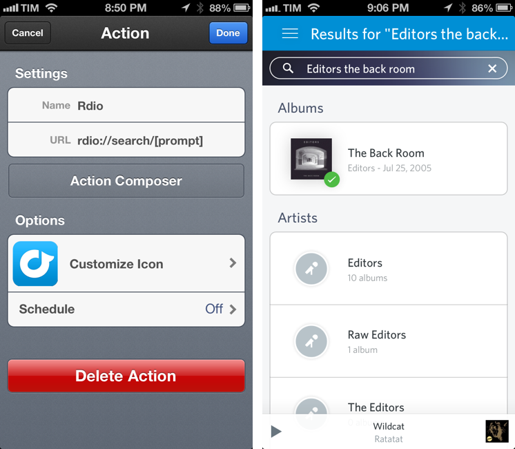
Rdio 2.2, released earlier today, includes – besides an improved interface and label search – a new URL scheme for launching searches from other apps (thanks, Adam). The URL scheme is fairly simple:
rdio://search/[search term]
In the past, I relied on a hack made possible by Bang On to redirect Rdio web URLs to the Rdio app. The problem with that solution was that it was a finicky process that couldn’t launch full, native searches directly in the Rdio app. The new version enables just that: you can now use the URL scheme to create search actions that will display pre-populated results in Rdio for iOS.
The new URL scheme means it’s easy to set up actions that trigger Rdio searches in apps like Launch Center Pro or Drafts. For this kind of quick search, my pick is Launch Center Pro, which I already use to launch Chrome and Pinbrowser searches. Until the Launch Center Pro team adds support for Rdio search in the Action Composer (they’re aware of it), you can create a custom action with the following URL:
rdio://search/[prompt]
Then, every time you want to search for something on Rdio, instead of opening the Rdio app and manually heading to the search field you can just open Launch Center Pro, type your search terms in a keyboard prompt, and tap a button to be redirected to a search inside the Rdio app.
I’ve been looking forward to a Rdio URL scheme for search for a long time. If you don’t want to use Launch Center Pro, you can build a custom action for Drafts, Mr. Reader, or any app that supports launching other apps via URL scheme.
Chrome for iOS Getting Voice Search Soon
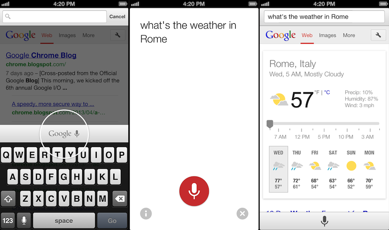
Following this morning’s rollout of the Voice Search for desktop, Google has also announced through the official Chrome blog that Chrome for iOS will receive the same feature “over the coming days”.
Voice Search, already available through the standalone Google Search app, will be activated in Google Chrome by tapping on a microphone button above the iOS keyboard:
Over the coming days, we’re rolling out an update for iPhone and iPad as well. You can now speak your searches into the omnibox. Touch the microphone, say your search query aloud and see your results (in some cases spoken back to you), all without typing a single letter.
Interestingly, the screenshot shown by Google displays the microphone button in the same additional keyboard row that’s currently occupied by buttons aimed at enabling users to more easily type URLs. Because Chrome for iOS, unlike Safari, uses a unified address bar for URLs and web searches, the extra keyboard buttons were necessary to let users quickly insert URL-related characters. It’s possible that Google will figure out a way to show both keyboard rows – the buttons and the new microphone – by letting users swipe horizontally above the keyboard.
Alongside performance improvements, Google also notes that “iOS apps can now give you the option to open links in Chrome and then return to the app with just one tap”. Assuming that Google is referring to the Chrome URL scheme with support for x-callback-url, that wouldn’t be new as it is already used by a variety of iOS apps (and as I showed today, users can play with it as well). However, Google has been quite vocal about its existing support for URL schemes lately, and it wouldn’t be surprising to see the company advertising the feature as new again.
Chrome for iOS, free on the App Store, was last updated in April.
Twitter for Mac Gets Notification Center Support→
Twitter updated its official Mac app today to include support for Notification Center and fixes for Growl (among other improvements). Notifications can be configured in the Settings, and, in my initial tests, they worked fine for mentions and direct messages.
In my Mountain Lion review, I noted that I didn’t like clicking on Twitter notifications because they were taking me to Twitter’s website instead of an app (they still do). It’s good to see Twitter updating their Mac app again.
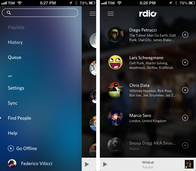
Rdio for iOS Update Brings Label Search, Revamped Sidebar, New “Find People” Feature
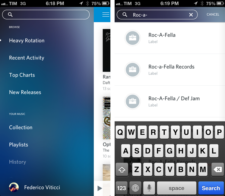
Rdio 2.2, released today for the iPhone and iPad, brings a series of important new features such as label search and improved user search, plus a revamped look for the slide-out navigation.
A feature highly requested by Rdio’s userbase, label search allows you to view top albums and artists of a specific label; if you want to see more artists or records, there are links to view a complete list – which, surprisingly, doesn’t support the tap & hold menu for quick actions that was introduced a few updates ago.
In the refreshed sidebar (also available on the iPad) a new Find People functionality allows you to find friends and artists you can follow by simply tapping on their profile pictures. It’s unclear how Rdio is determining user suggestions, but it’s likely that the service is looking into data provided by Twitter and Facebook accounts configured with it.
Today’s new version follows a series of updates that streamlined the app’s interface and enhanced its sharing capabilities. Rdio 2.2 is available on the App Store.
The Omni Group Launches OmniPresence For Automatic Document Syncing
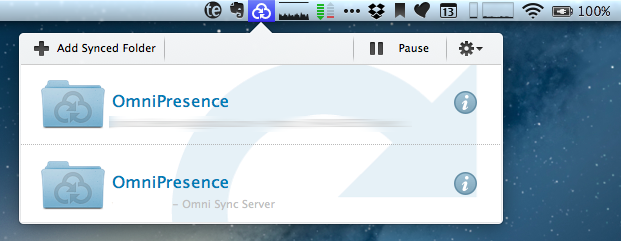
Announced in December 2012, The Omni Group has today started the public rollout of OmniPresence, their new free automatic document syncing solution for OS X and iOS. OmniPresence, based on open web technologies, is available inside OmniGraffle, OmniGraphSketcher, and OmniOutliner for iPad, and it also comes with a companion Mac app that runs in the menubar.
“The way we are doing it is not to hook it up into some backend proprietary service”, The Omni Group CEO Ken Case told us in an interview during Macworld|iWorld earlier this year. As a long-time user of Omni products such as OmniOutliner for the iPad and Mac, I was eager to see whether Case’s promises of a fast, reliable automatic syncing technology would grow into a stable product capable of fitting seamlessly into my daily workflow. After nearly two months of testing, I’m glad to say that, in some ways, The Omni Group has even exceeded my (already high) expectations. Read more