This Week's Sponsor:

Hello Weather

Half Off for WWDC Week, Just in Time for Summer.


Posts in reviews

Obscura 2 Review: An Approachable Manual Camera App with Tasteful Filters

I enjoy taking lots of photos. Over the years, I’ve dabbled with DSLRs, but more often than not these days, I use my iPhone because it’s always nearby.

I’ve historically used Apple’s built-in Camera app. It has the advantage of being available from the Lock screen, which is a big plus because it lowers the barrier to getting up and running with the camera. Later, I would go back and pick out the best shots, edit them a little in the Photos app, and share a few.

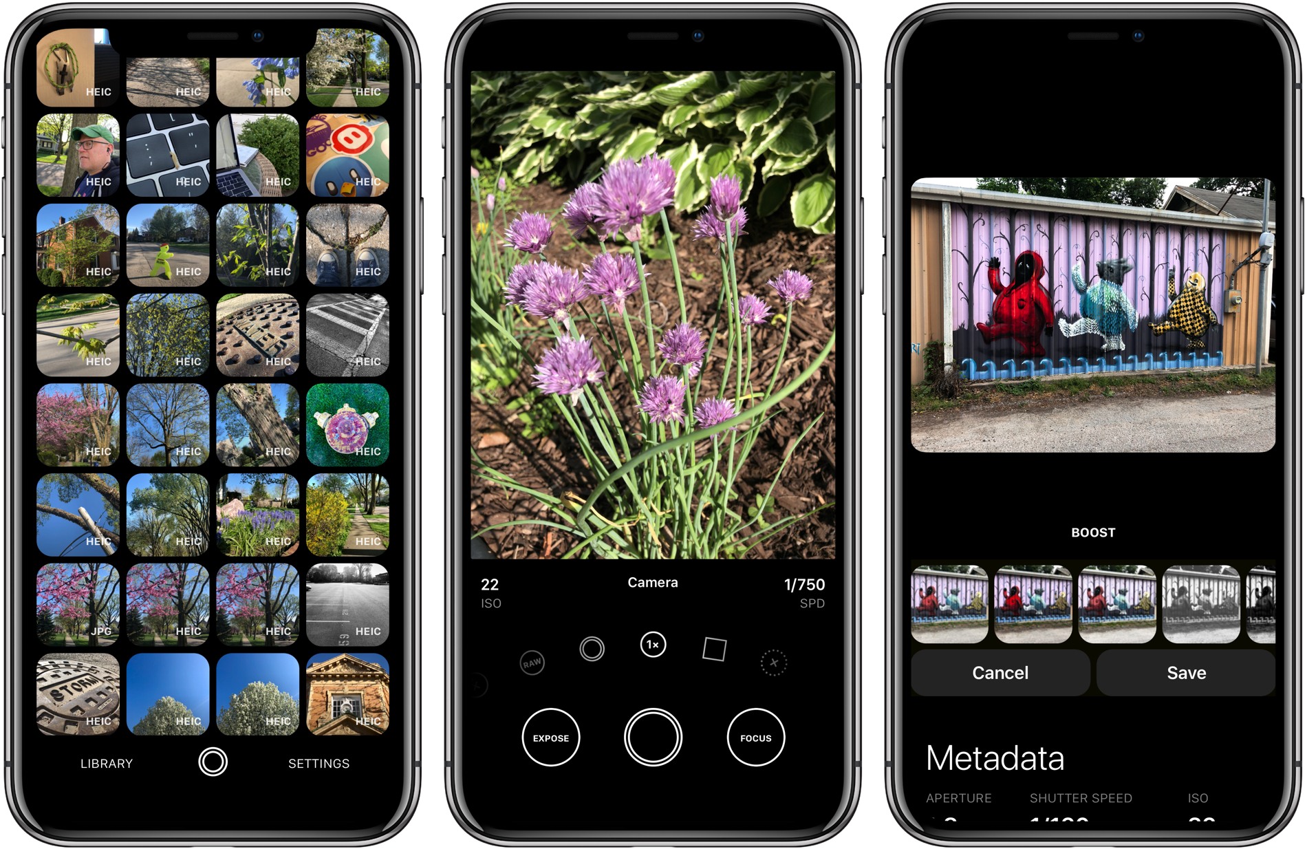
Over the past couple of weeks though, I’ve been moving between Apple’s Camera app and Obscura 2, which was released today by developer Ben McCarthy. I’ve used manual camera apps in the past, but always wound up going back to Apple’s option in the end.

Obscura has been different. I’ve found myself going back to it repeatedly because I enjoy the way it approaches taking pictures and editing them so much. I don’t expect I’ll stop using Apple’s Camera app altogether; it’s just too convenient. However, when I leave the house with the intention of finding something interesting to photograph this summer, I’m going to use Obscura.

One of the things I like most about photography is that it’s a creative outlet that’s just for me. Sure, I share some of the pictures I take, but it’s entirely for fun.

One of the issues I’ve always had with pro camera apps is that many take the fun out of photography for me. They have intimidating UIs that throw lots of photography jargon and controls at you in a way that sends me looking for a manual. It feels too much like work.

Obscura doesn’t dispense with camera-speak entirely, but it succeeds by presenting the complexities of manual camera features in a simple, thoughtful UI. Instead of sending me looking for support pages, I found myself experimenting with Obscura’s controls, learning what each does by doing, which has been an enjoyable, organic process.

Read more


A Redesigned 1Password 7 for Mac Enhances Watchtower and Adds Flexibility to Vaults, App Login Support, and More

AgileBits has released 1Password 7 for Mac, a significant update that is free to subscribers but also available as a standalone download. I’ve used 1Password since I started using a Mac. The app has always been the best way to store passwords for websites, and for years, that’s primarily how I’ve thought of it.

There’s been more to 1Password than just password storage for a while now though, and what sets this update apart is the depth of those other features and the ease with which they can be incorporated in your everyday computing life. That’s important because it doesn’t take much friction for someone to get lazy about security.

1Password 7 is a comprehensive update that touches every corner of the app. The app will still be familiar to long-time users, but features like Watchtower and Vaults have been extended with new capabilities that are worth exploring if you haven’t in a while. 1Password also works better than ever with app logins. There are dozens of other changes big and small that along with a design refresh that make 1Password 7 an excellent update.

Read more


Gemini Photos Declutters Your Photo Library

MacPaw has released a brand new iPhone app that takes the ideas from Gemini 2, the company’s duplicate file finder on the Mac, and applies them to your iOS photo library. Gemini Photos uses an algorithm to analyze your photos that suggests the ones you should consider deleting. With photo files getting bigger with each improvement of the iPhone’s camera and features like Live Photos and burst mode, a utility like Gemini Photos can save significant amounts of space on your iPhone.

Read more


Castro 3 Review: The Castro You’ve Always Wanted

Castro has long been one of the premier podcast clients on iOS, and its excellent version 2 – with an innovative triage system and delight-inducing design touches – helped solidify it as such. Those strengths in 2.0, however, were mitigated in part by the absence of a few key features that competing podcast apps tout. That changes with Castro 3.

If you’re unfamiliar with the app, Castro’s centerpiece feature is a triage system involving an inbox and queue. The premise is that, with the rising popularity of podcasting, there are more great podcasts available than ever before. If you subscribe to lots of shows, the standard episode management tools found in competing apps likely aren’t sufficient. With Castro, by default new episodes of shows land in your inbox, and can then be sorted to the top or bottom of your queue and downloaded, or archived if they’re not of interest to you. It’s an elegant solution to the problem of podcast overload, and, thanks to customization options that allow you to make certain shows populate the top or bottom of the queue automatically, it’s a system that works for you, tailored to your listening preferences.

Castro’s triage system clicked with me the first time I tried it, and I used the app daily for nearly a year. Eventually though, I became more selective about the portions of podcasts I listened to, and Castro’s lack of chapter support sent me elsewhere. I’ve seen comments from other prospective Castro users who were similarly turned off from the app due to one missing feature – and often, this feature was different for different people.

If an absent feature ever kept you from sticking with Castro 2, that almost certainly won’t be a problem anymore. Castro 3 addresses nearly all of those “one missing feature” requests in a single release. Trim Silence is Castro’s take on Overcast’s Smart Speed; full chapter support is now present, as is a new Apple Watch app; the player screen has been fully redesigned; Mix to Mono improves stereo mixes that are hard to hear; and finally, there are excellent new per-podcast controls in a variety of areas. Perhaps the only thing still missing is an iPad app.

Castro 3 is everything Castro already was, but better. It’s the app that Castro fans have always wanted.

Read more


Tweetbot 3 for Mac Review

Tapbots has released Tweetbot 3 for Mac, which overhauls the app’s design, provides greater flexibility to manage multiple columns and navigate different parts of Twitter, and includes a dark mode. For the first time since it was introduced in 2012, Tapbots has also made version 3.0 a separate paid app, which means that existing and new users alike will have to pay $9.99 for the update.

Read more


Streets 4 Adds Drag and Drop, Live Panorama Mode, and iPhone X Support

Last week my wife and I ventured to New York City for a vacation, and in the time leading up to that we planned out our agenda with the help of Google Street View. Unfortunately, our planning took place just a couple weeks too early to benefit from the newly released Streets 4 by FutureTap.

Streets is an iOS and watchOS app John reviewed upon version 3’s release. It provides an immersive, touch-friendly way to navigate Google’s Street View data. And in version 4, that experience has been upgraded with drag and drop support on iPad, a new Live Panorama mode, and optimization for the iPhone X’s display.

Drag and drop enables you to drop in a location from Apple Maps, a contact that includes an address, or any other linked address to load up nearby panoramas in Streets. My favorite feature enables dropping in any geotagged photo, which Streets will identify the location of so it can show you existing 360º images of the same or a nearby area – an easy way to discover great captures from other photographers.

Live Panorama mode can be toggled on by tapping the rotating circle icon in the top-right corner. Once activated, it offers a new interaction method for exploring street views. Rather than swiping around on the screen, simply move your device in the space around you and the visible street view area will change with your motion.

Whether you’re planning some time away, or simply want to explore the world from the comfort of your couch, Streets is the best way to do so on iOS.

Streets 4 is available on the App Store.


Cardhop 1.1 Adds Smart Groups, Printing, and More

Cardhop from Flexibits got an update to version 1.1 today, and it packs in some pretty great improvements for an incremental update.

If you missed it before, Cardhop is the app from the makers of Fantastical that does for contacts what Fantastical did for calendars. All your contacts are managed from your menu bar, and you’re never more than a few keystrokes away from sending an email, making a call, sending a text, or anything else contact-related. Type “email elle” and it will find Elle’s card, pick the first email address, and hitting enter will fire up a new email in Mail (or your favorite mail app). Type “call mom home” and handoff a call to Mom’s home phone number. It’s far more powerful than that, but I’ll refer you to John Voorhees’ great writeup back in October for the overview.

Cardhop 1.1 comes with some fixes and improvements, not least of them being parsing and formatting support for French, German, Italian, Spanish, English, and Japanese. But the two updates that I personally find the most useful are Smart Groups and printing support.

Smart Groups are what you probably imagine – a group of contacts based on a set of criterion that automatically updates as contacts change to match (or fail to match) those criteria. It opens up a few interesting organization and productivity schemes, but my first interest is in pseudo-tagging. I can now add @tags in contact’s notes field and have them sorted into one or more smart folders, reducing my need for a large number of “actual” contact groups. And if I stop using Cardhop and need to access those groups in another app such as Apple’s Contacts, I can always just do a search for the @tag and drag them into a regular group.

The printing features are elegant. Much like those in Apple Contacts, but with a few extra touches in the print dialog, as well as the convenience of printing right from Cardhop. Being able to pull up a contact or an entire contact group and print envelopes with return addresses, or spit out address labels for the whole bunch with just a few keystrokes is a wonderful convenience. All you have to do is type “print [name]” or “print [group]” (or use a Quick Action).

Print from Cardhop

Print from Cardhop

When the print dialog comes up, make sure that you’ve clicked “Show Details.”

Show Details

Show Details

From there you can choose a list, envelopes, or labels, and define which fields to use and other particulars for each type. (You can also switch type with ⌘1-3.)

Envelope printing setup

Envelope printing setup

Other new features include template preferences to control which fields are shown when entering new contacts, an “Add Notes with Timestamp” option to add dated notes to a contact, and typing in the “related contact” field now autosuggests other names from your contacts.

I’ve been loving Cardhop, and I think it’s worth anyone’s time to grab the free trial and give it a go. Cardhop costs $19.99 US and is available on the App Store and direct from Flexibits.


1Blocker X for iOS Review

The first thing you will notice when you set up 1Blocker X on an iOS device is its 7 toggles in Safari’s Content Blocker section of the Settings app. It’s a bit of a head-scratcher at first until you realize that this is what allows 1Blocker X to expand beyond the confines of its predecessor.

You see, iOS limits the number of blocking rules that can be implemented by an app to 50,000. That’s a lot of rules, but sadly not enough given the amount of junk on the Internet these days. As a result, it’s a limit that 1Blocker began to run into not long after it launched in 2015.

Finding a way around that hard limit required a rewrite of 1Blocker from the ground up. The result is 1Blocker X, an app with around three times as many blocking rules, room to grow, and enhanced flexibility for applying those rules.

Read more