This Week's Sponsor:

Copilot Money

Copilot Money, The Best Money Tracker, Launches on the Web – Limited-Time: Get 26% Off + 2 Months Free


Posts in reviews

Yoink: Enhanced Drag & Drop for Lion’s Full-Screen Apps

As I noted in my MacBook Air 13-inch review, the smaller the screen, the better full-screen apps get on Lion. For those still unaware of the new feature, OS X Lion comes with the possibility of enlarging applications to fill the entire screen – thus the name “full-screen mode” – so that, similarly to iOS, users can focus on one app at a time. Whereas some full-screen apps can look comically large on bigger displays such as a 21.5-inch iMac or Apple Thunderbolt Display, I found that smaller screens make more sense in regards to full-screen mode in that you don’t feel like you’re wasting available pixel space. Apple’s system applications have already been updated to take advantage of full-screen mode, and we’ve seen third party developers starting to play around with the new API as well, coming up with interesting solutions to modify the user interface accordingly to full-screen mode.

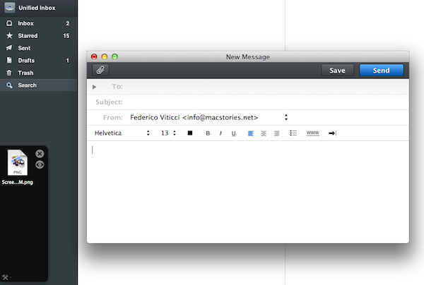
Personally, I have enjoyed using apps like Evernote, Sparrow and Reeder in full-screen mode on my MacBook Air. With a four-finger swipe, I can easily switch between these apps, and go back to my main desktop where all my other application windows reside. However, as full-screen apps live in their own separate graphical environment, I wished on a couple of occasions that Apple would implement an easier method to move files between spaces and full-screen apps in Lion. Rather than delving into the technical details of drag & drop and APIs, here’s a practical example: say I run Sparrow in full-screen mode, and I need to quickly drop an attachment onto a new message window. I could use the app’s “attach file” dialog, but drag & drop would be more intuitive. On Lion, there’s no simple way to drag files from Desktop 1, and drop them into a full-screen app. In fact, the “easiest” trick I’ve discovered to achieve such a functionality is to click & hold a file, hit the Mission Control key on my MacBook Air’s keyboard, select a a full-screen app and wait for it to “spring load” (e.g. the window flashes and after a few seconds comes in the foreground), then drop the file. Clumsy and slow.

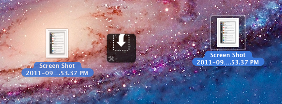
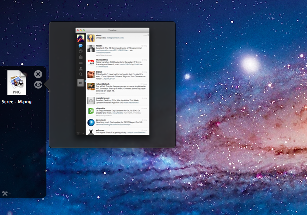
A new app by Eternal Storms – makers of Flickery and ScreenFloat, among others – called Yoink, aims at improving Lion’s behavior with drag & drop and full-screen apps. Built from the ground-up with Lion-only APIs, Yoink places an unobtrusive, translucent “shelf” at the side of your Mac’s screen every time you start dragging a file. Drop the file in there, switch to your full-screen app with a gesture, get the file out of the shelf. Done.

Yoink is a drag & drop assistant for Lion, in that it provides you with a virtual “safe zone” to temporarily store files – or rather, links to them – you want to move from one location (say your desktop) to another space or full-screen app.

Yoink doesn’t “copy” a file, or multiple ones, to its shelf: it only acts as a bridge between the original file, and the destination of the drop. So, back to my Sparrow example: I can select a bunch of files from my desktop, drop them into Yoink, switch back to Sparrow with a gesture, and get the files out of Yoink. Very simple. This works with any full-screen app, any space – Yoink works wherever you can drop a file. In fact, nothing stops you from using the app as a drag & drop utility for your Finder windows instead of full-screen apps, although the app is clearly focused on the latter.

In my tests, I’ve found Yoink to be very lightweight in memory footprint, and easy to use. The app only appears when you start dragging a file – you won’t see its window all the time – and you can customize it to sit on the left, or right of the screen. Alternatively, you can tell Yoink to quickly move next to your cursor as you drag a file, then go back to screen’s side. Yoink can store multiple files, Quick Look them, and let you scroll and select multiple items with CMD-click.

Yoink is available at $2.99 on the App Store, and you can head over the developer’s website to check out a demo video and get a better idea of the app in action. If you work with full-screen apps on a daily basis and you’d like to enhance Lion’s drag & drop support, Yoink is a must-have.


Tunesque: iTunes Search Made Easy From The Menubar

Many people claim searching any of Apple’s iTunes Stores is tedious, inane work. You have to launch an app, navigate to the search box and type for your result - and that’s only for searching one of Apple’s services at a time. Now imagine a ‘mythical’ Mac app that lets you search the Mac App Store and iTunes App Stores at the same time.

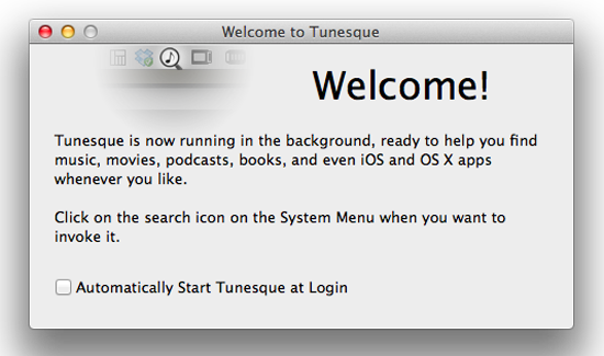
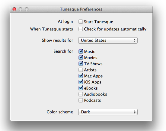
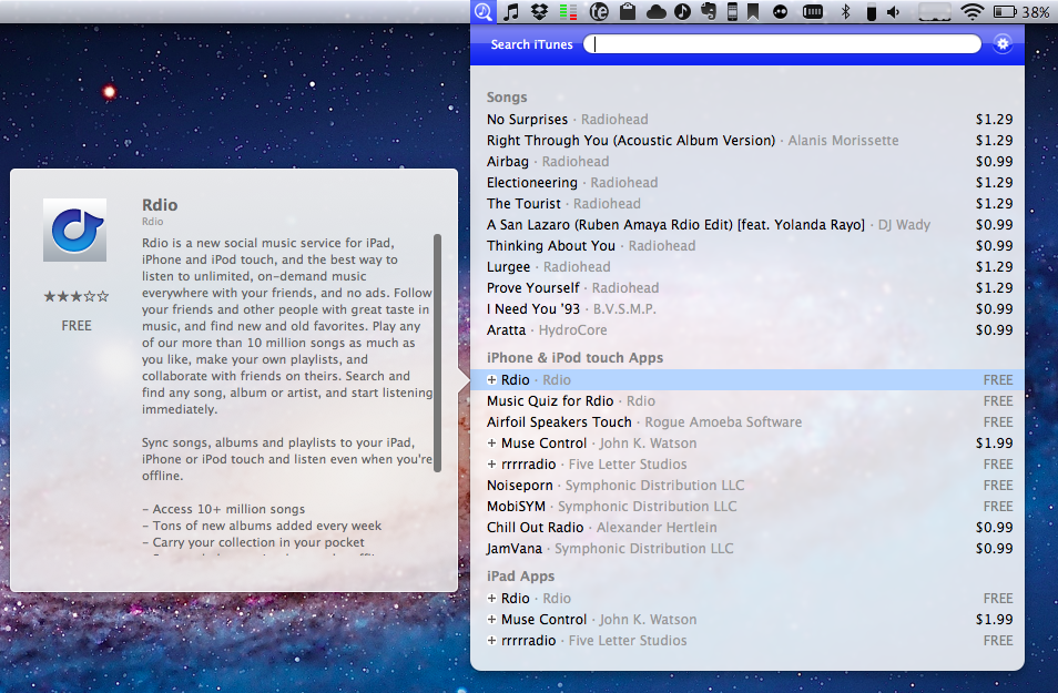
It’s no myth - enter Tunesque by AFK Studio. Tunesque lives in your Mac’s menubar: click the icon, and start typing to finds apps, music, movies, and books across all stores and “app stores” without having to manually launch them. If you feel Tunesque’s search is too broad, simply open the Preferences and define what categories you want to search for – you can check them all or just a few. Plus, the app works with your local iTunes Store, anywhere in the world, so you can select which international store you need and go.

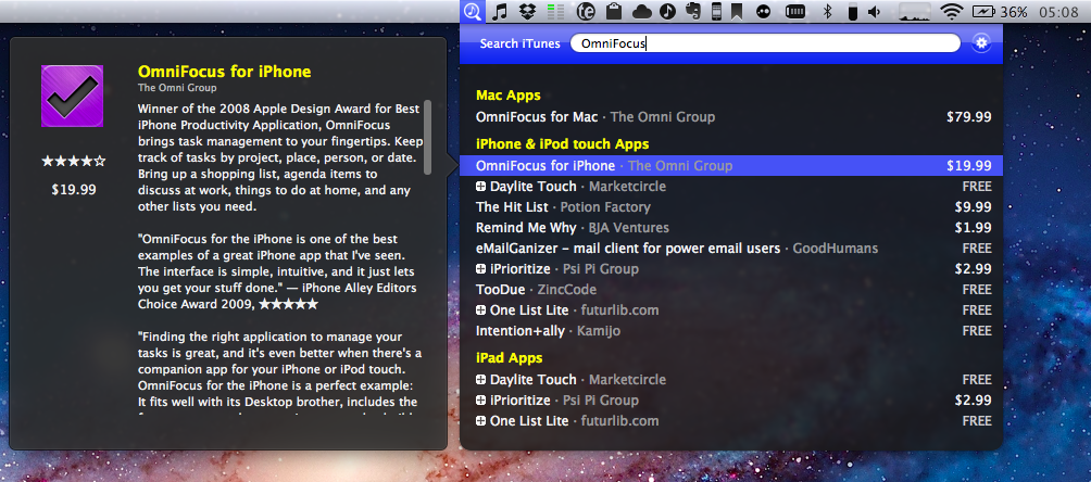
Tunesque has 2 color schemes, light and dark, so you can pick the mood you’re in that day while you search for that new Pantera single. I prefer the light scheme as it matches the OS better, but some people may like the dark tone for added contrast. The app could be improved with a global hotkey in the prefs, though clicking the menubar icon is still faster that a traditional search method.

Once you enter a search term, let’s say OmniFocus, you can arrow down through the results (it even lists prices) and a hovercard will pop out to the side giving you the app’s description - this is a nice feature.

Tunesque is available from the app’s website and is a small download - only 811kb, with a smaller price - free. Please note that when you use Tunesque to find apps, Apple pays the developers a small commission via iTunes’ affiliate service but this doesn’t affect the price to the customer. A direct download for the app can be found here.

If you search the App Store and iTunes more frequently than browsing, Tunesque will be a great time saver.


App Journal, Episode 1: Writron, Tempus, BillMinder

App Journal is a new series aimed at showcasing apps we have enjoyed using on our iPhones, iPads, and Macs, but decided not to feature in a standalone, lengthy review here on MacStories. Sometimes, an app is so simple, so focused on one task that a full review in our typical format would be unnecessary. But at the same time, we felt like we needed a way to get the word out about these little gems, other than a quick tweet or footnote on #MacStoriesDeals.

Think of App Journal as a mix of classic reviews, weekly app recommendations, and a diary of our experiences with apps that still deserve a proper mention. Because after all, that’s what we love: talking about great software.

In Episode 1 of App Journal, I take a look at Writron for iPhone, Tempus and BillMinder. Stay tuned for new App Journal episodes in the next weeks.

Writron

Writron is an app I found on the App Store last week and bought because of its simple, elegant icon and price tag. Admittedly, these are two factors that contribute to impulsive app-buying when iTunes credit is available, and curiosity takes over. Writron is a “text input tool” that can forward text to other apps and online services. That’s it. Once you’ve written some text using the app, you can tap & hold the sharing button to send it to Mail, Twitterrific, or other services supported with Mobile Safari such as Google, Evernote, Twitter, and Wikipedia. You can edit the “send to” menu to include options like Maps, Google Translate, Wikipanion, Wiktionary, and Twitter for iPhone. Additional templates will be added periodically and can be downloaded within the app.

Writron achieves two goals: it’s a text input tool with a heavy sharing component. And whilst sharing isn’t too dissimilar from what other apps like Note & Share offer, the writing experience is quite different. Writron comes with a toolbar between the keyboard and the text field; this toolbar has buttons to share, paste, cut, undo and redo, increase/decrease font size and move the iOS’ default cursor. Whereas tapping on these buttons triggers their basic functionality, Writron’s full potential is unlocked when you “tap, hold, and slide”. Here’s an example: tapping and holding the undo button will get you access to a scrollable timeline of words you typed, which you can control by sliding your finger across the toolbar itself. You don’t see a list of previously typed words and letters when you do so – instead, Writron directly manipulates text as you slide you finger back and forth through history, letting you know when you’re “out of undos and redos”. The same sliding concept applies to the “move cursor” action: you can tap on it to select a word, an entire sentence, or move to the beginning of your text, but it’s when you begin sliding that you’ll notice Writron can freely move the cursor between letters according to your finger’s movement. It’s seriously cool.

Writron may not revolutionize your workflow but it’s a neat little app that I’m sure will have its own passionate niche of aficionados. Writron is only $0.99 on the App Store. Read more


Quotebook: Save Your Favorite Quotes

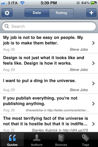
“I want to put a ding in the universe.”

“We will be as big as the Beatles, if not bigger.”

“Life is what happens to you while you’re busy making other plans.”

What do these three sentences have in common? First off, they’re all quotes – hit your favorite search engine to find out where they come from. But as far as the iPhone tech-savvy user is concerned, these quotes can be neatly organized in Quotebook, an iPhone app I’ve recently stumbled upon thanks to a friend’s recommendation.

Quotebook is a very simple and straightforward, albeit the goal it aspires to accomplish is perhaps greater than the average iPhone app’s underlying concept. Quotebook is a lovely and safe place for your quotes, regardless of their relationship with life, design, sports, achievements, love, or whatever you feel inspired by to save in a digital notebook. Personally, I’m that kind of tag junkie that keeps quotes and other digital memorabilia stored in his Evernote account – I can see, however, Quotebook’s appeal to someone who prefers to keep inspirational quotes in a separate place other than the default archiving system, be it Evernote or other solutions like Yojimbo.

Quotebook’s greatest strength is that it’s built for quotes, and nothing else. It doesn’t want or need to be a replacement for your notes and daily thoughts. The interface has been designed to make it easy to jot down a quote, and set correct attribution like author and source, or perhaps fiddle with ratings. The app goes one step further and makes it super-simple to import quotes found in your iPhone’s clipboard, and plays nicely with @author names, automatically opening a Twitter profile within a web view. That’s very nice of the developers – this got me started on saving some tweets I find inspiring. Quotes can be searched and filtered, shared on Twitter, Facebook and Tumblr, or browsed by author and tag using the buttons in the bottom toolbar. Pretty standard stuff for an iPhone app.

Quotebook, though, had me at the auto-suggest feature, which looks up on the Internet for incomplete quotes or attribution details. The app will give you its best recommendation for an incomplete quote you’ve inserted, guessing the author as well if an entry is found.

I like Quotebook. It’s simple. The latest version comes with a handy option to export and import notes (plain text is fully supported), and you can even find out more about an author or source using Wikipedia and Wikiquote. If you have an iPhone and you want to keep your quotes organized in a dedicated place, I strongly recommend Quotebook.


Watchlater 2.0 Improves Video Collection and Adds iPhone App

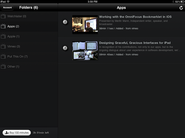
Back in March I reviewed Watchlater, an iPad app that I described as “an Instapaper for video” in the way it allowed users to save videos for later viewing using a simple browser bookmarklet. Whereas nothing has changed concept-wise since the original release, the much-improved version 2.0 of Watchlater addresses pretty much every issue I had with 1.0, adding support for more video providers, a better interface, as well as a redesigned web app and iPhone version.

First off, Watchlater slashed the price of in-app credits (used as “minutes” to cache offline videos) to $0.99 for 150 minutes, and $2.99 to have an additional 300 minutes to cache videos from Vimeo, TED, FunnyOrDie, and many others (you can check out the full list here). Unfortunately, as I noted in my first review, YouTube videos still can’t be saved offline due to copyright issues, however the developers have worked on improving the way these videos are loaded in a new window, so that YouTube’s mobile player scales gracefully both on the iPhone or iPad. This is also true for Vimeo material, and I’ve noticed a general trend towards polishing the overall UI which includes folder icons on iOS, and a completely revamped web app that turns your video queue into something” nice” to look at.

Videos from iOS devices can now be moved around folders, shared on Facebook and Twitter or forwarded to Safari, whilst the web app allows you to edit and manage folders, “search the web and add instantly”,  or switch from list to grid view.

Perhaps the biggest change in version 2.0, iPhone app aside, is the inclusion of Twitter, Facebook and Google Reader as sources for your videos. The new “connect & collect” feature lets you automatically build a video queue based on videos found in your Twitter and Facebook timelines or Google Reader feeds – whereas the “normal” Watchlater experience requires you to manually use a bookmarklet to “curate” videos you want to save for later, this new functionality will aggregate all videos related to your accounts, with the downside being that perhaps you don’t want any kind of video to show up in Watchlater. You can delete these videos, obviously, but it’d be nice to have filtering options to make sure that only some videos get forwarded to Watchlater. Speaking of the bookmarklet, it now works much better with videos embedded on web pages, and it supports more providers.

Watchlater is my favorite app to collect and organize videos I don’t have time to check out right away. You can get the app for free on the App Store, and unlock minutes through in-app purchases. Read more


Sleipnir Beta Comes To OS X with Group Tab Management and Sync

In the past months, I’ve reviewed several alternative browsers for iOS, and eventually settled with Grazing 2.0 because of its great multitouch support and push features that allow me to effortlessly and reliably share webpages across the Mac, iPhone and iPad through push notifications. However, amidst the plethora of shameless Safari copycats and relatively clever iPad browsers, there was Sleipnir, an iPhone app developed by Japanese studio Fenrir that impressed me with an innovative interface, and group tab management aimed at enhancing the iPhone’s browsing experience with the possibility of grouping tabs/websites by context through large thumbnail previews. Months later, Sleipnir came to the iPad, bringing an overhauled interface with bigger previews, and a new navigation system specifically built for the tablet. And now a beta of Sleipnir is available on the Mac, porting many of the functionalities seen on iOS to the desktop.

Sleipnir for Mac is in beta, and much is expected to change before the final release. The app is already compatible with OS X Lion, though it doesn’t support native full-screen mode in this first beta version, and some features like bookmark import are not working on my machine. In spite of the app being a little rough around the edges, Sleipnir for Mac is already pretty solid, and with free bookmark sync through the Fenrir Pass service it provides and interesting solution to use a non-default browser (like Safari) or more popular browsers like Google Chrome on iOS or the Mac.

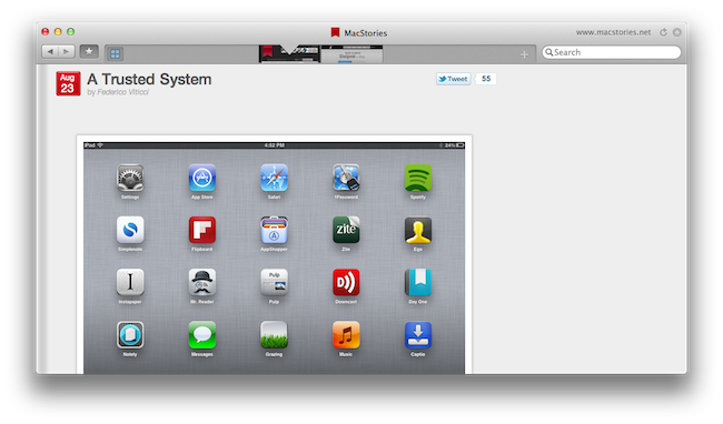
On the Mac, Sleipnir displays tabs as mini-thumbnails in an address bar-free toolbar, which also contains a search field, a new tab button, and, optionally, your bookmarks. In spite of the lack of an address bar by default, Sleipnir lets you manually type in an address with the standard CMD+L shortcut (it will slide in the address bar), and it enables you to keep an eye on the currently opened webpage by visualizing its domain in the upper right corner (something that Mozilla has also been experimenting with in Firefox). The selected tab is constantly marked by an indicator that runs through the toolbar as you switch between pages, whilst tabs can be closed by clicking on the “x” button, or by using the CMD+W shortcut.

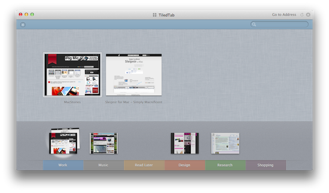
The biggest feature of Sleipnir is always been tab management through groups, and this has been ported to the Mac as well. Groups on the Mac are accessible from a window called “TiledTab”,  which displays large previews on a linen background, with groups in the bottom section of the page. You can move thumbnails between groups, search for tabs and rename groups, though I couldn’t find an option to delete existing groups or create new ones in this beta. Tab groups are useful if you usually keep a lot of tabs open and have been looking for ways to link related webpages together – furthermore, you can move between groups from the TiledTab UI with a two-finger swipe.

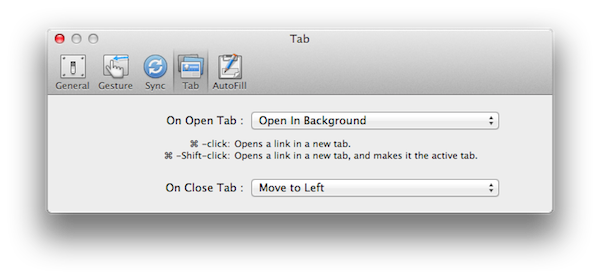
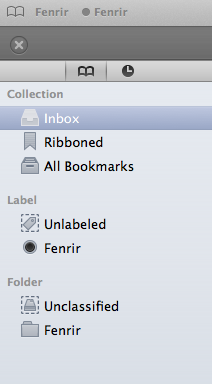
In the Preferences, Sleipnir lets you setup free bookmark sync using Fenrir Pass, and as we’ve seen before on the iPhone and iPad, Sleipnir’s implementation of bookmarks include things like an archive button, ribbons, and labels for deeper organization of saved webpages.

Sleipnir for Mac won’t replace the Safaris and Chromes of this world, but it’s got the feature set and ideas to become an alternative browser that you might want to use outside of your main browsing environment – say for research purposes (groups are great for that) or just to keep a different set of bookmarks always in sync between OS X and iOS.

You can download Sleipnir for Mac beta here, and get the universal iOS app for free on the App Store.


Marked 1.2: Rewritten from the Ground Up

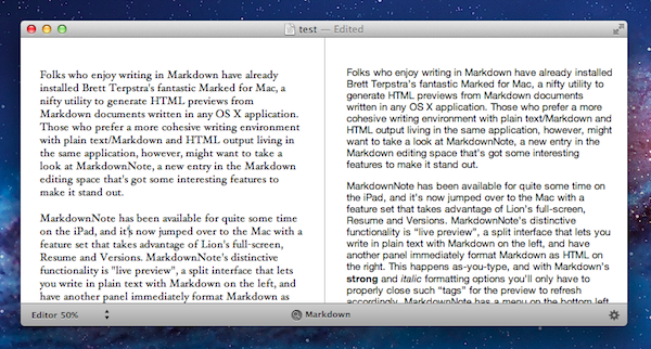
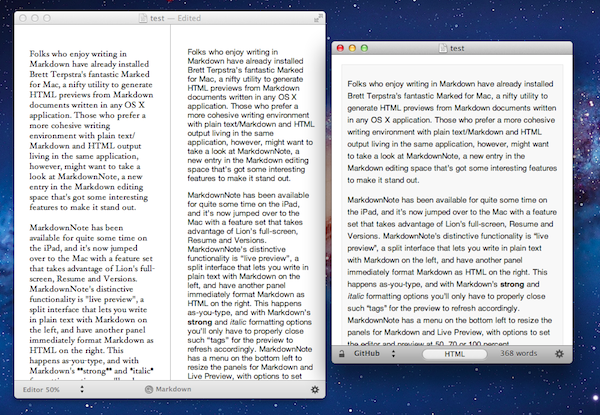
This one goes out to all the Markdown nerds out there (I’m one of them). Marked 1.2 is out, and it’s packed with tons of new features. The interface should be pretty familiar, although you have to like the new persistant word count that you can toggle on and off. CSS styles have been changed up a bit (if you’re not using your own — I used Horizon which is similar to the multi-column style), but asides from the tweaks on the surface of Marked, we have some usability improvements that should make everyone really happy.

Directly interact with the preview and source code using standard highlighting and copy shortcuts to grab text and quickly paste it in the application or web service of your choice. Bundled inside is a new MultiMarkdown 3 binary that’s efficient and better handles big files (for those writing another “Hitchhikers Guide to Markdown” manual), along with web document presentation and compatibility for everything from HTML and ERB (that’s Ruby shenanigans for those wondering). Hit command+E to edit text in your favorite editor, or find where you put down the Master Sword with command+R to bring the file into view from the Finder. Not geeky enough? Marked does a better job of knowing where you are in the document, and will even follow along if you’ve reached the bottom of the page. You can limit text width in the preview, supress link highlighting if you’re going to print (yes, printers till exist), and opening new preview windows can be opened to float on the desktop.

That’s just scratching the surface of what’s available in Marked if you write in Markdown — I use it on a daily basis here at MacStories, and I’m sure you fellow Geekstorians will find it just as useful. Check out the changelog to Marked (it is MASSIVE), read Brett Terpstra’s update, and check it out on the Mac App Store (it’s only $2.99).


OmniOutliner for iPad 1.1: Text Search, Row Splits, Line Breaks, and More

OmniOutliner for the iPad has been getting a lot of love here at MacStories, and we’re really excited about the version 1.1 update that hit the App Store yesterday evening. The first major update to OmniOutliner brings a ton of new feature and usability improvements, including searching for text, pasting multiple paragraphs as separate rows, and being able to split text into a new row if you’re breaking up girlfriends… I mean paragraphs. Let’s take a look at The Omni Group’s latest handiwork after the break.

Read more


Stay On Top Of Movie Releases with Trailrs

With the iTunes Store and Apple’s Trailers website, there’s no denying Apple has come up with a sweet combination to check out upcoming movies, and purchase or rent with one click those made available by movie studios after they’ve hit the box office. However, if you’ve been looking for a way to stay on top of new films and DVD releases directly from your iPhone or iPad, Trailrs is a new app developed by Andy Smart (the same guy behind Sociable for iPhone) that tightly integrates movie information and YouTube videos inside an app capable of sending you push notifications for your favorite movies, and more.

Trailrs is available as a universal app both on the iPhone and iPad, and it’s powered by a clean user interface design based on thumbnails for movie posters laid out on a classic linen background that’s everywhere on iOS devices nowadays. Trailrs allows you to check out trailers for “now showing” movies, upcoming releases (example: The Dark Knight Rises, coming out in 2012) and films now available on DVD. A button in the upper right corner lets you switch between these three different categories, whilst a “heart” icon on the left aggregates the movies you’ve marked as favorite – items you’re interested in, and that the app will save in its library to send you a push notification the day before they’re released in theaters. Furthermore, an Info button next to Favorites contains options to activate Facebook login (if you want to share a movie on your Wall), turn off notifications, and change your country from USA to UK, Spain, Japan, France, or Germany. The app will attempt to collect movie releases from these countries, replacing them with US data if not available.

As for the quality and availability of the trailers, the app doesn’t have the same huge catalog of Apple Trailers and there’s no way to switch between standard and high definition, as the app simply tries to fetch the most relevant video from YouTube, which when displayed natively on iOS doesn’t have controls to switch between 360p, 480p, 720p, and 1080p. Quality is fine in most cases, but I wish there were some options to enlarge the movie posters, and have multiple trailers like on Apple’s website (which, by the way, works well on iOS devices). I like the fact that you can look up each movie on IMDB and forward trailers to the iOS YouTube app – this is a workaround to see related videos, and thus additional trailers. Scrolling between pages in the main screen is smooth, and a second tab in the bottom toolbar allows you to geo-locate nearby cinemas to open in Maps and get directions.

At $1.99 on the App Store, Trailrs is a great-looking alternative to Apple’s Movie Trailers, perhaps with less content but with the possibility of getting push notifications for the movies you’re looking forward to and an intriguing UI. Go download the app here.