This Week's Sponsor:

Copilot Money

Copilot Money, The Best Money Tracker, Launches on the Web – Limited-Time: Get 26% Off + 2 Months Free


Posts in reviews

Organize And Investigate Your Mobile Screenshots with Screenshot Journal

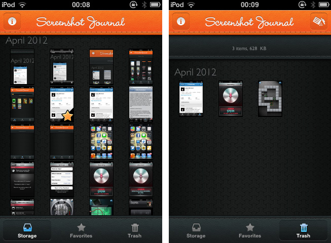
The first thing I have to mention about Screenshot Journal is that the developers at UIForge who are responsible for this handy and beautiful iPhone and iPad app do a really fast and good support work. Otherwise, I would not have been able to write this review at all, because to my surprise, the app didn’t work at all when I installed it for the first time. Fortunately, I just had to re-activate the location option for my Camera Roll to allow Screenshot Journal to journal my screenshots and myself to finally test it.

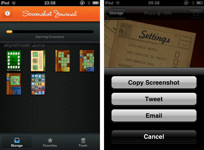
Screenshot Journal is a tool for UI designers, artists, and other pixel addicts who care a bit more about their iPhone (or iPad) screenshots than the integrated Camera Roll archive does. The app archives all your screenshots and organizes them chronologically or by marking favorites. After the first launch, Screenshot Journal imports all your existing screenshots within a few minutes, and new ones will immediately get imported after you took them and the app is running in the background. This way, it can handle an immense amount of images — the exact amount and overall data size is also displayed at the top — and you’ll never need to have a look into your Camera Roll again.

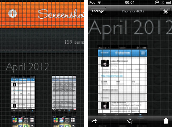
When selecting a screenshot, you’ll find the same interaction options as in the system Camera Roll, but all are slightly (one, in fact, immensely) improved. You can copy images, additionally send them via mail or Twitter to the world, and delete them, either individually or via a bulk delete in the trash window. But the real deal of Screenshot Journal is its zooming feature. You can zoom in an image until you can see (and optionally grid) single pixels, which equates an optical enlargement of up to 400 percent. Every detail of your screenshot becomes visible and analyzable; this feature is the reason why Screenshot Journal is a very handy companion utility for designers on the go: you can check any detail, flaws and bugs of beta designs, websites or other releases – wherever you are, almost instantly.

This powerful feature set is packed into a very beautiful UI, just as if Screenshot Journal itself wants to give an example of how such pixels should look like. For the first time, an app I test is that simple, I don’t consider the absence of preferences a drawback. Screenshot Journal doesn’t need preferences: its features are intuitive and arranged well within the app. Unfortunately, Screenshot Journal did not perform quite well on my 3rd-gen iPod running iOS 5. Changing from the main window to an image (and back) always took its 5 to 10 seconds and got pretty annoying after some time.

But nevertheless Screenshot Journal is a very good take on serving UI designers’ needs on the go. This app marks an important step forward in the area of mobile app and UI design, and I recommend it to anyone who needs to take and check a lot of screenshots on his iPhone or iPad.

Screenshot Journal is available as a universal app for $1.99 on the App Store.


Typeli Is A Questionable OS X Note-Taking App

I really thought a long time about the question whether I should review Typeli by Lukasz Dmowski or not. When I looked at the app website for the first time, I was quite impressed by its design and feature set, but after trying it out for some time, most of the magic the website conveys is gone. What remains is just another note taking app with innovative, but very uncomfortable and unfinished styling and organizing features. Read more


Assistant: Older iPhone Generations Just Got Their Own Siri

During the last years, dictation software has become more and more popular with the development of touchscreen devices. Many writers prefer to use mechanical keyboards for typing, because touchscreen keyboards are not suited for longer texts: they can get very uncomfortable for someone who is not used to them. So especially when you’re outside, dictating text or data can be a very comfortable and healthy alternative to touchscreen keyboards. Even Apple has shown a reaction to that development by introducing Siri, the mobile all-in-one voice assistant on the iPhone 4S. Although it works fine and has lots of features, there are still many independent competitors in this area of app development.. Assistant, developed by Appmosphere and designed by talented designer Michael Flarup, is one of the newer, yet slightly more interesting, efforts.

Assistant serves just one feature: setting calendar events and timers via voice recognition. I know, Siri does that as well, plus much more (and might be funnier too). So why mention a more or less obviously inferior competitor, for which you even have to invest extra money when you get Siri for free with your iPhone 4S? Well, first of all, because not everyone owns an iPhone 4S and Assistant works on 3G(s) and 4 models. And to a certain extent, because of Flarup and his UI work.
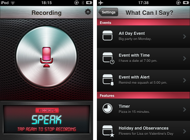
After firing up the app you’re greeted with that immensely huge and gloomy stainless steel recording button and some examples on how to use the features of Assistant. Tap it and the voice recording via the integrated or attached microphone starts; tap it again to stop it. The app processes your vocal input (using the well-founded technology of Nuance Communications) and shows up a date dialogue afterwards, titled with the dictated appointment content and enhanced by eventually mentioned reminders. That’s it: all these main windows are clean, simple and immediately understandable, and the voice processing is pretty accurate and efficient.

Besides its well-done demo video on the app’s website, Assistant also has many setting possibilities which make the app very flexible and useful. You can select the default calendar in which Assistant will deposit your appointments, and default alter time and event duration. The app currently supports only English language input: you can choose from Britain, American, and Australian English. In addition to that, the settings include examples as to which kind of formulations the voice recognition is able to process. It’s quite variable: for example to set an appointment to a special time you can use direct time spelling (12.00 AM) or prevalent paraphrases like noon.

So now let’s get into the UI. Although I like Michael Flarup’s style of digital design very much and, as I already pointed out, the main window and the dialogue panel look nice and polished, there are two things that made me feel a bit uncomfortable with the overall design of Assistant: the buttons and the (also stainless-steel-like) titlebar used within the settings. The latter might fit pretty well to the main window and the “What can I say?”-example list, since the recording button, the monospace screen at the bottom, and the gloomy red list elements correspond to it. But if you move into the settings and the standard iPhone listing UI used for selecting several options, it becomes a disturbing visual overkill. Secondly the buttons set on it do not have anything in common with the plastic and rather machinery look of the titlebar: in my opinion, they are too smooth and colored too dark to fit to the bright but still cold and “hard” atmosphere the title bar creates.

So, I have to say that giving an exact final statement or even a recommendation for buying Assistant is rather difficult. It definitely has some advantages and provides iPhone 3G(S) and 4 users the possibility of stripped-down voice dictation to quickly create calendar appointments. But its look is a bit uneven and therefore I think not good enough to be considered as a must-have — there are some hot spots in it, but to me it is not completely coherent and attractive to reasonably use because of the design. Still if you’re searching for a stable and quite enjoyable app to solve the problem of not having a Siri-like working robot on your phone, get Assistant for $1.99 to dictate calendar events on your older devices.


Insanely Simple

Like many others, I was disappointed by how Walter Isaacson’s official biography of Steve Jobs turned out. With the kind of access that Isaacson had to Jobs’ information, photos, close friends and colleagues, in my opinion, the author should have tried to linger less on the personal reasons that led Steve to walk barefoot around campus, and more on the ideas that shaped the great businessman and inventor that he was.

Steve Jobs was a polyhedric figure, and Isaacson tried to capture the “facts” of his life by focusing on several of his “passions” and “flaws” while, unfortunately, getting many of the facts that helped Apple become the company it is today simply wrong. Perhaps Jobs wanted the book to be a honest representation of “the man behind the business”. Perhaps Jobs’ idea of the book people wanted to read about him was inherently flawed, then. But the way I see it, Isaacson made a choice, independently from Steve, to put the spotlight on certain aspects of Steve’s life, while omitting key details and facts to better understand the Steve Jobs who founded and re-shaped Apple. Maybe “Steve Jobs” is perfect for Joan Baez, or one of Steve’s multiple ex’s in time. But it is not the book I, as someone interested in Steve Jobs the man and businessman, wanted to read.

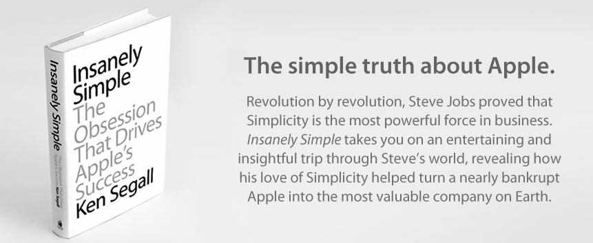
Ken Segall’s new book, Insanely Simple, is, from this standpoint, a simpler book about Steve Jobs. Rather than attempting to provide a complete and exhaustive picture of Steve Jobs in each and every aspect of his life – something that, as we’ve seen with Isaacson, can be a little daunting – Insanely Simple focuses on one thing: simplicity. Insanely Simple, though Segall’s recollections, wants to help readers understand how some of Steve’s ideas and behaviors came to be by following the principles of Simplicity.

Insanely Simple doesn’t want you to know why Steve didn’t wash for weeks, was a vegan, didn’t speak to his daughter for years, or refused to properly park his car. For as much as those are intriguing (and, to an extent, posthumously voyeuristic) nuggets of information, they won’t make you think about why the products Apple makes are great and profitable – the numbers speak for themselves – when compared to the plethora of options that we have on the market today.

Apple makes consumer products. Insanely Simple focuses on this aspect of the company from two perspectives: Segall’s, who worked at the Chiat\Day advertising agency alongside NeXT and Apple for several campaigns, and Jobs’, whom Segall got to know (and work with) personally. The two perspectives often intertwine and overlap in interesting ways: in the concise, fluent style of the book, Segall takes you through an anecdote about the introduction of the iMac to his ad team, and in the next chapter he’s comparing the shopping experience of Apple.com to Dell’s website.

Segall certainly didn’t write Insanely Simple for “Apple novices”, trying to explain that an iPhone is made of glass or what FireWire stands for (something that Isaacson did in his attempt to produce the universal book about Jobs for the masses). While, say, a less tech-savvy reader like my mother would probably need to look up a reference or two when reading Insanely Simple, I believe anyone will be comfortable within the range of discussion laid out by Segall: how “a deep, almost religious belief in the power of Simplicity” always beats Complexity in every business-related decision.

The thing is, it’s funny how Segall’s sole focus on one core concept – Simplicity – provides a richer and more meaningful tapestry of insight into Jobs’ attitude and actions than Isaacson’s poorly researched technical explanations and sentimental departures. In describing the oft-abused “think different” mindset that drives Apple as a company, Segall tries to portray Simplicity as a “skill” that “takes practice”. Unlike Isaacson’s story of the man, Segall thinks “being brutal and being respected are not mutually exclusive”.

Without spoiling too much of the book, I think a couple of brief excerpts can better put into context the “Power of Simplicity” that Segall wants to turn into the selling point of his work (below, page numbers are reported as provided in the review copy I received).

Page 42:

He stopped cold. His eyes locked on to the one thing in the room that didn’t look right. Pointing to Lorrie, he said, “Who are you?” Lorrie was a bit stunned to be called out like that, but she calmly ex- plained that she’d been asked to attend because she was involved with some of the marketing projects we’d be discussing. Steve heard it. Processed it. Then he hit her with the Simple Stick. “I don’t think we need you in this meeting, Lorrie. Thanks,” he said. Then, as if that diversion had never occurred— and as if Lorrie never existed—he continued with his update. So, just as the meeting started, in front of eight or so people whom Steve did want to see at the table, poor Lorrie had to pack up her belongings, rise from her chair, and take the long walk across the room toward the door. Her crime: She had nothing to add.

Lorrie, as Segall remembers, only added to the complexity of the room. She wasn’t “necessary” in the sense that, for what Steve wanted to accomplish during that meeting, he didn’t think Lorrie could contribute in any substantial way. So he asker her to leave. Where’s the line between honesty and rudeness? Segall continues (page 47):

To this day I have a recurring fantasy when I find myself trapped in a big meeting going nowhere. I imagine what Steve Jobs would say and do if he were sitting in that room, enduring what I’m enduring. In my fantasy, it’s like having a really good seat for a matinee at the Roman Colloseum. Who would Steve verbally dismantle or eject from the meeting? When would he cut the presenter off midsentence and say it’s all bullshit? With all the talk about how rough Steve could be, it should be acknowledged that oftentimes he was only doing what many of us wish we could do. Steve saw no reason to be delicate when his time, and the time of everyone in the room, was being wasted.

How many times have you wished you could simply call out someone during a meeting like that, and tell him he’s not necessary? Self-imposed social rules and the fear of hurting someone else’s feelings often keep us from doing what we want to do with a simple and efficient way. And as Segall says, “showing a little of that brutal honesty at the right time is a pretty good way to earn respect— and keep those smart groups small”.

When he hit something or someone with the “Simple Stick”, however, Steve Jobs didn’t always have the perfect touch or vision. But whilst reading Isaacson’s take on Jobs’ human flaws I had the feeling those traits were treated as “mistakes” without another possible explanation – just “mistakes”. I like how Segall tries to explain Steve’s deviation from the Truth of Simplicity as a result of a “skill” that needs to be learned and practiced. Even Jobs’ mind could sometimes be obfuscated by the appeal of “options” and “extras”; but because he was a visionary that understood the nature of Simplicity better than most people at the company – he could “see a spark in there that nobody else sees” – eventually Simplicity always found the way back to Steve’s vision.

The Ultimate Efficiency

In a way, Segall’s book is limited. It approaches the story of Steve Jobs at Apple with a very specific angle, it doesn’t follow a strict timeline of events, and it builds on the author’s theory that Simplicity leads to more prolific creative efforts with a constant flow of anecdotes and examples that, ultimately, aren’t “facts”. Segall doesn’t want to be a biographer, nor is he trying to put “the better book” about Steve Jobs’ life in the hands of customers. Segall wants to prove a point, and while the memories he uses surely contribute to solidifying his theory, in the end it is up to the reader to decide whether Simplicity really is the right key to understanding Apple’s success and a part of Steve Jobs’ persona.

I think Insanely Simple is honest. At $12.99 on the iBookstore (Amazon editions available here and here), you’re getting a clear, balanced recollection of events that focus on Simplicity, Steve Jobs, and the products and ideas that took place in between.

Insanely Simple may be “simpler” in terms of scope and chronological events, but it left me with a more complex, genuine necessity of reflecting more about Simplicity and its effects on Apple’s history than Isaacon’s book ever did.


Airfoil Speakers Touch 3.0 Review

Ever since developers started reverse-engineering the AirPlay protocol that Apple introduced with iOS 4.2 in November 2010, we have seen all kinds of possible implementations of Apple’s streaming technology being ported to a variety of devices, for multiple purposes and scenarios. From tools to turn Macs into AirPlay receivers for audio, video, iOS Mirroring sessions, then a combination of all them, to more or less Apple-approved “AirPlay audio receivers” sold in the App Store, then pulled, then released in Cydia, the past two years have surely been interesting for AirPlay.

When it comes to dealing with audio on my Macs and iOS devices, however, my preference always goes to Rogue Amoeba’s Airfoil. As covered multiple times in the past here on MacStories, Airfoil is a powerful solution from a renowned Mac development studio that allows you to easily control audio sources on your Mac, and organize how audio is sent across your room through Airfoil Speakers, Airfoil Speakers Touch, or a mix of other utilities as I also previously detailed. I love Airfoil, because it just works. And today it gets even better with a major update to Airfoil Speakers Touch, which reaches version 3.0, becomes universal, and adds a $2.99 in-app purchase to turn any iOS device into an AirPlay receiver for audio.

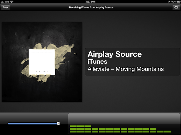
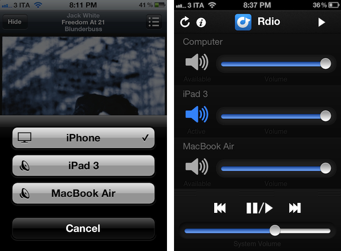
Available for free on the App Store, the new Airfoil Speakers Touch runs beautifully on iPhones or iPads with Retina display. More importantly, it doesn’t require you to send audio to the app exclusively through Airfoil on your computer (more here), as an in-app purchase will unlock the ability to receive audio from iTunes or any AirPlay-enabled iOS app or device. This is neatly illustrated by the in-app purchase unlocking screen inside Airfoil Speakers Touch 3.0.

By enabling the “Input II” option, you’ll be able to turn a device running Airfoil Speakers Touch into an AirPlay receiver recognized by iTunes on your computer, iOS apps like Rdio, Spotify or Instacast, or iOS itself through the system-wide playback controls in the multitasking tray. In my tests, Airfoil Speakers Touch 3.0 was correctly recognized by iTunes, iOS 5.1 on iPhones and iPads, and any app that allowed for streaming audio through AirPlay.

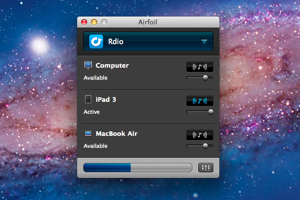
The true potential of Airfoil, obviously, is unlocked when you start combining the various utilities provided by Rogue Amoeba together to build your own personalized wireless audio setup. Whilst I greatly appreciate the support for native AirPlay integration (at $2.99 and in the App Store, it’s a no-brainer), I still like to control audio in my office or living room with a mix of Airfoil, Airfoil Speakers Touch, and Reemote. The latter is a fantastic third-party utility that, connecting to Airfoil on the Mac with a “server” app, allows you to directly control single audio sources and volume levels on iOS.

This means that, if I want to simply stream audio from iTunes or iOS to my iPhone and iPad I can use Airfoil’s new input method; if the audio I want to stream, though, comes from apps like Rdio for Mac or QuickTime, I can fire up Airfoil, beam the audio with its InstantOn technology, and control everything – sources and volumes and playback controls – with Reemote for Airfoil. I can even control standalone speakers connected to my Mac if I want to get audio both on my iPad and the external speakers. It’s a wireless audio nerd’s dream setup.

Airfoil is one of my favorite apps ever created for the Mac – one that I immediately install every time I set up a new OS X installation – and now the iOS version has proper AirPlay support through a $2.99 in-app purchase that, ultimately, just works. If you’ve been looking for an easy way to, say, beam iTunes or iPad audio to an iPhone connected to your car’s system, the latest Airfoil Speakers Touch gets the job done. And if your audio listening habits are made of more complex and variegate needs, you can stay assured Airfoil Speakers Touch will equally serve you well thanks to the combination of Rogue Amoeba-made and third-party utilities mentioned above.

Get Airfoil Speakers Touch 3.0 here.


The Heist 1.1: Highly Addictive Puzzle Fun

I’m a huge fan of puzzle games. Throughout the years I installed almost every interesting game from this genre on my iPod touch: Cross Fingers and Smart Sokoban are some of my all-time favorites. I have to confess, I didn’t notice MacHeist coming up with their first iPhone game about a year ago. But today, their very sophisticated iPhone game The Heist got updated to version 1.1 and I had the great pleasure to beta test its new features and gameplay. Finally, I also recognized what a great game concept and visual effects The Heist has to offer.

Let’s start out with the actual game features. The Heist has got a small “story” around it:

Some puzzle-obsessed nut has rigged up this vault with state of the art defenses! You’ll have to crack a variety of puzzles to short circuit the lasers, security cameras and electrified bars. Are you up for the challenge?
Because of that, you frequently get calls by your spying colleague Sophia who gives you more instructions and (not really existing) time limits. Every time she calls you, new levels and difficulties are unlocked until you finally reach the vault.

In version 1.1 this story and the whole app has been enhanced by various features and fixes (taken from its App Store description):

  • iPod play through with remote control support
  • Game Center enabled on older devices (iPad 1 and iPod Touch 2nd generation)
  • Awards earned achievements if any were missed
  • Support for unlocking secret Clear theme
  • Vault exit button

As the app is developed by the curators of MacHeist, there are some real loots deposited in this vault: with the new 1.1 version you can get steam codes for various games; you can even unlock a secret theme for Clear 1.1. To get there you have to solve four different puzzle games with 15 levels and four difficulty stages. These games actually include Smart Sokoban-style box puzzles, two sliding puzzles with bars and rectangle pieces. The most difficult — and unique — puzzle game in my opinion was the fourth one: a game where you have to sort differently colored stones marked with symbols on the field without having the same symbol two times in a horizontal or vertical row.

These games are not just addictive: they are surrounded by stunning visual effects and endowed with easy gameplay as well. The Heist is a very good example of how extensive and detailed design and the goal of keeping the gameplay smooth and simple should be mixed. Its use of LED effects, light reflections, and other more or less decorative elements is never disturbing the game’s content, and The Heist is easy and intuitive to play and understand.

With its Game Center integration (which now also works on iPad 1 and the 2nd generation iPod touch) and new achievements, The Heist is a quite substantial and addictive collection of tricky puzzles, and it definitely has the capability of captivating you for some time. If you like small time killers for short train or bus rides, go and get The Heist 1.1 right now for $0.99 (introductory sale price) .


StockTouch: Monitoring Stock Values With Style

As a lover of great interfaces, I’m constantly searching for developers who are passionate about displaying common content in new, attractive ways. This is sometimes easier (when it comes to photography or written content for example) but in some cases it can be very difficult and exhausting. Over the years I recognized that this is especially true for stock information and data. There is not much less sexy than linear diagrams and percentage data. You need a very good taste and, even more importantly, a perfect sense for balancing information and design in data visualization to create a functional and exiting product in this area. The developers at Visible Market Inc. definitely meet these requirements when you look at their app StockTouch for iPad.

The app displays the stock value information of the Top 100 companies from 9 industrial sectors (e.g.: technology, energy or health care). You can display their percentaged price change, volume and price change relative to the S&P 500 or the average change of the sector they belong to. Additionally, you can search for specific stocks and set them as favorites, which are then subtly highlighted. To filter this information even more you are able to choose between their global or U.S. value and arrange them in 5 different ways (in a top/low spiral, largest to smallest market cap etc.) — which brings us straight to the app’s concept of data visualization.

All these features and filter possibilities are integrated into a sidebar and get visible via pop up windows if you touch the respective pictogram. The actual stock data occupies the rest of the screen. The app’s main window presents you all 9 sectors in commensurate rectangles, which are headlined with the sector description and its overall percentaged change. StockTouch works with visual layers. By pinching or tapping one of the sectors, it zooms in and you can take a look at the sector’s “member companies” and their overall change within the set timeframe — again presented in a field of rectangles containing the different companies and their current stock value or change.

To visually underline the current value and its position in the respective sector, positive change is signalized with different shades of green; more or less stagnating stock prices are black and those falling can be identified by their red background colors. This intelligent and subtle use of colors makes it very easy to quickly analyze the overall changes of a sector, the stock market in general and, to a certain extent, also encourages the user to dive deeper into the information StockTouch has to offer, embodied by the third layer: the line chart of a single company’s stock value, available by tapping on a single stock within a sector.

The style of displaying the course of a single stock shows the second immense quality of StockTouch: its perfect use of visual and especially typographic hierarchy. Again, the background color indicates the general direction of the stock value’s course; but the real innovative solution in this part of StockTouch is the way the related numbers and information are organized and presented. At the top, using white space and different font opacity, the relevant data like the current stock value or the company’s position within its sector are easy to identify and read. Below the chart you get a short description of the company’s profile and the possibility to check several current newspaper articles about it which can be opened in an integrated (not very beautiful) web browser. But overall, the whole interface is modern, unique and intuitive at the same time.

Concerning the overall UX of StockTouch I think there are some small lacks in intuitive use though. For example, it is not possible to swipe left or right to move to another sector or company: you always need to zoom out completely, and then select the information you want to check. Furthermore, although the search feature is performing very fast, the results are listed way too small and you often unintentionally tap the wrong stock (which definitely can be avoided on a screen that large). StockTouch also features unobtrusive sound design while browsing through the stock data, but although I personally like the sound effects very much, the developers should at least have provided the option to turn them off — which is not the case here. In fact, the app does not offer any preferences at all, a move which surprised me bit, to be honest.

But nevertheless I became a fan of StockTouch immediately after firing it up for the first time. It is the product of a deep love for good design and unique and interesting data visualization. I absolutely recommend it to anyone who seeks for an easy way to monitor the stock market and has a taste for good interface development. StockTouch is available on the App Store as an universal app for $4.99.


Clear 1.1: Refining the User Experience

Defined by its clever and unmistakable user interface, Clear 1.1 refines second nature concepts and acknowledges community feedback by introducing a friendly new gesture, UI refinements, some added inspiration, and a big list making improvement.

First up: shake to undo. Shake to undo works with lists in Clear, allowing one to backpedal on new todo items or undelete list items previously cleared. A couple flicks of the wrist will display an alert signaling the opportunity to undo, redo, or cancel the option of retrieving a list or completing an item. Additionally, you can shake up your themes to select a random theme (as noted in the screenshot below).

As seen with undo, Clear keeps the context of its user interface in mind with custom alerts that can be best examined in the tips & tricks section of the app. By tapping on a quick todo (in this case “Shaking Things Up”), Clear provides context on the action. There is no OK or cancel button, nor is there an X to tap. Only a necessary tap anywhere on the display dismisses the on screen prompt without any call for user action — tapping to dismiss shouldn’t require the cruft of a one way out prompt. It’s a minor functional change, yet still significant in idea.

Ideas in Clear are quite literally rewarding when one begins by creating a new list or clearing a list’s items from the display. Several new quotes have been added in the 1.1 update — users can look forward to additional phrases to mull over after pouring coffee or after completing a day’s worth of items.

Lastly, improving upon lists, list items in Clear no longer have a limited character count. If ideas are flowing that are bigger than the width of your iPhone’s display, feel free to continue typing so that no word will be forgotten and no item will be left undone. Don’t worry — the shades of color splashed across the screen still look terrific.

While there are other secrets to be uncovered in Clear, I’ll try not spoil the fun and let you discover how to unlock some of the newly added themes. I maintain that Clear’s intuitive and ultimately addictive take on the traditional todo list is a much needed breath of fresh air in realm of task management. The new features are welcome improvements, and I’m looking forward to seeing what will happen to Clear in future updates. Clear is available for $0.99 in the App Store.


National Parks By National Geographic: A Beautiful Guide To American Nature

Great content deserves great design. In my opinion, this is one of the main principles UI designers have to sought after. If your product features great content, it needs to be highlighted with great design and usability elements around it, or it loses a lot of its advantages and flair. The second principle I truly admire when executed well is the attitude that content always comes first. If the standard tools (in the case of UI design, the standard interface elements) do not fit your app’s purpose, create new ones instead of reducing your feature set.

You do not often stumble upon apps with such interface features (one of the more prominent examples could be the current Twitter app with its “pull to refresh” feature) but if you do, most of the time your jaw just automatically drops. This is also the case with the new National Geographic National Parks app.

The app lets you discover American national parks in a way you’ve never seen before. You can rush through images, park information, secret tips and much more in a trip of pure joy and wonder. Before I focus completely on its tremendous UI, allow me to list the main park guide features the app has to offer as they are summarized in its App Store description:

  • Global and interactive map views with filtering by activity and seasonality
  • Personalized user space to track your favorite parks, activities, itineraries, photos, and more
  • Thousands of points of interest, all tagged with GPS coordinates for easy planning and locating
  • The top must-sees and must-dos for each park, curated by National Geographic editors [includes downloadable park guides]
  • Stunning photo galleries for each park, plus rare vintage images from the National Geographic Archive Photo tips from National Geographic photographers
  • Sharing through Facebook, email, and Twitter
  • Collectible park stamps.

Just to get the idea. But mentioning all these features explicitly would have distracted me from writing about what I’m really into: the app’s design and the way this content and feature possibilities are presented. So let’s get into that now.

When I fired up the National Parks app I immediately recognized that it’s something very special. The main window contains a beautifully styled photo wall of all parks to choose from or alternatively a map (with fluent Google Maps integration) featuring their hot spots and attractions. This window already shows the designer’s approach with taking common iOS buttons and selectors and re-editing them in order to give them a personal touch. This is most of the time achieved by changing their structure to something that looks wilder, grungy and very often like tanned leather. The app’s look makes you almost feel the park guide in your hands: everything is rounded up with well placed shadows, visual borders and, more importantly, realistic consistency.

After selecting a park and browsing through its given information, you’ll also recognize a (at least to me) completely new interface effect: if you take a look at its visitor stats or current weather situation, the main window gently slides in the background and up comes a halved screen presenting the selected information.

But National Parks is not just an excellent example for UI innovation: it also makes great use of visual guiding. The app features an immense and advantageous use of well-placed pictograms and especially photography — even on the rather small screen of an iPhone. Professional and beautiful images are flawlessly integrated while discovering the parks, and they give every single park presentation an individual and inspiring touch.

All in all I just can say that this is one of the most inspiring, useful and consistent iPhone apps I’d seen in a while now. There’s a lot more to it than I just highlighted. Although it crashed two times while using it and the enhanced park guides are only available for extra money (the first one is free, the rest is $1.99 each, which is a very fair price) I definitely recommend you downloading it for free. Whether you’re an enthusiastic lover of American National parks and a frequent visitor, hobbyist, professional photographer or just a interested design lover — it’s going to be worth it!