This Week's Sponsor:

Copilot Money

Copilot Money, The Best Money Tracker, Launches on the Web – Limited-Time: Get 26% Off + 2 Months Free


Posts in reviews

Mailsum Enhances Your Mail Account Surveillance

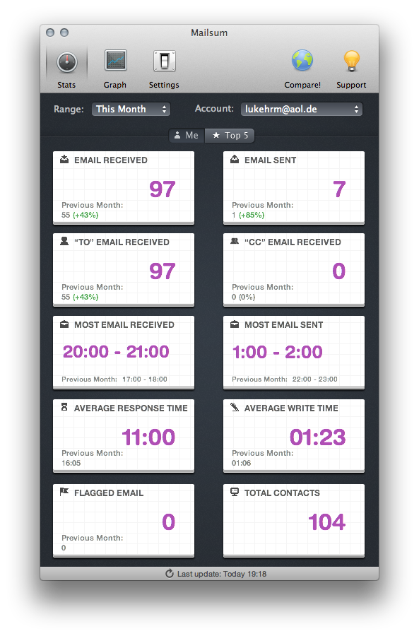
When it comes to email clients, most Mac users still stick to Apple Mail as their client of choice, although there are plenty good alternatives available. The reasons for that are clear: over years of constant development, improvement and changes, Apple managed to create a powerful, but still clearly laid out program, which fits the needs of both private and professional business users. Diversified labelling options, multiple mail signatures, folders, and diversified reply and creation features are just some examples. Nevertheless, there are still some people out there demanding one specific feature Apple mail lacks: statistics. But, as you know, there’s always an app for that. In this case, it’s Mailsum by Appmasters. Read more


Inkflow Has One Great Idea

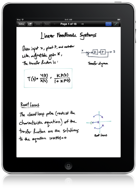
When we talk about hotly contested app markets for the iPad, we’re either talking about iOS text editors or sketching apps — today we’re focusing on the latter. Between Adobe, Autodesk, Paper, and Penultimate, something needs to be dramatically imaginative and different to make it stand out in a section of the App Store that is well contested and already populated with great apps. Sometimes an app like SyncPad stands out by providing new and interesting features (in this case it’s immensely useful for presentations), but very rarely does an app come along that can compete with these established tools on the iPad. Similar to how Instapaper and Pocket (once Read It Later) have captured the “read later” space, the aforementioned apps broadly cover everything you’d likely need or want when it comes to writing, drawing, and sketching.

Read more


Tweetbot 2.4 Brings New Search View, Keyword Mute Filters, Refinements

Following updates focused on iCloud sync and gestures, Tweetbot 2.4, released today on the App Store (iPhone, iPad), brings an updated search view with additional location features, relocated Trends and People categories, and various improvements that make the client’s search functionality more powerful and intuitive.

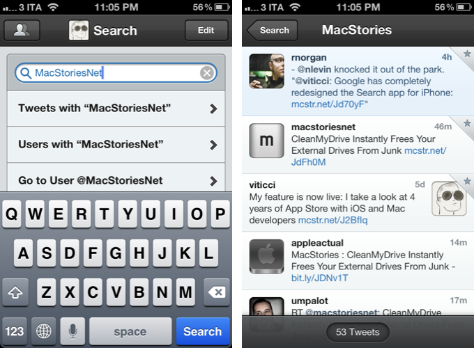
The new Search tab unifies Trends, People, and Top Tweets under a Browse section, with Saved Searches and the classic search box still available at the top of the screen. The dedicated Top Tweets option is quite enjoyable – I have indeed found myself browsing such flow of status updates on a couple of times for the occasional laugh or remarkably snarky tweet. Top tweets now also show up in regular search results, and they are marked by a silver star indicator.

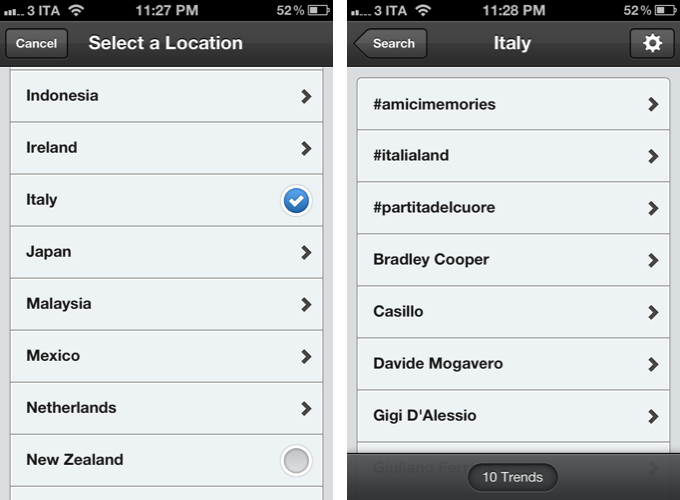
Trends, on the other hand, can be changed to another location directly from the search view of Tweetbot 2.4 – I don’t use Trends, but I assume the option will come in handy for those who, for some reason, like to check the recurring #Buongiorno trend in Italy.

The big addition in Tweetbot’s new search interface is support for nearby tweets. Here, you can view nearby tweets with the ability to change your location (just tap on the embedded Google Map), and you can perform location-based keyword searches for tweets containing specific words that also happen to be located near you. Unfortunately, Viterbo resembles a ghost town when it comes to looking for fellow local MacStories readers. I asked Tapbots, and they confirmed my town’s insistence of loading @viticci as the only local MacStories tweeter isn’t an app’s bug.

There are two more little touches I like in Tweetbot 2.4: you can double-tap the search tab to open search with the keyboard, and the search box has been optimized to let you easily jump to tweets, users, or a specific @user without additional taps.

Keyword Mute Filters

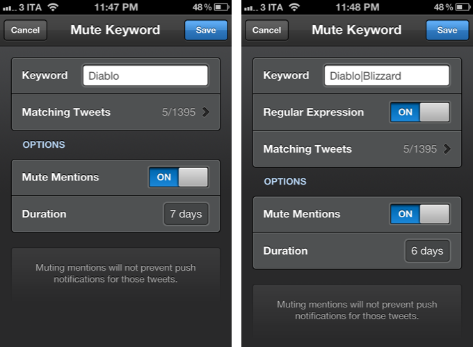
Tweetbot has been offering advanced mute filtering options for quite some time now. Version 2.4 now allows you to block specific keywords – not just users or clients – and there’s even support for regular expression if you really want to make sure you’re not reading about the latest spoilers in Game Of Thrones. Mentions can be muted as well.

Miscellaneous

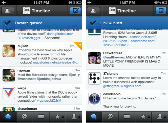
There are plenty of other refinements in Tweetbot 2.4. Offline support, for instance, will ensure tweets marked as favorite or sent to a Read Later service when no Internet connection is available will get “queued”, then sent/favorited as soon as you come back online. Sure enough, while browsing my timeline in Airplane mode, I fave’d a couple of tweets, sent some links to Pocket, and Tweetbot queued them. When I turned WiFi back on, the app refreshed, the tweets were marked as favorites in my account, and they appeared in my Pocket.

On the iPad, web and map views can now be dismissed with a two-finger swipe down gesture, which I found incredibly convenient and faster than reaching out for the Close button in the upper left corner. Also on the iPad, list views show one line of a list or profile description, and when viewing an image in full-screen, you can hold down for options.

Additionally, aside from the usual bug fixes, you can now swipe to the right on profile views to go back; items sent to Pinboard are marked as unread; and last, the compose screen comes with basic smart quote support (for quotes, em dash, and ellipsis).

With powerful new features and UI refinements added to an existing set of great functionalities, Tweetbot 2.4 retains familiarity while striving to remain the best third-party Twitter app for iOS. Get it from the App Store today.


Pulp Gets Retina Graphics, iCloud Sync for Mac & iOS, Trends

Between RSS clients and read later apps, Acrylic’s Pulp has always taken a different approach at presenting news beautifully on the Mac and iPad. Combining the traditional aspects of RSS (Pulp lets you add a website’s feed through search, direct OPML, and Google Reader) with the rich visual presentation of apps like Flipboard, Pulp (nèe Times) offers a magazine-like experience for web articles, which can also be stripped out of unwanted graphics through a feature called Magic Reader. In our previous coverage, we were positively impressed by Pulp for Mac’s push sync and Lion support, as well as the iPad version’s elegant layout.

Today, Acrylic is releasing two major updates to Pulp for Mac and iPad, adding an improved interface and Retina graphics on iOS, iCloud sync across platforms, and a new “smart home page” feature that automatically aggregates trends and relevant news items from your feeds.

Retaining the same page-based layout that allows you to add multiple sources in newspaper-like columns with different display options, the new Pulp adds a “Home” start page that features popular and trending articles from your existing feeds. Using a series of algorithms that determine an article’s relevancy through keywords, date, and other feeds mentioning it, the new Home page provides a grid of fresh and popular stories for the day. In actual testing, this meant that with Pulp set to refresh every 5 minutes, the app would look at my four sections (Apple, Technology, Science, Arts & Entertainment) and bring in popular news like the Google/Oracle trial and Jony Ive’s knighthood, sorted by keyword and grouped by sources.

The concept is interesting; I was told by the developers that Pulp builds this “smart home page” completely on the client side of the app – no data is uploaded to Acrylic’s servers and social networks aren’t contacted to aggregate popular links, either. I haven’t been able to test Pulp’s algorithm during a major news break, but I believe it is safe to assume it would grab popular stories within a couple of minutes. Overall, I think the new Home page is a good idea as it provides a simple and efficient way to “see what’s important” without navigating through feeds manually; in my tests, I noticed refreshing trends took slightly longer on the iPad version of Pulp – but the results were the same afterwards.

The big new feature of Pulp 2.5 is iCloud sync. Moving from the previous Pulp Sync service, iCloud will automatically keep feeds, pages, and shelf items in sync across the iPad and Mac. For testing purposes, I updated to Pulp 2.5 on the Mac, configured my virtual newspaper, and saved a couple of items to the app’s shelf using the new browser extension. Once I updated to the new 1.5 version on the iPad, the first launch of the app made me wait around 30 seconds for an automatic import of my data, and I couldn’t experience any errors of sort. iCloud sync has been fast and reliable in my tests, with Pulp deleting and adding sources between the iPad and Mac app within seconds. The addition of synced shelf items is welcome, too, as it offers a simple way to save articles “for later” – albeit the app also comes with direct integration for Pocket, Instapaper, and Readability.

Pulp 1.5 for iPad and Pulp 2.5 for Mac are two gorgeous, solid, and clever updates. Pulp has always wanted to provide a solution in between the fast-paced nature of RSS and the laid-back reading experience of magazines, and the new version builds on that foundation, enhancing it with iCloud sync and a useful, constantly up-to-date Home page.

Pulp for iPad is available at $2.99 on the App Store; Pulp for Mac is $4.99 on the Mac App Store.


WriteUp 3.0

https://cdn.macstories.net/002/29904_Camera%20Roll%201.png

https://cdn.macstories.net/002/29904_Camera%20Roll%201.png

In my original comparison of iOS text editors, I included WriteUp, a fast and powerful Dropbox-enabled app that stood out thanks to its support for folders and sub-folders, exporting options, and versions. Prior to settling with Writing Kit for my daily iPad writing efforts, in fact, I had been using WriteUp as my go-to text editor – version 2.0 of the app was solid, but in the end not as powerful as Writing Kit.

Version 3.0 of WriteUp, released today, adds new powerful functionalities to speed up the process of working with multiple Dropbox folders and notes, bringing a new built-in web browser to augment the app’s research capabilities with split view. I have been testing WriteUp 3.0 for the past two weeks, and while I won’t completely switch from Writing Kit just yet, this new iteration of the app has stayed on my iPad because of the very specific features it introduces.

Split View

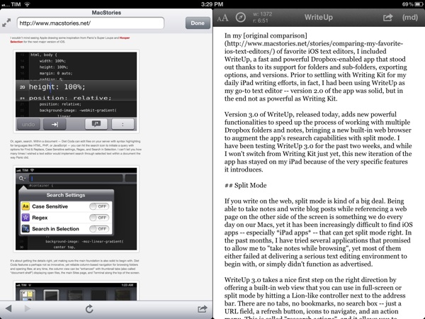
If you write on the web, split view is kind of a big deal. Being able to take notes and write blog posts while referencing a webpage on the other side of the screen is something we do every day on our Macs, yet it has been increasingly difficult to find iOS apps – especially iPad apps – that can get it right. In the past months, I have tried several applications that promised to allow me to “take notes while browsing”, yet most of them either failed at delivering a serious text editing environment to begin with, or simply didn’t function as advertised.

https://cdn.macstories.net/002/29904_Camera%20Roll%201.jpeg

https://cdn.macstories.net/002/29904_Camera%20Roll%201.jpeg

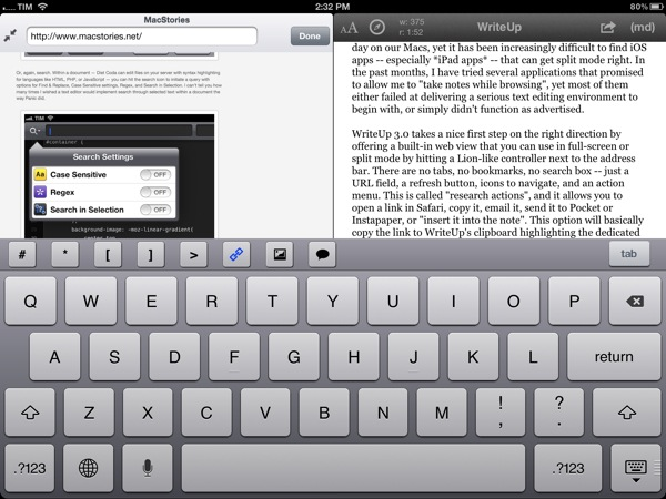
WriteUp 3.0 takes a nice first step on the right direction by offering a built-in web view that you can use in full-screen or split mode by hitting a Lion-like controller next to the address bar. There are no tabs, no bookmarks, no search box – just a URL field, a refresh button, icons to navigate, and an action menu. The latter is called “research actions”, and it allows you to open a link in Safari, copy it, email it, send it to Pocket or Instapaper, or “insert it into the note”. This option will basically copy the link to WriteUp’s clipboard highlighting the dedicated link button in the extra keyboard row, allowing you to open anInsert Link panel with the address already copied. Unfortunately, unlike Writing Kit, WriteUp 3.0 still doesn’t let you select words in text and only wrap those within Markdown links; I hope better Markdown auto-wrapping options will come in a future version of WriteUp. Overall, I also still prefer Writing Kit’s custom keyboard row.

The built-in web browser isn’t perfect: its performances aren’t comparable to Mobile Safari, and because of its size constraints, webpages will often be displayed partially, even when using the iPad in landscape mode. On a couple of times, I also noticed WriteUp would “freeze” a webpage without letting me reload it, and I really think there should be a dedicated Google button to relieve stress from the address bar. In spite of these few bugs and limitations, however, I can’t help but like WriteUp’s split view. It doesn’t let me drag & drop text between panels – I am not even sure that is technically possible – but it works in portrait and landscape mode, it’s dismissible with gestures, and, more importantly, it has already helped me write several news posts for MacStories when I needed to work side by side with webpages to reference quotes and other facts. It can only get better from here (idea: split view for multiple notes).

Pinned Notes, Favorites, and iCloud

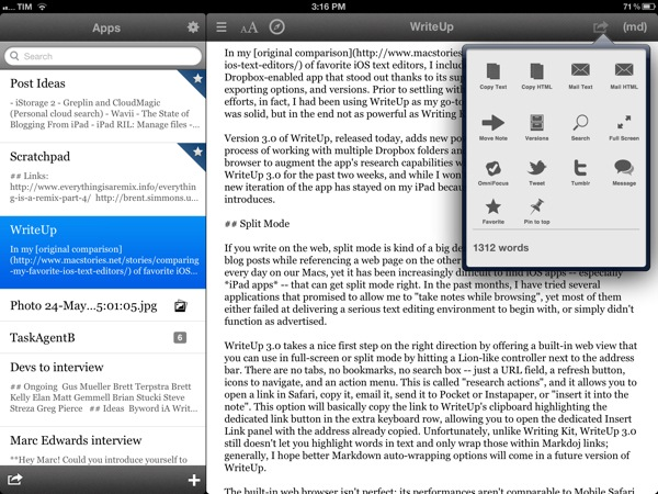
The second major addition to WriteUp 3.0 is something I’ve been wanting from a Dropbox text editor for a long time, and which the app gets precisely right. WriteUp can now mark notes as “favorite” and make them available anywhere no matter the folder they are into. Furthermore, a separate “pin” option lets you pin notes at the top of any folder, and both favorite and pinned items are synced across devices running WriteUp with iCloud.

https://cdn.macstories.net/002/29904_Camera%20Roll%203.png

https://cdn.macstories.net/002/29904_Camera%20Roll%203.png

Here’s how I use this feature. As outlined in my Dropbox writing workflow, I try to keep a consistent environment of text files that are always accessible and up to date independently from the tool or device I decide to use.

Lately, I have unified all my notes, drafts, and lists inside a single Apps folder that I can access from Writing Kit, TaskAgent, Drafts, TextDrop, and my Mac. My “longer notes” are located in the root of the /Apps folder, with sub-folders for the aforementioned apps inside it. OS X and TextDrop make it easy to navigate through these as they have access to my entire Dropbox filesystem; most iOS text editors, on the other hand, typically force you within a single folder, and won’t let you move between sub-folders. Not only does WriteUp let me navigate notes and folders, it now also a) enables me to mark my most used TaskAgent list as favorite so I can see it in the main Apps folder and b) pin my Scratchpad.txt file to the top of the folder view so I’ll always know where I can quickly jot down notes and links (and if I happen to be cleaning up my Drafts folder, I can easily cut links, and copy them back to Scratchpad.txt without navigating back to /Apps).

Pinned and favorite notes have been a terrific addition to my workflow, and I found both the implementation and iCloud sync solid and reliable. It’s not for everyone – admittedly, several writers I know like to keep their Dropbox notes and folders in separate locations – but if you’ve been looking for a way to unify your text files and folders in a single view, WriteUp 3.0 should have you covered here.

Wrap Up

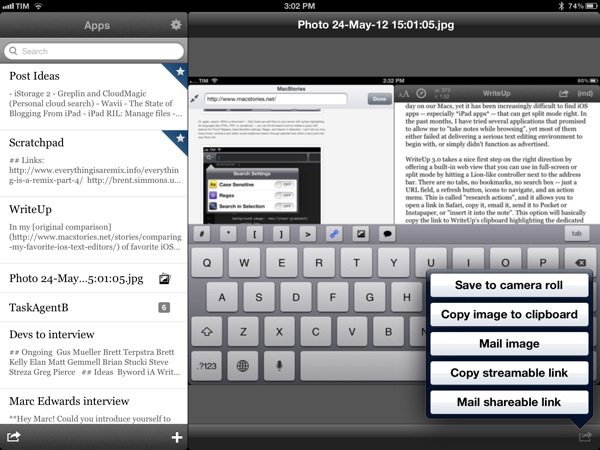
There’s a bunch of other neat additions in WriteUp 3.0. Markdown Extra (tables, footnotes, etc) is now supported, and the app can send notes to OmniFocus, iMessage, and publish to Tumblr. Terminology integration lets you look up or replace words using Agile Tortoise’s fantastic dictionary app; you can move “complete” folders to other locations in your Dropbox; and because Dropbox now lets you share files from any folder, WriteUp 3.0 can upload images, and give you a streamable link you can share or use as source for images in your notes. If you plan on serving images from your Dropbox account, this will come in handy.

https://cdn.macstories.net/002/29904_Camera%20Roll%202.png

https://cdn.macstories.net/002/29904_Camera%20Roll%202.png

In my tests, I experienced a few bugs with WriteUp 3.0. Sometimes, the built-in Markdown preview wouldn’t be displayed, forcing me to tap on another note, then select the previous one again to activate it; the app didn’t crash, but it failed to create a text file with “2.1” in the title (it wrongly recognized .1 as the extension, thus not creating a .txt file), and the bottom navigation bar (where the + button to create new notes is placed) isn’t displayed when using a Bluetooth keyboard. Fortunately, the developer has been extremely responsive, and I was told fixes, stability improvements, and new features are already underway now that 3.0 is available.

WriteUp 3.0 is a great update. In my opinion, Writing Kit still remains the most powerful text editor around, but, as I mentioned above, at the same time I couldn’t get myself to stop using the functionalities introduced in WriteUp 3.0 such as split view and favorite items. For those specific purposes – writing while referencing a webpage and browsing notes across folders – WriteUp 3.0 is superior to Writing Kit.

With strong sharing options, support for Versions (another feature most iOS text editors are lacking), images, custom CSS previews, and all the other features of version 2.0, WriteUp 3.0 has still some rough edges, but shows an incredibly promising, and possibly even more powerful text editing future.

WriteUp 3.0 is $4.99 on the App Store.


CleanMyDrive Instantly Frees Your External Drives From Junk

I am a huge fan of MacPaw products. The company’s care for consistent UI design combined with huge functionality is well-known all over the Macintosh community, and I use their apps pretty frequently. In fact, Gemini was the topic of my first MacStories post.

MacPaw remained makers of desktop software only, even after the iPhone came out; this is a move I personally like a lot, as you find less well-designed Mac apps than iOS utilities nowadays, and it feels good to see some guys focusing on the desktop business. MacPaw’s newest product, CleanMyDrive, is a stripped-down, menubar version of their first and most popular app CleanMyMac, and it fulfills the task of silently freeing your external HDD and flash drives from unwanted junk data or duplicates.

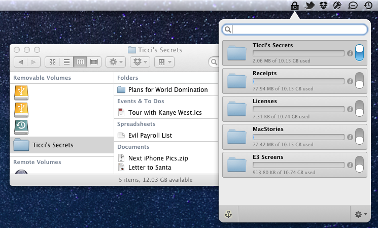
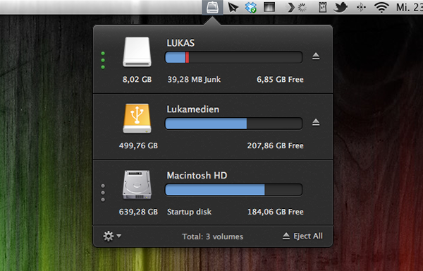
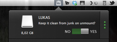
After installing the app, CleanMyDrives sits behind a nicely crafted hard disk icon in the menu bar. Click on it, and a dropdown window appears; from there, you can control the app’s features. The biggest advantage of making CleanMyDrive a menubar utility is that it’s invisible until you really need it. Now, every time you connect an external drive to your Mac CleanMyDrive will check its capacity and data — when it recognizes new ones, you’ll be asked whether it should check them as well in the future or not. The amount of used and free space is shown in a horizontal bar using blue and white parts.

If CleanMyDrive finds junk files on one drive (things like DS_Store, Thumbs.db, Spotlight, hidden trashes and so on), it displays their portion in red (plus the exact size in MB on hover), and you can delete them instantly. If you’re lazy and don’t want to manually delete the found junk on your drives all the time, CleanMyDrive can automatically delete junk every time you eject a drive, too.

After testing the app with my USB drives, I can say that it did not delete any of my files and folders, but still freed some space – likely related to “junk” accumulated over time.

Because the app is focused on smaller drives, CleanMyDrive firstly only scans external drives with 64 GB of storage or less. However, you can change that in the preferences to any size limitation you like and even disable it completely to also include large external HDDs. However, CleanMyDrive can’t check your internal drive for junk. One could already have guessed so from the app’s name, but as the internal drive’s storage is nevertheless shown in the app’s window, I tried to scan it as well. At this point, the developers allowed themselves some advertising for their other product: the app brazenly recommended me to scan my internal drive with CleanMyMac.

For cleaning my external drives, I’ll definitely stick with CleanMyDrive; this almost instant decision was mainly made due to the app’s fantastic and — yes, that’s the way I felt about it — cute design. The UI is clutter-free, simple, and it makes intelligent use of sliding effects and hover controls; it’s fun to use. The app’s small preference window plus the rotating cog wheel to open it up — little details, something I like very much — rounded up my impression of it as a cute little companion to ease up your workflow.

CleanMyDrive can be a very useful utility, especially when you’re using (maybe even several) external drives. Plus, its unobtrusiveness and pleasant user experience make for a very useful package which comes for free for a limited time. So don’t hesitate and grab CleanMyDrive on the Mac App Store while it’s hot.


Review: FontBook for iPad

I’m a typography addict. Since I watched Gary Hustwit’s “Helvetica” documentary film, I constantly follow several type foundries and blogs (of which I consider I Love Typography and Typedia the top-notch sites) to keep myself updated on the latest news and typefaces. Hence after I saw the introduction of FontBook by FontShop (which was recently updated to version 2.1 with a Retina-optimized UI), the app was an instant-buy for me. Finally I can discover new typefaces, designers, and foundries wherever I go, offline, just with my iPad.

I usually discuss an app’s design separately at the end of a post, but FontBook has to be an exception from that, since the app itself is showing perfect use of digital typography and content curation — in no other area of design, content and design are connected as closely as in typography. FontBook is developed by a 10 person team at FontShop, one of the largest and the longstanding typeface resellers on the Internet, founded by renowned Erik Spiekermann in 1989, so it is no real surprise that it executes this need for exact design with pure perfection. Read more


Review: iTV Shows 2

iTV Shows 2 is a handy app for keeping track of your favorite TV shows across all of your iOS devices. It has an improved interface, a slick new icon, local notifications for shows about to air, and it supports iCloud sync just to name a few of its features.

The user interface in iTV Shows 2 is extremely well done; the developers definitely hit the mark with this version of the app because not only is it gorgeous but it is also easy to use and contains all the features one would expect from an app dedicated to informing you about TV shows. To use the app, one needs only to search for (and add) some TV shows to the “My Shows” list. I immediately noticed an improved performance when simply searching for a few TV show titles. iTV Shows 2 definitely seemed snappier and more accurate with its search results. After adding my favorites “How I Met Your Mother” and “The Big Bang Theory”, I jumped back to the main screen and noticed the large beautiful icons separating out the shows. These are simply categories to help the user visualize when the TV show is going to air, if it has already aired, or if the next season has yet to announce a specific start date.

Another feature I enjoyed in iTV Shows 2 was the Genius tab which displays TV shows it thinks I might also enjoy watching. It was extremely accurate with its selections, however I am not entirely sure how it derives these suggestions. Perhaps I just enjoy very common and popular TV shows. Some of the shows it suggested that I happen to truly enjoy include “Dexter”, “Breaking Bad”, and “New Girl”. These are very different shows, but the app was spot on suggesting that I check them out.

Other features include a handy calendar view in which you can tap around and view episodes throughout the month. It also supports all of the latest iOS buzz words including universal, Retina Display ready, local notifications, and iCloud synchronization. I know people have come to expect iOS apps to be universal but I still appreciate each developer that decides to essentially give away two apps for the price of one. The iPad app seemed to have all of the love and detail that went in to the iPhone version. The iCloud sync worked flawlessly during my brief test, all of the shows I added while setting up the app on my phone were already added to the iPad version after simply launching the app on the second device.

The only issue I experienced was with the local notifications. I had received my first notification for an episode of “How I Met Your Mother” exactly 1 hour late. I immediately assumed it was a time zone setting issue in the app. Sure enough, I figured out that I had to go in to Settings > Preferences > Time Zone > and enable “Perform correction”. The note by the developers state to only use this setting if the app fails to automatically perform the time zone, so perhaps you readers will experience no issues at all. Other than this small hiccup the first day using iTV Shows 2, it has been very reliable.

I have to admit, at first I questioned whether or not I needed an app to remind myself to watch a TV show since 90 percent of the time I don’t watch TV shows live anyway, I use a DVR or stream the show on a network-connected device. This touches on what I feel is an industry wide shift in how consumers are interested in viewing TV shows – many of which are opting out of standard cable television services in favor of web services like Hulu Plus, Netflix, and Amazon Prime Video on Demand. I actually have traditional cable service but still subscribe to all three of these services (don’t ask me why), yet I was surprised to find as much value in iTV Shows 2 as I did. My wife and I enjoy watching entire seasons of TV shows at a time so checking off episodes as we watched them was a useful feature. I would be nice if the app eventually added some statistics about the number of TV shows I watch: maybe it could calculate the number hours I spend on TV (I am a statistics geek). Furthermore, I enjoyed the supplied information per show, e.g. what TV shows have seasons coming up, like HBO’s True Blood which is starting soon. iTV Shows 2 even has Twitter integration to share episode details with friends which was a pleasant surprise.

Overall, iTV Shows 2 has a sharp new user interface along with some pretty unique features. It may not be my most used app but it does serve a specific purpose and has definitely earned a permanent spot on my iOS devices.

iTV Shows 2 is available on the App Store for $2.99


Let’s Sing

Developed by Marco Tabini and Lex Friedman, Let’s Sing is the most addictive and fun iPhone game I’ve played in a while. Long story short: you can get it for free on the App Store, or buy the paid version.

Let’s Sing is a “social” iPhone game that you can play with your friends online, combining the traditional aspects of karaoke and television program “Name That Tune”. From the main screen of the app, a “Start a New Game” button allows you to find a friend to play against manually (by email or username), on Facebook, or through your Address Book. Once you’ve found a friend to play Let’s Sing with – sessions are private, meaning only you and your friend will play, and they won’t be shared publicly – it’s time to pick a song. If you want, however, Let’s Sing lets you pick a random opponent.

Let’s Sing is clever, in that rather than using a proprietary system to provide you with song previews – or worse, rely on in-app purchase to offer “song packs” – it simply connects to the iTunes Store to display three possible options at a time. Let’s Sing’s list of songs is manually curated by their developers in order to ensure a proper classification (easy/medium/hard), and, more importantly, to avoid items with complex names or strange characters that would be problematic to enter with the iPhone keyboard. The selection of songs is already fairly impressive, and support for the iTunes Store means the developers will be able to effortlessly add songs over time as they choose more. In my tests, I “sang” my friends hits from Beyoncè and Soundgarden, Micheal Jackson and R.E.M., and more.

Before a turn, songs can be previewed, and there is a link to buy an item on the iTunes Store if you suddenly realize you want that in your collection. From the song selection screen, you can also shuffle songs if you don’t like or know what you’re being offered, but shuffles are limited. Songs are displayed on a grade of difficulty, which will earn you and your friend more coins in case of successful streak. More shuffles can be unlocked with coins; if you’re out of coins, you can buy more with “real” currency using in-app purchases.

The singing and guessing part of Let’s Sing is what I like most about the game, and what got me hooked in the first place. Let alone that I get to hear online friends and colleagues I have never met in real life hum or whistle through their microphones, the whole process is extremely straightforward: you pick a song, whistle, hum, or like I do, “na na na na” through it, then hit Send. You can play back your recording to make sure you’ve got it right in 30 seconds, or cancel and re-record. Once sent, it’s up to your friend to guess, and the main screen of the app will reflect an ongoing game’s progress with an indicator. There is also an in-game chat to congratulate or shamelessly brag with a friend. Fortunately, Let’s Sing features push notifications, so you won’t have to wait inside the app for the next turn, but you’ll be informed by iOS.

On the guessing side, you can listen to what your friend recorded, and enter the song’s title with the keyboard. Alternatively, you can use in-game hints to reveal a song’s vowels or its artist.

I don’t typically play many games on my iPhone – I might take a random shot at Temple Run or Ski Safari while waiting in line – but Let’s Sing has turned out to be fun diversion that keeps me coming back. Let’s Sing combines my love for music (and guessing songs) with a streamlined way of embarrassing myself (in a good way) to people that wouldn’t otherwise hear me “na na na na-ing” the latest Nicki Minaj. It’s about your voice, your friends, and it’s fun.

Get it from the App Store.