As reported by CNET, Beats Music, the music steaming service that launched two months ago as Beats Electronics’ sister company, has introduced an API today. Available here, the Beats Music API will allow third-party developers to integrate their apps with Beats Music to access a catalogue of over 20 million songs and, more importantly, other features such as search, recommendations, playlists, and curated content.
If you’re willing to pay $100 a year for music, which in my experience for all the world’s music is a tremendous bargain, you should have access to music anywhere you might want it, in your car, house, anywhere,“ Beats Music Chief Executive Ian C. Rogers told CNET in an interview.
A new entry in the music streaming space, Beats Music launched to a substantial marketing campaign that saw a Super Bowl ad and various celebrity endorsements; unlike the major players in the field (Spotify and Rdio), Beats Music comes with a single paid tier that allows for unlimited, high-quality streaming at 320 kbps for $9.99 per month. Beats Music doesn’t have ads, and, this point, it has an iPhone app, a somewhat limited web app, and it lacks native apps for the desktop and tablets.
What differentiates Beats Music are the curation efforts that CEO Ian Rogers – a longtime music industry personality – wants to put at the center of the Beats Music experience. Over the course of the past year, the company has built an editorial team of music experts and critics who curate songs and albums in playlists and collections that are then automatically suggested to users. On top of curation, Beats Music allows listeners to receive songs based on their current mood and activity through a feature called “The Sentence”.
All these features are exposed in the API that Beats Music made public today. As the company writes:
Beats Music believes in being as open as possible, because we think the best ideas come from you. This is why we’ve decided to open up nearly all of our REST resources, which we use ourselves, to everyone.
The Beats Music API comes with fairly common functionalities such as artist and track lookup, audio playback (with two bitrate settings), search, metadata retrieval, and library management, but it also enables developers to access more specific aspects of Beats such as individual options for The Sentence, artist popularity, personal recommendations for “Just For You” items, featured Highlights and Editor Picks, new releases, and playlist subscriptions.
Beats Music’ API appears to offer a solution to, effectively, access all the functionalities of the official Beats Music app. Documentation (including terms of service) can be viewed here.
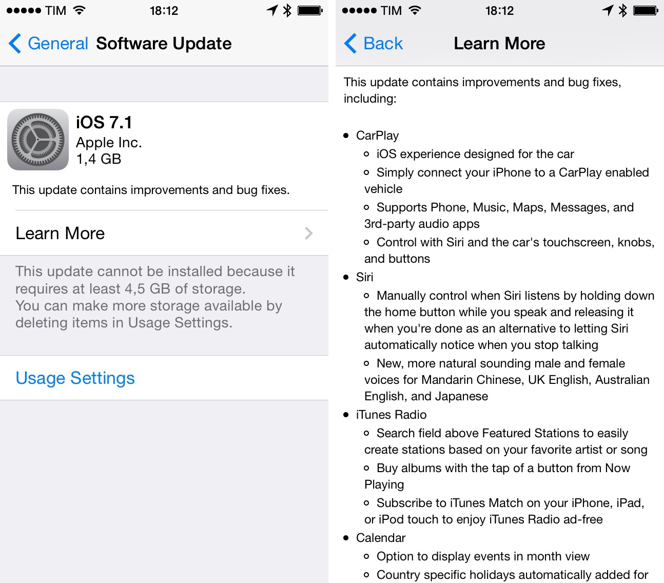
This week, Apple showed Beats Music among the list of initial partners for their CarPlay initiative. With Beats Music entering the crowded space of music streaming and radio services, an API may help the company gain traction among third-party developers quickly, enabling them to feature the service’s library and editorial aspects on a variety of devices and platforms. Just yesterday, music steaming service Spotify reported the acquisition of The Echo Nest, a music data company used by hundreds of online music services, including Rdio and MOG, which was acquired by Beats in 2012.