Posts in news

Shazam Launches Redesigned, Simplified iOS App

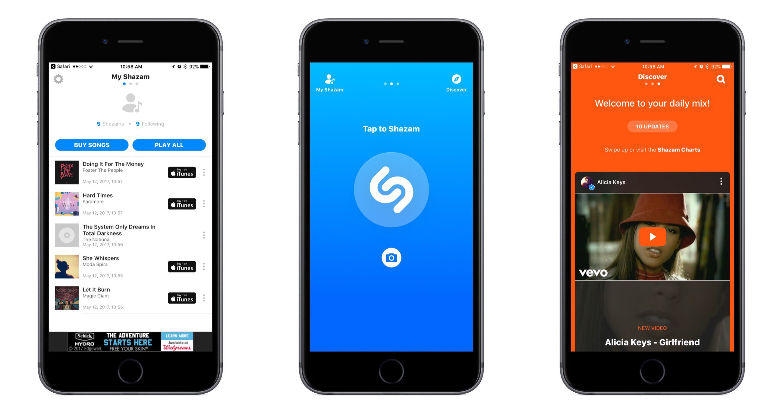
Shazam for iOS has introduced an update that makes app navigation more simple and streamlined. Gone are the traditional navigation tabs at the bottom of the screen; they have been replaced by a paginated layout where a swipe left or right is used to switch screens.

Launching Shazam lands you on the Home page, which is devoted almost entirely to the Shazam button. Tapping it will cause the app to start listening to what’s playing; one change to the Home page is that you now activate Auto Shazam with a long-press on the Shazam button. Auto Shazam allows the app to continue listening to what’s playing even after the app closes.

The top of the Home page indicates that there are three pages in total to navigate through. To the left of Home is My Shazam, to the right is Discover1, and swiping back and forth is the primary way to get where you want to go. This type of layout resembles that of apps like Snapchat, only Shazam pulls it off in a less confusing manner. Not only do you always see three navigation dots at the top of the screen to indicate your current place within the app, but the Home page also contains icons that show which pages are placed on the left and right – Snapchat could benefit from similar aids, for new users at least.

My Shazam hasn’t changed much from before, but in an effort to consolidate the total number of pages in the app, Discover now includes the contents formerly found in Trending as well. A Chart Update card is included with your daily mix, plus you’ll find a button at the top and bottom of your 10 daily updates that takes you straight to Trending.

I appreciate what Shazam has done to try simplifying its app, both in the number of pages to navigate through, and in adopting the swiping gesture to handle that navigation with ease. Not every app would benefit from such a streamlined interface, but it works well here.


  1. Unfortunately Discover has not yet made it to the iPad, so Trending stands in its place on that device. 

Apple Releases How-To Videos on iPhone 7 Photography

The iPhone 7 and 7 Plus include Apple’s most sophisticated cameras. Most of the time you see people out and about snapping quick shots that don’t necessarily take advantage of all the camera hardware and app have to offer. A series of 30-40 second videos released by Apple provide mini how-to tutorials on how to take iPhone 7 photography to the next level.

The videos are available on a new Apple website called ‘How to Shoot on iPhone 7’ and include videos on taking:

  • Portraits with the Portrait feature that’s exclusive to the iPhone 7 Plus;
  • Closeups using tap to focus and slide to adjust exposure;
  • Vertical panoramic photos;
  • Shots without using the flash;
  • Action photos with burst mode;
  • Selfies using the timer;
  • Photos framed with a unique angle;
  • Stills while filming video; and
  • Night time photos using street light.

Five of the videos are also on YouTube, and you can watch them after the break.

Read more


Snapchat Adds Magic Eraser, Emoji Brush, Limitless Snaps, and More

In an update released today, Snapchat has added a slew of new tools to enhance the creation and sharing of Snaps.

The Magic Eraser is a tool for removing unwanted objects from a picture. You can use it by tapping the scissors icon, then the stars icon. The tool works very much like the Repair Tool found in Pixelmator, the powerful photo editing app. Simply tap and drag on the part of the image you’d like to ‘erase,’ and after a couple seconds of work Snapchat will remove the object. When it works properly, what’s left in the absent object’s place will blend in nicely with the rest of the photo. As with all tools like this, the reliability can vary depending on the particular photo and object.

A second new tool is the Emoji Brush, which lets you draw with emoji on an image like you might draw with a standard colored brush. Tap the brush icon, then the heart emoji, to pull up the emoji picker. Currently only a select few emoji are available to choose from, including the heart, fire, star, flower, and a few others. If you tap and hold on the bottom of the emoji lineup, it will expand to temporarily reveal a variety of colored heart options.

Additional changes in the app include the new Loop tool, which lets you set a Snap to loop until your friend taps forward to the next Snap. This pairs nicely with the new option to remove a time limit from your Snap, so friends can view it as long as they’d like before moving on. Once the Snap is closed though, it will still delete as usual.


SQLPro Studio: A Cross DB Management Tool for macOS [Sponsor]

Do you work on a Mac, but need to interface with Enterprise Databases such as Oracle or Microsoft SQL server? Are you tired of firing up a Windows virtual machine just to run a query? Have you ever wished for a native Mac client? SQLPro Studio is the answer you’ve been looking for.

SQLPro Studio is a native Mac application that works with MSSQL server (both on premise and in Azure), Oracle, MySQL, PostreSQL and SQLite. The interface is fast and responsive, just like you’d expect from a native Mac app. It should go without saying, but SQLPro Studio can connect to databases hosted on Windows, Mac or Linux operating systems and supports either direct connection, or tunneling over SSH.

Write and execute queries in the tabbed query interface, SQLPro Studio supports all the features you’d expect: drag and drop fields from the SQL browser on the left to the SQL editor, auto complete SQL statements including table and field names, even reformat your SQL code to make it ‘pretty.’

You can easily export results as CSV, JSON or XML, and you can edit your results inline so long as you have a primary key on the table.

SQLPro Studio is your all in one solution for managing databases of all kinds, natively, from your Mac!

SQLPro Studio - macOS database management UI is available for $109.99, but MacStories readers can get 20% off by using the promo code MACSTORIES.

SQLPro Studio Studio is also available on the Mac App Store.


Apple Clarifies That Affiliate Program Changes Affect In-App Purchases Only

On April 24th, Apple sent an email to participants in the iTunes Affiliate Program that said:

Starting on May 1st 2017, commissions for all app and in-app content will be reduced from 7% to 2.5% globally. All other content types (music, movies, books, and TV) will remain at the current 7% commission rate in all markets. We will also continue to pay affiliate commissions on Apple Music memberships so there are many ways to earn commissions with the program.

The drastic cut in the rate on apps and In-App-Purchases and the short notice took participants in the program by surprise.

The May 1st deadline came and went seemingly without any change to the payout rate on apps. Apple has since posted a clarification to the iTunes Affiliate Resources website that says:

We’d like to clarify some changes being made to the Affiliate Program. Commissions for all iOS in-app purchases will be reduced from 7% to 2.5% globally, and all other content types (including music, movies, books, paid iOS apps and TV) will remain at the current 7%.

Anecdotal evidence since May 1st supports the clarification that the change to affiliate commissions affects In-App Purchases only. Links to apps and other content sold by Apple will continue to earn 7%, which is welcome news for websites and developers who rely on that revenue.


iTunes Connect’s App Analytics Adds Source and Referrer Data

Two years ago, Apple rolled out App Analytics on its iTunes Connect developer portal. Originally announced at WWDC in 2014, App Analytics gave developers a better understanding of how and when their apps were used, how many views their app’s page on the App Store received, and more. However, the original version of App Analytics did not report how customers got to the App Store.

Yesterday Apple announced an expansion to App Analytics that adds source and referral data. According to Apple’s developer news website:

App Analytics in iTunes Connect now provides insight on where customers discover your app, including App Store browsing and search, within other apps, or on the web. With key metrics based on source types, you can see your top referring apps and websites, making it easier to optimize your marketing campaigns.

Apple’s App Analytics page elaborates:

With App Analytics, you can see how many users discover your app while searching or browsing the App Store — including tapping on Search Ads for your app — to gain insight into how your marketing and metadata impact downloads.

App Analytics counts users who visit your app’s product page from a link within another app.

Blogs, websites, and other online sources that link to your app’s product page, are critical in driving user acquisition through word-of-mouth marketing and PR. With App Analytics, you can see which organic marketing channels drive the highest traffic, downloads, usage, and revenue for your app.

There is a lot of interesting new data for developers to digest in App Analytics that should help them market their apps more effectively. I particularly appreciate the ability to drill down into any source of App Store traffic to see how it has performed over time and from which countries those customers are coming.


Apple Q2 2017 Results: $52.9 Billion Revenue, 50.8 Million iPhones, 8.9 Million iPads Sold

Apple has just published its financial results for Q2 2017, which covered the period from January 1, 2017 through to April 1, 2017. The company posted revenue of $52.9 billion with a quarterly net profit of $11 billion. Apple sold 8.9 million iPads, 50.8 million iPhones, and 4.2 million Macs during the quarter.

“We are proud to report a strong March quarter, with revenue growth accelerating from the December quarter and continued robust demand for iPhone 7 Plus,” said Tim Cook, Apple’s CEO. “We’ve seen great customer response to both models of the new iPhone 7 (PRODUCT)RED Special Edition and we’re thrilled with the strong momentum of our Services business, with our highest revenue ever for a 13-week quarter. Looking ahead, we are excited to welcome attendees from around the world to our annual Worldwide Developers Conference next month in San Jose.”

Read more


Doo Adds Task Collaboration, Checklists in Version 2.0

When I wrote about Doo over a year ago, I called its methodology “daring and bold,” a sentiment expressed primarily due to its sparse interface and few features. Although I found its straightforwardness endearing, those looking for a more robust task manager were likely sent packing.

In version 2.0, though, Doo maintains its simplicity while growing into a more powerful productivity tool. The inclusion of task collaboration and checklists specifically makes the update a win, and the additions continue to be hits down the line: location reminders, morning and evening hours, and interface customization with font sizes.

The changes in Doo are well-integrated, too – while some apps might tack them on and make them seem out of place, Doo integrates them directly into the existing UI elements. Basically, you won’t have any problems finding or ignoring the new features, depending on what you’re looking to do.

Practically, using Doo’s new tools can make a big difference in your workflow. For example, a task in Doo can now be broader, with more intricate steps listed in the checklists. With Task collaboration, store trips or packing for vacation can now be a shared breeze.

Both Doo for iPhone and Mac received the update, so owners of each should make sure to update to see the latest the Ciarlo Software team has to offer. And if you haven’t picked up Doo yet, check out my review posted above and download the app for iPhone here ($3.99) and Mac here ($9.99).