This Week's Sponsor:

Listen Later

Listen to Articles as Podcasts


Posts tagged with "iOS 14"

One Week After Launch, Users Already Have Several Options for Alternative Browsers and Email Clients on iOS and iPadOS 14

iOS and iPadOS’s 14’s customization options don’t end at widgets. The OS updates also let users change their default email and browser apps for the first time. The feature is a little buggy in iOS and iPadOS 14.0, but I wanted to share how to set it up and explain what your current options are for anyone looking to switch away from the default Safari and Mail apps from Apple.

Switching is simple. The first step is to download a browser or email client that has been approved to serve as an alternative to Apple’s defaults. Developers must request permission to offer their apps as an alternative browser or email app, meeting certain requirements for each type of app. It’s an extra step in the app submission process, so not all browsers and email apps can be swapped in for Safari and Mail from the get-go. Still, less than a week after the public release of iOS and iPadOS 14, users have several options.

Microsoft Edge, Outlook, and Google Chrome are all default browser and email client options now.

Microsoft Edge, Outlook, and Google Chrome are all default browser and email client options now.

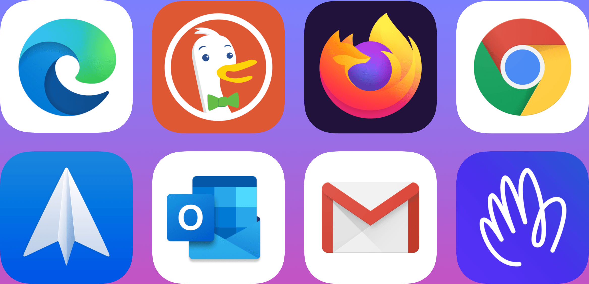
New alternatives are being released all the time, but so far, it’s possible to swap out Safari for:

Probably the most popular browser that hasn’t been approved as a Safari alternative yet is Brave, the privacy-focused browser, although The Verge reports that the feature is coming.

Email apps available include:

Between the two quartets of alternatives, a significant portion of the browser and email markets have been covered already.

Picking a new default browser or email client from the Settings app.

Picking a new default browser or email client from the Settings app.

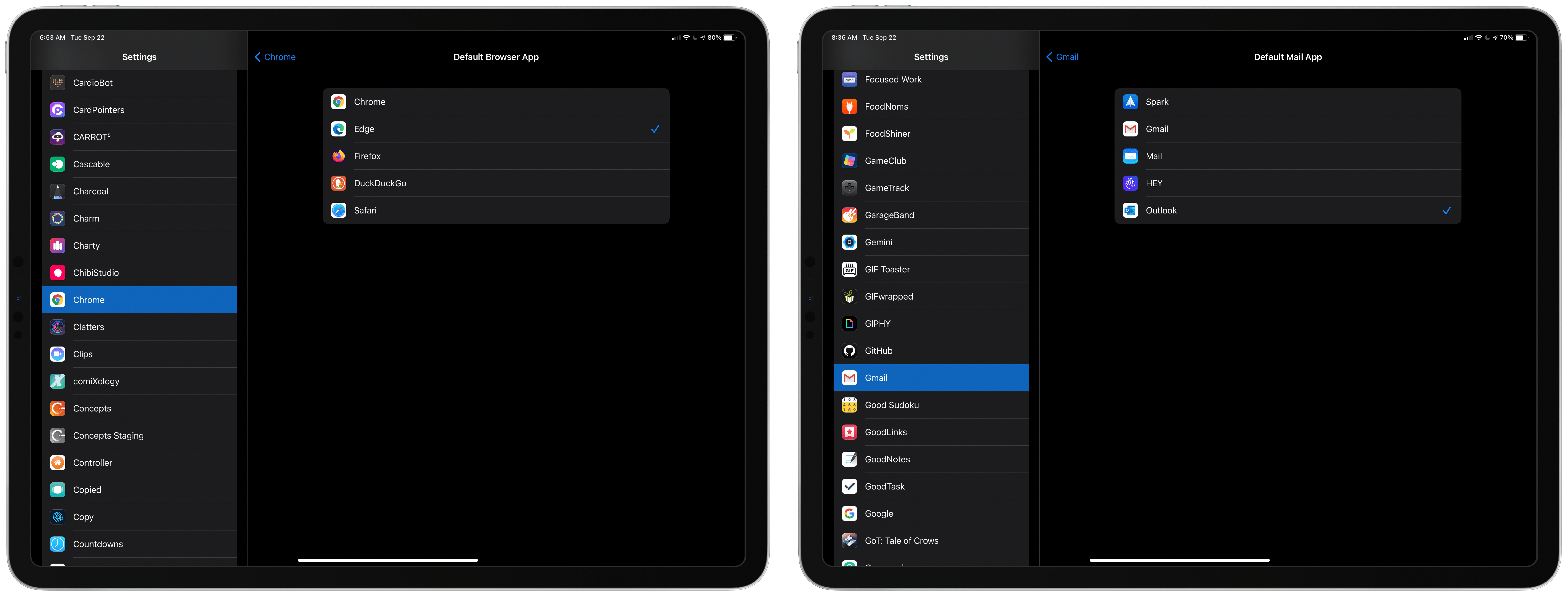
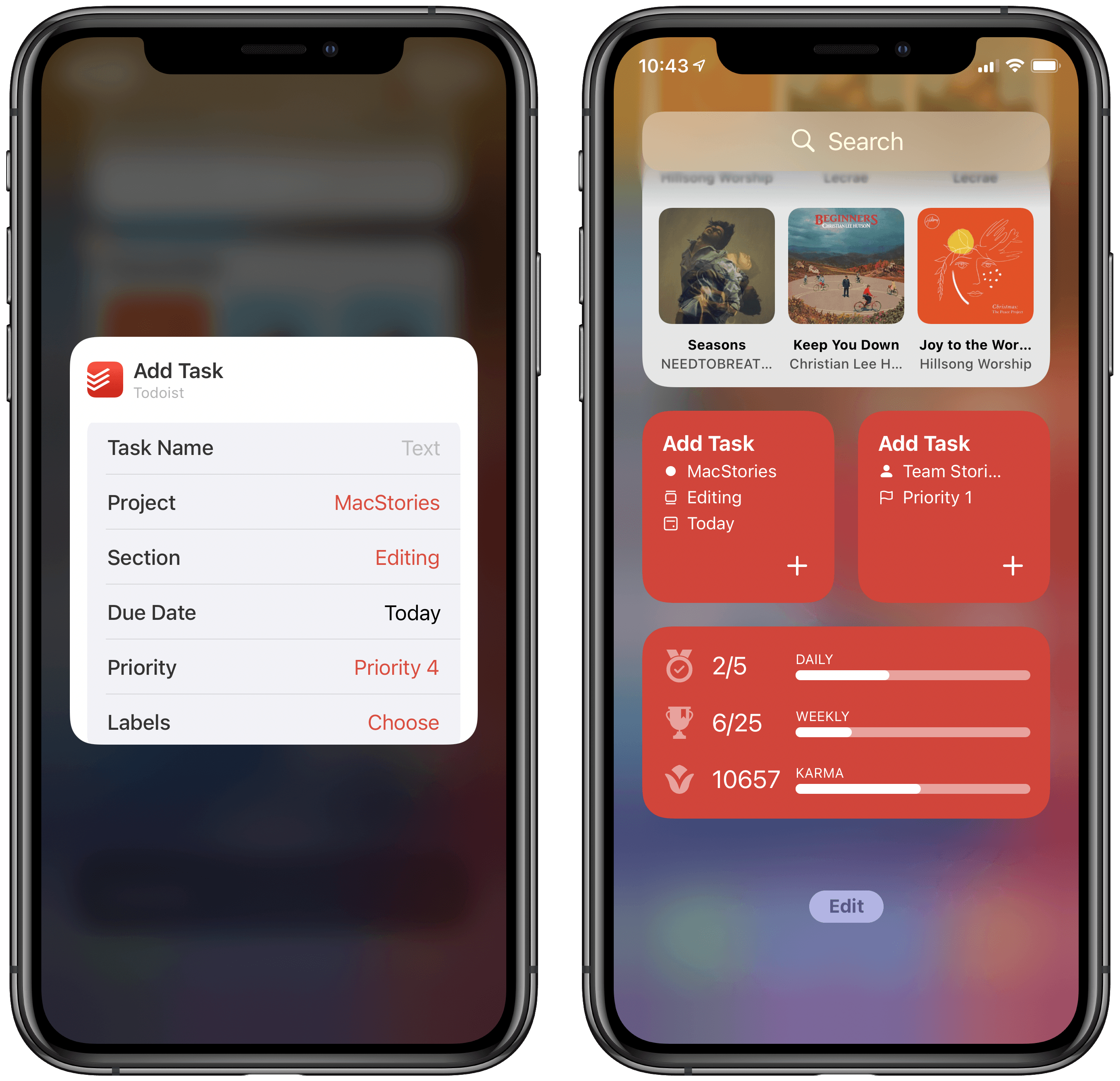
Getting back to the process of switching apps, once you’ve installed one of the approved alternatives, go to the Settings app on your iPhone or iPad. Scroll down to the entry for the app you’ve just downloaded, and tap it. There you’ll find a new entry for ‘Default Mail App’ or ‘Default Browser App,’ depending on which you’re changing. Tap it and pick the alternative you want to use, and that’s it.

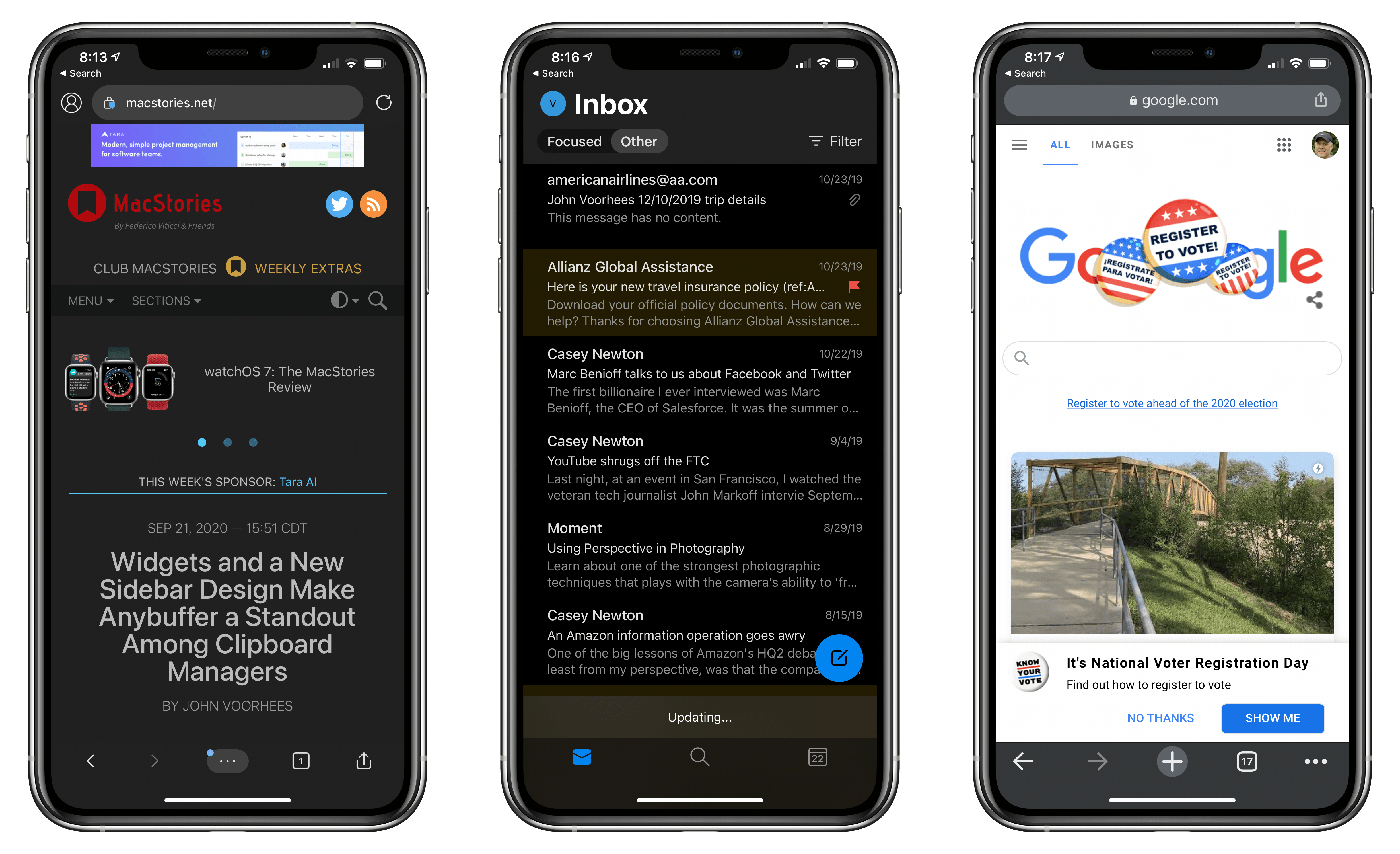
As easy as the process of switching is, though, the feature is not bug-free. I have been unable to get iOS or iPadOS to recognize my new default email client after I switch it. I’ve tried several apps and email links in multiple apps and on the web, but every time I tap one, the system Apple Mail-based compose sheet opens. Federico has had the same issue. I read somewhere that switching email apps only works if you change your browser first, but that didn’t work for me either. Perhaps MacStories readers will have better luck than I’ve had, but at the moment, I cannot change email clients.

9to5Mac also reported last week that if you restart your iPhone or iPad, any default browser or email changes you’ve made are lost. It’s not hard to reset your defaults, but it’s an annoying bug that I expect will be fixed in a later update to iOS and iPadOS 14.

Personally, I use both Safari and Mail and am happy with them, though I wish Mail would adopt some of the modern features of apps like Spark. Still, I’m glad users have been given greater choice when it comes to the default app experience.


Widgets and a New Sidebar Design Make Anybuffer a Standout Among Clipboard Managers

I use clipboard manager apps in a couple of different ways on my iPhone and iPad. The first way is as long-term storage. I stash documents, snippets of text, and URLs that I need to send to people over and over, which is easier than digging around in the Files app or Dropbox.

Second, I use clipboard managers as a short-term holding pen for all sorts of information. Sometimes I’m combining an image, some text, and a URL from different apps. Other times, I find something I want to send to someone later, and I don’t want to lose track of it. Lately, I’ve been using Anybuffer for both situations. The app has been great, but with the latest version that supports widgets and the new iPad sidebar design, Anybuffer has taken a significant leap forward.

Read more


Creating Your Own Widgets: A New Category of Apps Emerges

This summer, when Apple detailed iOS 14 and the Home screen changes it would bring, the company highlighted personalization as one of the key features of the new widget-populated Home screen. Rather than just containing an assortment of apps, iOS 14 Home screens can feature the information that matters most to you. Whether that’s your Activity rings so you can stay on top of your health, the current weather forecast, your task list, a memory from the Photos app – there are an abundance of options for personalizing your Home screens now.

I’ve tried a ton of Home screen widgets from third parties over the summer, and developers are doing lots of creative things with their apps’ widgets. One of the most exciting trends I’ve seen is the emergence of a new category of apps entirely centered around widgets. While most widgets will come built in to the apps you already know and love, some developers have built brand new apps for the sole purpose of enabling users to create and customize widgets in a hyper-personalized way. The best widgets I’ve tried offer configuration settings so you can tailor them to your exact needs, and these new apps take that idea even further, offering widget creation tools relating to a variety of traditional app categories – like weather, photos, health and fitness, productivity, and more – but in a single centralized app.

Leading the pack in this regard is Widgetsmith from David Smith, which not only covers one of the widest array of different widget types, but also features a power user-friendly scheduling option that sets it apart. The App Store hosts a growing number of other widget creation tools too, such as Widgeridoo, Widget Wizard, Glimpse, and Health Auto Export.

Because each app specializes in providing its own custom set of options, there’s no limit to the number of apps worth trying. Widget needs can be highly personalized, so it’s no surprise that the apps designed for creating widgets all offer their own takes too.

Get ready to upgrade your Home screens.

Read more


Soor Offers Beautiful, Customizable Widgets for Apple Music

The formula is tried and true: Apple makes quality software that nonetheless leaves a lot of room for third-party developers to build something more powerful and better tailored for specific needs. In iOS 14, the built-in Music widget is a great example of this. I really like Music’s widget, which shows your recently played albums and playlists so you can quickly get some music going; it offers valuable utility. But if I’m frank, there’s a whole lot more that could have been done with widgets for Music.

That’s where Soor comes in. The third-party client for Apple Music that I recently covered offers not one, not two, but three different widgets to satisfy your music needs. And within those three widgets there’s a lot of customization to help account for a wide assortment of user preferences and desires. Every widget is powerful and also just as beautiful as what Apple’s team built, matching the full Soor app’s identity as a whole.

Read more


Wikipedia’s Widgets Bring Daily Updates to Your iOS 14 Home Screen

My iPad and iPhone are both important devices in my life, but they serve different roles for me. I use the iPad Pro as a work machine, while my iPhone is set up more for recreation and on-the-go uses. As a result, my approach with widgets has largely differed on each device. One widget I happily keep installed on both, however, is Apple’s Photos widget. I love the surprise and delight element of having the widget update automatically throughout the day, displaying photos I wouldn’t have seen otherwise.

This sort of passive, but welcome information delivery is at the heart of three separate widgets included in the latest Wikipedia app update:

  • Picture of the day
  • On this day
  • Top read

The purpose of each widget is pretty self-explanatory: one shows a different beautiful photo each day, another tells you about something that happened on this day in the past, and another shows today’s popular Wikipedia pages.

Widgets that surface data from one of the largest public information hubs in the world seems like a no-brainer use case, and the Wikipedia app has done a great job here.

Each widget is available in small, medium, and large sizes, showing more or less information as they’re able. I find the small size a great choice for the picture of the day, though the large is nice too because it includes a caption to accompany the photo. With ‘On this day’ and ‘Top read’ the medium size strikes a great balance of providing just the right amount of information. And if you ever want to learn more, you can always tap on the widget to jump straight to the content you’re interested in.

Widgets have so many different use cases, but this delivery of information I’d never otherwise see is one of my favorites. Wikipedia is a perfect example of how to do it right, and I’m eager to continue exploring this concept as I build out my ideal iOS and iPadOS 14 Home screens.


Things Introduces New Widgets and Scribble for Task Creation on iPad

I’ve used Things off and on as my primary task manager for as long as I’ve used Apple devices, which is just over a decade now. During that time the app has been remarkably consistent at supporting new OS features as soon as Apple launches them, and this year is no exception. In its latest update, Things has added new widgets for iOS and iPadOS 14 as well as a unique implementation of Scribble for creating new tasks. Apple Watch users will find a couple useful new complication options too.

On the surface, the update may seem simple and straightforward: new widgets, Scribble support, and new complications. But as the team at Cultured Code has done time and time again, their implementation of new OS technologies is thoughtful and even innovative, especially on iPad.

Read more


Todoist’s iOS 14 Widgets Make Managing and Creating Tasks Easier than Ever

Todoist’s three new widget types.

Todoist’s three new widget types.

Even before iOS and iPadOS 14 brought a new form and function to widgets on Apple platforms, one of the tried and true widget use cases in previous years was task lists. Some of my most used widgets over the years have been those provided by my task manager, so I was excited to see the slate of new widgets Todoist has introduced in its latest update for iPhone and iPad.

Before detailing the new widgets, though, it’s important to state up front that for all the advantages of iOS 14’s new widgets, they bring a regression that negatively impacts task managers especially: widgets can no longer be fully interactive. In the iOS 13 widget for Todoist, you could check off tasks as you completed them without needing to open the full app. With the app’s new widgets that’s no longer possible, because the only interactions Apple currently allows in widgets is launchers into different parts of an app. The good news is that apps are allowed to offer both iOS 13 and iOS 14 widgets to users, so on iOS 14 Todoist users will find both options available. If you really need the old functionality it’s still available to you, there’s just no way to add a legacy widget to the Home screen.

That bad news out of the way, let me focus on how Todoist’s team has made the most of the new widget system in a couple key ways.

Let’s start with its basic Tasks widget. In iOS 14 you can configure a list of your tasks to appear in either a small, medium, or large widget. Each widget can be set to show tasks from your Today or Upcoming lists, or one of your projects, labels, or filters. Despite being unable to check off tasks from the widget, there are two advantages over Todoist’s previous widget: information density and the ability to create multiple widgets. Since Todoist’s developers no longer need to create large touch targets for users to check off tasks, the widget is able to display a bit more information than before. And you can now create separate widgets tied to separate lists of tasks, even stacking them if you’d like, offering a lot more flexibility than before.

Besides widgets for lists of tasks, Todoist offers two other widget types: Productivity and Add Task. The former displays stats relating to your task completion goals for the day and week, along with your karma score. I’ve never been big on tracking the number of tasks I complete in a given day, but the Productivity widget’s nice to have for users who care about those numbers. The Add Task widget, however, is exactly what I would want from every task manager.

Configuring Todoist’s Add Task widget.

Configuring Todoist’s Add Task widget.

Both the medium and large Tasks widgets already offer a button to quickly create a new task inside Todoist, but the dedicated Add Task widget is special because it can be customized to create tasks that have their metadata pre-filled. You can set which project and section the newly created task will have, its due date, priority, labels, and even the task name if there’s a specific task you commonly create. Once it’s set up for your preferences, the Add Task widget eliminates the monotony of filling in metadata over and over again for every new task. If you commonly create tasks assigned to a certain project and with a certain due date, the widget is now the quickest way to do that.

Add Task is only available as a small widget and as a result it can only have a single group of pre-sets for creating a single type of task, but that makes it a perfect candidate for stacking. Using a few different Add Task widgets for different types of common tasks you create and having them stacked will still provide a faster task creation method than having to enter the metadata over and over with every new task.


Todoist already offered the fastest task creation of any task manager I’ve used thanks to its natural language input system, but now with the Add Task widget it provides an even faster method. Todoist’s developers have clearly spent time considering the needs of their users and have built a suite of widgets that meet those needs well. The OS restriction against full interaction will hopefully be removed in the future, but even if it never is, Todoist has delivered value with its new widgets that more than makes up for what it lost.

Todoist is available on the App Store.