Safari
Few apps are more important to the macOS experience than Safari. Whether it’s for work or leisure, an enormous part of your computing day is probably spent within the confines of a browser window with multiple tabs open. As a result, design changes to Safari are high-stakes gambles that should be approached with caution and should only be implemented where they serve a clearly defined goal that meaningfully improves the browsing experience for users.
Apple took a big risk with the Safari design that was introduced at WWDC, and it fell flat. I spent most of the summer working with that design, and it never grew on me, and I never got used to it.
To Apple’s credit, it listened to the feedback and corrected course, fixing the most egregious issues with Safari’s tab design. The compact tab design that combines Safari’s toolbar and address bar with its tabs in a unified interface was made optional early in the beta period. Then, very late in beta cycle, Apple reverted rolled back the remainder of its tab design changes and made tinting the chrome of Safari’s toolbar an option only if you use compact tabs. It’s been quite a journey that has largely wound up back where we started, but the summertime drama over Safari’s shifting design shouldn’t overshadow the fact that the browser also includes excellent new features like tab groups and Quick Note integration that have worked their way into my day-to-day web browsing workflow.
Tabs
At WWDC, Apple announced sweeping design changes to Safari across the iPhone, iPad, and Mac. The reaction was swift and negative, especially with the way the address bar was initially handled on iOS.
On the Mac (and iPad), Apple took a different tack. The address bar and tabs weren’t moved to the bottom of Safari’s window. Instead, the address bar was merged into the active tab, and the tab bar’s chrome changed with the tint color of the website open in each tab.
For most of the Monterey beta tab bar colorizing is turned on by default. I lived with it turned on for a couple of months, and with a single site with a rich color palette open, the effect can look beautiful. In practice, though, the feature is a distraction. One moment the tab bar might be the familiar dark gray of macOS’s dark mode, but switch tabs, and suddenly everything is bright red. If you work with a lot of tabs, you want the tab bar to be consistent. Changing colors from tab to tab makes it harder to locate extensions and other toolbar buttons, so in the end, I turned the feature off and never looked back.
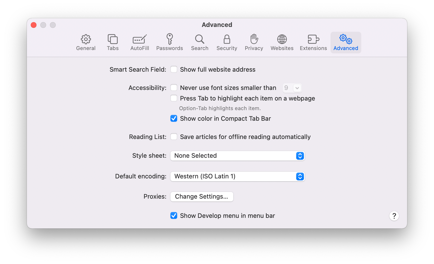
Colorizing the tab bar to match the site you visit is only available in compact mode and can be turned on in Safari’s Advanced Preferences tab.
In the shipping version of Monterey, tab bar colorization is still available but the option has been further de-emphasized. Now, the option to turn colorize tabs is only visible in Safari’s Preferences after you turn on its streamlined tab bar mode.
The the Compact tab layout, what Apple sometimes refers to as the streamlined tab bar, combines Safari’s address bar and toolbar with the active tab. The Compact layout was the default in the early Monterey betas, but that has changed. Now, the Compact tab layout is turned off by default. I don’t recommend using the Compact tab layout, but if you want to see what it’s like, head to the Tabs section of Safari’s Preferences and select ‘Compact’ under ‘Tab layout.’
If you switch to the streamlined tab bar, you’ll see the address bar and the buttons on either side of it disappear. The address bar is moved to the active tab, which makes it wider than any other tabs you have open. Most of the toolbar buttons for Safari features and third-party extensions you’ve installed move to the left and right sides of your row of tabs, but some of those buttons, like the Share button, move behind a new ‘more’ button that appears on the right side of the active tab’s address bar.
The streamlined tab layout undeniably increases the vertical space visible in a Safari tab. The trouble is that the gains aren’t worth the cost of cramming so much into a single horizontal strip of UI. It’s simply a bad trade. Look at the difference between the screenshots above. This example wasn’t cherry-picked to emphasize my point. I easily could come up with a more egregious example.
I have five tabs open in the screenshots above. In the ‘separate tab’ layout, the tabs span the window, I can see the URL of the active tab and the site names and most of the page titles for the other tabs are visible. When I switch to the Compact layout, I can still tell I’m on MacStories, but the tabs are crammed in the center of the window eliminating most of the detail about my other tabs to make room for toolbar buttons and the address bar.
Safari saw a lot of design drama this summer. The app was harder to use than before, and it was distressing to see an app on which I rely so heavily take such an abrupt turn for the worse. That, however, is water under the bridge. What’s important is that Apple listened to its users and, in the end, I think Safari’s design experiments landed in the right place.
Tab Groups
The changes to Safari this year aren’t strictly about its design. There are some excellent new tools available with Monterey, my favorite of which is tab groups.
When tab groups were explained onstage at WWDC, I was left scratching my head. At first, tab groups struck me as bookmarks masquerading as something new and different. In fact, the difference is real and the sort of thing that is a fantastic addition for anyone whose browser use spans multiple projects and tasks over time. That’s because tab groups let you park sets of tabs in a safe, synchronized spot any time your browsing gets interrupted.
There are all sorts of scenarios where I’ve found tab groups to be useful, but first, let’s examine how they differ from bookmarks because it makes a difference in how they are used. A saved bookmark takes you to the same URL every time. Bookmark macstories.net, and every time you click on the bookmark, you’ll wind up on MacStories’ homepage.
You could add the MacStories homepage to a tab group, too, but the experience is a little different. That’s because a tab group is more like a saved browsing session than a link to a specific webpage. If MacStories is in one of your tab groups when you open it, but you navigate from it to another site like 512 Pixels, the next time you open the Tab Group, one of the tabs will be for 512 Pixels, not MacStories where you started.
If you want to open a set of saved websites and always be taken to the same sites, you can use folders of bookmarks. For example, let’s say you send out invoices for your business once a week, and to do that, you always start with three tabs: your bank, your invoicing service, and a Gmail tab for emailing customers. That’s the perfect scenario for a folder of bookmarks that will take you to those same three sites every time you need to send out invoices.
To extend that scenario further, though, say you had ten invoices to send out, but before you could get all of them out, you’re interrupted by something else that required you to open a bunch of different tabs. This is where tab groups shine. You could leave your invoicing tabs open and then open more tabs for the new task, but depending on how long it takes you to get back to the invoicing, those tabs can quickly get lost among the tabs for the new task you started, plus any other tabs you open in the meantime.
With tab groups, you can take the invoicing tabs from my example and create a tab group, saving their state the way you left them when you picked up a new task. Better yet, the tabs in your invoicing tab group would be synced across your devices, so you can pick the task back up later no matter what device you’re on.
I’ve been doing some ongoing research about AppleScript, which is perfect for a tab group because I can continue whenever I have time on any device.
I’m a big fan of tab groups. The interrupted task scenario is just one example of where they come in handy. I’ve also found tab groups to work well as a very lightweight ‘read later’ service where I can temporarily park articles I find throughout the day for reading on my iPad mini in the evening when I have the time to read.
Tab groups are also excellent for long-term research that I don’t finish in one sitting, whether that’s for a family trip or research for a longer-term work project. I’ve still got tab groups that I saved at the beginning of the summer that I continue to periodically revisit on a variety of devices. One thing I’d like to see added in the future on all platforms is the ability to create tab groups, add to them, delete them, and retrieve the links saved in them using Shortcuts.
It’s also worth mentioning that you can quickly switch to a tab group without opening Safari’s sidebar. Click on the caret next to the tab group icon in Safari’s toolbar for a drop-down list of all of your tab groups. Pick one, and you’ll be immediately switched to those tabs. You can also share the links in a tab group by right-clicking on it to copy the links or dragging them into a text field. What you’ll get is a list with the name of the tab group and the links below it.
The Rest of Safari’s Sidebar
Tab groups reside in Safari’s redesigned sidebar alongside Bookmarks, Reading List, and Shared with You links. The close relationship between tab groups and bookmarks makes them an obvious, complementary pairing in the sidebar. The same goes for Reading List, although I wish Apple had taken the opportunity this year to refine Reading List too. The feature has barely been touched in years and is in desperate need of an organizational framework like folders or tags for it to be useful to anyone who saves lots of articles to read later.
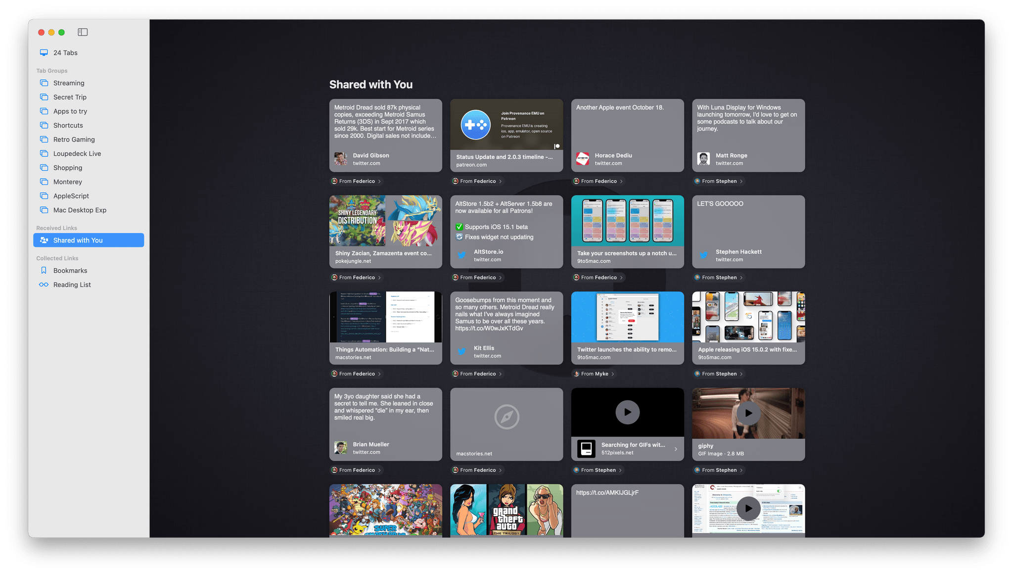
I’ll cover Shared with You when I get to Messages, but these are a collection of links shared with you in the Messages app, which are sometimes duplicated in Apple News, if they’re available there, and can be added to your custom Safari start page too. I haven’t found Shared with You to be very useful, and I wish Apple would provide a setting in Preferences to hide that section of the side bar and the others that I don’t use, similar to the way I can hide content sections of Music’s sidebar.
Safari and Quick Note
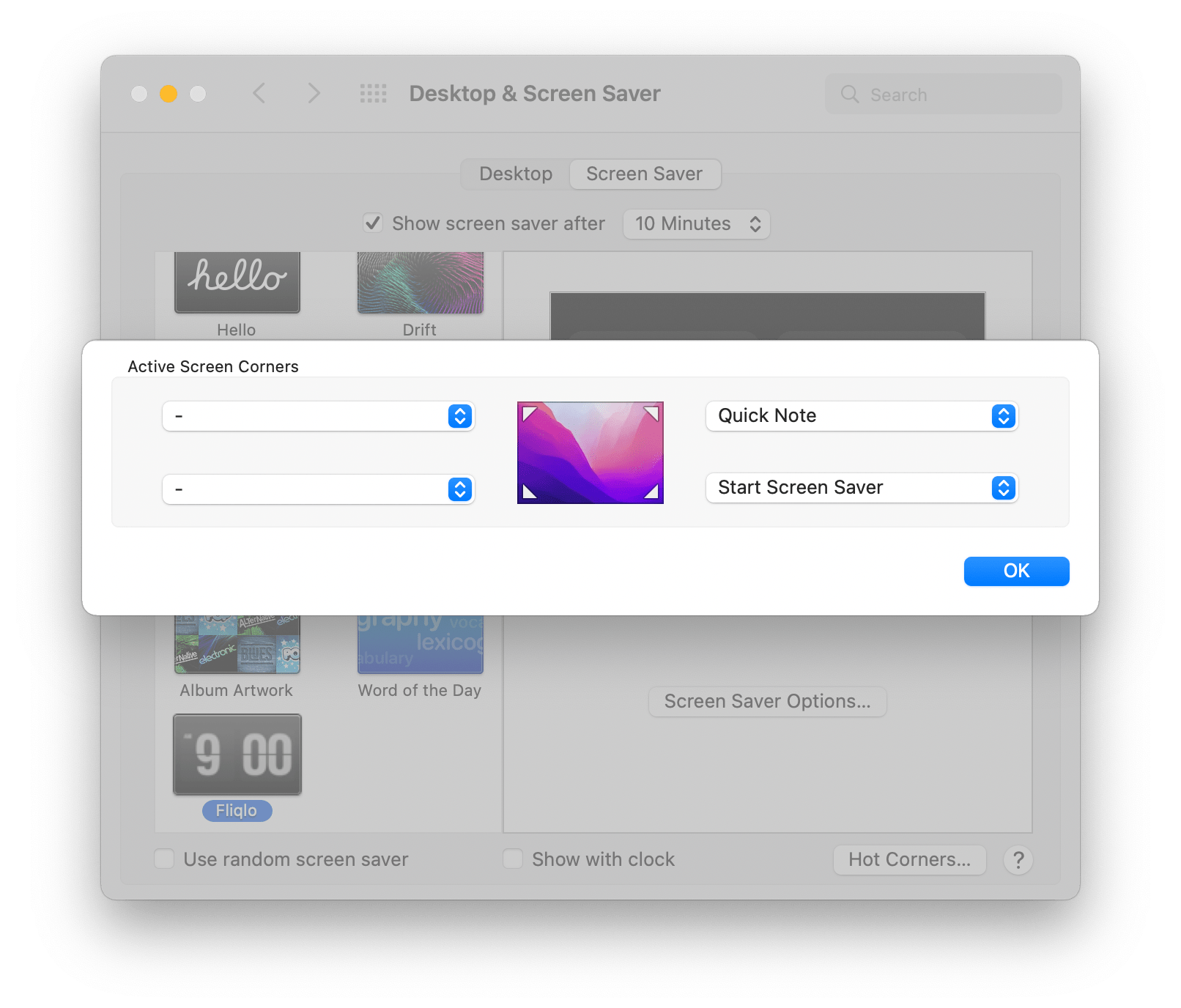
Quick Note is a new feature of the Notes app that includes a special integration with Safari. The feature can be opened on the Mac with the Globe or Fn key + Q keyboard shortcut, which can be changed by visiting the Shortcuts for Mission Control section of the Keyboard System Preferences pane. Quick Note can also be tied to any of the four Hot Corners in the Desktop & Screen Saver System Preferences pane.
If you’ve read Federico’s iOS and iPadOS 15 review or my story on the feature from over the summer, you already have a sense of what Quick Note can do. On the iPad, Quick Note’s separate hovering window marks a significant new direction for iPadOS.
On the Mac, the experience is a little different. By and large, I prefer the iPad experience because you can swipe between your collection of quick notes adding to whichever is relevant to what you’re doing. In contrast, the Mac opens either the last note you worked on or a new one depending on the setting you picked. By default, Quick Note picks up where you left off with your last note.
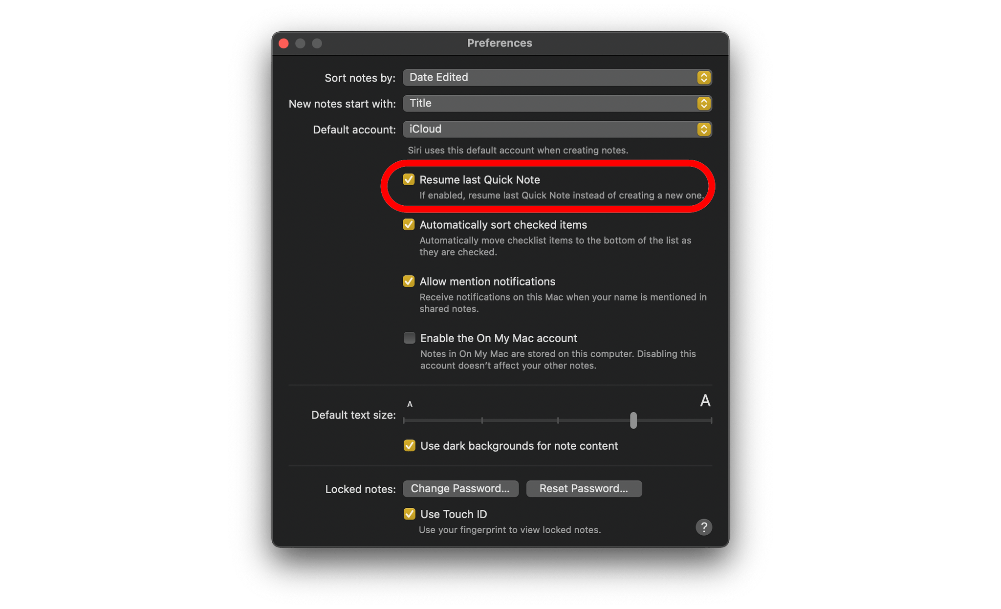
Whether you start a new Quick Note or pick up where you left off can be selected in Notes’ preferences.
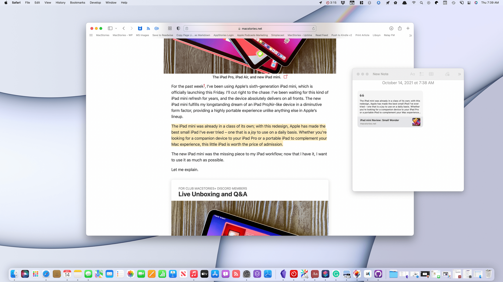
A big part of Quick Note’s utility on the iPad is the novelty of having a floating window available to take notes without having to dedicate a Split View or Slide Over space to Notes. On the Mac, which has always been a windowed environment, having a separate Quick Note window is inherently less useful, but the feature is still powerful because of its deep linking support, which is why I raise this feature in the context of Safari. If you’re browsing in Safari, you can select page elements, including text and images, and highlight them by right-clicking and picking Add to Quick Note.
The highlighting is persistent, meaning it remains visible between visits to the site you’ve highlighted. Return to the page you’ve highlighted, and a thumbnail of your Quick Note appears in the corner of the screen that you can use to reopen the note. You can also reopen the note by clicking on your highlights. The power of bi-directional linking of this sort pushes the combination of Notes and Safari far up the research tool ladder for a lot of users, myself included.
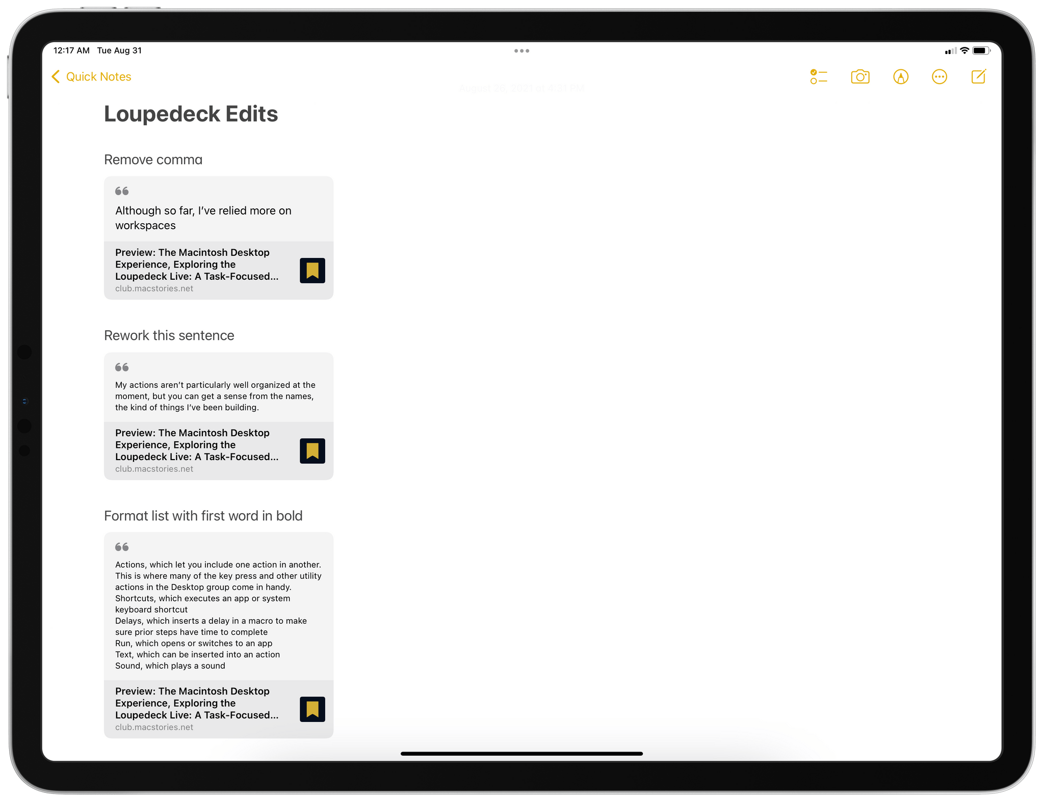
Another unique use case for Quick Note that Federico discovered over the summer is for collaborative editing. If I save a draft article to our WordPress or Calliope systems, Federico can review it in Safari as an admin user. Despite the fact that the draft article is unpublished behind a login, he can highlight excerpts, dropping them into a note with Quick Note and adding some explanatory notes alongside each excerpt. When he’s finished, he can share that note with me, and I can review it alongside the draft article to make any changes, all behind our admin logins.
The same process that Federico used on iPadOS to mark up my articles using Quick Note, I used when editing his iOS and iPadOS 15 review. Whether I was on my iPad Pro or Mac didn’t matter; both worked equally well whether I was doing the editing or receiving Federico’s edits of my work. When we finish with a story, and it has been published, we simply delete the shared quick notes.
I’d like to see the same sort of tight highlighting and Quick Note integration added to more apps, including Books and Preview. Really, any text-based document app where highlighting is useful is a good candidate for Quick Note integration.
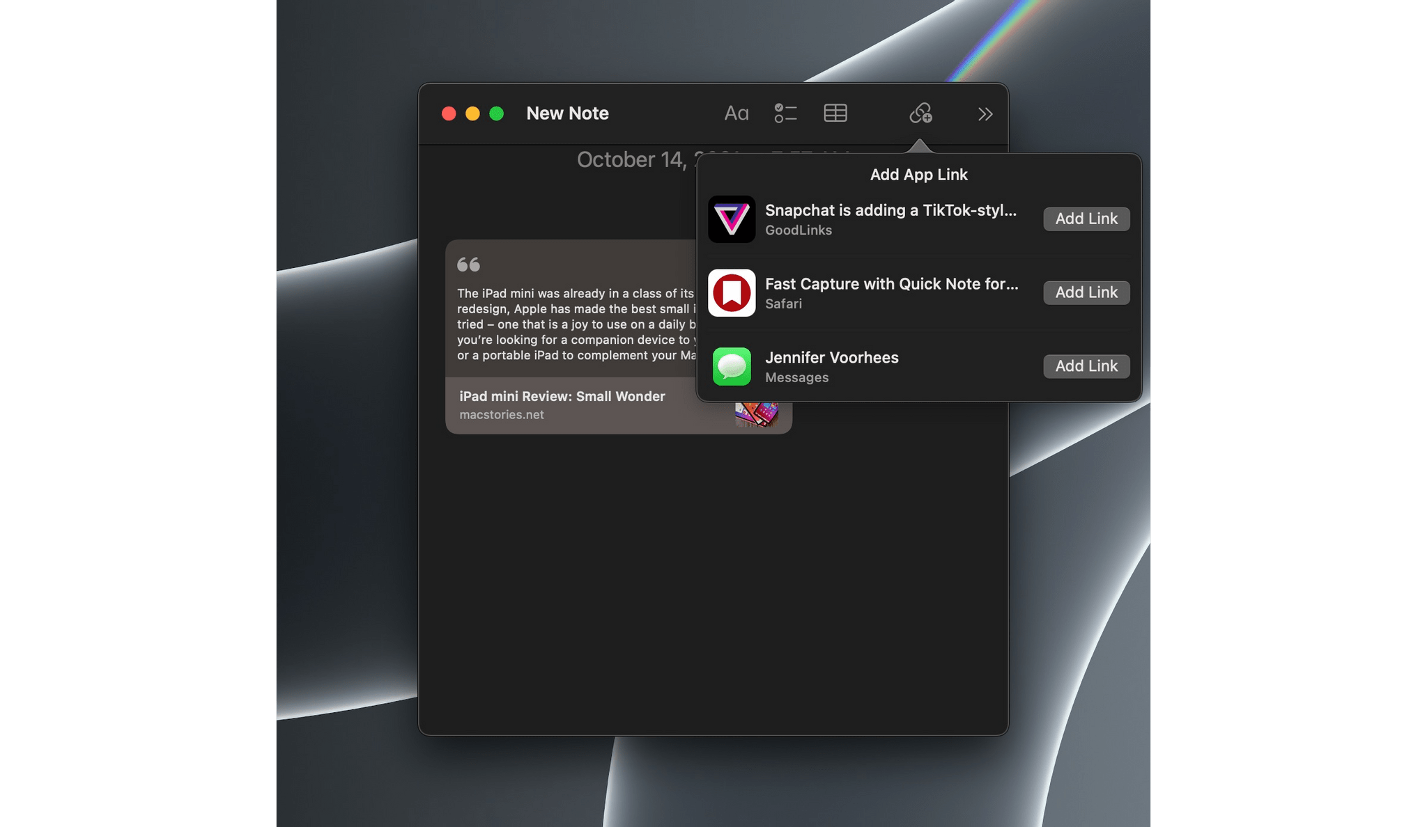
In addition to highlighting support in Safari, Quick Note can link to any app that takes advantage of NSUserActivity, adding deep links to content in those apps that reopens them when the Quick Note link is clicked. A lot of my favorite apps that have come to the Mac from iOS or iPadOS already support Quick Note, so I expect you’ll find linking suggested when you invoke Quick Note while using your favorite apps too.