
As apps updated for iOS 11 begin to trickle out onto the App Store, it’s fitting that the first of what will be many reviews on MacStories in the coming days features ARKit, which from all indications is a big hit with developers. Even more fitting though, is that the app reviewed is PCalc by James Thomson. PCalc is an excellent calculator app that was one of Federico’s ‘Must Have’ apps of 2016. It’s available on iOS devices, the Apple Watch, and even the Apple TV. Still, you wouldn’t expect it to incorporate 3D animation or augmented reality, but that is exactly what the latest version of PCalc has tucked away in its settings.
PCalc’s Delightfully Insane About Screen
Club MacStories Turns Two
I was a Club MacStories member before I joined the MacStories team as a writer, and it’s been fun to watch the Club grow and then become part of building it. The first issue of MacStories Weekly that I worked on was Issue 20 in February of last year. I was amazed that Federico and Graham Spencer had almost single-handedly produced those first nineteen issues of Weekly, several issues of the Monthly Log, and fifty issues of MacStories Weekly Classic. It’s a lot of work, but it’s also a labor of love – if it weren’t, we couldn’t do it. We produce the newsletter and other content for the Club because we love apps, the people who make them, and sharing them with our readers.
We’re fortunate at MacStories to have some of the very best readers around. Without you, MacStories wouldn’t be possible. Club MacStories gives us an outlet to share even more about apps than we could otherwise.
We’re also lucky to have the best team of writers around. In the past year, although Graham left the team, we added Ryan Christoffel, Jake Underwood, and Stephen Hackett to the newsletter as regular contributors, which has kept the MacStories Weekly and Monthly Log fresh and relevant to a broader audience.
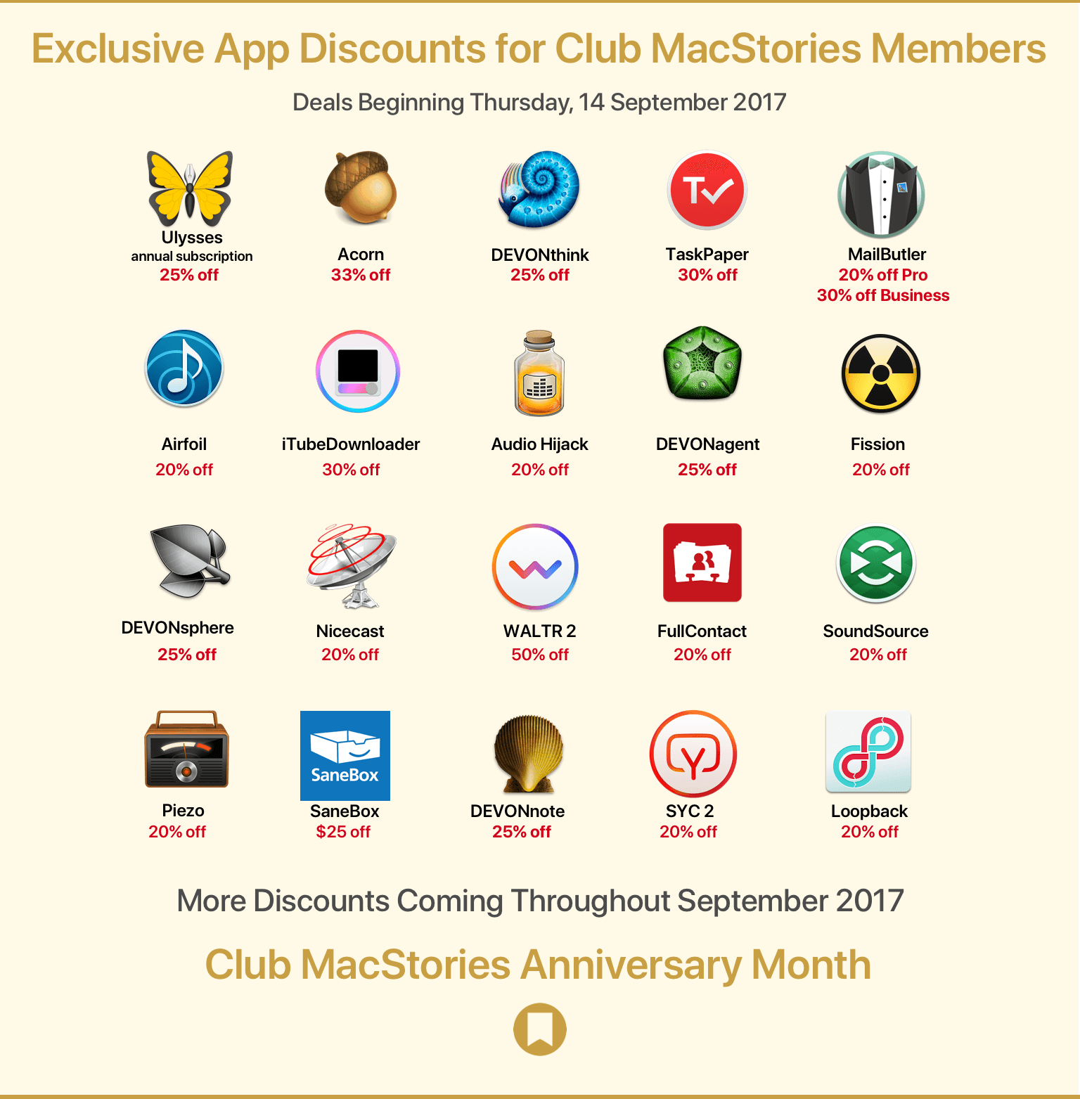
Last year at this time, we celebrated Club MacStories’ first anniversary. After producing another 60 newsletters for a total of 120 since the Club’s inception, we wanted to do something special for members. When we asked our friends in the developer community to help us celebrate by offering special deals to Club MacStories members, the response was immediate and overwhelming, for which we’re very grateful.
We’ve assembled a great list of discounts this year that we’ll announce in two waves. The first wave, launching today, includes:
- Ulysses - 25% off an annual subscription;
- Acorn - 33% off;
- Softorino YouTube Converter 2 - 20% off;
- Softorino WALTR 2 - 50% off;
- Rogue Amoeba - 20% off all apps;
- DEVONtechnologies - 25% off all apps;
- MailButler Professional - 20% off;
- MailButler Business - 30% off;
- FullContact - 20% off premium subscription;
- TaskPaper - 30% off;
- SaneBox - $25 off; and
- iTubeDownloader - 30% off.
As Club members, you can access these deals from a special webpage that we’ve set up just for you. The second wave of discounts will be announced next Thursday (September 21), and there will be additional surprises and deals announced in the next three issues of MacStories Weekly as well.
But there’s even more coming during Club MacStories anniversary month, including a free edition of the eBook version of Federico’s iOS 11 review, the ‘Making Of’ his iOS 11 review, and other special surprises. So be sure to keep an eye out for them beginning next week.
Thanks again to our Club members. We appreciate the hard-earned money you spend to be part of our growing community, and we enjoy making the newsletters for you every week. If you’re an annual member and your subscription is expiring, we hope you’ll join us for year three. We’ve got big plans for the Club and would love for you to be part of them.
Trello Launches Mac App with Custom Keyboard Shortcuts, Native Notifications, and More→

Today Trello introduced a new dedicated Mac app that includes features built for power users, such as customizable keyboard shortcuts, desktop notifications, and more.
Any serious productivity app on the Mac needs to include keyboard shortcuts, and the team at Trello clearly knows that. There are shortcuts for all the expected things like adding a new card, navigating between boards, and more. Where Trello impresses is that you can customize these shortcuts to your liking, making them easier to remember. One unique shortcut allows you to set a specific board to automatically open every time you start the app, saving an extra click.
Since it’s a native app, Trello includes native macOS notifications now, an improvement over the sometimes-janky Safari-powered notifications. It also enables opening boards in separate windows. Lastly, the app supports the Touch Bar for MacBook Pro owners.
Trello is available for download from the Mac App Store.
September 12 Roundup: All the Little Things

Yesterday’s keynote event at the Steve Jobs Theater featured the debut of several major new products, but there were a lot of small details revealed outside the keynote as journalists got their hands on the new devices. Below is a roundup of some of the most interesting extra details from the day.
AppStories, Episode 22 – Apps With a Human Touch→
On this week’s episode of AppStories, we discuss what’s left now that Federico is finished writing the text of his iOS 11 review, preview some of the upcoming coverage on MacStories and the upcoming second anniversary of Club MacStories, and consider the importance of little human touches that make apps by indie developers a delight to use.
Sponsored by:
- Omni - Celebrating 25 years of human-centered productivity!
- Twist - Our mission is to make team communication calmer, more organized, and more productive.
AppStories Episode 22 - Apps with a Human Touch
0:00
43:56
43:56


iPhone 8 and iPhone X: The MacStories Overview

This morning Tim Cook took the stage for the first time at the brand new Steve Jobs Theater within Apple Park. Following a touching tribute to Steve Jobs himself and a slew of other announcements, Cook introduced the products that everyone was waiting for: this year’s new iPhones.
Apple’s 2017 iPhone lineup has a big twist over past offerings. Rather than just releasing two models of differing size and very similar specifications, the Cupertino company has announced three new models. The iPhone 8 and iPhone 8 Plus are a fairly standard yearly update, including processor, camera, design, and display improvements, as well as a few unique and interesting new perks. Unveiled alongside these, however, is the big new thing: the iPhone X.
Apple is calling the iPhone X1 the future of smartphones, and it certainly does look futuristic. There are some huge changes in this new device for both hardware and software, but before we get there let’s review the updates to the also-brand-new iPhone 8 models. I know the iPhone X is getting most of the attention, but we shouldn’t overlook that Apple has some excellent updates to its other models as well. If the iPhone X weren’t shipping this year, Apple would still have a strong lineup of smartphones for 2017.
iTunes Removes the App Store and More to Focus on Music, Movies, TV Shows, Podcasts, and Audiobooks
Apple has updated iTunes on macOS to eliminate ringtones, iTunes U, and perhaps most surprising of all, iOS apps. According to Apple’s support page:
Apps for iPhone, iPad, and iPod touch are now exclusively available in the new App Store for iOS.
iTunes 12.7 now includes music, movies, TV Shows, Podcasts, and Audiobooks only. Apple’s support page links to instructions on how to download each type of content that has been eliminated.
Although there were prior indications that Apple was streamlining iTunes, such as when it announced that iTunes U content was being eliminated from the app, the removal of downloaded iOS apps and the App Store itself is surprising. iTunes is now focused on just two types of media audio and video.
The update to iTunes also adds the Friends feature first seen in the iOS 11 beta. Apple Music subscribers can set up a profile and follow friends to see the music and playlists they are listening to. I’ve been using the Friends feature all summer and it’s been a great way to find and try new music.
Apple Adds Videos to Developer Portal on Optimizing for New Devices→
To help developers take advantages of the latest technologies introduced during today’s event, Apple has posted fourteen videos to its developer portal. The list features multiple videos on the iPhone’s A11 chip, as well as how to design apps for the iPhone X’s unique shape and updating apps to support the new Apple TV 4K.
Covering app frameworks, graphics and games, design, and media, these videos give insight into how to maximize apps for Apple’s newest devices. While some are on the shorter side – like “An Introduction to HDR Video” and “Authoring 4K and HDR HLS Streams” – many are well over ten minutes, diving deep into things like Metal 2 and how it integrates with the A11 chip.
You can also follow all of our Apple event coverage through our September 12 hub, or subscribe to the dedicated September 12 RSS feed.
Apple Accessories Roundup: iPhone, Apple Watch, Wireless Charging, and More

Although much of what we saw on stage today at Apple’s keynote was widely expected, Apple also unveiled previously unseen accessories for iPhone and Apple Watch. From style to protection to charging, Apple’s newest cases, bands, and power products add much more to the products revealed onstage today.