Connected, Episode 270: Best Trees in the Country

On this week’s episode of Connected:

Federico and Stephen each attempted to use HomeKit Secure Video, and it didn’t go well. Myke is excited about a new folding phone, and the whole crew orders iPhone 11 Pro battery cases before solving many mysteries presented in photos of Apple’s new Mac Pro factory.

You can listen below (and find the show notes here).

AppStories+ Deeper into the world of apps
0:00
01:42:10

Connected, Episode 270

AppStories+ Deeper into the world of apps

Sponsored by:

  • Squarespace: Make your next move. Enter offer code CONNECTED at checkout to get 10% off your first purchase.
  • PDFpen, from Smile : The ultimate tool for editing PDFs on the Mac.
  • Freshbooks: Online invoicing made easy.
Permalink

Timery for Toggl Updated with Shortcut Parameter Support and a Refreshed Design

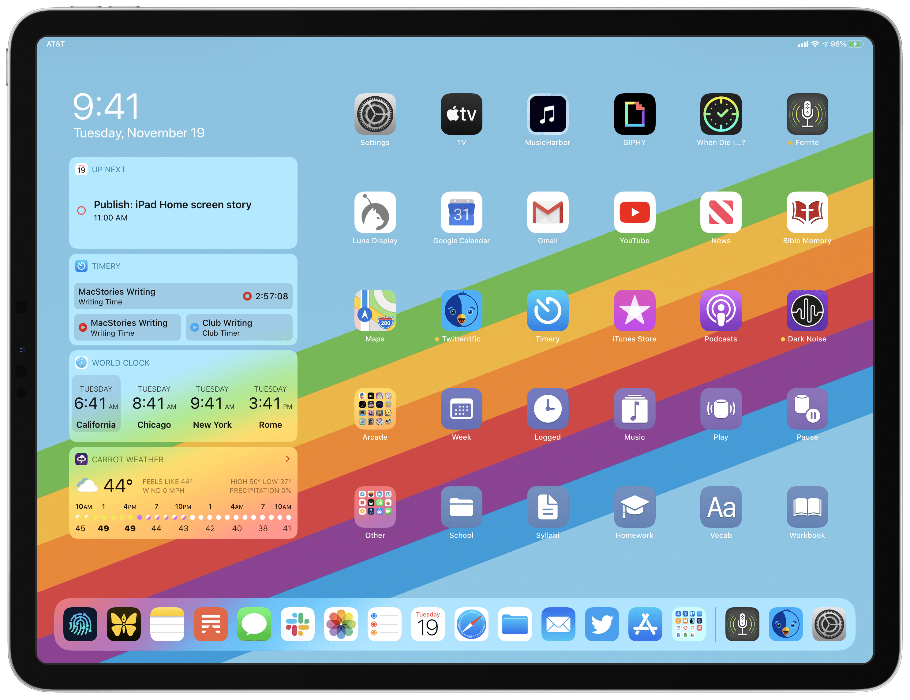
Timery for Toggl continues to add new iOS 13 features with the release today of version 1.05, which includes improved Shortcuts support and new design elements.

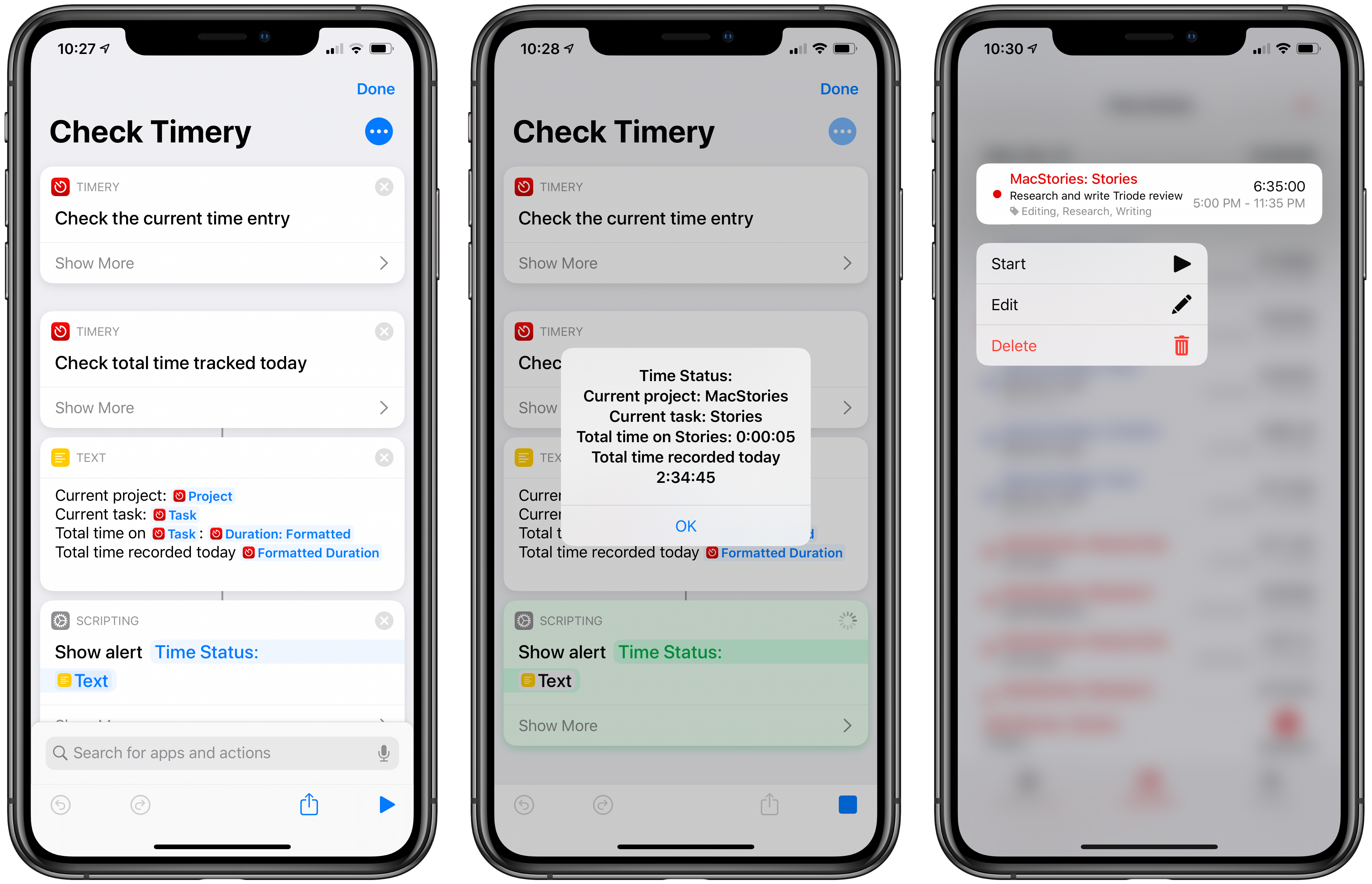
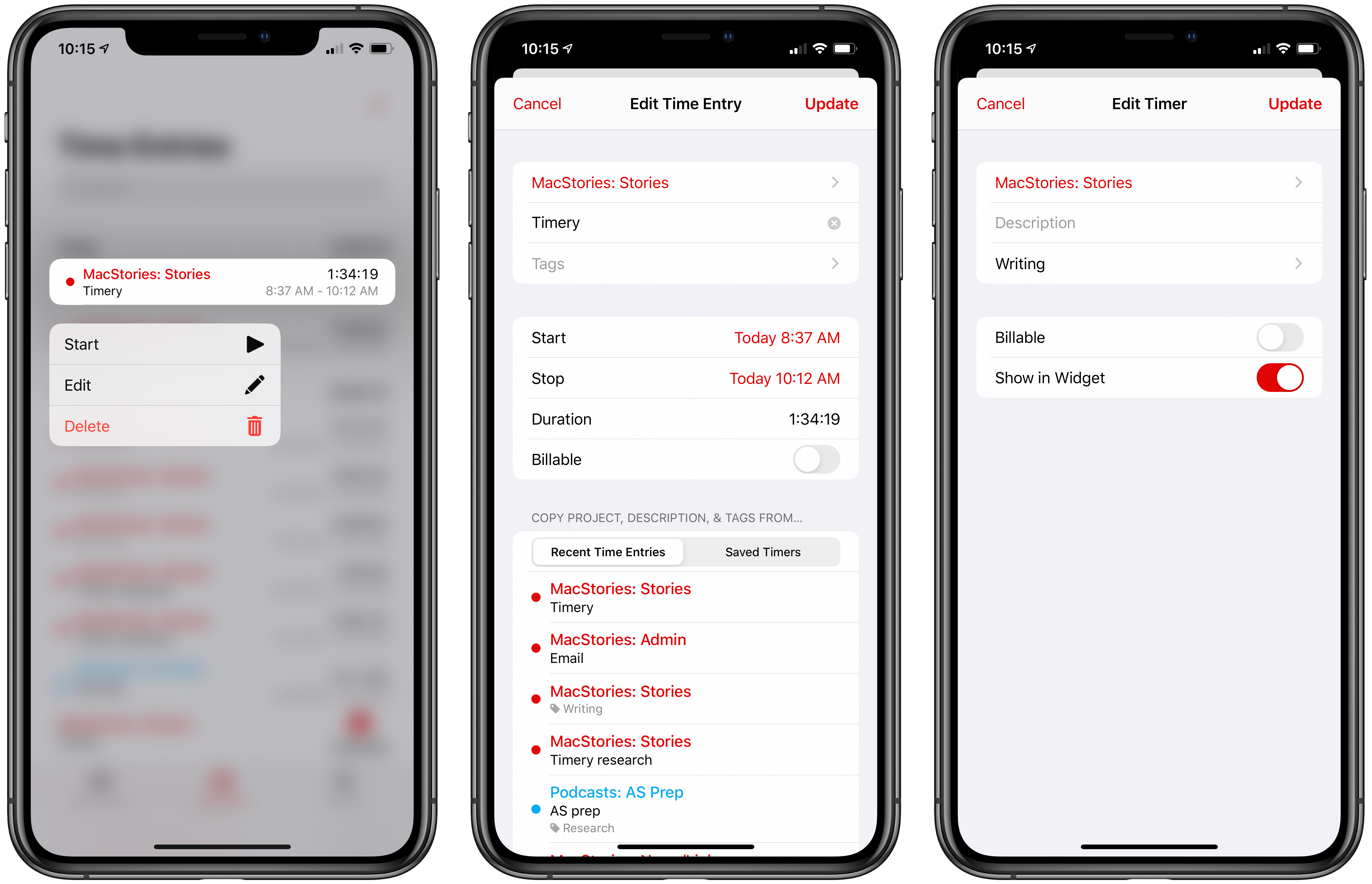
The most significant addition to Timery is support for shortcut actions with parameters and data output. Now users can start a project with a description, tags, and its billable status. The action outputs Time Entry Details, which makes the project name, task, description, tags, start time, duration, billable status, and entry name available.

Projects and tags can be added to the ‘start timer’ action from your list of saved projects and tags when you set up a shortcut or from another source like a user prompt. Any tags applied by a shortcut action that don’t already exist will be added to your Toggl account, but using an incorrect project name will result in an error. Timery also supports adding multiple tags to an entry, although they must be separated by commas or on their own lines. Time is output in total numbers of seconds, in ‘00:00:00’ format, or written out like ‘1 hour, 45 minutes, and 32 seconds.’ The time entry name that the shortcut action generates is a combination of the project name and description. A separate action for stopping a timer outputs the same data.

The other available actions allow users to check the time logged for:

  • The current time entry
  • The current day
  • A project
  • A project with a description and tags

Each of these actions returns duration data in the three formats described above for time logged on the current day only. One thing I’d like to see added in the future is a parameter to adjust the time period reported, so I could use a shortcut to check the total time logged for a project this week or month, for example.

The new shortcut actions open up a lot of interesting possibilities, including the ability to do things like send time tracking data to apps like Numbers, which could be used to create charts. A simple shortcut that I’ve found to be effective is one that checks the current timer I have running and reports back with its elapsed time and the total time tracked today. It’s the sort of shortcut that’s handy to stick in the Shortcuts widget or on your Home screen for a quick time check that doesn’t require opening Timery itself.

Check Timery

Check your currently-running timer and total time logged for the day. Timery for Toggl is required for this shortcut.

Get the shortcut here.

From a design standpoint, Timery has added context menus, which serve as an alternative to swiping left and right on saved timers and time entries, to play, stop, and delete timers and entries. Although the addition doesn’t extend the functionality of the app, I personally prefer context menus to swiping to reveal options and will be using this feature a lot, especially on my iPhone, where using the context menu provides a nice bit of haptic feedback.

New context menus and refreshed UI for editing saved timers and existing time entries.

New context menus and refreshed UI for editing saved timers and existing time entries.

Timery has also made use of inset grouped table views, the card-like UI seen throughout iOS 13. Editing a saved timer or an existing time entry pulls up the card-like UI from the bottom of the screen with the same editing options I covered in my review of version 1.0. Again, the change doesn’t affect the functionality of Timery, but it serves to align the app with current design trends, which prevents it from looking dated.

As I explained in a MacStories Weekly column for Club MacStories members recently, Timery has had a significant impact on the way I work every day. Whether or not you track time for billing purposes, Timery is a valuable tool for anyone curious about how they spend their time. As a result, I’m glad to see it continue to be refined with the latest frameworks and APIs. I particularly appreciate the addition of shortcuts with parameters, which provide a lot more flexibility than was previously possible.

Timery for Toggl is available on the App Store as a free download with certain features available via a subscription.


Apple Releases Smart Battery Case for iPhone 11 and 11 Pro with Dedicated Camera Button

Today Apple has launched new versions of its Smart Battery Case for the latest iPhone models, the iPhone 11, 11 Pro, and 11 Pro Max, which are available to order now from the company’s website with November 25 delivery, which is the same date the case will be available in local stores.

Like previous editions of the Smart Battery Case, the case’s exterior is made of silicone. There are three color options for the 11 Pro and 11 Pro Max case: Pink Sand, White, and Black. The standard 11 case, however, is only available in Soft White and Black. All different versions of the Smart Battery Case are available at the same price: $129.

Links:

Each version of the Smart Battery Case offers a quoted 50% longer battery life, making the already-excellent battery life of this year’s iPhones even better. They also all come with a new feature not available with any other previous case: a dedicated button for launching the camera, which sits on the lower-right side of the case.

From the product listing:

The case features a dedicated camera button that launches the Camera app whether the iPhone is locked or unlocked. A quick press of the button takes a photo and a longer press captures QuickTake video. It works for selfies, too.

This is a very intriguing development, and one that’s particularly fitting for the iPhone 11 lineup due to its heavy emphasis on cameras. Now with the Smart Battery Case, you can shoot photos and videos for much longer than before without killing your battery, while also gaining more convenient access to the Camera app than is possible without the case.


Apple’s Cycle Tracking: A Personal Review

The Cycle Tracking app on watchOS and inside Health on iOS.

The Cycle Tracking app on watchOS and inside Health on iOS.

Menstruation is often forgotten or overlooked – ironic considering that 50% of the population experiences it. This applied to health tracking on Apple Watch and iPhone too, which for the first year offered nothing related to menstruation, but this year Apple Watch received a dedicated Cycle Tracking app, and symptom tracking in the Health app which includes fertility tracking as well. The previous absence of this feature was notable, primarily because other competing health trackers like Fitbit offered it a long time ago.

Everyone who menstruates has different needs when it comes to tracking cycles – if you should track birth control, sexual activity, fertility, and more. What I like most about Apple’s implementation of this feature is that you can turn off elements which aren’t useful for you; I’m sure many others will do the same as me and turn off the vast majority of the options. I personally get the impression that a lot of the features are targeting people trying to conceive, and honestly, that’s not me. That said, I’ve spent a few months evaluating this setup, and comparing it to previous systems I’ve tried, and now I’m ready to talk about it.

Read more


Spark Updated with Multiwindow and Dark Mode Support and a Design Refresh

Two Spark windows open in Split View.

Two Spark windows open in Split View.

Spark, the email client from Readdle, received a strong update today that adds support for the latest iOS and iPadOS features, dark mode and multiwindow, while also introducing a design refresh that refines, rather than reimagines what was already there.

Multiwindow on iPad is excellent to have in an email app. I’ve been using Apple Mail in multiple windows since iPadOS first launched, and it’s especially handy for composing a message while still viewing other messages in your inbox, or that you’ve saved for later. Spark is no exception here: the flexibility to browse the app while writing a message, or even compose multiple messages at once, is fantastic. Where apps like the official Gmail client don’t even support Split View yet(!!), I’m happy to see Spark follow Apple Mail’s example in making multiwindow a core functionality.

Unlike many other apps that have added support for iOS 13’s dark mode this fall, today’s update for Spark is especially noteworthy because the app didn’t formerly offer a dark mode option at all. Now, Spark supports both light and dark modes and follows the system setting by default, though you can choose to perpetually keep the app in a single mode. I was happy to find that you can choose from both grey and true black themes, both of which look especially nice with the app’s blue accent colors; the only drawback is that just the grey theme can currently follow iOS’ system setting, so if you want to use true black, the app will stay in that mode until you manually change it.

Customizing Spark's toolbar.

Customizing Spark’s toolbar.

Dark mode comes alongside a design refresh for Spark. While the app will still look entirely familiar to existing users, I think the tweaks to font details, spacing, and layout result in a better experience overall. The biggest standout of the redesign is that Spark can now display avatars next to messages, similar to what the official Gmail client offers, which I really value. Also, there’s a new option to customize the toolbar actions when viewing a message. Spark has always been great at providing customization tools, so it’s nice to see yet another added to the app.

Spark is one of the best email options on the App Store, and I especially recommend it for teams. Federico, John, and I use its team features to share and comment on emails together, which is an extremely valuable aid to collaboration. If you’ve tried Spark before and it’s not for you, there may not be enough different in today’s update to tempt you, but if you use an iPad at all, don’t underestimate how nice it can be to employ multiple windows while working through email.


Apple Maps Continues Its US Expansion

Yesterday, Apple Maps received its biggest US update by area yet, encompassing several states in the Midwest and West. Along with it, came a comprehensive update from Justin O’Beirne, who has been chronicling the updates since they began.

Apple started rolling out new, more detailed maps of the US in September 2018 and said at WWDC this year that the new maps would cover the entire US by the end of 2019. With the latest update, which is the sixth, only the Southeast and Central states, Alaska, and a few other areas remain un-updated.

Source: justinobeirne.com

Source: justinobeirne.com

According to O’Beirne’s post, Apple’s new maps now cover over 50% of the US by area and two-thirds of its population, including the country’s ten largest cities. Although almost half of the US by area has yet to have its maps updated, the accelerated pace of updates, suggests to O’Beirne that it is possible the remaining parts of the US may still be completed before the close of the year.

In addition to dozens of GIFs with side-by-side comparisons of the old and new Apple Maps for different regions of the US, O’Beirne goes into detail on the changes Apple has made to identifying roads, parks, and other landmarks at different zoom levels. It’s a fascinatingly in-depth analysis that suggests that Apple has increasingly automated its map creation process.

Be sure to check out O’Beirne’s post for all the details and the many GIF comparisons.

Permalink

Spotify Announces New ‘Your Daily Podcasts’ Algorithmic Playlist

Spotify aims to do for podcasts what it’s done for music recommendations with today’s announcement of a new algorithmic podcast playlist.

One of the music streaming service’s greatest strengths is the analysis it does of users’ listening habits, which it uses to recommend new tracks through playlists like Discover Weekly and Daily Mix. According to Spotify, its new ‘Your Daily Podcasts’ playlist will analyze recent episodes you’ve streamed and the shows you follow to make recommendations tailored to the type of shows that match your interests. For example, for story-based sequential shows that you haven’t tried before, Spotify will offer the trailer or first episode of a show, while for daily, news-based podcasts, the playlist may include a recent, topical episode.

The addition of ‘Your Daily Podcasts’ is not surprising given remarks by Spotify CEO Daniel Ek when the company acquired Gimlet Media and Anchor. At the time, Ek said Spotify would offer improved ‘curation and customization’ for users and ‘better discovery, data, and monetization to creators.’

Podcast discovery remains an area that a number of companies are working to improve. As Spotify’s share of the podcast listener market increases, its ability to anticipate the podcasts and individual episodes that subscribers will enjoy has the potential to rival what has already made it such an attractive service for many music fans. Given its dominance of podcasting, it will also be interesting to see if Apple counters by enhancing its own discovery tools in the future.

Spotify says that the new playlist is available to subscribers in the US, UK, Germany, Sweden, Mexico, Brazil, Canada, Australia, and New Zealand who have listened to at least four podcasts in the past 90 days.


My Modern iPad Home Screen: Apps, Widgets, Files, Folders, and Shortcuts

My iPadOS Home screen.

My iPadOS Home screen.

For several years after its launch, one of the best and worst things about the iPad was that it was basically just a blown-up iPhone. This meant the device was extremely easy to use and intuitive, but it also meant lots of “computer-like” tasks were difficult to perform on an iPad. When the iPad Pro debuted in late 2015, that began to change. Features like Split View, Slide Over, Picture in Picture, and drag and drop made the iPad a more capable computer than ever. However, despite those advancements, it took until this fall before one of the iPad’s core iPhone inspirations was altered: the Home screen.

Before iPadOS, the iPad’s Home screen was just a larger version of an iPhone Home screen, with no unique advantages to it. That finally changed mere months ago, when iPadOS 13 brought two primary improvements to the Home screen: it could hold 30 icons rather than 20, and it could include pinned widgets.

These two changes alone weren’t radical departures from the Home screen’s iPhone origins, but combined with other discoveries, they unlocked significant new possibilities.

On a recent episode of Adapt, I challenged Federico to try re-creating a Mac-like desktop environment on the iPad’s Home screen, complete with file and folder launchers. What he came up with is exactly what I’d hoped for. This newfound ability, alongside iPadOS 13’s enhancements to how shortcuts work when added to the Home screen, and the debut of MacStories Shortcuts Icons, meant it was time for me to seriously consider a new approach to my Home screen.

What I’ve come up with includes apps, app folders, files, file folders, shortcuts, and of course, widgets. It’s a diverse setup, and it all lives on a single page of icons. Let me explain.

Read more


AppStories, Episode 139 – Interview: How Soulver Reimagined the Calculator with Its Creator, Zac Cohan

This week, we are joined by developer Zac Cohan, the creator of Soulver, a combination notepad and calculator that reimagines how calculations are made on the Mac and iOS.

Sponsored by:

  • Luna Display – Turn any Mac or iPad into a wireless second display.
  • MacStadium – Get 50% off your first two months of a Mac mini subscription now with code APPSTORIES, or get started with MacStadium’s new Orka private cloud.
  • Linode – High-performance SSD Linux servers for all of your infrastructure needs. Get a $20 credit.

AppStories+ Deeper into the world of apps

AppStories Episode 139 - Interview: How Soulver Reimagined the Calculator with Its Creator, Zac Cohan

0:00
49:15

AppStories+ Deeper into the world of apps

Permalink