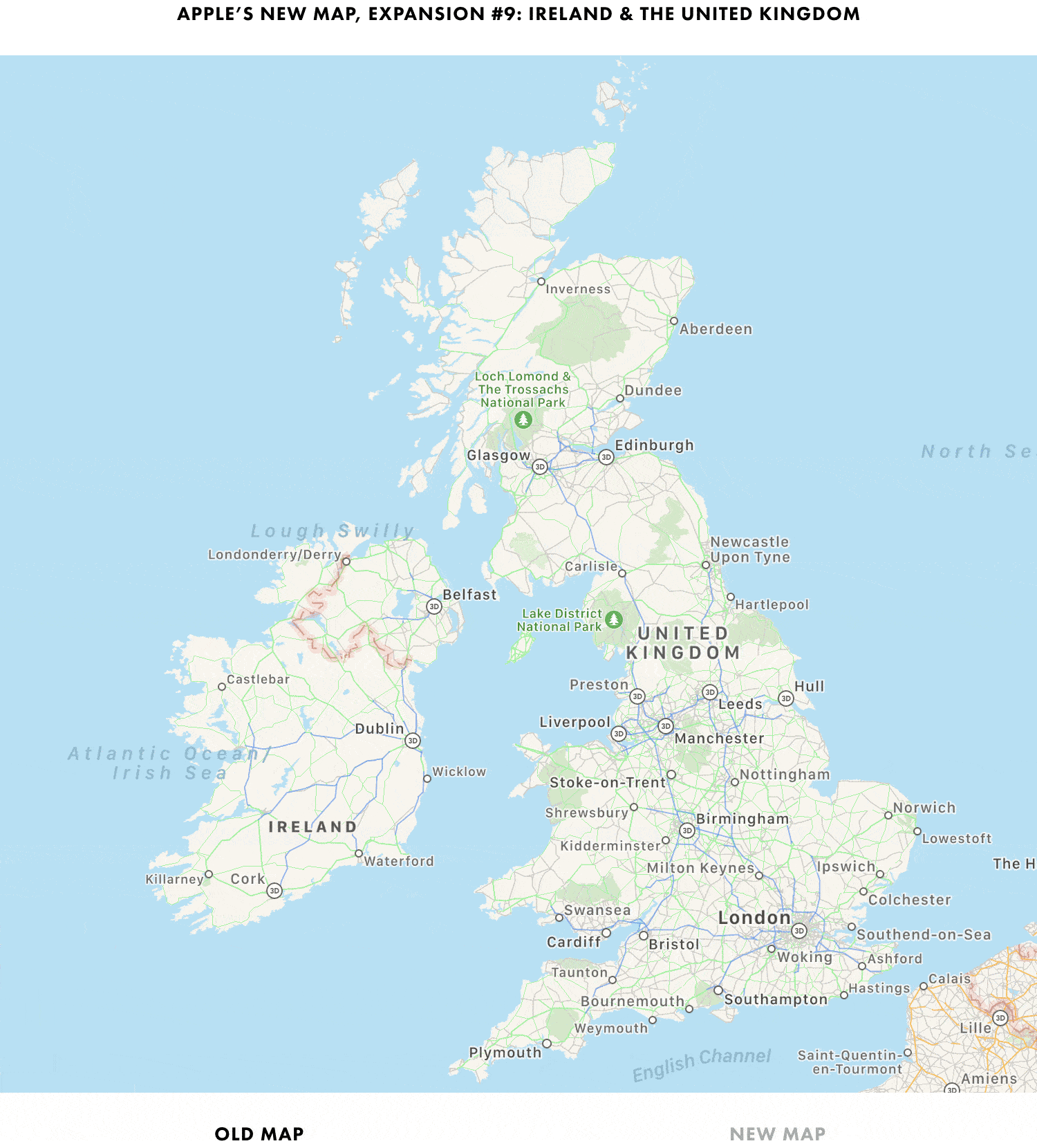
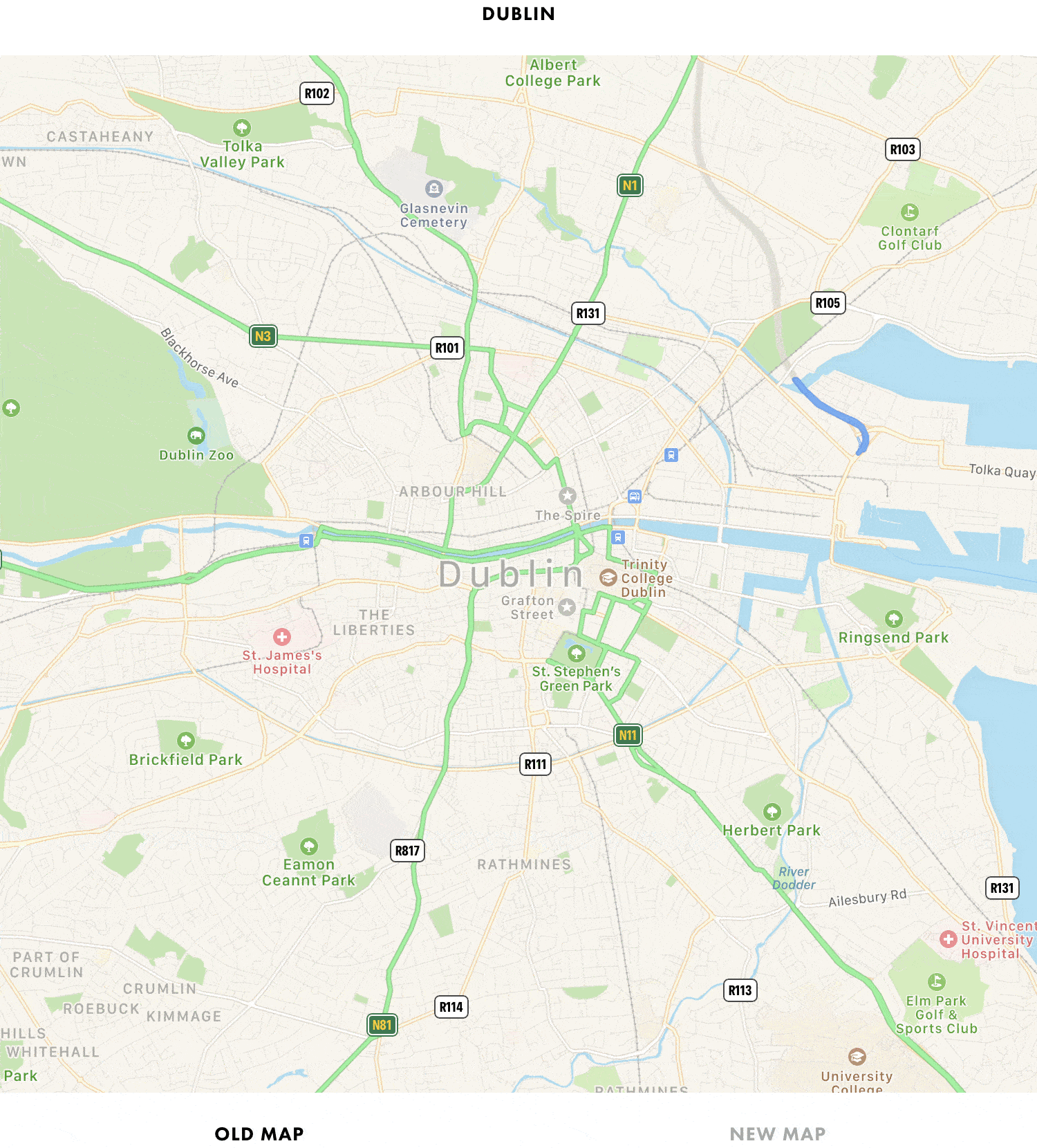
On this week’s episode of AppStories, Federico helps John set up an iPod touch as a media companion for watching TV and movies, enjoying music, and controlling HomeKit devices.
Sponsored by:
MacStadium – Get 50% off your first two months of a Mac mini subscription now w/ code APPSTORIES, or get started with MacStadium’s new Orka private cloud.
Linode – High-performance SSD Linux servers for all of your infrastructure needs. Get a $20 credit.
Kolide – User focused security for teams that value productivity, transparency, and employee happiness. Try it free for 30 days.
Ironically, Apple chose to name this year’s update to macOS after an island. Since the iPhone and iOS took off, macOS has sometimes felt like an island isolated from the rest of the company’s OSes, but the goal articulated by the company at WWDC this year was quite the opposite. Apple clearly telegraphed that change is coming to the Mac and it’s designed to bridge the user experiences between each of its platforms.
To developers, that message came in the form of Catalyst and SwiftUI. Catalyst, which was previewed as an unnamed ‘Sneak Peek’ in 2018, is meant to make it easier for iPadOS developers to bring their apps to the Mac. SwiftUI has a similar longer-term goal of unifying and streamlining how developers build the interfaces for their apps across a range of devices, for everything from the Apple Watch to the Mac.
The efforts to draw macOS in closer with Apple’s other operating systems run deeper than just developer tools though. macOS may have been the foundation on which iOS was built, but in the years that followed iOS’s introduction, the two OSes grew apart. Identically-named apps were developed on different schedules, which meant they rarely included the same features. Also, system-level functionality like System Preferences, which serves the same purpose as iOS’s Settings app, was unfamiliar, making Mac adoption unnecessarily hard for newcomers. Catalina is an attempt to address those kinds of inconsistent user experiences.
With Catalina, Apple has taken clear, though not always successful, steps to bridge the divide between the Mac and iOS. App functionality has been realigned, System Preferences has been rearranged, and new features have been added to make it easier to move from one platform to the other.
As with other transitional periods in the Mac’s history, this one isn’t going to be easy. However, because the change is driven by a fundamental change in computing, it’s also necessary. We live in a new climate where computing is now dominated by mobile devices. For many people, a smartphone is all the computing power they need day-to-day. That doesn’t mean there’s no longer a place for the Mac, but it’s clearly what’s driving the changes in Catalina.
Apple could have chosen to ignore the shift of the ground beneath its feet and merely maintained macOS, making the kind of small incremental changes we’ve become accustomed to in recent years. However, not adapting is as deliberate a choice as change is, and it carries just as much or more uncertainty for the Mac as a platform because it risks irrelevance.
The Mac isn’t in crisis, but it isn’t healthy either. Waiting until the Mac is on life support isn’t viable. Instead, Apple has opted to reimagine the Mac in the context of today’s computing landscape before its survival is threatened. The solution is to tie macOS more closely to iOS and iPadOS, making it an integrated point on the continuum of Apple’s devices that respects the hardware differences of the platform but isn’t different simply for the sake of difference.
Transitions are inherently messy, and so is Catalina in places. It’s a work in process that represents the first steps down a new path, not the destination itself. The destination isn’t clear yet, but Catalina’s purpose is: it’s a bridge, not an island.
Time is at the heart of TickTick. The app includes everything from a Pomodoro timer and habit tracker, to calendar views. It’s a to-do list, planner, reminder, as well as a calendar, which eliminates switching between apps, saving you time and effort.
At the same time though, TickTick is lightweight. The app’s workflows are carefully designed and optimized. For example, you can start by adding tasks and setting reminders. Later, you could use the Pomodoro timer to help you stay focused as you work on those same tasks, or you could punch in daily to develop a task into a habit. TickTick puts you in full control letting you choose to show or hide each of these features in the Tab Bar so you always have exactly what you need, no more, no less.
Another essential part of the app is TickTick’s simple clean-cut design. From List to Subtask, each interface is clean and tidy. Unlike to-do apps that are littered with checkboxes, TickTick makes managing tasks a breeze that feels as natural as note-taking.
All-in-one is not only about features, but also the seamless sync across multiple platforms, including iOS, Mac and Apple Watch. TickTick’s R&D team develops each and every application to fit its many platforms. There are even web and Windows versions of the app, which users love. Getting things done on every platform you work on has never been so easy.
TickTick free version for iOS (Apple Watch included) and Mac is perfect for daily use and includes Siri, Shortcuts, and URL scheme support. Premium features, like Custom Smart Lists, Reminders for Sub-tasks, and adding up to 299 lists, 999 tasks per list, and 199 sub-tasks per task, are available for just $2.99 monthly or $27.99 annually.
Patrick Klepek writes for VICE about the 14-year-old developer, Spruce Campbell, whose game Operator 41 was part of the Apple Arcade launch:
“When I saw the Apple Arcade announcement in March I dropped everything and decided to build a whole new game for Arcade,” [Campbell] told VICE via email. “I thought that the games that really fit Apple Arcade will probably be designed for it from the ground up, so I came up with a stealth game that would work on all the Arcade platforms.”
Campbell has quite a personal story. As Klepek notes, the young developer taught himself to code starting at the age of 8, and when he was 12 he designed a game, CyberPNK, that netted him a BAFTA award. He also received a scholarship to attend WWDC this June, which is where he was able to personally pitch Operator 41 to Apple for Arcade inclusion. Campbell says following that pitch:
“I went back to the dorms, and over the next week I was accepted onto the service,” he said. “I’d say that was the luckiest moment of production—so many stars had to align for me to be accepted onto the service and everything went so well.”
Klepek’s concluding words put into perfect context what this story means for the potential of Arcade’s future.
Operator 41 doesn’t have many reviews. It didn’t get a big marketing push, and wasn’t on Apple’s big stage…But what’s remarkable is that Operator 41 exists at all, and shows Apple having a willingness to give people a shot. Apple Arcade isn’t a place where, like the App Store, anything can get published. There is a curation element. Campbell wasn’t signed because he made a hit that Apple thinks will bring new people into Apple Arcade. In this case, Apple decided it was worth including a game by a mostly unknown 14-year-old designer.
Arcade’s launch has been fantastic, and with the near-certainty of more stories like Campbell’s moving forward, the service’s future looks bright.
In this week’s installment of the Shortcuts Corner, I share an interesting assortment of shortcuts, from an updated version of my Apple Frames shortcut and an easy way to open the App Store’s Updates page to an automation that takes advantage of a feature in the latest Numbers update. And for Club MacStories members, I’ve prepared two shortcuts that should speed up the process of getting the current time for different cities around the world – both via the Shortcuts app and Siri. Let’s dive in.
Summer may be over, but there’s never really an offseason for planning future vacations or business trips. We all have our own methods of trip planning – where we store important documents, how to set an agenda and share that agenda with family or friends – but I’d guess most of us aren’t entirely satisfied with our current planning systems. Important information can be scattered across different apps, services, or analog files, which is fine but not ideal. Tripsy aims to solve that problem.
Tripsy isn’t entirely new to the App Store, having first launched almost a year ago, but it recently received a major 2.0 update alongside iOS 13’s debut. While I never used the previous version, the new Tripsy is exactly the tool I’ve wanted for trip planning for a long time. The app serves as a one-stop shop for organizing all of your trip-related information: you can add Apple Maps points of interest to your agenda, scheduling them to specific times and days, add notes to each saved location, store important travel documents in the app, and share your full trip data with fellow travelers. All of this functionality is enhanced by a strong app experience thanks to system features like multiwindow on iPad, Sign In with Apple, dark mode, and more.
The iPadOS 13 Shortcuts series continues with an exploration of what’s changed with shortcuts run from the Home screen and share sheet. Afterward, Clips drives Federico crazy, so he gets his revenge with a challenge for Ryan.
You can listen below (and find the show notes here), and don’t forget to send us questions using #AskAdapt and by tagging our Twitter account.
This week, Stephen tells a story about his Apple Watch accomplice, Myke reviews tvOS 13 and Federico explains how Deep Fusion and Capture Outside the Frame work.
You can listen below (and find the show notes here).
0:00 01:34:09
Connected, Episode 263
Sponsored by:
Squarespace: Make your next move. Enter offer code CONNECTED at checkout to get 10% off your first purchase.
Care/of: Personalized vitamins, protein and more, delivered to your door. Use ‘connected’ for 25% off.
When Apple introduces a fundamental change to how apps interact with iOS (and now iPadOS), it’s always fascinating to see the different ways those changes are adopted by third-party developers. Although Apple sets a baseline for how new frameworks work, it has less control over how they are used, and it’s those implementation details that often have the greatest impact on users.
In the inaugural version of iPadOS, that’s been the case for multiwindowing. Many apps stick to the basic built-in ways to open multiple instances of the same app. However, the real power of multiwindowing is revealed by apps like GoodNotes, which goes the extra mile and provides an experience better than any other multiwindow app I’ve tried.
Dragging a PDF into a new window.Replay
What makes GoodNotes special is not just the sheer number of unique ways to open a second window for the app, though that’s impressive in itself, but the thoughtfulness of its execution. In every corner of the app where you might want to move a folder, document, page, or bit of data into a new window or document, you can. The result is a level of flexibility that even Apple’s own iWork suite doesn’t match, further cementing GoodNotes as my favorite app for taking handwritten notes.