Apple’s Cycle Tracking: A Personal Review

The Cycle Tracking app on watchOS and inside Health on iOS.

The Cycle Tracking app on watchOS and inside Health on iOS.

Menstruation is often forgotten or overlooked – ironic considering that 50% of the population experiences it. This applied to health tracking on Apple Watch and iPhone too, which for the first year offered nothing related to menstruation, but this year Apple Watch received a dedicated Cycle Tracking app, and symptom tracking in the Health app which includes fertility tracking as well. The previous absence of this feature was notable, primarily because other competing health trackers like Fitbit offered it a long time ago.

Everyone who menstruates has different needs when it comes to tracking cycles – if you should track birth control, sexual activity, fertility, and more. What I like most about Apple’s implementation of this feature is that you can turn off elements which aren’t useful for you; I’m sure many others will do the same as me and turn off the vast majority of the options. I personally get the impression that a lot of the features are targeting people trying to conceive, and honestly, that’s not me. That said, I’ve spent a few months evaluating this setup, and comparing it to previous systems I’ve tried, and now I’m ready to talk about it.

Read more


Spark Updated with Multiwindow and Dark Mode Support and a Design Refresh

Two Spark windows open in Split View.

Two Spark windows open in Split View.

Spark, the email client from Readdle, received a strong update today that adds support for the latest iOS and iPadOS features, dark mode and multiwindow, while also introducing a design refresh that refines, rather than reimagines what was already there.

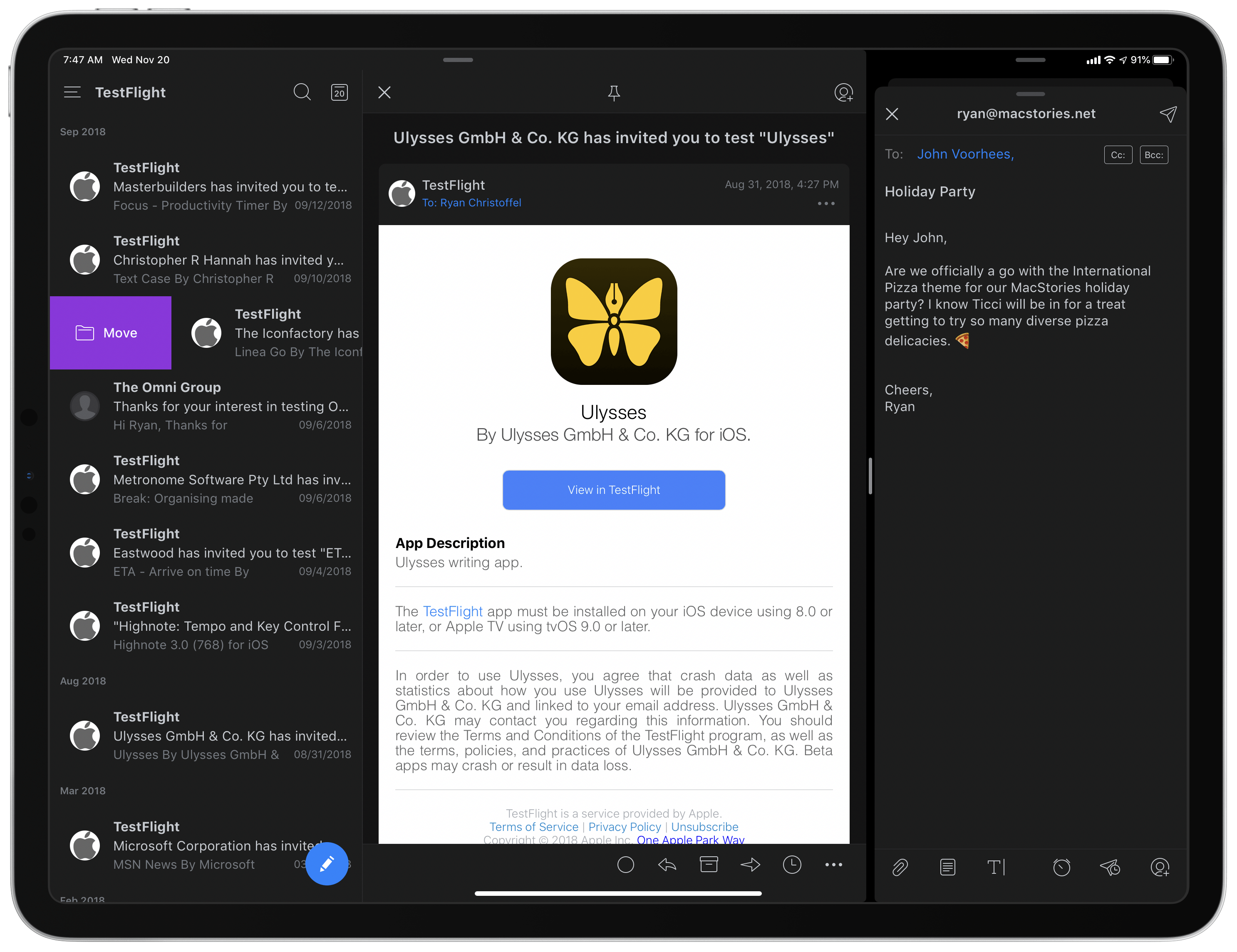
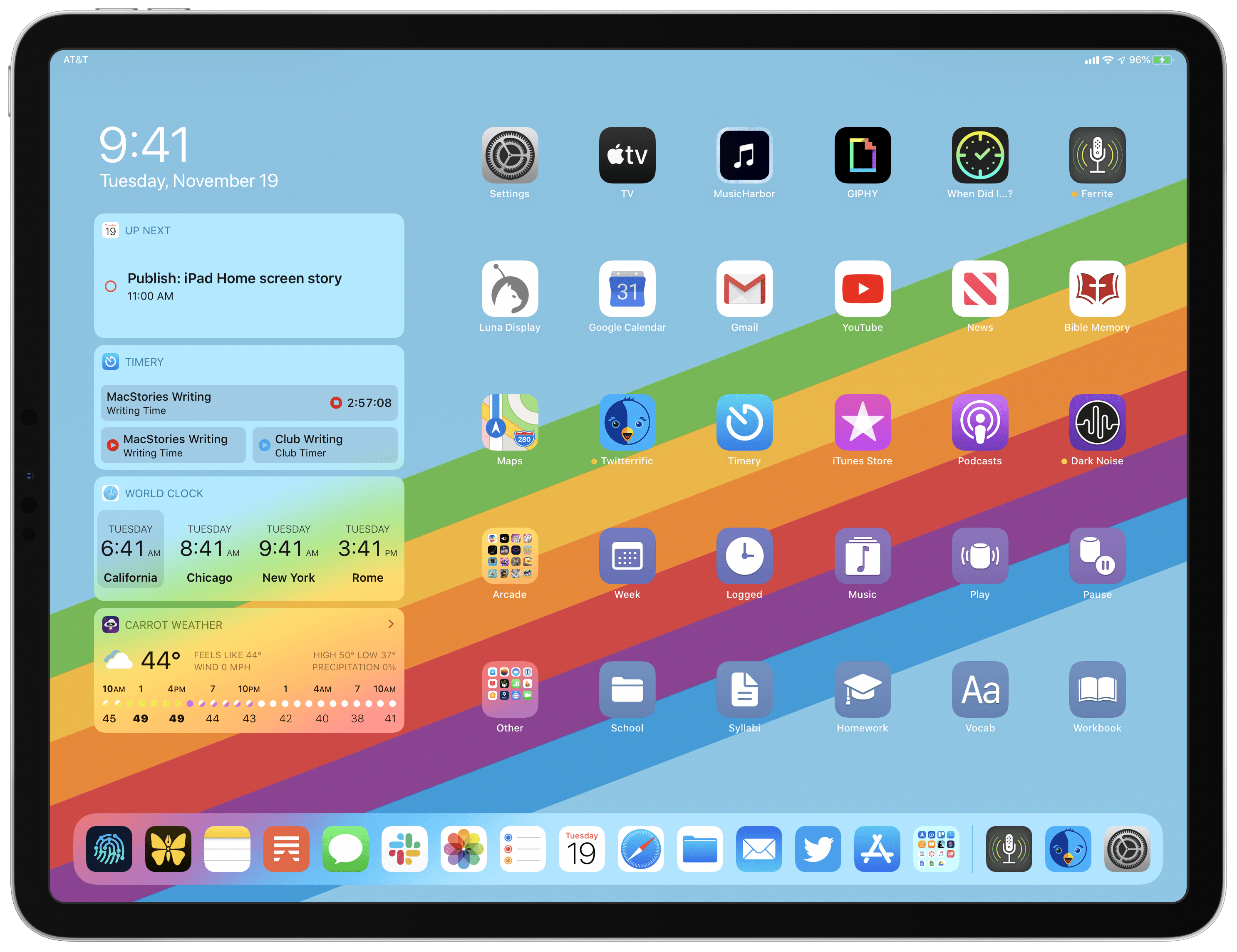
Multiwindow on iPad is excellent to have in an email app. I’ve been using Apple Mail in multiple windows since iPadOS first launched, and it’s especially handy for composing a message while still viewing other messages in your inbox, or that you’ve saved for later. Spark is no exception here: the flexibility to browse the app while writing a message, or even compose multiple messages at once, is fantastic. Where apps like the official Gmail client don’t even support Split View yet(!!), I’m happy to see Spark follow Apple Mail’s example in making multiwindow a core functionality.

Unlike many other apps that have added support for iOS 13’s dark mode this fall, today’s update for Spark is especially noteworthy because the app didn’t formerly offer a dark mode option at all. Now, Spark supports both light and dark modes and follows the system setting by default, though you can choose to perpetually keep the app in a single mode. I was happy to find that you can choose from both grey and true black themes, both of which look especially nice with the app’s blue accent colors; the only drawback is that just the grey theme can currently follow iOS’ system setting, so if you want to use true black, the app will stay in that mode until you manually change it.

Customizing Spark's toolbar.

Customizing Spark’s toolbar.

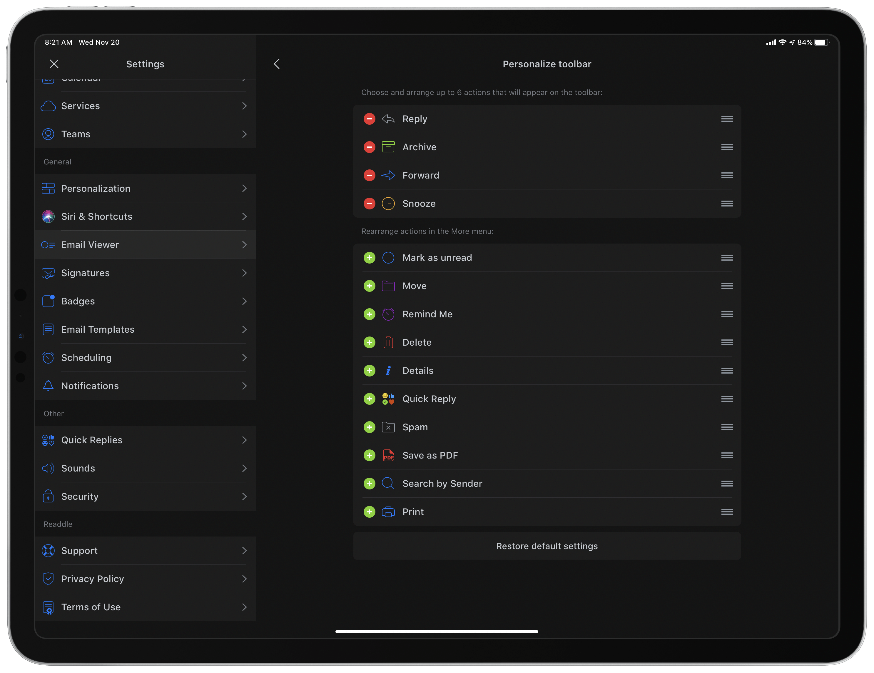
Dark mode comes alongside a design refresh for Spark. While the app will still look entirely familiar to existing users, I think the tweaks to font details, spacing, and layout result in a better experience overall. The biggest standout of the redesign is that Spark can now display avatars next to messages, similar to what the official Gmail client offers, which I really value. Also, there’s a new option to customize the toolbar actions when viewing a message. Spark has always been great at providing customization tools, so it’s nice to see yet another added to the app.

Spark is one of the best email options on the App Store, and I especially recommend it for teams. Federico, John, and I use its team features to share and comment on emails together, which is an extremely valuable aid to collaboration. If you’ve tried Spark before and it’s not for you, there may not be enough different in today’s update to tempt you, but if you use an iPad at all, don’t underestimate how nice it can be to employ multiple windows while working through email.


Apple Maps Continues Its US Expansion

Yesterday, Apple Maps received its biggest US update by area yet, encompassing several states in the Midwest and West. Along with it, came a comprehensive update from Justin O’Beirne, who has been chronicling the updates since they began.

Apple started rolling out new, more detailed maps of the US in September 2018 and said at WWDC this year that the new maps would cover the entire US by the end of 2019. With the latest update, which is the sixth, only the Southeast and Central states, Alaska, and a few other areas remain un-updated.

Source: justinobeirne.com

Source: justinobeirne.com

According to O’Beirne’s post, Apple’s new maps now cover over 50% of the US by area and two-thirds of its population, including the country’s ten largest cities. Although almost half of the US by area has yet to have its maps updated, the accelerated pace of updates, suggests to O’Beirne that it is possible the remaining parts of the US may still be completed before the close of the year.

In addition to dozens of GIFs with side-by-side comparisons of the old and new Apple Maps for different regions of the US, O’Beirne goes into detail on the changes Apple has made to identifying roads, parks, and other landmarks at different zoom levels. It’s a fascinatingly in-depth analysis that suggests that Apple has increasingly automated its map creation process.

Be sure to check out O’Beirne’s post for all the details and the many GIF comparisons.

Permalink

Spotify Announces New ‘Your Daily Podcasts’ Algorithmic Playlist

Spotify aims to do for podcasts what it’s done for music recommendations with today’s announcement of a new algorithmic podcast playlist.

One of the music streaming service’s greatest strengths is the analysis it does of users’ listening habits, which it uses to recommend new tracks through playlists like Discover Weekly and Daily Mix. According to Spotify, its new ‘Your Daily Podcasts’ playlist will analyze recent episodes you’ve streamed and the shows you follow to make recommendations tailored to the type of shows that match your interests. For example, for story-based sequential shows that you haven’t tried before, Spotify will offer the trailer or first episode of a show, while for daily, news-based podcasts, the playlist may include a recent, topical episode.

The addition of ‘Your Daily Podcasts’ is not surprising given remarks by Spotify CEO Daniel Ek when the company acquired Gimlet Media and Anchor. At the time, Ek said Spotify would offer improved ‘curation and customization’ for users and ‘better discovery, data, and monetization to creators.’

Podcast discovery remains an area that a number of companies are working to improve. As Spotify’s share of the podcast listener market increases, its ability to anticipate the podcasts and individual episodes that subscribers will enjoy has the potential to rival what has already made it such an attractive service for many music fans. Given its dominance of podcasting, it will also be interesting to see if Apple counters by enhancing its own discovery tools in the future.

Spotify says that the new playlist is available to subscribers in the US, UK, Germany, Sweden, Mexico, Brazil, Canada, Australia, and New Zealand who have listened to at least four podcasts in the past 90 days.


My Modern iPad Home Screen: Apps, Widgets, Files, Folders, and Shortcuts

My iPadOS Home screen.

My iPadOS Home screen.

For several years after its launch, one of the best and worst things about the iPad was that it was basically just a blown-up iPhone. This meant the device was extremely easy to use and intuitive, but it also meant lots of “computer-like” tasks were difficult to perform on an iPad. When the iPad Pro debuted in late 2015, that began to change. Features like Split View, Slide Over, Picture in Picture, and drag and drop made the iPad a more capable computer than ever. However, despite those advancements, it took until this fall before one of the iPad’s core iPhone inspirations was altered: the Home screen.

Before iPadOS, the iPad’s Home screen was just a larger version of an iPhone Home screen, with no unique advantages to it. That finally changed mere months ago, when iPadOS 13 brought two primary improvements to the Home screen: it could hold 30 icons rather than 20, and it could include pinned widgets.

These two changes alone weren’t radical departures from the Home screen’s iPhone origins, but combined with other discoveries, they unlocked significant new possibilities.

On a recent episode of Adapt, I challenged Federico to try re-creating a Mac-like desktop environment on the iPad’s Home screen, complete with file and folder launchers. What he came up with is exactly what I’d hoped for. This newfound ability, alongside iPadOS 13’s enhancements to how shortcuts work when added to the Home screen, and the debut of MacStories Shortcuts Icons, meant it was time for me to seriously consider a new approach to my Home screen.

What I’ve come up with includes apps, app folders, files, file folders, shortcuts, and of course, widgets. It’s a diverse setup, and it all lives on a single page of icons. Let me explain.

Read more


AppStories, Episode 139 – Interview: How Soulver Reimagined the Calculator with Its Creator, Zac Cohan

This week, we are joined by developer Zac Cohan, the creator of Soulver, a combination notepad and calculator that reimagines how calculations are made on the Mac and iOS.

Sponsored by:

  • Luna Display – Turn any Mac or iPad into a wireless second display.
  • MacStadium – Get 50% off your first two months of a Mac mini subscription now with code APPSTORIES, or get started with MacStadium’s new Orka private cloud.
  • Linode – High-performance SSD Linux servers for all of your infrastructure needs. Get a $20 credit.

Permalink

Apple to Hold Awards Ceremony Celebrating Its Favorite Apps and Games on December 2nd

Apple unexpectedly announced today that it will hold a ceremony in New York City on Monday, December 2nd to honor its favorite apps and games. No other details are currently available, except those in the invitation that was received by some members of the tech press including, as reported by MacRumors, Lance Ulanoff:

Apple’s annual Design Awards at WWDC have served the purpose of recognizing outstanding apps in the past, but an event like this at the end of the year that wraps up the best of 2019 makes a lot of sense and gives the company an opportunity to shine a light on the best offerings from third-party developers in a way that goes beyond the year-end recap lists it has done in the past.


Kolide: User Focused Security For Teams That Slack [Sponsor]

Kolide is a new Slack app that messages employees when their Mac, Windows, or Linux device is not compliant with security best-practices or policy.

With this app, Kolide will notify users or groups when a device is out of compliance along with clear instructions about what is wrong, and step by step instructions to remediate the issue themselves. They can even confirm in real-time that they resolved the problem with an interactive button inside the Slack message!

Unlike most endpoint security solutions, Kolide was designed with user privacy in mind. Your users will know what data is collected about their device, who can see that data, and can even view the full source code of the agent that is run on the device.

Kolide is already used by hundreds of fast growing companies who want to level-up their device security without locking down their devices. Try Kolide’s new product for free for 30 days for your entire fleet by visiting kolide.com.

Our thanks to Kolide for sponsoring MacStories this week.


NoiseBuddy: Control Noise Cancellation and Transparency Modes of AirPods Pro on a Mac

Earlier this week, Guilherme Rambo released a new Mac utility called NoiseBuddy that toggles between the noise cancellation and Transparency modes of AirPods Pro and the Beats Solo Pro headphones when they’re connected to a Mac. The app can place an icon in your Mac’s menu bar or on the Touch Bar and uses the same noise cancellation and Transparency iconography found in Control Center on iOS and iPadOS. The app’s settings allow you to run NoiseBuddy in the menu bar, on the Touch Bar, or in both places. To switch modes, simply click the icon in the menu bar or tap the Touch Bar button.

The Touch Bar in transparency mode.

The Touch Bar in transparency mode.

This isn’t Rambo’s first time working with Bluetooth headphones and the Mac. He also created AirBuddy, which we covered previously. AirBuddy is a Mac utility that displays the charge status of AirPods and Beats headphones that use Apple’s proprietary wireless chips. The app also allows users to connect those headphones to their Macs via Bluetooth with a single click.

NoiseBuddy’s menu bar app in transparency mode.

NoiseBuddy’s menu bar app in transparency mode.

NoiseBuddy is the kind of Mac utility that I love. It takes overly fiddly aspect of interacting with macOS and makes it dead simple. The free app is available from Rambo’s GitHub repo, where it can be downloaded as a ZIP archive and then dragged into your Applications folder.