For many people who have stepped away from Twitter, Mastodon is their first experience with a decentralized social network. There’s a lot that can be said about the pros and cons of decentralization, but I want to focus on one very specific technical feature that Mastodon shares with a growing list of other services: ActivityPub.
ActivityPub is a W3C-recommended standard that was published by its Social Web Working Group almost five years ago and defines a decentralized social networking protocol for client apps and servers that connect them. The benefit to users is interoperability among services that adopt the protocol.
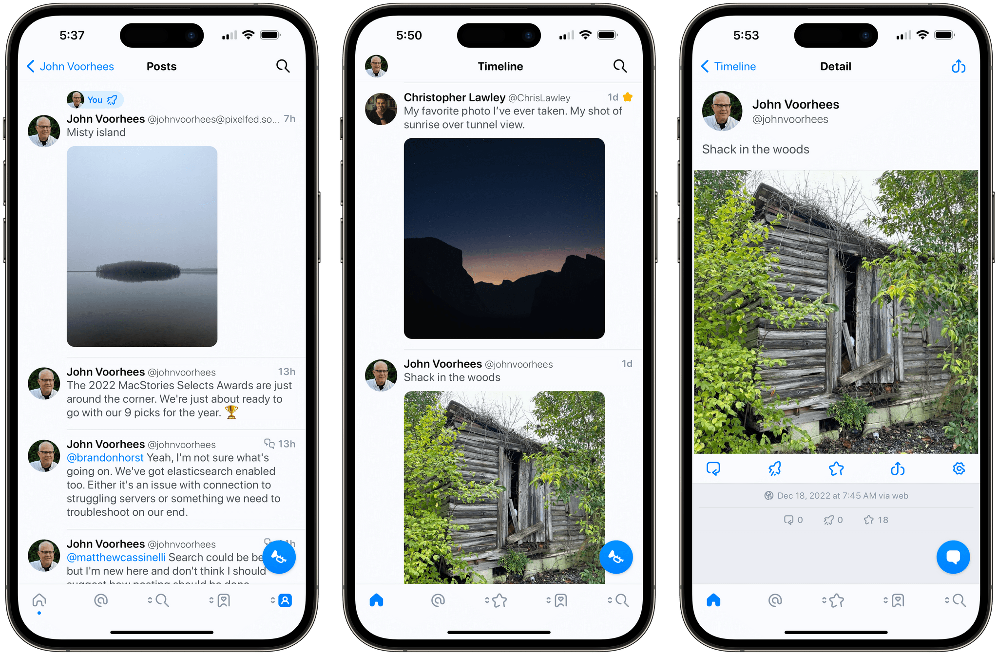
In practice, that means users of one ActivityPub service can follow and interact with users of a different service, which opens up some interesting possibilities. Tumblr seems to agree. The company plans to add ActivityPub support, so its users can interact with Mastodon’s users. That news piqued my interest in ActivityPub, but I’m not patient enough to wait for Tumblr to add support. I wanted to take two ActivityPub services for a spin now, so I set up a Pixelfed account on pixelfed.social.
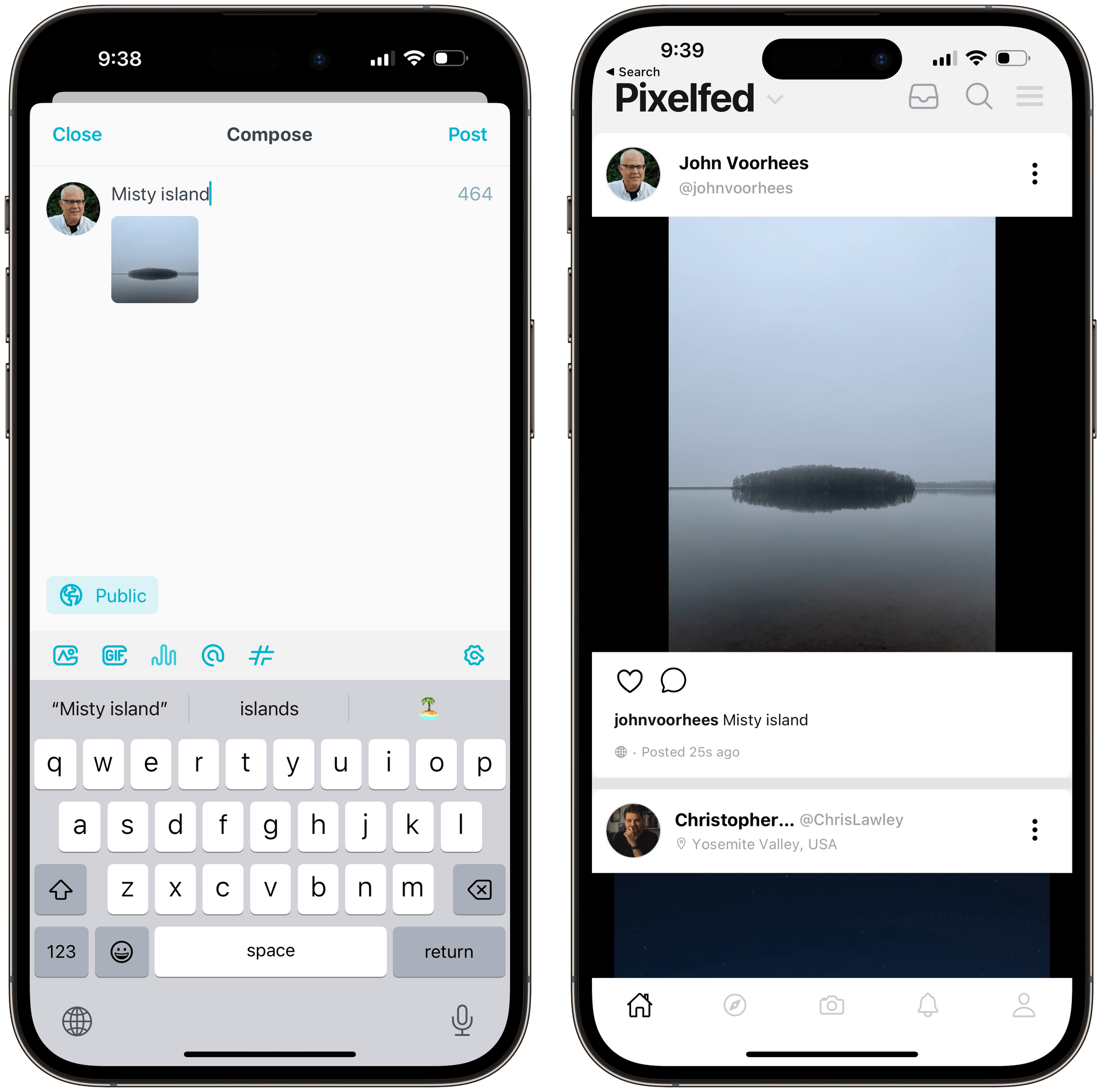
Pixelfed is sort of like a decentralized version of Instagram that has adopted the ActivityPub protocol. Users can post photos, follow other users, and send each other messages. The service recently started beta testing an iOS app that is available on TestFlight, so I downloaded it, set up an account, and posted about it on Mastodon.
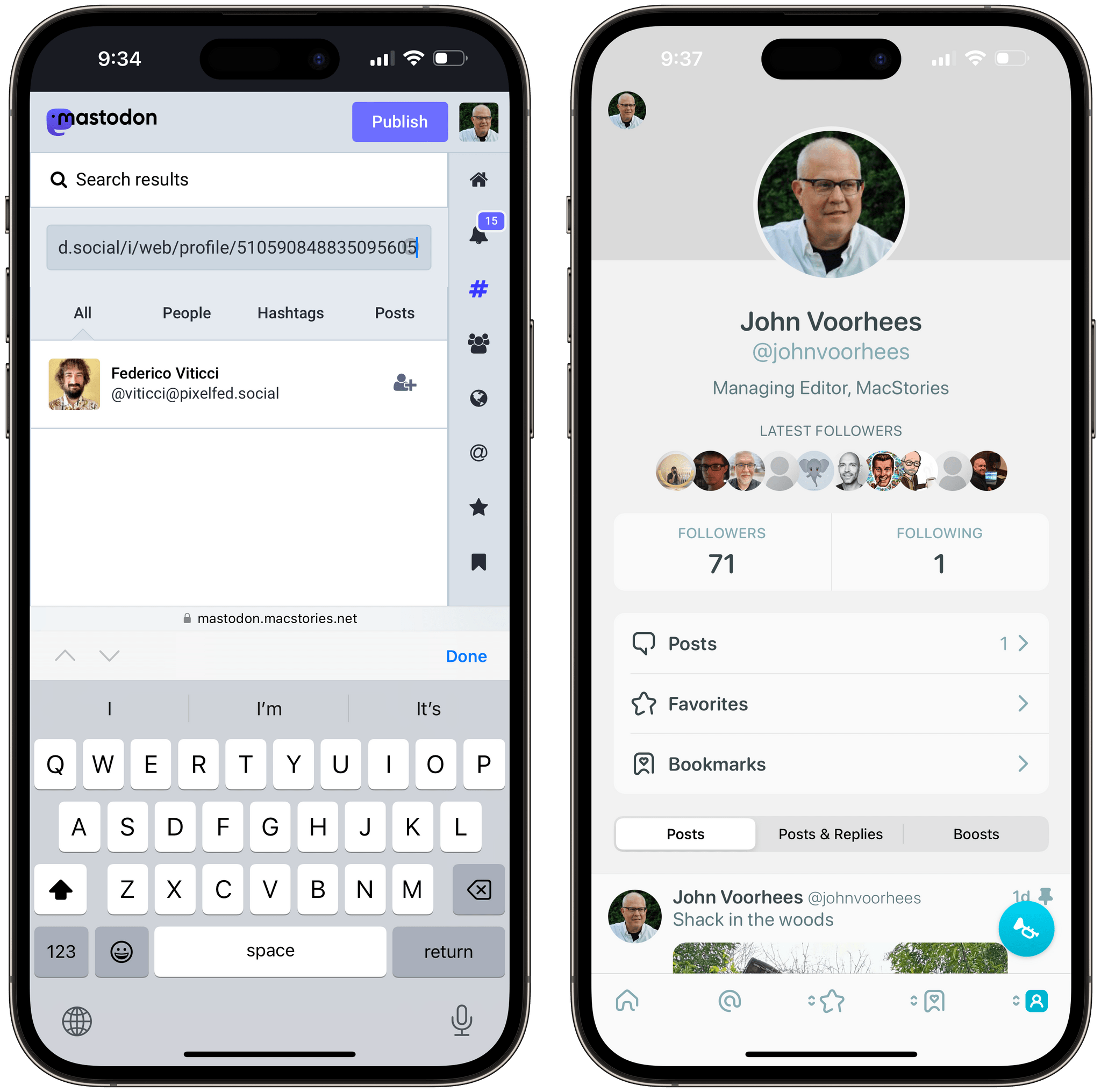
Because Pixelfed and Mastodon servers both comply with ActivityPub, anyone can follow my Pixelfed account from Mastodon without having to create a Pixelfed account or download the app, which is exactly what Federico did:
In practice, following someone’s Pixelfed feed is even easier. Instead of searching for my username, Federico could have searched for the URL for my Pixelfed profile in a Mastodon app and followed me that way. It’s worth noting, though, that not all Mastodon apps support searching for non-Mastodon servers. If you have trouble adding someone to your Mastodon feed, try Mastodon’s web app, which I’ve tried and know works. Also, be patient because some Pixelfed servers like pixelfed.social are struggling with an influx of new users that have hurt its reliability.
As the owner of a Pixelfed account, ActivityPub provides me some additional benefits too. First, I added my Pixelfed account to Ivory, the Tapbots Mastodon app that’s currently in alpha testing. That lets me post photos and respond to followers in the same app I’m using for Mastodon, which is nice. I’ve also followed my Pixelfed account from my Mastodon account, which allows me to view my posts from my Mastodon feed and boost them to my Mastodon followers, creating the equivalent of cross-posting on two services without actually posting separately to both.
Although there are a growing number of services that support ActivityPub, including PeerTube, a YouTube alternative for video, micro.blog, which supports parts of the protocol, and many others, it’s still early days for the protocol. However, with Twitter reminding users of the peril of relying on a centralized service provider, the pace of ActivityPub adoption is picking up, which should make 2023 a very interesting year for the open web.


](https://cdn.macstories.net/banneras-1629219199428.png)