If I had to choose two alternatives to Google Reader, I’d pick Feedly or Digg Reader for most people. Moving to either service takes seconds since you sign into these services with your existing Google account credentials, after which they import your existing feeds with little fuss. Neither Feedly or Digg Reader require you to pay a subscription fee, making them good choices for casual readers and those who won’t get the value out of an alternative with pro features.
Google Reader will no longer be active after July 1st, and you’ll have until July 15th to export your existing feeds. I recommend following this guide by Katie Floyd if you want to back up your current subscriptions.
Why Feedly
Feedly is my reader of choice. Feedly has a solid web app that works in all major browsers from Google Chrome to Opera, plus they have great Android and iOS apps, making it one of the few alternatives that’s already available on most devices. It’s integrated with IFTTT, and there’s an open API so you can still use your favorite apps like Reeder. There will be a subscription for people who want more features down the road.
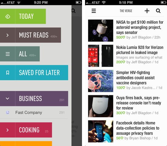
Feedly’s mobile apps are put together like a magazine, but they’re not as deliberate as an app like Flipboard. Folders are eschewed for colorful headers, and the endless feed of articles is replaced by covers and article groupings that can be flicked away like turning a page. It’s an app made for skimming, for picking and choosing, and the result is something that feels fresh and not boring.
You can share articles to Pocket or Instapaper, to Twitter or Facebook or Google+, to Buffer or your device’s clipboard so you can paste a link into a chat app like I sometimes do. There’s a section that only shows you the most popular stuff from your feeds for the day, and then there’s a section for browsing everything all at once. You can search for sites you like and subscribe to them, or browse general categories for things like technology and games to discover something new. There’s lots of swooshing and swiping gestures throughout the app; when browsing articles, swiping left and right advances to the next or previous article, and pulling up closes them so you can continue perusing. If you’re reading in the dark, you can change the theme from white to black.
My favorite feature is the giant button at the end of each section that lets you mark everything as read. It’s super clever.
You can download Feedly for iOS here.
Why Digg Reader
Digg Reader is a new feed reader that closely resembles Google Reader. There’s no Android app right now, but there is an iOS app. You won’t be able to plug Digg Reader into your favorite apps just yet, but an API is planned.
Betaworks, the company behind Digg Reader, has a history of working with products that track things on the web or help you discover the most popular stories. Bit.ly is a company of betaworks, as is recently acquired Instapaper. Betaworks created News.me, an iOS app that highlighted the best articles and videos your friends shared on Twitter. Today, News.me has stuck around as a service that delivers the day’s best stuff to your inbox. Betaworks also revived Digg, turning it into a handcrafted site that presents the web’s top stories.
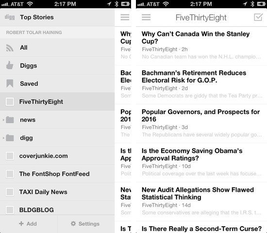
Digg Reader is a modern take on Google Reader, integrating betaworks’ intimate knowledge of what’s popular from Digg into its core. Thus, the best feature is the popular view, which presents a list of the most popular unread articles from your feeds. The layout is very clean and simple, the reading experience being a prime focus for both the web and mobile apps. Digg Reader is much friendlier to look at and use on a daily basis than other alternatives.
The web app is currently the most robust and is very friendly to those who are accustomed to Google Reader’s keyboard shortcuts. You can share articles to Facebook or Twitter, and choose to save articles to apps like Instapaper, Pocket, and Readability. The things you Digg can also be publicly shared through a user specific URL. Like Feedly, Digg Reader lets you search for sites and discover something new in a variety of categories. The iOS app currently lacks the popular view, but it does have a darker theme for evening reading.
I recommend Digg Reader over Feedly if you read on your computer more often than your tablet or phone.
Digg on iOS has Digg Reader built-in. Download it here.