If you haven’t noticed, it’s not Friday, and Thanksgiving is still a week away. Yet here we are, talking about Black Friday deals. That’s because every year, Amazon pushes the start of its deals a little earlier.
This is far from the first article you’ll come across about Black Friday deals, and it won’t be the last. But what’s different about our approach to Black Friday is that we’re pickier than most sites.
When I sat down to consider Amazon’s Black Friday deals, I looked at a long list of factors, including:
- whether we’ve reviewed and recommended a product on MacStories,
- the percentage of the discount,
- the absolute dollar amount of the discount (which we can’t list due to Amazon rules),
- whether each deal beats past deals,
- and a bunch of other factors.
What we’ve come up with is a list of a couple dozen excellent deals that will save you loads of money on everything from great holiday gifts to nerd staples like storage, networking gear, and upgrades to your computing setup.
Every time I write one of these roundups, I inevitably run across even more great deals after the story has been published. So in addition to this story, we’ll be posting deals on the MacStories Deals Mastodon and Bluesky accounts.
Club MacStories Plus and Premier members will be sharing their Black Friday deal finds on Discord too. If you’re not a member, you can sign up here. The Discord server is just one of the many perks of joining the Club.
Finally, please note that the Amazon links in this article are affiliate links. If you follow one of our links and buy something, we make a small commission.
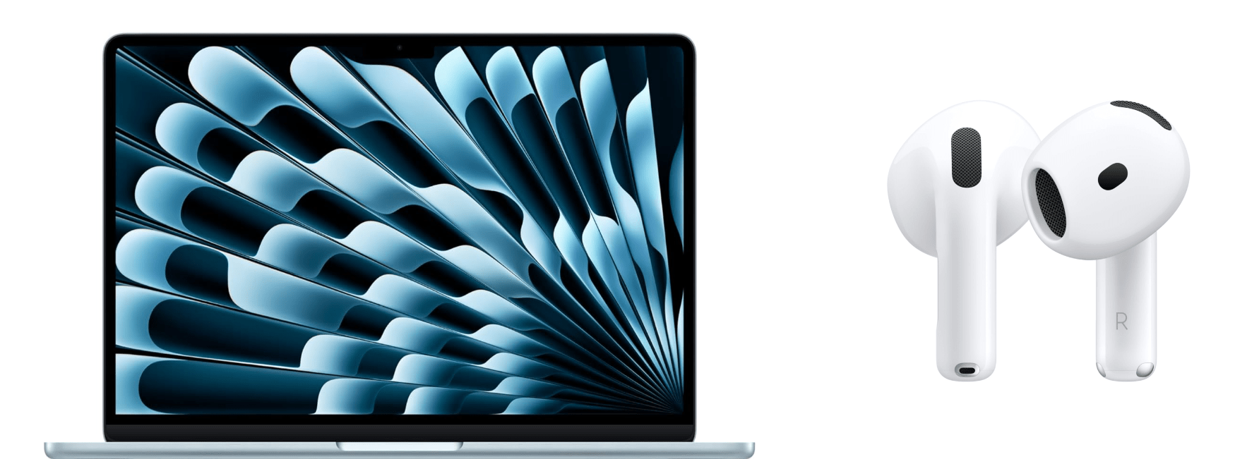
Storage
Storage is a staple of Black Friday, with excellent deals on hard drives and SSDs of all shapes and sizes. This year is no different. Whether your Mac’s drive is filling up and you need to offload some large files or you’re looking for a backup solution, now is the time to pull the trigger and get more storage.
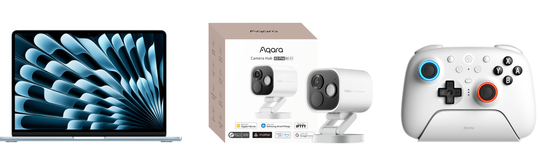
I mention Samsung portable SSDs a lot on MacStories and the MacStories Deals accounts because I’ve used them for years and they’re reliable. Samsung’s fastest model – the T9 – is my favorite because it uses USB-C 3.2 Gen 2x2, making it equally good for quick backups and working on large files externally.
Currently, both the 4TB Samsung T9 SSD and the 2TB model are on sale on Amazon, with the biggest discount on the 4TB model. You can save a little more with SanDisk’s 2TB external drive, but it runs at half the speed of the Samsung T9, so I recommend the T9. However, if you want to go really big with an SSD, SanDisk has Samsung beat with an 8TB model that, while expensive and half the speed of a Samsung T9, will be far faster than a mechanical hard drive for backing up a Mac with lots of internal storage. Samsung sadly does not offer an 8TB T9 drive.
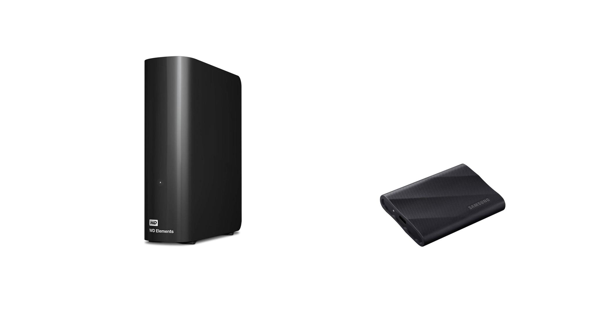
SSDs are great, but even on sale, they’re more expensive than mechanical hard drives. If you don’t need the fastest speeds and can tuck your hard drive away somewhere the heat and noise won’t bother you, Amazon has a great deal on a 14TB Western Digital Elements hard drive. I’ve used Elements drives a lot over the past several years for archiving big projects and Time Machine backups, and I’ve been very happy with their performance. If you need a big drive, now is the time to pick one of these up; they’ve never been cheaper.
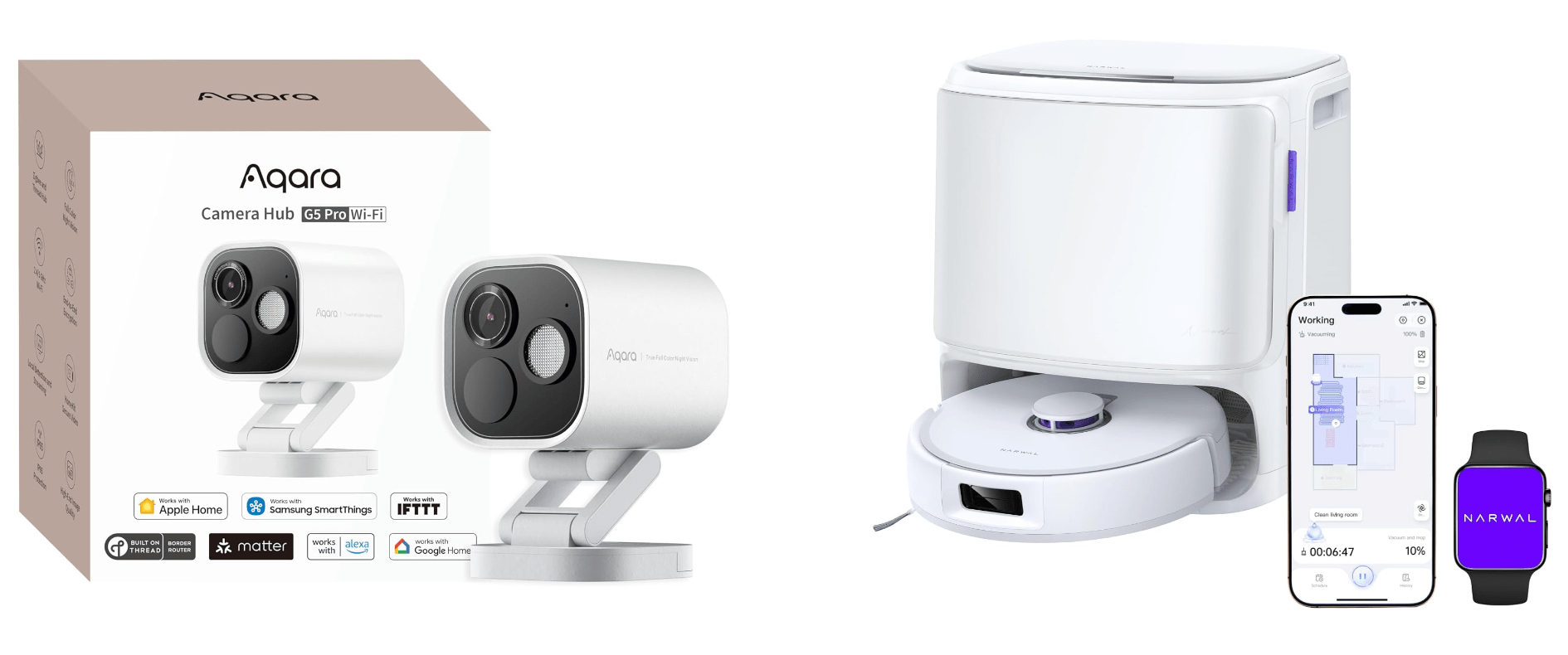
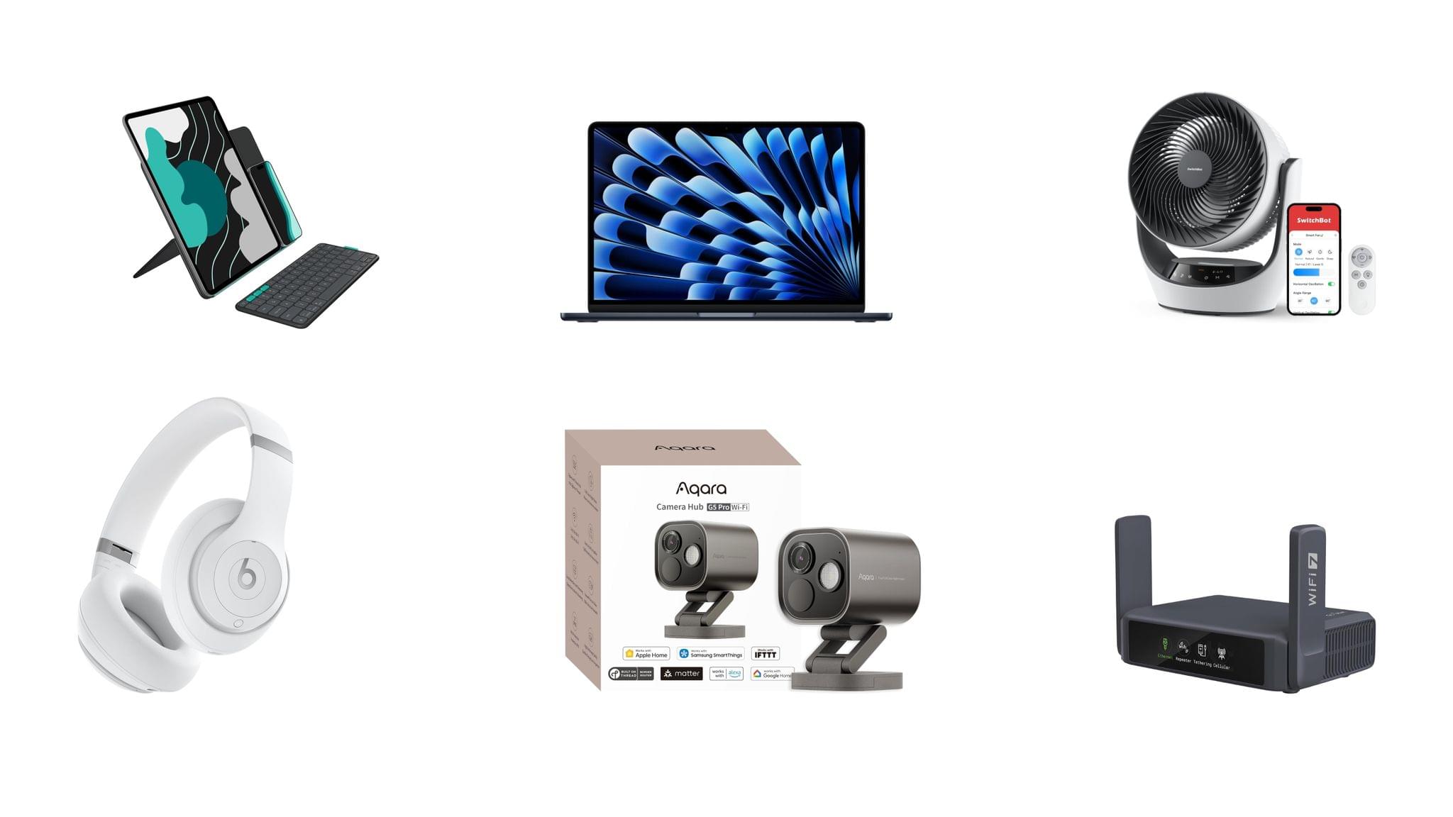
Smart Home
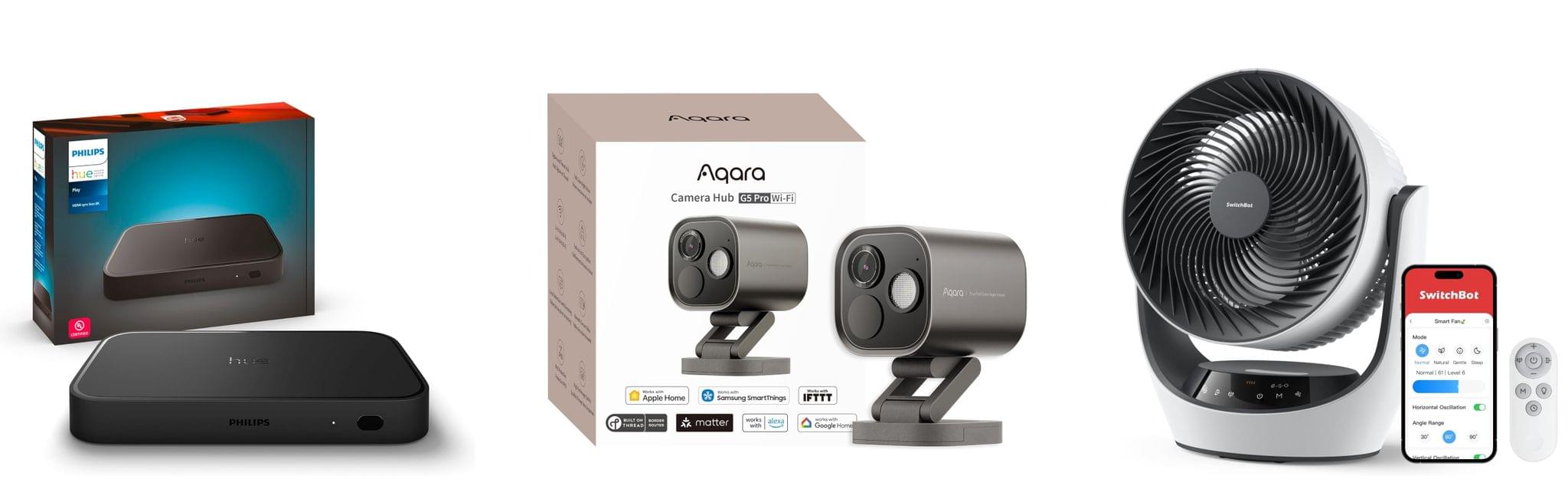
For starters, the Aqara 4MP Camera Hub G5 Pro is deeply discounted for Black Friday. I reviewed this outdoor HomeKit-compatible camera earlier this year and love it. From the feedback I’ve heard, MacStories readers seem to love the camera, too.
I also reviewed the Philips Hue Play HDMI Sync Box 8K this summer. Paired with Philips Hue lights, it’s remarkably capable, syncing the colors of your lights to whatever is on your TV. While it’s not a smart home essential, it is a lot of fun, and if you need a little push to pull the trigger on this sort of gadget, this discount is a great excuse.
On the more practical end of the spectrum, Philips Hue is also offering a great deal on its Go Smart Portable Table Lamp, which works plugged in or via its built-in battery. I’ve had my eye on this lamp for a while because it’s very portable and would add nice accent lighting when I’m working on my balcony in the evening or anywhere else with less-than-ideal lighting.
Finally, as I mentioned on the Setups video that Federico and I recently released, I love my new SwitchBot Smart Desk Fan. It oscillates left and right as well as up and down, and it has nine speed settings. Best of all, I can control it from the buttons on the front of the device, using the included remote control, or with Shortcuts because it works with HomeKit.
Read more