This Week's Sponsor:

Copilot Money

Copilot Money, The Best Money Tracker, Launches on the Web – Limited-Time: Get 26% Off + 2 Months Free


Posts in reviews

Shine, Beautiful Weather App for iPhone, Goes International

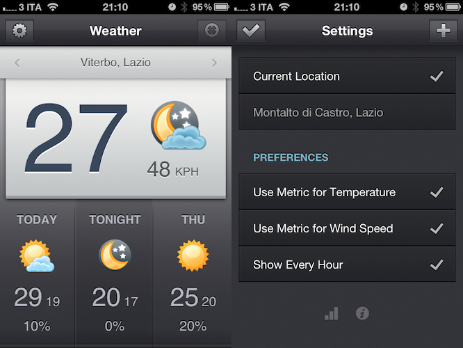
When I reviewed the first version of Shine, a simple weather app for the iPhone, I noted how it was backed by a beautiful interface design but full international support was nowhere to be seen. The app looked great, but I couldn’t get forecasts and wind speeds to display correctly in Italy. Most of the times, they just weren’t there – clearly, Shine was aimed at US iPhone users looking for a neat weather solution.

After the release of iOS 5 beta and the introduction of the weather widget in Notification Center, I didn’t stop looking for great weather apps that would keep me updated on my favorite locations for the summer. After all, my town is only 45 minutes away from the beach and I like to check on weather conditions before I drive there. Shine 2.0, released today, finally allows me to use the app in a reliable way thanks to proper support for international countries. I can’t check on every single country in Europe (or worldwide, for that matter) but I can say that it seems to be working just fine in Italy. I can see current conditions, forecasts (whose UI has been tweaked to offer more detailed info) and wind speeds; data matches with weather info provided by other Italian websites and weather services.

Shine 2.0 won’t change anything if you’ve been using the app in the United States, but it finally allows people overseas to check on weather using this beautiful app they bought last month. You can download Shine at $0.99 from the App Store.


Postbox 2.5 Released: New UI, Faster, Lots Of New Features

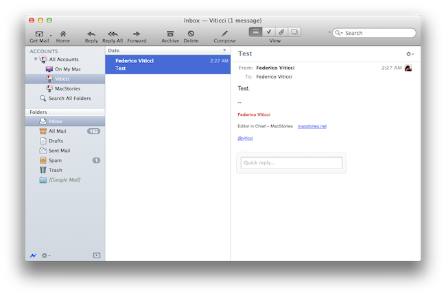
Earlier today, we published an article detailing some of the interface changes set to be introduced in Postbox 2.5, a major update for the popular alternative email application for Mac and Windows that, among other things, was teased by the developers as one of the biggest rewrites of the app to date. With a series of blog posts, the Postbox team had in fact already announced that the client would get an overall improved interface, new toolbar icons on the Mac, a completely re-imagined message view, and a vertical pane view to take advantage of widescreen monitors – admittedly one of the glaring omissions from the previous versions of Postbox. Read more


Carousel Instagram Client Gets Gestures, Search, Refined UI

Back in May I reviewed the first version of Carousel, a beautiful Instagram client for Mac that, thanks to the Chameleon framework built by The Iconfactory, brought Instagram’s photo streams and profiles to the desktop with a gorgeous iOS-like user interface. Whilst in the past month, with Lion nearing its final release and the WWDC, we’ve seen several examples of iOS apps making the big leap to the Mac, Carousel was one of the first apps to try the iPhone-inspired approach with a vertical layout, tabs, and popover menus. Together with Twitterrific, Carousel is a fine example of iOS interface schemes coexisting with more standard Mac applications.

Carousel 1.1, released today, adds a number of new features and refinements to make the Instagram experience on OS X even more beautiful and easy to use. First off, search: you can now search for specific @users or #keywords on Instagram, pin your searches as you would in Twitter for Mac, or click on tags and usernames in photo comments, which now are better styled to indicate the original author’s caption. Saved searches sit below the search bar, but to perform a search you’ll have to choose an element from a popover menu. The app has gained a new “likes” tab to see all the photos you’ve liked and a fetch separator to start where you left off in the stream, but more importantly gestures are now supported to easily open a photo in Quick Look (pinch and zoom) or check out a profile (swipe on the photo). It feels very natural and smooth using a Magic Trackpad.

Among the little fixes and refinements, the developers have updated the iOS-like toolbar to make sure the selector is draggable (try it, neat animation in there) and the comment form remains visible even if you click outside of Carousel’s main window.

Carousel 1.1 is a solid update for the most beautiful and intuitive Instagram client currently available on the Mac. You can buy Carousel at $4.99 on the Mac App Store.


Flexiglass: The Dock & Menubar Utility That Makes Window Management a Breeze

One of the old habits Apple kept around in Snow Leopard was the handle that’s used to resize windows from the bottom right corner. While convenient out of habit, my transition to the Mac from Windows back in 2008 was met with a few minor complaints with window resizing and “snapping” being two convenient features I missed. Other oddities, such as the close button (which is really a close window button) and the zoom button (which questionably works as a maximize button) took some getting used to, although I’ve adopted the common command-Q reflex.

While Spaces manage the slew of windows I’ll open during the workday, there is an occasional need to sort between multiple windows in the same place and to group work or school related content together. The problem is that it’s not always easy getting everything just the way you want it, and as I drag windows to each side of the screen for some crazy dual setup, I would gripe before grabbing the corner, then snatching the titlebar and dragging the window to the left or right side of the display. It’s not always a problem, but boy it would be convenient if…

Flexiglass! Oh yes, we have yet another utility designed to manage your windows as efficiently as possible. I’ve covered my fair share of “window controllers” including MercuryMover, SizeUp, Cinch, Zooom/2, DoublePane, WindowFlow and I’m sure there are many others to solve a switcher’s common complaints. Flexiglass meets a nice middle ground. While MercuryMover and SizeUp are clearly geared towards power users who can’t keep their fingers off the keyboard, Cinch and DoublePane were designed for the everyday Joe wanting to replicate basic Windows features. Flexiglass contains a little bit of everything, and I think it’s one of the most approachable, yet tricked out window managers I’ve seen. It doesn’t overwhelm users with a handful of keyboard shortcuts, and it does a good job of striking a balance between mouse and keyboard interactivity.

Read more


MacStories Product Review: AViiQ Portable Quick Stand

While a review was poised a few weeks ago for AViiQ’s latest product, I felt the need to take their latest invention through a thorough review process that involved travel, a variety of MacBooks and PCs, and daily use to see if AViiQ’s Portable Quick Stand holds up to heavy use. Snapping from the fold into a prism that’s ready to leverage your laptop and bring your laptop’s screen closer to eye level, this is the alternative to the original Portable Laptop Stand which I reviewed back in February.

Read more


Review: Pogoplug Software Puts Your Mac In The Cloud

Yesterday, I scored a free Pogoplug Software Premium account thanks to the good folks over at The Next Web. I’m a big fan of well-done cloud services that allow me to access my stuff anywhere I go, and as I’m also always interested in desktop solutions aimed at securely mirroring your computers’ contents to the cloud, I was excited to install the new Pogoplug app on Lion and take it for a spin. The results are surprisingly good, but far from perfect.

Pogoplug became popular a few years ago thanks to a network-attached device that enables you to put media in it, and access it from a variety of devices and the web because it is actually connected to the Internet. Rather than forcing you to buy an additional piece of hardware to plug into your home router and waste space on your desk, though, the new Pogoplug Software product allows you to access your media in your personal cloud at $29 per year for unlimited computers and devices. That’s undoubtedly a great offer: once installed on your Mac, the Pogoplug app will scan your computer’s drive and default locations (like Music and Movies) for content, and make it available online. Once authenticated, you’ll be able to stream music, watch a movie, or read a PDF from an iPhone, iPad, or web browser. The concept is not too far away from what Jim Dalrymple at The Loop said Apple was working on to enable users to put files in the cloud. The solution turned out to be a little different as we know, yet Pogoplug Software holds up to this idea: it’s your Mac, mirrored to the cloud, and available anywhere. Read more


Review: #NowPlaying with NowPlayer

There are many iPhone audio player apps available, yet only a few really stand out. My Artists, which we have reviewed in the past, is one of our favorites and is very feature filled. Notes on artists, links to videos, and lyrics are just some some of the extended features. However, most of the time I don’t need these features and if I’m on AT&T’s stellar EDGE network, many of these features take too long to load on my iPhone.

I jumped on a new beta some time ago from @misecia for an app called NowPlayer. Without ever using it, but only seeing mock-ups on Dribbble, I was very interested. The interface is sexy and every pixel has been placed perfectly. Now, I know that usability is important too, and this app doesn’t fall short in that category either. NowPlayer is largely based on gestures for controlling the audio within the app: you can control your music with swiping or tapping with your finger on screen. These gesture controls are perfect for when you’re exercising or typing up a review and don’t want to look over at your iPhone’s display. The gesture system is totally customizable too:

 two-finger tap is used to play/pause, but it can be changed to a double tap if you desire; you can then perform a three finger tap to auto-send a tweet, swipe left/right to change tracks, swipe up/down to change the volume, and double tap with two fingers to change shuffle mode. There are a few Easter eggs for extra options, some still haven’t been found! Don’t worry, as there are onscreen controls, too, and they are minimal and look great as well. Read more


Stratus: Finally, A Beautiful CloudApp Client for iPhone and iPad

CloudApp, the service I use on a daily basis to share links with my Twitter friends and files with my co-workers, never had a unified experience for the iPhone and iPad. Launched as a Mac-only desktop utility with an online interface to browse and manage your uploads, CloudApp later gained much needed functionalities like real-time streams for uploads and view counts, as well as custom domains for Pro users, and a redesigned web app with more options for downloads, inline viewing, and file sharing. Overall, I think CloudApp is the easiest and most powerful way to share items on the web, and manage what you’ve shared from a great-looking web counterpart. The Mac app has also been updated recently to include a flexible plugin architecture, more keyboard shortcuts, and live updating results in the menubar. But as far as iOS goes, and especially the iPad, CloudApp has never seen a huge adoption from developers.

On the iPhone, however, there was a nice surprise called Cloud2go that impressed me since its first release for the solid feature set, elegant interface, and overall nice implementation of CloudApp’s basic functionalities like clipboard integration and uploads. The app was updated a few months ago to include the aforementioned live streams, as well as a slew of other improvements that have undoubtedly turned Cloud2go into the CloudApp client to have on the iPhone. But it didn’t have an iPad version.

Today, developers Jeff Broderick and Kolin Krewinkel have released Stratus, a free CloudApp client for iPhone and iPad that I’ve been testing over the past months and it’s become my go-to app when it comes to uploading and sharing links with CloudApp, as well as managing what’s already in my account. Read more


Agenda: An Elegant Calendar App Powered By Gestures

If all developers were to follow Apple’s recent paradigms when it comes to designing applications for the average iOS and OS X user, we’d end up having tons of different apps using the same faux leather / paper / linen / notebook interface elements. Take a look at the Address Book and Calendar apps on Lion, or the recent introduction of Reminders on iOS 5: as Apple’s OSes move forward, the trend in UI design seems to be that of creating software that resembles old, real-life counterparts people are accustomed to. And while you can argue this started back in 2007 with the Notes and Calculator apps for iPhone OS, there’s no doubt the launch of the iPad last year and the upcoming Lion added fuel to the fire with their skeuomorphic interfaces.

Agenda, a new app by Ken Yarmosh of Savvy Apps, looks like your old paper calendar but, luckily for us, adds modern interaction schemes and ideas that help revitalizing the old concept of month sheets, notes, and calendars in general. Rather than mimicking a calendar but resorting to the usual menus and navigation buttons to get around monthly views, days, and events, Agenda enables you to swipe horizontally on screen to go back (and open) any view. For example, the app starts in a beautiful and elegant view that lets you see an entire year worth of events; with a swipe to the left, the app slides to the current month. With another swipe, the monthly view becomes a weekly one, with a list of your upcoming events; another swipe, and you can open the current day of the week. Swipe again, and you’re brought to a single-event view of what you have to do at a specific time of the day. Obviously, all these actions can be activated with regular taps, too: tap on a specific month, and Agenda will open it with its slide animation. Same applies for days in the monthly, or weekly views. However, it’s very clear the developer put the focus on the ease of use of gestures, rather than normal taps: swiping to move between views is intuitive and fun, whereas swiping vertically will allow you to navigate between months, and days of the week in the sections provided by Agenda. It almost feels like Windows Phone 7’s UI principles of swiping between views have been ported to a native iPhone application, without the Metro interface of course. Once again: you can get around Agenda’s interface by simply tapping on screen, but there’s no denying this app was built with gestures in mind and the possibility of swiping to get to the view you need.

As far as adding new events goes, Agenda relies on the standard iOS calendar functionalities to lay out the event creation menu and integration with calendars already configured on your iPhone. Agenda can access any MobileMe (even iCloud for iOS 5 users), Exchange or Google calendar set up on your device, and adding new events uses Apple’s default window to assign a title, location, time, invitees, and so forth.

Overall, Agenda is a nice complement to Apple’s default calendar solution for iPhone in the way it keeps things minimal, letting you focus on seeing what you have to do and what’s upcoming, rather than supercharging calendars with additional functionalities most users won’t ever need. Agenda is clean, easy to use, and powered by a great gesturing system that makes using the app incredibly simple and intuitive. Get it here at $2.99.