This Week's Sponsor:

Copilot Money

Copilot Money, The Best Money Tracker, Launches on the Web – Limited-Time: Get 26% Off + 2 Months Free


Posts in reviews

Slow Feeds Brings A Simple, Unique Innovation To RSS Apps

In the oft-abused Death of RSS debate, a common and universal truth is typically forgone: RSS is a standard, not a single entity, and as such its survival or presumed “death” should be related to the services that use it, not the standard itself.

The problem many people have with RSS is roughly the same others have with email: it’s not as real-time as Twitter, and if you don’t keep on tabs on it you can easily get overwhelmed by the onslaught of unread items demanding your constant attention. While in the past few years some amazing apps and technologies have leveraged RSS as a foundation to provide new experiences, little has been done to address the simple problem behind the possible frustration caused by RSS: that RSS can be useful for sites with fewer but focused items, but it can get annoying (like email) with hundreds of unread items. Is it possible to retain the usefulness of RSS, while ensuring its catch-all nature is relegated to a level that avoids frustration?

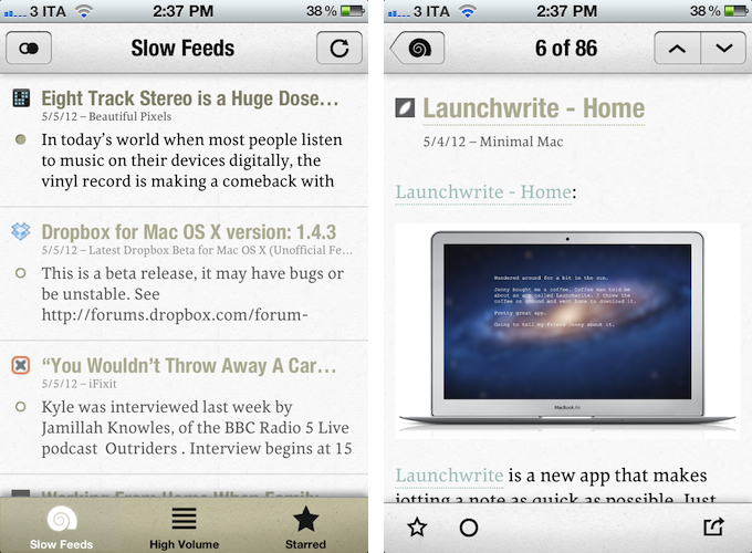
Slow Feeds by Stefan Pauwels is an iPhone app that does one thing well: it separates “slow” from high-volume feeds, and it lets you check out both within a single interface. It fixes a simple problem with a unique, yet totally obvious approach: it understands the convenience of RSS for either “low” and “high” volume websites, and doesn’t treat them equally.

Once logged in with your Google Reader account, Slow Feeds (whose icon is very appropriate) will take a couple of minutes on first launch to “understand” which feeds are usually slow, which ones have many posts per day, then it will break them up into two categories: Slow Feeds and High Volume. A third tab in the bottom bar is also dedicated to Starred items.

The first tab, Slow Feeds, lets you switch between All or Unread items for sites with few content every day: for instance, this is where I can find things like the iFixit Blog, Minimal Mac, or Beautiful Pixels. These are sites that I am interested in, but that because of their low-volume nature could sometimes easily get lost in the plethora of unread items (ever wondered why these sites usually don’t publish on Apple keynote day?). The app has been very accurate at picking “slow feeds” for me, going back a few months to older items it knew I might have missed – indeed, thanks to Slow Feeds I rediscovered many articles that I had unintentionally ignored.

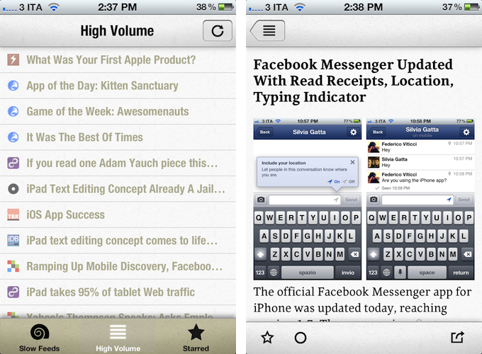
The High Volume tab, on the other hand, displays a list of all items from all sites that publish a lot of items every day. In here, I can find MacStories, MacRumors, Daring Fireball, The Loop, and all those other publications that are very active in terms of post frequency. The results have been accurate in here as well, but I think there are some things the app could do better. For one, when compared to “regular” RSS apps like Reeder or Mr. Reader, the High Volume tab is obviously lacking: there are no sorting options, no folders, and the list of items isn’t organized by date. Slow Feeds isn’t meant for this kind of consumption – the app’s purpose is to keep “slowly updated feeds from getting lost in the fast river of news” – but I think some more options wouldn’t hurt.

Similarly, it’d be nice to be able to manually specify feeds that are “low volume”. By default, Slow Feeds automatically calculates the frequency for each feed based on the number of items per feed and time interval, but a manual option could be useful for, say, those sites that don’t typically publish a lot items, but may have exceptions (such as several Apple blogs on a keynote day). Being one of the first releases of the app, I wasn’t expecting to find the same amount of configurable options and settings as in Mr. Reader, but nevertheless, I am looking forward to having more sharing features in the article reading view (which right now only supports Twitter, email, and Instapaper).

Slow Feeds won’t replace your daily RSS app (it doesn’t want to), yet at the same time, I believe it really has a chance of becoming an app many will use alongside their RSS client on a daily basis. Slow Feeds’ core concept is so clever, and so naturally implemented, I am now wondering why, in retrospective, others didn’t come up with it first.

Slow Feeds is $2.99 on the App Store.


Reading News With Hacker News ∗

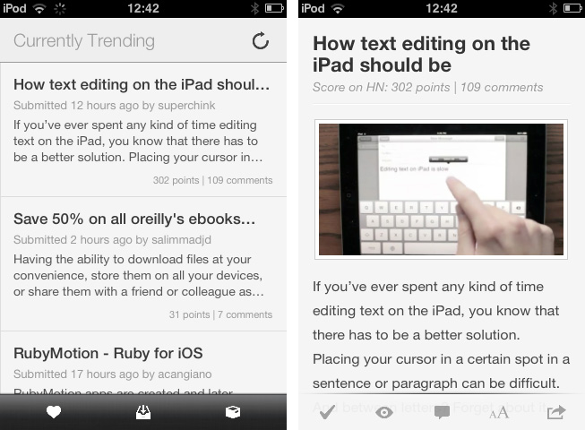
Hacker News from YCombinator is a reliable and very active source of information for all things geeky. Users collect noteworthy technology news articles from all over the web, comment and discuss on them, and vote to create a top list sorted by popularity. Following the trends of the community by joining the network or just regularly visiting the site and clicking through new articles is interesting for anyone who wants to know a bit more about the latest web technologies and how to help enhancing them, from entrepreneurs to developers. In my opinion though, the HN website is cluttered, and the typography is a mess. Maximilian Mackh solved many of these issues by recently publishing his iPhone client for Hacker News. Read more


Track 8 Brings The Metro Experience To An iPad Music Player

At what point do we cross the line that separates insipid clones from genuine inspiration, uncomfortable hybrids from interesting experiments? Track 8, a $1.99 music player by Ender Labs, tries to imagine what listening to music on the iPad would be like using Microsoft’s Metro UI experience.

Following the basic principles of Swiss graphic design, the Metro design language is focused on getting rid of “superfluous” design elements such as buttons and toolbars to turn the content – words, pictures, videos – into the user interface to manipulate on screen. Originally conceived on Windows Phone 7 and being updated as the foundation of the future Windows 8 OS, Metro has struck a chord with the design community thanks to its elegant approach to modern typography, dynamic layouts, and intrinsic originality compared to other mobile platforms. But does Metro make sense as an app running on iOS, the polar opposite of Microsoft’s studies in terms of UI design and experience?

Ender Labs isn’t afraid to say that they wanted to see how Metro would work on the iPad, without excuses. So while I’ll leave the task of determining whether this is right to someone else – I sure hope Microsoft doesn’t come knocking at Ender Labs’ door for any reason – I want to to focus on Track 8 the app for iPad you’d probably interested in checking out.

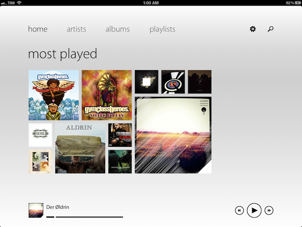
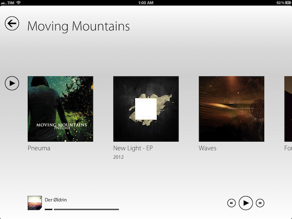
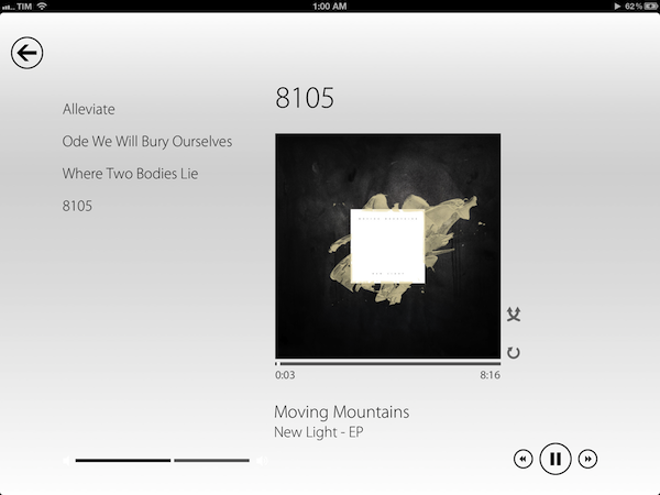
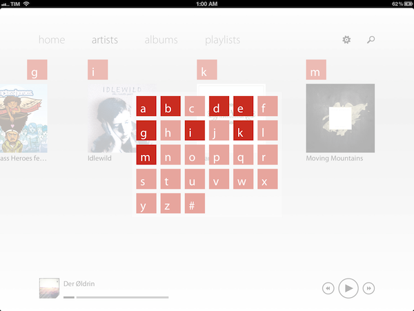
Fetching music directly from the native iOS music app, Track 8 displays four tabs (home, artists, albums, playlists) on a clean canvas that emphasizes typography, solid colors, and album artworks instead of icons, buttons, and scrollbars. In pure Metro fashion, the content becomes the interface you are manipulating: tapping on an album will advance a level “into” the content of that album, and tapping again on a song will bring up the now playing view with a larger cover art, and only some basic buttons to play, pause, shuffle, and repeat. Everything is kept as minimal as possible: the volume and progress controls are two simple flat, solid bars you can slide; to go back to a previous view, you tap on a large back button in the upper left corner that “snaps back” with a nice fading animation. To move horizontally between content, you swipe.

Track 8 comes with some appearance settings to customize the look of the Metro experience on iOS. The background color can be set to light or dark, and 10 additional options are provided to set the “accent color” for selected content and UI items. The app has some wallpapers (including linen), and you can also opt to display artist backgrounds, which are pulled from Last.fm and saved in the app’s local cache for when you won’t have an Internet connection. To keep the app in line with Metro’s elegant and uncluttered paradigm, I turned artist backgrounds off and chose a simple light wallpaper.

Track 8 works and it looks gorgeous, but it is undeniable that is an app that’s not meant to be on this platform. Not just for mere aesthetics – as an iPad app, Track 8 contradicts the very underlying principles of iOS interaction and navigation. The fact that tapping on sections at the top, for instance, gets you into a single level of interface is the antithesis of the iOS tab bar, which always allows you to switch with one tap between multiple, even nested sections. Or again, alphabetical lists: on iOS, letters are placed on the right side of a scrollable view, allowing you to quickly jump to a specific letter. With Track 8, artists and albums are grouped alphabetically, sorted horizontally in a grid, and tapping on a specific letter will display a popup grid to quickly jump to any other letter.

Track 8 doesn’t want to be an iOS app by design, and whilst this can be an advantage as long as loyalty to the Metro design language goes, it is also the app’s biggest shortcoming when it comes to expecting certain elements and patterns that are standards on iOS.

Track 8 won’t win an Apple Design Award. It won’t revolutionize the market of third-party music players for iPad, and it sure is an experiment that doesn’t aim at pushing the limits of iOS forward. But that’s not to say Track 8 doesn’t look great and work well on the iPad: if you’re a fan of Metro and would like to see that kind of experience in app that also happens to have a real functionality, Track 8 is your best option. You can get it at $1.99 on the App Store.

Building Our MacStories Wiki with VoodooPad 5

In the past three years writing for MacStories, I have stumbled across several applications that I really wanted to try, but eventually put off because I didn’t have time to learn more about their functionalities and purposes.

VoodooPad by Flying Meat – Gus Mueller’s indie development shop, also behind my favorite OS X image editor, Acorn – has been one of those apps for the longest time. I’m all for supporting independent developers, and I believe that, at some point, I even purchased a VoodooPad 4.x license and the iOS version “because you never know”. I wanted to learn and use VoodooPad, but I kept reverting to Evernote, Dropbox, and you know what else. When I read about the improvements and new features coming in VoodooPad 5.0 and got invited by Gus to test the major release, I realized two things: that I needed to learn more about VoodooPad without further delays, and that version 5.0 revealed the fleeting purpose I had been missing from my quick skims through VoodooPad’s website.

Some apps are complex, but they are not complicated. The subtle difference between these mechanics is exemplified by VoodooPad, which is presented as a “personal wiki app”, but that, in reality, is so much more. In fact, starting with powerful wiki capabilities as the app’s foundation, VoodooPad can be used for just about anything as long as you can type or come up with ways to enter information into the app. All this while staying simple, intuitive, and powerful at the same time, hiding advanced functionalities under the hood alongside those little details connoisseur of great Mac software can recognize and appreciate.

If you’re looking for a list of features in VoodooPad 5.0, the website and documentation pages are the perfect place to read through. Flying Meat is well known among Mac veterans for its painstakingly accurate and in-depth docs (possibly only second to Bare Bones Software), so make sure to check them out if you want explanations and answers. In this post, I thought it’d be fun to briefly illustrate how we are using VoodooPad at MacStories, and how I think the app can make sense alongside other text-oriented syncing services like Dropbox editors and Evernote.

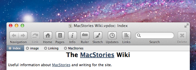
VoodooPad is a personal wiki-building application at its core, and we’re using it at MacStories exactly for that. Read more


Create Multiple Mail Signatures On Your iPhone with Signatures

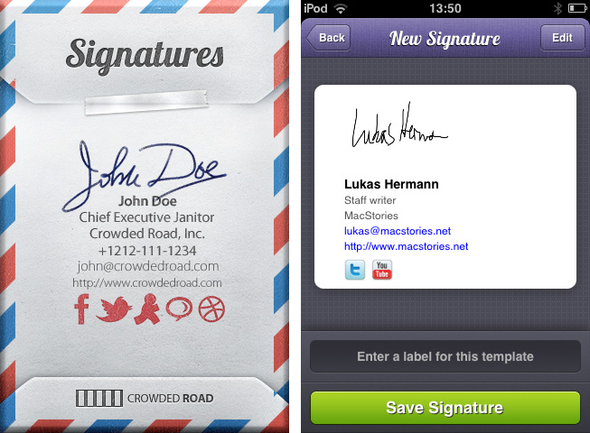
When it comes to mail conversations, it’s often difficult to find the right signature for the mail you’re about to send. You obviously cannot send a mail to your grandma ending up with “Kindest Regards, Lukas Hermann – Staff writer for MacStories.net”. I mean, of course you can, but she may misconceive that a bit. To avoid uncomfortable answers or telephone calls from her, mail apps for the Mac most of the time offer the ability to create several signatures and add them to a mail with a single click. On the iPhone, you can only create one signature, it completely lacks of this ability although it’s Mac companion has this feature. Signatures from Crowded Road fills this gap of functionality with a great UI and many useful features. Read more


My New Dropbox “Quick Note-Taking” App: Drafts 1.1

In my review of Drafts 1.0, I wrote:

Drafts is neither a text editor nor a minimal Twitter client. Drafts is a frictionless way to capture and save ideas that also happens to be integrated with system functions and applications you may be already using to elaborate on those ideas. Drafts can be used as an inspirational notepad to store the genius idea you have while you’re brewing coffee, or when you’re busy writing something else (just fire up Drafts, and quickly dictate your text if you have an iPhone 4S). I would like to see an even faster way to email text (like Captio or Note 2 Self do) as well as support for Evernote and more text-based iOS apps in a future update, so here’s to hoping the feedback on this initial version will be strong enough to encourage Greg Pierce, the developer of Drafts and Terminology (which the app also supports for definitions), to consider more functionalities and an iPad counterpart.

And from my Dropbox Writing Workflow, about the service I use to save “quick snippets of text” into Dropbox:

I am not always writing long form content. In fact, most of the time I am simply saving ideas and short sentences in Dropbox. The web service I use to quickly get bits of text as .txt files into Dropbox is Send To Dropbox. Using my “Attachments” folder, Send To Dropbox connects via OAuth to my Dropbox account and gives me a unique email address I can email stuff to.

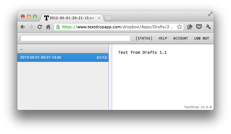
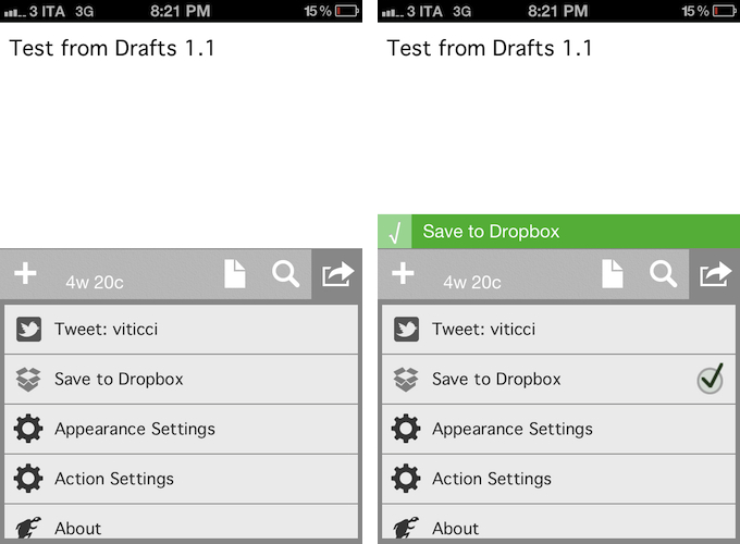
Drafts 1.1, released today, delivers in the two areas I used to find myself dabbling in: quick notes and Dropbox. Aside from a new icon by Wet Frog Studios, some minor UI refinements, and better feedback for executed actions, Drafts 1.1 comes with direct Dropbox integration to let you easily save a draft with one tap into your Dropbox account. Drafts will save notes as timestamped .txt files, meaning that, if you’re clever enough and want to automate your quick note-taking workflow, you could build rules in Hazel to look for specific timestamps and content inside the Apps/Drafts folder in Dropbox.

Personally, Drafts 1.1 fills a particular void in my workflow – a native iPhone app whose sole purpose is to save quick bits of text as single .txt files in Dropbox. With Drafts 1.1 and TextDrop, I can reclaim control of my drafts without being forced to use Send To Dropbox (which still has the obvious advantage of working anywhere). I like how I can type text into Drafts 1.1, hit the Dropbox sharing button, forget about it, and then access my text snippets with TextDrop, iOS file managers like ReaddleDocs and GoodReader (which allow you to directly edit text or “open in” other apps), or my OS X Dropbox folder.

Drafts 1.1, however, doesn’t just bring a few enhancements, bug fixes, and Dropbox support. For instance, third-party app integration has been supercharged with direct support for Sparrow (text will be passed along as email body, and the cursor will be automatically placed in the Subject field), Messages, and Simplenote. Even better, Drafts now lets you configure the apps and actions you want to keep visible in the sharing list with a dedicated menu; installed apps are automatically recognized, whilst supported-but-not-installed ones have a link back to the App Store (the App Store link button could use the same fresh coat of UI paint the icon received). You can enable and disable actions with a double tap.

Typically, 1.1 updates don’t fundamentally change the nature of an app, as they improve on existing features and fix glaring omissions of the first release. For me, Drafts 1.1, with the addition of Dropbox and more stability, feels like an all-new app that now sits in my iPhone dock to quickly save .txt into Dropbox. If you liked the functionalities of Drafts 1.0 and were waiting for more, I highly recommend Drafts 1.1, available on the App Store today at $0.99.


PlaceTagger 2 Releases Universal Build, iCloud Support, Mac App Store Version

PlaceTagger is a veteran iPhone app that has been around for years – originally an app that allows photographers to use their iPhone to geotag the photos taken with a traditional digital camera. Return7, the company behind PlaceTagger and other great apps like Billminder and Debtminder, has a reputation for innovating in every App Store category they take on. This release of PlaceTagger 2.0 including a universal build for iOS devices, a new Mac App Store version, and even iCloud support binding them together, has certainly lived up to their outstanding reputation.

There is no shortage of iOS apps tailored to photographers but PlaceTagger has really excelled in the niche area of providing a quality geotagging product to users of all experience levels. Version 2.0 does a remarkable job at implementing a simplistic user experience for what could have been an extremely complicated outcome. The iOS app is designed to run on iPhones as well as 3G enabled iPads. Although it is possible to run this app on a wifi-only iPad or an iPod touch connected to a wifi network, the results may vary and it is not officially supported. Overall, I found the user interface to be pleasantly minimal while still providing the necessities required to effortlessly start capturing GPS data.

When I first launched the iOS app, my eyes were drawn to a large clock and message reminding me to ensure the time on my camera matched the time on my phone. This was easy to check and was honestly the only thing I had to configure during my entire time using the suite of PlaceTagger apps. Once I had my camera’s clock synced to my iPhone I simply tapped the “Begin” button and stuffed my phone back in to my pocket so I could snap some pictures with my digital camera. I am not a professional photographer or even a decently skilled photographer so I usually rely on my iPhone to take outstanding photos. While I was testing PlaceTagger, I used my point-and-shoot Canon IS770, an iPhone 4S to log GPS data, and PlaceTagger on my MacBook Air to tag the photos. Apart of the new features in version 2 is the ability to tag photos on the iPad with the camera connection kit, however I had neither of these available so I opted for the Mac app. When I was finished taking pictures of my two Jack Russell Terriers, Bob and Daisy, I pulled out my phone and tapped the “Finished” button. That was the only interaction with the iOS app that I had – two taps on one button.

I jumped over to my MacBook Air, popped in my camera’s SD card and pointed the Mac App Store version of PlaceTagger to the pictures on the memory card. Below each picture was a bit of text saying “Location Matched” and all I had to do was select the “Tag Photos” button to complete the process. Right then it clicked, PlaceTagger had magically synced all of the GPS data between my devices with no settings, options, or configuration – it just worked.

PlaceTagger 2 has the most invisible implementation of iCloud I have ever seen.

When the tagging process was complete, I simply imported my photos in to iPhoto just as I normally would and experienced no issues. In iPhoto’s “Info” section for each of these photos is now a little Google Map containing the exact location the photo was taken.

If you are a user of a standard digital camera and have an iOS device then I highly recommend PlaceTagger 2 to add GPS data to all of your future photos. This suite of geotagging apps does not just add functionality to your Apple devices, but it also breathes new life in to older technology like my Canon SD770. You do not have to be a prosumer to enjoy the benefits of PlaceTagger because its polished user interface and refined feature set makes it the ideal companion app to photographers of any skill level.

PlaceTagger 2 is currently available on the iTunes App Store for $4.99 and there is also a version on the Mac App Store priced at $4.99


Metanota Brings Simplenote Organization To OS X

At some point during a writing career there comes that moment, in which you have to decide how to sync your text to all your devices. Some people use Dropbox; others, like me, prefer Simplenote. Metanota is a “new & noteworthy” OS X client for Simplenote which enhances the service’s feature set with different organizing possibilities on the desktop.

My reason for sticking with Simplenote (and Notational Velocity as a Mac client) instead of Dropbox is pretty simple: it’s easy, and it works. There’s a feature, however, that’s lacking in Simplenote – a feature that Federico also pointed out as an advantage of Dropbox: organizing your notes. Especially when you have to manage many lists, information, and text, Simplenote through Notational Velocity can get pretty cluttered and confusing, despite its powerful searching feature, which doesn’t just titles but content as well. Often, I get overrun by my own notes.

Metanota has decent search abilities, and although its note creation is not as smooth as in NV (which incorporates the search and creation features in one single interaction), it possesses a comfortable writing environment. While using Metanota and NV in parallel, text was not always synced properly with the first try, but the app did not create duplicates or deleted notes. Its design isn’t really pleasing, but it’s functional and serves the basic needs of a good note-taking app. Metanota can sync automatically every 20 seconds, 60 seconds, 5 minutes, and 60 minutes; with automatic sync in the background, notes were quickly synced to the Simplenote web app running in my desktop browser. Notes deleted on Simplenote’s website were deleted automatically on Metanota, and, similarly, updates made to a note from the Mac app were saved as “versions” on Simplenote’s website.

I want to focus on the most advantageous feature the app has to offer: sorting notes in folders. Simplenote itself features note tagging — these tags are also shown in the sidebar and on top of any tagged note in Metanota as folders. I believe tagging is not incorporated well in NV, where you just can sort notes after their tag, but not list only those notes with a specific tag with one click. Metanota imports Simplenote tags and allows you to create your own “folders” in the sidebar: these will be synced to Simplenote as tags, but Metanota doesn’t (surprisingly) lets you drag & drop notes between “folders”.

Overall, Metanota is a visually well-arranged Simplenote client with the biggest feature in its two sidebars. It more or less seamlessly syncs with the Simplenote service, it offers some nice features to cope with a large amount of notes and with the task of organizing them, but it doesn’t come with more advanced features such as Markdown support or keyboard shortcuts.

You can try Metanota for free on the Mac App Store (the built-in, unobtrusive ads can optionally be removed through a $9.99 in-app purchase).


Alfred 1.2 Adds 1Password Support, New Themes, Improved Matching Algorithm

Alfred – the productivity tool for Mac OS X that started off as a simple application launcher – has now evolved in to a tool that has literally changed the way so many people now use their computers. The team at Running With Crayons has been hard at work preparing the next release of Alfred, and today they are happy to make version 1.2 available to everyone. It has taken months of hard work, but their software development team has managed to integrate some outstanding new features and general improvements in both the free Mac App Store version as well as the Powerpack version available on their website.

Without a doubt, the single greatest feature added to the latest version of Alfred is one reserved exclusively for paid Powerpack customers which gives users access to the their 1Password 1Click Bookmarks. There has already been a lot of buzz around the web after the developer preview of this feature rolled out, but to see it in action is truly amazing. There is very little to configure and Alfred will attempt to find your 1Password keychain, then store your bookmarks automatically. I was quite impressed because my 1Password keychain is in an obscure spot in my Dropbox folder; however, Alfred had no troubles finding it and accessing my bookmarks. From there, it is a simple command ‘1p’ to begin searching the 1Click bookmarks. In typical Alfred fashion, it searches as much of the criteria as possible including the name and URL of the bookmark to ensure it finds the right one.

I am certain that this feature was a popular request among users, and I love when developers take the time to not only listen to what their customers have to say, but actually deliver updates that reflect that actual desires of those using the software.

In both the paid and the free MAS version, Alfred 1.2 has brought tremendous improvements to the matching algorithm it uses to find files as the developer noted on his blog last week. Sometimes these performance enhancements are hard to visualize when you actually get your hands on the software, but I am confident you will see improved search results in this latest version.

Let me tell you a quick story to illustrate just how great the matching algorithm is in version 1.2. One of my fellow MacStories writers had sent me an iMessage consisting of only a quote that, judging by his continued conversation, it was one he expected me to be familiar with, yet I had no idea. I copied the text from Messages and pasted it in to Alfred intending to search Google in hopes of finding out whom he was quoting. Before I could hit enter, Alfred had found that quote inside a PDF that my fellow constituent had dropped in our shared Dropbox folder. I had no idea this file was even on my computer let alone the quote he had sent was apart of its contents. In the time it took me to type Command+V and hit Enter, Alfred had found the file and opened it for me. Expecting Safari to open with a Google search completed, it took a few seconds for my brain to comprehend what had just happened. Alfred knew exactly what I was searching for despite the fact I had no idea. That is great software.

Other new features in both the paid and free versions of Alfred include two new themes as well as large type support. The two new themes called “Dark and Smooth” and “Pistachio” are a couple of great looking themes that were created by actual Alfred users and then voted on for a the opportunity to become default themes in the application. There are more details about these new themes available on the Alfred website.

Now, not every new feature is going to appeal to everyone. This Large Type support was apparently highly requested among users but I have yet to find a reasonable use for it in my day to day workflow. The basics of this feature are as such – you type any bit of text in to Alfred and then hit Command+L. Alfred will then fill the screen with that text in an extremely large font. According to the release notes, this is great for phone numbers and email address; I have only found it useful for showing dirty words to my wife from across the living room.

I also wanted to briefly mention some of the improvements on Global Hotkeys because it was partly a request of mine. Powerpack users will find a new check box option under Global Hotkey extensions that will allow any selected text to be passed to an extension when the Global Hotkey is triggered. It is hard to comprehend the usability added by this one small feature through simply reading about it so be sure to also check out David Ferguson’s video on how to use the new feature as he also demonstrates his “Drop in Pocket” extension.

Also added to Global Hotkeys was the option to paste the latest history item as plain text and the ability to assign a Global Hotkey to a text snippet. I have already started using the latter to manage my different email signatures with single keystrokes.

As with most general releases of Alfred, these are not the only new features and improvements, but they are some of my favorites. The release notes are quite exhaustive and contain all the additions in great detail. If you have the Mac App Store version then there is an update waiting you in the App Store so go ahead and grab it. If you have the Powerpack version then be even more excited because you also have an update waiting, but with even more awesome features!