This Week's Sponsor:

Dropzone 5

Improve your Drag-and-Drop Workflow


Posts in news

Mac Catalyst Isn’t Only for Bringing iPad Apps to the Mac for the First Time

So far, the most common path to releasing a Mac Catalyst app on the Mac App Store has been to adapt and release an existing iPadOS app as a first-time Mac app. However, that’s not the only route to the Mac App Store. Apple allows developers to use Mac Catalyst in a variety of ways, as Steve Troughton-Smith has demonstrated with HCC Solitaire, a Mac-only game built using Mac Catalyst. He and Brian Mueller, the creator of CARROT Weather, have also used Mac Catalyst to release new versions of Mac apps that were previously built with AppKit.

As Troughton-Smith’s HCC Solitaire confirms, developers are not required to have an iPad app on the App Store to release an app on the Mac App Store using Mac Catalyst.

https://twitter.com/stroughtonsmith/status/1183880710840635400

The game is an implementation of classic solitaire that’s just $0.99 and displays no ads. Perhaps most interesting from a developer standpoint, though, is that you won’t find HCC Solitaire if you search for an iOS or iPadOS version on the App Store. Troughton-Smith built the game using UIKit and the tools provided as part of Mac Catalyst without also creating an iPadOS version.

Brian Mueller's CARROT Weather.

Brian Mueller’s CARROT Weather.

Mac Catalyst apps can also be swapped in for existing Mac apps. That’s what Brian Mueller did with CARROT Weather, which was launched the day macOS Catalina was released as version 4.13 of his existing AppKit app. Troughton-Smith took the same approach with SameGame, a color-matching game in which you earn points by eliminating contiguous blocks that are the same color, releasing version 2.2 shortly after Catalina’s release.

Steve Troughton-Smith's SameGame.

Steve Troughton-Smith’s SameGame.

I don’t expect either of these approaches to become the main way that Mac Catalyst apps are released, but I’m glad to see that it’s possible. Most developers will be bringing an iPadOS app to the Mac for the first time, but business models, developer backgrounds, the APIs used in an app, and many other variables play a role in the decision of whether to use Mac Catalyst. It’s encouraging to see Apple take a flexible approach and allow developers to experiment because that makes Mac Catalyst useful to more of them. However, as I noted in my Catalina review and elsewhere, that flexibility needs to be coupled with bug fixes, documentation, and rapid evolution of Mac Catalyst for it to become a viable option for a wider audience of developers.


New Beats Solo Pro Headphones Featuring Apple’s H1 Chip Are Available for Pre-Order

Apple subsidiary Beats has announced a new version of the Beats Solo Pro noise cancelling headphones, which can be pre-ordered now and will begin shipping at the end of the month.

The new headphones, which retail for $299, feature Apple’s H1 chip that also powers the second-generation AirPods and Powerbeats Pro. The H1 chip enables hands-free ‘Hey Siri’ commands and the ability to share audio with someone using the Audio Sharing feature that Apple debuted with iOS and iPadOS 13. The headphones also have volume, track, and call controls on the right ear cup and a button for turning noise cancellation and their Transparency feature on and off on the left ear cup.

Unfolding and folding the Solo Pros turns them on and off.

Unfolding and folding the Solo Pros turns them on and off.

The Beats Solo Pros feature active noise cancellation to filter out external sound and what Beats calls Transparency that uses external microphones to allow some sounds through, so users remain aware of their surroundings when using the headphones. According to Beats, the headphones, which are turned on and off by unfolding and folding them, get 22 hours of battery life with noise cancellation and Transparency turned on. If those features are turned off, the company says the battery life lasts 40 hours. The company also says that a ten-minute charge provides up to 3 hours of battery life. The Solo Pros charge with a USB-A to Lightning cable for the first time too.

The Solo Pros come in six colors: light blue, red, dark blue, ivory, black, and gray. Although The Verge and other sites report that the new headphones will begin shipping on October 30th in the US, apple.com currently lists the ship date as October 29th during the pre-order checkout process.


More than 200 New Emoji Coming Soon Are Now Available in iOS and iPadOS 13.2 Beta 2

It’s October, which means Apple’s latest crop of emoji is right around the corner. As usual, Jeremy Burge at Emojipedia has all of the details. As previewed earlier this year, Apple will release its version of Emoji 12.0 from the Unicode Consortium this fall in iOS and iPadOS 13.2 and in a future update of macOS Catalina and watchOS 6 too.

The release of the new emoji is a long process. The first step came in February when the Unicode Consortium announced the details of the emoji that it had approved for 2019. Apple, like other platform vendors, took the specifications from the Unicode Consortium and implemented its interpretation of each emoji, which the company previewed in July.

Today, those emoji, plus a few that weren’t previewed on World Emoji Day in July, have been added to the iOS and iPadOS 13.2 betas. The new emoji should be shipped to the broader public as the official iOS and iPadOS 13.2 release soon. Among the new emoji are people in wheelchairs, skin tone support for people holding hands, a sloth, a waffle, a yawning face, a skunk, garlic, a yo-yo, and a flamingo.

https://twitter.com/jeremyburge/status/1182350386188828677

For the first time today, Apple also revealed its emoji for an otter, a pinching hand, a beverage box, and a ringed planet. Also added to iOS and iPadOS 13.2 is a new emoji keyboard interaction for picking the skin tone for emoji that depict multiple people.

Emoji have become a significant driver of OS updates for Apple, and I expect this year will be no different. With the explosion of choices, though, I do wish Apple would implement an emoji search mechanism on iOS and iPadOS and improve the search functionality on the Mac.

Permalink

RSS Client Lire Arrives on Mac App Store with One of the Best Early Catalyst Implementations

In June I wrote about my hopes for Catalyst, the technology that allows iPadOS developers to bring their iPad apps to the Mac. At the time, I said that RSS clients were one of the categories of apps I wanted to see brought from the iPad to the Mac first. That wasn’t because there are no options on the Mac. For instance, I recently reviewed NetNewsWire, which is excellent. However, there are very few options if you want an app that’s available on the Mac, iOS, and iPadOS, supports a rich set of features, and is actively maintained. That’s why I was pleased to see that lire, one of my favorite RSS readers on iOS and iPadOS, was released this week on the Mac using Catalyst.

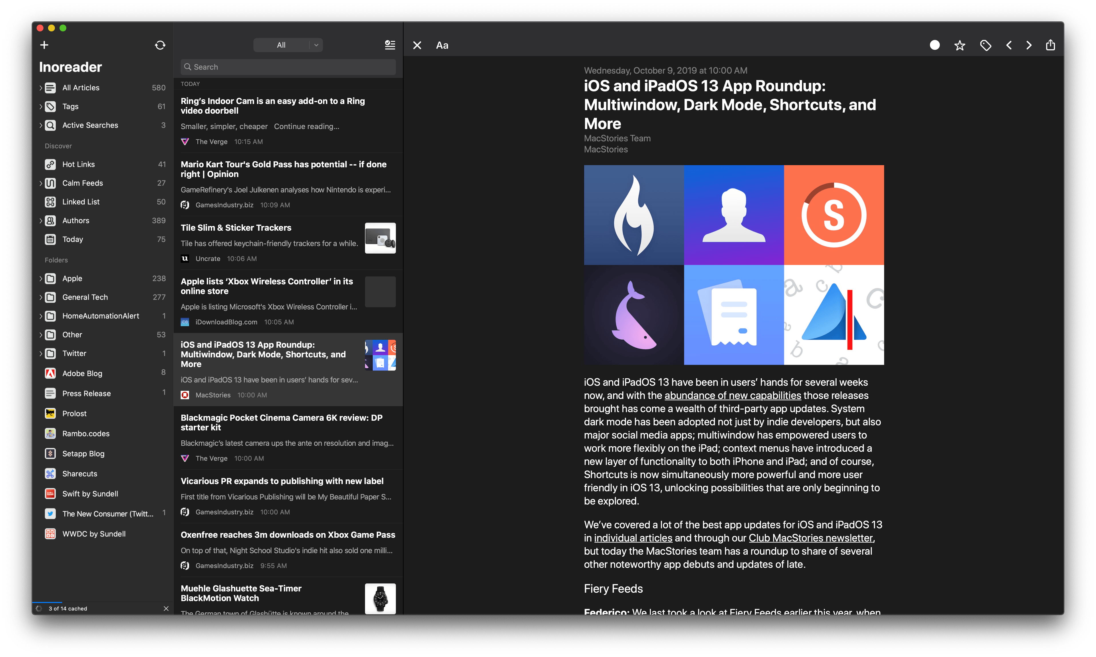
If you’ve used lire on an iPad, you’ll immediately feel at home when you open the app on the Mac for the first time. The layout is similar to the iPad version, with one notable exception: instead of the two columns you see on the iPad, lire displays three columns on the Mac. This means you can view your list of subscriptions, articles, and a selected article simultaneously. On the iPad, the article view is separate from your subscriptions and article list. It’s a small design change that makes a lot of sense on the Mac, where screens are usually larger than the iPad. I would, however, like to have the option of hiding the first two columns, which is not currently possible, though they can be resized.

If you use lire with an RSS syncing service like I do, once you log in you can browse sources in the first column by subscription and tag. Like the iOS and iPadOS versions, the first column also includes Discover and Folders sections. Discover collects Hot Links, which are URLs that frequently appear among your feeds, Calm Feeds for sites that don’t publish often, linked list articles, posts organized by author, and articles published recently, which you can define in the app’s preferences. As you’d expect, folders are user-defined sets of feeds.

Articles and images can be opened in separate windows.

Articles and images can be opened in separate windows.

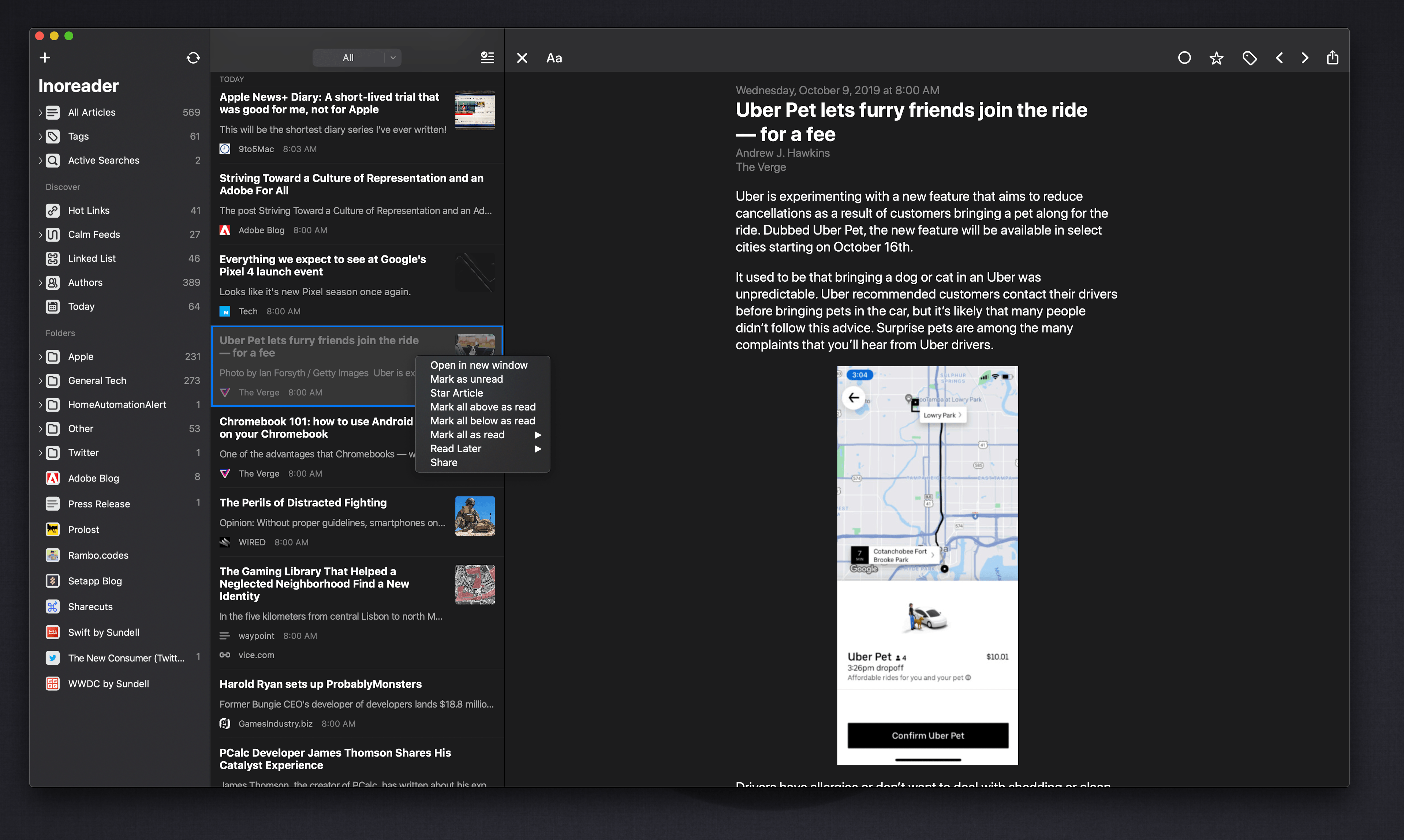
The article list can be filtered in nine different ways, and there’s a toolbar button to mark everything as read. Right-clicking an article summary provides options to open it in a separate window, mark it as read or unread, star it, mark the articles above or below it as read, mark everything as read, send it to a read-later service, or share it via the system share sheet or lire’s custom share options. The many options make the article list a fantastic way to filter and scan through a large number of articles and manage the ones you want to follow up on and share with other apps.

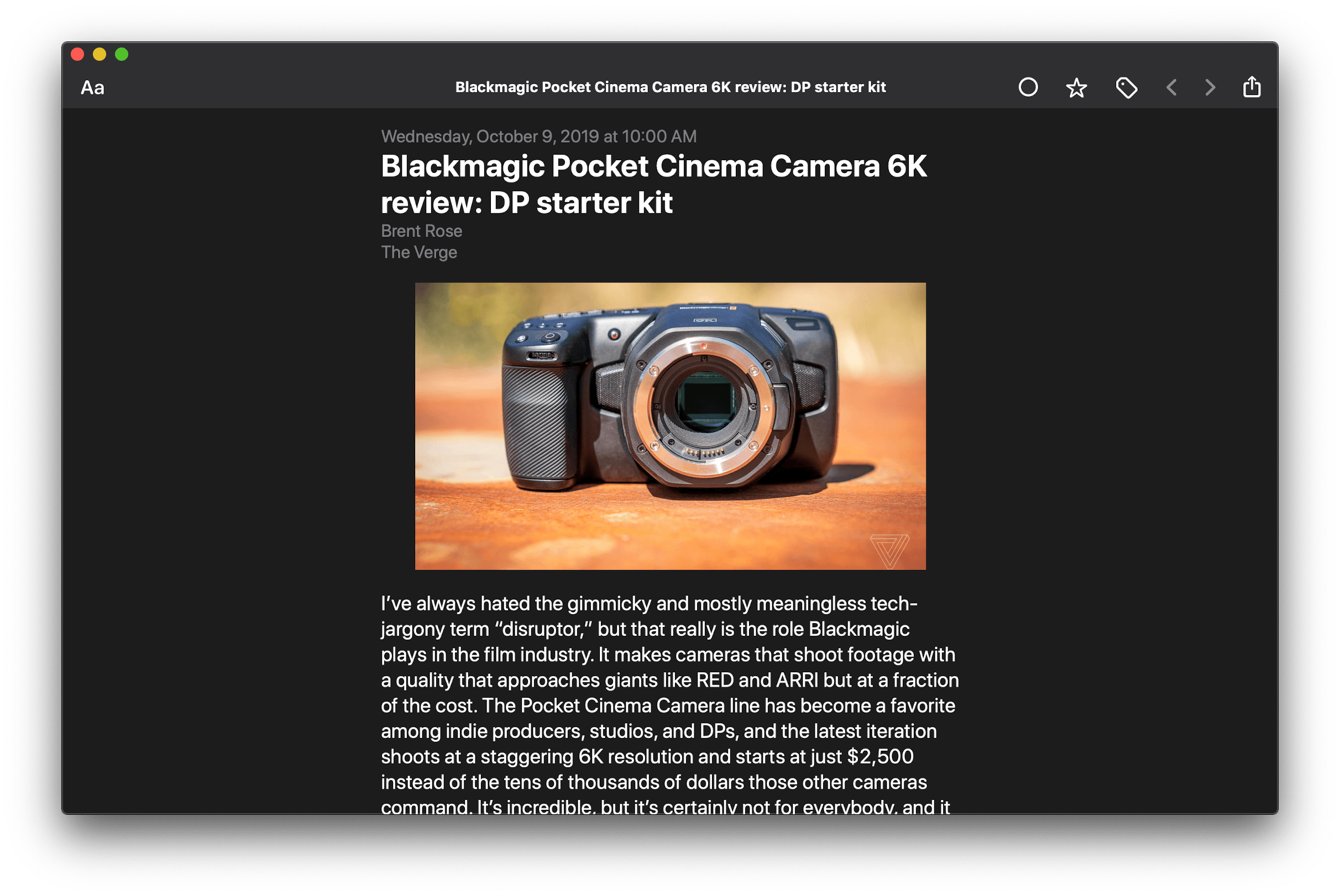
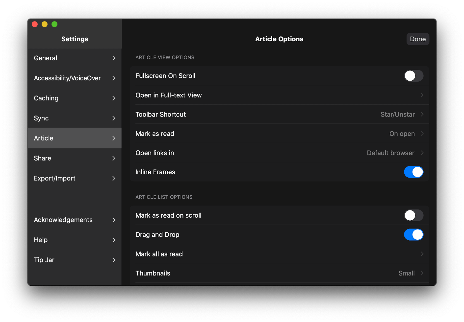
There are separate appearance settings for article view, which is a nice way to manage the amount of information available independently from the subscription and article list. The article view also includes buttons for marking the currently-viewed article as unread, starring and tagging it, navigational arrows, and a share button that includes share options supplied by the macOS share system as well as custom ones like ‘Copy Link,’ ‘Pin Author,’ ‘Download as EPUB,’ and more.

I’ve used a lot of different RSS readers, and lire has always stood out because it can be customized in so many different ways. The app also does a better job than most other RSS clients of pulling the full text of an article from an RSS feed that offers truncated versions of its articles only. Although some features of the iOS and iPadOS apps aren’t available on the Mac yet, such as theming, I’ve been impressed with the level of customization that’s been brought over so far.

Unlike many other Catalyst apps, lire includes a separate preferences window.

Unlike many other Catalyst apps, lire includes a separate preferences window.

However, what makes lire one of the best Catalyst adaptations of an iPad app that I’ve seen so far is its attention to detail on the Mac. It’s a collection of smaller touches that make the app feel more at home on the Mac than most other Catalyst apps. For example, lire includes tooltips when you hover the pointer over the buttons in its toolbar. That’s something that isn’t automatically available to Catalyst apps, so few apps have adopted it so far. Lire has also implemented custom right-click context menus throughout the app to access share, view, mark as read, and other options. The app also makes extensive use of keyboard shortcuts and allows for links to be opened in your default browser in the background, something that far too few AppKit apps offer. I also appreciate that lire uses a separate Preferences window instead of a popup view that hovers over but is still part of the app’s main window, which many Catalyst apps do.

lire makes extensive use of context menus throughout.

lire makes extensive use of context menus throughout.

RSS feeds have benefitted from the healthy app competition found on iOS and iPadOS, pushing power user features forward at a rapid pace. The Mac’s RSS scene hasn’t been nearly as active in the past, but with the addition of lire and Fiery Feeds, which also launched on the Mac App Store for the first time this week, my hope is that we’ll see a resurgence of RSS readers on the Mac App Store with innovative new features.

Lire is available on the Mac App Store for $19.99.


macOS Catalina: The MacStories Review

Ironically, Apple chose to name this year’s update to macOS after an island. Since the iPhone and iOS took off, macOS has sometimes felt like an island isolated from the rest of the company’s OSes, but the goal articulated by the company at WWDC this year was quite the opposite. Apple clearly telegraphed that change is coming to the Mac and it’s designed to bridge the user experiences between each of its platforms.

To developers, that message came in the form of Catalyst and SwiftUI. Catalyst, which was previewed as an unnamed ‘Sneak Peek’ in 2018, is meant to make it easier for iPadOS developers to bring their apps to the Mac. SwiftUI has a similar longer-term goal of unifying and streamlining how developers build the interfaces for their apps across a range of devices, for everything from the Apple Watch to the Mac.

The efforts to draw macOS in closer with Apple’s other operating systems run deeper than just developer tools though. macOS may have been the foundation on which iOS was built, but in the years that followed iOS’s introduction, the two OSes grew apart. Identically-named apps were developed on different schedules, which meant they rarely included the same features. Also, system-level functionality like System Preferences, which serves the same purpose as iOS’s Settings app, was unfamiliar, making Mac adoption unnecessarily hard for newcomers. Catalina is an attempt to address those kinds of inconsistent user experiences.

With Catalina, Apple has taken clear, though not always successful, steps to bridge the divide between the Mac and iOS. App functionality has been realigned, System Preferences has been rearranged, and new features have been added to make it easier to move from one platform to the other.

As with other transitional periods in the Mac’s history, this one isn’t going to be easy. However, because the change is driven by a fundamental change in computing, it’s also necessary. We live in a new climate where computing is now dominated by mobile devices. For many people, a smartphone is all the computing power they need day-to-day. That doesn’t mean there’s no longer a place for the Mac, but it’s clearly what’s driving the changes in Catalina.

Apple could have chosen to ignore the shift of the ground beneath its feet and merely maintained macOS, making the kind of small incremental changes we’ve become accustomed to in recent years. However, not adapting is as deliberate a choice as change is, and it carries just as much or more uncertainty for the Mac as a platform because it risks irrelevance.

The Mac isn’t in crisis, but it isn’t healthy either. Waiting until the Mac is on life support isn’t viable. Instead, Apple has opted to reimagine the Mac in the context of today’s computing landscape before its survival is threatened. The solution is to tie macOS more closely to iOS and iPadOS, making it an integrated point on the continuum of Apple’s devices that respects the hardware differences of the platform but isn’t different simply for the sake of difference.

Transitions are inherently messy, and so is Catalina in places. It’s a work in process that represents the first steps down a new path, not the destination itself. The destination isn’t clear yet, but Catalina’s purpose is: it’s a bridge, not an island.

Read more


Apple to Open Siri Up to Third-Party Messaging and Phone Apps

Bloomberg reports that Apple will open up Siri to third-party messaging apps with a software update later this year. Third-party phone apps will be added later. According to Bloomberg’s Mark Gurman:

When the software refresh kicks in, Siri will default to the apps that people use frequently to communicate with their contacts. For example, if an iPhone user always messages another person via WhatsApp, Siri will automatically launch WhatsApp, rather than iMessage. It will decide which service to use based on interactions with specific contacts. Developers will need to enable the new Siri functionality in their apps. This will be expanded later to phone apps for calls as well.

As Gurman notes, the company’s change in approach comes as Apple is facing scrutiny over the competitive implications of its dual role as app maker and App Store gatekeeper in the US and elsewhere.

It’s interesting that the update is a Siri-only change. Users will still not be able to replace Messages with WhatsApp or Phone with Skype as their default messaging and phone apps for instance, but it strikes me as a step in the right direction and a change that I hope leads to broader customization options on iOS and iPadOS.

Permalink

AppStories, Episode 132 – Apple Arcade: The Launch and Favorite Games

On this week’s episode of AppStories, we cover the all-new MacStories Shortcuts Icons, a set of 300 custom icons for shortcuts that you can add to your Home screen and then revisit Apple Arcade in the wake of its public launch discussing some of our favorite games so far.

Sponsored by:

  • Pingdom – Start monitoring your website performance and availability today, and get instant alerts when an outage occurs or a site transaction fails. Use offer code APPSTORIES to get 30% off.
  • Zapier – The easiest way to automate your work. Start your 14-day free trial today.
  • Direct Mail – Create and send great looking email newsletters with Direct Mail, an easy-to-use email marketing app designed exclusively for the Mac.

AppStories+ Deeper into the world of apps

AppStories Episode 132 - Apple Arcade: The Launch and Favorite Games

0:00
46:50

AppStories+ Deeper into the world of apps

Permalink

Halide 1.14 Adds New Lens Switching Interface and Guides

Halide 1.14 is out with a new lens switching UI to accommodate the three-camera system of the iPhone 11 Pro and Pro Max. As soon as the update was out, I went for a walk to give it a try.

Halide has introduced a new lens switching button featuring haptic feedback and a dial-like system for moving among the iPhone’s lenses. When you press down on the lens button, you get a tap of haptic feedback to let you know without looking that the lens picker has been engaged.

From there, you can slide your finger among the ultra wide, wide, and telephoto options that radiate out from the button. As you swipe your finger across each option, it enlarges, and you’re met with another little bit of haptic feedback as you swipe over the lenses other than the one already selected. Once you have the lens you want, you simply let go and your iPhone switches to it.

You can also cycle through the lenses in order by tapping the button repeatedly or swipe left for the ultra wide lens or up for the telephoto one. In my brief tests, swiping left or up is the best option if you already know the lens you want, but using the dial-like lens switcher is perfect for considering your options first because Halide has also added lens preview guides.

With the lens button engaged, Halide shows guides for each of your zoom options. That means if you’re using the ultra-wide lens, you’ll see the light gray guidelines for the wide and telephoto lenses. As you swipe over those lenses, the guides change to yellow to highlight the composition you’ll get if you switch to that lens.

If you’re already using the telephoto lens though, Halide will highlight the outer frame of the image to suggest you’ll get a wider shot, though it does not zoom the viewfinder out to show that composition until you lift your finger. You can see how the lens guides work from the screenshots I took at a local high school football field above and in this video:

Switching lenses in Halide.Replay

When you switch to the ultra wide lens, you’ll notice that not all the usual Halide features are available. Manual focus is missing and so is shooting in RAW. That’s because the new iPhone hardware and iOS and iPadOS 13 don’t support those features. Although the ultra wide shots don’t support RAW, Halide has included a ‘MAX’ option in place of the ‘RAW’ option, so you can get the most image data possible from your wide shots, which you can see in the screenshots below.

Ultra wide images are limited to MAX quality (left) instead of RAW, which is supported by the wide and telephoto lenses (right).

Ultra wide images are limited to MAX quality (left) instead of RAW, which is supported by the wide and telephoto lenses (right).

The Halide team says that the latest update also includes noise-reduction adjustments to the RAW images produced by the iPhone 11, but that they are continuing to fine-tune how that app handles RAW photos from the new phones as part of a more significant update that is coming next.

The latest update is relatively small, but I especially like the use of haptic feedback and lens guides, which make it easy to switch lenses when you’re focused on the viewfinder of the camera instead of Halide’s buttons.

Halide is available on the App Store for $5.99.


Introducing MacStories Shortcuts Icons: 300 Custom Home Screen Icons for Your Shortcuts

Update: October 18, 2019: MacStories Shortcuts Icons has received its first free update, which adds 50 new icons to the set. You can read more here.

I’m thrilled to announce MacStories Shortcuts Icons, a set of 300 custom icons for shortcuts added to your Home screen, designed by the MacStories team.

Here’s the short version of this story: the set contains 300 Home screen icons, it has been specifically designed with Shortcuts users in mind, and it works on both iPhone and iPad. It’s available today at $14.99 and you can buy it here.

If you’re a Club MacStories member, check your member area for a discount code first: for you, the set is 33% off, so you can purchase it at $9.99.

All sales are final. You can read our license and terms of use here.

You can find a complete preview of MacStories Shortcuts Icons’ 300 glyphs here..

With these icons, you’ll have more options than what is provided by default in the Shortcuts app for Home screen icons. There are no workarounds, no hacks: our icons can be installed using a native feature of Shortcuts supported in the just-released iOS and iPadOS 13.1.

And here’s the best part: MacStories Shortcuts Icons will keep the original colors of your shortcuts, so you’ll be able to create Home screen shortcuts that are consistent with the app, yet unique and personal. MacStories Shortcuts Icons is the first Shortcuts-specific icon set to support this.

Here are actual examples of my iPhone and iPad Home screens, which I updated using MacStories Shortcuts Icons:

Mixing and matching apps with MacStories Shortcuts Icons on my Home screens.

Mixing and matching apps with MacStories Shortcuts Icons on my Home screens.

We’ve teamed up with our designer Silvia Gatta for this set, which is the first product we’re launching under the new MacStories Pixel brand.

We spent months crafting MacStories Shortcuts Icons with attention and care for the Shortcuts community, and I’d love for you to check it out.

Now, let me share a few more details on how MacStories Shortcuts Icons came to be.

Read more