Federico Viticci

10765 posts on MacStories since April 2009

Federico is the founder and Editor-in-Chief of MacStories, where he writes about Apple with a focus on apps, developers, iPad, and iOS productivity. He founded MacStories in April 2009 and has been writing about Apple since. Federico is also the co-host of AppStories, a weekly podcast exploring the world of apps, Unwind, a fun exploration of media and more, and NPC: Next Portable Console, a show about portable gaming and the handheld revolution.

Why I Use Todo.txt

I’d like to briefly elaborate on my Todo.txt setup, which I only started using last month as a way to keep my “todo articles” separate from general “todos” that I now keep organized and synced through Remember The Milk. Several readers have emailed me asking why I chose Todo.txt of all text editors and task management systems, so here it goes.

Todo.txt has a simple syntax that requires no learning curve. I can fire up Todo.txt’s iOS app or TextEdit on my Mac, and add a new line for a new todo, which in my case is an article I’m working on or I know I’ll be working on in the immediate future (this week or next week, I try not to project too distant in the future as blogging priorities can rapidly change). I’ve tried other text-based todo solutions like TaskAgent and TaskPaper, and I like them a lot as apps with outstanding support from their developers, but I just feel more comfortable using Todo.txt’s syntax, which appends new lines as todos and marks those beginning with an “x” as complete. Obviously, Todo.txt comes with much more complex possibilities and interfaces such as a full-featured CLI and support for contexts and priorities, but I use none of these features. To me, Todo.txt is the easiest way to maintain a list of “todo” Vs. “not done yet” articles that I want to have on MacStories.

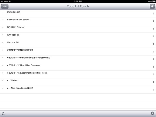
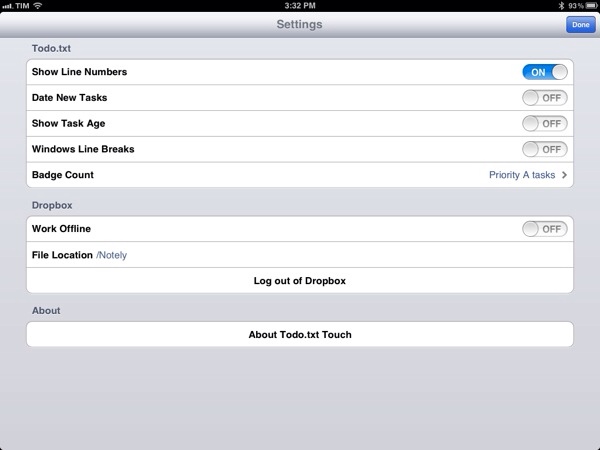
For this reason, I keep the Todo.txt iOS apps (on my iPhone and iPad) as simple and clutter-free as possible. Developer Gina Trapani made sure that you can sort by date and todo ID, enable app badges and date new tasks but, again, I haven’t found myself needing any of these (I could have enabled badges on the Mac too). In the Todo.txt iOS app, I chose to display line numbers to give me an easily scannable overview of just how many items I have, and I’ve disabled everything else as you can see in the screenshot. With this setup, it takes 30 seconds to open the app, quickly see what’s up while it’s syncing (takes a few seconds as the file to load is very lightweight) and enter a new todo. I don’t use contexts and projects either: as I mentioned last week, I don’t need a “context” for my MacStories articles, and the project is always the same, writing for the site.

If possible, things are even simpler on my Mac. Todo.txt is synced via Dropbox and alias’d on my desktop. When I need to check on the articles I have in my queue I can use TextEdit or, better, nvALT, which also displays all my other Dropbox notes synced inside a “Notely” folder (no particular app preference here, I just liked the name). Adding new todos to the file requires a few seconds, but if I’m feeling really keyboard-junkie I can append a new todo to the end of the file using an Alfred extension. I use Alfred for a lot of different tasks on my Mac (adding items to Remember The Milk, converting currencies, generating new random passwords, etc.), so it helps that I’ve found a way to integrate Todo.txt with my existing workflow.

And when an article is done and a todo is complete? I just delete it. I don’t archive, “review”, flag or categorize. Articles are just there and it’s up to me to write them.

Text-based todo management systems go back a long way. In learning about Todo.txt’s history, I stumbled upon relatively old articles that described how it was popular “back in the day” (we’re talking pre-Tiger days as well) to keep everything, from notes to passwords to long-form articles, inside a giant .txt file formatted in some way for easy scanning. These days we’re using the modern versions of those systems, which may be Evernote, Yojimbo, or other anything buckets. These services come with a fantastic set of features – I’m a huge fan of Evernote myself – but as far as my articles go, I want them to be highly portable in an environment that’s open to any other app for access and modifications. With plain text, I can have my MacStories-related todos synced in a text file that can be opened and correctly read by any text editor – and I’m sure it’ll remain that way for the next 20 years when .docx files will be corrupted and biting the dust.

Some parts of Todo.txt are modeled after David Allen’s GTD methodology and, at least for my articles, I’m not using GTD at all. But I am getting things done, for real, with a system that I can trust, is reliable and works anywhere.


Logging with Day One and Alfred

Yesterday, Brett Terpstra posted a fantastic little script to leverage Day One’s built-in CLI (command line interface, more information available here) to create new journal entries from the Terminal or an app launcher. Brett has posted instructions on how to use Launchbar with the script, or skip the app launcher part altogether and go with the Mac’s Terminal instead:

Day One already has a quick entry palette in the menubar. It also has a command line interface (/usr/local/bin/dayone)1 which provides some geeky options (try dayone in Terminal) and the flexibility needed to replace my current logging system. You can create entries quickly with either method, but I wanted just a little bit more out of it. I built a quick script which allows a basic syntax for starring entries and defining dates (using natural language) inline in the entry itself. It can be used from the command line, from LaunchBar (or similar) and can be incorporated into just about any scriptable workflow.

I wanted to make the script work with Alfred, my app launcher and navigation tool of choice, and it turns out the effort to modify Brett’s script is equal to zero. I simply replaced “on handle_string(message)” with “on alfred_script(q)” and ”end handle_string” with ”end alfred_script” to make it work in Alfred. Obviously, you’ll need to fill in the path to your script after you’ve followed Brett’s instructions.

The three Day One entries above were created (and starred) using Alfred.

Before you create a new Applescript extension in Alfred, don’t forget to download Brett’s script and make it executable in your desired location, and create a symlink for Day One’s CLI (Show Package Contents on Day One, then navigate to Contents/MacOS/dayone - that’s the CLI you have to symlink) in your usr/local/bin/ directory.

You can check out Brett’s post here, and catch up on our coverage for the latest version of the app, Day One 1.5 (Mac and iOS).


Quick Review: Wikibot

Aside from jokes about a name that sounds like a Tapbots app, I’ve been using Wikibot, a Wikipedia client by Avocado Hills, on my iPhone, iPad and Mac regularly, earning a spot on my Mac’s dock as well. Whilst Wikipedia’s website is mostly fine to quickly check on something you don’t know (albeit I’d refrain from lacking particular amounts of knowledge on January 18) and desktop launchers like Alfred made it extremely easy to query the service for anything you need, Wikibot stood out to me because of its clean interface and integrated approach to languages, history and bookmarks.

On the Mac, Wikibot starts up as a minimal window onto Wikipedia’s database with a button in the upper toolbar to display the app through Lion’s full-screen mode, one to load a random article, and a search bar. Search is where you’ll be entering your keywords and there is an option to visualize results as text (title + preview) or just title. You can open multiple tabs (CMD+T), change your preferred language from the menubar item, and “copy link” or “open in browser” via a keyboard shortcut.

The nicest features of Wikibot on the Mac, however, are Favorites, History, Read Later and the overall page design, which as I mentioned above is very uncluttered and clean. Not Articles-clean, but still very readable. As for the other functionalities, you can tell Wikibot to add a page to your favorite items, or access your entire history for all the things you looked up. These options are located in a sidebar, which can also display contents of an article (such as sections and references) and categories (as you can see in Instapaper’s case, “iPad” and “iPhone software”). Favorites can be organized in folders, and it’s easy to add a page to your bookmarks using a keyboard shortcut or drag & drop. If you, however, don’t feel like building a permanent database of bookmarks while you’re using Wikibot, but just want to quickly save a link for later inside the app, you can use the local queue functionality.

At $2.99, Wikibot for Mac is a fine desktop app for Wikipedia meant for those who don’t want to keep lots of tabs open in their default web browsers.

I, however, very much prefer the iOS versions of Wikibot, which work like their Mac counterpart but add iCloud sync for History, Favorites and Settings across devices, intuitive font size controls, visual history, gallery for images, sharing options for Twitter and Facebook and offline caching. Wikibot for iOS is a powerful Wikipedia client with a simple interface, and I’m told iCloud sync will soon come to the desktop as well. I especially like the app on my iPad, where visual search and image galleries have more room to shine and “it just feels right” to spend hours augmenting your knowledge.

Plus, Wikibot for iOS is $0.99 right now, which is a great price. Get it here.


Apple Planning “Nearly Transparent Store” For France

Apple Planning “Nearly Transparent Store” For France

Today’s cool Apple retail news comes from ifoAppleStore’s Gary Allen, who points to an article first appeared on AixEvProvence.fr magazine, which claims Apple is planning a nearly-transparent, all-glass retail store for the town located in the south of France.

A rendering posted by the magazine shows a one-level structure set back on a broad stone plaza, with a tan-colored rear wall, and all other encompassing walls made of glass. A second rendering shows the store is an extension of a design roughly based on the Upper West Side (NYC) store. Typically for Apple, the rendering does not show any Apple-like features and there are no visible Apple logos. According to the magazine, the city required Apple to build to new earthquake standards, and harmonize with the surrounding picturesque streets.

Of course, Apple isn’t new to state-of-the-art glass engineering. Steve Jobs famously said that they’ve been able to design Apple’s proposed future campus in Cupertino thanks to their expertise in durable glass constructions, which date back to 10 years ago when the company started opening retail stores featuring Apple’s distinctive glass. Most recently, Apple launched a redesign of its 5th Ave. Store in New York City using less glass panels and a patent for glass staircases was attributed to the company’s late CEO Steve Jobs.

This is a photo of the current Office de Tourisme in Aix en Provence.

Permalink

Jeff Broderick’s “QuickContact” Creates Call & Message Home Screen Icons

It appears a new trend among independent iOS developers is that of creating shortcuts to save time on tedious iOS tasks such as activating WiFi and Bluetooth, open third-party applications, or call someone. First came a bunch of web-based tools to create this kind of home screen shortcuts, including design extraordinaire Jeff Broderick’s Settings. We’ve covered this whole shortcut phenomenon quite extensively on MacStories, including Siri and the iPhone’s URL schemes (links that redirect iOS to apps or specific sections inside an app) and Launch Center, an app that spurred a debate around shortcuts and Apple’s review policies after the app was rejected from the App Store, whereas similar tools had been approved for sale. It was also discovered that Apple plans on making Settings unaccessible via URL schemes on the upcoming iOS 5.1.

Now Jeff Broderick is back at it, pouring his typical style and attention to detail into a new project called QuickContact. QuickContact allows you to create Home screen icons for people to call or send a text message to; you can choose between 15 icons designed by Broderick or upload your own upon creating a new shortcut, which is done through Safari on your iPhone or iPod touch. I won’t lie – I like Jeff’s style a lot, but I wish the web app was capable of supporting email addresses, too, besides phone numbers; I’d also like to launch the Phone or Messages apps directly without opening Mobile Safari first. Last, the app requires you to install a certificate on your device for this automation to work, and Broderick specifies on his website that “No information is saved”.

For those interested in trying out this first version of QuickContact, you can check out the project’s page here.


Thomas Brand On The History of Camino

Thomas Brand On The History of Camino

Thomas Brand has published a detailed overview of Camino’s timeline and unfortunate demise earlier this year due to Mozilla’s decision to officially discontinue Gecko embedding, which Camino uses. For those not familiar with it, Camino was the advanced browser in the early days of OS X when Safari wasn’t out yet and IE was still the only decent choice for Mac users.

Even though I still have Camino installed on my computer it fails to qualify as a reliable alternative browser less than two months since its last update. I am saddened that Camino must die in the effort to save Firefox, a browser that has gotten just a bloated as the Netscape Suite it once replaced. By losing Camino we will not only see the end of a browser that once made the Mac great, but the end of development community focused solely on the advancement of a Macintosh only application.

As written on Camino’s blog back in March, the future beyond version 2.1 (current release) is “unclear”.

Permalink

New Apps for 2012

With the new year, many people make up resolutions that often involve losing weight or spend less time checking email and Facebook. Whilst those are certainly noble resolutions, they don’t quite fit the goals that I have set for this year when I began thinking about 2012 and the things I’d like accomplish in the next 12 months. Instead of working more to make more money, I’d like to work less but work smarter, as Shawn recently mentioned in an episode of Shawn Today. I want to spend more time with my family and friends and use the “time for work” with better tools to get the same things done, but better. I’m working on a series of completely new projects, too, but I also would like to optimize my existing tasks to require less time yet yield better results.

Which means I have to get new tools and understand how to properly use the ones I already have.

So instead of making up new year’s resolution and give up on losing weight after three weeks as most people do (but won’t admit), I actually went ahead and got new tools. Which, in my case, means I bought new apps and gear to get work done.

I recently wrote about how I’ve switched from OmniFocus to Remember The Milk, Calendar and Todo.txt to effortlessly manage my tasks, events, and articles. I’d like to quote for the sake of context:

I don’t have access to my Mac 24/7 anymore. I work from different places, and 80% of the time I prefer to keep my iPad with me than a MacBook. Obviously, the tweaks and adjustments I had made on my Macs didn’t carry over to iOS devices.

Articles, app releases, website management and finances are all different kinds of tasks. I used to keep them in OmniFocus, and tweak the app and its view options to fit the way I worked. It turns out, having separate tools for different sets of tasks is helping me focus more and avoid distractions. Articles need research and are more text-oriented; app releases only need a quick ping or alert; finance and website management can go into a proper GTD app with lists, due dates, etc..

These are two key points: access and writing. I don’t have access to my Mac(s) 24/7 anymore and I have to give up on pretending my articles are tasks that need to be managed with tags and due dates. Writing is a creative process (even when I’m breaking news or analyzing a rumor, I try to offer a perspective for debate and analysis), and I don’t think creativity can be managed with strict rules and app badges.

So here’s a short list of new apps that are helping me rethink my workflow. Some of them will stick around, others will probably be deleted – I don’t know. What matters is that taking a step back and reconsidering your work habits is a healthy practice (clearly better than telling your friends you’re going to lose weight or quit smoking) that, I believe, can lead to better relationships, a new knowledge of your workflows, and, ultimately, better results. Read more


Soul Calibur Coming To iOS This Week

Soul Calibur Coming To iOS This Week

Namco’s Soul Calibur – the first episode that was released on arcade in 1998, then on SEGA’s Dreamcast in 1999 – has been ported to iOS and will be released this week, on January 19. Aside from being compatible with the iPhone, iPod touch and iPad, the game will feature Retina graphics and Game Center support.

Namco Bandai also promises that the virtual pad controls on the touch screen will better recreate traditional controls. The game will have Game Center support with high scores listed on the Leaderboard; six modes (arcade battle, time attack, survival, extra survival, practice, museum); and 19 playable characters, including Kilik, Xianghua, Maxi, Mitsurugi, Taki, Voldo, Sophitia, Nightmare, Astaroth, Ivy, Hwang, Yoshimitsu, Lizardman, Siegfried, Rock, Seong Mi-na, Cervantes, and Edge Master.

Japanese blog 4Gamer offers the first screenshots of the game showing graphics comparable to the Dreamcast version, as well as touchscreen controls for iOS devices – here’s a direct link to a single screenshot. 4Gamer also posted actual hands-on material, including first impressions of a pre-release version and a trailer [Google Translation].

Fans of the original Soul Calibur can look for the game to hit the App Store on Thursday, January 19.

Permalink

The Omni Group Posts Omni Sync Server Stats, Service Coming To More Apps

As a follow-up to their previous update on Lion adoption numbers, The Omni Group has published a blog post on Omni Sync Server usage stats. The Omni Sync Server is a cloud-based system that handles OmniFocus databases across Macs, iPhones and iPads. It’s been in “beta” for several months and it’s free, allowing OmniFocus customers to keep their tasks in sync over-the-air free of charge.

The Omni Group monitored usage on the OSS, and found out that roughly 31,500 users were active in the past 8 days (at the time of publishing the blog post). 92% of iOS devices on the OSS were updated to the latest version of iOS, 5.0.1; the most popular Mac computer in usage logs has turned out to be the 2011 MacBook Air with 10%. As for OmniFocus, the majority of active users are opting for the Mac+iPhone combo, with “all 3” being the second most registered option. Surprisingly, “only” 2069 users were active as iPad-only.

With Omni Sync Server, The Omni Group has built its own cloud that syncs user data across the whole OmniFocus ecosystem on OS X and iOS. The developers have also confirmed that the service will come to other document-based Omni apps, such as the popular OmniOutliner. Indeed, the lack of proper automatic sync between the mobile and desktop versions of these apps has forced many users to either switch to different software with Dropbox support or rely on third-party tools such as DropDAV, which turns your Dropbox into a webDAV server compatible with Omni apps and Apple’s iWork for iOS (the latter lacking cloud sync before version 1.5).

You can read more about OmniFocus’ sync and the Omni Sync Server here.