John Voorhees

5632 posts on MacStories since November 2015

John is MacStories' Managing Editor, has been writing about Apple and apps since joining the team in 2015, and today, runs the site alongside Federico. John also co-hosts four MacStories podcasts: AppStories, which covers the world of apps, MacStories Unwind, which explores the fun differences between American and Italian culture and recommends media to listeners, Ruminate, a show about the weird web and unusual snacks, and NPC: Next Portable Console, a show about the games we take with us.

MacStories Unwind: The ADAs, New Apple Watch Details, and Big Sur’s Redesign

AppStories+ Deeper into the world of apps
0:00
35:58

AppStories+ Deeper into the world of apps


Sponsored by Streaks Workout: Work out in your home with no equipment.

This week on MacStories Unwind:

MacStories

Club MacStories

  • MacStories Weekly
    • John shares a collection of small but interesting changes coming in macOS Big Sur
    • Federico shares an OmniFocus shortcut for iOS and iPadOS 14
    • Ryan considers Apple’s plans for gaming
    • We’ve got a reader straw poll about WWDC 2020
  • Monthly Log
    • John on the Big Sur redesign and whether it’s a sign of an imminent touchscreen Mac, part of a longer-term experiment, or something else
    • Stephen considers the design changes coming to the Mac with Big Sur
    • Ryan shares some of the apps he’s switching to while testing iOS and iPadOS 14

AppStories

Unwind Picks


App Debuts

Inoreader Inoreader is one of the most powerful RSS services available. I don’t like the service’s app as much as other RSS clients, but I keep it installed on my iPhone so I have access to some of the service’s features without logging into my account on the web. This week, the iOS app...


Q&A

Question: Dear John, your reading and note-taking workflow really inspired me. I love the idea of having a smaller second iPad for reading and note-taking. However, the current iPad mini is a little too expensive for such a small range of tasks for me to be justified. What would you recommend? (Jan)

For something...


Big Sur Grab Bag: The Small Changes You May Have Missed

For the past two weeks, I’ve spent a lot of time pouring over the details about Big Sur. As with any OS release, there are lots of little details that emerge from WWDC sessions and other sources that don’t make it into the keynote, so I thought I’d share a few of my favorites. New...


Michael Flarup on Big Sur’s New Design

In the years since iOS 7 ushered in flat, minimalistic design, Michael Flarup has consistently pushed back, insisting that the trend had gone too far and there was still room for fun and expression in design. With the redesign of macOS 11 Big Sur, Apple surprised the design world by introducing a design that harmonizes macOS with the company’s other OSes, while providing room for expressiveness.

As Flarup explains:

Materials and dimensionality has made its way back into the interface —and every single app icon for every application and utility that Apple ships with macOS has been redesigned with depth, textures and lighting. This is a big deal. Probably bigger than what most people realise.

The post is a fantastic overview of where design stands on Apple’s platforms today and the influence that the company’s choices have on the design community. Whether intended or not, the unexpected design shift on macOS is one that Flarup expects to see radiate out to affect the design of iOS and iPadOS too:

With this approach Apple is legalising a visual design expressiveness that we haven’t seen from them in almost a decade. It’s like a ban has been lifted on fun. This will severely loosen the grip of minimalistic visual design and raise the bar for pixel pushers everywhere. Your glyph on a colored background is about to get some serious visual competition.

It’s interesting to consider where this new direction will lead. Big Sur’s iconography is part of a broad redesign on macOS that runs far deeper than the design changes made to iOS or iPadOS this year. Whether those platforms will follow the Mac’s lead in the future or take their own paths is something I expect to see debated a lot in the months to come. However it plays out, though, I’m glad to see the Mac retain character in its design as it heads into what promises to be a new era for the Mac.

Permalink


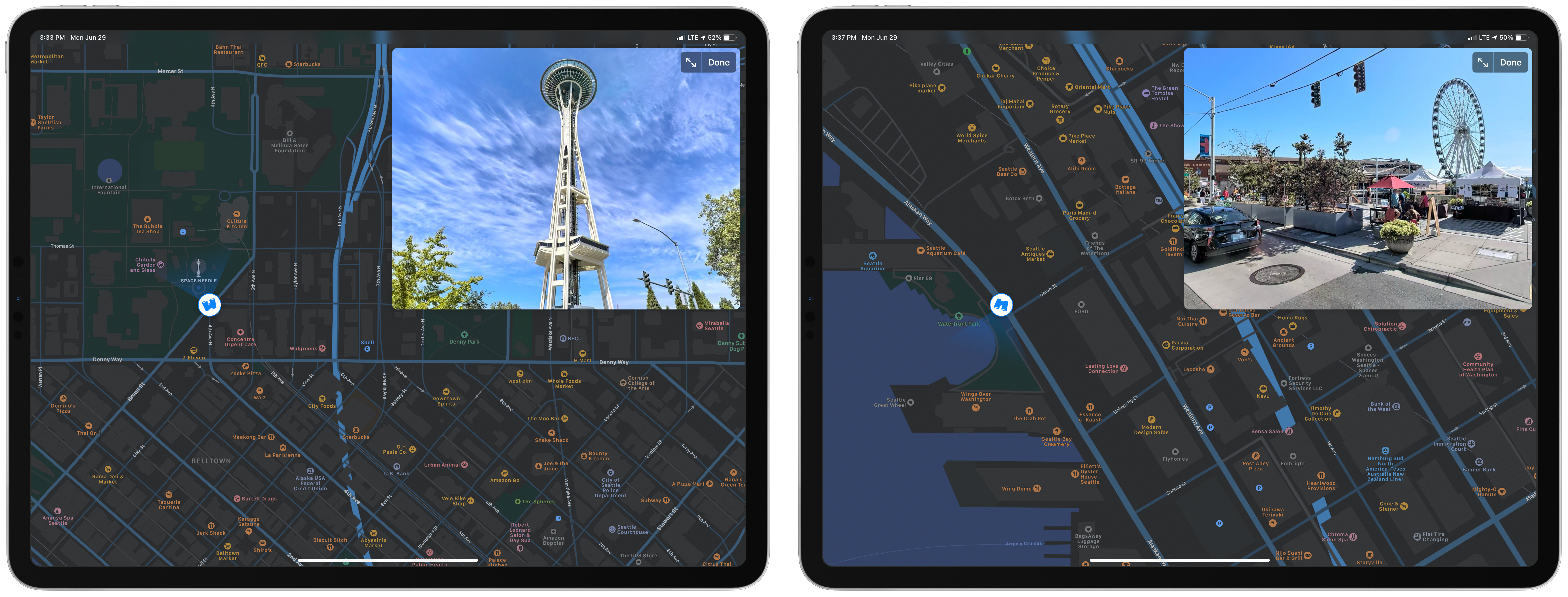
Apple Adds Look Around for Seattle, Washington in Maps

It was clear during WWDC that Apple is forging ahead with its Maps app at full-speed. Not only were several interesting refinements to the app and its underlying data announced during the conference keynote and sessions, but Apple continues to improve the functionality of its maps throughout the year, adding its Look Around feature to Seattle, Washington today.

Look Around was the marquee addition to Maps in iOS 13. The feature, which competes with Google Street View, provides a 3D representation of the world from a car’s vantage point. When you zoom far enough into an area that supports Look Around, an icon of a pair of binoculars appears in the top right-hand corner of the screen. Tapping it opens a separate overlay that you can pan around by swiping and move through by tapping along streets. The animations are smooth and the images high-resolution, making Look Around a terrific way to explore an unfamiliar area before visiting.

Seattle joins ten other US cities as the eleventh area to add the Look Around feature. The last city added was Chicago and parts of its suburbs, which were added in April.

At WWDC, Apple announced that Apple is updating its map data in Ireland, the UK, and Canada later this year. With the US map data updated, I’m glad to see Apple moving forward in other countries. I expect that before long, we’ll see other countries add the new map data too.

Also, I hope that the addition of Look Around in Seattle marks an acceleration of that feature. It’s a fantastic resource in the 11 major urban areas it covers. Still, I’d love to see Look Around expand to smaller cities and public spaces over time, making it useful to a broader cross-section of the world’s population.


Apple’s Kevin Lynch on watchOS 7’s Sleep Tracking

Scott Stein of CNET interviewed Apple’s Kevin Lynch about watchOS 7’s upcoming sleep tracking feature. Unlike third-party sleep tracking wearables and apps, Apple’s approach is simpler. As Stein explains:

Unlike other wearables such as the Fitbit or Oura, which measure how much time you spend in the various sleep phases and even give calculated sleep quality scores, Apple’s sleep tech is more simplified. It just tracks duration of sleep, movement disturbances and heart rate. The content of your sleep isn’t analyzed much at all. Instead, Apple’s placed a big focus on the time you go to bed and what you do while you wind down.

Instead of tracking time spent in different sleep phases, Apple’s focus is on winding down before bed and sleep duration, using positive reinforcement to encourage better habits. As Lynch says:

“You can’t really coach yourself to have more or less REM stages,” he says. “We felt like that wasn’t the best way Apple could add value here on sleep. We focused on the transition to the bed, which we think is way more actionable, and will result in people getting a better night’s sleep, which then has secondary effects of perhaps your REM stages sorting themselves.”

I haven’t had a chance to install the watchOS 7 beta yet, but sleep tracking is right at the top of my list of features I want to try this summer. I’ve used third-party apps that made me feel anxious about my lack of sleep, so I’m keen to see how Apple’s approach stacks up.

Permalink