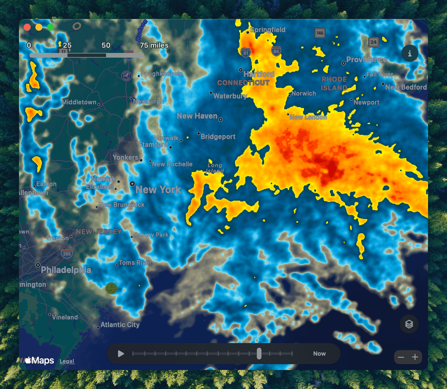
Twitter clients may have been a design playground in the early days of the App Store, but it’s weather apps that have carried the torch. That’s because the developers of weather apps have to simultaneously contend with a vast amount of data and a wide variety of user preferences.
Last week, for The New Yorker, Kyle Chayka profiled Acme Weather, the new weather app from the team behind Dark Sky that I recently reviewed.
The problem with weather apps, as Brian Mueller, who was interviewed for the story, puts it is that:
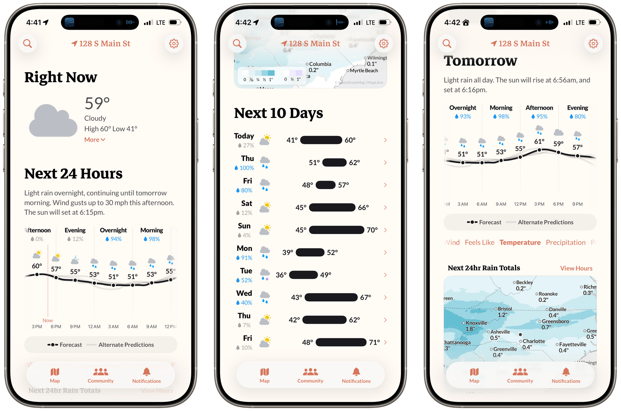
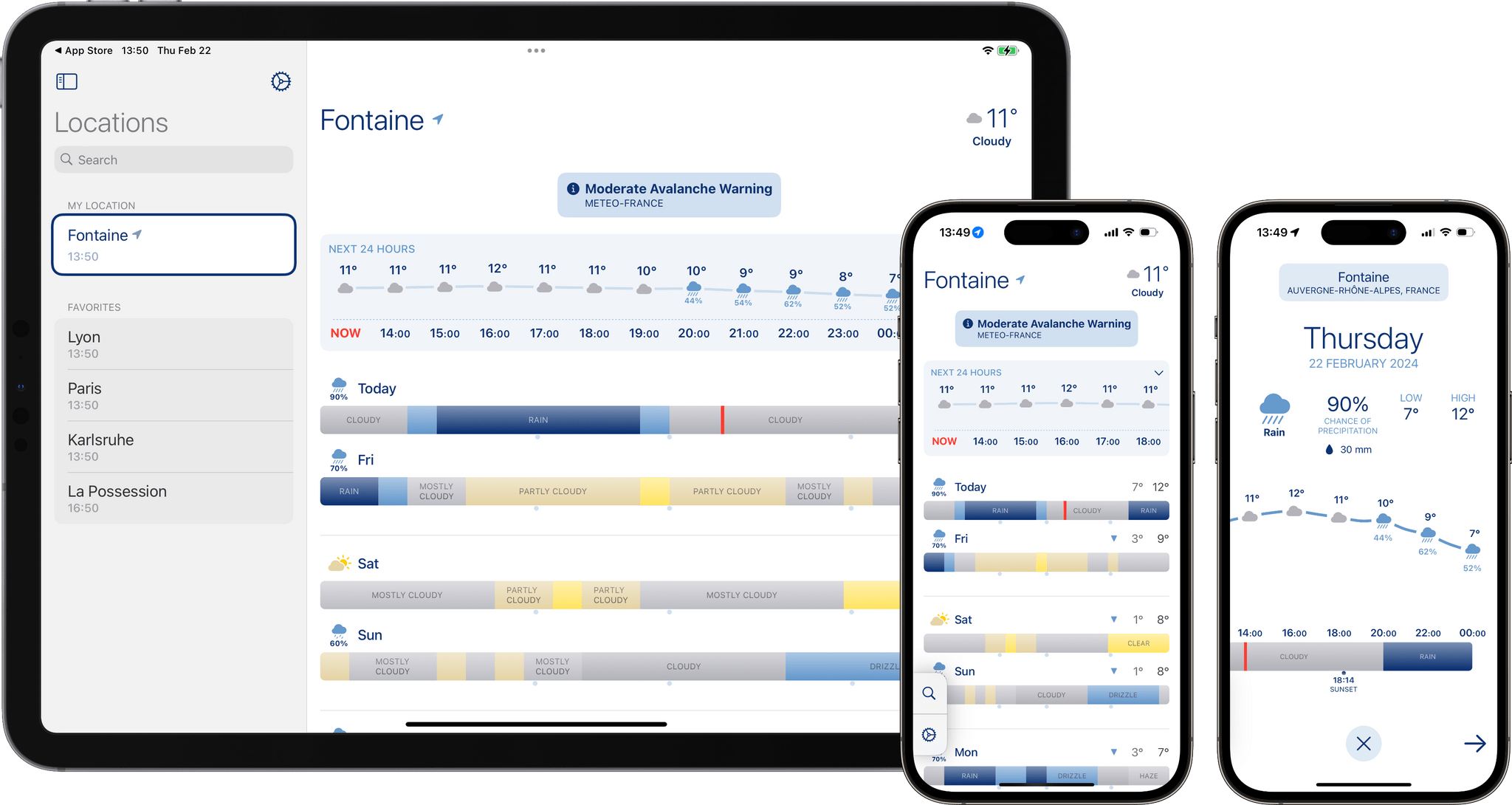
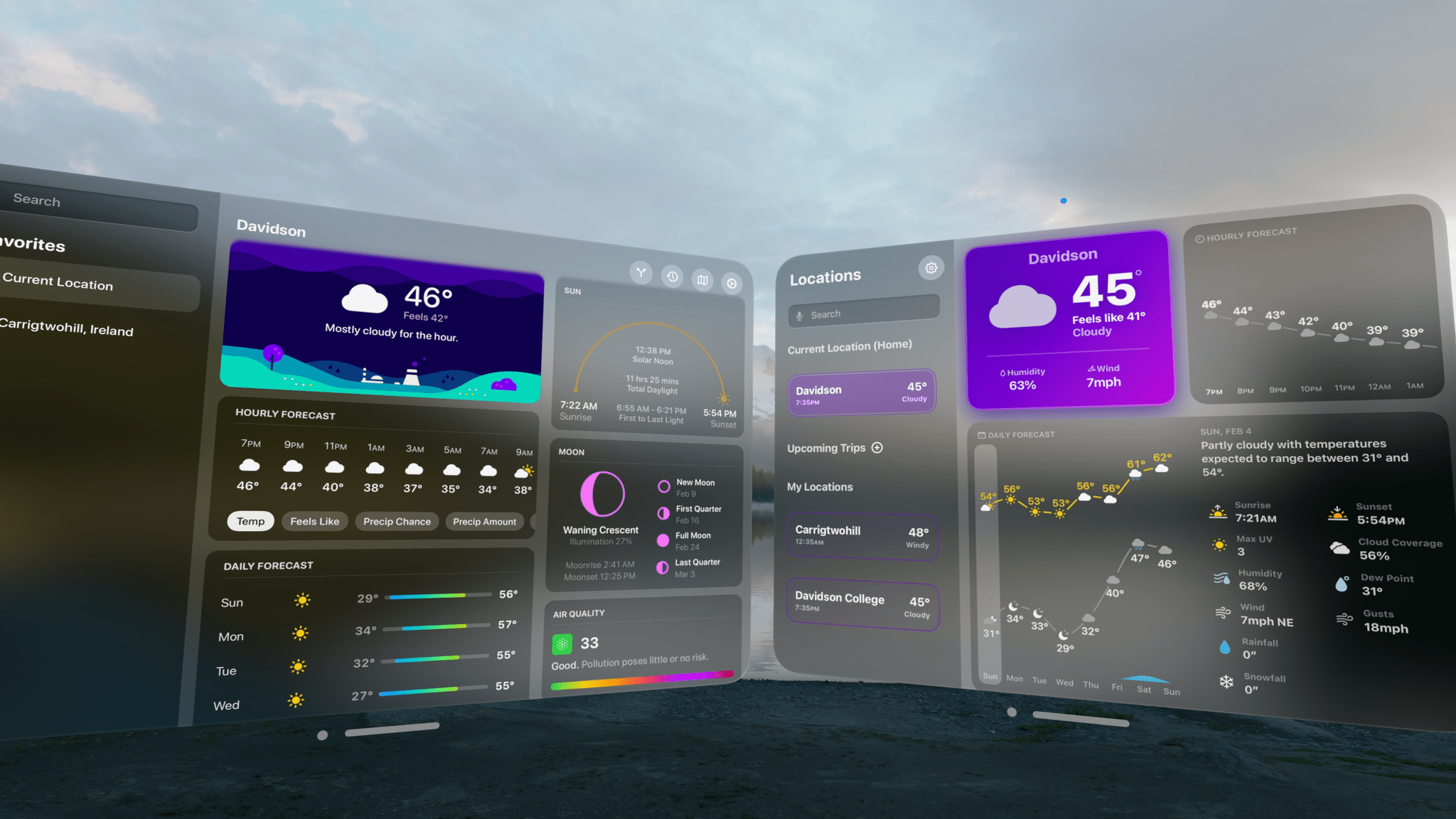
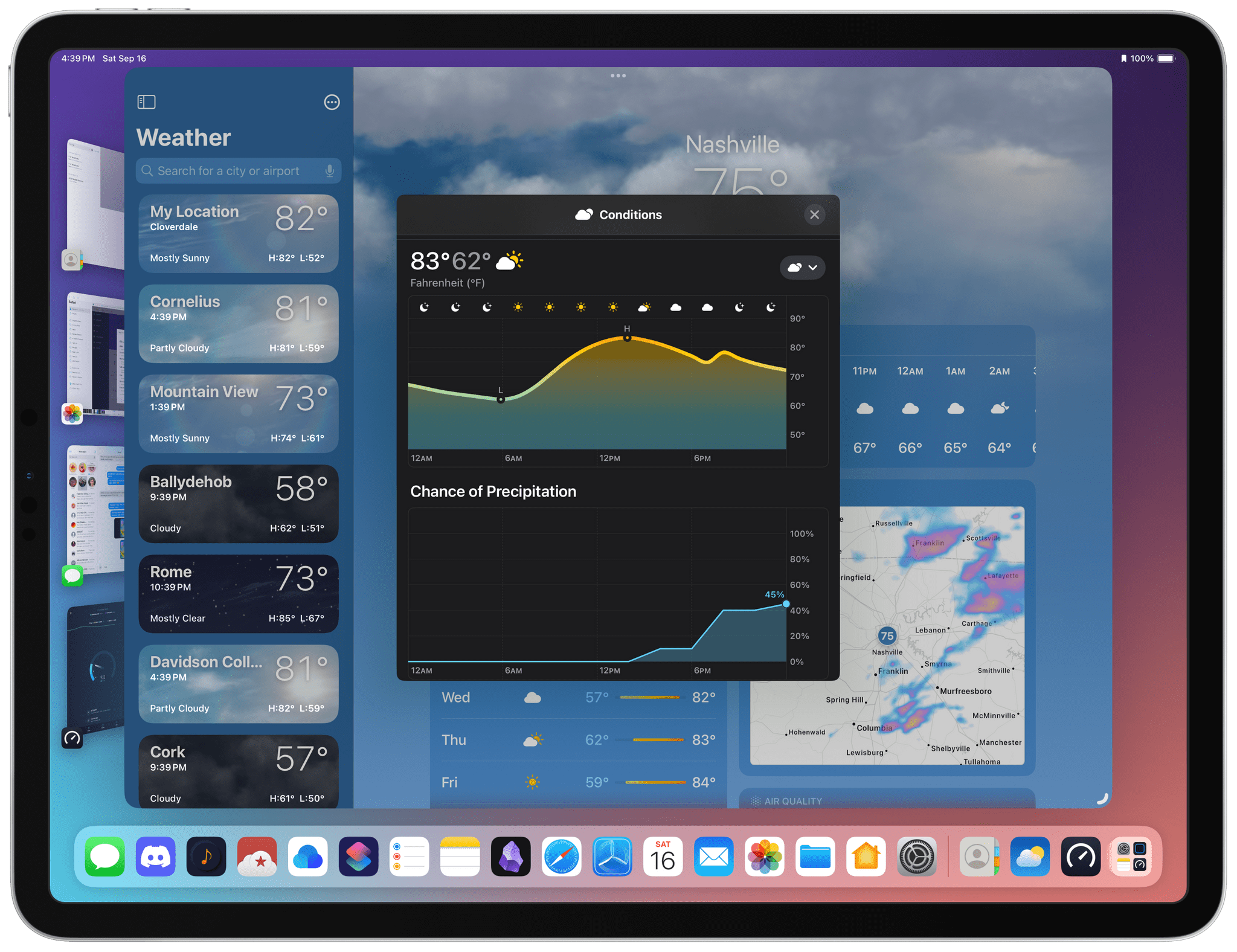
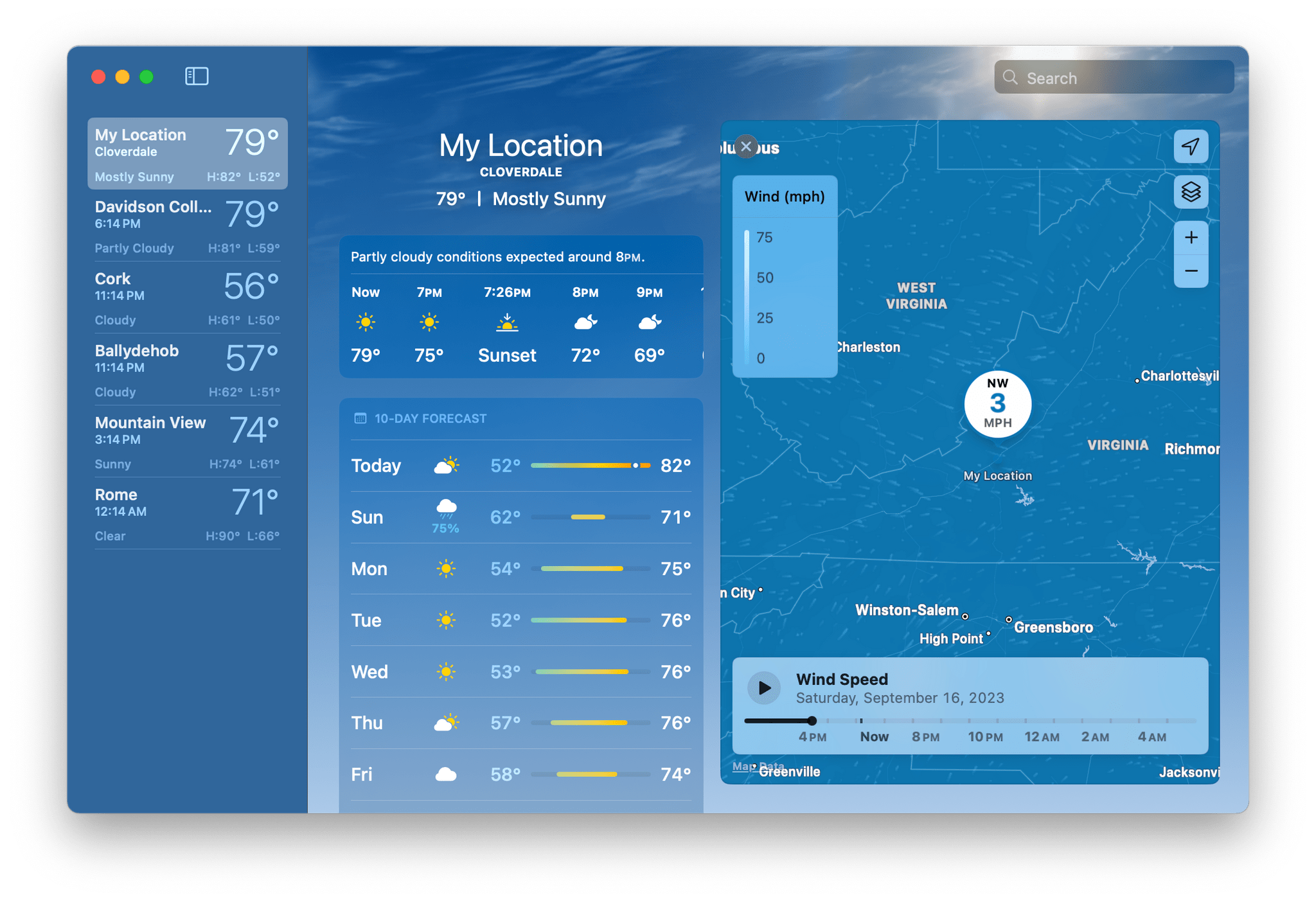
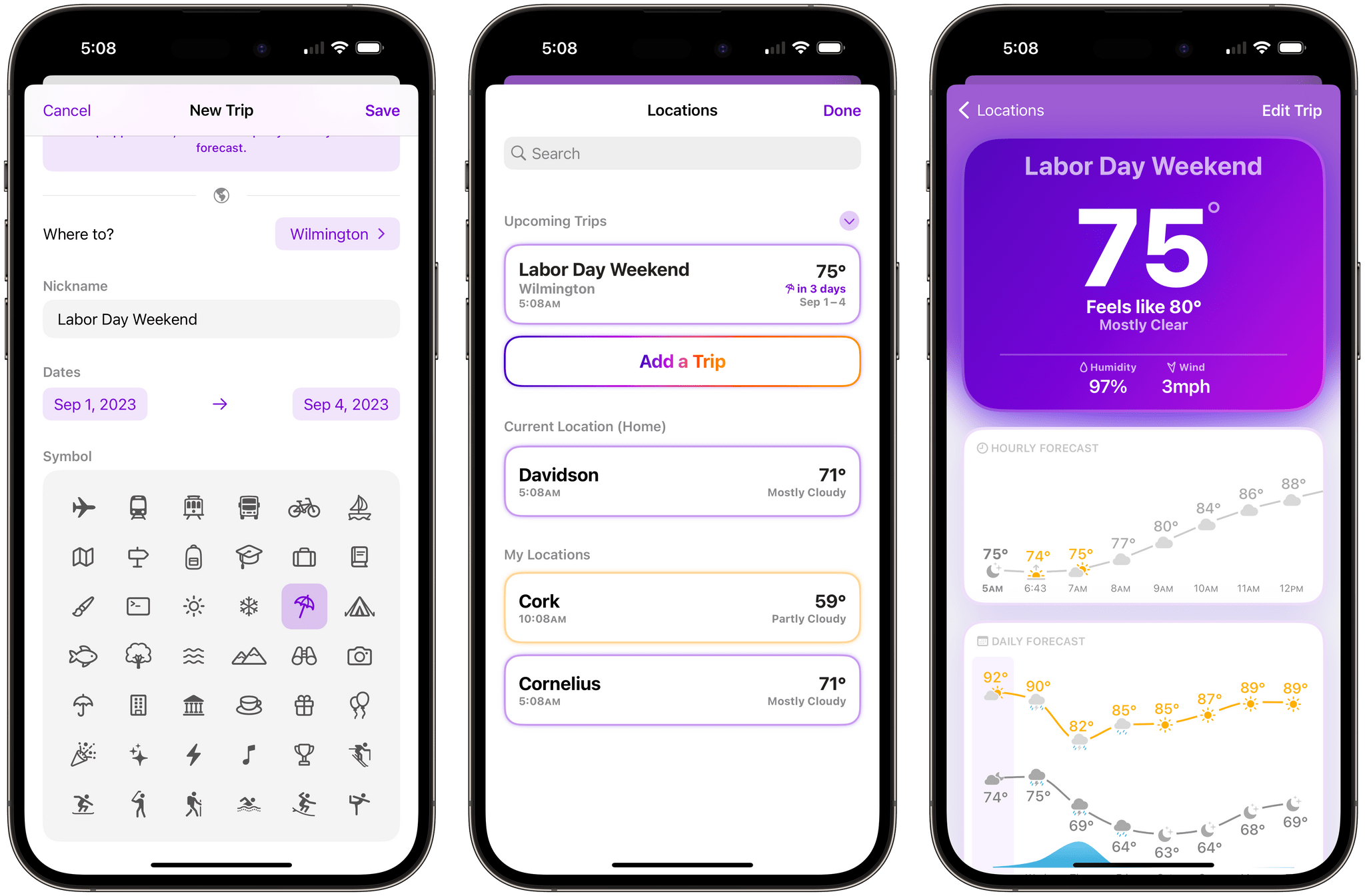
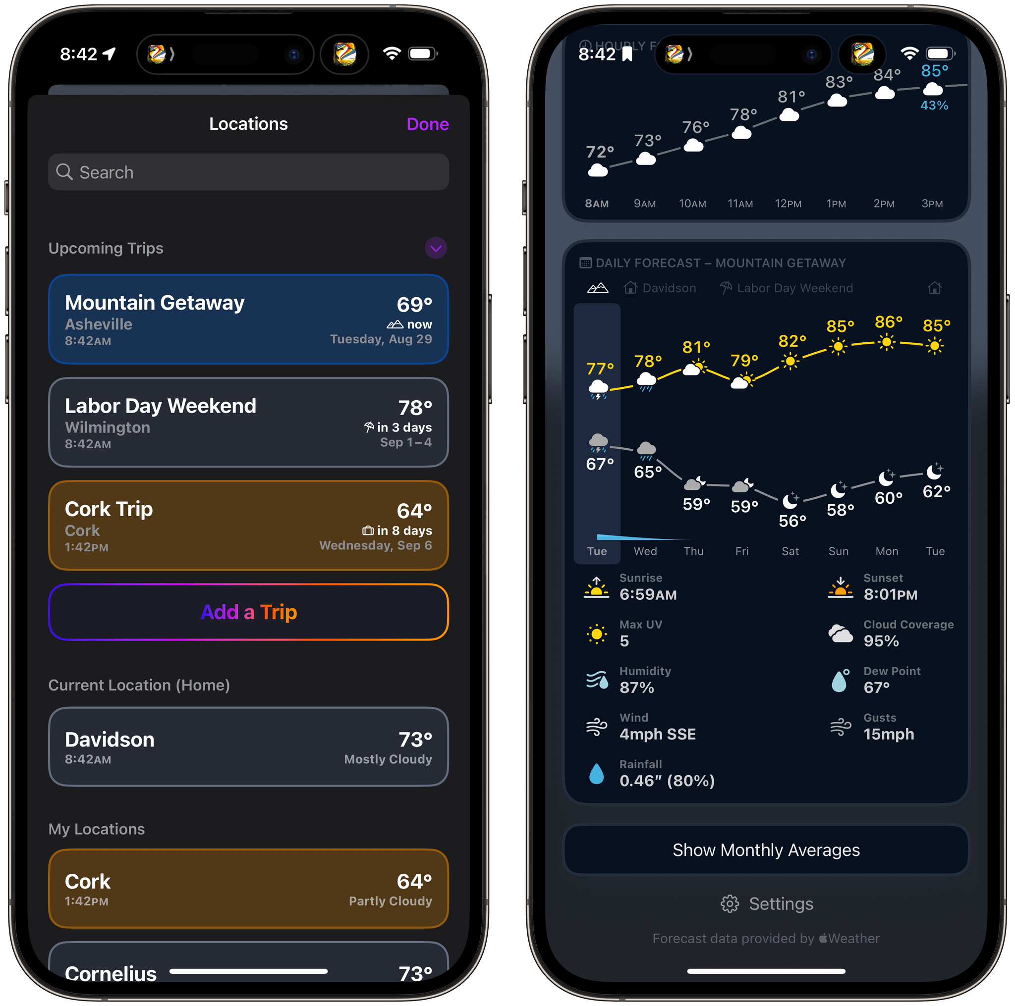
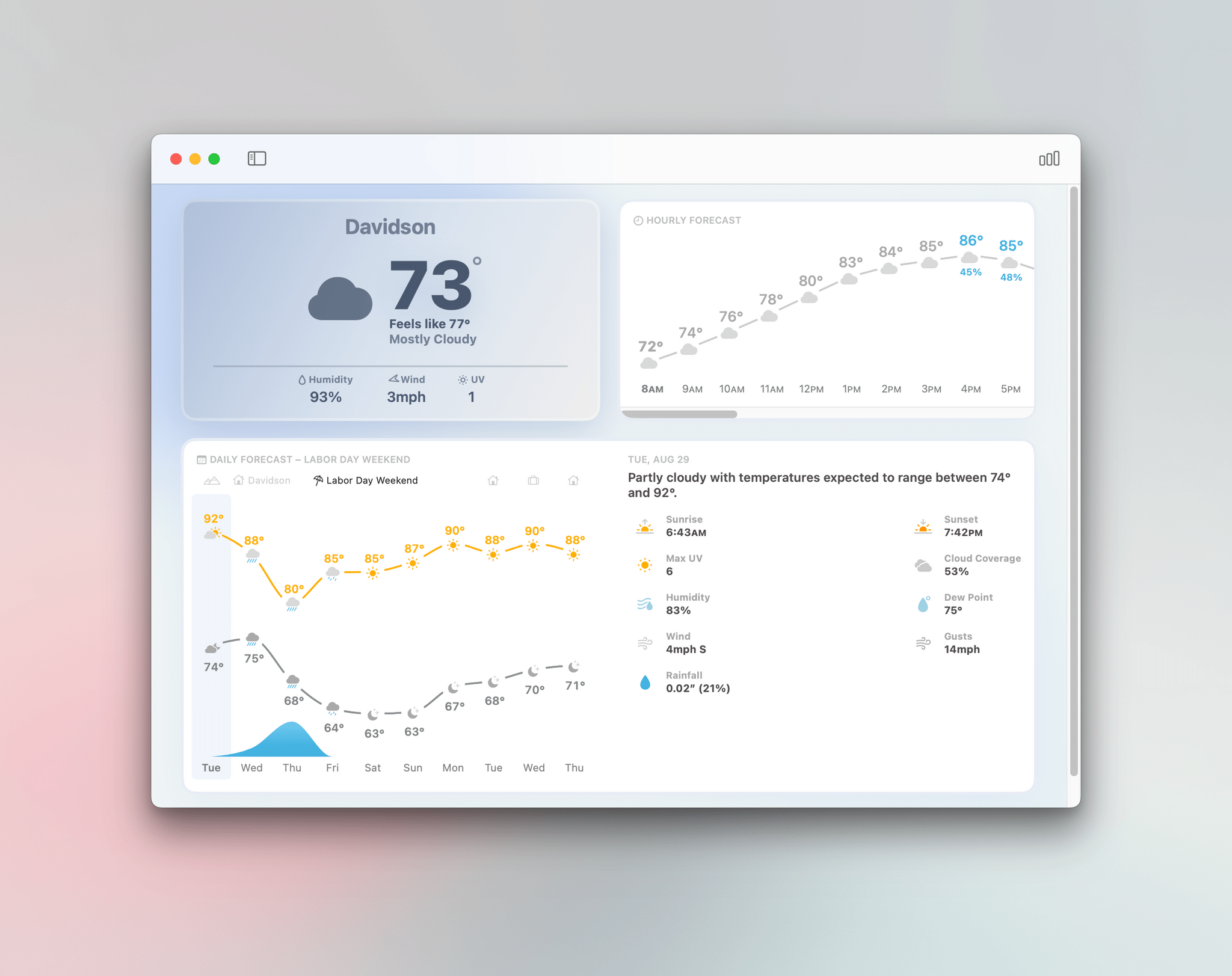
“Everybody wants their own weather app,” Mueller told me. An Angeleno may care more about air quality, for instance, whereas a Bostonian wants to know the chance of snow. Carrot’s imperfect solution is to allow users to customize their own display, choosing which information to foreground, against a backdrop of chaotic animations and snarky jokes (“The temperature is low, but my disdain for you is even lower”). Hello Weather separates various stats—on UV or wind—into separate onscreen tiles. Acme’s answer, the most elegant of the three, is to show a minimum of information based on what matters most in a given moment.
Chayka clearly prefers Acme’s approach, which overlays weather predictions from multiple forecasters accompanied by a short narrative summary. I like Acme Weather’s, too, but Chayka was too quick to dismiss CARROT Weather and Hello Weather’s approaches. The fact that all three, plus other top tier weather apps like Mercury Weather can co-exist proves Mueller’s point that everyone wants their own weather app. I’d argue the real problem is that most users haven’t found the right weather app for them or aren’t willing to pay for a better one. Acme Weather is an excellent app, but it’s just one among many great choices, and as users, we’re fortunate that there’s room for all of them.