
WWDC week is always full of big and small announcements about Apple’s core software platforms. Monday’s keynote only has time for sharing a limited number of details, however, so as the week goes on many new discoveries are made as developers and writers delve into the first beta OS releases themselves. As a result, we always have a roundup of new things to share midway through the week. So today, on top of everything detailed in our overviews of iOS and iPadOS 14, watchOS 7, macOS Big Sur, and tvOS 14, here’s an assortment of extra goodies that will be arriving on your devices this fall.
Posts tagged with "featured"
WWDC 2020: All the Little Things in Apple’s New OS Releases
Access Extra Content and Perks
Founded in 2015, Club MacStories has delivered exclusive content every week for nearly a decade.
What started with weekly and monthly email newsletters has blossomed into a family of memberships designed for every MacStories fan.
Club MacStories: Weekly and monthly newsletters via email and the web that are brimming with apps, tips, automation workflows, longform writing, early access to the MacStories Unwind podcast, periodic giveaways, and more;
Club MacStories+: Everything that Club MacStories offers, plus an active Discord community, advanced search and custom RSS features for exploring the Club’s entire back catalog, bonus columns, and dozens of app discounts;
Club Premier: All of the above and AppStories+, an extended version of our flagship podcast that’s delivered early, ad-free, and in high-bitrate audio.
macOS Big Sur: The MacStories Overview

It was a big day for the Mac. At WWDC’s opening keynote, Apple announced that the platform will transition to Apple-designed chips dubbed Apple Silicon. That switch was highly anticipated, and I’ll cover it in a separate story tomorrow. What was a bigger surprise, though, was the complete makeover of macOS that was revealed.
The latest version of macOS, which has been incremented to version 11.0 and is known as Big Sur, ushers in a new design language that reduces chrome and takes cues from aspects of iPadOS. The design changes to macOS weren’t the only big change announced today, though. Safari got what Apple describes as its biggest update ever, which includes under-the-hood performance enhancements, design tweaks, and all-new features. Big Sur will gain many of the features coming to iOS and iPadOS, too, bringing feature parity across platforms to more apps than ever.
Access Extra Content and Perks
Founded in 2015, Club MacStories has delivered exclusive content every week for nearly a decade.
What started with weekly and monthly email newsletters has blossomed into a family of memberships designed for every MacStories fan.
Club MacStories: Weekly and monthly newsletters via email and the web that are brimming with apps, tips, automation workflows, longform writing, early access to the MacStories Unwind podcast, periodic giveaways, and more;
Club MacStories+: Everything that Club MacStories offers, plus an active Discord community, advanced search and custom RSS features for exploring the Club’s entire back catalog, bonus columns, and dozens of app discounts;
Club Premier: All of the above and AppStories+, an extended version of our flagship podcast that’s delivered early, ad-free, and in high-bitrate audio.
iOS and iPadOS 14: The MacStories Overview
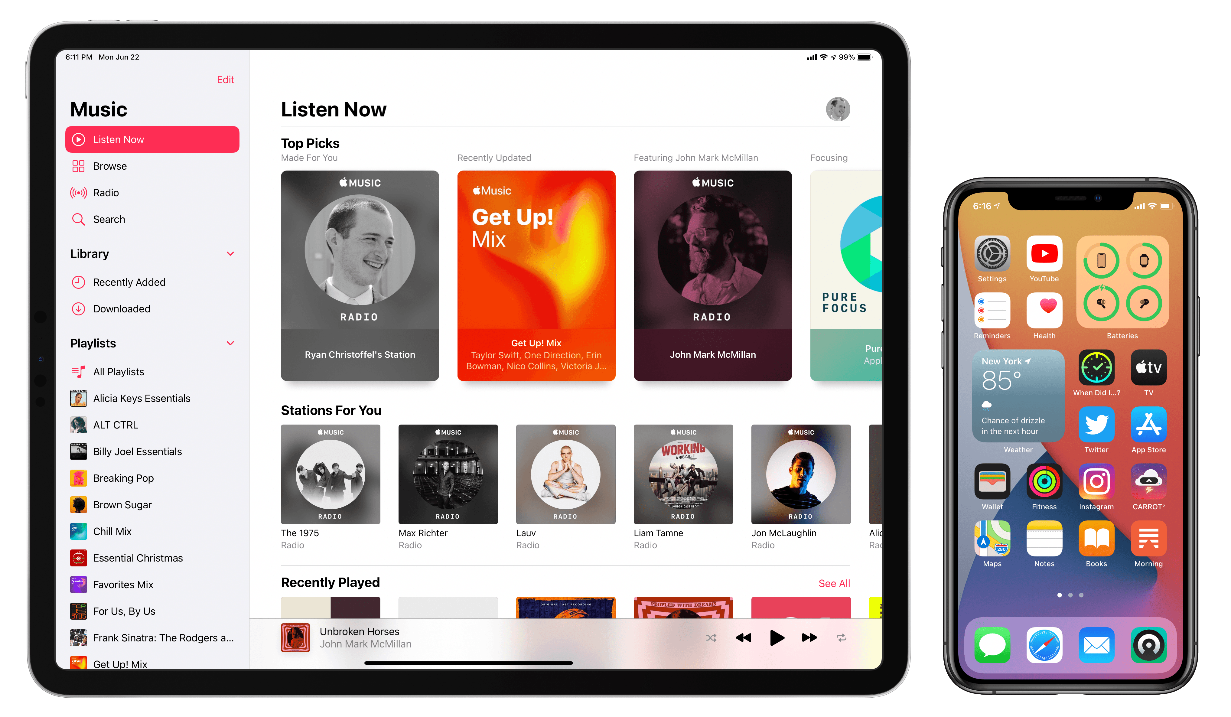
Today Apple detailed the next major versions of its two most popular computing platforms: iOS and iPadOS 14. While the list of new features in these releases may not be as long as in some years, each update nonetheless has a lot to offer. From Home screen enhancements to tons of app upgrades spanning nearly every system app, plus the new Translate app and Siri improvements, Apple Pencil handwriting features, emoji search (finally!) and more, the iPhone and iPad are being refined this year in a variety of ways.
Here’s our in-depth overview of all the most important updates.
Access Extra Content and Perks
Founded in 2015, Club MacStories has delivered exclusive content every week for nearly a decade.
What started with weekly and monthly email newsletters has blossomed into a family of memberships designed for every MacStories fan.
Club MacStories: Weekly and monthly newsletters via email and the web that are brimming with apps, tips, automation workflows, longform writing, early access to the MacStories Unwind podcast, periodic giveaways, and more;
Club MacStories+: Everything that Club MacStories offers, plus an active Discord community, advanced search and custom RSS features for exploring the Club’s entire back catalog, bonus columns, and dozens of app discounts;
Club Premier: All of the above and AppStories+, an extended version of our flagship podcast that’s delivered early, ad-free, and in high-bitrate audio.
watchOS 7: The MacStories Overview
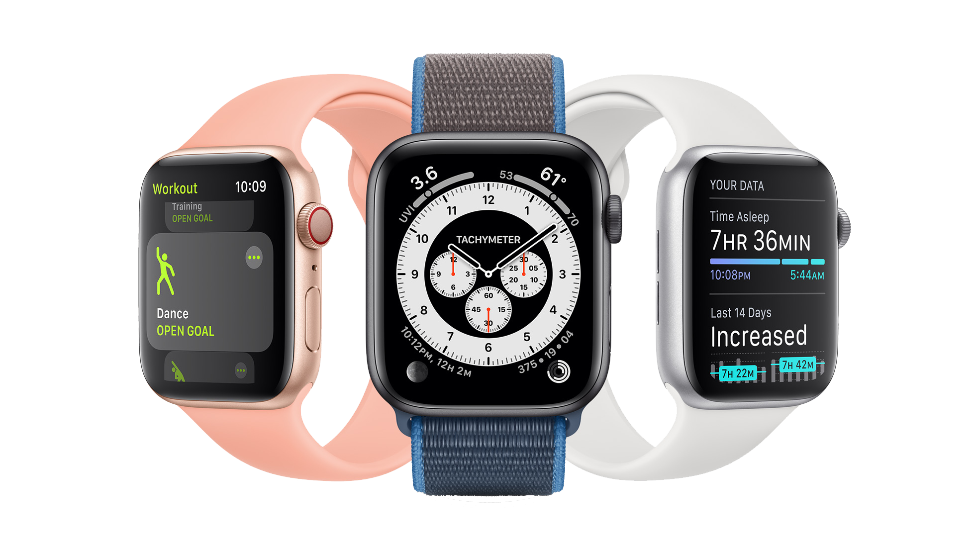
It’s WWDC week, and while we’ve been deprived the pleasure of meeting up in person this year, Apple’s OS updates are rolling forward like always. In this morning’s keynote address, Apple VP of Technology Kevin Lynch announced the latest version of the Apple Watch operating system. watchOS 7 isn’t as dramatic as some past releases have been, but it does introduce some excellent new features including sleep tracking, multiple distinct complications from the same app, a Shortcuts app, and new workout types. We’ll dive into all the features in depth below.
Access Extra Content and Perks
Founded in 2015, Club MacStories has delivered exclusive content every week for nearly a decade.
What started with weekly and monthly email newsletters has blossomed into a family of memberships designed for every MacStories fan.
Club MacStories: Weekly and monthly newsletters via email and the web that are brimming with apps, tips, automation workflows, longform writing, early access to the MacStories Unwind podcast, periodic giveaways, and more;
Club MacStories+: Everything that Club MacStories offers, plus an active Discord community, advanced search and custom RSS features for exploring the Club’s entire back catalog, bonus columns, and dozens of app discounts;
Club Premier: All of the above and AppStories+, an extended version of our flagship podcast that’s delivered early, ad-free, and in high-bitrate audio.
GoodLinks Review: A Flexible Read-it-Later Link Manager Packed with Automation Options
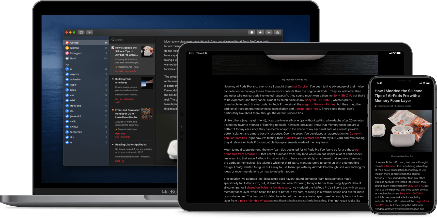
The original crop of read-it-later apps that date back to the earliest days of the App Store were based on web services maintained by the developers of those apps. Apps like Instapaper and Pocket, the two biggest names in the space, have always been backed by web services that integrate tightly with native apps across Apple’s platforms. It’s a model that worked, and although those apps have continued to evolve and change with regular updates over the years, new entrants into the category were few and far between in this once hyper-competitive category – until now.
Thanks to relatively recent changes to Apple’s OSes, a new generation of read-it-later apps are emerging. They no longer need to run their own web services and are leveraging the latest OS technologies in new and interesting ways. One of the very best is GoodLinks, a new read-it-later app and link manager released today by Ngoc Luu, the developer of the well-known text editor 1Writer.

Since returning to Reeder for the RSS feeds I follow, I’ve been using its read-it-later service, which is terrific. We’ve also covered apps like Abyss and Readit in MacStories Weekly. Like GoodLinks, those apps use iCloud sync to keep articles you save synced across all the devices they support instead of using a developer-maintained web service. That’s a relatively new development for these sorts of apps, but the difference in this new generation of read-it-later apps runs deeper. New features of the OSes on which GoodLinks runs have breathed new life into the category, and its developer has taken advantage of these features to provide new utility to users.
Having settled into a comfortable Reeder workflow, I didn’t expect the way I manage links to be upended anytime soon. However, that’s exactly what has happened since I began using GoodLinks. What grabbed me is a versatility that stems from the fluidity of getting links into the app, managing them, and getting them out again. There’s built-in flexibility to GoodLinks that allows it to adapt exceedingly well to a wide variety of use cases. As with any 1.0 app, there’s room for improvement, but my wishes for GoodLinks are just that: wishes borne of enthusiasm for a terrific app that has quickly found its way into my daily workflow. Let’s dig into the details.
Access Extra Content and Perks
Founded in 2015, Club MacStories has delivered exclusive content every week for nearly a decade.
What started with weekly and monthly email newsletters has blossomed into a family of memberships designed for every MacStories fan.
Club MacStories: Weekly and monthly newsletters via email and the web that are brimming with apps, tips, automation workflows, longform writing, early access to the MacStories Unwind podcast, periodic giveaways, and more;
Club MacStories+: Everything that Club MacStories offers, plus an active Discord community, advanced search and custom RSS features for exploring the Club’s entire back catalog, bonus columns, and dozens of app discounts;
Club Premier: All of the above and AppStories+, an extended version of our flagship podcast that’s delivered early, ad-free, and in high-bitrate audio.
Pastel Review: A Modern Color Utility for iPad and iPhone
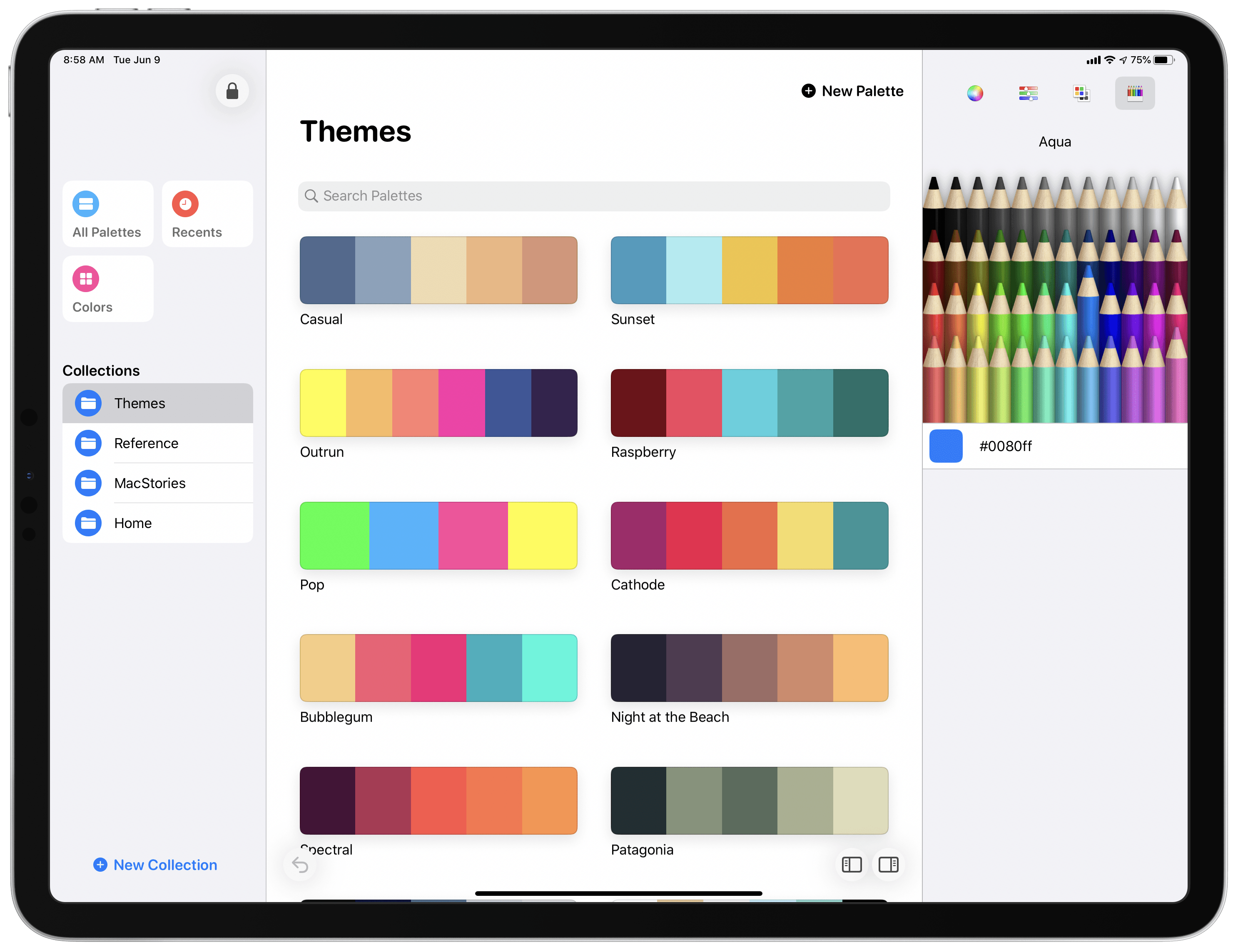
Five years into the iPad Pro era, iPad software is finally starting to catch up to its excellent hardware. Thanks to a mix of software enhancements, business model trends, and key developer tools such as Mac Catalyst, both iPadOS and its third-party app ecosystem have become more accommodating to professional uses.
Entering that context is Pastel, the latest app from developer Steve Troughton-Smith. Pastel is a color palette utility for the iPad and iPhone that has a Catalyst-powered Mac version coming soon. The app offers a dedicated home for storing collections of color palettes and individual colors you want to save for reference. It also takes advantage of technologies like drag and drop and context menus to perfectly complement other creative tools on your device.
Access Extra Content and Perks
Founded in 2015, Club MacStories has delivered exclusive content every week for nearly a decade.
What started with weekly and monthly email newsletters has blossomed into a family of memberships designed for every MacStories fan.
Club MacStories: Weekly and monthly newsletters via email and the web that are brimming with apps, tips, automation workflows, longform writing, early access to the MacStories Unwind podcast, periodic giveaways, and more;
Club MacStories+: Everything that Club MacStories offers, plus an active Discord community, advanced search and custom RSS features for exploring the Club’s entire back catalog, bonus columns, and dozens of app discounts;
Club Premier: All of the above and AppStories+, an extended version of our flagship podcast that’s delivered early, ad-free, and in high-bitrate audio.
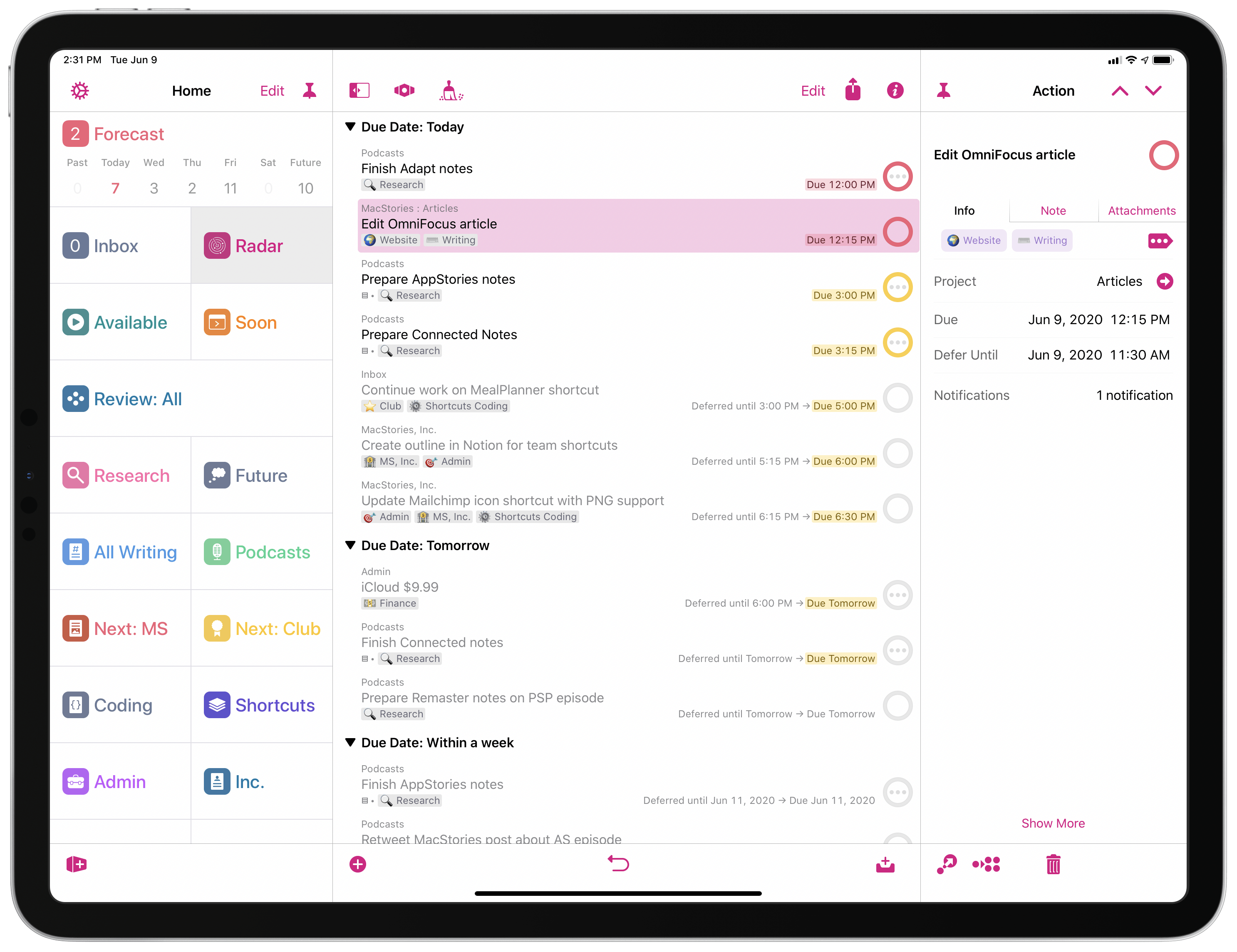
How I Use Custom Perspectives in OmniFocus
A few weeks ago, we released the latest product under the MacStories Pixel brand: MacStories Perspective Icons, a set of 20,000 custom perspective icons for OmniFocus Pro. You can find more details on the product page, read the FAQ, and check out my announcement blog post here. The set is available at $17.99 with a launch promo; Club MacStories members can purchase it at an additional 15% off.
As part of the release of MacStories Perspective Icons (which, by the way, takes advantage of a new feature in OmniFocus 3.8 to install custom icons with a Files picker), I wanted to write about my perspective setup in OmniFocus and explain why custom perspectives have become an integral component of my task management workflow.
Let me clarify upfront, however, that this article isn’t meant to be a primer on custom perspectives in OmniFocus. If you’re not familiar with this functionality, I recommend checking out this excellent guide over at Learn OmniFocus; alternatively, you can read The Omni Group’s official perspective documentation here. You can also find other solid examples of OmniFocus users’ custom setups around the web such as these two, which helped me better understand the power and flexibility of perspectives in OmniFocus when I was new to the app. In this story, I’m going to focus on how I’ve been using perspectives to put together a custom sidebar in OmniFocus that helps me navigate my busy life and make sense of it all.
Access Extra Content and Perks
Founded in 2015, Club MacStories has delivered exclusive content every week for nearly a decade.
What started with weekly and monthly email newsletters has blossomed into a family of memberships designed for every MacStories fan.
Club MacStories: Weekly and monthly newsletters via email and the web that are brimming with apps, tips, automation workflows, longform writing, early access to the MacStories Unwind podcast, periodic giveaways, and more;
Club MacStories+: Everything that Club MacStories offers, plus an active Discord community, advanced search and custom RSS features for exploring the Club’s entire back catalog, bonus columns, and dozens of app discounts;
Club Premier: All of the above and AppStories+, an extended version of our flagship podcast that’s delivered early, ad-free, and in high-bitrate audio.
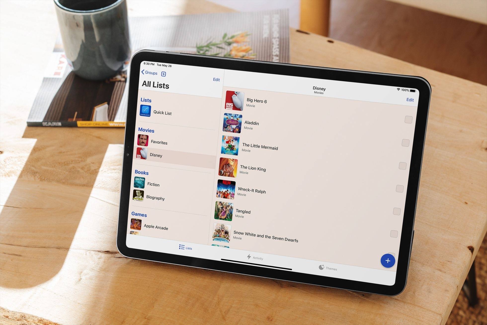
Sofa Debuts Modern iPad App, Rich Themes Experience, and More
I suspect I’m not alone in saying that 2020 has been a big year for personal media consumption. The absence of normal social events has meant more time for reading, watching shows and movies, and other forms of relaxation.
At the end of last year I wrote about how I was using Sofa, a media list app, to track the TV and films I’d watched in 2019. I’ve used the same approach throughout 2020, and it continues to work well for me. The only change is that I’ve been testing a big update to Sofa for the last few weeks that’s available now. Previously exclusive to the iPhone, Sofa now offers a rich iPad experience complete with Split View, Slide Over, and multiwindowing, keyboard shortcuts, and mouse and trackpad support. Additionally, today’s update adds a robust theming system to the app and seamless iCloud syncing. It’s a strong step forward for the app, making it more versatile than ever before.
Access Extra Content and Perks
Founded in 2015, Club MacStories has delivered exclusive content every week for nearly a decade.
What started with weekly and monthly email newsletters has blossomed into a family of memberships designed for every MacStories fan.
Club MacStories: Weekly and monthly newsletters via email and the web that are brimming with apps, tips, automation workflows, longform writing, early access to the MacStories Unwind podcast, periodic giveaways, and more;
Club MacStories+: Everything that Club MacStories offers, plus an active Discord community, advanced search and custom RSS features for exploring the Club’s entire back catalog, bonus columns, and dozens of app discounts;
Club Premier: All of the above and AppStories+, an extended version of our flagship podcast that’s delivered early, ad-free, and in high-bitrate audio.
Introducing MacStories Perspective Icons: 20,000 Custom Perspective Icons for OmniFocus Pro
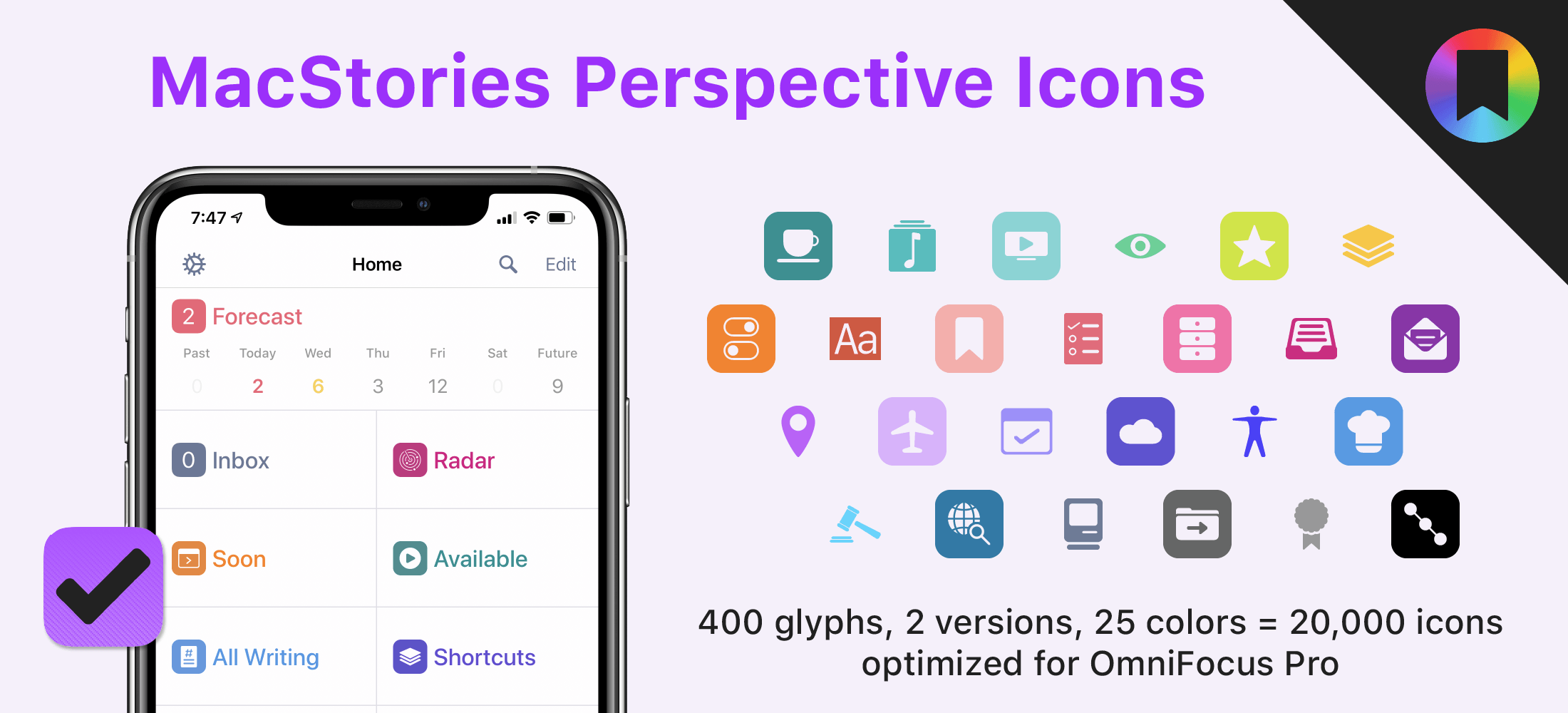
Today, I’m thrilled to announce MacStories Perspective Icons, a set of 20,000 icons for custom perspectives in OmniFocus Pro.
Here’s the short version of this story: our brand new Perspective Icons offer 400 unique glyphs with two distinct icon shapes available in 25 different colors, for a total of 20,000 icons included in the set. Yes, you read that number right. The icons can be easily installed in OmniFocus Pro for Mac, iPad, and iPhone using Finder or the Files app; all the icons and colors have been optimized for OmniFocus and designed to look like native additions to the app.
For a limited time, you can get the set at $17.99, down from the regular price of $24.99.
Access Extra Content and Perks
Founded in 2015, Club MacStories has delivered exclusive content every week for nearly a decade.
What started with weekly and monthly email newsletters has blossomed into a family of memberships designed for every MacStories fan.
Club MacStories: Weekly and monthly newsletters via email and the web that are brimming with apps, tips, automation workflows, longform writing, early access to the MacStories Unwind podcast, periodic giveaways, and more;
Club MacStories+: Everything that Club MacStories offers, plus an active Discord community, advanced search and custom RSS features for exploring the Club’s entire back catalog, bonus columns, and dozens of app discounts;
Club Premier: All of the above and AppStories+, an extended version of our flagship podcast that’s delivered early, ad-free, and in high-bitrate audio.