Today, Apple released version 26.1 of its full family of OSes. Every platform received attention, including the proverbial “bug fixes and feature enhancements,” but it was iOS 26.1 and iPadOS 26.1 that received the most changes that are likely to be noticed by users.
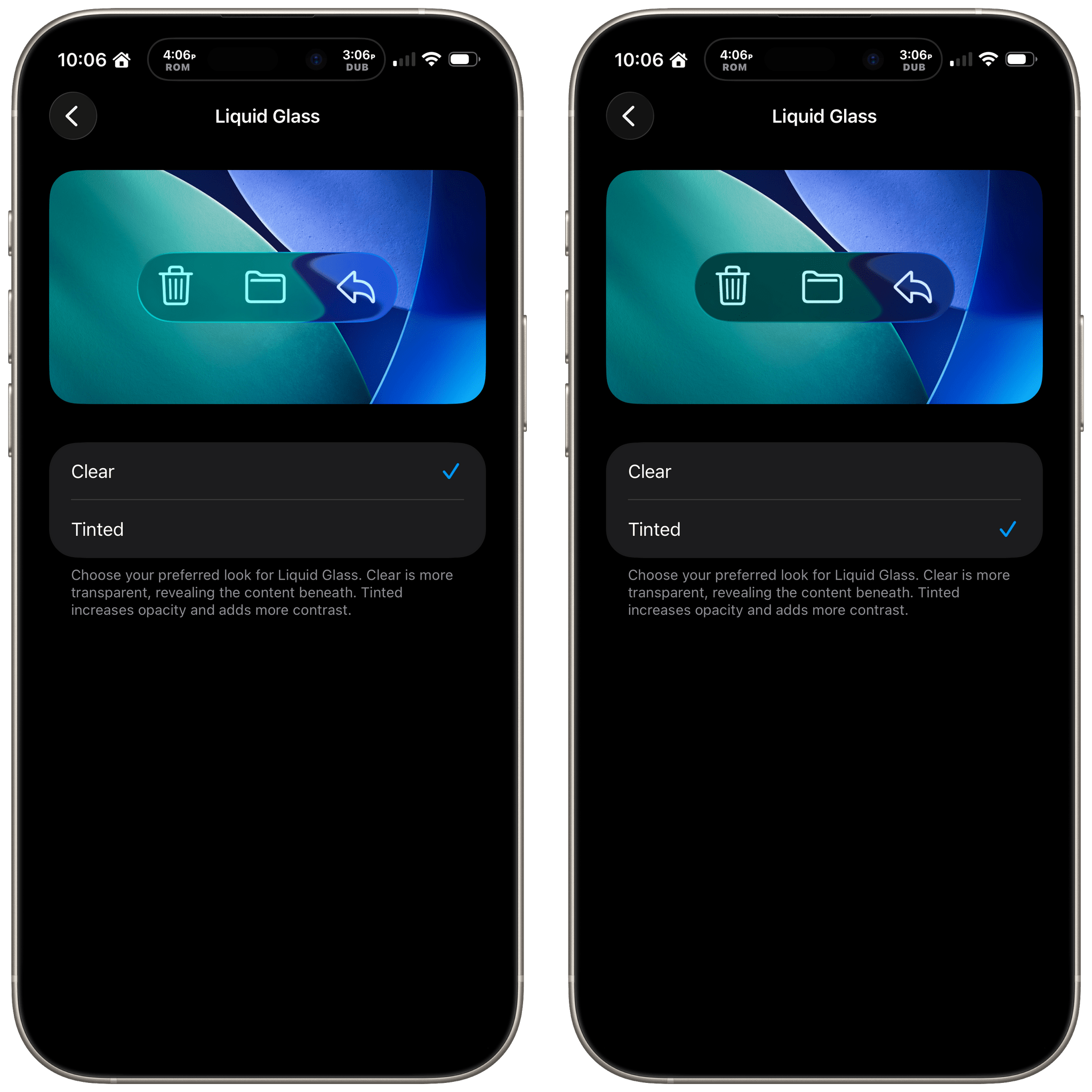
Liquid Glass: Tinted
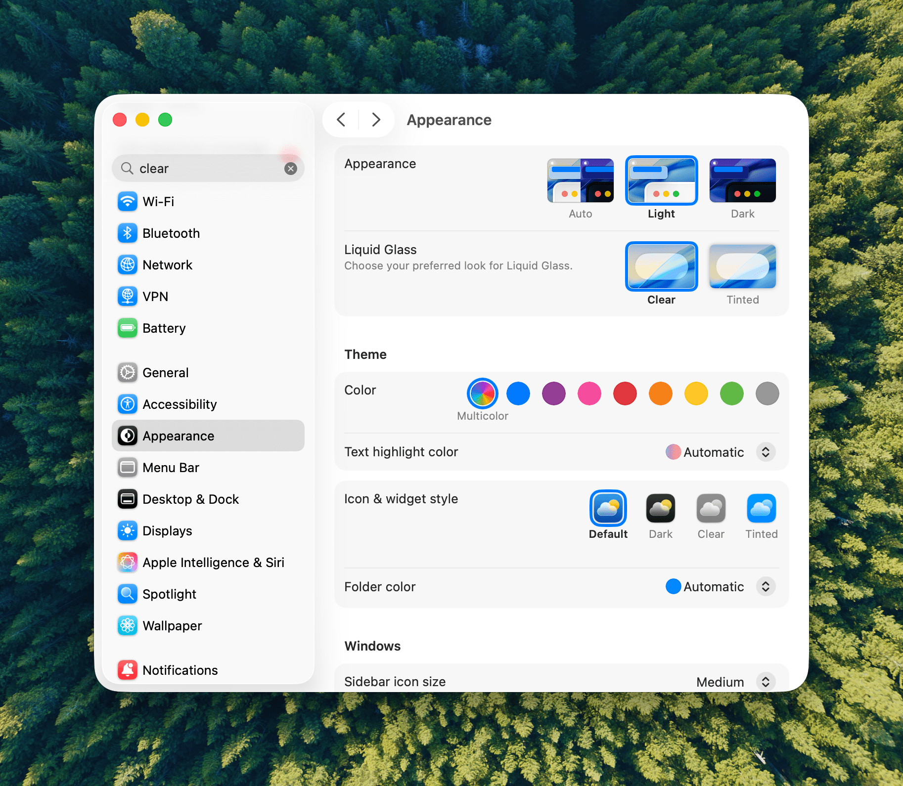
Let’s start with iOS 26.1 because most of the changes to it are reflected in iPadOS, too. Probably the biggest news is a new setting that allows users to choose between Clear and Tinted versions of Apple’s signature Liquid Glass design. Many readers we’ve heard from like Liquid Glass or didn’t notice a substantial difference when they updated to iOS and iPadOS 26, but for some, the design change was a regression in readability. With iOS, iPadOS, and macOS 26.1, users can opt for a Tinted version of Liquid Glass that reduces transparency, increasing the design’s opacity and enhancing contrast.
Liquid Glass is an opinionated design, so I’m a little surprised at this change. I like Liquid Glass in more places than I don’t, but given the readability issues some people experienced, this change is a good one. If you like Liquid Glass or barely noticed it to begin with, you’re fine. However, if it rubbed you the wrong way, check out the Liquid Glass setting in the Display & Brightness section of Settings, which has a helpful before-and-after preview of what the change looks like.
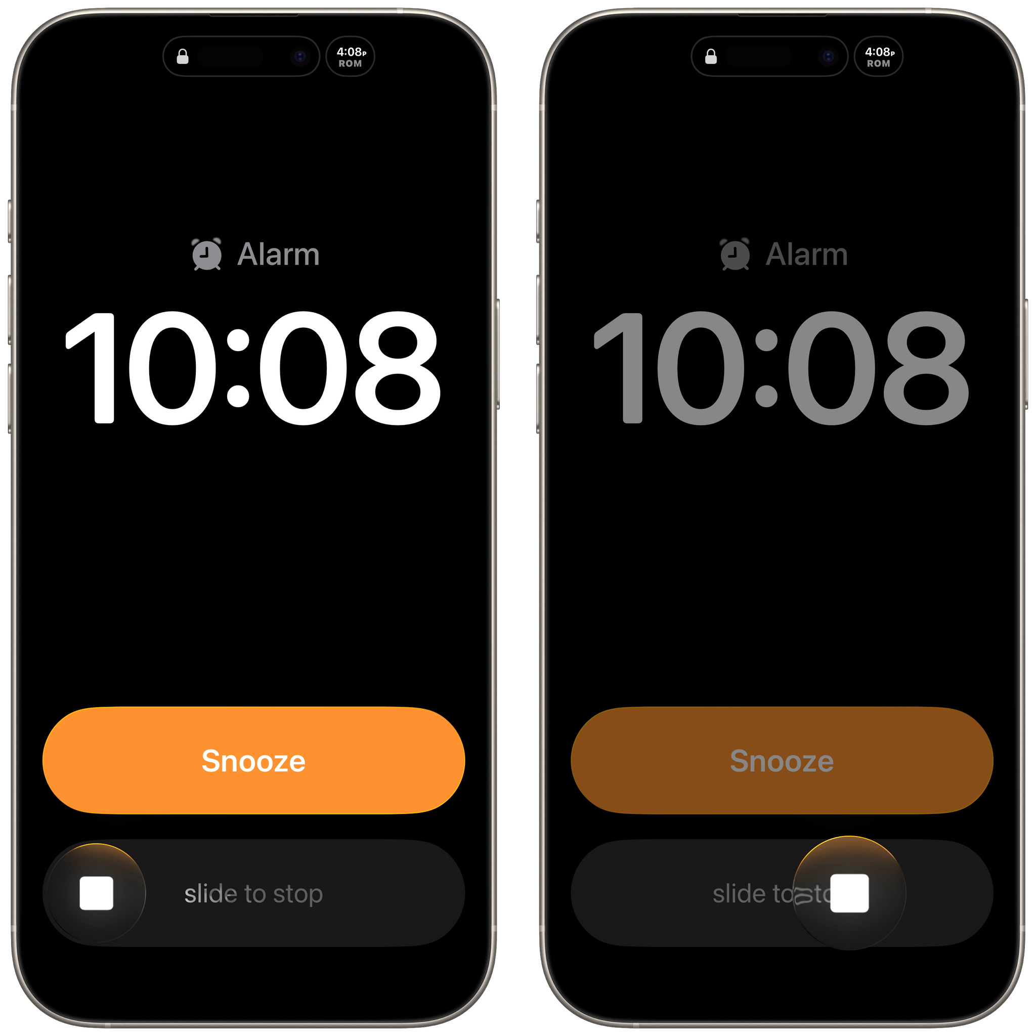
Slide to Stop
With iOS 26, Apple placed two big buttons onscreen when an alarm went off. One was for stop and the other snooze. That wasn’t a big deal for many of the alarms you set throughout the day, but when you’re waking up in the morning blurry-eyed, two big buttons stacked on top of each other weren’t ideal. For a lot of users, it was a toss-up whether stabbing at their iPhone through a morning haze would stop their alarm or snooze it.
With iOS and iPadOS 26.1, the ‘Stop’ button for an alarm set in the system Clock app now requires a slide to stop gesture, which echoes the Slide to Unlock gesture of the original iPhone. The more deliberate gesture is a good move on Apple’s part. I can’t imagine someone tapping and sliding their finger to stop an alarm by accident.
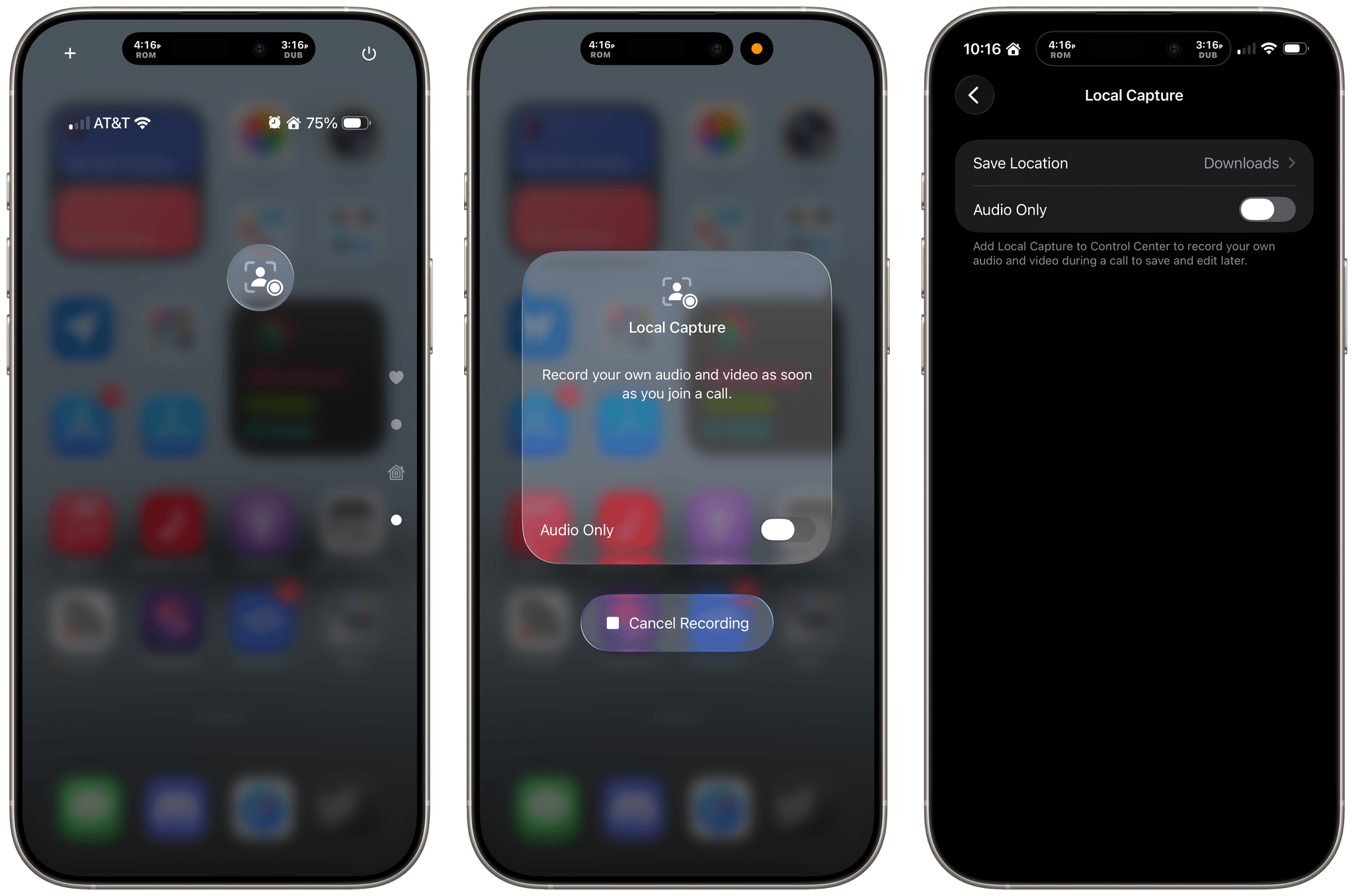
Local Capture Refined
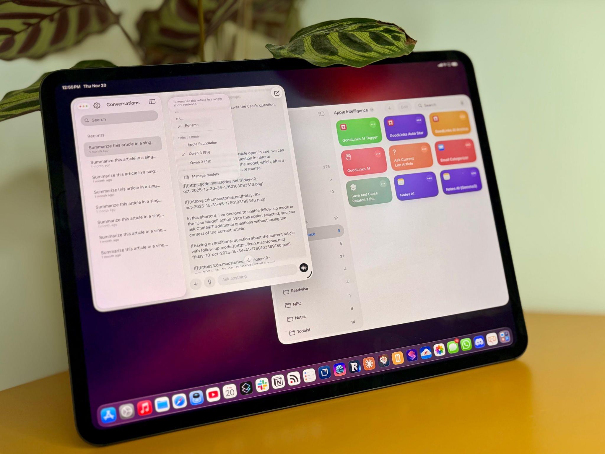
Apple has also refined Local Capture for the iPhone and iPad, which is great. Local capture allows you to record high-quality audio and video from an iPhone or iPad, while simultaneously on a video call using a service like Zoom. It’s a feature that podcasters wanted for many years, and although I was excited to find that Apple had listened to our annual requests with iOS and iPadOS 26, the implementation fell a little short because it didn’t allow for gain control, making it difficult to get a properly balanced recording with some microphones. Likewise, there was no option in the first iteration of the feature to pick where your recording was saved.
With iOS and iPadOS 26.1, both issues have been addressed sooner than many of us expected, which is fantastic. Now, you can adjust gain and pick a save location for the files you record from Settings. It’s great to see Apple react so quickly to the feedback it received on this feature. The feature fell just short enough in its original implementation that I had decided not to rely on it unless I had no choice. However, although it’s not how I’m going to record most of the time, local recording now has sufficient settings that I will feel a lot more comfortable relying on it in the future.
Camera and Photos
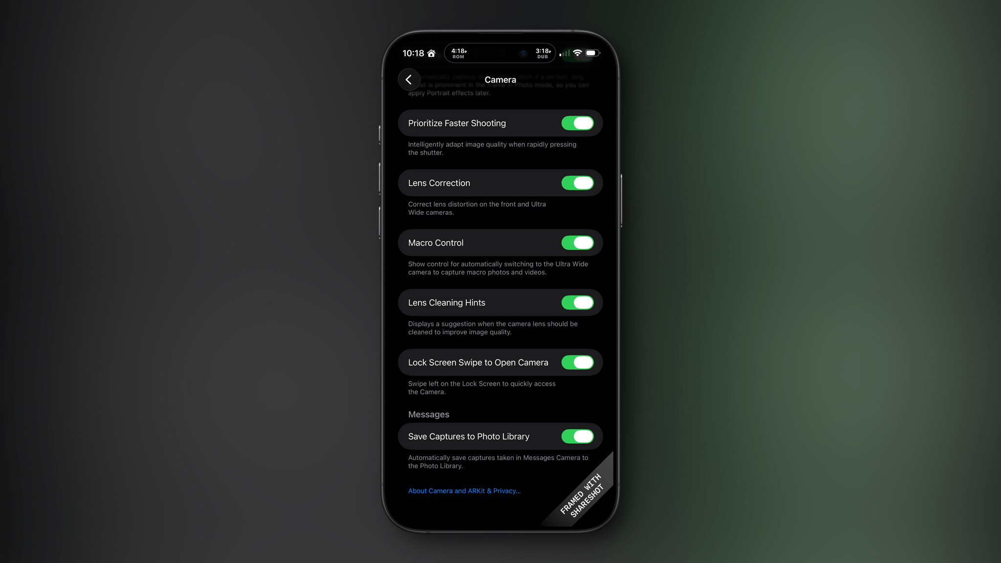
I don’t know about you, but it’s not uncommon for me to accidentally activate my iPhone’s camera by inadvertently swiping left on my Lock Screen. For me, it’s a once-in-a-while thing, but if it happens to you a lot, you can now deactivate the gesture in Settings under the Camera section.
There are relatively minor changes to Photos, too. The interface elements for playing multiple selected images as a slideshow, marking them as favorites, or hiding them are now at the top of the Photo app’s three-dot “More” menu.
Everything Else in iOS
The iOS update includes a bunch of other small changes:
- A new accessibility setting to “Display Borders” around buttons, which replaces the old “Button Shapes” setting;
- The Lock Screen wallpaper picker includes new prompts to help users through the setup process;
- Rapid Security Responses has been replaced by a toggle in Settings that allows users to choose whether automatic security updates are applied to their iPhone or iPad;
- The Fitness app has gained new custom workout options for workout type, estimated Active Calories, effort, duration, and start time;
- Many interface elements in Settings are now left-aligned;
- The color backgrounds of events in Calendar have been reverted to their pre-iOS and iPadOS 26 look;
- Swiping on the mini-player in Music now skips forward and back among tracks in your queue;
- Apple Intelligence is now available in Danish, Dutch, Norwegian, Portuguese (Portugal), Swedish, Turkish, Chinese (Traditional), and Vietnamese. Also, AirPods Live Translation now has support for Japanese, Korean, Italian, and both Mandarin Traditional and Simplified Chinese; and
- The Vision Pro app includes a 3D model of your Vision Pro.
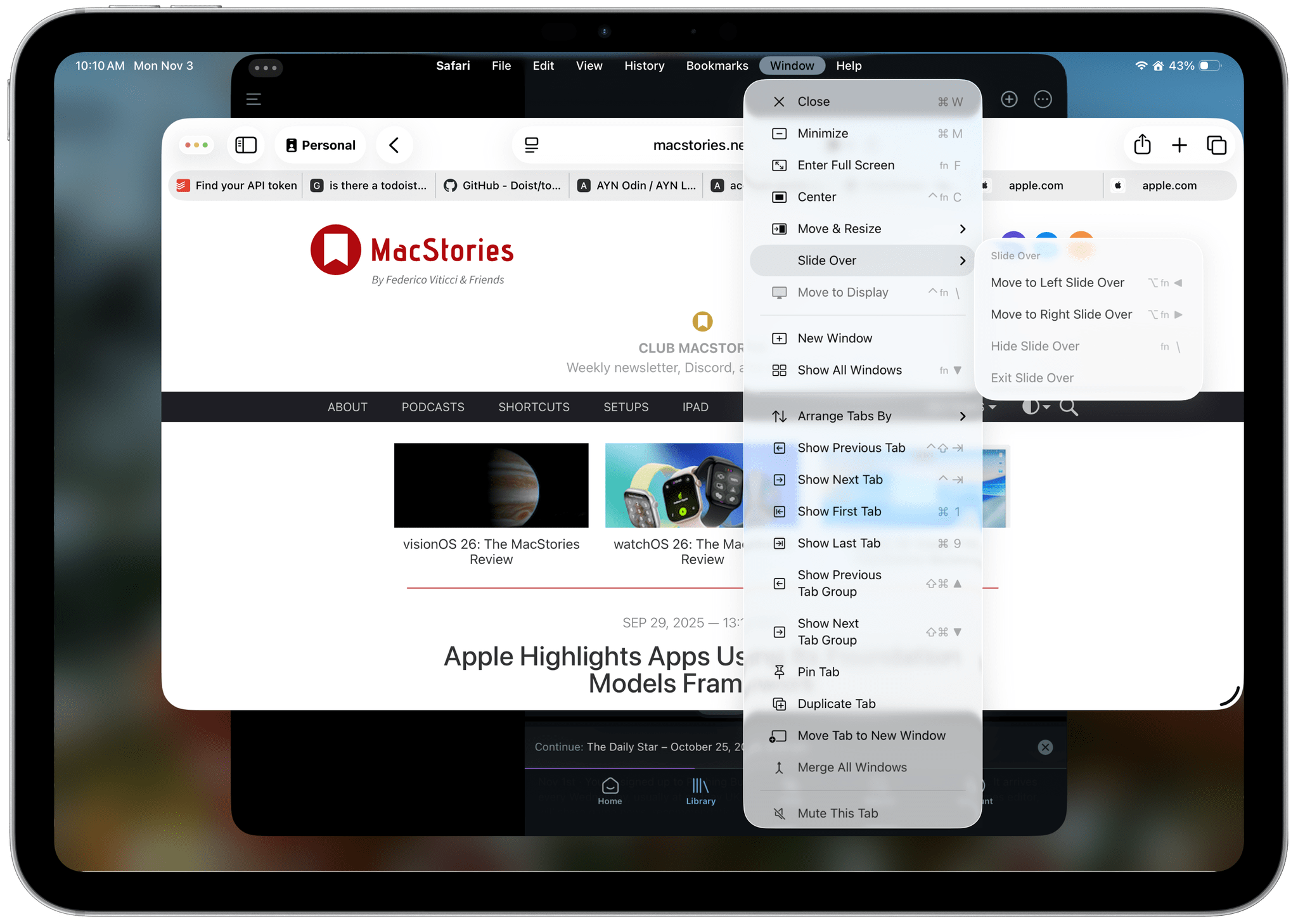
iPadOS 26.1: Slide Over and New Window Management Options
The lion’s share of changes to iOS are carried over to iPadOS 26.1, but there are a couple of revisions to the iPad’s OS that are unique to it.
First, Slide Over is back. Apple heard from a vocal group of iPad users who relied on Slide Over to get their work done and has added the feature back to the OS with a twist. The new Slide Over supports a single app tucked just offscreen with a little Picture-In-Picture style indicator along the edge of your iPad’s screen. Previously, you could switch between multiple apps using a dedicated Slide Over switcher interface. However, now, your Slide Over window can be resized to any size, which wasn’t possible before. Also, the single Slide Over app is a per-display restriction, meaning that if you use an external display with your iPad, you get a second Slide Over app.
Second, Apple has added some new menu items for managing window. There are now options to hide your current window, hide your other windows, and close all of your windows, all of which close gaps between how windows work on the iPad and Mac.
macOS 26.1 Tahoe
Like iOS and iPadOS 26.1, macOS Tahoe has gained a tinted version of Liquid Glass. If Apple is intent on preserving maximum transparency in Music and Photos, I may give the “tinted” version a try. I generally like Liquid Glass on the Mac, but it’s not perfect, and “tinted” mode may help.
Finally, AutoMix, the feature that uses Apple Intelligence to transition tracks of a playlist by matching their beats, now works with AirPlay. When I first tested this feature over the summer, I assumed AutoMix would work automatically with my Bluetooth speakers that I use at my desk, but that wasn’t the case. Now, however, whether you use AirPlay speakers or wired speakers, AutoMix will work.
Sadly, there’s not much to report about visionOS, watchOS, or tvOS. Each undoubtedly received under-the-hood improvements, but you’ll have to wait for substantive new features from them.
If there’s a theme surrounding the 26.1 updates to Apple’s OSes, it’s that the company is listening to its users. Tinted Liquid Glass, the return of Slide Over, and the updates to the very niche Local Capture feature are all great examples of Apple’s engineering teams turning around meaningful updates to its OSes based on feedback from users. That’s great to see, and a trend that I hope continues long into the future.