Apps
Nowhere is Apple’s work to align the user experience of the Mac, iPadOS, and iOS more apparent than in the changes made to Catalina’s built-in apps. Chief among those changes is the breakup of iTunes into parts by media type. As profound as splitting up iTunes after 18 years is though, it shouldn’t overshadow the extensive changes made across a wide swath of Catalina’s built-in apps. Those other changes are just as consequential both for their depth of new features, which will satisfy the needs of many users, and closer ties to their iOS and iPadOS counterparts. First, however, it’s time to pour one out for iTunes, which has served Mac users since before the iPod was even introduced.
The Breakup of iTunes
The long-anticipated breakup of iTunes is finally upon us. Music, TV shows, movies, podcasts, and audiobooks have all been moved to separate apps. After years of complaints about iTunes feature creep and bloat, most people seem to have accepted that it was time to break up iTunes, but that doesn’t mean everyone is happy with the new Music app. The de-emphasis of purchasing music, removal of features, and UI changes have all been points of criticism during the beta period.
Personally, I love the new Music app but understand why the changes rub some users the wrong way. iTunes had an 18-year run on the Mac. A lot has changed in the way digital music is enjoyed in that time, but a lot of habits have been formed too, which makes the transition difficult.
Still, even though you won’t find an app called iTunes on your Mac anymore, the lion’s share of its functionality remains intact in one place or another. What’s changed is Apple’s focus, which is most evident in Music’s prioritization of streaming over purchasing music. Purchasing music on the iTunes Store is still possible, but it’s been deemphasized. Instead, Apple Music is front and center. Combined with separate apps handling podcasts, TV shows, movies, and audiobooks, there’s no mistaking that Music’s purpose is to serve first and foremost as a player for Apple Music.
The one-two punch of breaking up iTunes and deemphasizing purchased music is a lot for users to absorb and Apple to get right in one release, but on balance, I’m happy with the changes. Of course, there’s room for improvement and a few rough edges, but compared to using iTunes, Music and the other media apps Apple has introduced or updated are a delight.
Music
iTunes started life as a music player in January 2001 before there was an iPod or iTunes Store for purchasing music. The Music app is a return to those roots but reimagined for Apple’s music streaming service. Purchased music is still available, and you can even rip, mix, and burn CDs for when you need to drop a funk bomb, but that type of functionality has been tucked away out of sight in favor of streaming.
I spend a lot of my time working on a Mac while listening to music. However, until the Catalina beta, I found myself streaming music from an iOS device to the HomePod in my office more and more often. iTunes was too bloated and buggy. The app was slow to start, and when I clicked ‘Play’ on an album or playlist, it usually started by skipping the first song and going straight to the second. It was easier to use AirPlay from my iPhone instead.
That has changed with the new Music app, which is hands down the app I’ve used and enjoyed the most during the Catalina beta period. I’ve had far fewer problems than I ever had with iTunes. Music launches and loads the For You and Browse tabs faster than iTunes ever did, and playback is more reliable, though not perfect.
Still, it has taken a while to get used to Music. The layout of iTunes’ controls is deeply ingrained in my muscle memory that I still find myself looking in the wrong places for certain things. Over time though, I’ve mostly adjusted, and now I couldn’t imagine going back to iTunes.
Design
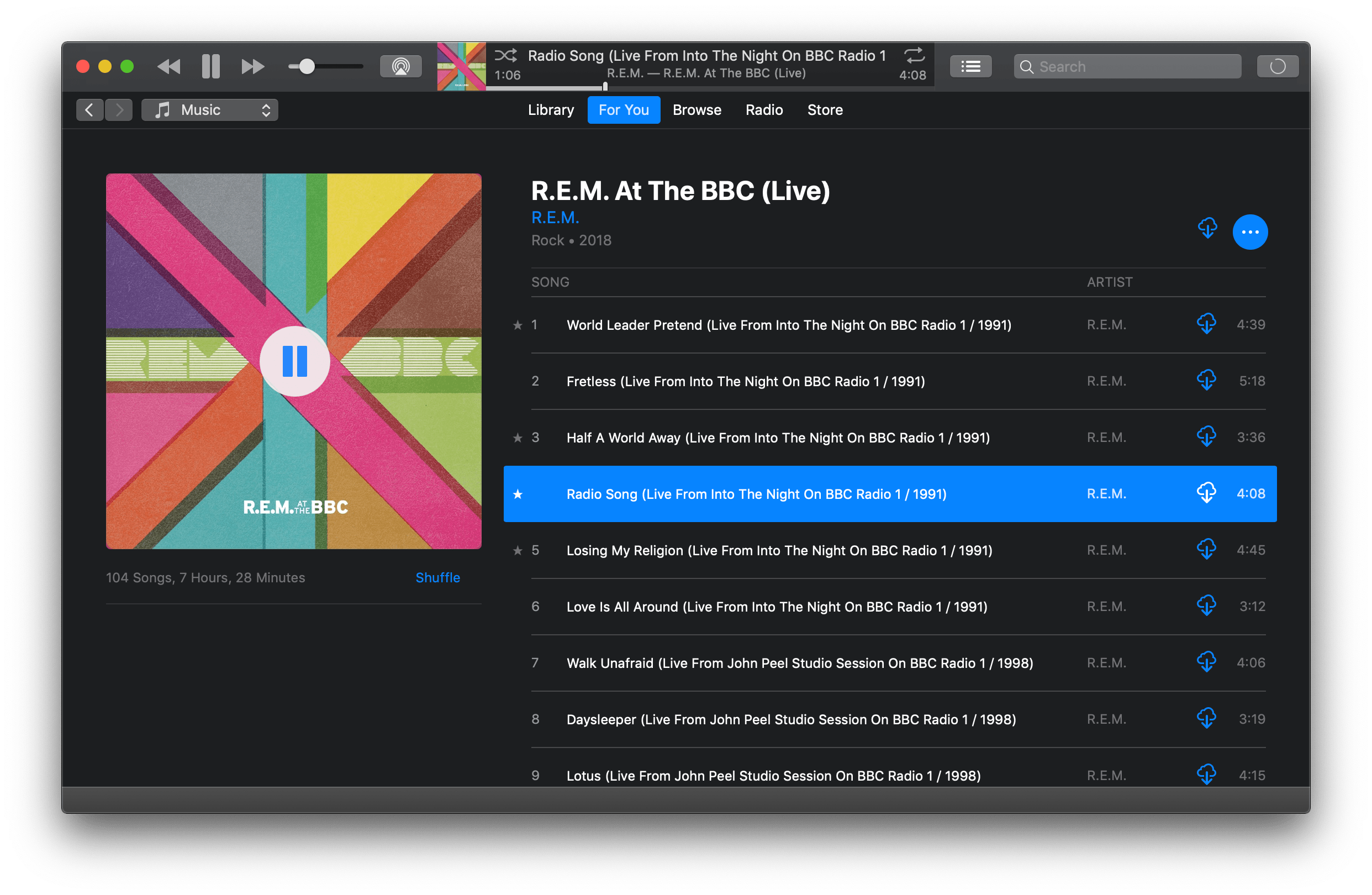
Navigation in Music has been simplified by moving everything to the left-hand sidebar. In iTunes, top-level navigation was laid out horizontally near the top of the app’s window. This meant that if you were in For You, Browse, or Radio, you didn’t have access to the albums, artists, genres, playlists, and other categories of music in your Library. Now, with everything in the sidebar, it’s possible to jump straight from playing an album in For You to a playlist you’ve made or saved in your Library, for example.
Moving navigational elements to the left sidebar frees up vertical space to display more music, which is further aided by a new responsive design. Before, the artwork in iTunes’ For You, Browse, and Radio tabs was static. Now, playlist, album, and radio station graphics are scaled dynamically as the app’s window is resized. As a result, Music is much more comfortable to use in a smaller window. That’s an excellent update for the many Mac users who use Music on a small laptop screen.
My testing over the summer bore out the advantage of the new dynamic artwork. Whereas I always used iTunes in a window that filled my screen, Music has felt comfortable in a smaller window on my 13-inch MacBook Pro’s display, allowing me to use the rest of my screen for other apps.
Another nice touch is that color has returned to Music’s sidebar. The monochrome icons in iTunes’ sidebar made it difficult to distinguish between different music categories. In contrast, the Apple Music tabs in the sidebar feature bright shades of red, orange, and pink, while the Library tabs range from bright blue to purple. Playlists remain monochrome, which is a shame because I’d like to see a better differentiation between Smart Playlists and others.
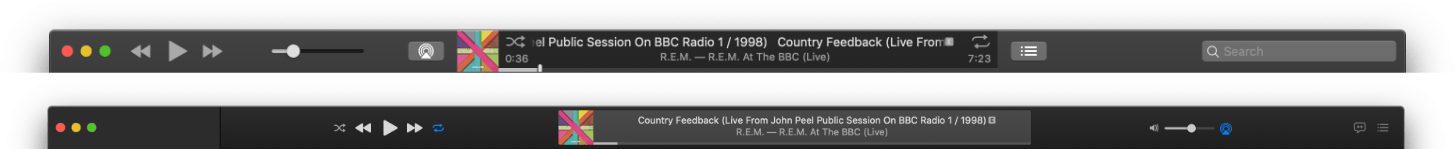
It’s worth noting that the playback controls and other information at the top of the window have been rearranged too. Curiously, the forward navigational button has been eliminated from Music entirely, making backtracking through your music browsing the only option. It’s a perplexing change that I don’t like, even though I’m admittedly more likely to want to back up while browsing than skip forward again. Also, if you click the ‘Up Next’ button you can access your playback history for the songs you previously played.
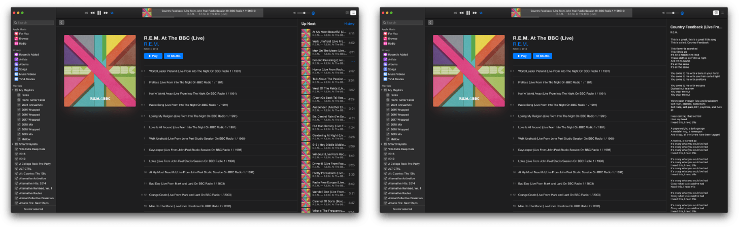
Artwork, track, album, and the three-dot menu button have moved to the left side of the top of Music’s window, playback controls are now in the center, and volume and AirPlay controls are on the right side. The Upcoming, History, and Lyrics popover window from iTunes has been replaced with a panel that slides in from the right edge of Music’s window. Also, Lyrics has a separate button in Music that triggers the same slide-in panel, making the feature more discoverable. Unfortunately, Music on the Mac doesn’t have the same time-synced lyrics found in iOS and iPadOS 13 and tvOS 13.
Album and playlist pages have changed too. A big play button no longer appears when you hover over an album or playlist’s artwork. Instead, there are more conspicuous Play and Shuffle buttons directly beneath the title and artist information.
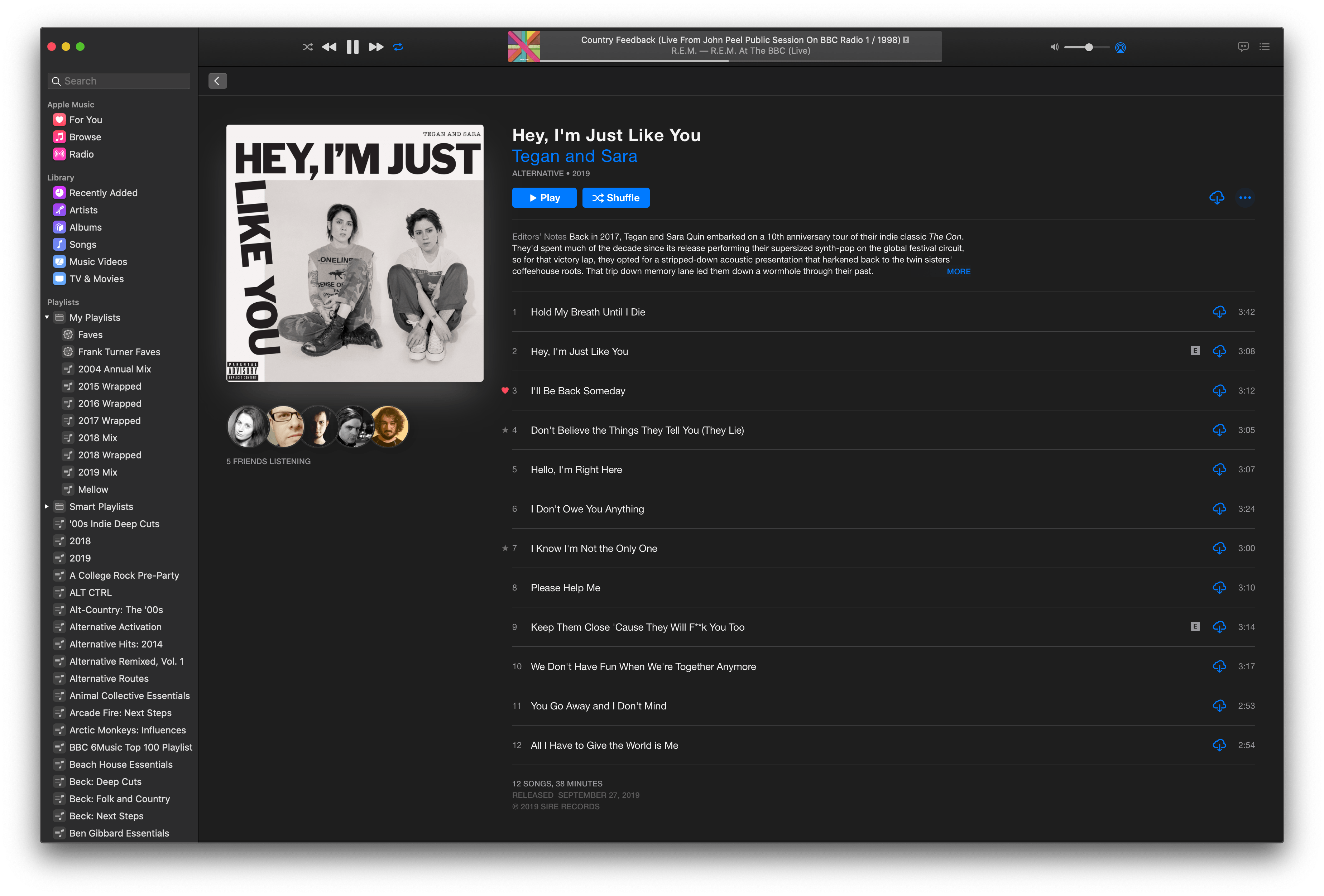
Editorial content has moved too. In iTunes, editorial content was excerpted beneath the album art along the left side of the window. Now, editorial content appears immediately beneath the new Play and Shuffle buttons, which is closer, though not quite identical to how editorial content is treated in the iOS version of the app. Although the text is smaller, it’s more directly in users’ line of sight, which makes it more noticeable, and it can be expanded with a click of the ‘More’ link.
Features
As I mentioned at the top, the core functionality of iTunes has migrated to Music and elsewhere in Catalina. Some features have, however, been eliminated entirely.
The most notable removal is probably column browser, a feature that has been in iTunes for what seems like forever. From Song view, column browser allowed you to drill down from a list of every song in your iTunes Library by Genre, Artist, Album, Composers, and Groupings. For anyone who lived in Song view, column browser was a fast way to get to particular songs or albums.
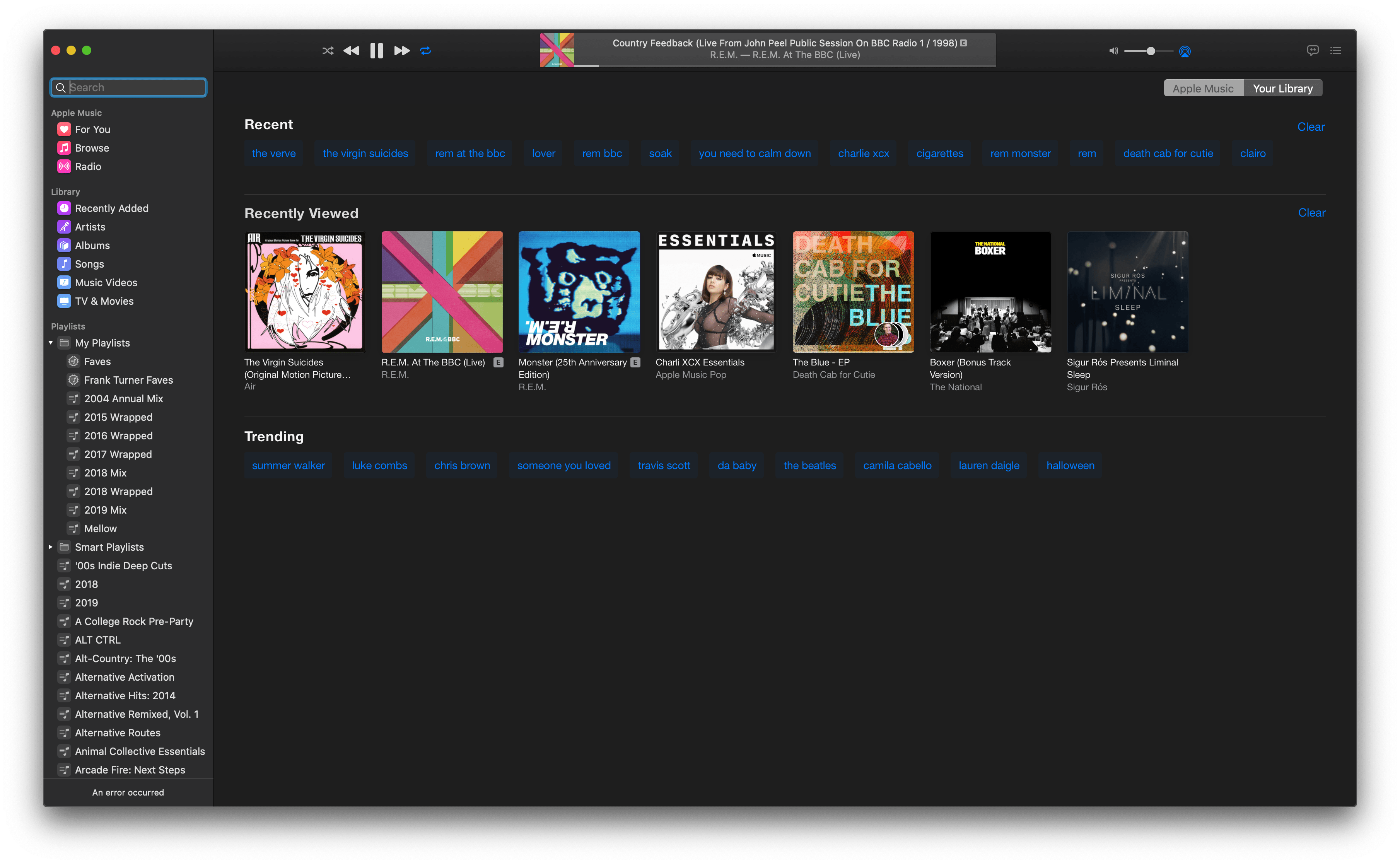
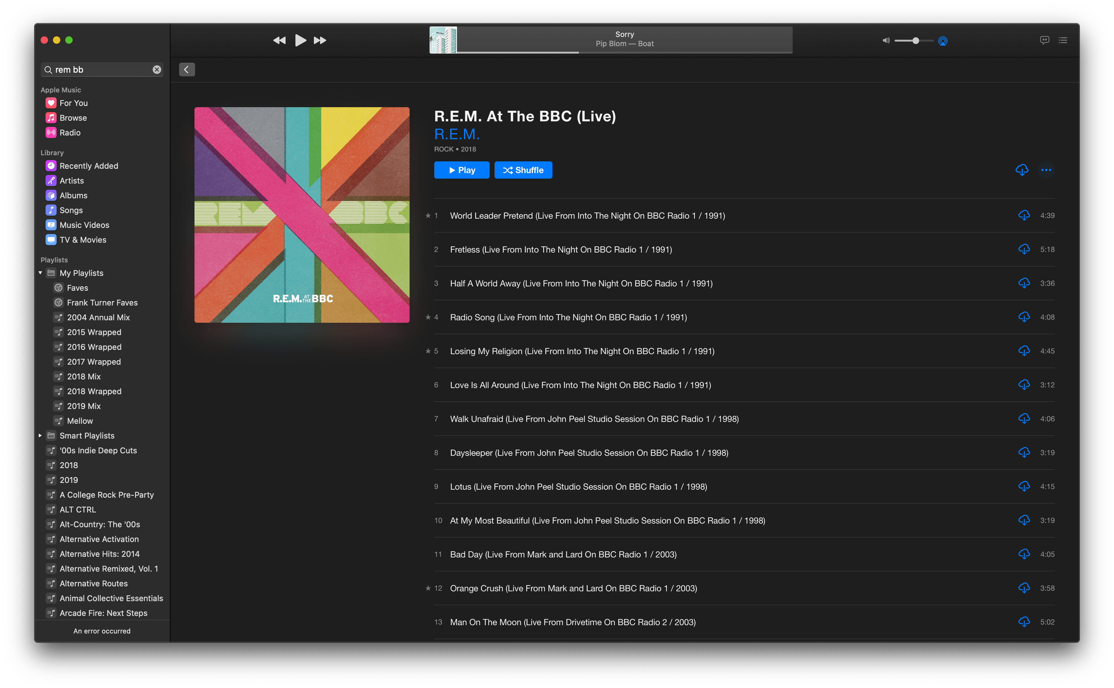
I’ll admit that I haven’t used column browser in years and won’t miss it. I find most of the music I want to play by browsing the For You and Browse tabs in Music. If I’m looking for a specific artist, album, or song, I use search, which has been enhanced in Music with Recent, Recently Viewed, and Trending sections that appear when you first click into the Search field in the sidebar. I rarely scroll through my Library anymore, which I suppose is a byproduct of having fully transitioned to streaming my music from Apple Music.
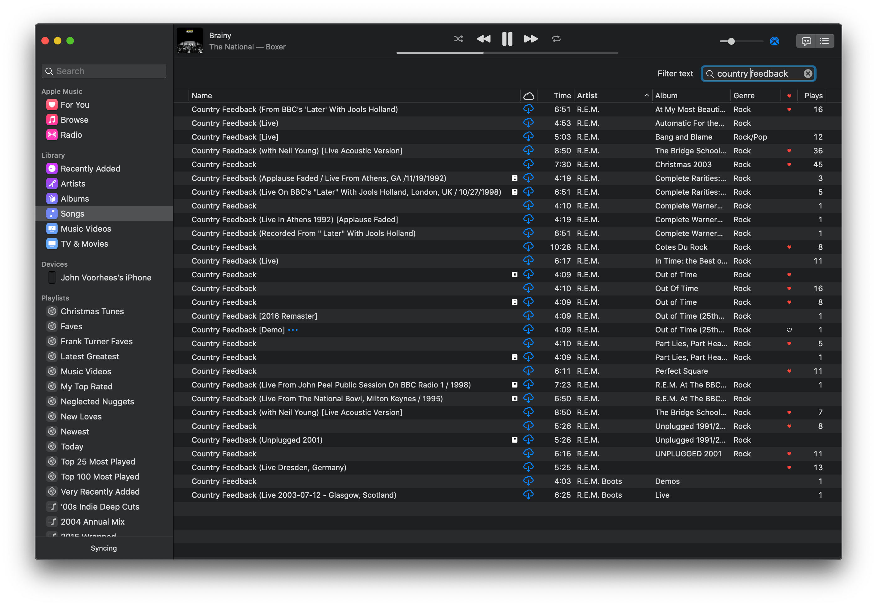
That said, I understand how hard it would be to adjust to Music if column browser was the primary way you browsed your music collection. The functionality hasn’t been completely eliminated though. In its place, there’s a new View menu item called Show Filter Field, which can be used much the same way as the column browser but uses substantially less space. Type a term in any of the Library’s categories, and the Filter Field will narrow the results to the text you type. The Filter Field doesn’t let you browse exactly the same way the column browser did, but I’ve found it an effective way to get to a particular artist, album, or song quickly, which was also the point of the column browser.
Although much of the legacy functionality of iTunes has been preserved in Music, the elimination of Column Browser reflects a general shift away from a personally-curated library of music. Music still includes a Library that has all the music you’ve purchased, but your Library is listed after Apple Music’s For You, Browse, and Radio tabs in the sidebar.
In perhaps the clearest sign that the days of purchasing music from Apple are numbered, the iTunes Store tab has been hidden by default. The Store is still available in the General section of Preferences alongside ‘Star ratings’ and ‘Songs list checkboxes,’ two other legacy iTunes features. Store results can still be accessed in search results, but Apple Music results are the default here too.
More than anything, I’m surprised more wasn’t stripped from iTunes than column browser. You can still rip music from CDs and burn owned music to CDs. Genius playlists can still be created, although Genius Mixes seem to be gone for good. Music supports AppleScript too, and even the Visualizer is still around, although it’s been moved to the Windows menu.
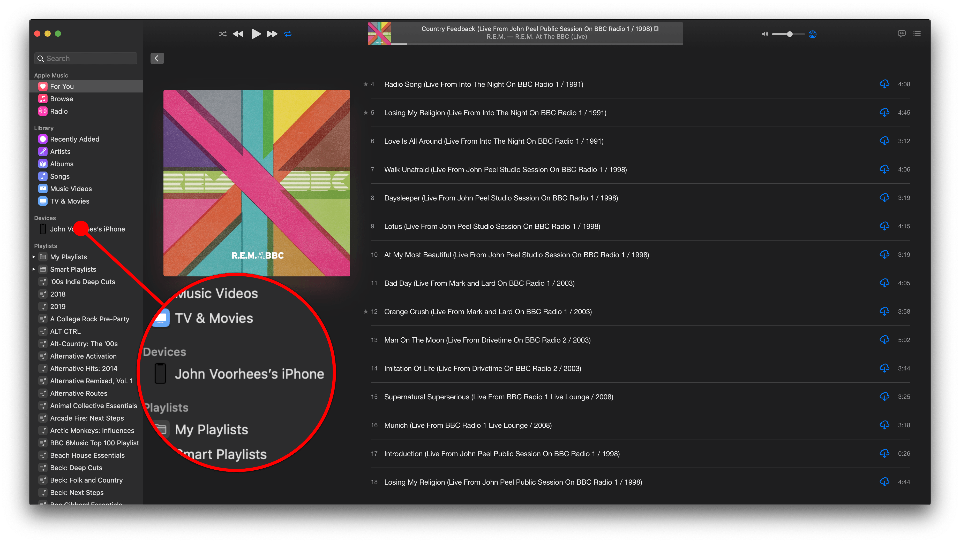
iPod and iOS device syncing over a cable has been removed from Music entirely and moved to the Finder. iPods and iOS devices now show up in the Locations section of the Finder’s sidebar. Clicking on a connected device reveals controls very similar to what used to be displayed inside iTunes. From here, you can manage sync settings, media loaded on devices, and backups as well as update and restore devices
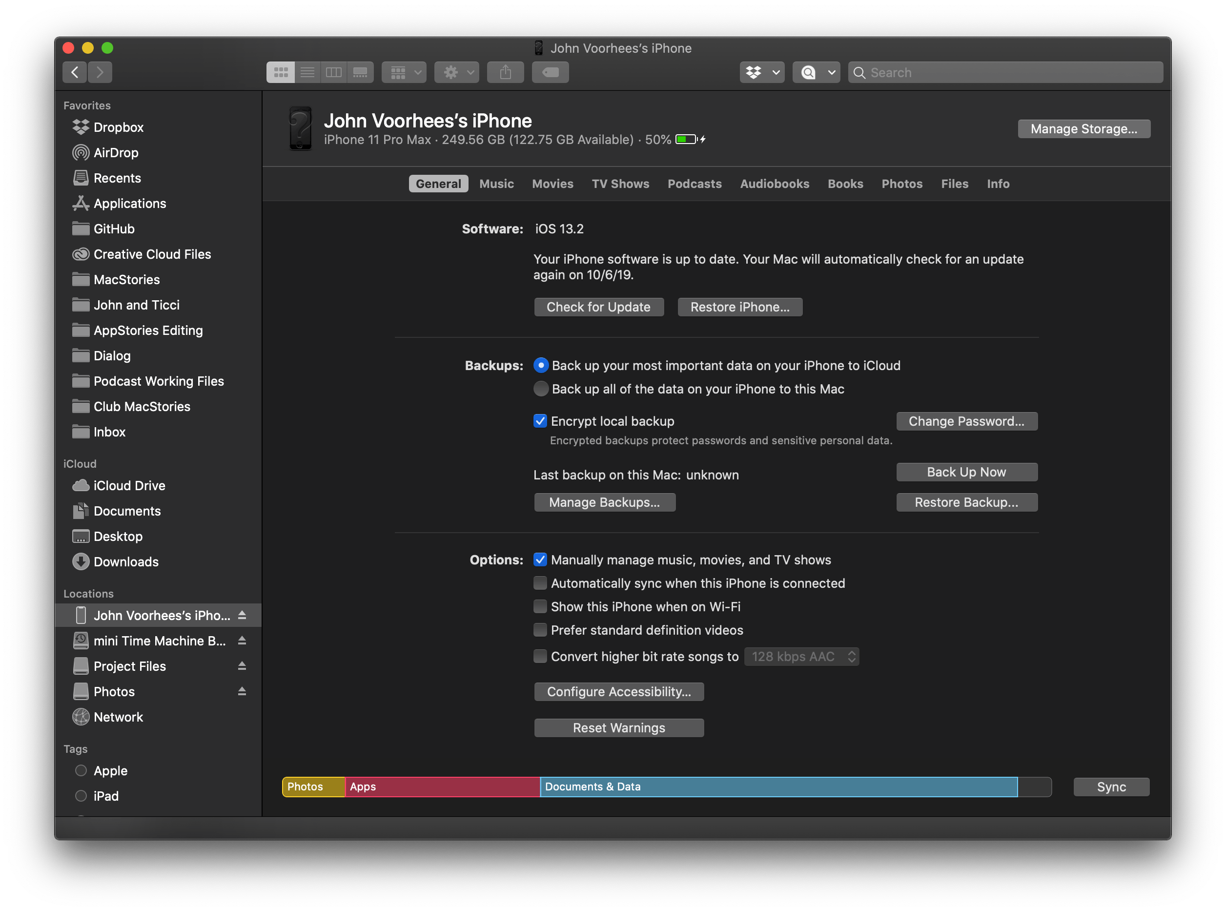
To smooth the transition and make the move to the Finder discoverable, iOS devices and iPods that have been plugged in still show up in Music between your Library and Playlists. If you click on a device, Music displays the songs stored on it along with a few options. In the upper right-hand corner of the window is a Sync Settings button that opens the Finder with the device highlighted in the Locations section of the sidebar.
At the bottom of Music’s device window are controls for auto-filling a connected device with music from your smart playlists and a subset of your other playlists. The Settings button lets you pick whether songs are replaced when autofilling a device, whether they are chosen randomly and whether higher-rated items are preferred. You can also set a storage limit for auto-filled music.
The other feature of iTunes that has been moved elsewhere is Home Sharing, which has been centralized as part of the Sharing pane in System Preferences. Home Sharing allows a Mac in your household to act as a server for media you own. Any device on the same local network can download music, movies, and TV shows to play. Home Sharing can also be set up to share photos with an Apple TV. In iTunes, this feature resided in the Sharing tab of the app’s Preferences.
I’ve enjoyed the addition of a dedicated Music app on the Mac. As someone who primarily streams songs from Apple Music, the new app is a meaningful update from iTunes. It loads faster, is more responsive, and benefits from the clarity that results from focusing on streaming instead of purchased music and other media. I also prefer the UI to iTunes’ because it works better in a smaller window than iTunes did. Music will be harder to get used to for anyone who is accustomed to browsing a large library of owned and/or downloaded music, but other than column browser, so little has been removed from iTunes that I expect with time, even library-oriented users will find a way to make Music work for them.
