The day has finally arrived. iOS 18.1, iPadOS 18.1, and macOS 15.1 are all out and include Apple’s first major foray into the world of artificial intelligence. Of course, Apple is no stranger to AI and machine learning, but it became the narrative that the company was behind on AI because it didn’t market any of its OS features as such. Nor did it have anything resembling the generative AI tools from OpenAI, Midjourney, or a host of other companies.
However, with today’s OS updates, that has begun to change. Each update released today includes a far deeper set of new features than any other ‘.1’ release I can remember. Not only are the releases stuffed with a suite of artificial intelligence tools that Apple collectively refers to as Apple Intelligence, but there are a bunch of other new features that Niléane has written about, too.
The company is tackling AI in a unique and very Apple way that goes beyond just the marketing name the features have been given. As users have come to expect, Apple is taking an integrated approach. You don’t have to use a chatbot to do everything from proofreading text to summarizing articles; instead, Apple Intelligence is sprinkled throughout Apple’s OSes and system apps in ways that make them convenient to use with existing workflows.
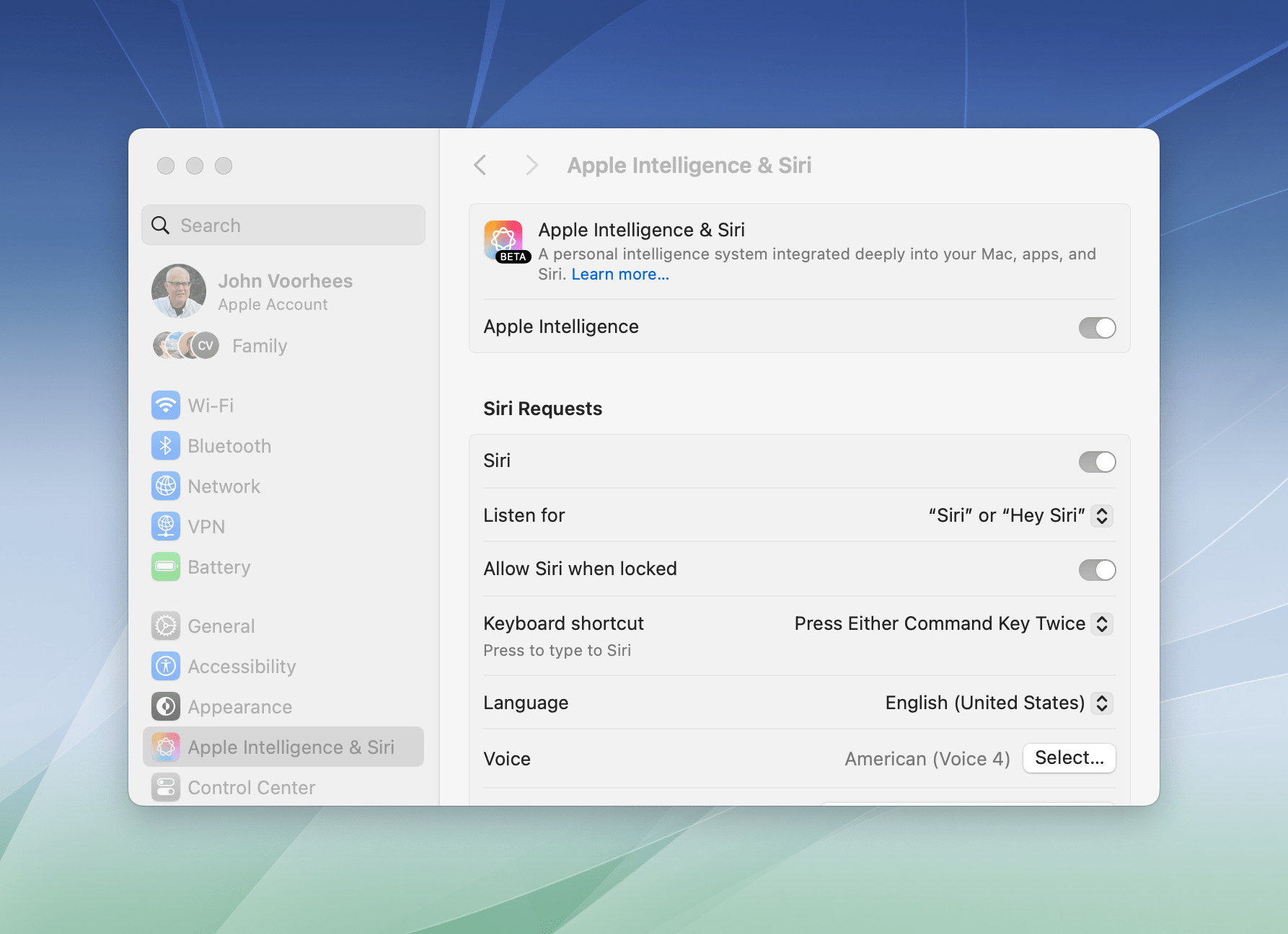
If you don’t want to use Apple Intelligence, you can turn it off with a single toggle in each OS’s settings.
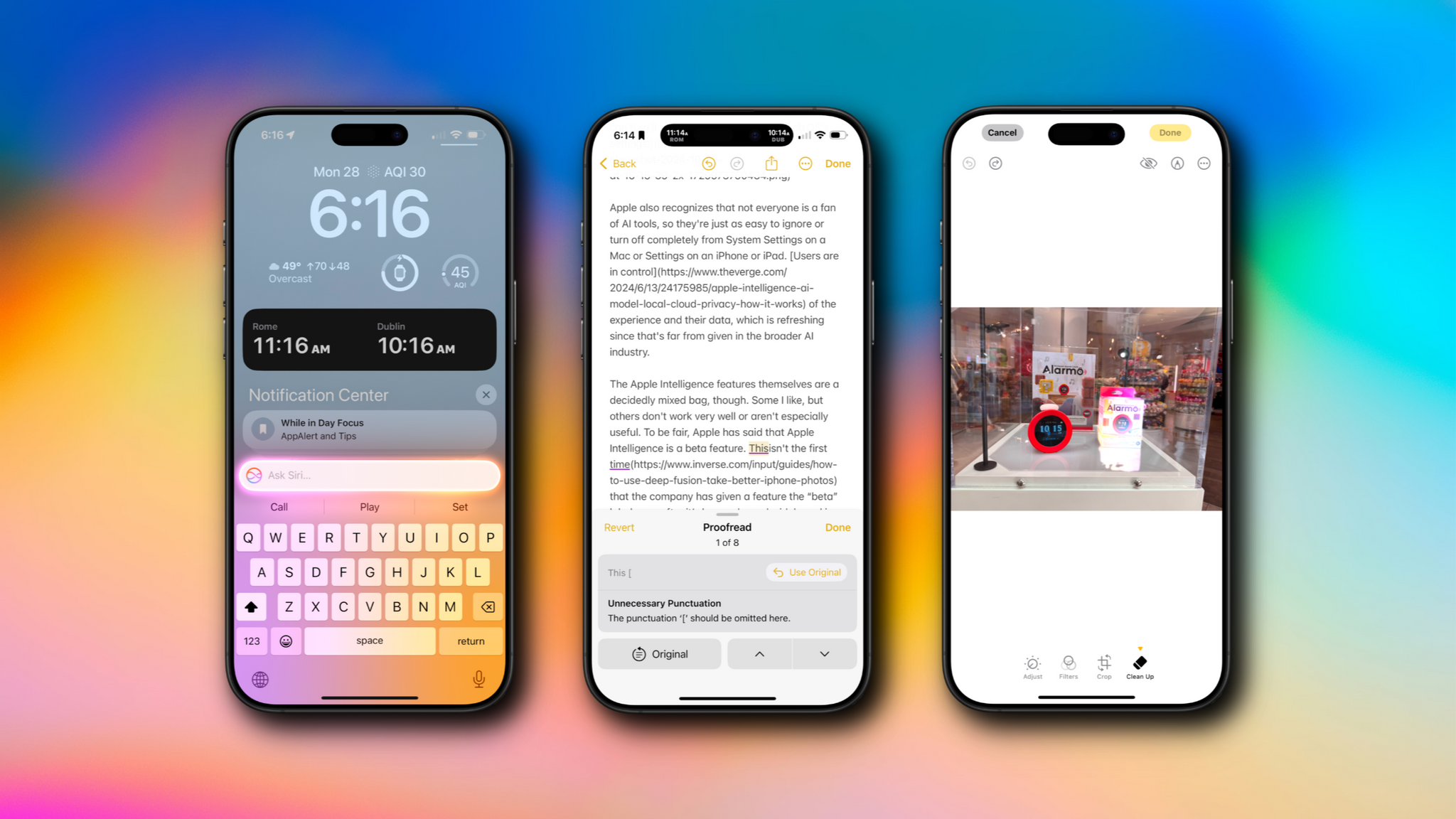
Apple also recognizes that not everyone is a fan of AI tools, so they’re just as easy to ignore or turn off completely from System Settings on a Mac or Settings on an iPhone or iPad. Users are in control of the experience and their data, which is refreshing since that’s far from given in the broader AI industry.
The Apple Intelligence features themselves are a decidedly mixed bag, though. Some I like, but others don’t work very well or aren’t especially useful. To be fair, Apple has said that Apple Intelligence is a beta feature. This isn’t the first time that the company has given a feature the “beta” label even after it’s been released widely and is no longer part of the official developer or public beta programs. However, it’s still an unusual move and seems to reveal the pressure Apple is under to demonstrate its AI bona fides. Whatever the reasons behind the release, there’s no escaping the fact that most of the Apple Intelligence features we see today feel unfinished and unpolished, while others remain months away from release.
Still, it’s very early days for Apple Intelligence. These features will eventually graduate from betas to final products, and along the way, I expect they’ll improve. They may not be perfect, but what is certain from the extent of today’s releases and what has already been previewed in the developer beta of iOS 18.2, iPadOS 18.2, and macOS 15.2 is that Apple Intelligence is going to be a major component of Apple’s OSes going forward, so let’s look at what’s available today, what works, and what needs more attention.


 for more details on each Club option.](https://cdn.macstories.net/ivborw0kggoaaaansuheugaac50aaajwcayaaaakgq9xaaaacxbiwxmaaastaaaleweampwyaaam-1629596463664.png)