This Week's Sponsor:

Collections Database

A Powerful Database with iCloud Sync


Posts tagged with "Apple Maps"

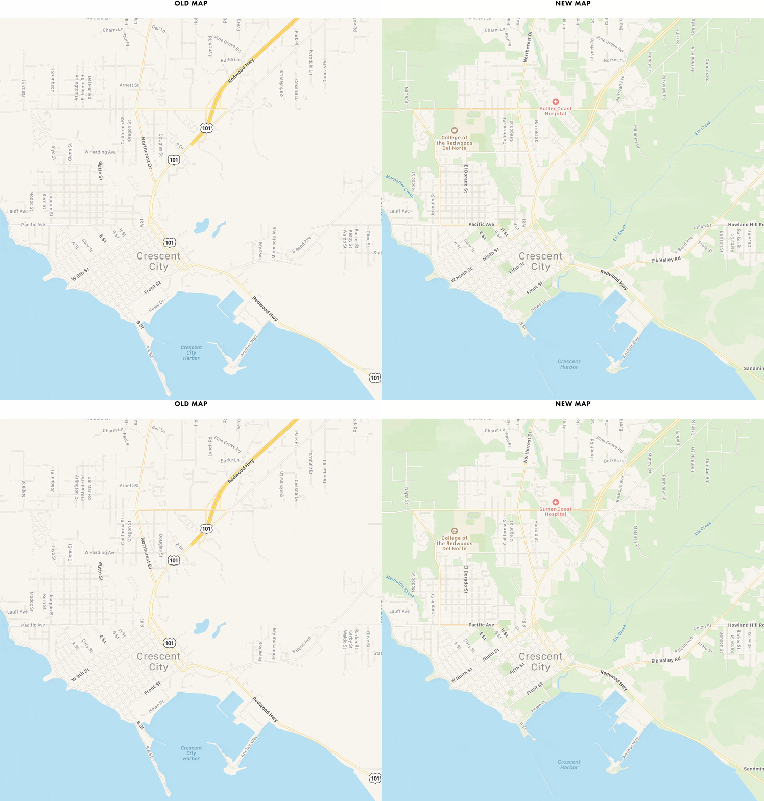
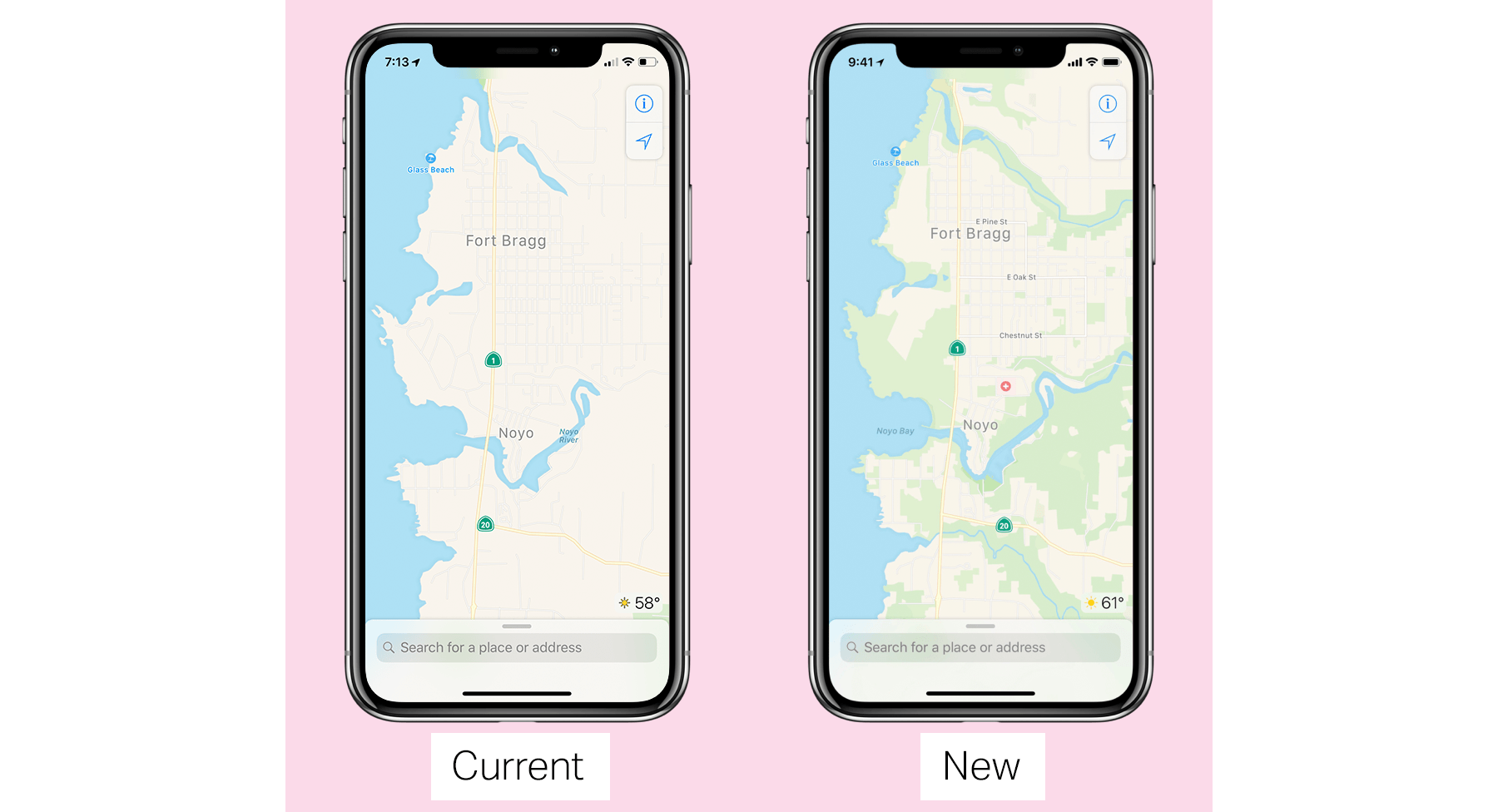
How Far Ahead of Apple Maps Is Google Maps?

Another fantastic essay by Justin O’Beirne, this time focused on explaining one of Google Maps’ strongest advantages over Apple Maps: the ability to use data to create more data.

With “Areas of Interest”, Google has a feature that Apple doesn’t have. But it’s unclear if Apple could add this feature to its map in the near future.

The challenge for Apple is that AOIs aren’t collected—they’re created_. And Apple appears to be missing the ingredients to create AOIs at the same quality, coverage, and scale as Google.

This is a perfect example of Google’s institutional approach to data collection paying off in the long term, giving them a substantial lead over the competition. O’Beirne’s visual comparisons between Google Maps and Apple Maps are just brutal.

Yes, Apple Maps may be “prettier”, but when you’re going somewhere, or need to find a specific point of interest, I bet you don’t care about “pretty”. You just want your map to tell you where to go, or show you accurately where you’re meant to be. Google is objectively ahead here, and Apple Maps’ slow evolution is concerning. There’s an interesting parallel here between Apple Music and Apple Maps: both nicer iOS apps than Spotify and Google Maps, and both far behind in terms of intelligence of the service itself.

As I wrote earlier this year:

Speaking from personal experience, Google Maps has considerably improved in my area in the past year, while Apple Maps has remained essentially the same. Which isn’t to say that Apple Maps is bad – Google simply has an edge over local business information and they’re evolving at a faster pace than Apple. To me, Apple Maps looks and feels nicer; Google Maps seems smarter and it has modern features I’d like Apple to add.

Permalink

A Year of Google Maps & Apple Maps

Justin O’Beirne is back with another in-depth analysis of Google Maps and Apple Maps, with a focus on how Google has taken a different approach over the past year:

Shortly after I published my Cartography Comparison last June, I noticed Google updating some of the areas we had focused on:

Coincidence or not, it was interesting. And it made me wonder what else would change, if we kept watching. Would Google keep adding detail? And would Apple, like Google, also start making changes?

So I wrote a script that takes monthly screenshots of Google and Apple Maps.1 And thirteen months later, we now have a year’s worth of images.

The screenshot comparisons in his post perfectly demonstrate Google’s iteration and Apple’s relative stagnation.

Speaking from personal experience, Google Maps has considerably improved in my area in the past year, while Apple Maps has remained essentially the same. Which isn’t to say that Apple Maps is bad – Google simply has an edge over local business information and they’re evolving at a faster pace than Apple. To me, Apple Maps looks and feels nicer; Google Maps seems smarter and it has modern features I’d like Apple to add.

I wonder what Apple has in store for WWDC and if they should consider separating Maps from their monolithic software release cycle in the summer.

(See also: O’Beirne in May and June 2016.)

Permalink

Dispelling the Apple Services Myth

Apple is known for its quality hardware and software, but services are another story.

Cloud-based services are the future – there’s no denying that. And Apple historically has struggled with its cloud offerings. From MobileMe, to the early growing pains of iCloud, to the Apple Maps fiasco, the company gained a poor reputation in the area of services.

Only in the last two years has Apple publicly touted services as a core part of its business. Company press releases as recent as May 2015 ended with the following self-definition:

Apple designs Macs, the best personal computers in the world, along with OS X, iLife, iWork and professional software. Apple leads the digital music revolution with its iPods and iTunes online store. Apple has reinvented the mobile phone with its revolutionary iPhone and App Store, and is defining the future of mobile media and computing devices with iPad.

There’s a lot that feels outdated here, including the fact that both Mac and iPod are highlighted before the iPhone. But one major way this paragraph fails to describe the Apple of today is that the word ‘services’ is nowhere to be found.

Amid a variety of other changes, Apple’s current self-definition includes the following:

Apple’s four software platforms — iOS, macOS, watchOS and tvOS — provide seamless experiences across all Apple devices and empower people with breakthrough services including the App Store, Apple Music, Apple Pay and iCloud.

Services are a key component of modern Apple. The way the company defines itself, along with the numerous services shoutouts in quarterly earnings calls, prove that.

Despite Apple’s increased focus on services, the common narrative that the company “can’t do services” still hangs around – in online tech circles at least.

But is that narrative still true, or has it grown outdated?

I want to share how I use Apple services in my everyday life across three important contexts of life:

  • As I work,
  • On the go, and
  • Around the house.

My aim is not to perform an in-depth comparison of Apple’s cloud offerings and competing products. Though competitors and their features will come up occasionally, the focus here is on my experiences in everyday living – my experiences, not yours. I understand that just because something does or doesn’t work for me, the same isn’t necessarily true for you. The point of this piece is not to try proving anything; instead, I simply want to assess and share my current experiences with Apple’s services.

Read more


Apple Improves Maps in Europe with EV Charging and Bicycle Rental Data

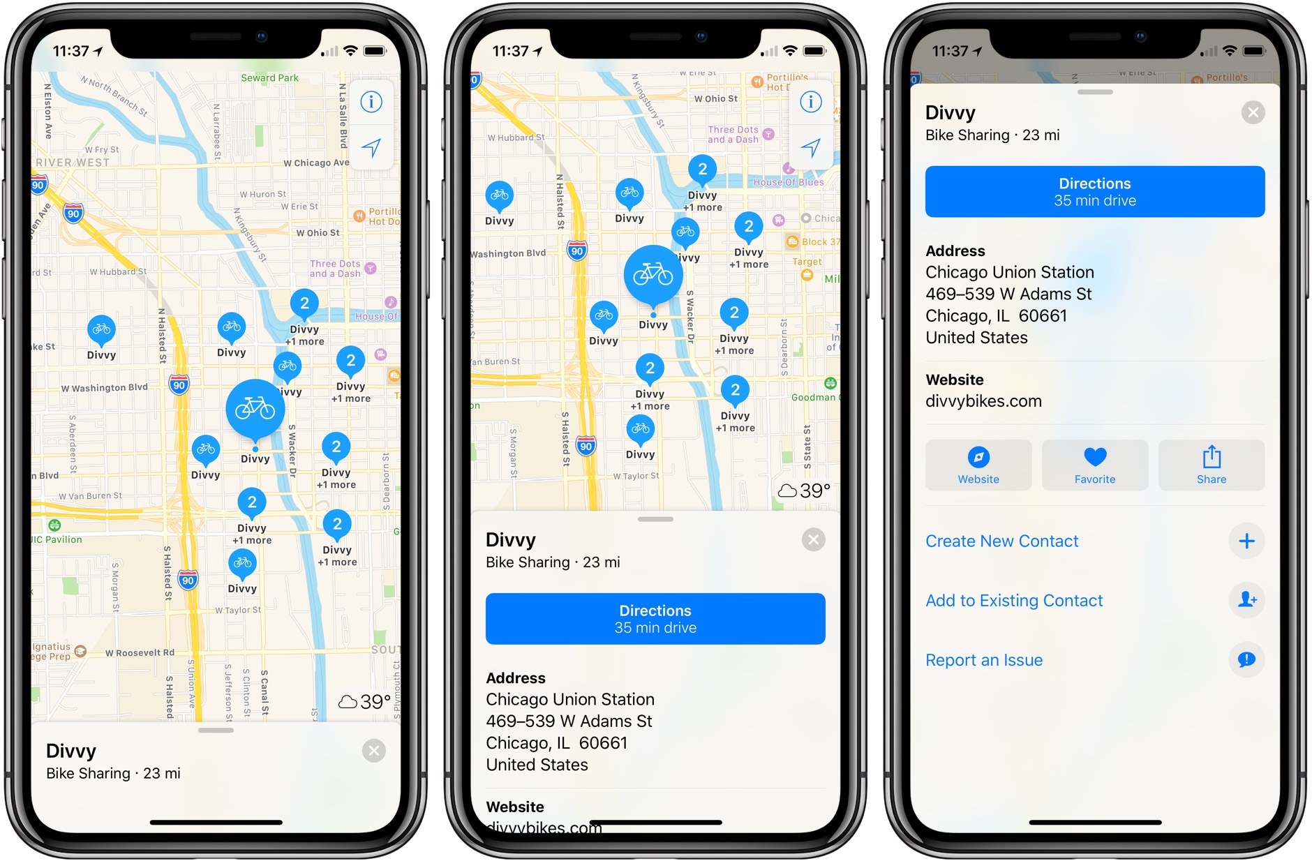
Nate Lanxon reports for Bloomberg on some welcome updates to Apple Maps in Europe:

Apple Inc. is expanding the capabilities of its Maps app in Europe to help users charge their electric vehicles or find bike rental hubs.

The company has added the locations of the U.K.’s electric vehicle charging stations by incorporating data from Munich-based Cirrantic’s Moovility service, which lists re-juicing points for cars made by Tesla and Nissan, among others.

It has also added public bicycle rental and drop-off points to maps of London, New York and Paris in a catch-up to long-time mobile navigation leader Google, which has listed such stations in multiple countries for some time.

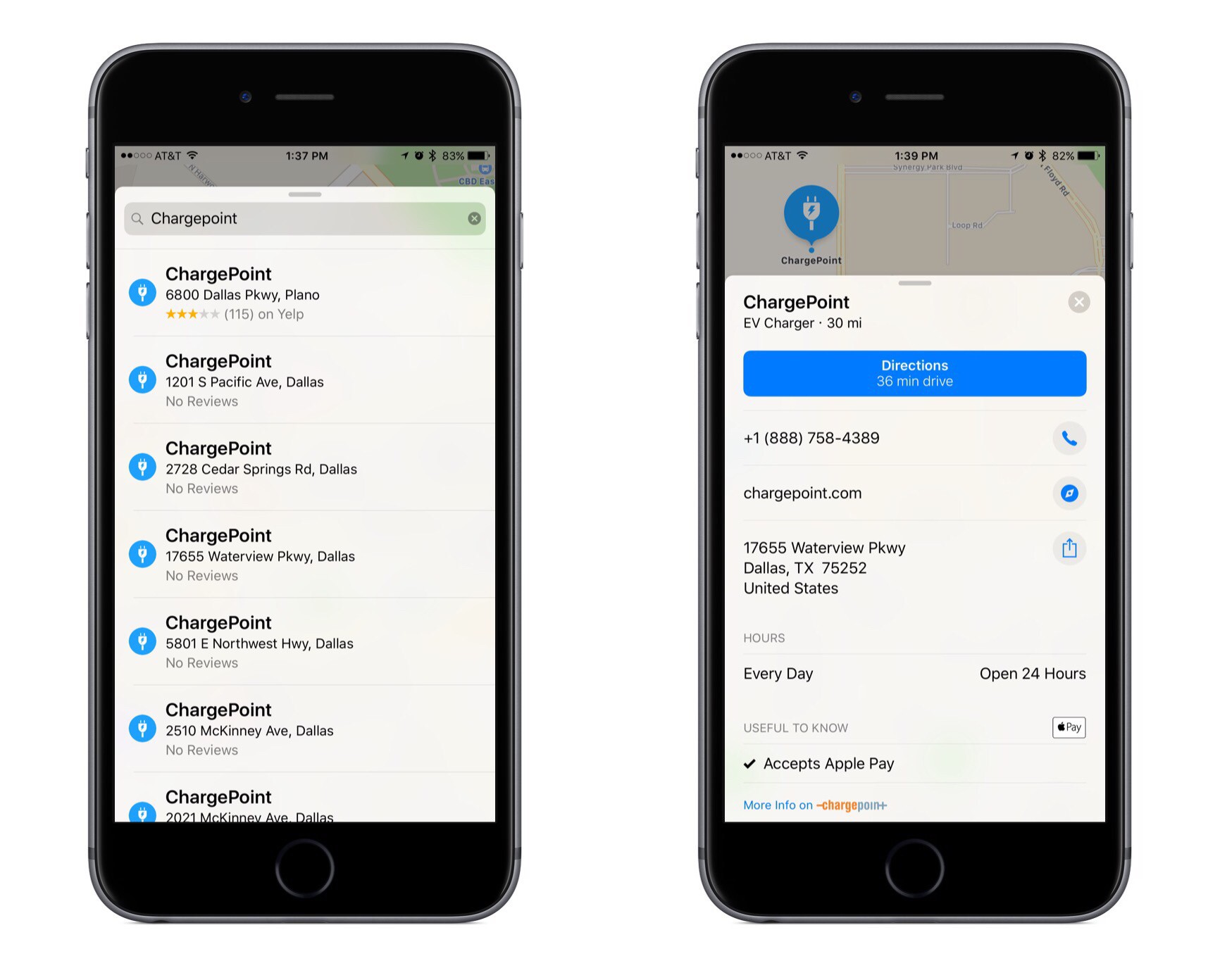
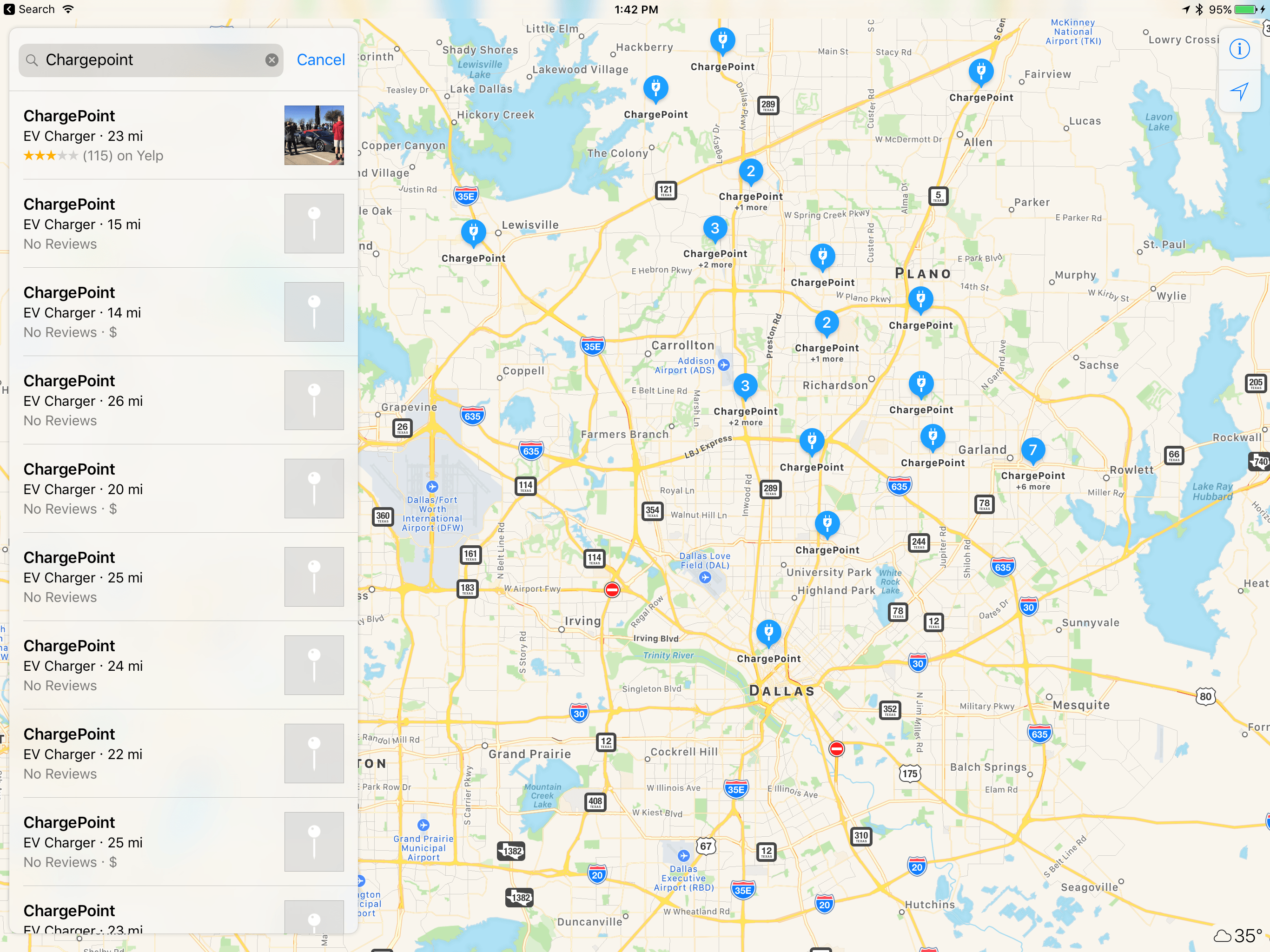
Last December Apple added ChargePoint integration to Maps to help users in the U.S. find electric vehicle chargers, so it’s nice to see something similar come to Europe.

The bicycle rental information is also welcome as Apple Maps continues branching out from simply providing directions to now being a central hub for various modes of transportation, such as ride sharing and now bicycling.

Permalink

Apple Maps Adds ChargePoint Integration

Jordan Kahn of Electrek reports on the latest improvement to Apple Maps:

Apple has been slowly adding more electric charging station listings to Apple Maps since the release of iOS 10, and today the world’s largest EV charging network, ChargePoint, officially confirmed integration.

The official integration not only means that ChargePoint’s network of charging stations will now be visible as EV Charger badges within Apple Maps, allowing users to tap through to get more info on the station, but users can also initiate charging and complete payment from a link in Apple Maps to the ChargePoint app (Apple Pay included).

Ever since Apple first set out to create its own mapping solution, and found it more difficult than expected, it has aggressively pursued various partnerships to expand the breadth and veracity of its mapping data. Those partnerships have seemed to slow down of late, likely because Maps has less improving to do today than it did shortly following its 2012 launch.

Having spent several years building partnerships to ensure its data won’t lead any drivers astray, Apple has more recently been able to focus on integrating data that’s less important, but still quite useful. A few months ago we saw the company team up with Parkopedia to improve parking data, and now charging stations are a natural next step.

Permalink

Apple Maps vs. Google Maps vs. Transit

Concise, well-illustrated comparison of transit maps from the developers of Transit for iOS:

Transit maps are hard. Really hard. Even for Apple and Google. Piecing a transit map together, city by city, agency by agency, stop by stop, without it turning into a hairy mess is INCREDIBLY difficult. So far, no one (not even Apple or Google) have been able to create a transit map that is both automatically generated and well designed. Why is that?

As Apple outlined at WWDC, their approach to transit takes a long time because it involves manually curated details (things like signs, directions, and cultural conventions that match the real world), which wouldn’t be possible with an algorithm alone.

That said, I can vouch for Transit in Rome. The app is excellent. Well designed, with some clever interactions (such as an “arrive by” option to plan a trip on a timeline), and a joy to use. It’s also the only decent transit app that combines public transit with local car sharing services on the same map.

I wish Apple Maps transit data was a) available in Rome and b) as flexible as Transit.

Permalink

Google Maps & Apple Maps: Cartography Comparison

When I linked to Justin O’Beirne’s analysis of Google Maps in May, I asked:

It’d be interesting to see the same comparisons between Apple and Google, as well as between old Apple Maps and Apple Maps today.

Not only did Justin deliver (for context, he designed and led the development of Apple Maps’ cartography), he’s started an entire series detailing the cartography of Google Maps and Apple Maps.

At its heart, this series of essays is a comparison of the current state of Google’s and Apple’s cartography. But it’s also something more: an exploration into all of the tradeoffs that go into designing and making maps such as these.

These tradeoffs are the joy of modern cartography — the thousands of tiny, seemingly isolated decisions that coalesce into a larger, greater whole.

Our purpose here is not to crown a winner, but to observe the paths taken — and not taken.

(Can you tell he left Apple in 2015?)

I couldn’t stop reading the first post in the series, in which Justin compares the choices Google and Apple have made for displaying cities, roads, and points of interests on their maps. Utterly fascinating and amazingly detailed.

I’ve always preferred Apple’s overall design and balance of their maps (which Justin’s data confirms), but, in my experience, their data (POIs and roads) was either old or inaccurate. My area in Rome seems to have improved in the past year, and maybe I should try Apple Maps again.

I’m looking forward to Justin’s next entries in the series.

Permalink

What Happened to Google Maps?

Fascinating study by Justin O’Beirne on how Google Maps changed from 2010 to 2016 – fewer cities, more roads, and not a lot of balance between them on a map at the same zoom level.

He writes:

Unfortunately, these “optimizations” only served to exacerbate the longstanding imbalances already in the maps. As is often the case with cartography: less isn’t more. Less is just less. And that’s certainly the case here.

As O’Beirne also notes, the changes were likely made to provide a more pleasant viewing experience on mobile devices.

I understand his point of view – the included examples really make a solid case – but I can also see why Google may consider the average user (looking up points of interest nearby, starting navigation on their phone) and think that most users don’t want that kind of cartographic detail anymore.

It’d be interesting to see the same comparisons between Apple and Google, as well as between old Apple Maps and Apple Maps today.

Permalink