Jordan Kahn of Electrek reports on the latest improvement to Apple Maps:
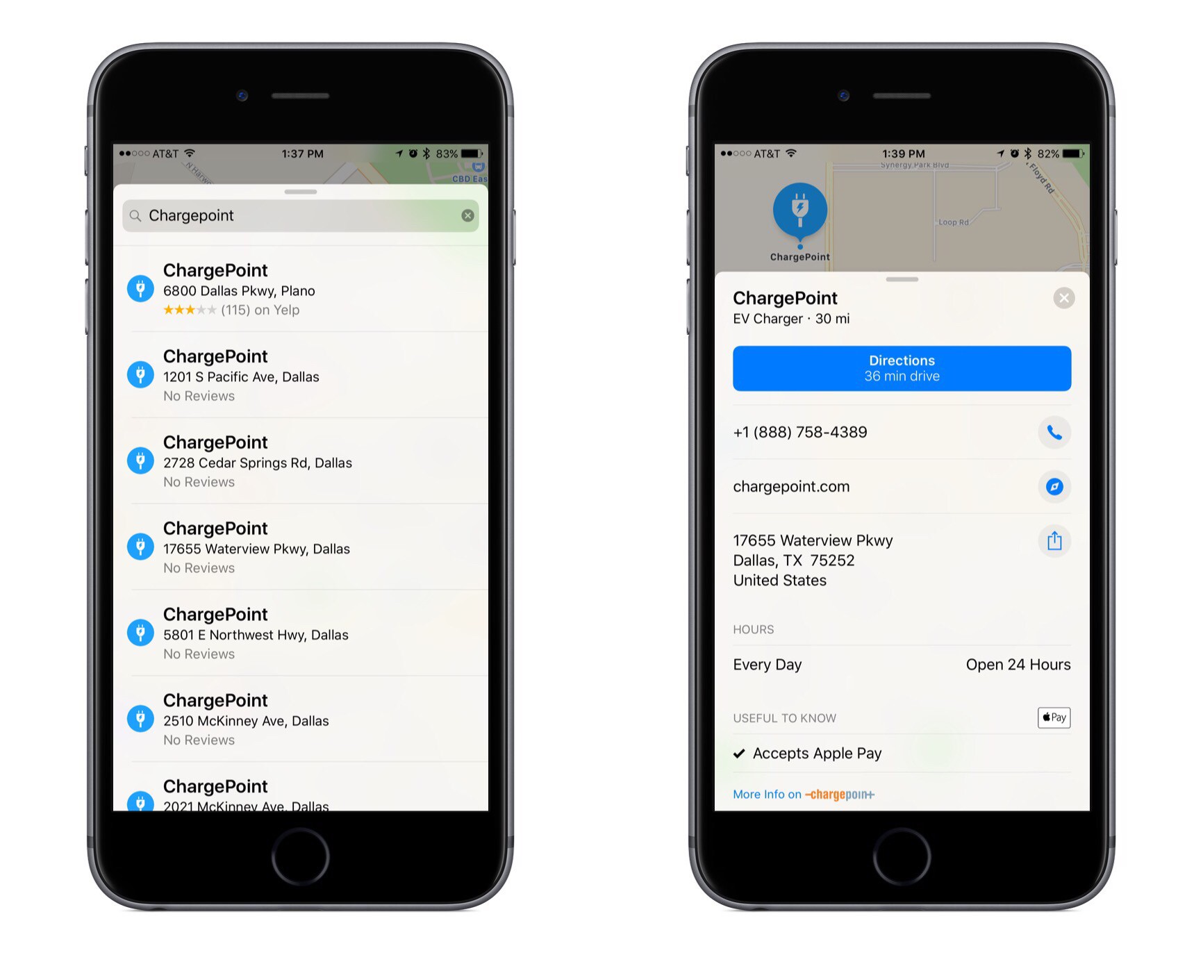
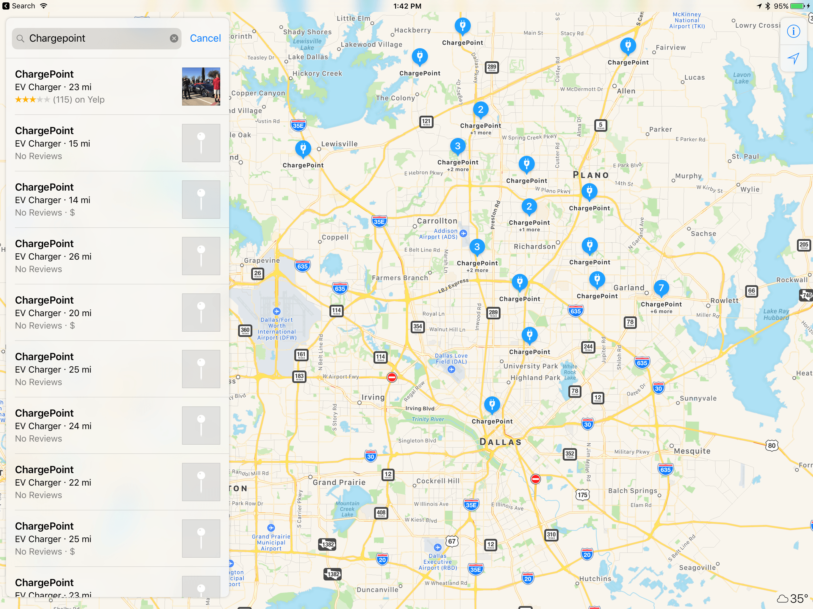
Apple has been slowly adding more electric charging station listings to Apple Maps since the release of iOS 10, and today the world’s largest EV charging network, ChargePoint, officially confirmed integration.
The official integration not only means that ChargePoint’s network of charging stations will now be visible as EV Charger badges within Apple Maps, allowing users to tap through to get more info on the station, but users can also initiate charging and complete payment from a link in Apple Maps to the ChargePoint app (Apple Pay included).
Ever since Apple first set out to create its own mapping solution, and found it more difficult than expected, it has aggressively pursued various partnerships to expand the breadth and veracity of its mapping data. Those partnerships have seemed to slow down of late, likely because Maps has less improving to do today than it did shortly following its 2012 launch.
Having spent several years building partnerships to ensure its data won’t lead any drivers astray, Apple has more recently been able to focus on integrating data that’s less important, but still quite useful. A few months ago we saw the company team up with Parkopedia to improve parking data, and now charging stations are a natural next step.