Watch Faces
Every year Apple releases a batch of new first-party watch faces for us to choose from. Throughout the summer it was looking like slim pickings this year, but Apple kindly dropped six more faces the day before releasing watchOS 7. Not to worry though – while the takes might be a bit hotter than usual, I’ve reviewed each of the new options below.
Pride Analog and Pride Digital 2020
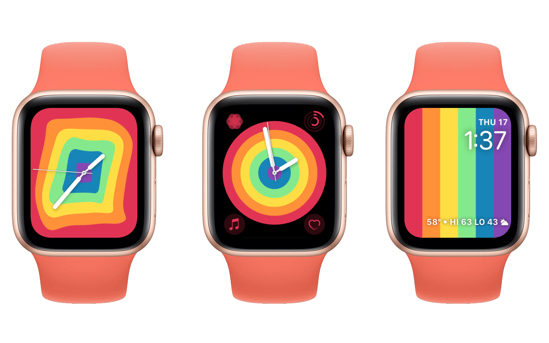
Apple has once again updated their collection of pride watch faces for the new year. One analog and one digital, last year I dinged the digital version pretty hard for illegibility while praising the design of the analog option. Thankfully the 2020 designs are both excellent.
Apple has fused the wobbling strings of 2019 into solid color blocks. Like last year, the design undulates when you tap it or spin the Digital Crown. Periodically the colors will shift in their order, making the entire appearance change and keeping the pattern constantly fresh.
There’s not much to say about Pride Analog this year that I didn’t say about it last year: I love this design and continue to think that it’s one of the best watch faces available. Pride Digital is far better this year, but I still dislike that the complication at the bottom is a text-string type. This is my least favorite complication style since I think it’s hard to parse information from it at a glance. It’s also still a bit difficult to read the complication’s text over the colors, but it remains head and shoulders above last year.
Chronograph Pro
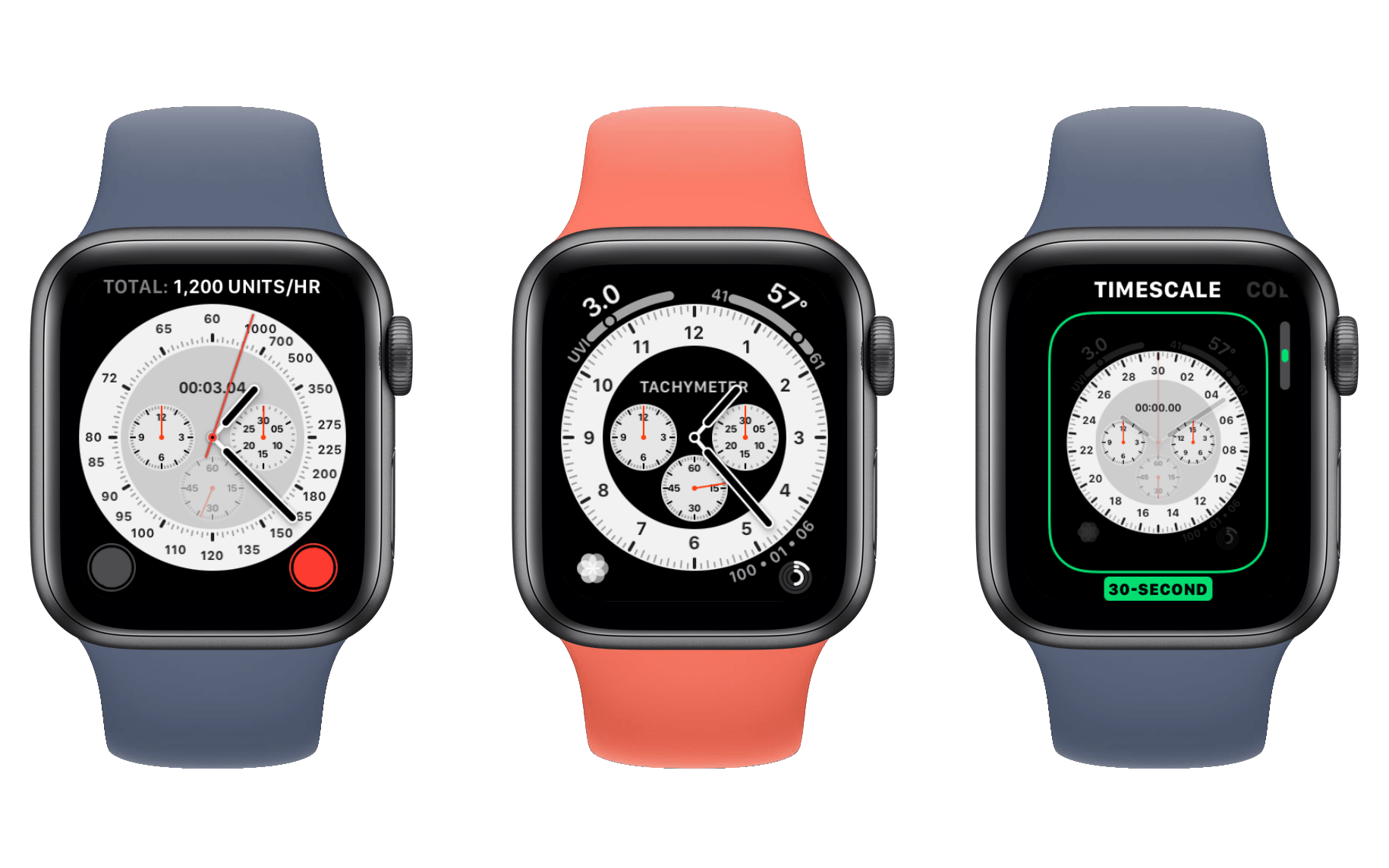
Chronograph was one of the watch faces that shipped on the original Apple Watch, and this year Apple is releasing a new Chronograph Pro option to go alongside it. The original Chronograph featured a stopwatch that you could control directly from your watch face. Chronograph Pro features a tachymeter2 in the default setup which requires you to tap anywhere in the center dial section of the face to open. From there you can stop and start it with the familiar stopwatch buttons. While editing the face you can also swap the tachymeter out for a 60-second, 30-second, 6-second, or 3-second stopwatch. These all work exactly like they do on the standard Chronograph face. Beyond the option for a tachymeter, the “Pro” moniker on the new face also indicates that a fourth complication slot is available. The non-pro face reserves the top-right corner for its unchangeable stopwatch button.
The design of Chronograph Pro is a bit bolder than that of Chronograph, and I think it’s a welcome improvement. Opening an extra complication slot is a nice touch too. If you need a stopwatch or a tachymeter regularly then this is a great new option to explore. If you just like the design, Infograph is a similar face (and still my personal favorite) which allows editing the central circular dials to be complications of your choosing.
Count Up
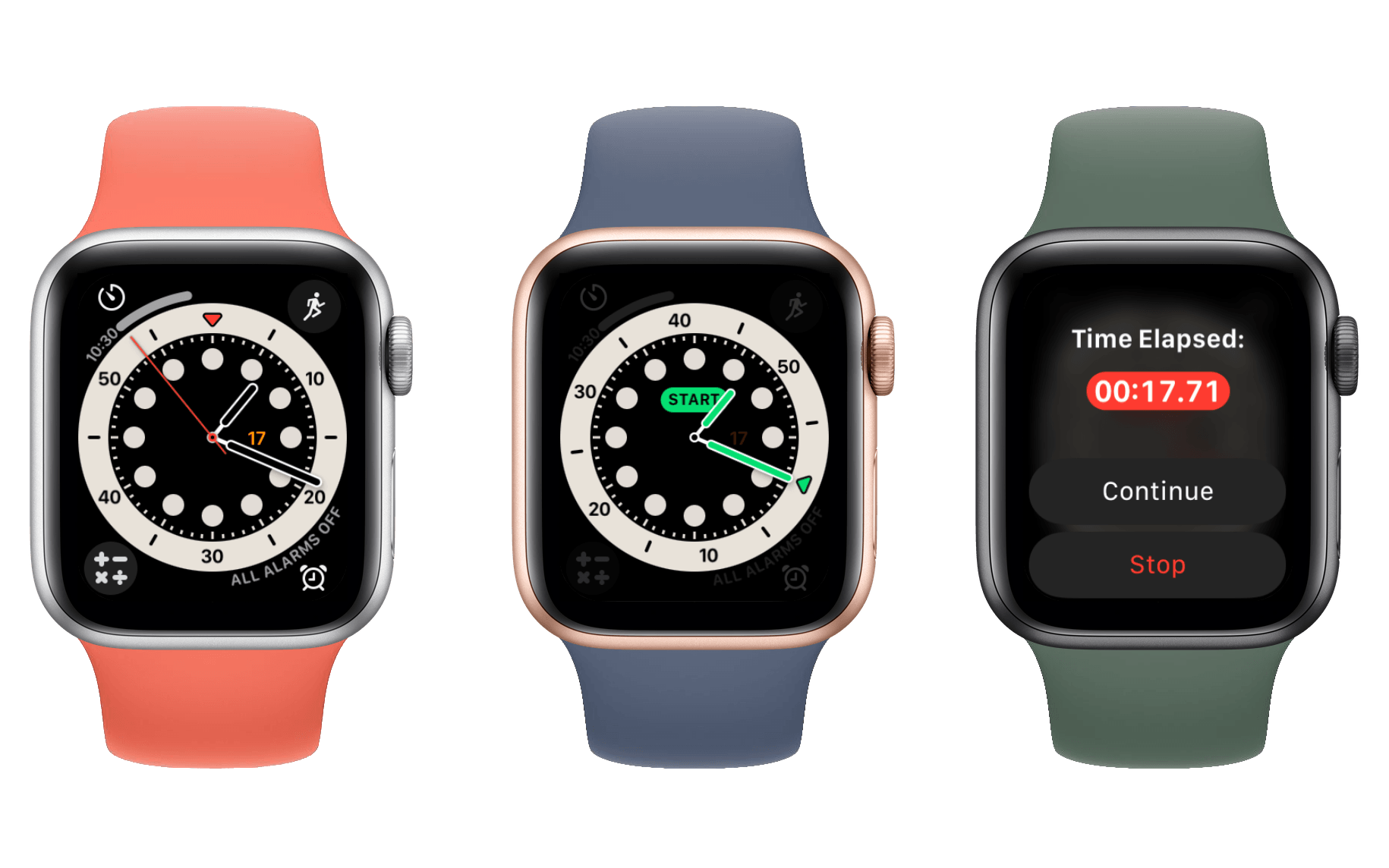
Count Up has a similar look to Chronograph Pro, but tapping the center of it rotates the dial and reveals a small green Start button on it. Tapping the button starts a timer that counts upward by seconds. You can view the current time on the watch face, and tapping the watch face pops up a dialog with the timer and options to Continue or Stop. Stopping it immediately clears the timer, and as far as I can tell there’s no way to see what time it was at when it stopped.
I like the look of this watch face, but its UI feels rushed. The Start button is way too small, and it’s actually pretty hard to hit it accurately. If you miss it even slightly then the face will reset to its original position instead of starting the timer. Furthermore, after starting a timer the tiny Start button’s area becomes the container for the timer’s current readout. This text is way too small and very hard to read, and it gets worse if a clock hand is covering it (the hand does turn transparent, but the extra visual clutter makes the text below even more difficult to read). Finally, stopping a timer really should give you a chance to see what the final time was.
The Count Up face is a nice start to an interesting idea, but I think Apple has a ways to go before this face is actually compelling. Perhaps if they had included it earlier than the day before the OS release they could have implemented some improvements in time.
X-Large and Photos
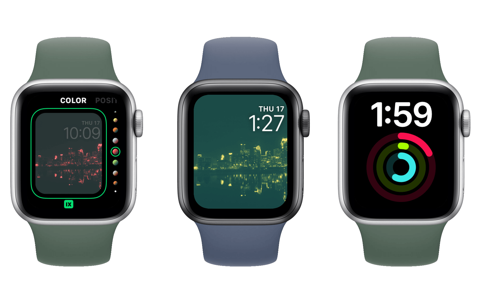
Both of these faces have been around for a while, but they’ve received some updates this year. X-Large now supports adding a complication, which actually entirely transforms its design. Rather than just a huge digital time split across two lines, the new X-Large will collapse its time readout to a single line at the top with a giant complication displayed below it. The time is still quite large, but the complication takes up around two-thirds of the screen.
I actually like this look a lot better than the old X-Large. The complication will show as a single color that matches your chosen color for the face, but if you’d rather colorize the complication then you can now switch X-Large to a multicolor mode. This sets the digital time’s text to white, but lets the complication use whatever colors it wants to.
The Photos face changes are less drastic. A new option enables setting a permanent color filter over the standard Photos face. You can choose from the same huge list of colors that are supported for most watch faces. The filters are not subtle, but they do give a bit more consistency to the feel of your watch face if you have it set to cycle between random photos from your collection rather than choosing a single one. The Photos face has never been my bag, but I know its quite a popular choice and I’m glad to see Apple adding more options to it.
Artist
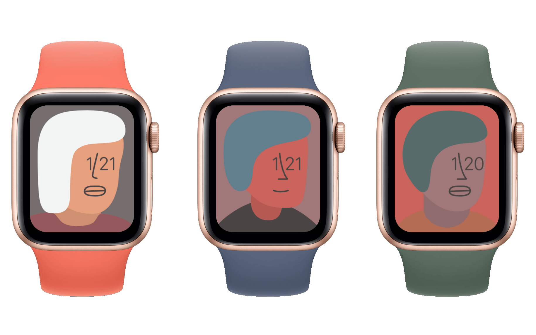
The Artist face is a collaboration between Apple and artist Geoff McFetridge. This face is weird, but I kind of love it. It’s entirely made up of a series of simple drawings of people whose eyes are the current time. The drawings will cycle automatically over time, or you can tap anywhere on the face to request a new one. Tapping the face morphs the previous drawing into the next one with a pleasant animation, but if you tap rapidly then the animation is skipped and you can watch the various drawings fly by.
The characteristics of each drawn person are algorithmically assembled from some pool of options, resulting in millions of final possibilities. On Apple Watch Series 5 and higher, the dimmed version of the face for the always-on display shows each drawing as an outline only. Activating the display will fill in the colors.
I find this watch face strangely satisfying to look at; McFetridge did an excellent job on the art. My only gripe is that, of course, Apple has not provided any complication slots on Artist. I get that they don’t want to cover the art, but I don’t think that a couple small circle complications in the bottom corners would impact the effect much at all. Anyone who disagrees with that could always turn them off. With complications gaining more and more importance in watchOS every year, I really wish Apple would be less stingy about which watch faces support them.
Even without complications I like Artist so much that I might wear it for a while. The art reminds me of Finder, and I just enjoy looking at it. Ultimately though I think I’ll return to Infograph as my watch face of choice. I like having quick access to CARROT Weather and Workout directly from my watch face, and I’m still experimenting with various Shortcuts complications.
Memoji
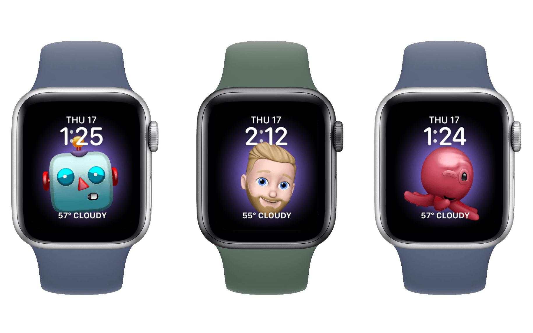
The Memoji face is pretty self-explanatory. You can pick from your custom Memojis or from Apple’s set of character Animojis. Whichever one you choose will live on your watch face and stare at you all the time. You can customize the background color behind it, and pick a complication to go above and below it.
Your chosen Memoji or Animoji will hang out with you and randomly move around. Sometimes it will fall asleep for a while, and sometimes it will smile at you. For some reason the Memojis really enjoy making duck faces. If you tap your Memoji or Animoji friend then it will jump toward you and give you a big smile or laugh.
The Animoji all have different animations and different feelings. Here’s a miniature review of most of them: the cow Animoji is constantly chewing, but never swallows. The poop loves to dance. The mouse mostly just quivers and blinks – I think it’s terrified and trying to play dead. The octopus just likes to flap its tentacles around, and if you tap it sometimes it will wink at you like a weirdo. The giraffe likes to flash a very patronizing smile while it waits for you to release it from this watch face prison. The shark is way too happy and should not be trusted. The owl has no idea where it is or how it got here. The boar thinks you smell really good and the monkey is way too into peek-a-boo. The robot’s nose itches, but it doesn’t have any hands to scratch it. The cat really wants you to leave it alone so it can go to sleep. The dog is a very good boy. The alien is adorable, the fox is suspicious, and the pig is surprised. The panda stares deep into your soul and the chicken is a close talker. There are even more but you’ll have to try them out for yourself.
The Memoji face is a fun addition. I think using the actual Memojis feels odd since you just have a disembodied head – possibly your own – sitting on your wrist staring and smiling at you (I guess the Artist face is similar, but it’s clearly artsy and doesn’t feel as strange). The Animoji options all feel more in line with other character watch faces like Toy Story or Mickey Mouse.
Stripes
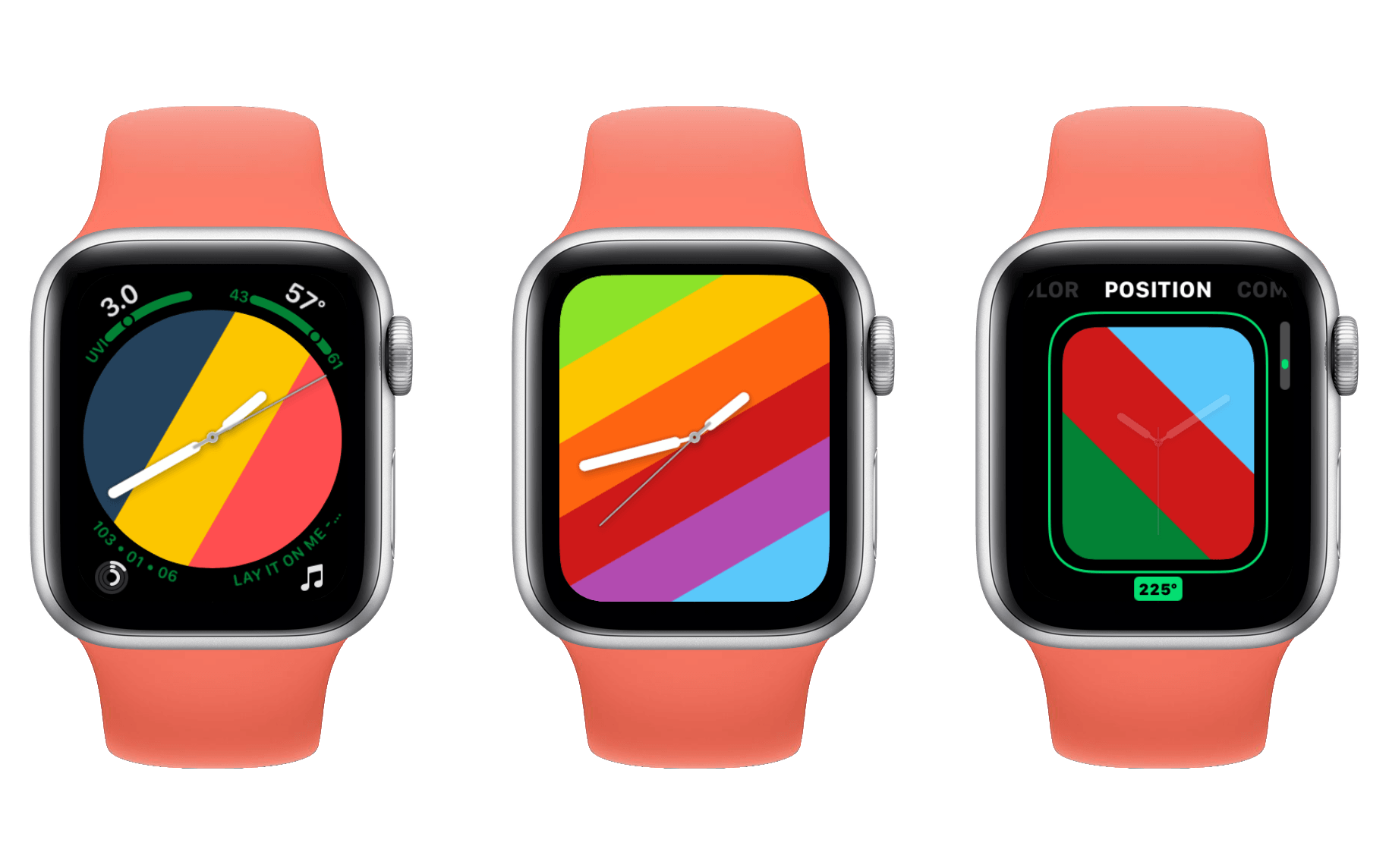
Stripes is a lovely little watch face which shows exactly what its name suggests. Its charm comes in its customizability: you can add between two and nine stripes, and individually set colors for each of them. You can even change the rotation of your stripes freely between zero and 345 degrees.
Similar to the many other faces, Stripes supports a full screen mode and a circular mode. The full screen mode looks excellent, but doesn’t support any complications. The circular mode will provide you with a complication in each corner, but will deprive you of the full glory of your stripes. As I argued last year, I’m pleased that there’s an option here for complication users, but I wish Apple would find a way to make complications available on the objectively nicer full screen design.
Stripes is one of the most customizable faces on the Apple Watch, and Apple showed off how you can create lots of national flags or team colors using it. I think this is awesome, and would like to see this level of customization come to more watch faces in the future.
GMT
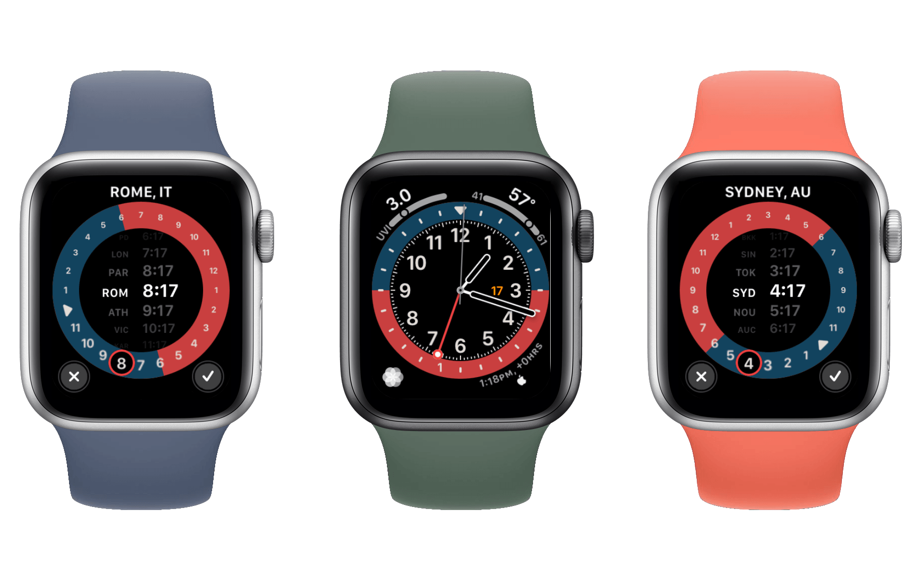
The new GMT watch face has a very nice looking two-tone design with four corner complications and a central date. The great part about this face comes when you tap anywhere within its dial. The GMT face will transform to show a list of time zones and the current time in each of them. You can turn the Digital Crown to cycle through the time zones, and if you hit the checkmark in the bottom right then the watch face will change to show that time zone permanently. While set to a different time zone than your watch’s system time, a monogram will appear in the top-center of the face displaying the abbreviation of the selected time zone.
For anyone who needs to check other time zones regularly, this face is an excellent choice. Its design is beautiful and its interface is well done. Even if you don’t need other time zones regularly, the unique two-tone color scheme and the solid number of complications might make this face a good fit for you anyway.
Typograph
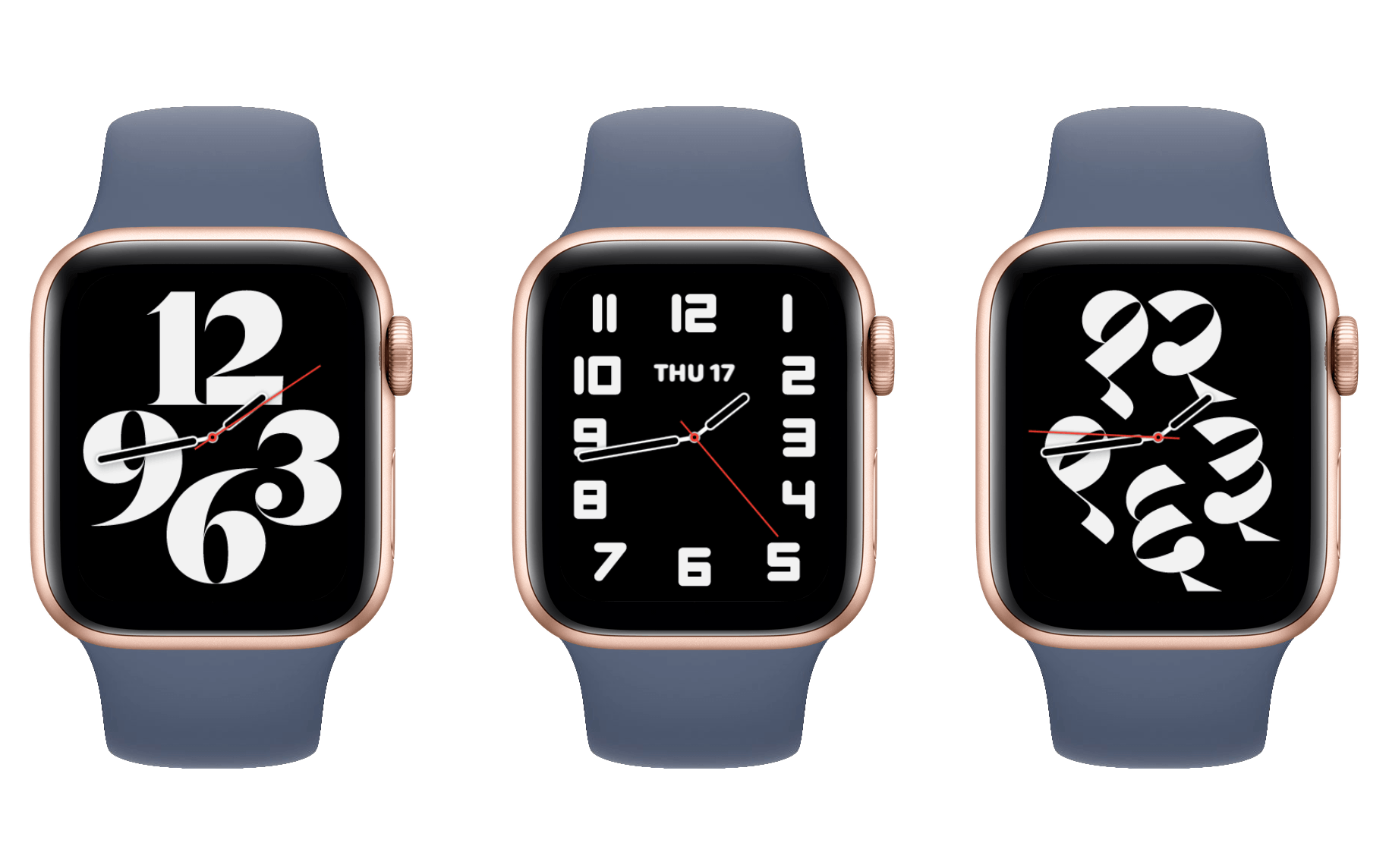
The Typograph watch face is another artsy new option with no complications. It does support showing the digital time or a monogram in the middle, but that’s all. Around the outside it shows either four large or twelve small clock numerals, and you can change their style or use symbols instead. Maybe this kind of face appeals to watch enthusiasts, but to me it just feels like it’s trying too hard to make the Apple Watch look like a regular watch – and removing all of the (face-related) advantages of having a smartwatch in the process. This is certainly not the first Apple-designed watch face which that criticism applies to, but I just can’t muster much enthusiasm for these kinds of faces anymore.
- I was going to explain what a tachymeter is since I had never heard of one before, but the Wikipedia page has a lot of math in the basic description so I’m just gonna leave that here and you can examine it if you’re interested. If you need a tachymeter you probably already know what it does. ↩

#/media/File:Finder_Icon_Evolution.jpg)